Gouache StylePicture Books
Flat opaque colour, a chalky matte surface and brush edges instead of outlines — gouache illustration applied to every page of a whole book, not just one nice painting.
- Real gouache behaviour — opaque paint, matte finish, no line work
- Three gouache looks: base, animation storybook, retro magazine
- Your characters stay the same person on every page
- Free credits by request — no card
50,000+
Stories Created
10,000+
Active Creators
50+
Art Styles
4.9/5
User Rating
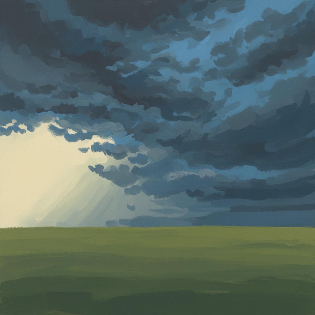
What Makes a Gouache Illustration Look Like Gouache
Not the palette. Gouache is recognised by four behaviours of the paint itself — and three of them follow from the first.
Colour that covers
Gouache is watercolour pigment with the transparency taken out. A stroke does not let the paper glow through it — it sits on top and hides whatever it lands on. That single property is the reason every other mark on this list happens.
Light painted last
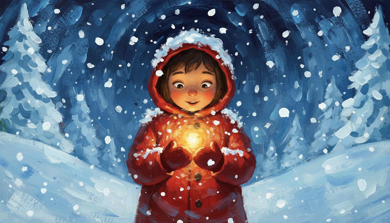
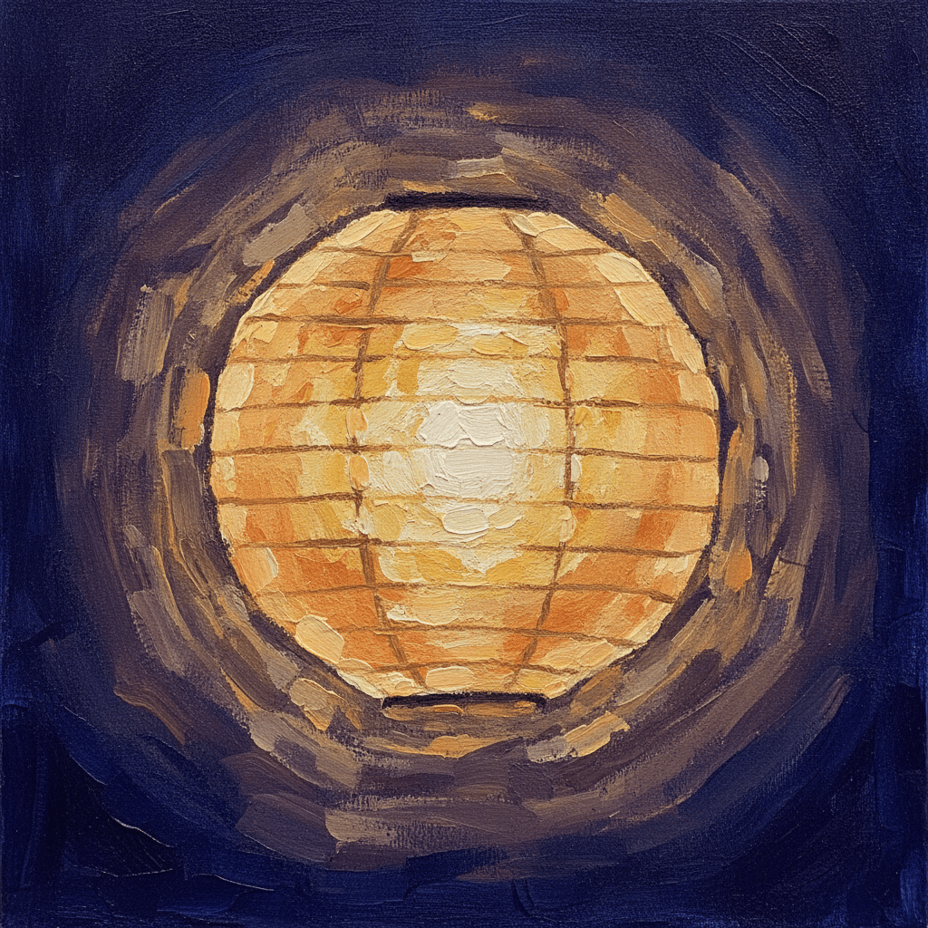
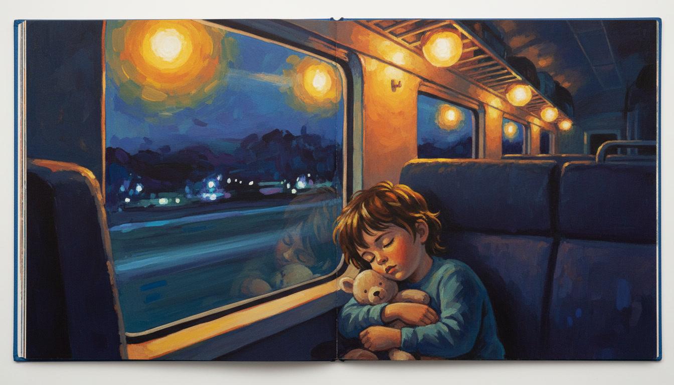
Because the paint covers, the brightest thing in the picture can go on at the very end. Snow on a night sky, a lit window in a dark street, a lamp in a room — all of it laid over the dark instead of carved out of the white.
Brush edges, not outlines
Nothing here is drawn and then filled in. Where two shapes meet, the boundary is the edge of a brushstroke. The style brief asks for visible brush texture and no outlines at all, so forms are separated by colour rather than by line.
Matte, never shiny
Dry gouache goes chalky and dead flat. That is a feature: a matte surface has no glare, which is exactly why animation studios painted their backgrounds in it. The render brief asks for a matte finish and rules out anything glossy.
Gouache Illustration Is Watercolour Turned Inside Out
These two get filed together as “painted” styles, and they are opposites. Watercolour is what you let through; gouache is what you put on top. One property — opacity — reverses the whole way the picture gets built, and that decides which scenes each style is good at.
Why that makes gouache a night-scene style
In watercolour, a glowing lamp in a dark room is genuinely difficult — the glow has to be planned from the start and protected as bare paper while everything around it is darkened. Get it wrong and there is no way back, because transparent paint cannot lighten anything.
In gouache the same lamp is nearly free. You paint the dark room first, then put the light on top as thick pale paint. That is why so many of the scenes gouache is famous for are the same handful of situations: snow, lit windows, lanterns, moonlight, a small bright thing held in the dark. The medium rewards them.
It is worth knowing which one you actually want before you commit a whole book to it. If your story is airy and diffuse — a summer morning, a distant hill, something half-remembered — pick watercolour instead. If it has a light in it, pick gouache.
Make a Gouache Picture Book in 3 Steps
From a one-line idea to a finished, fully painted gouache book in under two minutes.
Describe the story
A sentence is enough. Gouache rewards scenes with light in them, so something like "a boy follows a spill of lamplight from room to room to find who is awake" gives the paint something to do.
"The last bus home, and a hundred lit windows"
Pick the gouache style
Choose base Gouache for flat matte paint, Gouache Animation Storybook for impasto brushwork and snowy cinematic light, or Retro Gouache for chunky 1980s magazine colour blocks.
Opaque pigment, matte finish, brush edges, no outlines
Generate and export
C2Story writes the story, breaks it into pages and paints every one of them in gouache. Read it on screen, share the link, or export the PDF and print it.
Whole book illustrated, PDF export, instant sharing
Three Gouache Looks on C2Story
“Gouache” is not one thing. These three sit in the style picker and they read very differently on the page.
Gouache
The painterly default. Rich opaque pigments, warm earth tones and matte finish colours, with visible brush texture doing the work an outline would normally do. It asks for opaque watercolour and a matte finish, and rules out anything transparent, glossy or sharply digital. Pick this when you want honest flat paint.
Gouache Animation Storybook
Thick impasto gouache with loose wet-and-dry brushstrokes, clear wide eyes, cinematic soft light and a snowy atmosphere. Its palette is warm painterly gouache, cool snow blue, soft peach, amber glow and muted evergreen — vintage storybook charm carrying modern animated-feature richness. Brush edges only, no outlines.
Retro Gouache
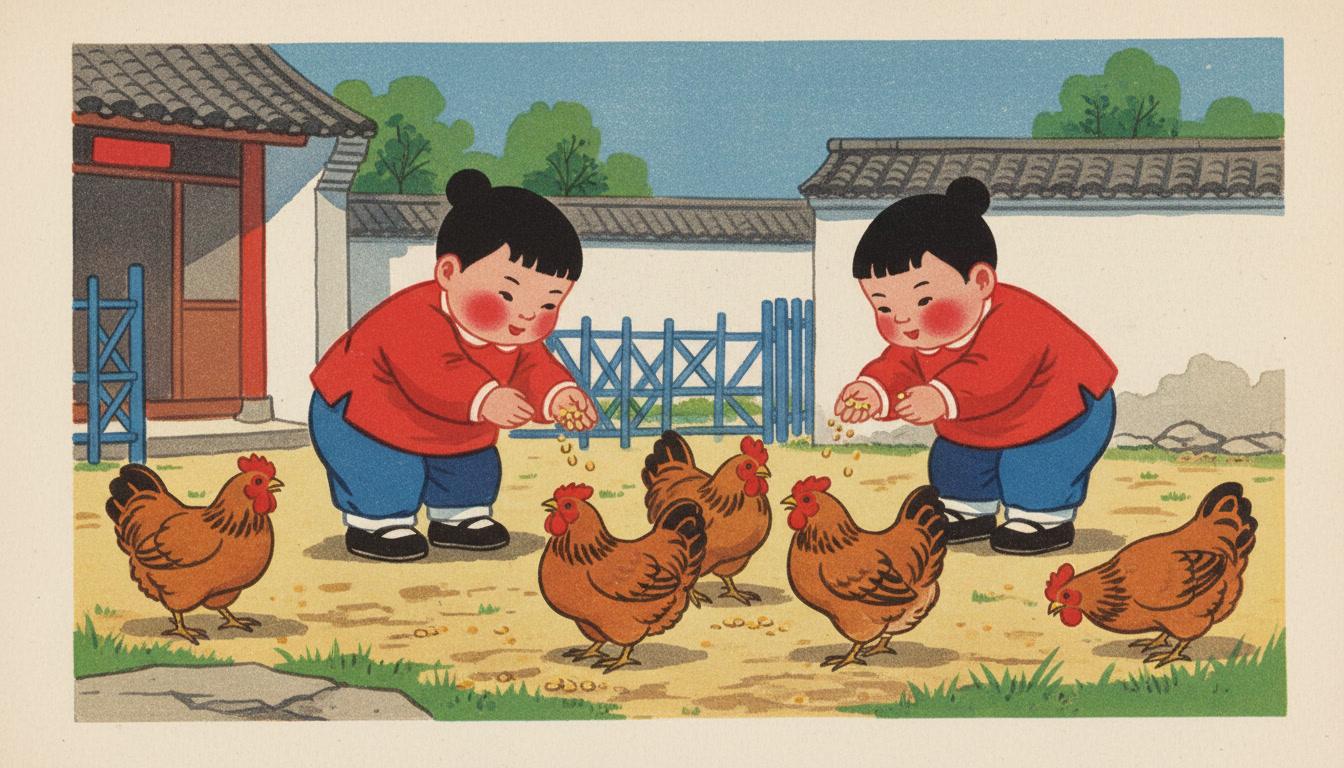
Nineteen-eighties Chinese children’s magazine gouache. Chunky flat colour blocks, sturdy short-limbed figures with round faces and rosy red cheeks, simple black-dot eyes, hair as a flat black silhouette, barely any shadow, and a vermillion, lake-blue, ultramarine, grass-green and ochre poster-paint palette on lightly textured paper.
Gouache Story Art Ideas to Get You Started
Six ideas chosen because they all contain a light, a snowfall or a window — the things opaque paint does better than anything else.
The Last Bus Home
A child and a grandmother ride the final bus of the evening across a dark town, counting the lit windows they pass. Nothing goes wrong. The whole book is the warmth of small lights seen from the cold side of the glass.
Create this storySnow Came in the Night
A girl wakes to find every familiar thing in the garden wearing a new white shape — the bicycle, the bin, the dog kennel. A book about recognising things by their outline when their colour has gone.
Create this storyThe Lighthouse Keeper's Cat
One cat, one beam of light, and a hundred and eighty turns a night. The light sweeps across rocks, waves, gulls and a small sleeping animal, showing a different slice of the world each time it comes round.
Create this storyGrandmother's Courtyard
Chickens, a washing line, a chipped enamel basin and an afternoon that lasts forever. An everyday-life story with no plot to speak of, built for the flat blocks and rosy cheeks of retro magazine gouache.
Create this storyThe Longest Winter Walk
A father and child walk to the far edge of a frozen field and back, and the walk there feels nothing like the walk home. Evergreen, grey sky, red hat — three colours doing all the emotional work.
Create this storyWho Turned the Lamp On?
Somebody in the house is awake, and a small boy follows a spill of warm light from room to dark room to find out who. A mystery whose only clue is where the light falls.
Create this storyAI-Generated Gouache Illustrations
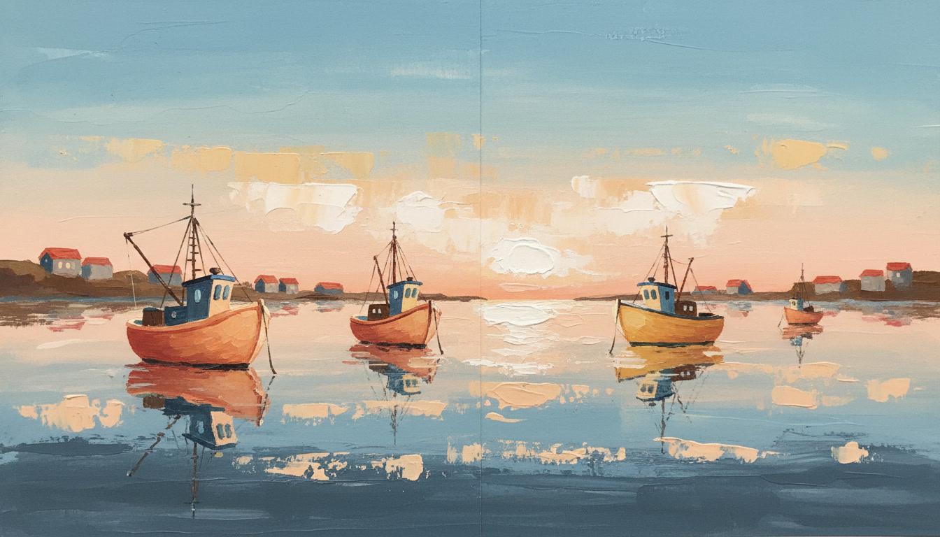
Look at where the light sits. In each of these the brightest paint is on top of the dark, and no shape is held together by an outline.
Gouache Picture Book Art for Every Subject
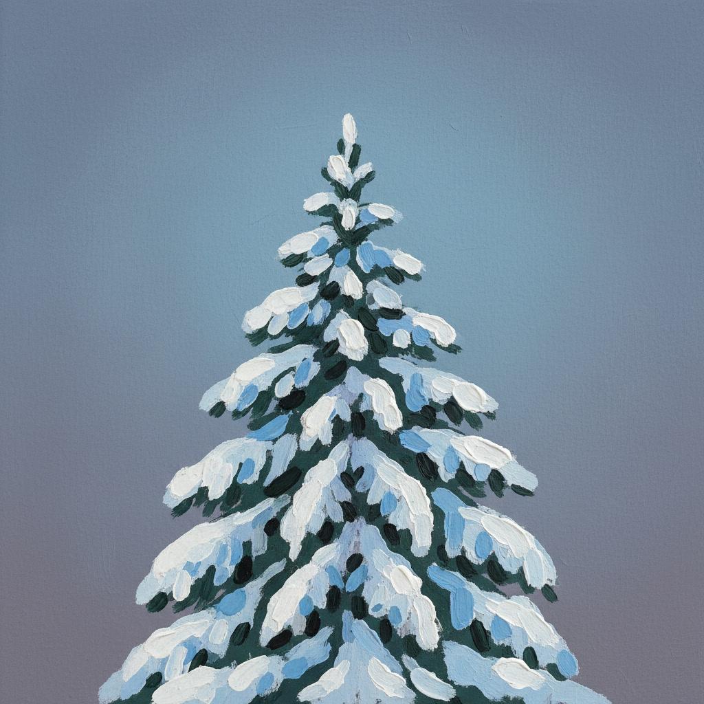
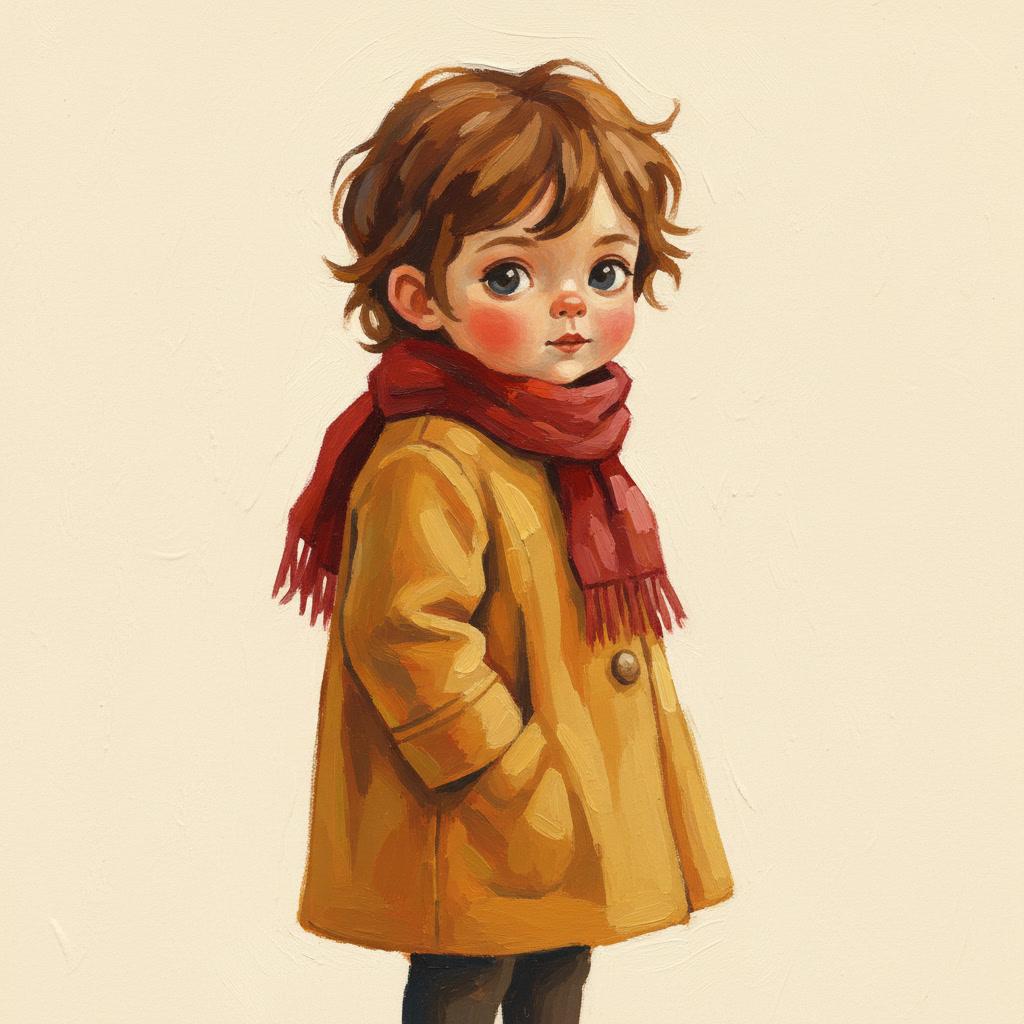
Lamplight, snow, people, rooms, weather — the same opaque paint, applied to whatever your story is actually about.

Everything You Need for Gouache Style Picture Books
A painted look is easy to get once and hard to hold for twenty-four pages. This is the part that holds it.
The same paint on every page
Opacity is easy to lose halfway through a book — one page drifts transparent and the spell breaks. The gouache style carries a fixed render brief, so page twenty is painted with the same loaded brush as page one.
Your cast stays the same person
Brushwork is meant to vary between pages. Your characters are not. Save a character once and their design travels into every page and every later book, so the looseness stays in the paint.
Three gouache looks to choose from
Base Gouache for flat matte paint, Gouache Animation Storybook for impasto and snowy cinematic light, or Retro Gouache for chunky 1980s magazine colour blocks. Choose before you generate, or try the story in each.
Whole books, not single images
You are not prompting for one nice painting. Describe the story and C2Story writes it, breaks it into pages and paints every one of them in gouache, matched to what each page actually says.
Any language you read aloud in
Flat opaque paint reads the same in every language. Write the story in English, Spanish, Chinese, Japanese, French and more — the gouache illustration style does not change with the text.
PDF you can hand to a printer
Export the finished gouache picture book as a PDF. That file is the handoff — print it at home, or take it to whichever print service you already use.
Gouache Style Picture Books — Questions
What people ask before they commit a whole book to gouache.
Explore More Story Ideas
Discover more styles, tools, and story types
Bug Stories
Ladybugs, butterflies, busy bees and glowing fireflies
Explore
Ghibli Style Books
Dreamy Miyazaki-inspired art
Explore
Children's Book Creator
Design beautiful kids books
Explore
Storybee Alternative
More styles & features
ExploreGouache Style Picture Books — Paint a Whole Book in Opaque Colour with AI
A gouache picture book looks painted in a way children can read instantly: solid areas of colour, a chalky matte surface with no shine, and shapes that meet each other cleanly without any drawn line holding them in. It is the look of classic animation backgrounds and of mid-century children's publishing, and it comes from one physical fact about the paint — gouache covers. C2Story renders that look across an entire book: opaque pigment, matte finish and visible brush texture on every page rather than on one lucky image.
The useful thing to understand about gouache illustration is how different it is from watercolour, which it is usually shelved beside. Watercolour is transparent, so the paper supplies your only white and you work carefully from light to dark, protecting the bright places before you lose them. Gouache reverses that. White comes from a tube and goes on last, straight over the dark — which is why a gouache page can hold a lit window, a lantern, fresh snow or moonlight so easily, and why the C2Story gouache style explicitly avoids anything transparent or glossy. Choosing between the two is really choosing whether your story has a light in it.
There is more than one gouache in the style picker. Base Gouache gives you rich opaque pigments, warm earth tones and honest flat paint. Gouache Animation Storybook is thicker and more cinematic — impasto strokes, loose wet-and-dry brushwork, soft snowy light and a palette of cool snow blue, soft peach, amber glow and muted evergreen, with brush edges doing all the drawing. Retro Gouache goes somewhere else entirely: 1980s Chinese children's magazine art, with chunky flat colour blocks, round rosy-cheeked faces, hair as a flat silhouette and a vermillion-and-ultramarine poster-paint palette. Same medium, three registers.
The risk with any painterly style over twenty-four pages is drift — one page goes transparent or picks up an outline and the book stops feeling like a book. C2Story keeps the render brief fixed for the whole story, and keeps your cast separate from it: save a character once and their design is carried into every page, so the looseness lives in the brushwork and never in who somebody is. Write it in any language you read aloud in, export the finished gouache style picture book as a PDF, and hand that file to whichever printer you already use. Start free — see our pricing plans, compare every option on the illustration styles hub, or go straight to the AI Story Generator.