Pop ArtPicture Books
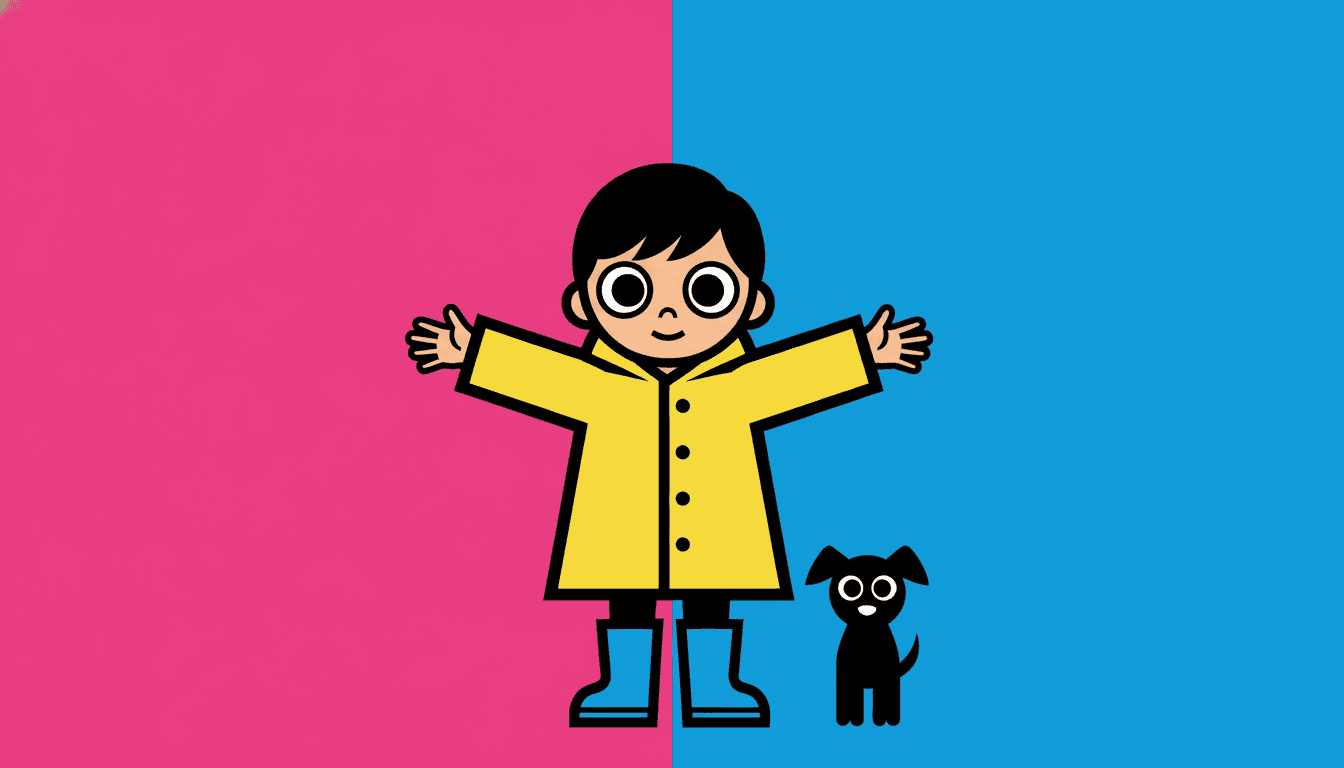
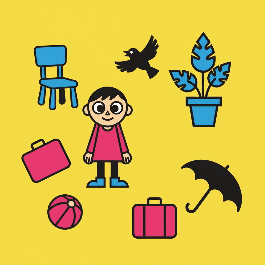
Pop art is the one look here that did not come from books. Thick black outlines, round bulging eyes, and hot pink meeting electric blue with nothing in between — held across a whole book, not one lucky poster.
- Thick black outline, flat fills, zero shading
- A palette chosen to clash, not to match
- Built to be read from across a room
- Free credits by request — no card
50,000+
Stories Created
10,000+
Active Creators
50+
Art Styles
4.9/5
User Rating
What Makes Pop Art Different From Every Other Flat Style
Plenty of looks here are flat and outlined. Only this one inherited its manners from advertising, and all four of these follow from that.
Pop art did not come from books
Almost everything else in this library traces back to publishing — picture books, editorial cartooning, ink painting, the gallery. The pop branch traces back to commercial work: posters, packaging, magazine covers, advertising art, television cartoons. That ancestry is still sitting in the brief, which asks for flat punchy pop lighting and figures organised by bold silhouette. It is a look built to be seen by someone who was not yet looking.
So it presents your character instead of observing them
This is the practical consequence, and it is the thing to decide on. A watercolour page lets you watch a child who does not know you are there. A pop art page turns that child a few degrees towards you, lights them evenly, outlines them and hands them over. Nobody in a pop art picture book is ever quite unaware of the reader — which is a gift for some stories and a problem for others.
The colours are picked to fight, not to match
Three enabled styles here share one unusual instruction word for word: a few high-chroma clashing flat colours, keeping silhouettes and clothing in strong graphic contrast. Most palettes in this library are schemes — mustard beside teal, grey-blue beside beige, chosen to agree. This one is a collision, chosen so that each shape shoves the shape next to it forward. Hot pink against electric blue is not a slip.
It refuses the in-between
Its four refusals are soft shading, muted palette, fine rendering and realism — and the first two are the same refusal twice. A gradient is two colours negotiating; a muted palette is every colour meeting in the middle. Strip both out and two hues meet at a hard edge with nothing between them. That is why the thick black outline matters here: it is not decoration, it is the referee.
Pop Art Presents Your Character. It Does Not Observe Them.
Most picture book illustration is a kind of watching. The child in the painting does not know you are there, the light comes from a real direction, and you are looking in at something already happening.
An advertisement cannot afford that. It has to reach someone who had not agreed to look, and it has about a second to do it. The pop styles here inherit the whole method — flat punchy lighting with nowhere to hide, figures organised by bold silhouette, faces reduced to a few forceful features, and a palette tuned for contrast. The result is that your character is always, slightly, being handed to the reader.
That makes it a public-story style. Parades, talent shows, shopfronts, sports days, a town full of signs — anything where the characters are already performing gives this look something true to do.
And it fights the quiet ones. A story that wants to be overheard rather than announced will keep running into a style that announces. For those, a painted look serves you better.
The style names what must never appear, and the first two entries are really the same ban stated twice — one about tone, one about saturation:
Poster Composition Is Not What Makes It Pop. The Palette Is.
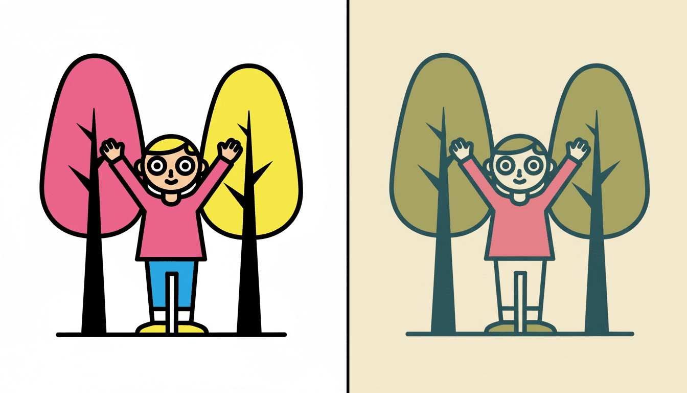
Both halves of that picture are flat, both are composed like a poster, both reduce the figure to a clean shape. Only one of them is pop, and the difference is nothing to do with the drawing.
The right-hand look is Belle-Époque Poster Flat — a real style here, with flat decorative colour blocks and simplified figure outlines, built on muted olive, warm cream, dusty rose and deep teal. Same construction, opposite temperature. Pop takes the identical flat poster logic and refuses the muted palette by name, which is the single edit that turns a decorative page into a loud one.
There is a test for it. Imagine the page desaturated. A comic page survives — it was built on ink and black. A pop art illustration collapses, because once the colours stop clashing there is nothing left holding the shapes apart.
About the dots. Most people picturing pop art are picturing printed halftone. Neither style with pop in its name asks for it — the dots are in the retro branch, with a gentler, more nostalgic look attached.
Worth seeing side by side before you commit: the bold flat style, where the outline rather than the colour is load-bearing, the mid-century style, which is where the halftone printing lives, and the comic book style, which spends its energy on action rather than on contrast.
Create a Pop Art Picture Book in 3 Steps
From a one-line idea to a finished book that keeps its colours fighting all the way through, in under two minutes.
Describe the story
A sentence is enough. Give this look something public and performed — a parade, a shopfront, a stage, a match. Characters who are already facing an audience suit a style that was built to face one.
"Every shopkeeper paints a bigger sign than the last"
Pick the pop branch
Choose Pop Satire Cartoon for thick black outlines and the loudest version, 80s City-Pop Girl for clean even lines and white space, Bold Geometric Picturebook for the same clash with no outline at all, or Showa Commercial Cartoon if you want the printed dots.
Thick black, high-chroma clashing colours, flat bright fills
Generate and export
C2Story writes the story, breaks it into pages and draws every one to the same brief. Read it on screen, share the link, or export the PDF and take that file to whichever printer or print service you already use.
Whole book drawn, PDF export, instant sharing
Pop Art and Its Loud Neighbours
Four real styles that all run bright and flat, sorted by the two things that actually separate them: how heavy the outline is, and who the loudness is aimed at.
Pop Satire Cartoon
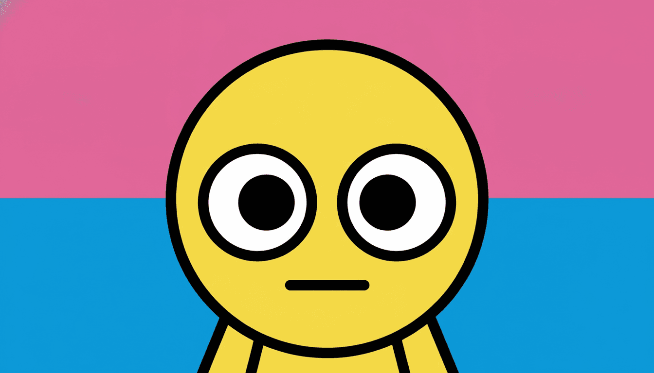
Thick black outlines, round bulging big eyes, flat characters with almost no shading, figures built on clear silhouettes and big shapes with few but forceful features, poses driven by limb direction, and a few high-chroma clashing flat colours. Its lighting is flat punchy pop lighting and its line is a thick black outline. One thing to know before you pick it: its brief names adult social satire, and its own preview subject is a character mid-eyeroll. On a children’s story it comes out broad and loud and funny rather than sweet.
80s City-Pop Girl
Clean-line 1980s urban pop: crisp confident even lines of uniform weight instead of a thick black contour, flat high-chroma clashing colour blocks in hot pink and electric blue, generous white space, and bold graphic contrast between a figure and a retro city behind it. It refuses muddy shading, cluttered detail and soft gradients. Pick this when you want pop colour that reads as cool and uncluttered rather than as a shout — it leaves half the page empty where the satire branch fills it.
Bold Geometric Picturebook
Forms built from clean geometric blocks, strong silhouettes, high-saturation colour, characters reduced to a few key shapes — and the same clashing flat hues as the pop styles, but with deliberately minimal outlines. There is no black contour to separate anything, so the clash does all the separating by itself. This is the branch written for picture books rather than for satire or fashion, and it is the safest pop-bright choice for a young reader.
Showa Commercial Cartoon
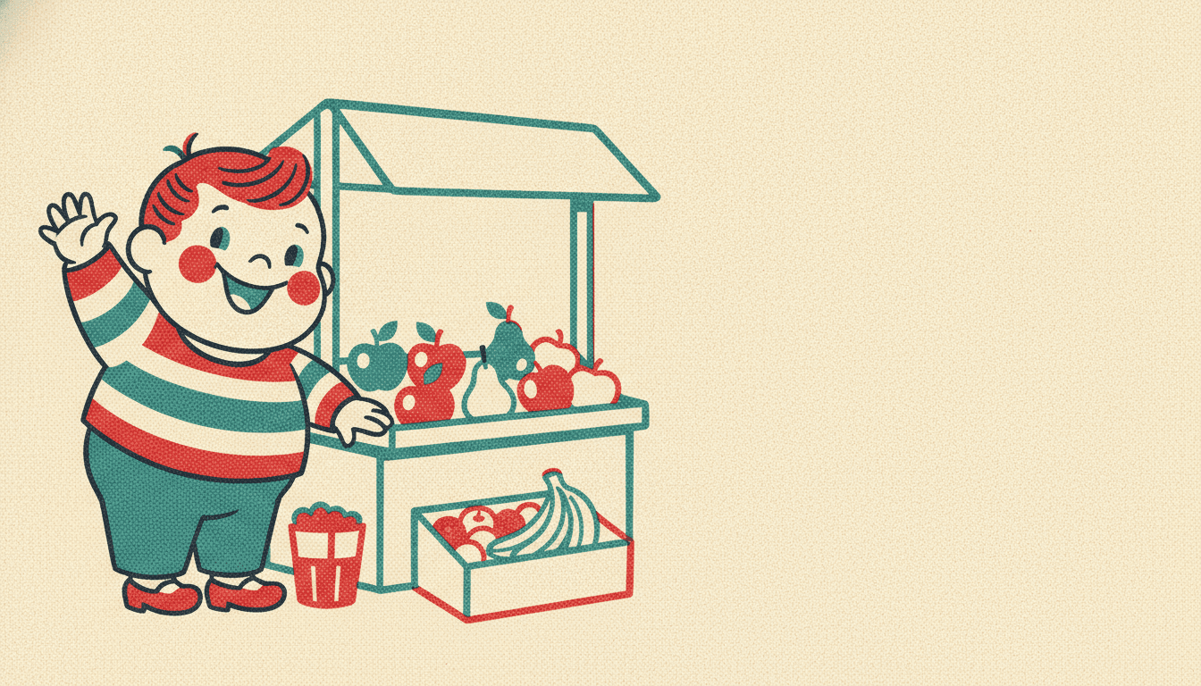
Mid-century Japanese commercial cartoon: plump rounded cheerful characters, clean confident outlines, a flat printed poster feel with subtle halftone warmth, in bright cherry red, teal and warm cream. If what you actually pictured was printed dot texture — the thing most people mean when they say comic pop style — it is here, in the retro branch, not in the two styles with pop in their names. It is also the gentlest of the four.
Two more relatives are worth knowing about. Belle-Époque Poster Flat uses the same flat poster composition in a deliberately muted palette, which is the clearest proof that the colour rather than the layout is what makes a page pop. Bold Flat Satire keeps the thick contour and the punchy accents but hands the structural job to the outline instead of the clash. For where pop sits among the wider families, see our guide to comic book art styles, or browse everything on the illustration styles hub.
Pop Art Story Book Ideas to Get You Started
This look is better at public, performed and noisy than at private, subtle and still. These six lean into that.
The Loudest Shop on the Street
Every shopkeeper paints a bigger, brighter sign than the one next door, until the whole street is shouting. A style descended from advertising is the only honest way to draw a story about advertising, and the clashing palette does the arguing for you.
Create this storyTalent Show Night
Six acts, six children, one stage, and everybody facing the audience. Pop art presents rather than observes, so a story where the characters are genuinely performing is a story where the style is finally doing what it was built to do.
Create this storyThe Mascot Who Wanted a Day Off
A costumed mascot is a character who is also an advertisement — permanently smiling, permanently on duty. Flat punchy lighting and round bulging eyes make that joke visible on the page before a single word is read.
Create this storyThe Big Match
Sport, read from across a room. Poses in this style are driven by clear limb direction and bold silhouette, which is exactly how you draw a leap, a throw and a save so that a four-year-old can tell them apart instantly.
Create this storyEverything Is Pink Today
A child decides the world needs one more colour in it, and keeps going. When the palette is built from a few high-chroma flats that clash on purpose, a story about colour itself gets to use the style as its plot.
Create this storyThe Robot on Television
A small robot appears on every screen in town and nobody can switch it off. Mass media inside the story, drawn in the visual language of mass media — a pop art illustration earns its loudness when the subject is loudness.
Create this storyAI-Generated Pop Art Illustrations
Try it on these: find the place where one colour turns into another. There is no such place — every edge is a hard stop.
A Comic Pop Style for Every Subject
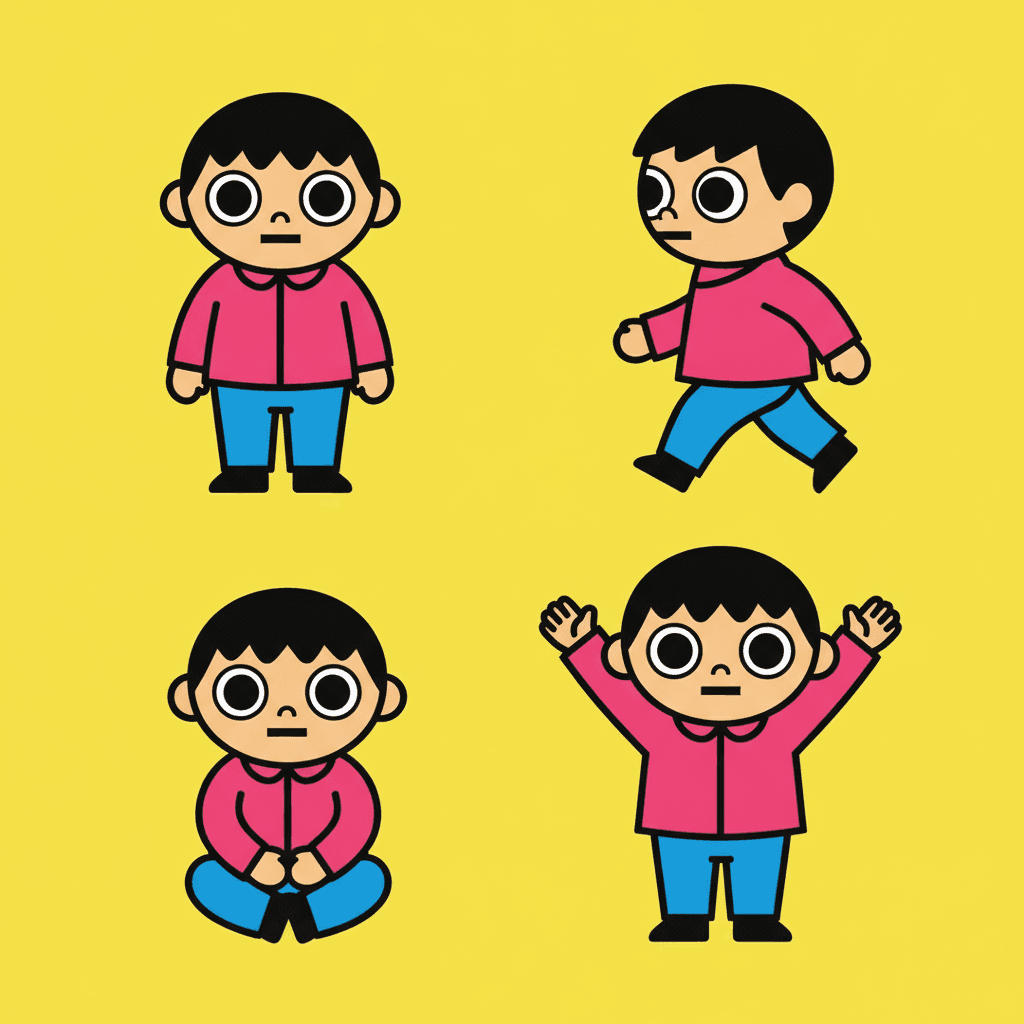
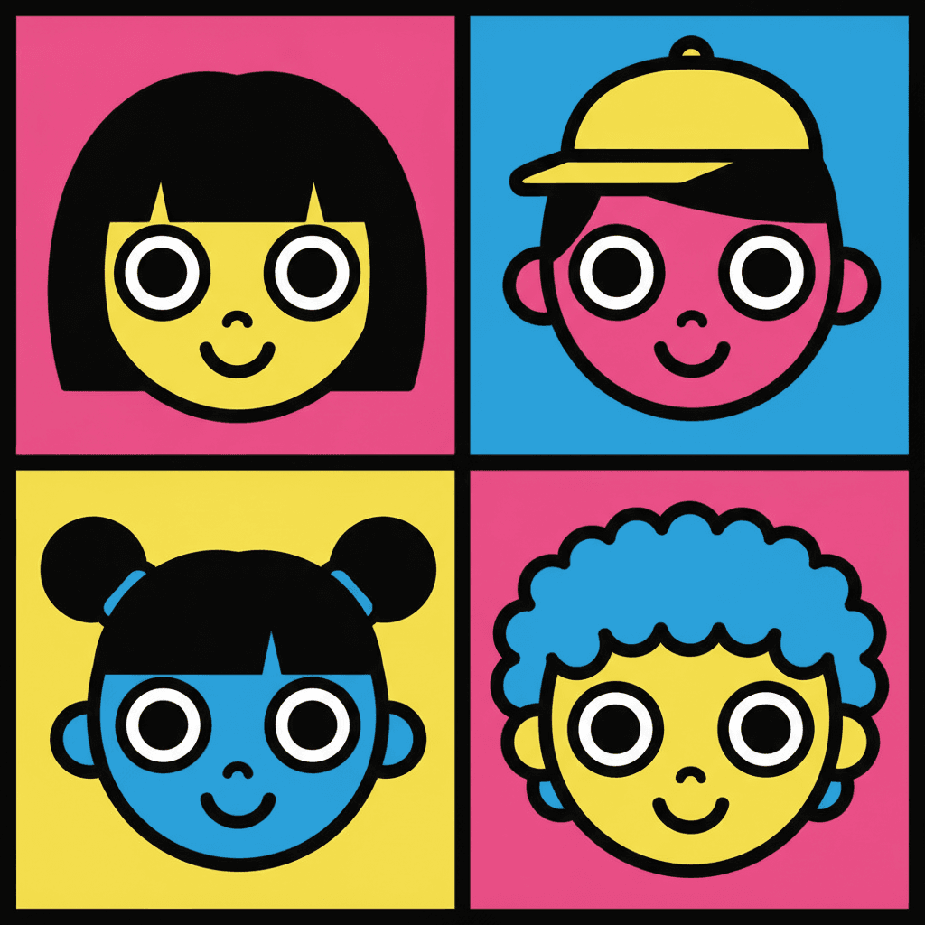
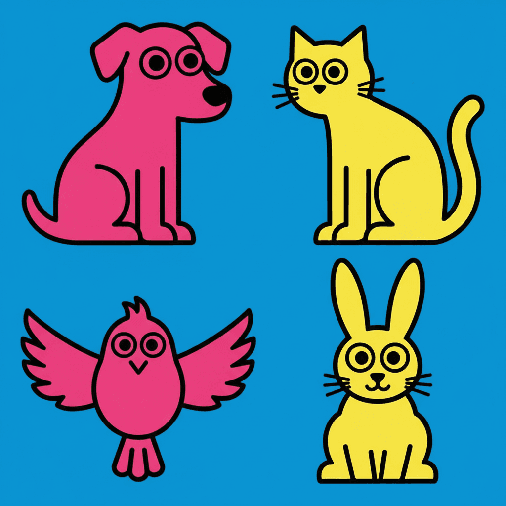
Characters, faces, animals, objects, whole colour fields — the same thick outline and the same clashing flats, spent on whatever your story is actually about.

Everything You Need for Pop Art Picture Books
One loud image is easy. Twenty-four of them, with the same cast, the same four colours and the same hard edges, is the part that needs building.
The same four colours on page twenty
A clashing palette is the easiest thing in the world to lose. Ask an image model for bright and it will happily hand you a different bright on every page, and by the end the book is rainbow rather than pop. One fixed brief — thick black outline, flat fills, a few high-chroma clashing colours, flat punchy lighting — is carried into every page of the book instead, so the collision stays the same collision throughout.
Four refusals, and two of them are the same one
Soft shading, muted palette, fine rendering, realism. Read them together and the pattern shows up: the first two both ban the middle ground, one in tone and one in saturation. That is what keeps a pop art page from quietly softening into an ordinary cheerful illustration halfway through a book.
A cast built from silhouette and colour
Save your characters in the Character Library, with up to fourteen reference images each, and they carry into every page and into later books. It matters in a specific way here: when faces are two big eyes and a line, a reader identifies people by outline, hair shape and the two colours they are wearing — so what a saved character is really holding steady is the silhouette and the palette.
A palette that arrives with the look
There is no colour picker and no hex field. The range comes with the style — thick black, high-chroma clashing colours, flat bright fills — and that is the point rather than a limitation. The contrast between the figure and the ground is the structure of the picture, so handing out an eyedropper would be handing out a way to break it.
Whole books, not single posters
You are not prompting for one striking image. Describe the story and C2Story writes it, breaks it into pages, and draws every page in this style, matched to what that page actually says — so the look holds across a narrative instead of lasting one lucky render.
Any language you read aloud in
The look carries no language of its own. Write in English, Chinese, Japanese, Spanish, French and more — the black outline, the flat fills and the clashing colour do not change with the text. Graphic contrast is about as close to a universal as illustration gets.
Pop Art Picture Books — Questions
What people ask before committing a whole book to hard edges and a palette that cannot be turned down.
Explore More Story Ideas
Discover more styles, tools, and story types
Farm Stories
Friendly farm animals and barnyard fun
Explore
Ligne Claire Picture Books
One even ink line & flat unshaded colour
Explore
Picture Book Maker
Create illustrated picture books
Explore
ChatGPT vs C2Story
Purpose-built for picture books
ExplorePop Art Picture Books — Clashing Colour, Hard Edges, Whole Books with AI
Pop art is the one family in this library that did not come out of publishing. Nearly every other look here traces back to picture books, editorial cartooning, ink painting or the gallery wall. The pop branch traces back to commercial work — posters, packaging, magazine covers, advertising art, television cartoons — and that ancestry is still visible in every line of the brief. On C2Story the main version is the Pop Satire Cartoon style: thick black outlines, round bulging big eyes, flat characters with almost no shading, figures built on clear silhouettes and big shapes with few but forceful features, poses driven by limb direction, and a few high-chroma clashing flat colours keeping silhouettes and clothing in strong graphic contrast. One brief, applied across an entire book, so the collision on page twenty is the same collision as on page one.
The thing worth understanding before you commit a book to it is the difference between presenting and observing. Most picture book illustration is a kind of watching — the child in the painting does not know you are there, the light falls from somewhere real, and you are looking in at something already under way. An advertisement cannot work like that, because it has to reach a person who had not agreed to look, in about a second. So it flattens the light so nothing is hidden, organises the figure as a silhouette you can read at a glance, cuts the face down to a few forceful features, and picks colours that shove each other forward. A pop art illustration inherits all four of those moves, which means your character is always being handed to the reader rather than quietly observed. That is a genuine advantage for parades, talent shows, shopfronts, sports days and any story where people are already performing — and a genuine obstacle for a story that wants to be overheard.
The second thing to know is which part of the page is load-bearing, because several styles here are flat and outlined and they are not doing the same job. In the bold flat style the outline carries the picture: a thick heavy contour does the separating and the colour sits inside it. In a pop art story book the colour carries it, and the outline is there to keep two fighting hues from blurring. There is a quick test — imagine the page with the saturation removed. A comic page survives, because it was built on ink and black. A pop page collapses, because once the colours stop clashing nothing is holding the shapes apart. The same logic explains Belle-Époque Poster Flat, a real style here with identical flat poster composition and a deliberately muted palette of olive, cream and dusty rose: same layout, opposite temperature, and not remotely pop. The palette is the whole difference.
Two honest notes before you start. First, the dots. Most people picturing pop art are picturing printed halftone, and neither of the styles with pop in their names asks for it — both specify flat colour. The dots live in the retro branch instead: Showa Commercial Cartoon asks for a flat printed poster feel with subtle halftone warmth, and Retro Vintage asks for a muted warm palette with halftone texture. Pick one of those for the printed look and accept something gentler, or pick a pop style and accept flat, loud, untextured colour. Second, pick your branch deliberately. Pop Satire Cartoon names adult social satire in its brief and its own preview character is mid-eyeroll, so it runs broad and a little sharp; Bold Geometric Picturebook gives you the same clash with no outline and a cast written for picture books; 80s City-Pop Girl trades the heavy contour for crisp even lines and generous white space. Where this look struggles is predictable from its refusals — soft shading and muted palette are banned, so there is no dusk, no weather, no fog and no mood lighting, and fine rendering is banned, so fur, bark and water are out. Keep your cast in the Character Library, with up to fourteen reference images each, so silhouette and costume colour stay fixed when faces are two eyes and a line. Write in any language you read aloud in, then export the finished book as a PDF — that file is the handoff to whichever printer you already use, and the images you generate are licensed for commercial use. Start free: see our pricing plans, browse every option on the illustration styles hub, compare it with the bold flat style or the mid-century style, read the guide to comic book art styles, or go straight to the AI Story Generator.