Pixel ArtPicture Books
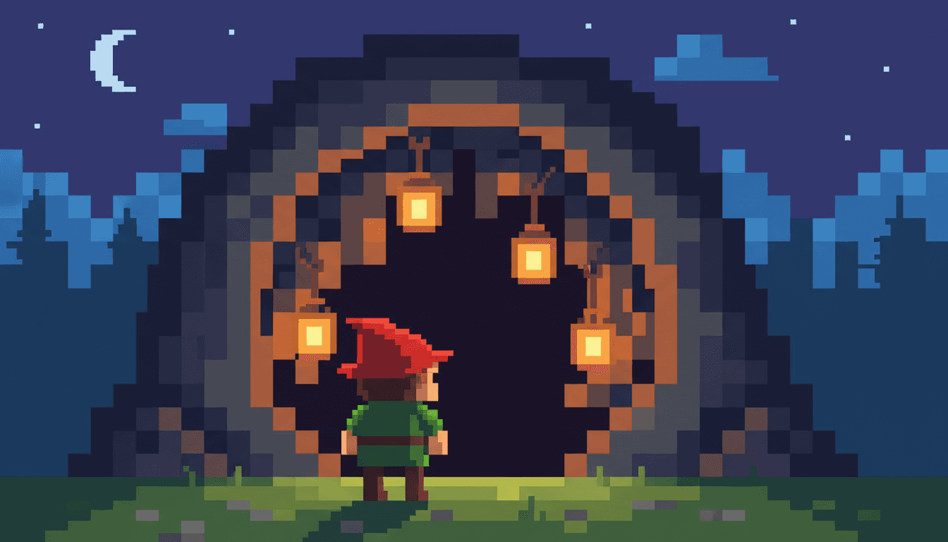
Pixel art illustration works by running out of room on purpose. A fixed grid, a rationed palette, and edges that step instead of curve — held across a whole pixel art picture book rather than one good sprite.
- Real 16-bit behaviour — crisp pixels, visible grid, dithered shading
- Anti-aliasing and gradients refused by the style itself
- Characters readable at every size, page after page
- Free credits by request — no card
50,000+
Stories Created
10,000+
Active Creators
50+
Art Styles
4.9/5
User Rating
What Makes a Pixel Art Illustration Look Like Pixel Art
Not nostalgia, and not the subject matter. Four things follow from drawing on a grid you are not allowed to leave.
The grid comes before the drawing
Every other medium lets you decide how fine a mark can be while you are making it. Here the cell size is fixed first, and after that you are not drawing a curve — you are choosing which squares are on. The resolution is a decision, and it is the first one.
A diagonal is a staircase
Nothing is anti-aliased. A slanted line is a visible run of steps, and softening those steps with a half-tone edge is the single fastest way to stop something looking like pixel art. The jaggedness is not a limitation being tolerated — it is the finish.
Shading is a pattern, not a blend
With gradients ruled out, a third tone has to be faked. Dithering does it: a checkerboard of two palette colours that the eye mixes at a distance and reads as texture up close. Shadows end up having a weave, which is why pixel art looks woven rather than painted.
The palette is a fixed budget
A limited 16-bit palette means colour is rationed, and rationed colour starts carrying meaning. When only one thing on the page is red, red becomes a name. That is the mechanism the whole style runs on, and it is what makes the next section work.
Pixel Art Does Not Draw a Character. It Encodes One.
Give a painter a face and they add: eyes, then eyelashes, then the light on the cheek. Give a pixel artist a face at this resolution and they have perhaps twenty cells to work with, which forces a question no other medium asks out loud — which single feature survives?
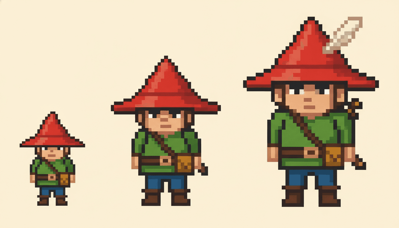
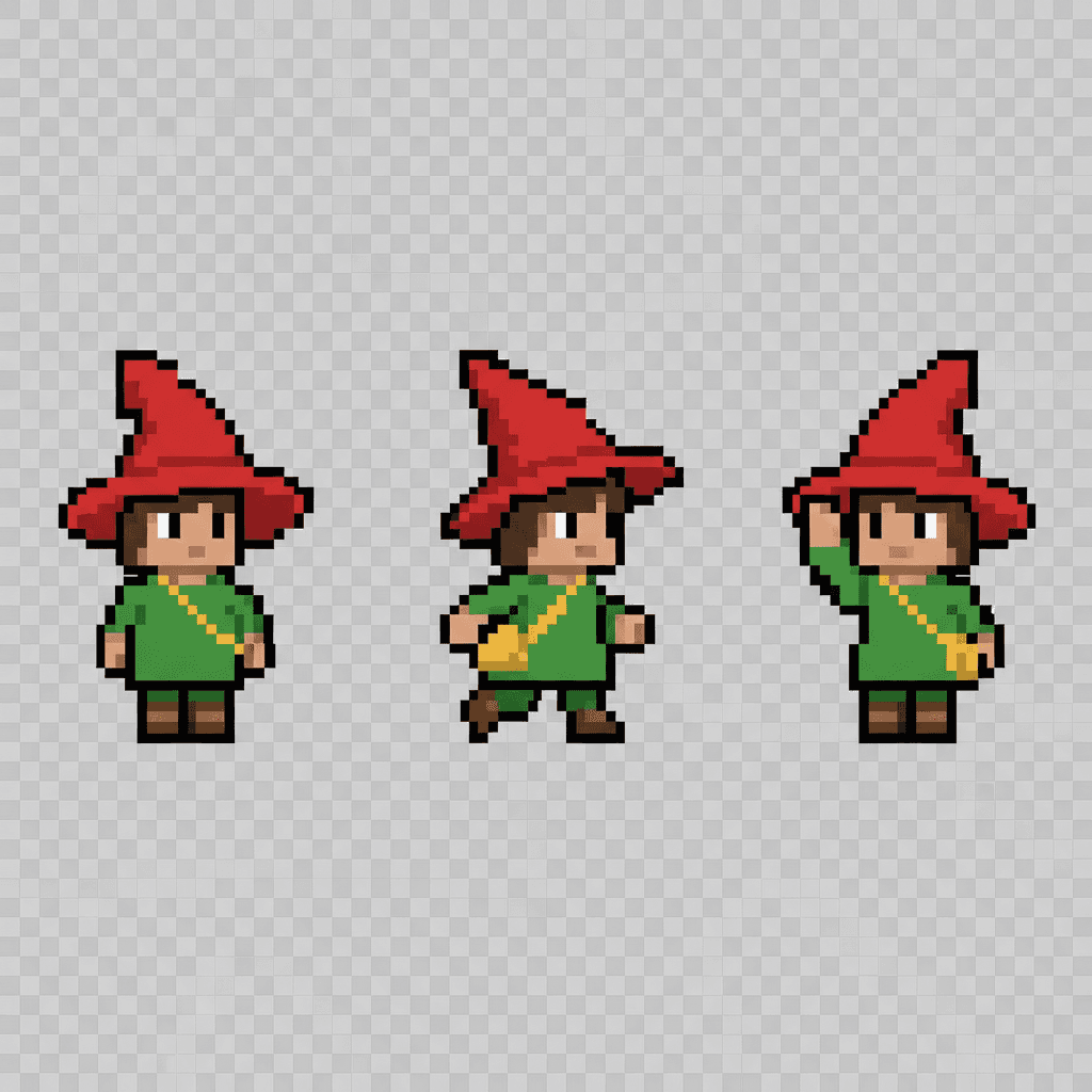
Whatever you keep becomes the character. A red pointed hat, a green tunic, one slung satchel. Those are not decoration, they are the encoding, and a reader identifies the person by decoding them. Which is why consistency in a pixel art picture book is a different job from consistency anywhere else:
Fewer marks, higher stakes. Change the hat colour in a watercolour book and you have a continuity slip. Change it here and it is a different child, because the hat was most of what said who they were.
But drift is visible. That same sparseness makes a book easy to audit. There is no accumulated detail to hide in — the marks either match across twenty pages or they obviously do not.
The style carries its refusals in writing too. Alongside what it asks for, it names what must not appear on any page:
Create a Pixel Art Picture Book in 3 Steps
From a one-line idea to a finished book rendered on the grid, in under two minutes.
Describe the story
A sentence is enough. Pixel art likes clear silhouettes and places you can tell apart at a glance, so something like "two friends cross a tiled world looking for the square that fell out of it" gives the grid plenty to do.
"The castle moves one screen away each time"
Pick the pixel style
Choose Pixel Art for the 16-bit grid, or one of its retro neighbours if you want a rationed palette with a different texture — Risograph for grainy misregistered print, Retro Vintage for mid-century halftone.
Crisp pixels, visible grid, limited palette
Generate and export
C2Story writes the story, breaks it into pages and renders every one of them in your chosen style. Read it on screen, share the link, or export the PDF and take it to a printer.
Whole book rendered, PDF export, instant sharing
Pixel Art and Its Retro Neighbours
Worth saying plainly: Pixel Art is one style, not a family. The retro category holds three in total, and the other two are not pixel art — they are what people sometimes mean when they ask for it.
Pixel Art
The real one: a 16-bit retro game aesthetic with crisp pixels, a limited colour palette, charming blocky characters and the pixel grid left visible. Its render brief asks for pixel-perfect edges and flat pixel lighting, and explicitly refuses smoothing, gradients, realism, high resolution and anti-aliasing.
Risograph
Also built on a rationed palette, but the texture comes from printing rather than from a grid: limited spot colours, grainy layers that sit slightly out of register, halftone and bold flat shapes. Pick this when you want the restraint of pixel art without the staircase edges.
Retro Vintage
The nostalgia without the hardware. A muted warm palette, halftone texture and a mid-century print feel — closer to an old picture book than to an old console. Worth knowing it exists, because people searching for "retro" often mean this rather than pixels.
Pointillist Pixel Fantasy
A stippled micro-grain fantasy look from the hand-drawn catalog — dense dot texture like knitted grassland, muted fantasy tones, a quiet fable mood. It has "pixel" in the name and reads grainy rather than gridded, so it is listed here to tell the two apart, not to pad the count.
If what you actually want is bold shapes and flat colour without the staircase edges, the minimalist style gets there by a different route, and the comic style keeps flat colour inside panel layouts.
Pixel Art Story Ideas to Get You Started
The grid is better at clear shapes and separate places than at soft faces and crowds. These six lean into that.
The Boy With Three Pixels of Hair
A character wakes up to find one of his pixels missing and nobody recognises him any more. A joke about identity that only works in this medium, and a neat way to teach a child what a detail is actually for.
Create this storySixteen Colours and No More
A painter is given a palette of sixteen and told the world needs painting. She runs out of blue halfway through the sea. A story about rationing that mirrors exactly how the style itself works.
Create this storyThe Map With One Tile Missing
Two friends cross a tiled world looking for the square that fell out of it. Grid-shaped worlds are easy to draw and easy for small readers to follow, because each screen is a place and each place is a page.
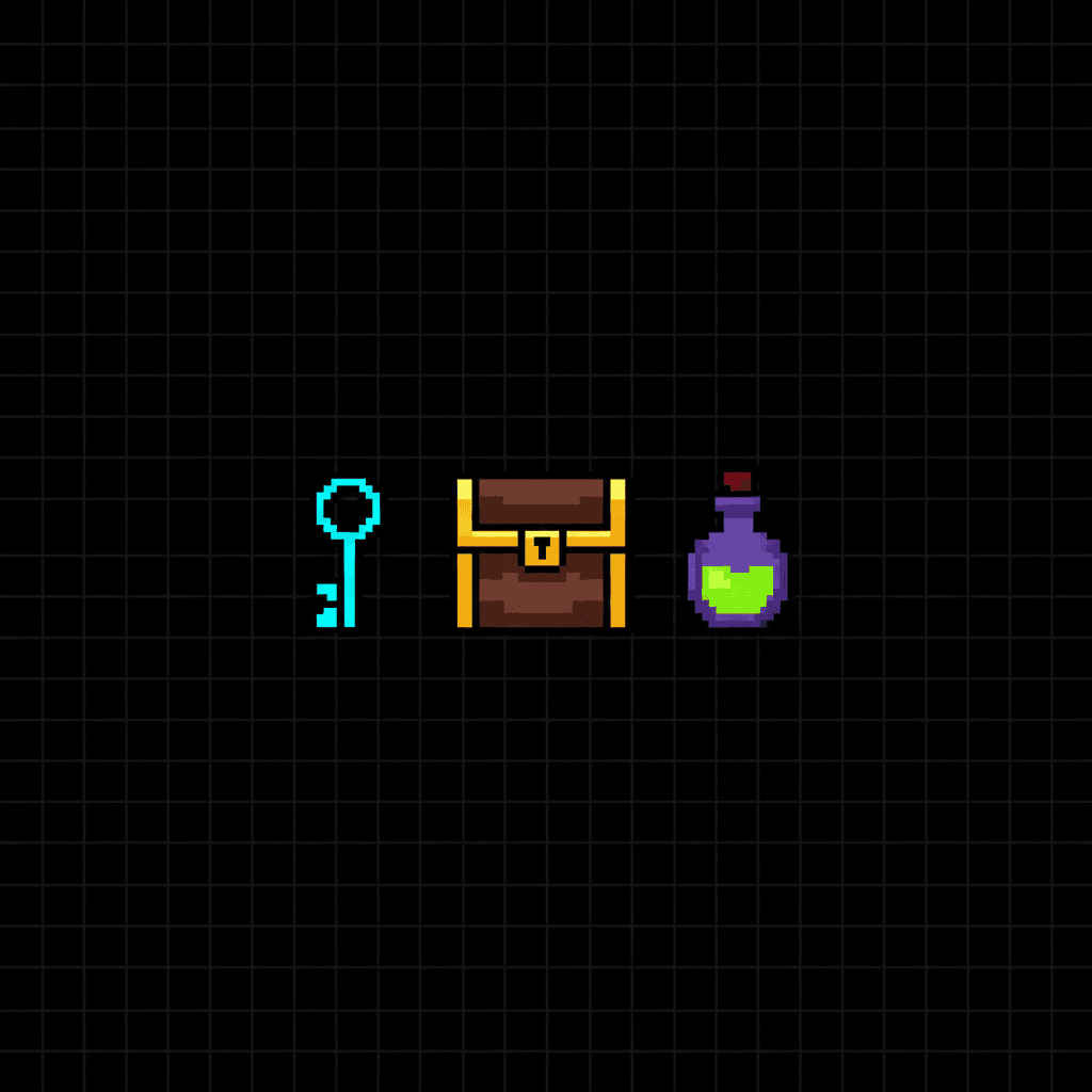
Create this storyChest, Key, Potion
Three objects, one small thief, and a problem with the order he opens things in. Item sprites are the clearest thing pixel art does — a shape plus one accent colour and a child knows exactly what it is.
Create this storyThe Castle That Scrolled Away
Every time the hero gets close, the castle moves one screen to the left. A gently frustrating quest with a warm ending, built to use the side-on, flat-planed layout that a pixel art story falls into naturally.
Create this storyGrandad Made Games
A child finds an old machine in a cupboard and meets the blocky people her grandfather drew forty years ago. The one story where the style is also the subject — and the one most likely to make an adult read it twice.
Create this storyAI-Generated Pixel Art Illustrations
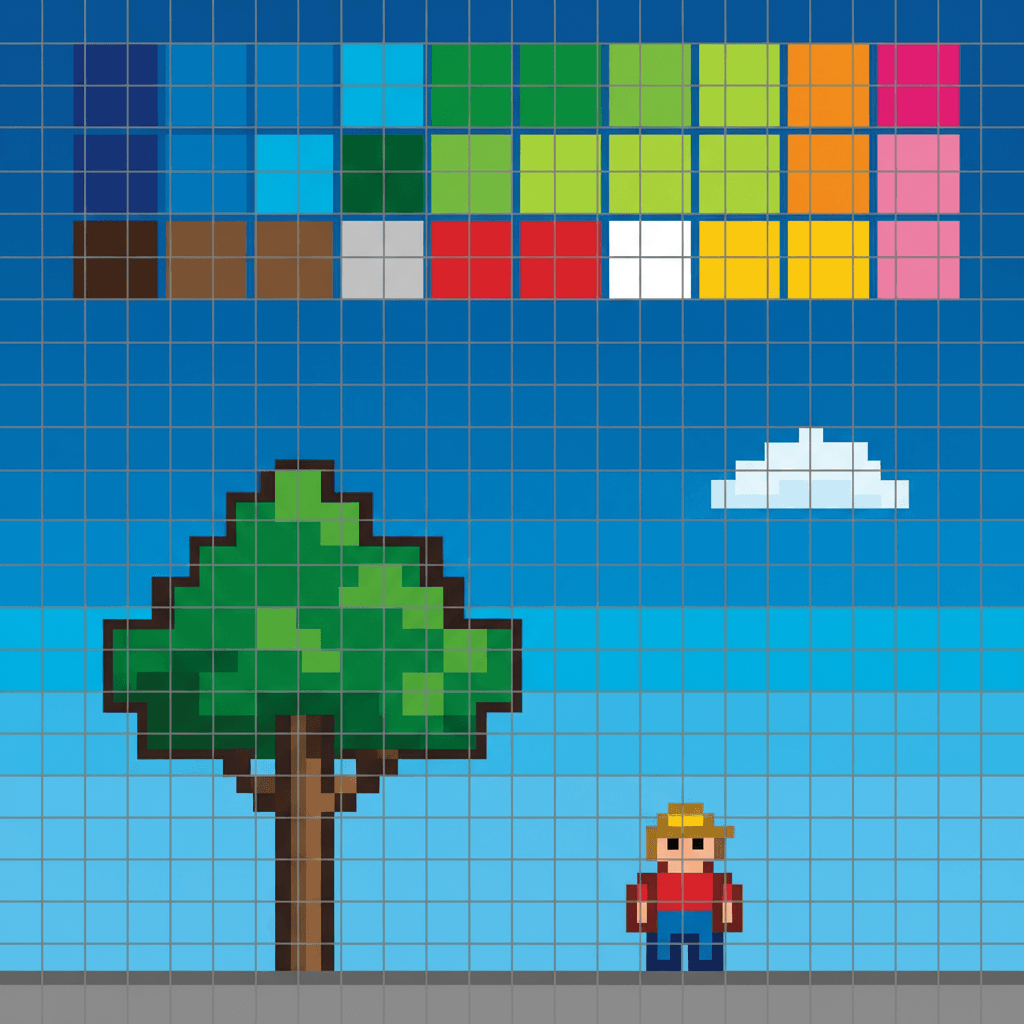
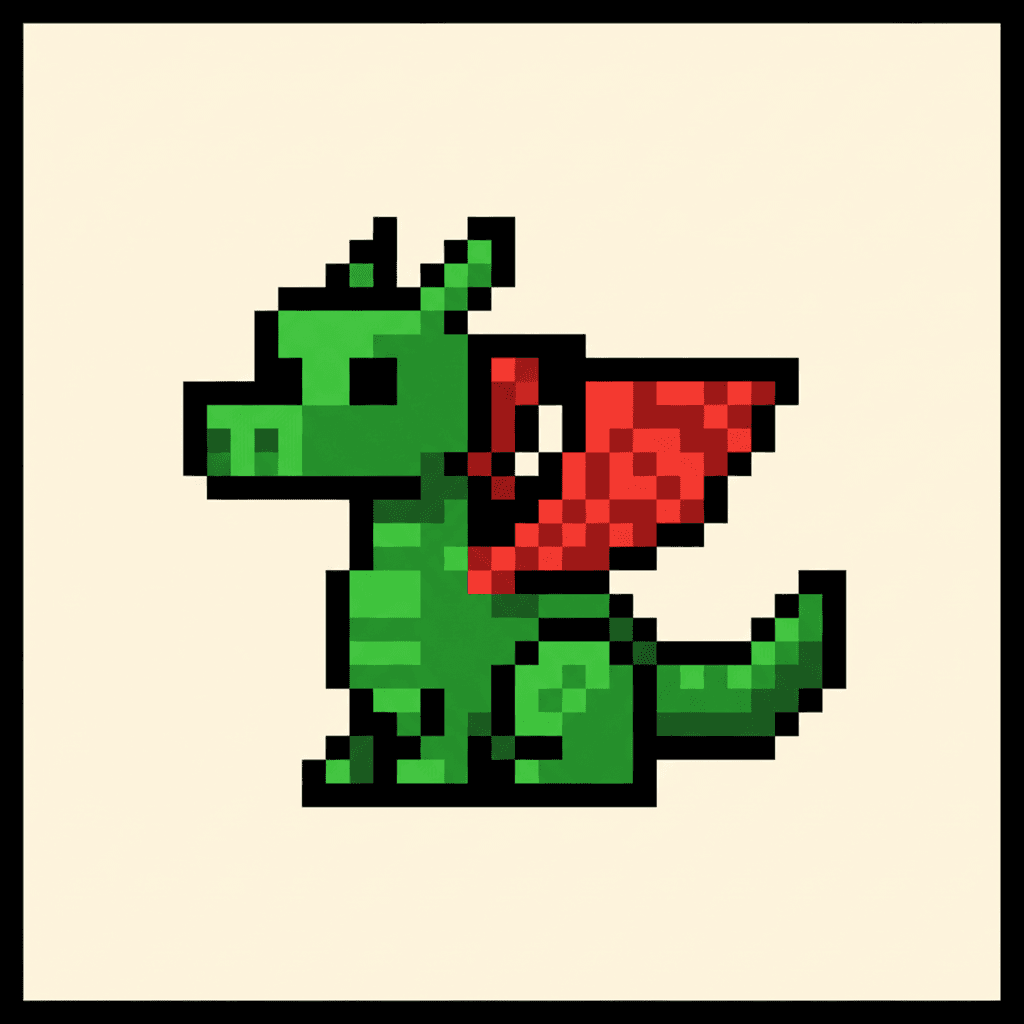
Look at the edges. The diagonals step, the shadows are woven out of two colours, and nothing has been smoothed to be helpful.
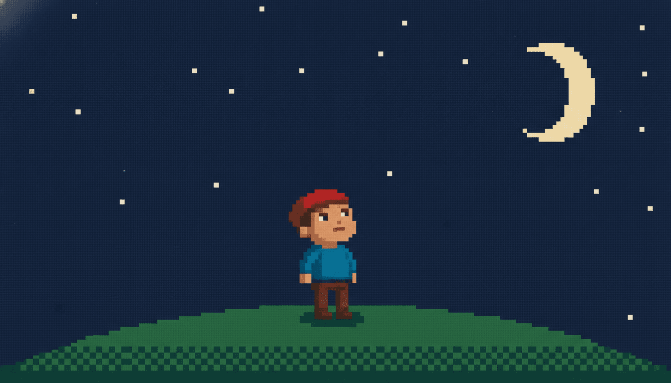
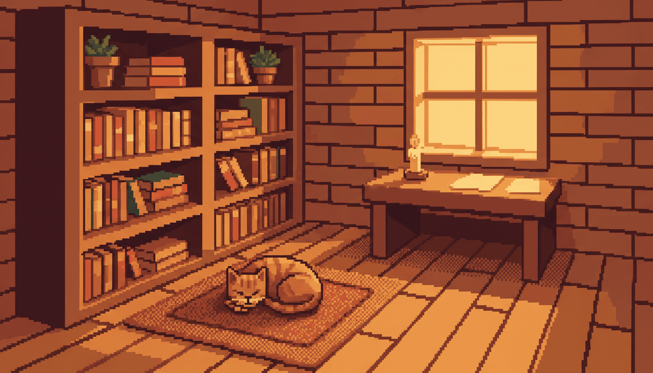
Pixel Art Picture Book Illustration for Every Subject
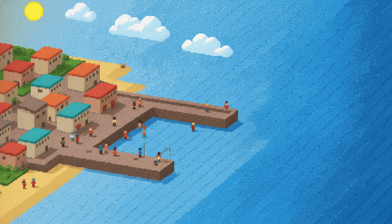
Characters, animals, palettes, creatures, objects — the same fixed cell size, spent on whatever your story is actually about.
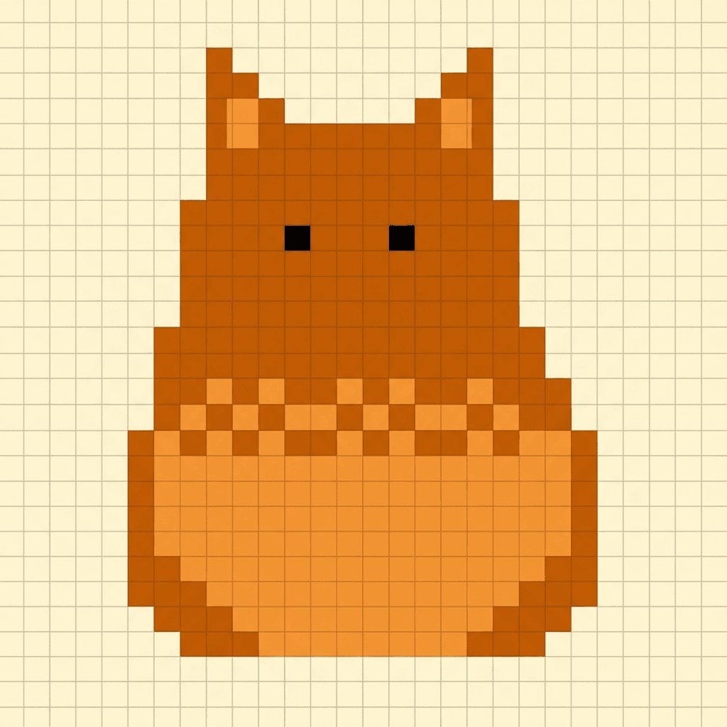
Everything You Need for Pixel Art Picture Books
One convincing sprite is luck. Twenty-four pages on the same grid with the same cast is the part that needs building.
The same grid on every page
The pixel style carries a fixed render brief — crisp pixels, visible grid, pixel-perfect edges, flat pixel lighting, a limited palette — into every page of the book, so page twenty is not quietly rendered at a higher resolution than page one.
Smoothing is refused in writing
An image model wants to make things look nicer, and nicer means softer. The style names its enemies outright — smooth, gradient, realistic, high resolution, anti-aliased — so the one instinct that would destroy this look is the one it is told not to follow.
A cast that survives the resolution
At this size a character is a silhouette and two accent colours. Save them once in your Character Library and that small set of identifying marks travels into every page and every later book, instead of being re-guessed each time.
Consistency you can actually check
An unexpected side effect of low resolution: drift is obvious. In a painted style a character can slide for ten pages before anyone notices. Here the hat is either the same three pixels or it is not, so you can audit a whole book at a glance.
Whole books, not single sprites
You are not prompting for one good sprite. Describe the story and C2Story writes it, breaks it into pages, and illustrates every page in the pixel style, matched to what that page actually says.
Any language you read aloud in
The grid carries no language of its own. Write the pixel art story in English, Chinese, Japanese, Spanish, French and more — the pixels do not change with the text.
Pixel Art Picture Books — Questions
What people ask before committing a whole book to a grid.
Explore More Story Ideas
Discover more styles, tools, and story types
Safari Stories
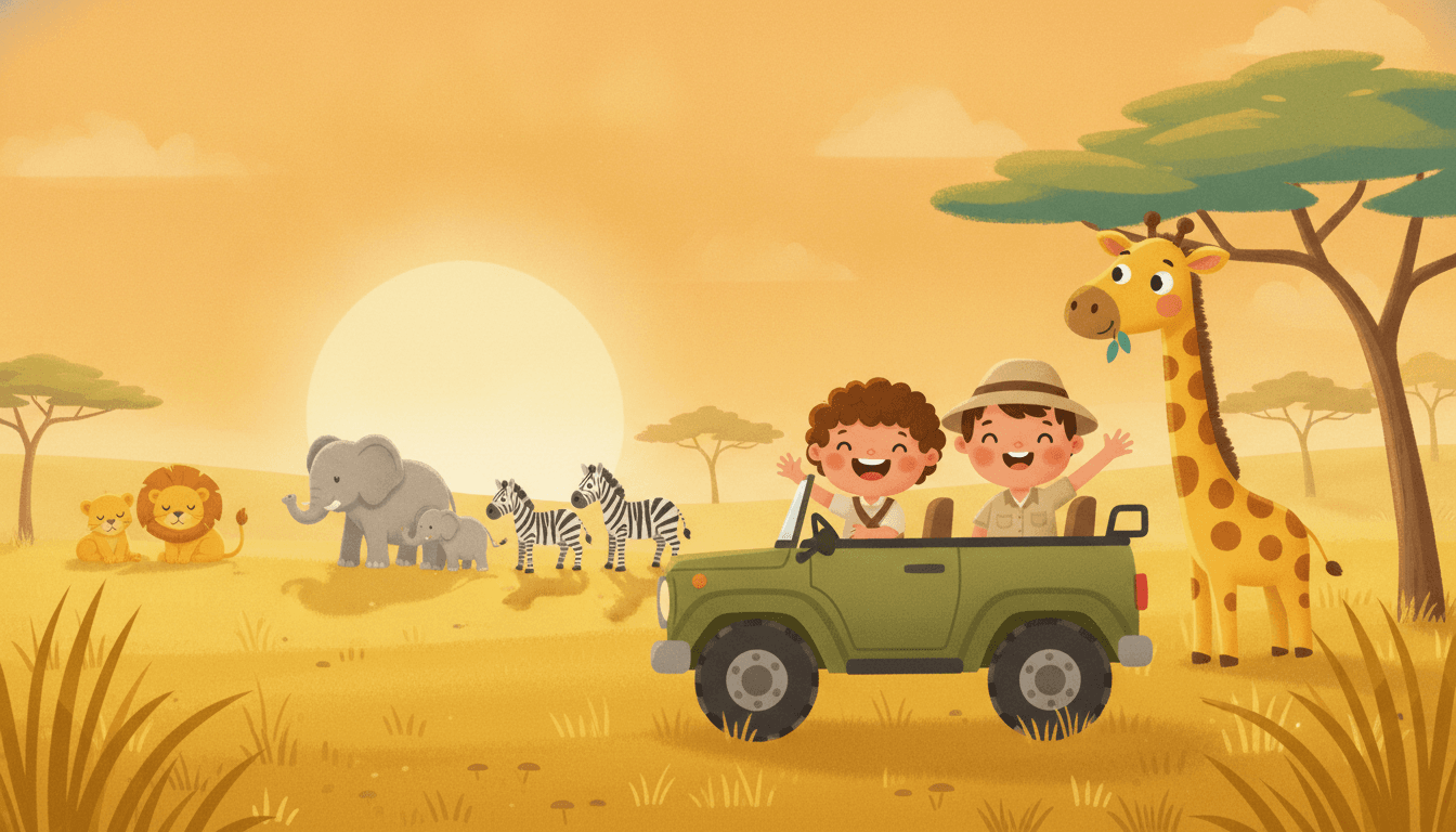
Jeep rides, giraffes, elephants and lions on the savanna
Explore
Anthropomorphic Animal Books
Dressed animals with jobs & a busy little town
Explore
Picture Book Maker
Create illustrated picture books
Explore
Storybee Alternative
More styles & features
ExplorePixel Art Picture Books — Make a Whole Book on the Grid with AI
A pixel art picture book is the only kind where running out of room is the technique rather than the problem. The cell size is fixed before anything is drawn, the palette is rationed, diagonals step instead of curving, and a third tone has to be woven out of two with a dithered checkerboard because gradients are not available. C2Story applies that logic across an entire book — crisp pixels, a visible grid, pixel-perfect edges and flat pixel lighting, on every page rather than on one lucky sprite.
The interesting problem in pixel art illustration is not making one good sprite. It is that low resolution changes what a character even is. Strip a face down to twenty cells and you cannot carry identity with eyelashes and cheekbones — you carry it with a silhouette and two accent colours, and whatever you chose to keep becomes the whole encoding. That makes consistency across a book both more fragile and far easier to inspect. C2Story keeps your cast in a Character Library so the same small set of identifying marks travels from page one to page twenty-four and into every later book, instead of being re-guessed each time an image is made.
The grid also needs defending from the generator's urge to improve things, because improvement here means smoothing. An image model asked for a blocky character will happily hand back a softly-shaded one with anti-aliased edges and a tasteful gradient sky, which is a nicer picture and not pixel art at all. So the style names its enemies outright — smooth, gradient, realistic, high resolution, anti-aliased — alongside what it asks for, which is how a pixel art story keeps its staircase edges for a whole book.
Being straight about scope: Pixel Art is a single style here, not a twelve-deep family, and the retro category holds three in all. Pixel Art is the 16-bit grid itself; Risograph rations its palette the same way but gets its texture from grainy misregistered spot-colour printing; Retro Vintage is mid-century halftone nostalgia rather than anything to do with a console. Pointillist Pixel Fantasy in the hand-drawn catalog reads as stippled grain, not a grid, despite the name. Pixel art suits quests, maps, clear objects and places you can tell apart at a glance — write it in any language you read aloud in, export the finished book as a PDF, and hand that file to whichever printer you already use, checking a test page first because some printers smooth hard edges when scaling. Start free: see our pricing plans, browse every option on the illustration styles hub, compare it with the minimalist style, or go straight to the AI Story Generator.