
Botanical Ink Picture BooksLit Like a Page, Not a Place
Four of the seventy-eight style briefs here ask for cross-hatching. A botanical ink picture book is built from the only one whose light is named after a printed plate instead of a place — so the hatching is not shadow. It is substance.
- Fine-nib pen lines that visibly wobble and change pressure
- Dense cross-hatching used for surface, never for shade
- Sepia ink, muted greens and faded rose on warm ivory
- Free credits by request — no card
50,000+
Stories Created
10,000+
Active Creators
50+
Art Styles
4.9/5
User Rating
What Makes Botanical Ink Different From Simply Drawing Plants
Pen hatching is not rare in this library. What is rare is pen hatching with no light to put it to work — and one field in the brief, shared by none of the other seventy-seven, is where that comes from.
The only brief whose light is named after a printing process
Every style in C2Story runs on a short written brief recording a palette, a lighting note, a line weight and a few things to avoid. Nine of the seventy-eight hand-drawn briefs ask for flat or even light in some form — flat graphic lighting, flat neutral light, soft even ambient light, flat decorative lighting. Every one of those names a quality the light has. This brief names where the light comes from instead: even antique-plate lighting. That is the light of a printed book page lying under a lamp, not light inside the scene at all. There is no sun in these pictures, no window, no lamp, no fire and no glow, and nothing casts a shadow on the ground or on a leaf. The page is lit. The place is not.
Four briefs cross-hatch. Only two do it densely, and they disagree about why
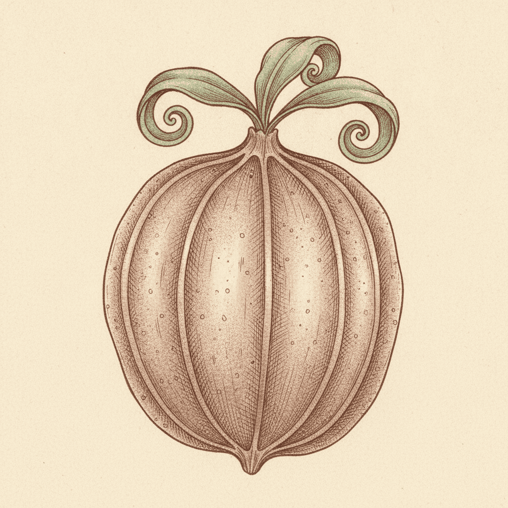
Four of the seventy-eight use the words cross-hatching at all: a deadpan cartoon, an anthropomorphic animal town, a Victorian gothic pen illustration, and this one. Set the gothic brief beside this one and they look like the same craft — both specify a fine nib, both ask for dense cross-hatching, both refuse soft gradients. Then read their lighting fields, which are opposites. The gothic one reads moody hatched chiaroscuro, and its own prompt says the hatching is there for shadow and volume: the marks are standing in for darkness. This brief has flat even light all over, which leaves its hatching nothing to darken. So the same marks do a different job here — they describe substance. The veins in a leaf, the nap of fur, the ribs on a seed pod, the grain of a dry husk.
A hand you can see — and the only one of the three holding a pen
Worth counting honestly, because the wobbly line is not the rare part. Twenty-eight of the seventy-eight briefs ask for a mark that is uneven, loose, imperfect or deliberately crooked in some wording, so a visible hand is almost the house style here. Narrow it properly and three briefs share this one’s exact sentence — visible hand pressure, pauses and slight unevenness giving the outline a real on-paper rhythm. The other two are brush briefs: a wild Eastern spirit-ink and a mythic bestiary ink, both working in flowing calligraphic strokes and soft ink washes. This is the only one of the three holding a dip pen. A brush wobbles by flexing and can lay down a wash; a nib wobbles by catching on the paper and cannot wash at all, so every tone in these pictures has to be built from separate countable lines.
The plants are invented — this is not a field guide
The honest note, and the one most likely to catch you out. The words around this look — botanical, specimen, natural history — all promise accuracy, and the drawing does borrow the density and the ivory-and-sepia dress of an old engraved plate. But the brief asks for strange ornate flora and fauna and classical curio-cabinet whimsy, and it is the only one of the seventy-eight to use the words flora and fauna at all. What it draws is a plant that could grow rather than one that does: too many petals, leaves scrolled like a carved bracket, seed pods of no species in particular. If what you actually want is real wildlife rendered with field-guide care, the animal watercolour style is built for exactly that and this one is not.
Nothing in the Picture Is Allowed to Be Background
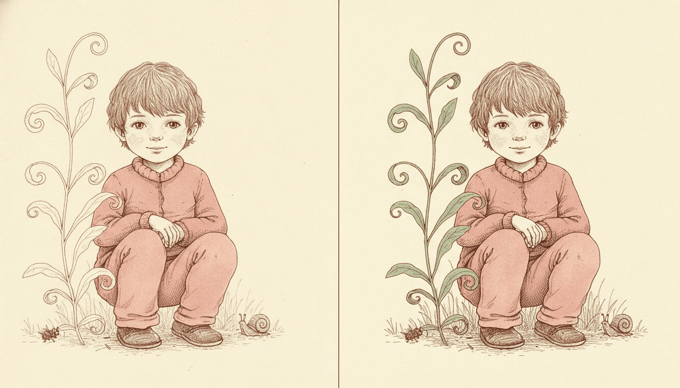
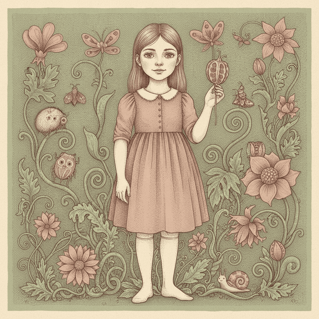
Look at the two halves. It is the same boy, the same crouch, the same hands folded over the same knees, the same snail at his right and the same small beetle at his left, drawn in the same thin wavering pen line — nothing about him has changed at all. The plant beside him has not changed shape either: the same stem, the same spiral at the top, the same pointed leaves in the same places. What changed is only how much of the drawing it was given. On the left it is an outline and nothing more, hollow, uncoloured, unhatched — the way a background normally behaves in a picture, hanging back so the character can come forward. And it works: your eye goes straight to the boy and stays there.
On the right the identical plant has been filled with green and worked over with the same hatching as the boy, and something quieter happens. He stops being the only thing in the picture. The plant now has as much substance as he does, so the eye has two places to go instead of one, and the picture becomes a place with a boy in it rather than a boy with a backdrop. That second half is what this brief does on every page, and it is the single most useful thing to understand about it. Most styles in this library simplify behind the figure on purpose — a few flat shapes, a bare horizon, an empty page — because that is how you make a character read. This one refuses to, and spends the same patient fine-nib attention on a leaf in the far corner as on a face in the middle.
The light cannot help you. With an even plate light and no shadow anywhere, there is no way to push one thing back and pull another forward. Detail is the only hierarchy available — and this brief spends it evenly.
So the setting becomes a character. That is a real trade: a reader who likes to search is rewarded on every page, and a figure that needs to dominate a page will not.
Its four refusals, in the order the brief states them:
Write a Page That Has Things In It
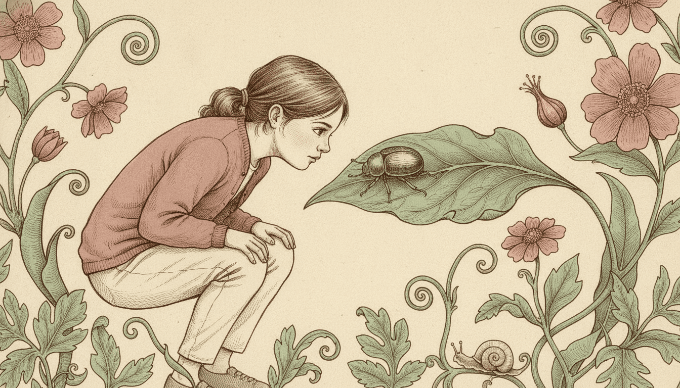
A girl crouched level with a beetle on a leaf, both drawn with the same care, with curling growth filling both edges of the frame. That composition is close to the centre of what this brief is built to make, and it is worth knowing before you write a word. Work out what the style has taken away and the advice follows on its own. It has no light source, so it cannot give you a time of day. It has no shadow, so it cannot give you weather, or dusk, or a sudden fright. It refuses smooth gradients, so it cannot even give you a graded sky. Every tool a picture normally uses to carry atmosphere has been removed from this one.
What it has instead is an appetite for detail that does not run out, and it applies that appetite indiscriminately — to a leaf in the corner as readily as to a face in the middle. So write pages that have things in them. A garden nobody weeded since spring, a hedge surveyed on hands and knees, a windowsill of nine pots each grown from a cutting, an allotment inherited from somebody who never explained any of it. Each of those is a page whose content is stuff rather than mood, and each gives the hatching something real to do. Hand the same brief a thunderstorm, a nightfall or a quiet goodbye at dusk and you are asking a style with no light at all to produce a picture made entirely of light. It will draw something, and the one quality that made it worth choosing will not be in it.
Give it inventory, not atmosphere. A hedge, a greenhouse bench, an overgrown plot, a windowsill — a page of specific things is the picture this brief is built to make.
Small subjects are not a problem here. A beetle gets the same attention as a face, so a story about tiny things does not have to be scaled up to be seen.
Worth seeing side by side before you commit: the crosshatch style, which hatches with the same nib but to make shadow, the fine-line ink style, which uses the same pen as sparingly as possible, and the animal watercolor style, which draws real species with the field-guide accuracy this one deliberately does not.
Create a Botanical Ink Picture Book in 3 Steps
From a one-line idea to a finished book that holds the same nib, the same density and the same even light from first spread to last.
Describe the story
A sentence is enough. Give it a page with things in it — a garden, a hedge, a windowsill, a plot gone wild. This brief draws inventory far better than it draws atmosphere, because it has no light with which to make an atmosphere.
"A girl decides to draw every leaf in the lane"
Pick Ornate Botanical Ink
Choose it for a fine crooked nib, dense cross-hatching and detail spread evenly across the whole page. Choose Crosshatch Gothic Ink instead if you want that hatching to make shadow, Fine-Line Urban Wit for the same pen used sparingly, or Mythic Bestiary Ink for a brush and real ink washes.
Sepia ink and sage green on warm ivory
Generate and export
C2Story writes the story, breaks it into pages and builds every one to the same brief. Read it on screen, share the link, or export the PDF and take that file to whichever printer or print service you already use.
Whole book built, PDF export, instant sharing
Botanical Illustration and Its Nearest Neighbours
Four real styles, sorted by the question that actually separates them: what are all those ink marks for?
Ornate Botanical Ink
An intricate fine-nib pen-and-ink illustration of strange ornate flora and fauna, with dense cross-hatched detail, classical curio-cabinet whimsy, and delicate crooked linework that keeps visible hand pressure, pauses and slight wobble for a real on-paper rhythm. Its palette is warm ivory paper, sepia ink, muted botanical greens and faded rose; its light is even antique-plate lighting; its line weight is fine crooked variable ink lines; and the four things it refuses are flat vector strokes, uniform chibi faces, smooth gradients and photorealism. It will render whatever scene your story actually describes.
Crosshatch Gothic Ink
The nearest rival on craft and the cleanest contrast on purpose. It asks for the same dense crosshatching from the same fine nib ink line, and then lights it as moody hatched chiaroscuro — meticulous fine ink hatching for shadow and volume, in a Victorian atmosphere of quirky macabre characters and cold understated gothic black humour. It also refuses colour outright and works in black ink and paper white alone. So one hatches to make darkness and the other hatches to make surface. Take that one if you want shadow and drama; take this one if you want detail under an even light.
Fine-Line Urban Wit
The same instrument pushed the other way. It asks for precise hairline ink strokes, tiny figures set inside large airy environments and abundant white space, and it puts dense shading in its own list of refusals — so the pen is used sparingly and the open page does the work. This brief fills the page instead, with elaborate detail running right into the corners. Two styles, one pen, and a straight disagreement about how much of it a picture should have. Worth seeing beside each other if you are undecided about density.
Mythic Bestiary Ink
One of the two briefs sharing this one’s sentence about visible hand pressure, pauses and slight irregularity. Everything after that diverges. It works in ink washes and textured strokes with variable pressured brush lines, lit as moody atmospheric ink lighting, and it draws ancient legendary beasts reimagined as modern creature design. Washes and mood are precisely what a nib under an even plate light cannot give you. If your story wants weather, atmosphere and a big dramatic animal, take that one. If it wants a hundred small things each drawn properly, stay here.
Three more worth knowing. The animal watercolor style is the accurate one — real species painted with field-guide care, which is exactly what this style trades away for whimsy. The folk decorative style also fills a page with botanical ornament, but as flat pattern rather than as plants that grow. And the nordic whimsy style hatches delicately too, then frames it in vast white space instead of filling the frame. Browse everything on the illustration styles hub.
Botanical Ink Story Ideas to Get You Started
Every one of these is a page with things in it rather than a page with a mood in it, which is the picture this brief draws most naturally.
The Garden Nobody Weeded
One summer with the gate shut, and what moved in while nobody was looking. A page whose whole content is overgrowth is the page this brief draws better than anything else in the library.
Create this storyWhat Lives Under the Hedge
A survey of one hedge, conducted on hands and knees over a week. The style gives a beetle the same patient attention it gives a face, so a story about small things is not a story it has to shrink for.
Create this storySeventy-One Kinds of Leaf
A child decides to draw every leaf in the lane, and gets as far as seventy-one. A collection is a natural shape for a look built on elaborate repeated detail rather than on dramatic light.
Create this storyThe Snail Who Took the Long Way
Three days, one wall, and a route only she could explain. Small calm creatures drawn properly at rest are squarely inside what this brief is written to produce.
Create this storyGrandma’s Windowsill
Nine pots, each one started from a cutting, each one with a story attached. A page full of specific things, each worth drawing, is the kind of page this style rewards.
Create this storyThe Allotment at the End of the Lane
A plot inherited from somebody who never explained what any of it was. Dense invented growth with a child somewhere inside it is this brief’s most natural composition.
Create this storyAI-Generated Botanical Illustration Examples
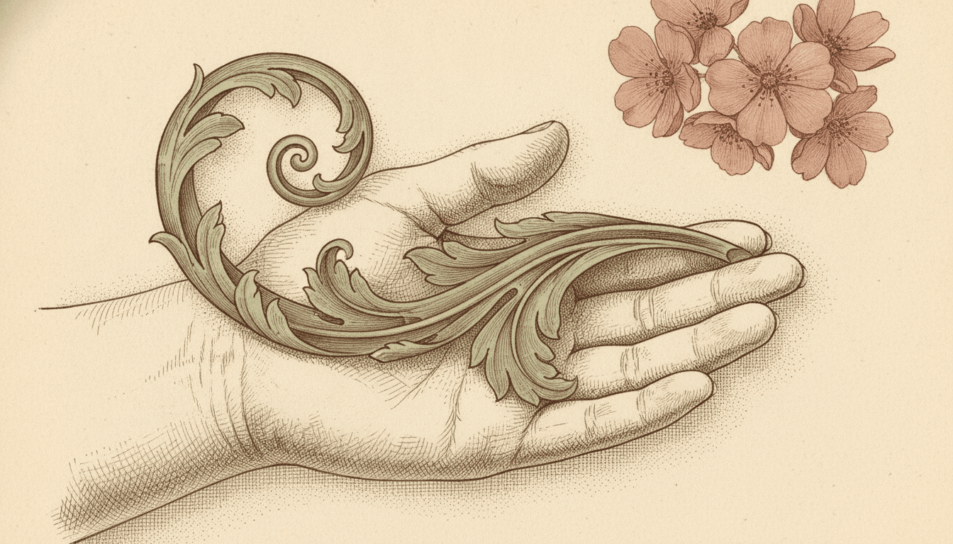
Three pages, one decision held across all of them. The split frame is the same boy drawn twice with the plant beside him left as a hollow outline on one side and given the same hatching as him on the other. The girl crouched nose to nose with a beetle shows what that buys you — a small thing drawn with as much care as a face. And the open palm is the line itself, close enough to watch a single stroke swell, thin and wander.
Botanical Ink Illustration for Every Part of Your Story
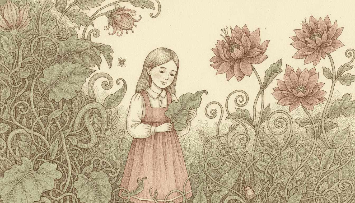
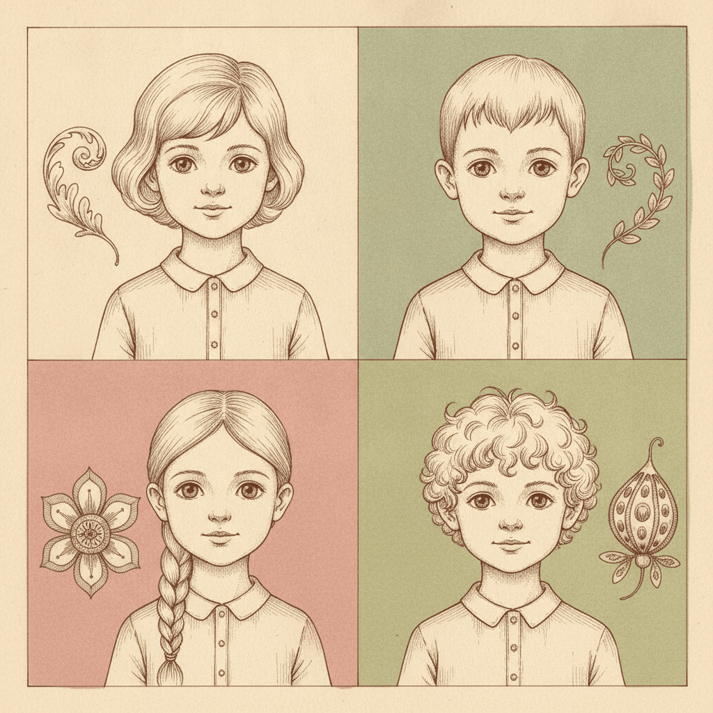
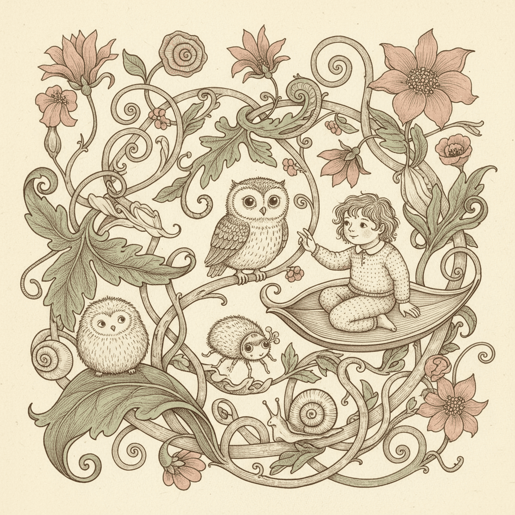
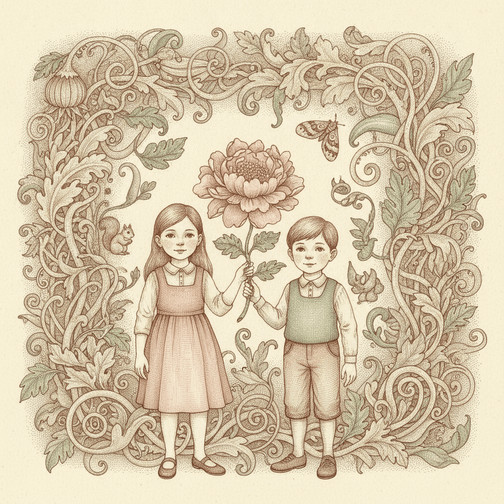
Four faces drawn with the same nib, a girl standing in growth that is as detailed as she is, a child sitting on a leaf among creatures that are odd and entirely friendly, one dry seed pod turned round by nothing but crossed ink lines, and two children inside a border of hatched foliage — the same pen and the same even light, spent on whatever your story is actually about.
Everything You Need for Botanical Ink Picture Books
One beautiful plate is easy. Twenty-four pages whose nib stays crooked, whose hatching stays dense and whose light stays flat is the part that needs building.
The same density, held for twenty-four pages
This is the thing that breaks first when pages are generated one at a time, and in a dense style it breaks loudly. Detail is a budget decision, so if page three hatches every leaf, page four leaves the background as bare outline and page five drops to three plain shapes, the book stops reading as a deliberate look and starts reading as a set of unrelated pictures. One fixed brief is carried into every page instead: fine-nib pen-and-ink, dense cross-hatched detail, crooked hand-pressure linework, an ivory-and-sepia palette with muted greens and faded rose, and the same four refusals of flat vector strokes, uniform chibi faces, smooth gradients and photorealism.
A cast that has to survive a crowded page
Worth understanding before you cast your book, because a busy picture makes consistency harder rather than easier. The brief asks for quirky individual expressions and body language and refuses a uniform cute default, which is exactly the kind of specificity that drifts when every page is drawn fresh — and in this style a character shares the frame with fifty other hatched things competing for the eye. Save each character in the Character Library with up to fourteen reference images and they are carried into every page and on into later books at the same proportions and with the same face. Characters built from an uploaded photo stay private to your account.
Ivory, sepia, sage and rose — and what a tinted palette costs
The palette is recorded as warm ivory paper, sepia ink, muted botanical greens and faded rose. Two things are worth knowing. First, it is genuinely a colour palette and not a brown drawing: the greens are green and the rose is pink, just quiet. Second, it is narrow and warm throughout, with no cold note, no strong red and no dark to drop a scene into, so a book in this style arrives at one steady temperature and the detail carries the variety instead of the colour. If you want a page that can go cold or go dark, the crosshatch and cinematic styles are built for it. There is also no global greyscale switch in C2Story, so a monochrome book means choosing a style that is monochrome by design.
A curio cabinet, with the unsettling half left out
The honest note this look needs stating plainly. A real cabinet of curiosities is half wonder and half specimen drawer — bones, pinned insects, things in jars, things that used to be alive — and an engraved plate is a document of something collected. Our generation guidance holds the line on purpose. Every living thing on these pages is alive, awake, whole and gently friendly; there is no skull, no bone, no taxidermy, no pinned insect, no preserved creature and nothing withered or sinister; the creatures are soft and rounded with calm eyes; no insect ever swarms; and nothing is mounted, pressed, framed, bottled or set out for study. You get the wonder of the cabinet and none of the drawer.
A whole book, not one beautiful plate
This look survives today almost entirely as single images — a print somebody framed, an endpaper, a page torn out of an old book — and a single image is the easy part. You are not prompting for one. Describe the story and C2Story writes it, splits it into pages and builds each page to this brief according to what that page actually says, so the elaborate detail is spent across a narrative with a beginning and an end rather than all at once on one arresting picture. You get picture-book pages, with your words set as type rather than drawn into the art — which matters here, since a real botanical plate would have carried Latin names and numbered keys and this style deliberately carries none.
A page a child can stay inside for a while
The structural case is a good one, with one caveat. A dense page rewards a long look: there is always another creature, another pod, another curl of stem to find, which is why books in this tradition get read again rather than read once. Nothing is frightening, every creature is friendly and awake, and the even light means no dark corner and no shadow a small child has to interpret. The caveat is the mirror image: there is no big simple shape to grab a very young eye, so this suits a child who likes to search over a toddler who wants one clear thing per page. For that, the bold flat or pictogram styles are the better fit. Write in English, Chinese, Japanese, Spanish, French and more; the look does not change with the language.
Botanical Ink Picture Books — Questions
What people ask before committing a whole book to one crooked nib, a great deal of hatching and no light at all.
Explore More Story Ideas
Discover more styles, tools, and story types
Ninja Stories
Dojo training, stealth missions and the secret scroll
Explore
Animal Watercolor Books
Real species & fully painted habitats
Explore
Picture Book Maker
Create illustrated picture books
Explore
Midjourney vs C2Story
Stories, not just images
ExploreBotanical Ink Picture Books — A Crooked Nib, Dense Hatching and No Light to Put It To Work
A botanical ink picture book is one where every page is an intricate fine-nib pen-and-ink drawing: strange ornate plants and gentle odd creatures built from dense cross-hatching, laid down in sepia ink on warm ivory with muted botanical greens and a faded rose, drawn with a delicate crooked line that keeps the visible pressure, the pauses and the slight wobble of a real hand working on paper. On C2Story this is the Ornate Botanical Ink style, and its brief states the ambition in one sentence — intricate fine-nib pen-and-ink illustration of strange ornate flora and fauna, dense cross-hatched detail, classical curio-cabinet whimsy. One brief applied across a whole book, so the twentieth spread is built from the same instruction as the first.
The part worth knowing before you commit a book to it is which of that is genuinely rare, because pen hatching is not rare here at all. Two counts against the seventy-eight hand-drawn briefs enabled in C2Story settle it. Run the first on the marks: four briefs ask for cross-hatching in those words — a deadpan cartoon, an anthropomorphic animal town, a Victorian gothic pen illustration and this one — and of those, the gothic brief is the one that genuinely rivals it, specifying the same fine nib and the same dense crosshatching and the same refusal of soft gradients. Run the second count on the light, and the two come apart completely. Nine briefs ask for flat or even light in some wording, and every one of them names a quality the light has: flat graphic lighting, flat neutral light, soft even ambient light, flat decorative lighting. This brief alone names where the light comes from. Its lighting field reads even antique-plate lighting — the light of a printed book page lying under a lamp, not light inside the scene at all — and no other brief in the library names its light after a printing process. The gothic one, by contrast, reads moody hatched chiaroscuro, and its own prompt says plainly that the hatching is there for shadow and volume.
Which settles what all those ink marks are actually for. In the gothic brief the hatching is standing in for darkness: it is shadow, drawn. Here there is no darkness to stand in for — no sun, no window, no lamp, no glow, nothing lit from one side, nothing casting a shadow on the ground or on a leaf — so the same marks are freed to describe substance instead. The veins running through a leaf, the nap of fur on a small animal, the raised ribs and dry grain of a seed husk. And because an even light cannot push one thing back and pull another forward, detail becomes the only hierarchy a page in this style has available, which is where its most distinctive habit comes from: it spends that detail evenly. Most looks in this library simplify behind the figure on purpose, with a few flat shapes or a bare horizon or an open page, because that is how a character is made to read. This one refuses to, and gives a leaf in the far corner the same patient fine-nib attention as a face in the middle — so the setting stops being a backdrop and becomes a second character. The line follows the same logic: its weight is recorded as fine crooked variable ink lines, and the brief asks for visible hand pressure, pauses and slight wobble for a real on-paper rhythm. That sentence is shared with two other briefs, a wild Eastern spirit-ink and a mythic bestiary ink, and both of those are brush briefs. This is the only one of the three holding a dip pen — and a nib, unlike a brush, cannot lay down a wash, so every tone on these pages has to be built from separate countable lines.
Four honest notes before you choose it. First, and most important, this is not a field guide. The vocabulary around botanical illustration — specimen, natural history, plate — all promises accuracy, and the drawing borrows the density and the ivory-and-sepia dress of a real engraving, but the brief asks for strange ornate flora and fauna and curio-cabinet whimsy, and it is the only one of the seventy-eight to use the words flora and fauna at all. What it draws is invented: flowers with too many petals, leaves scrolled like carved brackets, seed pods of no species in particular. For real species rendered with naturalist care, take the animal watercolor style instead. Second, the writing advice follows directly from what the style has given up: with no light source, no shadow and no gradient, it cannot produce an hour of the day, a weather, a dusk or a fright — every tool a picture uses for atmosphere has been removed — so write pages that have things in them rather than pages that have a mood in them. A garden nobody weeded, a hedge surveyed on hands and knees, a windowsill of nine pots, an allotment nobody explained. Third, the palette costs you something real: warm ivory paper, sepia ink, muted botanical greens and faded rose is genuinely a colour set rather than a brown drawing, but it is narrow and warm throughout with no cold note and no dark to drop a scene into, so the book arrives at one steady temperature and the detail carries the variety instead — for a page that can go cold or dark, the crosshatch style and the cinematic style are built for it, and there is no global greyscale switch in C2Story, so a monochrome book means picking a style that is monochrome by design. Fourth, the provenance needs stating plainly: a real cabinet of curiosities is half wonder and half specimen drawer, full of bones, pinned insects and things in jars, and an engraved plate is a document of something collected and usually dead. Our generation guidance states the opposite outright — every living thing is alive, awake, whole and gently friendly, with no skull, no bone, no taxidermy, no pinned insect, no preserved creature and nothing withered or sinister; the creatures are soft and rounded with calm eyes; no insect swarms; and nothing is mounted, pressed, framed, bottled or set out for study. You get the wonder of the cabinet and none of the drawer. In exchange you get a book built to be read twice — a dense page always has another creature or another curl of stem left to find, and the even light means no dark corner and no shadow a small child has to interpret — with the caveat that there is no big simple shape here for a very young eye, so a toddler who wants one clear thing per page is better served by the bold flat style. Consistency is handled for you: save each character in the Character Library with up to fourteen reference images and they are carried across every page and into later books, with photo-built characters staying private to your account. Write in any language you read aloud in, then export the finished book as a PDF, which is the handoff to whichever printer you already use, and the images you generate are licensed for commercial use. Start free: see our pricing plans, browse every option on the illustration styles hub, or go straight to the AI Story Generator.