Scandinavian FolkPicture Books
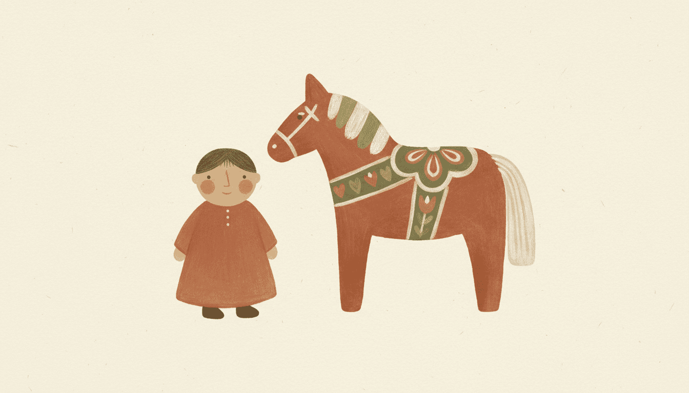
Scandinavian folk art illustration decorates a surface rather than describing a view. Humble naive shapes, matte terracotta and olive, and edges left slightly wrong on purpose — held across a whole Nordic folk picture book, not one handsome print.
- Flattened naive shapes, painted rather than drawn
- A short matte palette — neon refused by the style itself
- Flat folk-art light: nothing casts a shadow
- Free credits by request — no card
50,000+
Stories Created
10,000+
Active Creators
50+
Art Styles
4.9/5
User Rating
What Makes a Scandinavian Folk Art Illustration Look Folk
Not the tulips, and not simply the palette. Four things follow from decorating a surface instead of describing a view.
There is no light in the room
The lighting instruction this style carries is, word for word, flat even folk-art lighting. Nothing is lit from anywhere and nothing casts a shadow. That one decision is what separates folk art from illustration that merely looks simple — a painted cupboard door has no sun in it, because whoever painted it was decorating a surface rather than describing a view.
So size has to carry the meaning
Lose the light and you lose both of the usual ways to say look here: you cannot throw a background out of focus and you cannot push it into the distance. Folk painters settled this centuries ago by painting the important thing bigger and closer to the middle. Name one subject per page in your scene description and the style will do the same.
The palette is short, and earthy
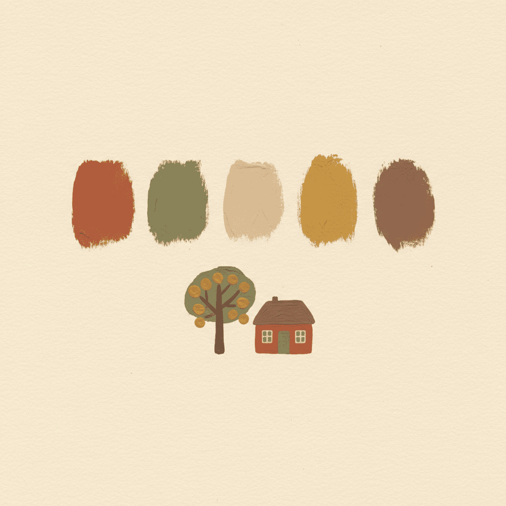
Matte earth tones, warm terracotta, muted olive, cream, faded mustard — and neon colours sit on the list of things to avoid. A folk palette was originally an accident of supply: those were the pigments a farmhouse could actually get hold of. Keeping it that short is what makes twenty-four pages read as one object instead of twenty-four pictures.
The edges stay slightly wrong
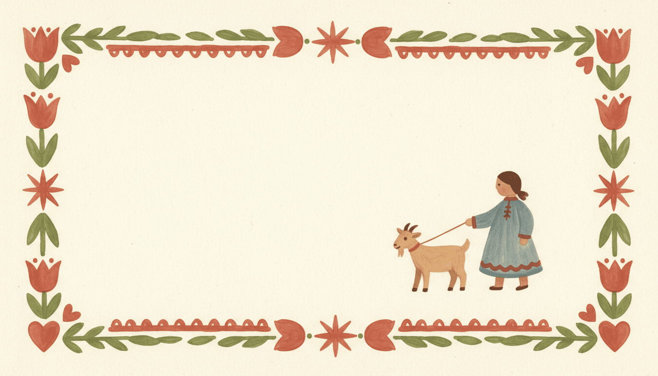
The line is specified as soft irregular hand-drawn edges, and sharp digital vectors are refused outright. A clean outline is the fastest way to kill this look, because the wobble is the whole evidence that a hand was involved. Tidiness here reads as factory, and factory is the one thing folk art is not.
With No Light and No Depth, Size Is How You Say “Important”
Most illustration tells you where to look by lighting one thing and letting the rest fall back — a bright face, a soft background, a shadow pinning a figure to the ground. This style gives up all three. Its light is specified as flat and even, so there is no direction to it, and the forms are flattened, so there is no distance to recede into.
Folk painters had the same constraint on a cupboard door and solved it the obvious way: the important thing is bigger, and it sits nearer the middle. Everything else gets smaller and goes to the edges. That is not naivety — it is the only hierarchy available once you have refused depth.
So write one subject per page. “The goat gets out” gives the style a thing to make large. “A busy morning on the farm” gives it nine things of equal size and no way to rank them.
And let the space stay empty. Restrained empty space is part of the brief, not a gap waiting to be filled. The cream around a figure is what makes it the figure.
The style carries its refusals in writing. Alongside what it asks for, it names what must not show up on any page:
“Folk” Covers Several Different Temperatures
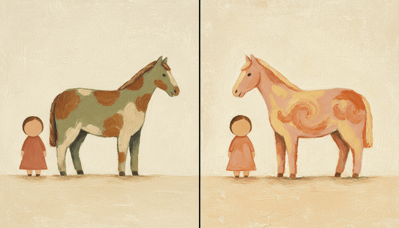
Here is the part that catches people out. Several styles are built on naive folk figures, and they do not agree about how warm or how loud the paint should be — two of them say so directly in what they refuse.
Scandinavian Folk Naive asks for a soft matte earth-tone palette and lists neon colours as something to avoid. Oil-Pastel Healing asks for the opposite energy — thick creamy high-saturation colour in peach, butter yellow and dusty rose. Nordic Fine-Line Whimsy refuses saturated floods and heavy fills altogether and leaves the page mostly white.
Cosy and restrained are not the same word. If what you are picturing is soft, warm and a little sweet, the oil-pastel branch is probably your style. This one is drier, calmer and more sparing.
Busy or bare is the second question. Folk Decorative Storybook fills the frame with botanical motifs and a crowd of figures. Scandinavian Folk Naive leaves most of the page alone.
All of them are honestly folk. Only one is the one you had in your head, and choosing deliberately costs nothing.
Create a Scandinavian Folk Picture Book in 3 Steps
From a one-line idea to a finished book painted in matte earth tones, in under two minutes.
Describe the story
A sentence is enough. This look is strongest on farmsteads, animals, weather, seasons and made objects — things that flatten cleanly — so something like "a family repaints the wooden horse every spring" gives the brushwork plenty to do.
"Nine hens, one missing egg, and a long walk"
Pick your branch
Scandinavian Folk Naive for matte restrained earth tones, Oil-Pastel Healing for warm creamy saturation, Folk Decorative Storybook for crowded botanical pattern, or Nordic Fine-Line Whimsy for sparse pen and white space. One decision, and it sets the whole book.
Terracotta, muted olive, cream, faded mustard
Generate and export
C2Story writes the story, breaks it into pages and paints every one in your chosen style. Read it on screen, share the link, or export the PDF and take that file to a printer.
Whole book painted, PDF export, instant sharing
Scandinavian Folk Naive and Its Handmade Neighbours
Worth being plain about scope: Scandinavian Folk Naive is one style in the picturebook group, not a category. These are the four worth comparing before you commit a whole book.
Scandinavian Folk Naive
Humble naive childlike shapes, a soft matte earth-tone palette, relaxed textured brushwork and restrained empty space — a warm handmade craft feel rather than a drawn one. Its refusals are explicit: no glossy rendering, no sharp digital vectors, no neon colours, no photorealistic detail. Flat even lighting, soft irregular edges, matte gouache texture.
Folk Decorative Storybook
Folk by way of line drawing rather than brushwork: ornamental botanical motifs, a vintage muted palette of dusty teal, brick red and ochre, and a quirky crowd of figures where each one gets its own silhouette, face shape and head-to-body ratio. It refuses uniform chibi faces and the generic cute default by name. Pick it when the page should be busy and patterned.
Oil-Pastel Healing
Also built on naive folk figures with simple rounded proportions, but painted in thick creamy high-saturation blocks of warm peach, butter yellow and dusty rose, with coarse grainy waxy strokes and chalky smudges. If the word you had in mind was cosy rather than restrained, this is very likely the style you actually wanted.
Nordic Fine-Line Whimsy
Nordic, but drawn with a pen and left mostly empty: delicate fine-line hatching, quirky characters, a tender lonely mood and vast white space framing the subject, on fine black ink, cool grey wash and a single soft red. It refuses heavy fills and saturated colour floods — the opposite instinct to painted folk art.
Three more worth knowing: Paper Cut builds folk-inspired scenes from layered cutouts with real shadows between the layers, Folk Tale works in a different tradition entirely with decorative Chinese folk-opera figures and patterned borders, and Art Brut Raw Figure pushes naive all the way to deliberately crude. For the same matte paint quality with a wider palette see the gouache style; for clean reduction instead of handmade reduction see the minimalist style.
Scandinavian Folk Story Ideas to Get You Started
Flat painted folk shapes are better at animals, farmsteads, weather and made things than at tender close-up faces. These six lean into that.
The Horse That Was Painted Every Spring
A family repaints the wooden horse in the yard each year, and the child is the first to notice it has slowly become a different horse. This style is painted-object art to begin with, so a story about painted objects is on home ground.
Create this storyNine Hens and One Missing Egg
A counting walk around the farmyard with one stubborn gap in it. Flat folk shapes are genuinely countable — a hen here is two blobs, a wedge and a dot — which is more use to a three-year-old than a feathered one.
Create this storyThe Goat Who Would Not Be Small
A goat objects to being painted the same size as the hens and insists on taking up the whole page. A joke only a style with no perspective can make, and a quiet way into why the biggest thing on a page is the thing we look at.
Create this storyThe Longest Winter on the Hill
Snow that will not go, and a family making it through. The palette is already terracotta, olive and cream, and there are no gradients to paint a sky with — so the cold has to be told in lamplight, blankets and wool, which is the better version anyway.
Create this storyGrandmother Had Tulips On Everything
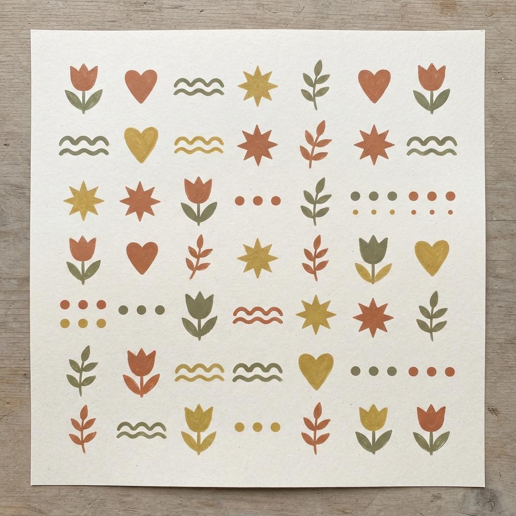
The cupboard, the chest, the bowl, the sleeve of a coat. A story where the folk motifs themselves are the subject, and where a child slowly works out that someone sat down and put them there.
Create this storyEverything Here Was Made by Somebody
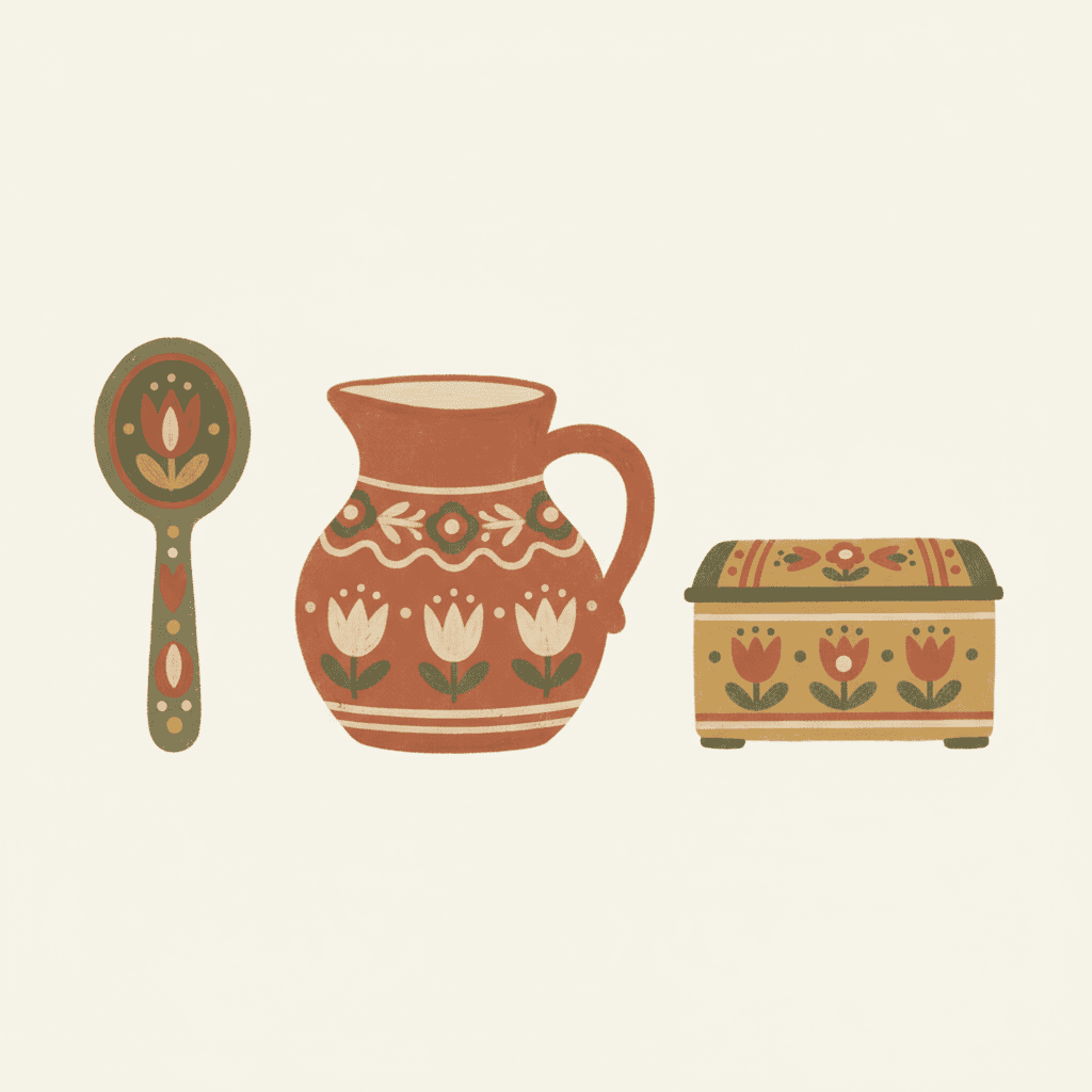
A child asks who made the spoon, then the chair, then the blanket, and does not stop asking. Handmade is the entire brief of this style, so a book about things being made looks like the thing it is about.
Create this storyAI-Generated Scandinavian Folk Art Illustrations
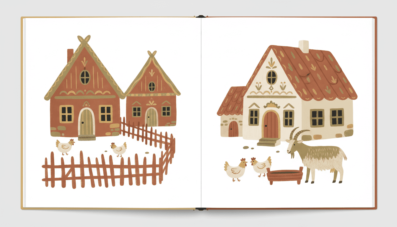
Look at the edges and the empty cream. Nothing is lit, nothing casts a shadow, and no outline is quite straight.
Nordic Folk Picture Book Illustration for Every Subject
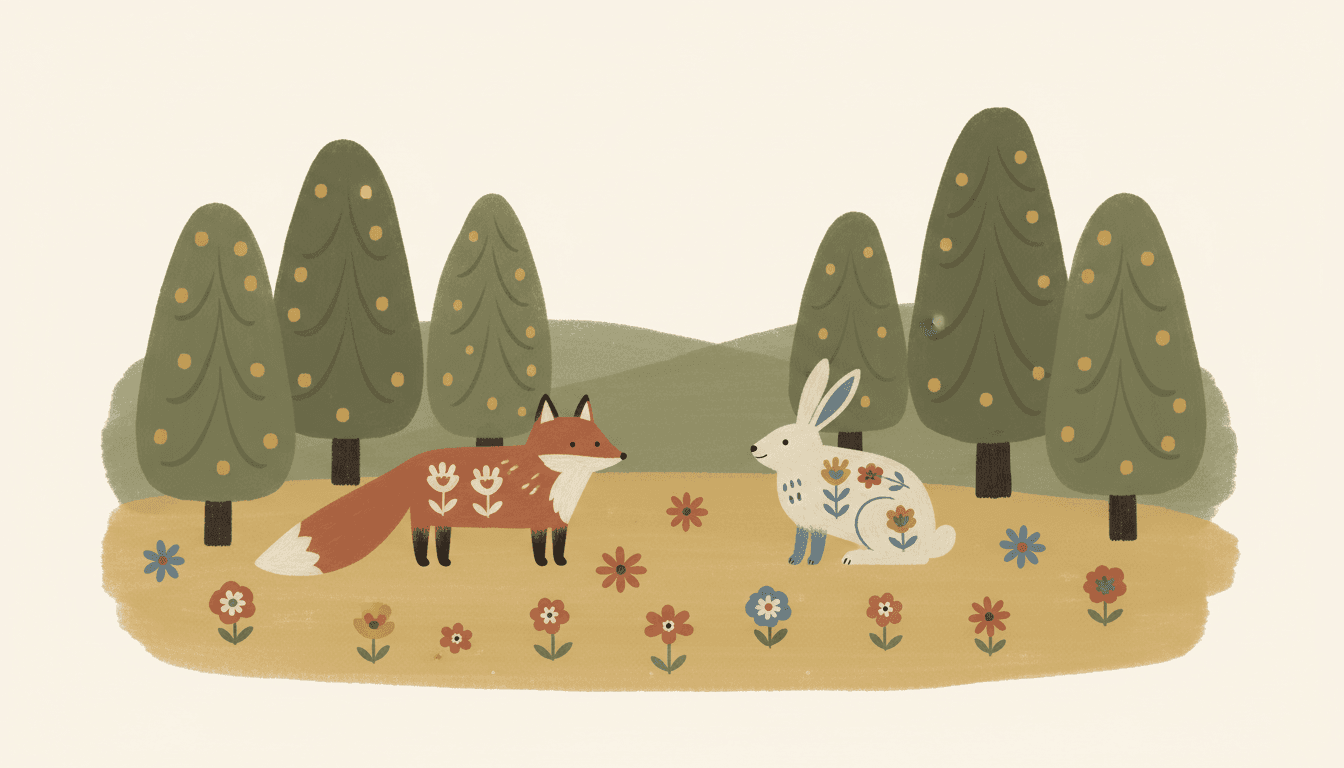
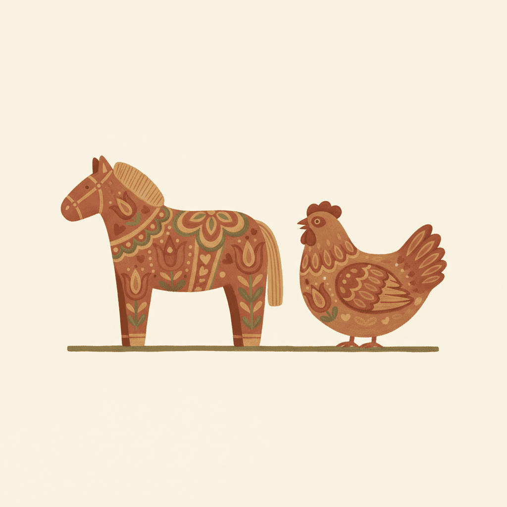
Characters, animals, palettes, motifs, objects — the same soft brush and the same four earth tones, spent on whatever your story is actually about.
Everything You Need for Scandinavian Folk Picture Books
One good folk painting is easy. Twenty-four pages with the same hand, the same short palette and the same cast is the part that needs building.
The same hand on every page
The style carries one fixed brief — matte earth tones, flat simplified forms, hand-drawn brushwork, restrained space, flat even lighting — into every page of the book, so page twenty is not quietly tidied up and lit in a way page one was not.
Sharpness is refused in writing
Left to its own instincts an image model cleans up: it straightens the wobble, crisps the outline and adds a little gloss, because that reads as finished. Here the style names the four things that must never appear — glossy render, sharp vector, neon colours, photorealistic — so the one reflex that would dissolve this look is the one it is told to suppress.
A cast built from very few marks
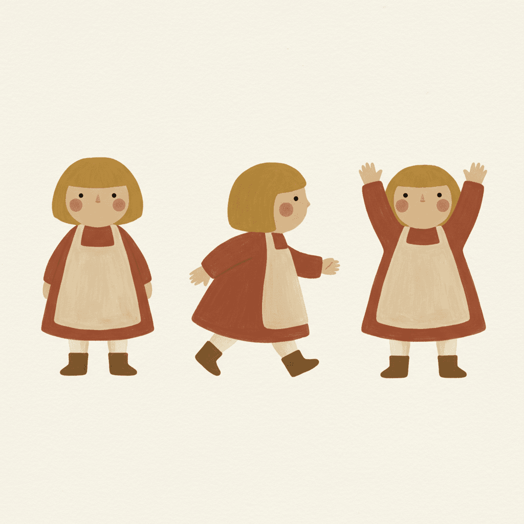
A folk character is a round face, two dot eyes, one garment shape and two colours. Save them in your Character Library — up to fourteen reference images each — and that short description travels into every page and into later books, instead of being re-guessed each time.
A palette you do not have to choose
There is no colour picker and no hex field. The style brings terracotta, muted olive, cream and faded mustard with it, and your scene descriptions steer within that: a harvest page comes back warmer and more mustard, a winter one drier and paler.
Whole books, not single prints
You are not prompting for one handsome panel. Describe the story and C2Story writes it, breaks it into pages, and paints every page in the folk style, matched to what that page actually says.
Any language you read aloud in
Painted folk shapes carry no language of their own. Write the story in English, Chinese, Japanese, Spanish, French and more — the palette, the motifs and the soft edges do not change with the text.
Scandinavian Folk Picture Books — Questions
What people ask before committing a whole book to matte paint and soft edges.
Explore More Story Ideas
Discover more styles, tools, and story types
Rainbow Stories
Rainbows after the rain, rainbow bridges and pots of gold
Explore
Gouache Picture Books
Flat opaque paint & matte brush edges
Explore
Children's Book Creator
Design beautiful kids books
Explore
Storybee Alternative
More styles & features
ExploreScandinavian Folk Picture Books — Paint a Whole Book by Hand with AI
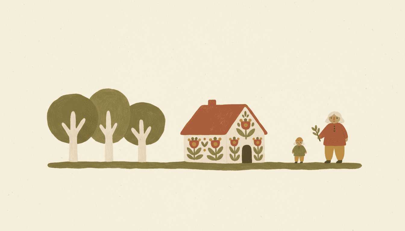
A Scandinavian folk picture book is decorated rather than depicted. A child is a round face, two dot eyes and one garment shape; a horse is a stout painted body with a tulip on its flank; a cottage is a block, a roof and a motif along the eaves. Colour arrives as matte paint in a short earthy range — warm terracotta, muted olive, cream, faded mustard — laid down with visible brushwork and edges that are never quite straight. C2Story applies that one brief across an entire book, so every page carries the same naive flattened forms, the same soft irregular edges and the same flat folk-art light, instead of one page happening to come out right.
The thing most worth understanding about Scandinavian folk art illustration is what it gives up. There is no light source, so nothing casts a shadow, and the forms are flattened, so nothing recedes. That removes the two tools illustration normally uses to tell you where to look. What is left is scale and placement: the important thing is painted larger and sits nearer the centre, the way it always was on a painted chest or a cupboard door. Writing for this style therefore means naming one subject per page and leaving the rest small — and leaving the cream space around it alone, because restrained empty space is part of the brief rather than a gap to fill.
It is also worth knowing which folk art style storybook look you are actually after, because the styles built on naive folk figures disagree about warmth. Scandinavian Folk Naive is the restrained one — soft matte earth tones, relaxed textured brushwork, plenty of empty space — and it refuses glossy rendering, sharp digital vectors, neon colours and photorealistic detail outright. Oil-Pastel Healing uses the same naive folk figures but asks for thick creamy high-saturation colour in peach, butter yellow and dusty rose with coarse waxy strokes, which is what most people mean when they say cosy. Folk Decorative Storybook swaps brush for crisp ink line and fills the page with ornamental botanical motifs and a crowd of distinctly built figures. Nordic Fine-Line Whimsy goes the other way entirely — fine-line hatching, a tender lonely mood and vast white space, refusing heavy fills and saturated floods. All four are honestly folk; only one is the book in your head.
Consistency works in your favour in a nordic folk art storybook, because a character here is only a handful of decisions rather than a page of rendered detail. Keep your cast in the Character Library, with up to fourteen reference images each, and that short description travels from page one to the end of the book and into later books too. The trade-off is that drift has nowhere to hide: the smock is either that terracotta or it visibly is not. Write the story in any language you read aloud in, then export the finished book as a PDF — that file is the handoff to whichever printer you already use, and uncoated or lightly textured stock suits a matte palette far better than a glossy sheet does. Start free: see our pricing plans, browse every option on the illustration styles hub, compare it with the gouache style or the minimalist style, or go straight to the AI Story Generator.