Ligne ClairePicture Books
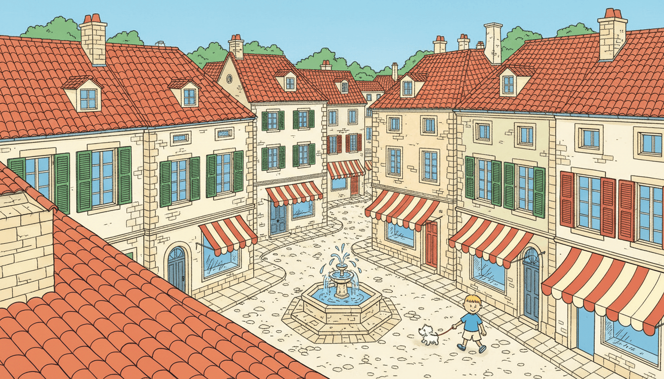
A ligne claire style draws everything at the same strength — the hero, the drainpipe, the cobbles at the back. One even ink line, flat colour, no shading, held across a whole book instead of one good panel.
- One uniform ink weight on every object in frame
- Flat colour blocks that stop dead at the line
- Backgrounds drawn as carefully as the characters
- Free credits by request — no card
50,000+
Stories Created
10,000+
Active Creators
50+
Art Styles
4.9/5
User Rating
What Makes a Clear Line Illustration Actually Clear
Not the tidiness, and not the bright palette. Four decisions, each of which gives up a tool other styles rely on.
One ink weight for everything in the frame
The line weight this style carries is specified as a precise uniform ink line, and uniform is the whole idea. A line that swells and tapers is how most illustration whispers "look here" — thick for the hero, thin for the furniture. Clear line gives that up. A drainpipe at the back of the frame is inked exactly as firmly as the main character's jaw, which means emphasis has to be earned by composition instead of handed out by the pen.
Colour fills a shape, it does not model one
The brief asks for bright cheerful flat colour blocks, and flat means flat: one colour per shape, stopping dead at the ink. No gradient across a wall, no darker edge where a sleeve folds, no highlight on a cheek. Colour here is identification rather than lighting — this roof is terracotta, that shutter is sky blue — which is the opposite of how the crayon style works, where colour deliberately runs past the line.
The light refuses to dramatise
The lighting note is bright even daylight. Not a low sun, not a single lamp, not a shaft through a window. Every object is lit from everywhere at once, so you cannot throw a scene into shadow to make it tense or pull a face out of the dark to make it matter. That is worth knowing before you write a midnight chapter: clear line will render it legible and cheerful rather than dark.
The background is drawn as carefully as the hero
The render brief asks, in writing, for meticulous old-world street architecture and cobblestone detail. Most styles let the background go — wash it out, blur it, drop it into silhouette. This one cannot, because there is no blur and no shadow available to do it with. So every cobble, tile and balcony railing gets stated. The demand this style makes is completeness, and that is why its pages feel like places rather than backdrops.
A Ligne Claire Style Has Nowhere to Hide
Every other style keeps an escape hatch. Watercolour can let a background dissolve into a wash. Cel shading can drop half a scene into a hard shadow. Crosshatching can bury an awkward hand under texture. Manga can replace a room it does not want to draw with speed lines. All of them are ways of not stating something.
Clear line has none of them. With one line weight, flat fills and even daylight, there is no blur, no shadow, no texture and no haze — so anything left vague simply looks like a mistake. The style does not demand more skill than its neighbours. It demands completeness, and that is a different thing to plan for.
So write scenes with things in them. “The station at nine in the morning” gives the pen forty objects to be precise about. “She felt far away from everyone” gives it nothing to draw.
And do not ask it for dread. Menace is made of shadow and the half-seen. This look is lit evenly and hides nothing, so a midnight scene comes back legible and bright rather than frightening.
The style carries its refusals in writing. Alongside what it asks for, it names what must never appear on a page — and these four are exactly the four places an unresolved drawing normally hides:
Clear Line and Minimalist Use the Same Line for Opposite Ends
These two get confused more than any other pair on the site, and the confusion is reasonable: both are flat, both are clean-edged, neither shades anything. Pick either one for its tidiness and you may end up with the wrong book.
The briefs settle it in one phrase each. The minimalist style asks for simple shapes, large empty space and very few details. The clear-line style asks for meticulous street architecture and cobblestone detail. Same restraint in the mark-making, opposite appetite for stuff.
Minimalist is a subtraction. It keeps the one shape that carries the page and lets the white space do the rest. Best when mood, calm or a single idea is the point.
Clear line is an inventory. It draws the whole street and refuses to rank any part of it. Best when the world itself is what the reader came for.
Both are worth a look before you commit: compare the minimalist style, or see where clear line sits among the other families in our guide to comic book art styles.
Create a Ligne Claire Picture Book in 3 Steps
From a one-line idea to a finished book inked at one steady weight, in under two minutes.
Describe the story
A sentence is enough. This look is strongest where there is built detail to be precise about — streets, harbours, stations, markets, workshops, cutaway houses — so something like "a child takes the wrong turning home" gives the pen plenty to do.
"Six floors, one missing cat, and a search that opens every door"
Pick the clear line
Choose Ligne Claire City Sketch for uniform ink and flat colour, Comic Book for a heavier varying contour, Minimalist for the same cleanliness with far less in frame, or Flat Design for flat colour with no outline at all. One decision, and it sets the whole book.
Sky blue, terracotta roof red, leaf green, warm cream
Generate and export
C2Story writes the story, breaks it into pages and draws every one in the same ink. Read it on screen, share the link, or export the PDF and take that file to a printer — flat colour and one line weight reproduce unusually well.
Whole book drawn, PDF export, instant sharing
Ligne Claire Style and Its Flat-Colour Neighbours
Worth being plain about scope: there is one clear-line style here, not a category. Sorted by which of its two promises each neighbour keeps — the even line, or the full detail.
Ligne Claire City Sketch
Uniform crisp black ink, bright flat colour blocks, meticulous old-world architecture, an elevated panoramic viewpoint and bright even daylight, in sky blue, terracotta roof red and leaf green. Keeps the line and keeps the detail. Its four refusals are explicit: sketchy variable line, painterly shading, muddy colour, photorealistic.
Minimalist
Simple shapes, a limited palette, flat composition, large empty space, negative space — and, word for word, very few details. Mechanically it looks like a cousin: clean, flat, unshaded. In intent it is the reverse. Minimalist earns elegance by removing whatever it can; clear line earns conviction by drawing whatever is there.
Comic Book
Bold ink outlines, flat colours, dynamic composition and an action-panel sensibility. It shares the flat fill, but the contour is heavy and it varies, because a swelling brush line is how a comic sells impact. Pick it when the story is driven by action beats rather than by the places the action happens in.
Flat Design
Geometric shapes, solid colours, no gradients, a modern vector feel. This is the useful proof that flat colour and clear line are two separate decisions rather than one look: remove the ink contour and the same palette reads as pictogram and signage instead of as a European album page.
One more European option sits in the Retro group: 70s Euro Comic Animation keeps the flat painted colour and the continental humour but loosens the contour into hand-inked outlines over rough drawn backgrounds — the hand left visible, where clear line hides it completely. For the heavier inked branch see the comic book style; for the same crispness with screentone and cel shadow instead of flat fills, the anime style; and for colour that deliberately escapes the line, the crayon style.
European Comic Style Story Ideas to Get You Started
This look is better at places, journeys and machinery than at weather, darkness or inner life. These six lean into that.
The Longest Way Home
A child takes the wrong turning and crosses the whole town to get back. A walk is the ideal clear line plot, because the style draws every street it passes through at full attention rather than letting the route blur between landmarks.
Create this storyWhat the Harbour Does All Day
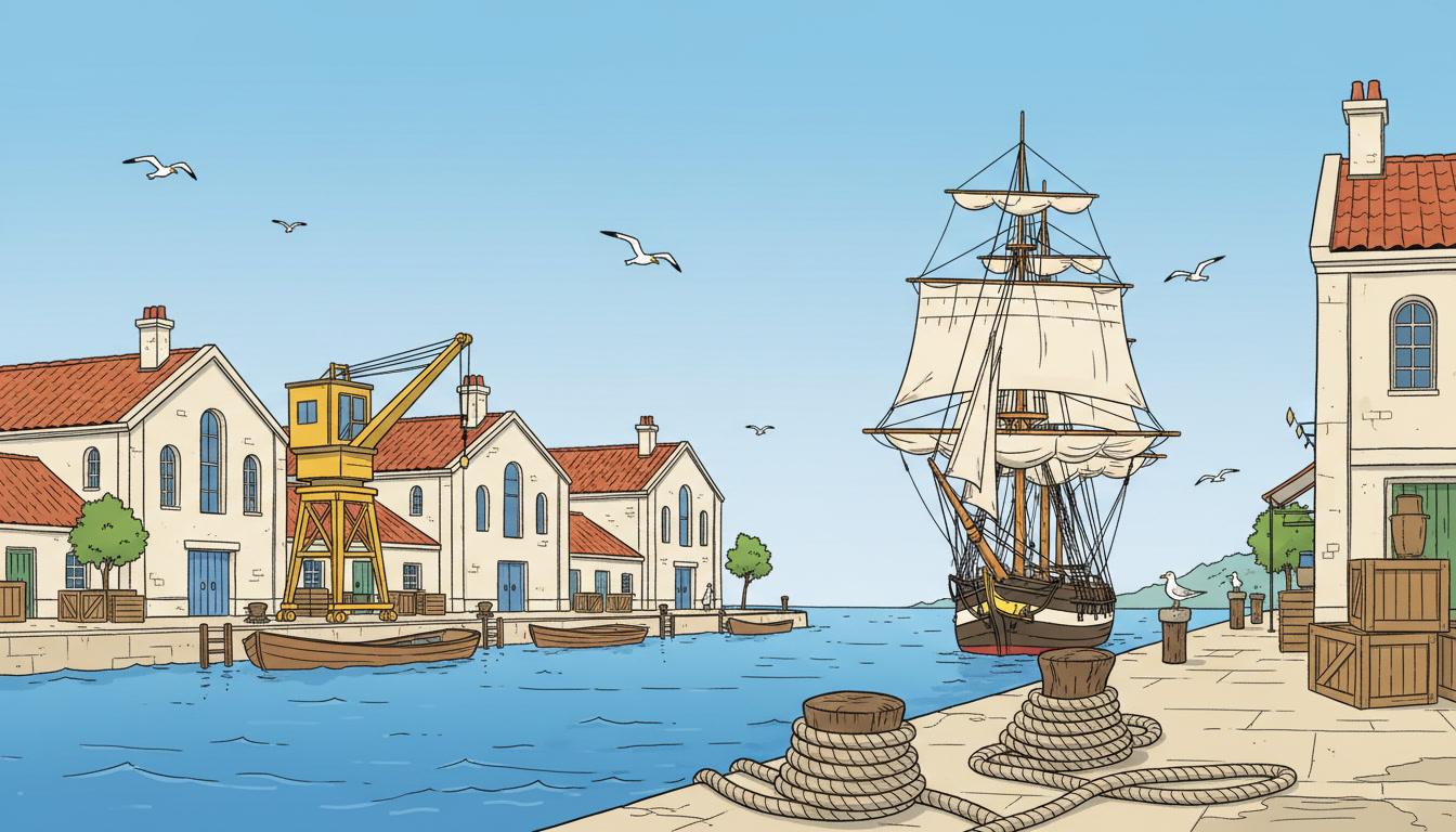
Cranes, crates, ropes, gulls and one small boat waiting its turn. Working places are full of specific objects, and this is a style that would rather draw forty of them properly than suggest a hundred.
Create this storySix Floors, One Missing Cat
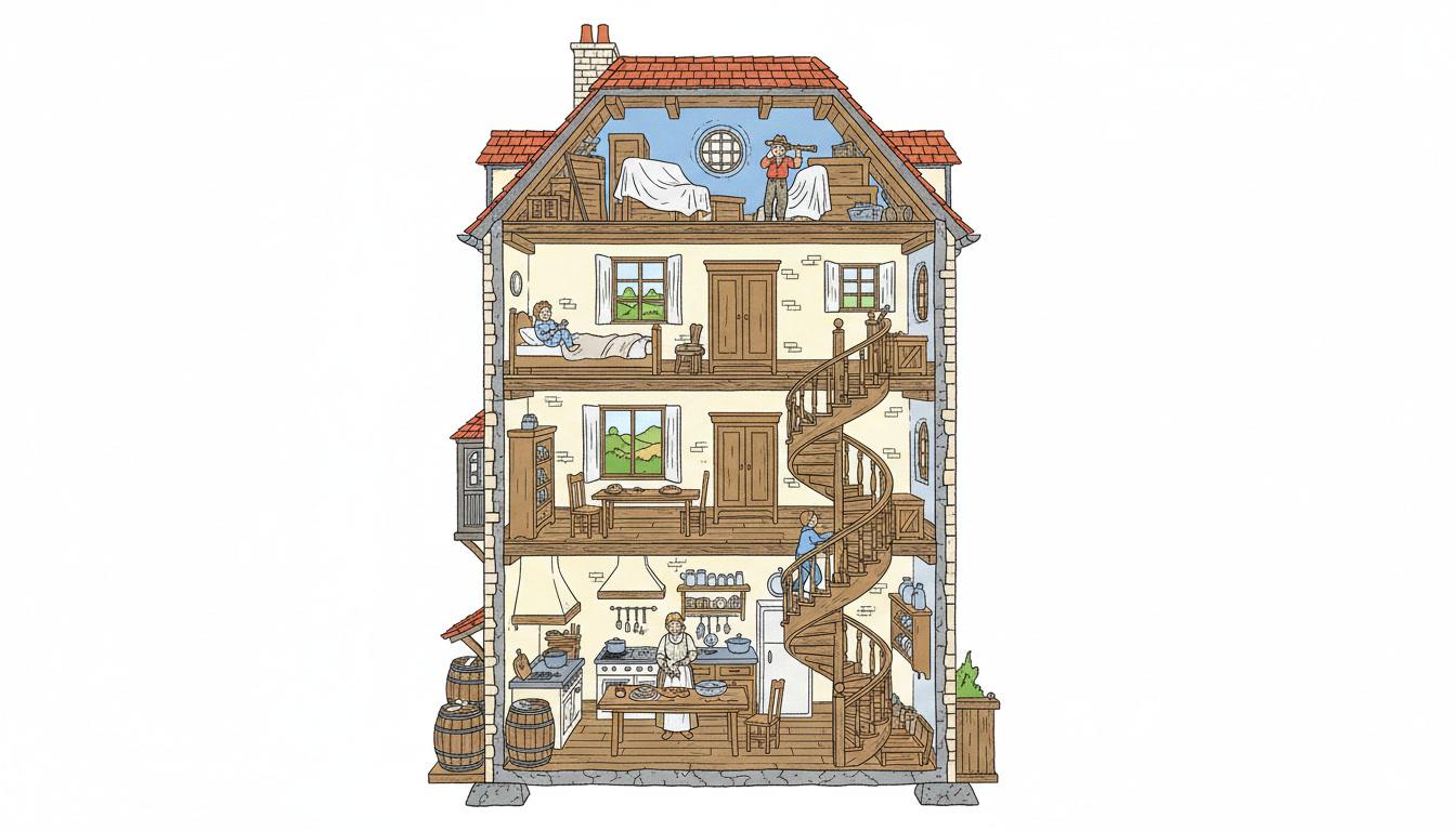
A search that opens every apartment in the building. The cutaway cross-section is clear line at its most satisfying, because no floor can be left vague to save effort — each one has to be furnished and inhabited.
Create this storyThe Nine Forty-Two
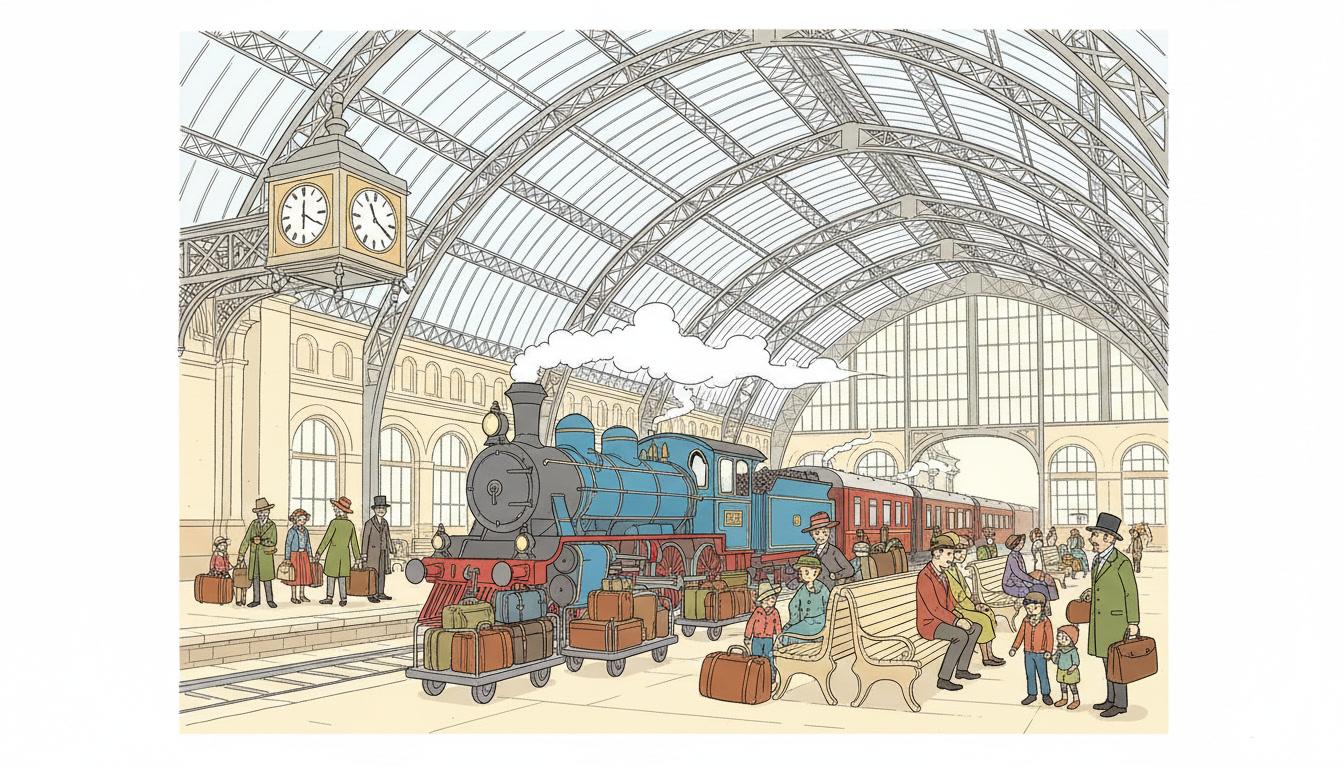
A train, a platform, a suitcase swapped by accident. Iron architecture and machinery reward a pen that never softens: every girder, rivet and luggage buckle stays legible instead of dissolving into atmosphere.
Create this storyMarket Day Is Too Loud
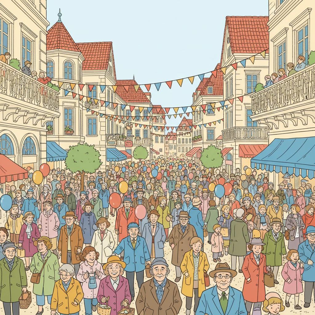
A quiet child navigating a square full of grown-ups. Crowds work here because background figures are drawn at the same weight as the hero, so being surrounded actually looks like being surrounded.
Create this storyA Map With One Mistake On It
A hand-drawn plan of the neighbourhood that does not quite match the neighbourhood. The elevated panoramic viewpoint this style prefers makes a town legible from above, which is exactly what a story about maps needs.
Create this storyAI-Generated Clear Line Illustrations
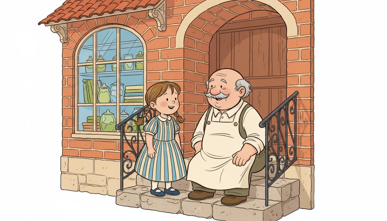
Follow any single line with your eye. It never gets thicker to flatter the hero, and it never gets thinner to let the background off.
Uniform Ink Line Art for Every Subject
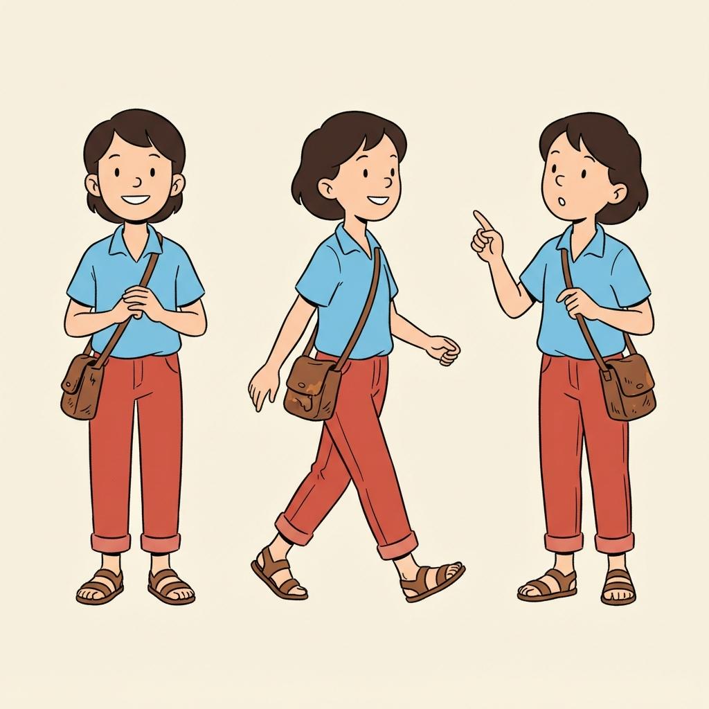
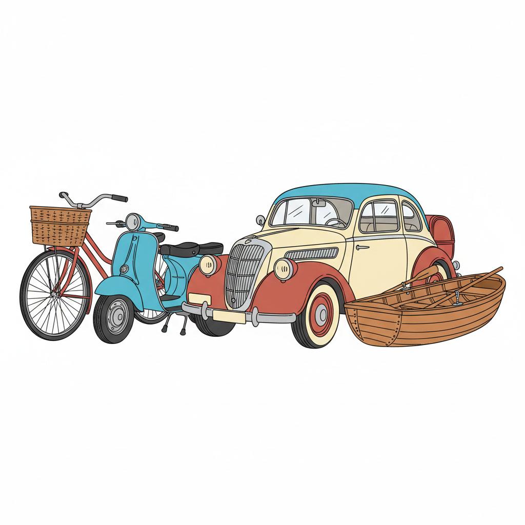
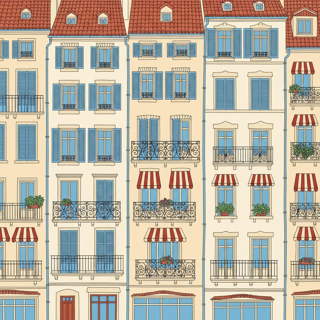
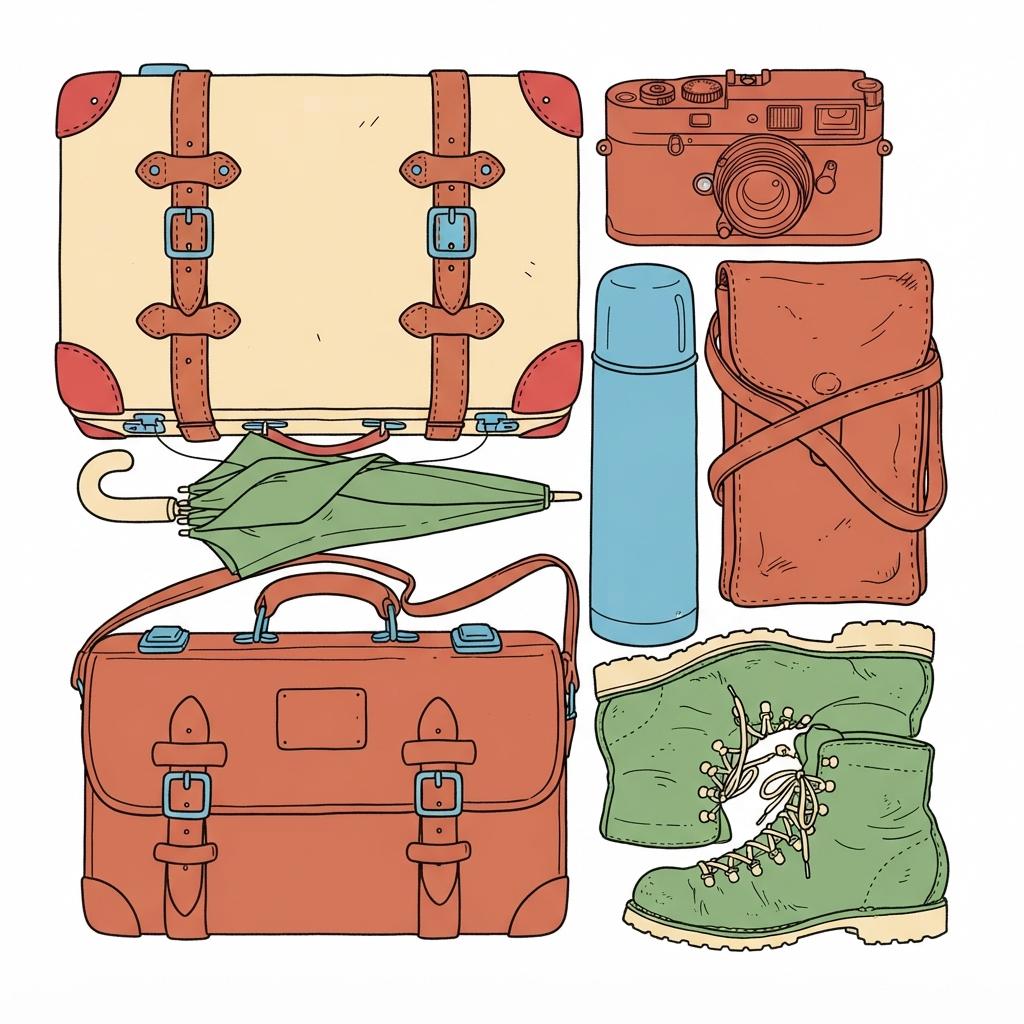
Characters, vehicles, architecture, objects, crowds — the same ink weight and the same flat colour, spent on whatever your story is actually about.
Everything You Need for Ligne Claire Picture Books
One clean panel is easy. Twenty-four pages at the same ink weight, with the same cast and the same town behind them, is the part that needs building.
The same pen on page twenty
One fixed brief — uniform ink line, flat colour blocks, meticulous architecture, bright even daylight — is carried into every page of the book. The hard part of clear line has always been holding the line steady for a hundred panels, and that is the part being automated here.
The four hiding places, closed in writing
Left alone, an image model reaches for texture and shadow, because both read as effort. This style names what must never appear — sketchy variable line, painterly shading, muddy colour, photorealistic — which are precisely the four ways an unresolved area normally gets covered up.
A cast that is easy to keep honest
Save your characters in the Character Library, with up to fourteen reference images each, and the description travels into every page and into later books. Clear line suits this unusually well, because a character here is a small set of flat facts: this hair shape, this jumper colour, these two dots for eyes.
A palette that arrives with the style
There is no colour picker and no hex field. The style brings its own bright cheerful range — sky blue, terracotta roof red, leaf green, warm cream — and your scene descriptions steer inside it: a harbour page comes back bluer, a market page warmer and more terracotta.
Whole books, not single panels
You are not prompting for one handsome street scene. Describe the story and C2Story writes it, breaks it into pages, and draws every page in this style, matched to what that page actually says.
Any language you read aloud in
The look carries no language of its own. Write the story in English, Chinese, Japanese, Spanish, French and more — the ink weight, the flat colour and the even daylight do not change with the text.
Ligne Claire Picture Books — Questions
What people ask before committing a whole book to one ink weight and flat colour.
Explore More Story Ideas
Discover more styles, tools, and story types
Cooking Stories
Little chefs, baking, pizza night and birthday cakes
Explore
Geometric Picture Books
Blocks held apart by clashing colour, not lines
Explore
Bedtime Story Generator
Cozy goodnight stories for kids
Explore
Storybee Alternative
More styles & features
ExploreLigne Claire Picture Books — Draw a Whole Town at One Ink Weight with AI
A ligne claire picture book is drawn in the clear-line tradition of European comic albums, and the tradition comes down to one rule applied without exception: every object in the frame gets the same thin ink outline. A character’s cheek, a wrought-iron balcony, the mortar between two bricks and a chimney four streets back are all inked at the identical weight. Inside each of those outlines sits a single flat colour from a bright cheerful range — sky blue, terracotta roof red, leaf green, warm cream — with no gradient and no shading. C2Story applies that one brief across an entire book, so page twenty is drawn with the same pen as page one instead of one spread happening to come out right.
What makes a clear line illustration unusual is not the tidiness, it is the absence of escape hatches. Most styles keep a way of not stating something: watercolour lets a background dissolve, cel shading drops half a room into hard shadow, crosshatching buries a difficult hand in texture, manga swaps an unwanted room for speed lines. With a uniform line, flat fills and bright even daylight, none of those are available — so everything in frame has to be actually drawn, and anything left vague reads as an error rather than as atmosphere. The style’s own refusals say the same thing from the other side: sketchy variable line, painterly shading, muddy colour and photorealistic are named as things that must never appear, and those four are precisely the places an unresolved drawing normally hides. The practical consequence is that this look rewards stories with places and objects in them — streets, harbours, stations, markets, cutaway houses, machinery — and works uphill on darkness, menace, weather and pure interiority.
It is also worth knowing which flat style you are actually after, because two of them are easy to mix up. The european comic style on this page keeps both of its promises — an even line and full detail. Minimalist keeps the clean flat mark-making but asks, in those words, for very few details and large empty space, which makes it a subtraction where clear line is an inventory. Comic Book keeps the ink but lets the contour swell and taper for impact. Flat Design keeps the flat colour and drops the outline altogether, which is the clearest proof that line and fill are two separate decisions. Being honest about scope: C2Story has one clear-line style, Ligne Claire City Sketch, sitting in the Contemporary group of a hand-drawn catalog of seventy-nine styles that each carry a full render spec — palette, render keywords, negative keywords, a lighting note and a line-weight description. It leans urban and panoramic by design, and 70s Euro Comic Animation is the nearby European cousin that loosens the line again.
Consistency is where a uniform ink line art book quietly wins. A style drifts over a long book in proportion to how many of its variables vary continuously, and this one fixes nearly all of them: one line weight, flat fills, even light, a fixed palette. Keep your cast in the Character Library, with up to fourteen reference images each, and the description travels from page one to the end of the book and into later books too. Write the story in any language you read aloud in, then export the finished book as a PDF — that file is the handoff to whichever printer you already use, and this is the most print-friendly look on the site, since flat colour areas and a single crisp line reproduce cleanly on almost any stock at almost any size. Start free: see our pricing plans, browse every option on the illustration styles hub, compare it with the minimalist style or the comic book style, read the guide to comic book art styles, or go straight to the AI Story Generator.