Comic Book Art Styles, Explained
Every list of comic book art styles is a gallery of famous artists. That is not much help when you have to draw forty panels. A style is really four decisions — line, shading, colour, figure — and the only one that matters is whether it survives the whole book.
- The four axes every comic art style sits on
- Eight families, what each is actually for, and where each breaks
- Why manga is a format, not one style
- How to pick a style that holds from panel 1 to panel 400
136
Selectable Styles
11
Style Categories
4
Axes That Define a Style
0
Artist Names in Prompts
A Style Is a Spec, Not a Vibe
Ask for “a gritty comic look” and you will get a different drawing every time, because gritty does not constrain anything. Ask for a heavy tapering brush contour, spotted blacks, a four-colour flat palette, hard top light and no gradients, and you get the same drawing on panel one and panel four hundred. That is the whole difference between the comic book art styles people talk about and the ones you can actually finish a book in.
Underneath the eighty labels in this guide there are only four variables. Everything below sorts the well-known comic art styles by where they land on those four, so you can pick by what a story needs rather than by which sample looked nicest on its best day.
Style names in this guide describe traits, not people. Nothing here asks you to name a living illustrator, and nothing here should — see why below.
The Four Axes Every Comic Book Art Style Sits On
Line, shading, colour, figure. Fix these four and you have named a style precisely enough to repeat it. Leave any of them open and the look drifts.
Line
How thick the contour is, and whether it varies. A heavy brush line that swells and tapers reads as action. A uniform hairline that never changes weight reads as clear-line European album work. A rough, broken pencil line reads as indie or diary comics. Line is the single fastest thing a reader clocks, and the hardest to fake later.
Pick the line first. Everything else negotiates around it.
Shading
There are really only four answers: dot screentone, hard-edged cel shadows, pen crosshatching, or nothing at all. Screentone says print manga. Cel says animation. Crosshatch says etching, gothic, editorial. Flat-and-unshaded says poster, pictogram, clear line. Mixing two of these in one book is the most common reason a comic looks inconsistent.
One shading method per book. Not two.
Colour
Full colour, limited spot colour, duotone, or pure black and white. This is a budget and a mood decision at once — a two-colour risograph palette hides weak rendering and reads as deliberate, while full painterly colour exposes every inconsistency. Black-and-white manga is not a cheaper colour comic; it is a different craft with different rules for depth.
Fewer colours forgive more. Full colour forgives nothing.
Figure
Head-to-body ratio, eye size, and how much of the face is actually drawn. A two-head chibi and an eight-head heroic figure cannot share a page. This axis decides your genre range more than anything else: exaggerated proportions carry comedy and warmth, naturalistic proportions carry drama and threat.
Proportion sets the emotional ceiling of the whole book.
Eight Families of Comic Book Art Styles
Almost every comic art style you can name is one of these eight or a deliberate cross between two. Each card says what defines it, what it is good at, and which styles in the C2Story library land there.
Inked Action Comic
Heavy contour, spotted blacks, dynamic diagonals
The look most people mean by "comic book" — bold ink outlines, flat saturated colour, big black shapes used as compositional weight, and panels staged like camera angles. It is built for motion and impact, and it goes brittle when a scene is two people talking quietly.
Best for: Superhero, adventure, sports, anything with physical stakes
In the library: Comic Book · Cinematic Action-Comedy Character
Screentone Manga
Black and white, dot screens for every value
Depth comes from adhesive dot patterns rather than colour or gradient. Expressive ink linework, large eyes, speed lines and tone gradients doing the work of lighting. Printed manga is black and white because that is what weekly serialisation allowed, and the whole visual grammar grew out of that constraint.
Best for: Serialised drama, school stories, fantasy epics
In the library: Manga Screentone · Chic Screentone Anime
Anime Cel
Crisp uniform outlines, hard-edged shadow shapes
Borrowed from animation production, where every frame had to be repaintable by a different hand. Shadows are solid shapes with clean borders, not gradients; colour fills are flat; the outline never wavers. That reproducibility is exactly why it is the most reliable style for a long story.
Best for: Anything you want to look modern, clean and consistent
In the library: Cel Shaded · Modern Cinematic 2D · Retro Cyberpunk OVA Cel
Clear Line (Ligne Claire)
Uniform thin ink, flat colour, no shadow at all
The European album tradition: every object gets the same line weight, colour sits in flat unmodelled blocks, and backgrounds are drawn with as much care as characters. It is calm, legible, and famously good at architecture and crowds — the style for a story where the world matters as much as the cast.
Best for: Travel, history, mystery, worlds with real geography
In the library: Ligne Claire City Sketch · 70s Euro Comic Animation
Webtoon Colour
Soft full colour, airbrushed light, glowing rim
The native style of the vertical scroll. Screens are backlit, so soft gradients and rim light look luminous rather than muddy; there is no page grid to hold the eye, so colour does the separating. It reads as contemporary and romantic, and it is the default expectation on a phone.
Best for: Romance, drama, anything published as a vertical scroll
In the library: Vivid Watercolor Anime · Korean Cream Doodle
Indie & Alt
Visible hand, rough line, limited or misregistered colour
Crosshatched pen, photocopied cel outlines, risograph spot colour that does not quite line up. These styles wear their making on the surface. They signal personal, literary or strange, and they let a story get away with rawness that a polished style would make look like a mistake.
Best for: Memoir, horror, literary graphic novels, zines
In the library: Crosshatch Gothic Ink · Xerox Cel Animation · Risograph
Cartoon & Gag
Silhouette over detail, comic timing in the pose
Built so the joke lands in one glance. Faces reduced to a few forceful features, bodies organised by shoulder-hip-limb direction, expressions that go deadpan or suddenly over-the-top. Whether it is a single-panel magazine cartoon or a four-panel gag strip, the drawing exists to time the punchline.
Best for: Humour, slice of life, editorial, four-panel strips
In the library: Gag-Manga Reaction · Single-Panel Editorial Cartoon · Bold Flat Satire
Painterly Graphic Novel
No contour line, colour and value carry the form
Watercolour, gouache or full painted panels where the edge of a shape is a colour change rather than a drawn line. The slowest to read and the most atmospheric. Works beautifully for short, quiet or historical stories and punishes long action sequences.
Best for: Literary adaptation, fable, historical and dream material
In the library: Airy Transparent Watercolor · Gouache Animation Storybook
What Actually Changes Between Comic Art Styles
Three differences do most of the work: how shadow is made, what shape the page is, and whether the style is written down as traits or borrowed from a name.
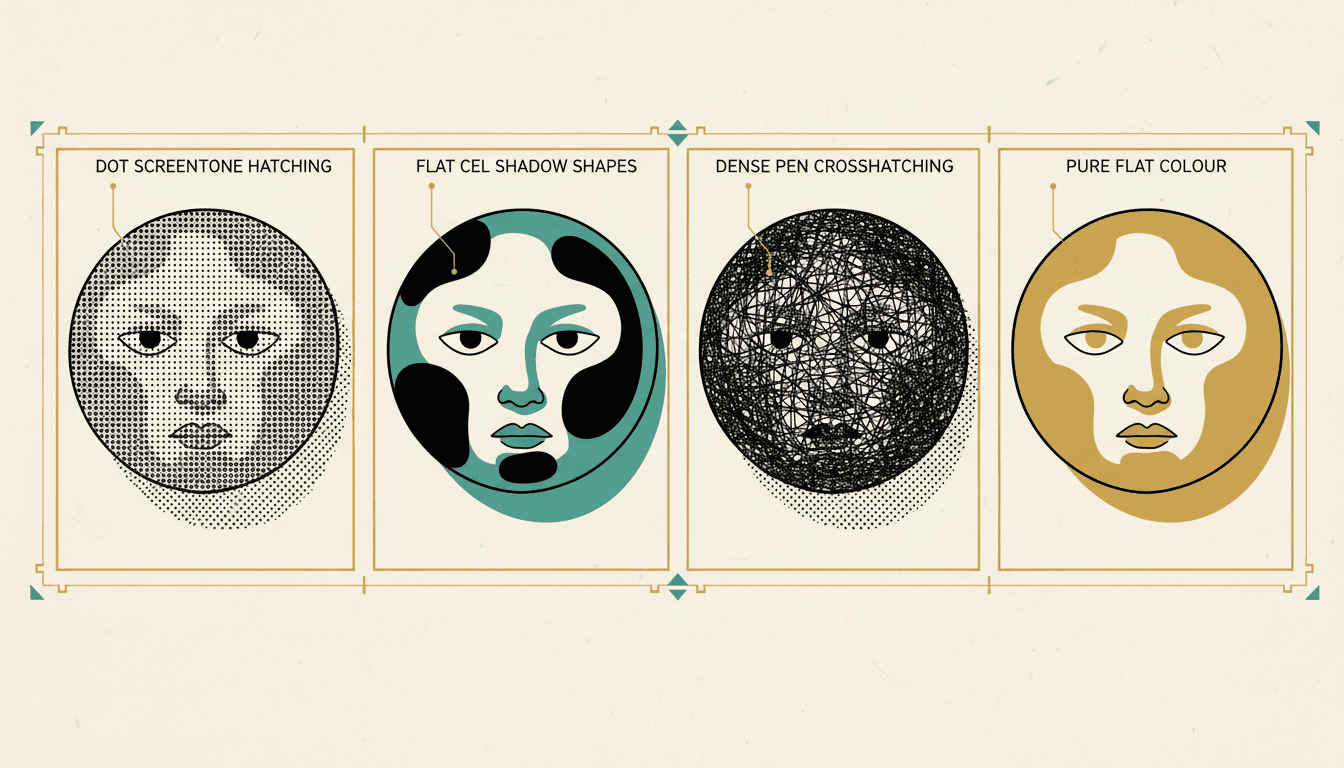
Four Ways to Shade
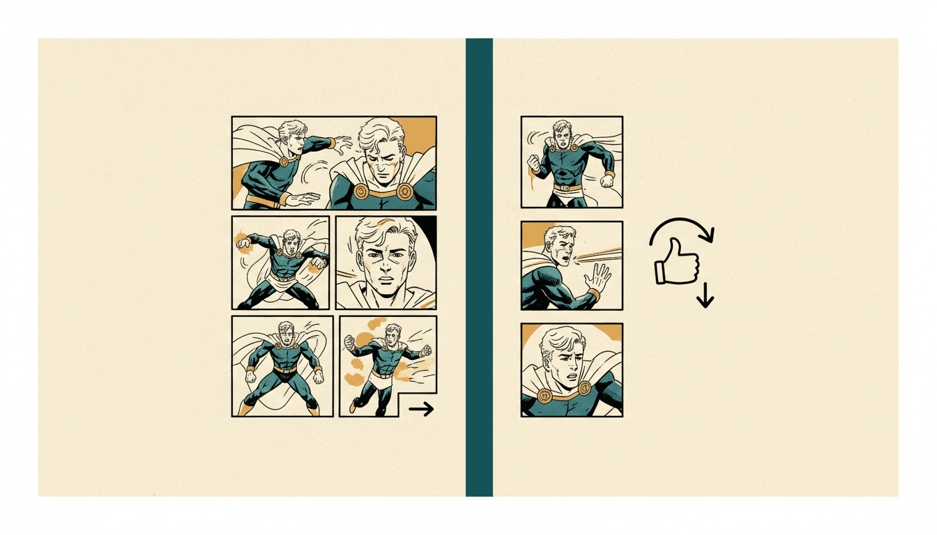
Page Grid vs Vertical Scroll
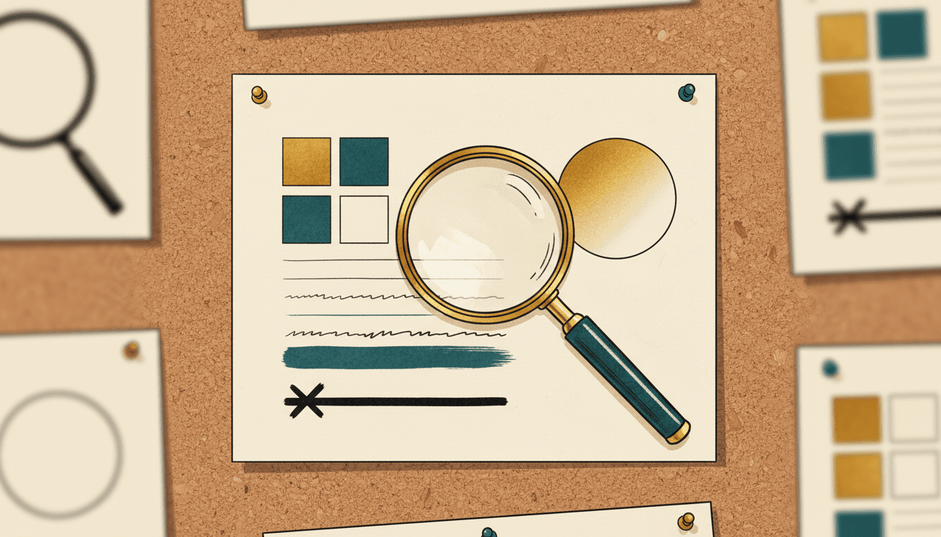
Traits, Not Names
Manga Art Styles Are Not One Style
“Manga” names a publishing tradition, not a look. These six traditions all count as manga and share almost nothing on the page — picking between them is a real decision, and picking “manga” is not.
Classic Rounded
Soft round contours, large expressive eyes, clean confident outlines and simple flat shading. Built for readable acting — you can tell what a character feels from the silhouette alone.
Screentone Chic
Crisp fluid line art over flat colour blocks with a subtle halftone micro-texture. Fashion-forward character design; the tone is decoration as much as shading.
Gag Reaction
Sketchy energetic line, silhouette prioritised over detail, expressions that swing from deadpan to sudden over-the-top. Comic timing lives in the pose, not the rendering.
Essay & Diary
Everyday and workplace vignettes drawn simply, where body language follows the style's own logic rather than defaulting to standard cute faces. The manga of ordinary life.
Watercolour Anime
High-saturation washes blooming over confident ink drawing, luminous translucent light. Reads as game illustration more than print manga.
Retro OVA Cel
Sharp hand-inked outlines over dense painted backgrounds, hard high-contrast light, analog film grain. The late-eighties direct-to-video look.
Adapting a long text rather than inventing one? The same choice shows up in manga generation, novel-to-manhwa and webtoon generation.
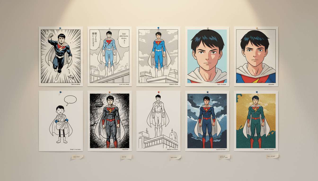
Five Comic Art Styles, One Character
The same figure rendered five ways. Nothing about the character changed — only the line, the shading and the colour depth.
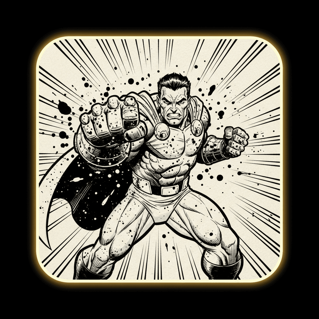
Inked Action
Heavy contour, spotted blacks
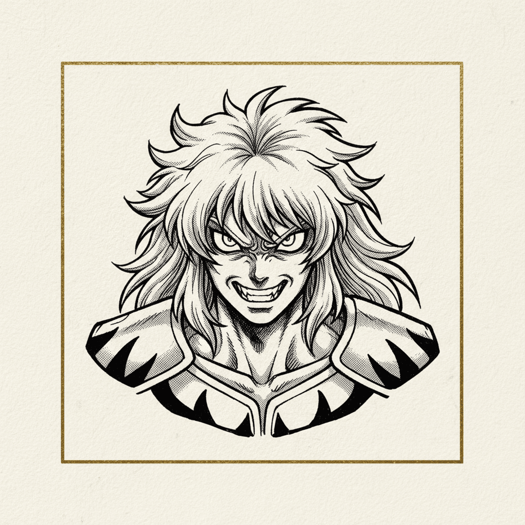
Screentone Manga
Dots instead of colour
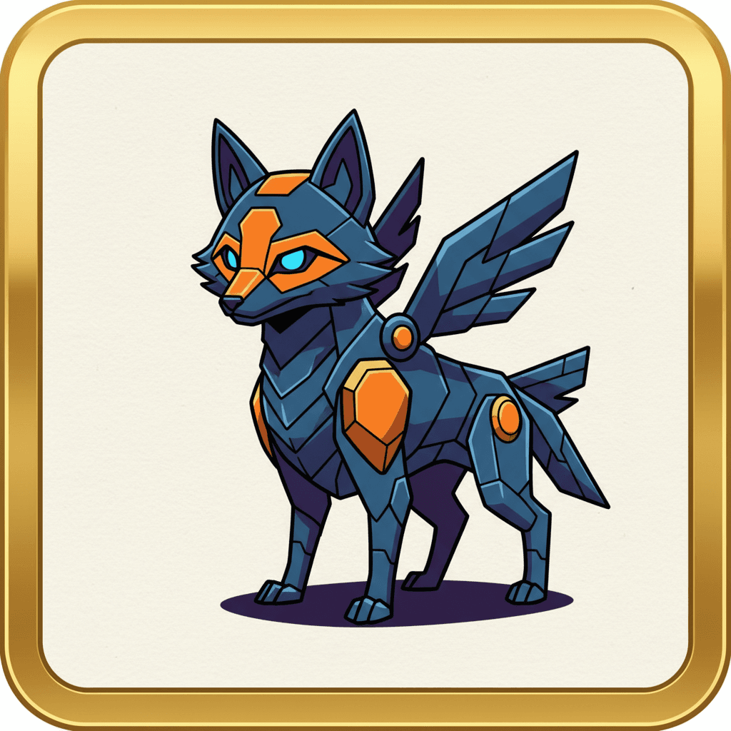
Anime Cel
Hard-edged shadow shapes
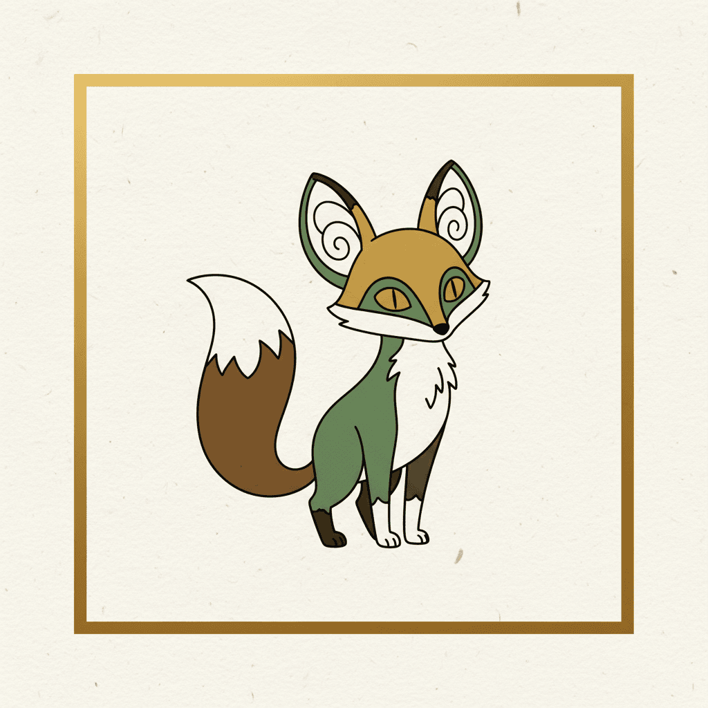
Clear Line
Uniform ink, flat colour
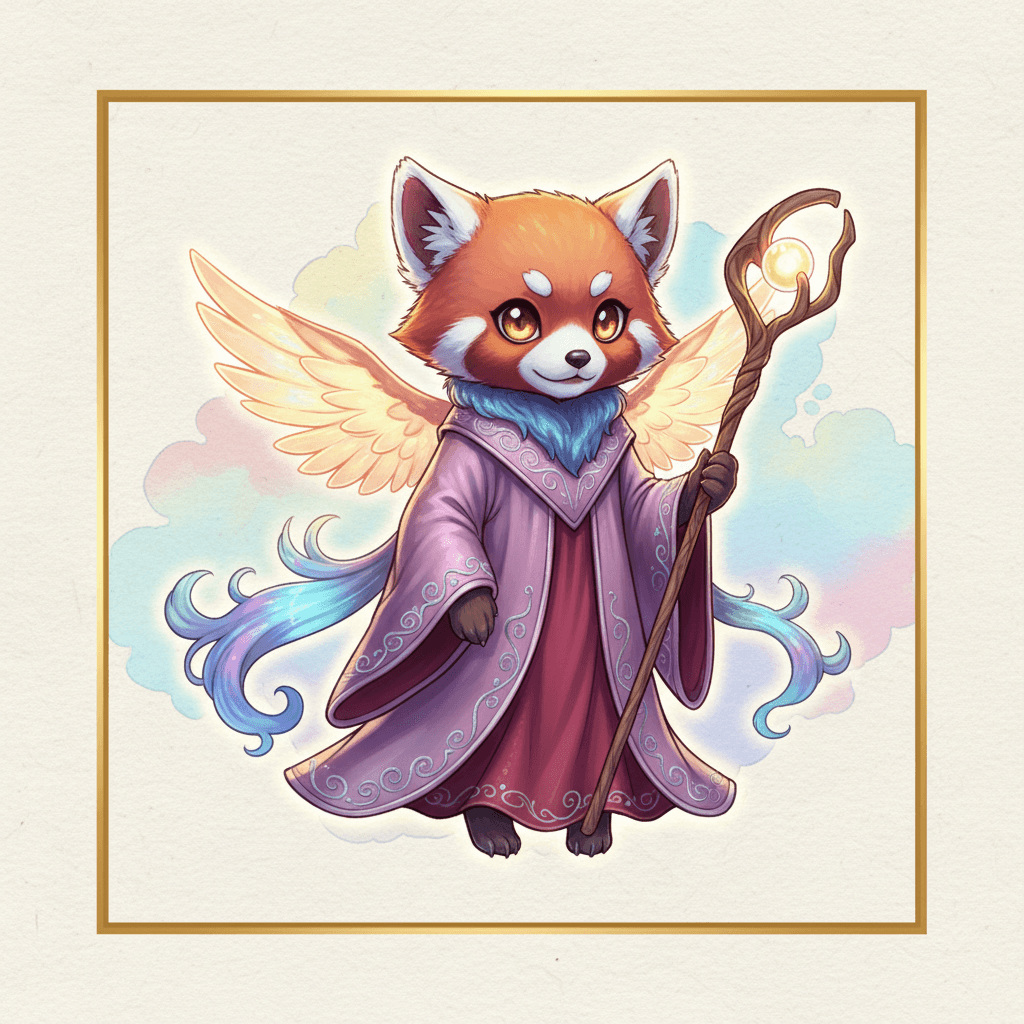
Webtoon Colour
Soft light for the scroll
Why There Is No “In the Style Of” Here
The fastest way to describe a comic art style is to name an artist who works in it. It is also the worst way. Our hand-drawn style catalog does keep an internal note of where each look originated, purely as data lineage — and that field is deliberately excluded from every prompt we build, from the interface, and from the public API. Styles are described by their visual traits, not by any name.
The practical reason is that names do not reproduce. A living illustrator’s work spans decades and several looks, so a name is a blurry instruction. A trait list is not: hairline contour, flat spot colour, cool overhead light, no gradients, no crosshatching. You can hold that steady across four hundred panels, and you can change exactly one part of it without losing the rest.
The other reason is that a book you intend to sell should not have someone else’s name baked into how it was made. Prompting for a named illustrator or a recognisable franchise character is an ordinary infringement problem that has nothing to do with AI policy — and it is one of the few things that genuinely gets a self-published book taken down. Our guide to AI illustration and KDP rules covers where that line sits.
So every style in the library ships as a specification: a colour palette, a set of render keywords, a negative keyword list of what must never appear, a lighting note, and a line-weight description. That last one matters more than it sounds — “extremely thin precise line” and “heavy tapering brush” are two different comics before anyone has drawn a character.
The Format Picks Half the Style for You
A printed page and a phone scroll are not the same canvas at different sizes. They reward opposite things.
The Printed Page
Reflective paper, a fixed frame, and a page turn you can weaponise.
- Fine line and dense hatching hold up — ink on paper has the resolution for it
- Screentone and halftone were invented for this surface and still look best on it
- The grid does the pacing, so panels can sit close together
- Soft glowing gradients go grey and flat on uncoated stock
The Vertical Scroll
A backlit strip one thumb wide, with no page turn anywhere in it.
- Soft colour and rim light glow rather than muddy — the screen is a light source
- Fine hatching disappears at phone width; bold shapes survive
- The gap between panels becomes the timing, so it has to be generous
- One subject per panel, staged tall — a wide establishing shot shrinks to nothing
How to Pick a Comic Book Art Style That Holds
Choosing a look for one illustration is easy. Choosing one that still looks like itself four hundred panels later is the actual skill.
Write the style as a spec
Palette, render keywords, lighting, line weight, and a negative list of what must never appear. Five fields beat a paragraph of adjectives, because every one of them is checkable on a finished panel.
Design the cast once
A style holds only if the characters inside it do. Lock the hero's face, hair, build and outfit as a reusable design before panel one, and reuse that design rather than redescribing it each time.
Test on your worst panel
Not the hero shot — the quiet two-person conversation, or the wide crowd. A style that only looks good on a splash page will collapse in the middle of chapter two.
Commit to one shading method
Screentone or cel or hatching or nothing. The moment two of them appear in one book, every reader feels it even if they cannot name what changed.
Match the style to the format
A dense crosshatched page is unreadable on a phone. A soft-gradient scroll style goes flat in print. Decide where it will be read before you decide how it will look.
Keep the spec with the project
Not in your head. When you come back to issue three months later, the written spec is the only thing that makes issue three match issue one.
Step two is its own craft — see the character consistency tool and the character bible generator.
Six Things People Get Wrong About Comic Styles
Manga is an art style.
Manga is a publishing format with a dozen visual traditions inside it. Gag manga, essay manga and screentone drama share a country and almost nothing else on the page.
Black and white means cheaper or simpler.
Monochrome comics carry depth through hatching, tone density and black spotting. Removing colour removes a tool, so the remaining ones have to work harder.
A style is a mood word like "gritty" or "cute".
A usable style is a spec: line weight, palette, shading method, lighting, and an explicit list of what must not appear. Mood words produce a different drawing every time.
You can switch styles between chapters for variety.
Readers read a style change as a flashback, a dream, or a mistake. If it is not one of the first two, it is the third.
Webtoon is just a comic turned sideways.
Vertical scroll has no page turn and no fixed frame. Gaps between panels become timing, and the soft-colour style exists because phone screens are backlit.
Naming a famous artist is the fastest way to a style.
It is the fastest way to an infringement problem and an unreliable result. Describing the traits gets you something you can actually repeat.
Terms Worth Knowing Before You Choose
Each of these names something you can point at on a finished panel — which is exactly what makes them more useful than adjectives.
From a Style Name to Finished Panels
Pick the family, then pick the tool that matches what you are making.
Make a comic
Panels, dialogue and one consistent cast, from a premise or a chapter you already wrote.
Make manga
Screentone, ink linework and right-to-left page order for a black-and-white serial.
Make a webtoon
Long-canvas vertical scroll, staged tall, with gaps used as timing between beats.
Make a graphic novel
Longer form, quieter pacing, and the painterly end of the style range.
Comic style, on a story book
Bold outlines and flat colour applied to an illustrated story rather than a panel grid.
Browse the whole style library
All 136 styles across eleven categories, with a sample render for each.
Frequently Asked Questions
Explore More Story Ideas
Discover more styles, tools, and story types
Animal Stories
Charming tales with cute creatures
Explore
Sumi-e Ink Wash Books
One-pass brushwork & deliberate emptiness
Explore
Children's Book Creator
Design beautiful kids books
Explore
ChatGPT vs C2Story
Purpose-built for picture books
ExploreComic Book Art Styles: A Working Guide, Not a Gallery
Search for comic book art styles and you mostly get galleries — a famous page, a famous name, a sentence of praise, next. That is useful for admiring and useless for deciding. The version of the question that actually helps is narrower: given four hundred panels to draw and one story to tell, which look can you hold steady the whole way? This guide answers that by sorting the field on four axes rather than by reputation. Line weight and whether it varies. Shading method — screentone, cel, crosshatch, or nothing. Colour depth, from full painterly through limited spot colour to pure black and white. And figure proportion, which quietly sets how funny or how serious the book is allowed to be.
Sorted that way, the eight recognisable families come out clearly. Inked action comic: heavy tapering contour, spotted blacks, flat saturated fills, built for impact. Screentone manga: monochrome, with dot screens doing every job colour would otherwise do. Anime cel: uniform outlines and hard-edged shadow shapes, inherited from animation production and therefore the most reproducible of all the comic art styles. Clear line: one thin ink weight for everything, flat unmodelled colour, backgrounds drawn as carefully as characters. Webtoon colour: soft airbrushed light designed for a backlit vertical strip. Indie and alt: crosshatched pen, photocopied outlines, misregistered risograph layers that wear the hand that made them. Cartoon and gag: silhouette over detail, everything staged to time a punchline. And painterly graphic novel, where no contour line exists and colour alone defines form.
Two corrections come up constantly. The first is that manga art styles are not one style — manga is a publishing tradition containing classic rounded character work, chic screentone, rough gag reaction comedy, everyday essay and diary comics, watercolour anime fantasy and retro cel drama, which share a country and very little else. Choosing “manga” is not a decision; choosing between those six is. The second is that format picks half the style for you. Fine hatching that sings on printed paper vanishes at phone width, and a soft-gradient scroll palette that glows on a screen goes grey on uncoated stock. Vertical scroll also removes the page turn entirely, so the gap between panels becomes your timing device.
C2Story’s style library holds 136 selectable styles across eleven categories, seventy-nine of them from a hand-drawn catalog where every entry is stored as a specification — colour palette, render keywords, a negative-keyword list of what must never appear, a lighting note and a line-weight description — rather than a mood word. Styles are described by their visual traits and never by an artist’s name, a rule written into the catalog itself, which is both better craft and the reason your finished book does not carry someone else’s signature in how it was made. From a chosen style the natural next steps are the comic creator, the manga generator, the webtoon generator, or the character consistency tool that keeps the cast on model while the style holds around them. Last reviewed September 2026.