Mid-Century ModernPicture Books
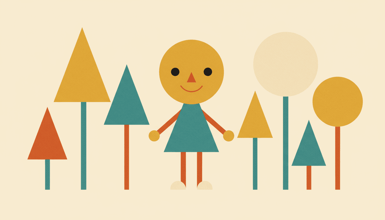
Mid-century modern illustration does not draw a character so much as build one out of parts. Flat colour blocks, hard-edged geometry and a mustard-and-teal palette — held across a whole mid-century picture book, not one handsome print.
- Figures assembled from bold simplified shapes
- Flat solid colour — gradients refused by the style itself
- Bright graphic or faded halftone — both branches available
- Free credits by request — no card
50,000+
Stories Created
10,000+
Active Creators
50+
Art Styles
4.9/5
User Rating
What Makes a Mid-Century Modern Illustration Look Mid-Century
Not the subject, and not simply the colours. Four things follow from building pictures out of flat shapes and a handful of inks.
Shapes come before contours
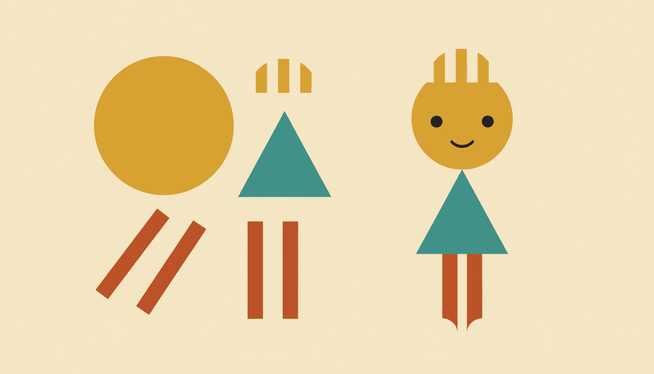
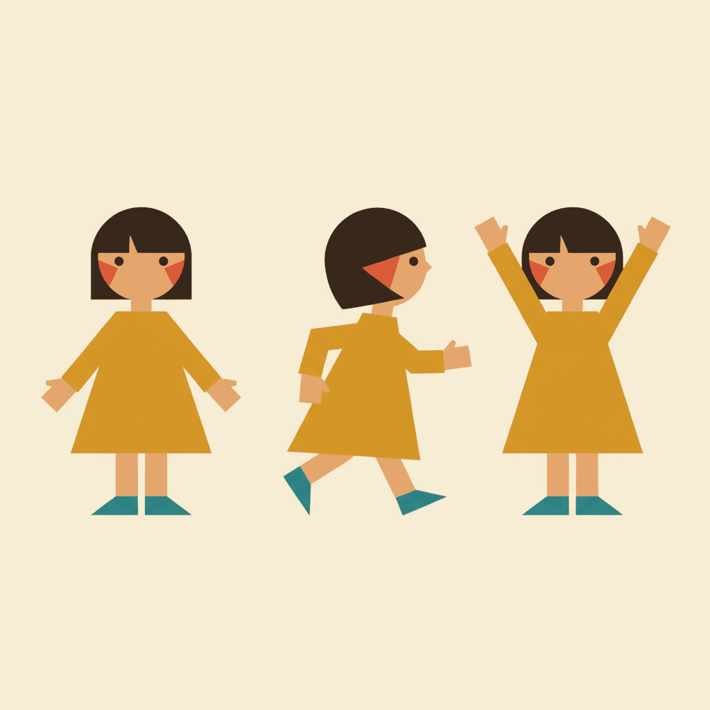
Most illustration starts at the outline and works inward. This one starts with a parts bin — a circle for the head, a trapezoid for the dress, two thin rectangles for legs. The render brief asks for bold simplified shapes and flat colour blocks, which is an instruction to assemble a figure rather than describe one.
Colour arrives in blocks, not blends
There is no light falling across a form here. Two areas are different colours because they are different shapes, full stop. Airbrush gradients are named as something to avoid, so the edge between mustard and teal stays a hard line — which is what makes the whole image read as printed rather than painted.
Proportion is a joke you are allowed to make
The style asks outright for playfully exaggerated proportions. Legs run too long, heads sit too round, a cat is mostly triangle. Because nothing is pretending to be accurate, nobody has to defend it — and children read a shape-exaggerated figure faster than a correct one.
The print shop left fingerprints
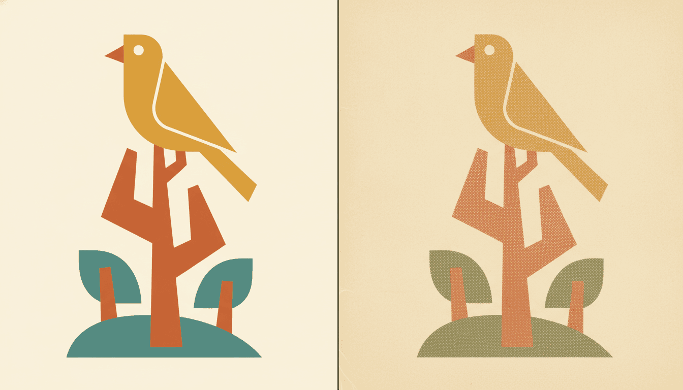
Halftone dots and that thin colour fringe where two inks miss each other are not decoration — they are what a 1950s press did when it laid down a handful of spot-colour plates. The retro branch of this look asks for halftone texture by name, which is why it feels pressed into paper.
Mid-Century Modern Is Simplified, Not Minimal
These two get confused constantly, and the confusion sends people to the wrong style. Minimalism removes things to leave space — its brief asks for very few details and large empty areas. Mid-century modern removes rendering, not content.
It will happily give you nine birds, a patterned rug, a starburst clock and a boxy car in one frame. What it will not give you is a gradient, a soft shadow or a carefully observed feather. Every object is flattened into separable blocks of colour — and then as many of them as the page can hold.
Busy is allowed. Density was never the enemy in mid-century illustration. Fussiness was. A frame can be crowded as long as every element in it is a confident shape.
Which is why the palette shouts. With no shading to carry depth, colour does that work alone. Mustard against teal is not a mood choice — it is how the picture gets its layers.
The style carries its refusals in writing. Alongside what it asks for, it names what must not show up on any page:
“Mid-Century” Is Two Opposite Instructions
Here is the part that catches people out. The styles that descend from this era do not agree about colour, and two of them say so explicitly in what they refuse.
The geometric style lists muddy colours as something to avoid. The Showa poster style refuses muted colours by name. Retro Vintage, meanwhile, is built on exactly that — a muted warm palette with halftone over the top.
Same era, opposite brief. One branch is a design decision — flat ink, confident shapes, loud palette. The other is a printing decision — faded plates, halftone, a thin fringe where colours miss.
So picture it first. If what you have in mind is an old book found in a loft, the bright geometric style will hand you something cheerful and wrong. Pick the printed branch instead.
Both are mid-century. Only one of them is the one you were imagining, and it costs nothing to choose on purpose.
Create a Mid-Century Modern Picture Book in 3 Steps
From a one-line idea to a finished book built out of flat shapes, in under two minutes.
Describe the story
A sentence is enough. This look is strongest on houses, machines, stylised animals and towns — things that reduce cleanly to shapes — so something like "a family moves into a house with no right angles" gives the geometry plenty to do.
"Nine birds, one branch, and a counting problem"
Pick your branch
Mid-Century Geometric Fable for bright flat colour blocks, Retro Vintage for muted halftone nostalgia, or Showa Commercial Cartoon for the upbeat poster look. One decision, and it sets the palette for the whole book.
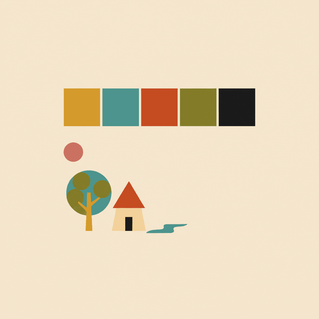
Mustard, teal, burnt orange, cream
Generate and export
C2Story writes the story, breaks it into pages and renders every one in your chosen style. Read it on screen, share the link, or export the PDF and take that file to a printer.
Whole book rendered, PDF export, instant sharing
Mid-Century Modern and Its Retro Neighbours
Worth being plain about scope: there is no single style called “Mid-Century Modern” in the picker. There are three that descend from the era, plus one that borrows the geometry without the period.
Mid-Century Geometric Fable
The drawn branch, and a featured style in the picker. Modernist flat colour blocks, bold simplified shapes and playfully exaggerated proportions, on a bright palette of warm orange, teal, mustard yellow and cream, lit flatly and edged hard. Its refusals are explicit: no photorealism, no airbrush gradient, no fussy detail — and, notably, no muddy colours.
Retro Vintage
The one that actually wants the faded look. Its brief reads 1950s aesthetic, muted warm palette, halftone textures, nostalgic, mid-century modern — so this is where you go for the thumbed-through-in-an-attic feel rather than the bright graphic one. If you pictured dusty mustard and soft brick red, pick this.
Showa Commercial Cartoon
Mid-century by way of Japanese advertising art, and also featured. Plump rounded cheerful characters, clean confident outlines and a flat printed poster feel with a little halftone warmth, on bright cherry red, teal and warm cream. Upbeat rather than nostalgic — it refuses muted colours outright.
Flat Design
Geometric shapes, solid colours, no gradients, modern vector finish. Mechanically it is the same construction logic, with the period palette and the halftone stripped out. Pick it when you want the geometry to read as contemporary and clean instead of as 1950s.
Two more worth knowing: Risograph gets flat rationed colour from grainy misregistered spot-colour printing, and the minimalist style keeps the clean geometry but trades the loud palette for negative space. If you want flat colour inside panel layouts instead, see the comic style.
Mid-Century Modern Story Ideas to Get You Started
Flat geometry is better at buildings, machines and stylised animals than at tender close-up faces. These six lean into that.
The House That Was All Triangles
A family moves into a house with no right angles anywhere, and has to work out how to hang a picture. Architecture is what this look does most easily, because a building here is three shapes and a colour.
Create this storyNine Birds, One Branch
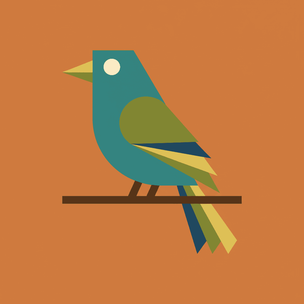
A counting story where each bird is a different wedge, beak and colour. Stylised wildlife suits the style perfectly — a bird reduced to a teal triangle and one round eye is more memorable to a four-year-old than a feathered one.
Create this storyThe Rocket That Needed a Push
A small, very optimistic spacecraft cannot quite leave the garden. Atomic-age hopefulness is baked into this visual language, so a story about machines and the future lands without any effort.
Create this storyEverything in the Kitchen Was Orange
A child decides one colour has taken over the house and sets out to find where it stops. A story about a palette, told in a style where the palette is the loudest thing on the page.
Create this storyThe Boy Who Was Three Shapes
He loses his triangle and has to be identified by the circle and the rectangle alone. A joke that only works in a style that builds people out of parts — and a gentle way into what makes someone recognisable.
Create this storyGrandma’s Living Room Never Changed
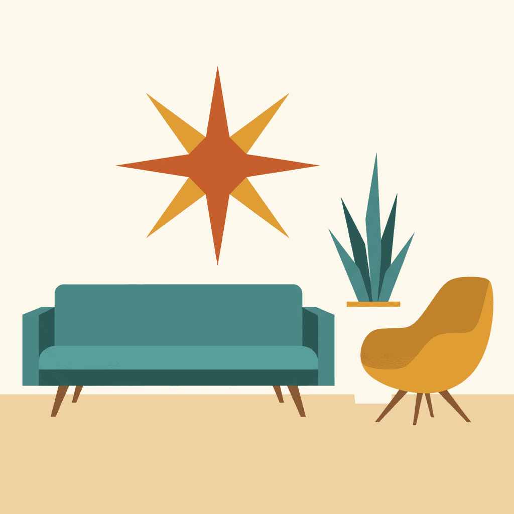
The teal sofa, the egg chair, the starburst clock — and the child who thinks it is all brand new. The one story where the period is the point, and the one most likely to make the adult reading it go quiet.
Create this storyAI-Generated Mid-Century Modern Illustrations
Look at the edges and the ink. Nothing is blended, nothing is lit, and the halftone one is printed rather than painted.
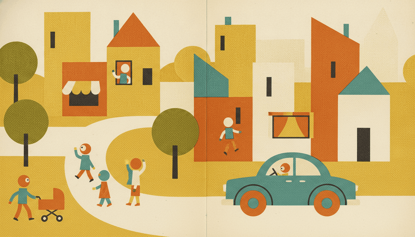
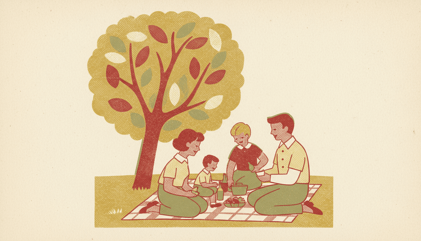
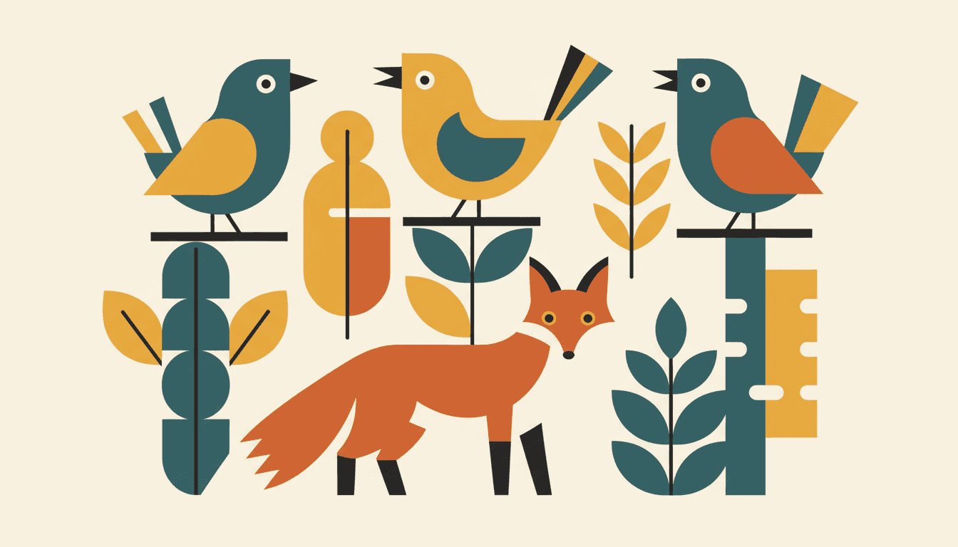
Mid-Century Modern Picture Book Illustration for Every Subject
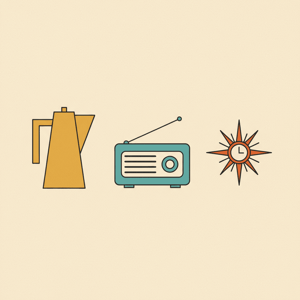
Characters, animals, palettes, interiors, objects — the same flat shapes and the same four inks, spent on whatever your story is actually about.
Everything You Need for Mid-Century Modern Picture Books
One good flat-colour print is easy. Twenty-four pages with the same shape kit and the same four inks is the part that needs building.
The same shape kit on every page
The style carries a fixed render brief — flat colour blocks, modernist forms, hard-edged geometric shapes, flat graphic lighting — into every page of the book, so page eighteen is not quietly softened and shaded in a way page one was not.
Gradients are refused in writing
Left alone, an image model will add a tasteful airbrushed sky and a soft shadow under the chair, because that looks more finished. Here the style names what must not appear — photorealism, airbrush gradient, fussy detail, muddy colours — so the one instinct that would dissolve this look is the one it is told to ignore.
A cast that is a set of parts
When a character is a circle, a trapezoid and two accent colours, consistency means that exact kit reappearing. Save them in your Character Library — up to fourteen reference images each — and the kit travels into every page and every later book instead of being re-guessed.
A palette with a point of view
There is no colour picker and no hex field. The style brings its own palette — warm orange, teal, mustard yellow, cream — and your scene descriptions steer it from there: an evening story comes back deeper and dustier, a seaside one leans teal.
Whole books, not single prints
You are not prompting for one handsome poster. Describe the story and C2Story writes it, breaks it into pages, and illustrates every page in the mid-century style, matched to what that page actually says.
Any language you read aloud in
Flat geometry carries no language of its own. Write the story in English, Chinese, Japanese, Spanish, French and more — the shapes and the palette do not change with the text.
Mid-Century Modern Picture Books — Questions
What people ask before committing a whole book to flat shapes.
Explore More Story Ideas
Discover more styles, tools, and story types
Zoo Stories
Lions, giraffes, the zoo train and a kind zookeeper
Explore
Pictogram Picture Books
Faceless sign-like figures caught mid-motion
Explore
AI Story Generator
Generate complete stories with AI
Explore
ChatGPT vs C2Story
Purpose-built for picture books
ExploreMid-Century Modern Picture Books — Build a Whole Book From Flat Shapes with AI
A mid-century modern picture book is built rather than drawn. A figure is a circle, a trapezoid and two straight legs; a house is a rectangle and a triangle; a bird is a wedge with one round eye. Colour arrives in flat solid blocks with hard edges, because no light is falling on anything — and the whole image is held together by a palette of mustard yellow, teal, burnt orange and warm cream rather than by shading. C2Story applies that logic across an entire book, so every page carries the same flat colour blocks, modernist forms and flat graphic lighting instead of one page happening to look right.
The distinction most worth getting straight in mid-century modern illustration is that simplified does not mean sparse. The minimalist style reduces by removal — very few details, large empty space. This one refuses fussy detail while cheerfully filling a frame with nine birds, a patterned rug and a starburst clock, each flattened into shapes you can name. Density was never the enemy in this era; rendering was. That is also why the palette has to shout: with no gradients available to carry depth, mustard against teal is doing the structural work that shadow would normally do.
There is one real decision to make, and it is about colour. The styles descending from this era disagree, and they say so in what they refuse. Mid-Century Geometric Fable is the bright graphic branch — modernist flat colour blocks, playfully exaggerated proportions, hard-edged geometry — and it lists muddy colours as something to avoid. Showa Commercial Cartoon is the poster branch, with plump rounded characters, clean outlines and a flat printed feel on cherry red and teal; it refuses muted colours by name. Retro Vintage is the printed branch and the only one actually asking for a muted warm palette with halftone texture over it. If the image in your head is an old book found in a loft, that third one is the one you want — the other two will hand you something cheerful and not at all faded. Flat Design sits alongside them with the same construction logic and none of the period flavour.
Consistency works differently in a retro picture book style like this one, and in your favour. When a character is a small kit of parts — one head shape, one garment shape, two accent colours — identity lives in a handful of decisions rather than in rendered detail, so it either reappears intact or it visibly does not. Keep your cast in the Character Library, with up to fourteen reference images each, and that kit travels from page one to the end of the book and into later books too. Write the story in any language you read aloud in, then export the finished book as a PDF — that file is the handoff to whichever printer you already use, and it is worth running a test page if you are printing the halftone branch, since fine dot patterns can moire against a printer's own screening. Start free: see our pricing plans, browse every option on the illustration styles hub, compare it with the minimalist style or the pixel art style, or go straight to the AI Story Generator.