
City Pop Picture BooksLoud and Empty at Once
Five of the seventy-eight style briefs here ask for a generously empty page, and four of them are quiet looks. A city pop picture book is built from the fifth — the only one that fills that emptiness with colour at full strength.
- Silhouette and contour drawn first, detail never added
- A few flat high-chroma colours, placed to clash
- Generous white space — the clearance the colour needs
- Free credits by request — no card
50,000+
Stories Created
10,000+
Active Creators
50+
Art Styles
4.9/5
User Rating
What Makes City Pop Illustration Different From Simply Using Bright Colours
Intense flat colour is not rare in this library. What is rare is intense flat colour with most of the page left open — and two cross-checks against all seventy-eight briefs show it happens exactly once.
Five briefs ask for a generously empty page. Four of them are quiet looks
Every style in C2Story runs on a short written brief recording a palette, a lighting note, a line weight and a few things to avoid. Exactly five of the seventy-eight hand-drawn briefs ask in those words for generous white space, and the company is revealing: a minimal deadpan cartoon working in grey-blue and beige, an airy watercolour of pale pastel washes, a classical blue-green landscape on rice-paper white, and a poetic ink wash in muted vintage watercolour. Four quiet looks. Emptiness in this library almost always arrives as a promise of calm. The fifth brief is this one, and in the same breath as that generous white space it asks for flat high-chroma clashing colour blocks.
And three briefs ask for colour this intense. The other two fill the frame
Run the cross-check the other way and it closes. Only three of the seventy-eight briefs use the words high-chroma: a pop satire cartoon, a bold geometric picture book, and this one. The first two then tell the render to deliver a fully rendered scene and a stylized full scene — colour wall to wall, edge to edge, nothing left open. This brief says generous white space instead. Widen the search to every brief that wants white space, negative space or a sparse composition in any wording and every brief that wants maximum colour intensity, cross the two lists, and the overlap is a single entry. City pop illustration is the only look here that is loud and empty at the same time.
The silhouette is drawn first and the detail is never added
The brief puts it in order: silhouette and contour prioritized over detail. Its line weight is crisp confident even lines — one unvarying weight, no swelling, no tapering, no sketchy searching — and what that line is asked to describe is the outer shape of a person rather than the stuff inside them. The brief then names the three places identity is allowed to live: the face shape, the proportions of head to body, and clearly drawn hands and feet. Two other briefs in the library share that exact instruction, so the phrasing is not unique to this one. What is unique is the company it keeps here, because a bold contour plus almost nothing inside it is precisely what survives being surrounded by empty page.
The light is flat and even — which means there is no neon
The honest field, and the one most likely to surprise you. City pop is remembered as a night-time look: glowing signage, a wet road, a skyline after dark. This brief cannot give you any of it. Its lighting is flat even pop lighting, it refuses soft gradients outright, and it refuses muddy shading too, so there is no glow, no bloom, no graded dusk sky, no reflection on a wet street and no light source anywhere to be seen. The daylight is flat, every field of colour is one even area, and nothing casts a shadow. The intensity here comes from the pigment, not from an illuminated sign — and knowing that before you commit a book saves the only real disappointment this style has to offer.
What an Empty Page Is Allowed to Be Filled With
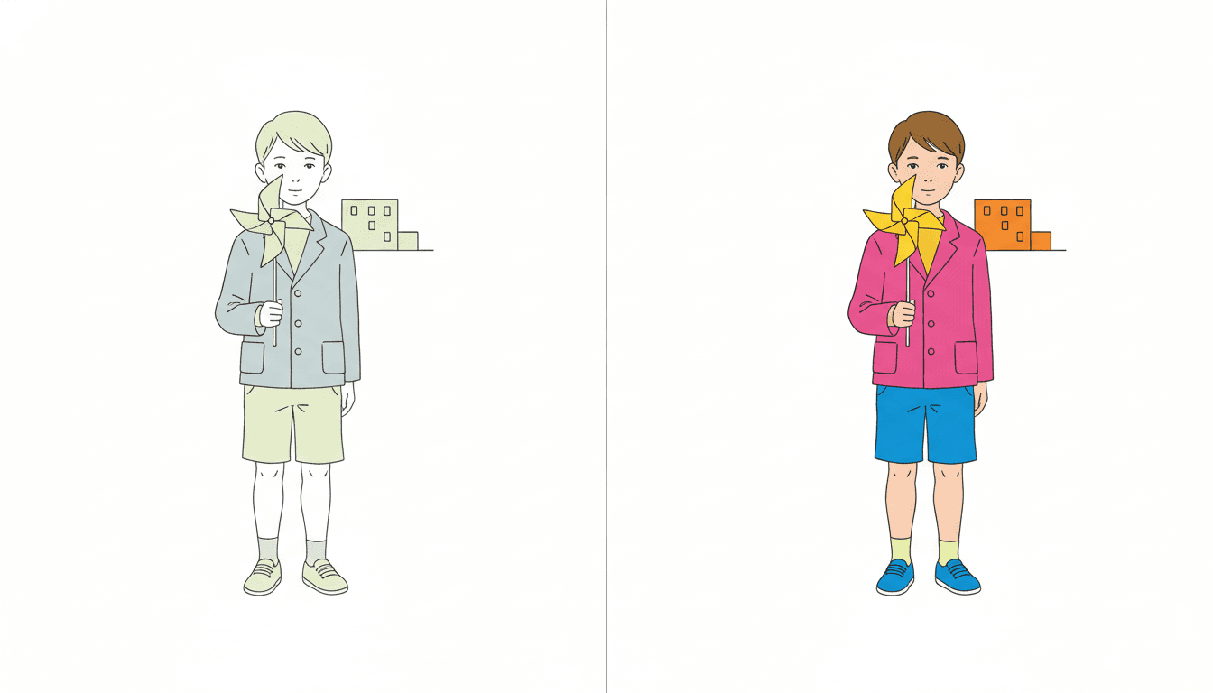
Look at the two halves. It is the same boy, the same stance, the same paper windmill held in the same hand, the same small block building behind him and the same thin even line describing all of it — the drawing has not changed between them at all. Nor has the thing you might expect to be the variable: both halves leave exactly the same large expanse of page plainly empty, the same white above his head and the same white to either side of him. What changed is only how hard the colour was pushed. On the left he is a soft grey-blue jacket over pale oatmeal shorts, with pale hair, pale shoes and a grey-green smudge of a building, and the page reads instantly as a quiet one. Notice that nothing about the boy is quiet. His pose and his face are identical to the half beside him. The picture is not calm. It is just whispering.
On the right the identical drawing is pushed to deep pink, bright blue and a yellow windmill against an orange building, and the page turns loud without turning any fuller. That is the whole argument of this style in one frame, and it is why the brief asks for generous white space and flat high-chroma clashing colour blocks in the same sentence instead of treating them as alternatives. In this library they usually are alternatives. Four of the five briefs that ask for a generously empty page are quiet looks, and two of those name saturated colour among the things they refuse outright; the only two other briefs that ask for high-chroma colour both go on to demand a fully rendered scene, filled corner to corner. The left half is what emptiness normally means here. The right half is what this one brief does with it.
Five briefs ask for generous white space. A deadpan cartoon, an airy watercolour, a blue-green landscape, a poetic ink wash — and this one. Four quiet looks and one loud one.
Three briefs ask for high-chroma colour. The other two want a fully rendered scene and a stylized full scene. Only this one asks for the page to stay open.
Its four refusals, in the order the brief states them:
Write One Person, Going Somewhere
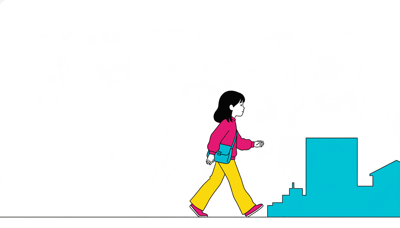
One girl, seen from the side, caught mid-stride with a bag across her body and most of the page left empty behind her. That composition is not an accident of this particular prompt — it is very close to the only picture this brief is built to make, and it is worth knowing before you write a word. The style hands you three things: a figure drawn as a bold silhouette in one even unvarying line, a city cut down to a few flat blocks, and an instruction to leave the greater part of the page alone. Put those together and what they describe is a protagonist crossing a space.
So the useful move here is a writing one rather than an art one: write one person, going somewhere. The walk to the shop, the first bus taken alone, the climb to the ninth floor, the dog who knows the route, the thing carried across town and not put down. Each of those is a single figure in motion with the city behind them rather than around them, and each gives the empty page something to be — the distance still to go. Hand the same brief a crowded market or a full family kitchen and you are asking a style that lists cluttered detail among its four refusals to go and manufacture clutter. It will try, and the page will lose the one quality that made it worth choosing. The reach of this style is genuinely narrow. Inside that reach, nothing else in the library competes with it.
Give it a page with one person in it. A walk, an errand, a bus ride, a climb up the stairs — a protagonist crossing a space is the picture this brief is built to make.
Keep the city behind them. Cluttered detail is refused outright, so the setting works best as a few plain flat shapes rather than as a crowded street.
Worth seeing side by side before you commit: the pop art style, which wants the same intense clash and covers the whole page with it, the fine-line ink style, which draws the same city on the same empty page and refuses saturated colour outright, and the geometric style, which drops the outline and lets the colours do the separating instead.
Create a City Pop Picture Book in 3 Steps
From a one-line idea to a finished book that holds the same line, the same clash and the same open page from first spread to last.
Describe the story
A sentence is enough. Give it a page with one person doing one thing somewhere in a city — this brief draws a figure crossing an open space better than it draws a crowded room, because cluttered detail is one of the four things it refuses.
"A girl takes the bus across the city on her own for the first time"
Pick 80s City-Pop Girl
Choose it for a bold even contour, a few colours at full strength and a page left generously open. Choose Pop Satire Cartoon instead if you want that clash to cover the whole page, Bold Geometric Picturebook if you want the colour to replace the outline, or Fine-Line Urbanite for the same city drawn quiet.
Hot pink and electric blue, flat, with room around them
Generate and export
C2Story writes the story, breaks it into pages and builds every one to the same brief. Read it on screen, share the link, or export the PDF and take that file to whichever printer or print service you already use.
Whole book built, PDF export, instant sharing
City Pop Illustration and Its Nearest Neighbours
Four real styles, sorted by the question that actually separates them: how much of the page does the colour get?
80s City-Pop Girl
Clean-line 1980s urban pop illustration with the silhouette and contour prioritized over detail, flat high-chroma clashing colour blocks, generous white space, and a bold graphic contrast between the figure and a retro city setting. Its palette is high-chroma pop colour, hot pink and electric blue; its light is flat even pop lighting; its line weight is crisp confident even lines; and the four things it refuses are muddy shading, cluttered detail, photorealism and soft gradients. It will render whatever urban scene your story actually describes.
Pop Satire Cartoon
The nearest rival on colour and the clearest contrast on everything else. It asks for the same few high-chroma clashing flat colours in strong graphic contrast, then wraps them in thick black outlines, round bulging big eyes and a fully rendered scene — colour to all four edges, no white space anywhere. It is also written for adult social satire rather than for children. So the two styles want the same pigment and disagree about the page: one covers it, this one leaves most of it open. Take that one for force. Take this one for clearance.
Bold Geometric Picturebook
The only other brief in the library using the words high-chroma, and the comparison turns on the line. That style specifies minimal outlines and a minimal clean edge, so the thing holding one shape apart from the next is the collision of two colours itself — which is why its colour has to run the full width of a stylized full scene. This brief keeps a real contour, crisp and confident and even, and that is what lets it stop: a figure with its own outline does not need a neighbouring colour to define it, so the rest of the page can simply be left alone.
Fine-Line Urbanite
The exact inverse, and the most useful style to see beside this one. It draws the same subject — gentle understated urban wit — with abundant white space, and then goes the other way on every decision: precise hairline ink strokes instead of one even confident line, tiny figures inside large airy environments instead of a bold figure against a few flat shapes, soft muted spot colour instead of high chroma, and saturated colour listed outright among the things it refuses. Two styles, one city, the same empty page, used for opposite ends.
Three more worth knowing. The showa retro style is the same country a few decades earlier, and it answers the opposite way — flat printed ink and a halftone texture covering the page, with warmth in plump rounded bodies rather than in a contour. The bold flat style shares the flat unshaded fill and makes a thick heavy outline load-bearing. And the muted editorial style turns the saturation dial the whole way down on purpose. Browse everything on the illustration styles hub.
City Pop Story Ideas to Get You Started
Every one of these is one person going somewhere, which is the page this brief draws most naturally.
The Long Way to the Shop
An errand on foot, four streets there and four streets back, and one detour that was not strictly necessary. A single figure crossing a mostly empty page is the composition this brief is built to produce.
Create this storyFirst Time on the Bus Alone
The fare in one hand, the stop counted and recounted. The city reduced to a few flat shapes behind a child is exactly how this look draws a journey — the setting present, but never competing.
Create this storyThe Dog Who Knew the Route
She thinks she is walking him. He has been leading. A story with two characters and nothing else in it suits a style whose brief asks for most of the page to stay empty.
Create this storyNine Floors Up
A new flat, a lift that takes forever, and a window with a view of exactly one other window. Plain block buildings in flat colour are what this brief does best, and a tall city is honest territory for it.
Create this storyThe Thing She Was Trusted With
Carried in a bag across town, not to be opened, not to be put down. One person, one object, one destination — a plot built entirely from a walk, which is the shape this style draws most naturally.
Create this storyFlowers for the Seventh Floor
Bought on the corner, carried up the stairs, handed over at the door. Flat bright colour against an open page makes a small bunch of flowers read loudly, which is more than most styles can do with a quiet errand.
Create this storyAI-Generated City Pop Illustration Examples
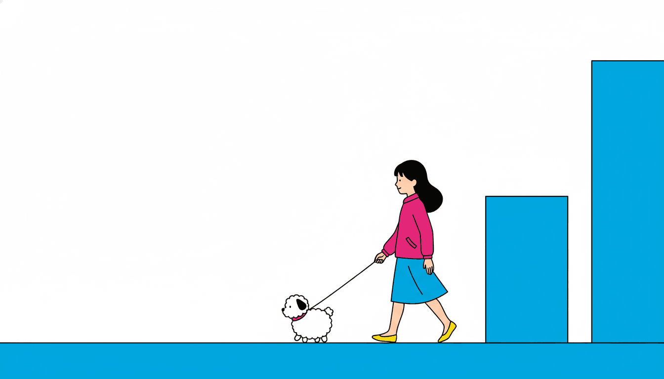
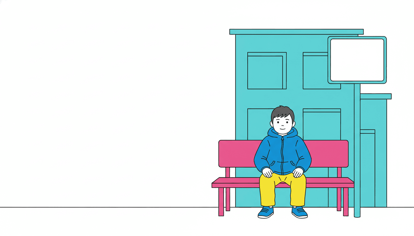
Three pages, one decision held across all of them. The split frame is the same boy drawn twice with the same amount of empty page on either side and only the strength of the colour changed, faded on the left and at full pressure on the right. The girl mid-stride with her shoulder bag is the page this style exists for — one person, going somewhere, the city reduced to a few flat blocks behind her and most of the paper left alone. And the bus stop is the proof that the light really is flat: a boy on a pink bench, a teal building, a completely blank sign, lit evenly all over, with nothing glowing and nothing casting a shadow.
City Pop Illustration for Every Part of Your Story
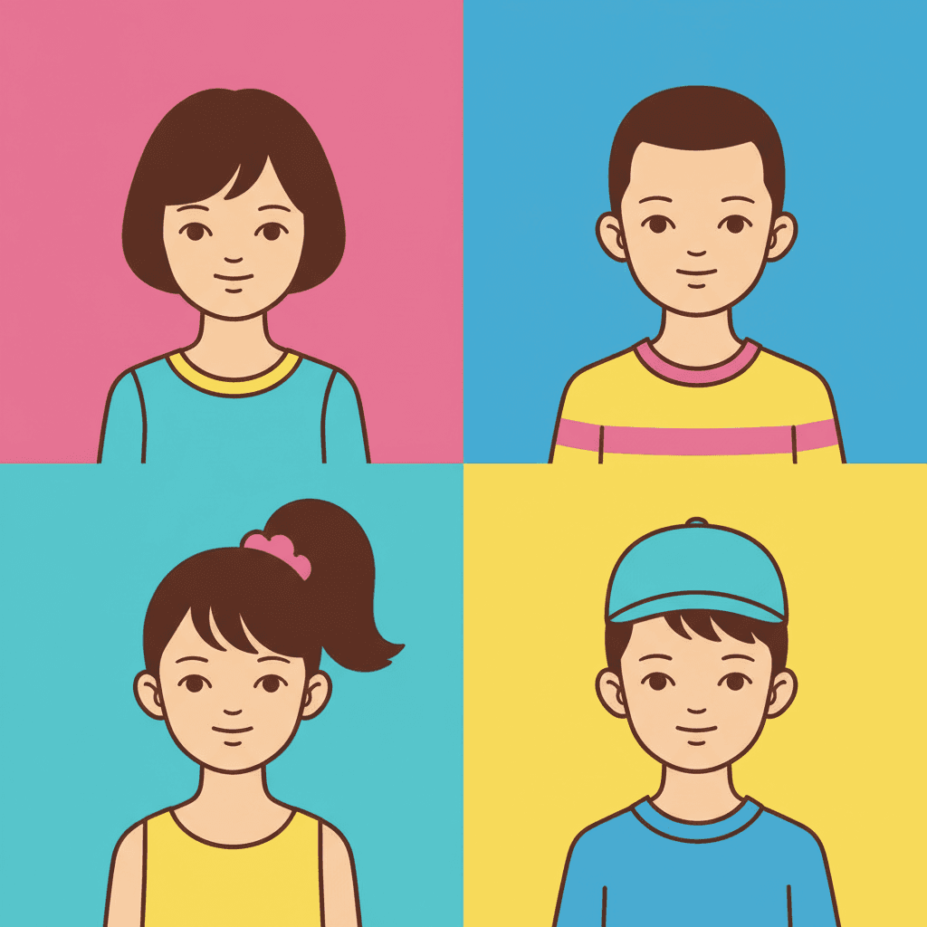
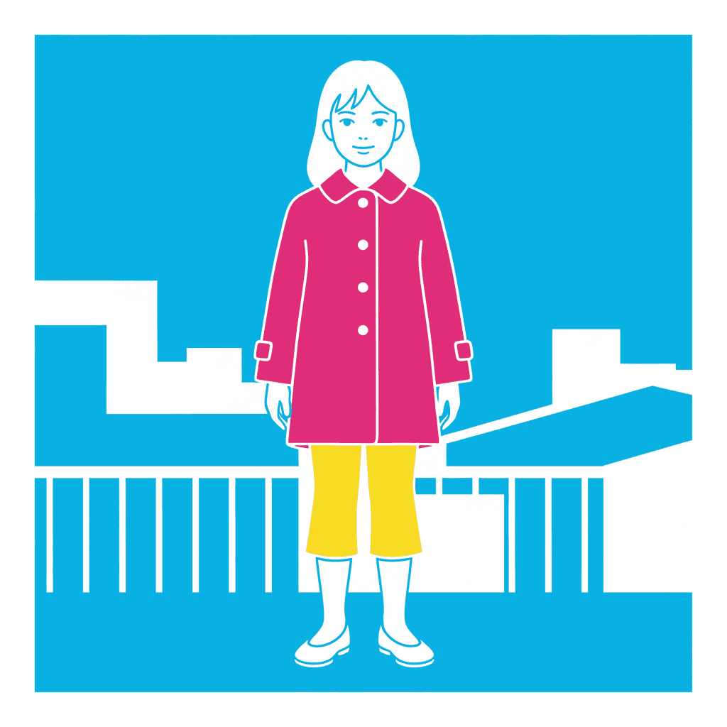
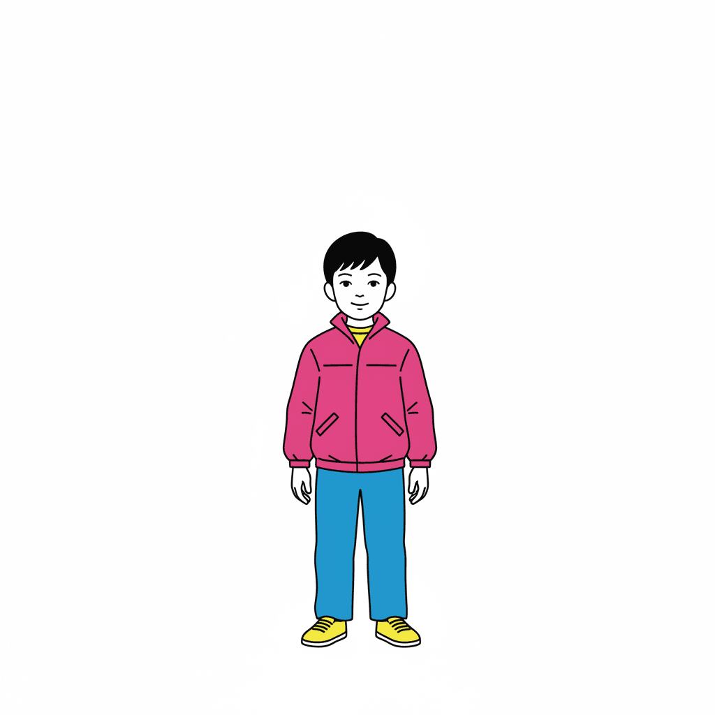
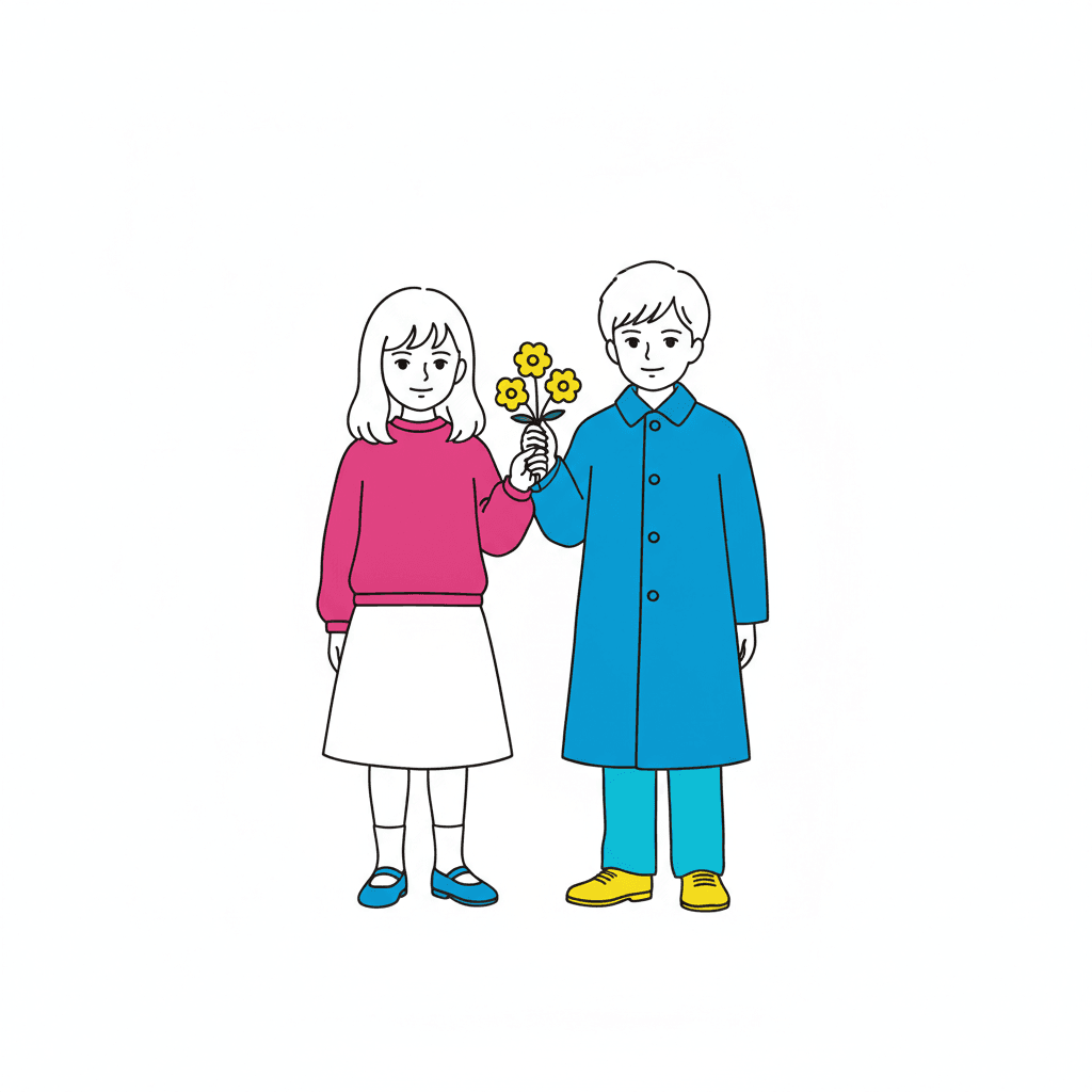
Four flat fields with a face in each, one figure against a single wall of blue, a small boy alone on an almost entirely empty page, a head drawn close enough to watch the line never change weight, and two children with a bunch of flowers held between them — the same even contour and the same few loud colours, spent on whatever your story is actually about.

Everything You Need for City Pop Picture Books
One striking frame is easy. Twenty-four pages whose line stays even, whose colour stays at full strength and whose empty space stays deliberate is the part that needs building.
The same amount of empty page, held for the whole book
This is the thing that breaks first when pages are generated one at a time, and in this style it breaks in a way you can see across a spread. White space is a composition decision, so if page three leaves half the page open, page four fills it corner to corner and page five adds a detailed background, the book stops reading as a deliberate look and starts reading as a set of unrelated pictures. One fixed brief is carried into every page instead: silhouette before detail, crisp confident even lines, a few flat high-chroma clashing blocks, generous white space, and the same four refusals of muddy shading, cluttered detail, photorealism and soft gradients. Twenty-four pages, one decision.
A cast recognised by its outline
Worth understanding before you cast your book, because this style is unusually dependent on it. The brief puts identity in three places only — the face shape, the proportions of head to body, and clearly drawn hands and feet — and withholds the interior detail most styles use to tell two characters apart. That makes your cast readable at a glance and fragile when every page is drawn fresh, since a silhouette is exactly what drifts. Save each character in the Character Library with up to fourteen reference images and they are carried into every page and on into later books at the same proportions. Characters built from an uploaded photo stay private to your account.
Hot pink and electric blue — and what a narrow palette costs
The palette is recorded as high-chroma pop colour, hot pink, electric blue and generous white space, and the brief says only a few colours are used at a time, placed to clash. Know the trade before you commit a book to it. There is no grey here to push anything into the background, no soft tone to hold a flashback apart and no low key to drop the temperature for one spread, so every page arrives at the same pitch and the page itself carries the contrast instead. If you want a book that can go quiet, the muted editorial and fine-line ink styles are built for it. There is also no global greyscale switch in C2Story, so a monochrome book means choosing a style that is monochrome by design.
An eighties adult look, with its adult contents left out
The honest note this style needs twice over. Its brief describes a fashionable young woman, and the tradition behind it is adult commercial illustration from a decade whose stock imagery ran to nightlife, bars, cigarettes and pin-ups — and the genre it is named after survives mostly as record sleeves. Our generation guidance holds the line on purpose. The cast is children and friendly animals, everybody fully and modestly clothed in ordinary everyday clothes, nobody posing for a photographer; no alcohol, tobacco or nightlife anywhere; no figure stretched into the tall proportions of a fashion plate and nobody drawn thin or gaunt; and nothing on the page is a record sleeve, a poster, a billboard or an advertisement. The words city pop describe how the drawing is made, never a thing appearing in it.
A whole book, not one striking frame
This look survives today almost entirely as single images — an album cover, a loop of animation, a print somebody framed — and a single image is the easy part. You are not prompting for one. Describe the story and C2Story writes it, splits it into pages and builds each page to this brief according to what that page actually says, so the empty space and the clash are spent across a narrative with a beginning and an end rather than all at once on one arresting picture. You get picture-book pages, with your words set as type rather than drawn into the art — which suits a style that produces no lettering of its own.
Easy on a young eye, in whichever language you read aloud in
The structural reasons are good ones. Cluttered detail is refused outright, so there is nothing on the page a child has to sort through; a crisp confident outline of one even weight says exactly where a thing stops; flat colour separates one object from the next with no ambiguity; and there is no shadow to be mistaken for an object and no texture to read through. The empty page helps rather than hurts here — a small child finds one clear figure easier than a full spread. The caveat is tonal: a look with no shadow and no dim light suits a story that moves rather than one that broods. Write in English, Chinese, Japanese, Spanish, French and more; the look does not change with the language.
City Pop Picture Books — Questions
What people ask before committing a whole book to one even line, a few loud colours and a page left half empty.
Explore More Story Ideas
Discover more styles, tools, and story types

Camping Stories
Tents, campfires, hiking and starry nights
Explore
Deadpan Cartoon Picture Books
Blank faces, dry humour & muted colour
Explore
Children's Book Creator
Design beautiful kids books
Explore
Storybird Alternative
Better AI story creation
ExploreCity Pop Picture Books — One Even Line, a Few Colours at Full Strength and the Room They Need
A city pop picture book is one where every page is a clean-line 1980s urban pop illustration: a figure drawn as a bold clear silhouette in one crisp confident line of unvarying weight, filled with a few flat areas of very intense colour placed hard against one another, set against a city cut down to a handful of plain flat shapes, and surrounded by a generous amount of plainly empty page. On C2Story this is the 80s City-Pop Girl style, and its brief states the ambition in one sentence — clean-line 1980s urban pop illustration, silhouette and contour prioritized over detail, flat high-chroma clashing colour blocks, generous white space, and a bold graphic contrast between the figure and a retro city setting. One brief applied across a whole book, so the twentieth spread is built from the same instruction as the first.
The part worth knowing before you commit a book to it is which of that is genuinely rare, because intense flat colour is not rare here at all. Two cross-checks against all seventy-eight hand-drawn briefs enabled in C2Story settle it. Run the first on emptiness: exactly five briefs ask in those words for generous white space, and four of them are quiet looks — a minimal deadpan cartoon working in grey-blue and beige, an airy watercolour of pale pastel washes, a modernised classical blue-green landscape on rice-paper white, and a poetic ink wash in muted vintage watercolour. Two of those four go further and list saturated colour among the things they refuse. Emptiness in this library arrives as a promise of calm almost every time. Run the second check on intensity: only three briefs use the words high-chroma, and the other two — a pop satire cartoon and a bold geometric picture book — then ask for a fully rendered scene and a stylized full scene, colour wall to wall with nothing left open. Cross the two lists in their widest form, every brief wanting white space or a sparse composition against every brief wanting maximum colour intensity, and the overlap is a single entry. This is the only style here that is loud and empty at the same time.
Which reframes what the white is for. In the four quiet briefs the open page is the mood: it is there to be calm, and nothing is competing with it. Here the open page is clearance. A few blazing colours placed deliberately to clash need room around them or the collision stops reading as a graphic contrast and starts reading as a mess — which is exactly why the same brief refuses muddy shading and cluttered detail in the same breath. The white is not quietening the picture down; it is what allows the colour to stay as loud as it is. The line follows the same logic. Its weight is recorded as crisp confident even lines — one unvarying thickness, no swelling, no tapering, no searching — and the brief puts the silhouette and the contour ahead of the detail, naming only three places where identity is allowed to live: the face shape, the proportions of head to body, and clearly drawn hands and feet. A bold contour with almost nothing inside it is precisely the kind of drawing that survives being surrounded by empty page. That instruction is shared with two other briefs in the library, so it is not unique on its own; what is unique is the company it keeps here.
Four honest notes before you choose it. First, and most important, there is no neon. City pop illustration is remembered as a night-time look — glowing signage, a wet road, a skyline after dark — and this brief cannot produce any of it: its lighting field reads flat even pop lighting, it refuses soft gradients and muddy shading outright, and that removes every tool a glow is built from, leaving no bloom, no graded dusk sky, no reflection on a wet street, no visible light source and no shadow anywhere. The intensity comes from the pigment, not from a lit sign. For real night or dramatic light take the grainy cinematic style or the cinematic style instead. Second, the writing advice is specific: this brief hands you one bold figure, a city reduced to a few shapes and a page it wants left open, which together describe a protagonist crossing a space — so write one person going somewhere. A walk, an errand, a bus ride, a stair climb, a dog taken out. A crowded market is the one scene it has no answer for, since cluttered detail is a stated refusal. Third, the palette costs you something real: high-chroma pop colour, hot pink and electric blue is a narrow loud set with no grey to push anything back and no low key to drop the temperature for a single spread, so the page itself carries the contrast instead of the palette — for a book that can go quiet, the muted editorial style and the fine-line ink style are built for it, and there is no global greyscale switch in C2Story, so a monochrome book means picking a style that is monochrome by design. Fourth, the provenance needs stating plainly: the brief describes a fashionable young woman, the tradition behind it is adult commercial illustration from a decade whose stock imagery ran to bars, nightlife and pin-ups, and the genre itself survives mostly as record sleeves — so our generation guidance states the opposite outright, with a cast of children and friendly animals, everybody modestly dressed in ordinary everyday clothes, nobody posing for a photographer, no alcohol or tobacco or nightlife anywhere, no figure stretched into the tall proportions of a fashion plate or drawn gaunt, and nothing on the page that is a record sleeve, a poster or an advertisement. The words city pop describe how the drawing is made, never a thing appearing in it. In exchange you get a book that is unusually easy for a young reader — cluttered detail refused, one even outline saying where each thing stops, flat colour separating objects unambiguously, no shadow to mistake for an object and one clear figure rather than a full spread to take in — and unusually easy to keep consistent, since the cast is carried by silhouette: save each character in the Character Library with up to fourteen reference images and they are reused across every page and into later books, with photo-built characters staying private to your account. Write in any language you read aloud in, then export the finished book as a PDF, which is the handoff to whichever printer you already use, and the images you generate are licensed for commercial use. Start free: see our pricing plans, browse every option on the illustration styles hub, or go straight to the AI Story Generator.