
Urban Tech Illustration Picture BooksThe Future Already Turned Up
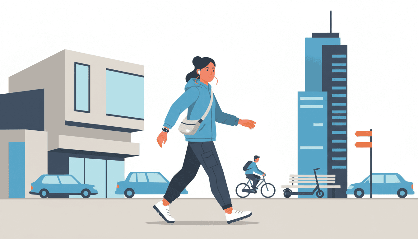
About a third of the seventy-eight style briefs here look back at some period. Only one names technology, and it lights it like an ordinary weekday afternoon. Urban tech illustration is built from that one: today’s city and the things people carry through it, in crisp flat shapes.
- Phones, scooters, earbuds and drones, drawn as ordinary kit
- Clean even flat light: no neon, no glow, no gloom
- Silhouette first, down to the hands and the trainers
- Free credits by request, no card
50,000+
Stories Created
10,000+
Active Creators
50+
Art Styles
4.9/5
User Rating
What Makes Urban Tech Illustration Different From a City Scene
Every style here is a written brief: a palette, a light, a line weight and a short list of refusals. Four lines in this one decide everything, and the first is a word no other brief contains.
The only brief in the library that names technology
Every style in C2Story runs on a short written brief: a palette, a lighting note, a line weight and a few things to avoid. Of the seventy-eight hand-drawn briefs, exactly one uses the word tech, and it is this one: an urban and tech mood, and the story’s modern urban-tech scene. Its preview line is a confident modern character with a device in a sleek urban setting. Only one other brief so much as shows a phone, and it is bold flat satire, whose commuter is deadpan-staring at one as the butt of the joke. The only other brief that says screen means screentone, the dotted texture printed in manga. Phones, earbuds, e-scooters and parcel drones have exactly one look in this library that was written with them in mind, and it is not making fun of them.
And it lights that technology like a weekday afternoon
The lighting field reads clean even flat light, and no other brief words it that way. That matters because of what the library’s other two machine-age briefs do with light. The late-1980s cyberpunk cel asks for high-contrast hard directional light, neon-lit interiors and rain-slick streets, and it refuses clean digital vector art and flat lighting by name. The glossy mecha brief asks for sharp reflective studio highlights. Wherever machines appear elsewhere in this library, they glow, gleam or loom. Here they are just lit, like everything else on an ordinary afternoon, and nobody in the picture finds them remarkable.
Commercial, and the only commercial brief set now
Four briefs call themselves commercial illustration. The other three are a mid-century Japanese advertising cartoon, a decorative guochao character with traditional patterns, and a 1920s-30s Shanghai advertising poster. All three look back at a period. This brief calls itself a contemporary commercial character illustration and asks for clean flat shapes and confident colour. That is the visual language of an app’s onboarding screen, a transit poster or a brand mascot today: designed to be read fast, by anyone, on the way to somewhere else.
Silhouette first, down to the hands and feet
The brief puts silhouette ahead of piled-up detail, and wants face shapes, head-to-body ratios and hand and foot forms to make a clear visual language. That sentence is not unique. Seven briefs here share it, including city pop. What is particular to this one is what the hands and feet are doing. In an urban-tech story they are nearly always holding or standing on something: a phone, a handlebar, a scooter deck, a parcel. The brief also asks for expressions driven by real character rather than uniform chibi cuteness, and it refuses generic chibi faces outright. So the people are not cute stand-ins. Each is a particular person with particular kit.
Same Man, Same Scooter, Two Kinds of Light
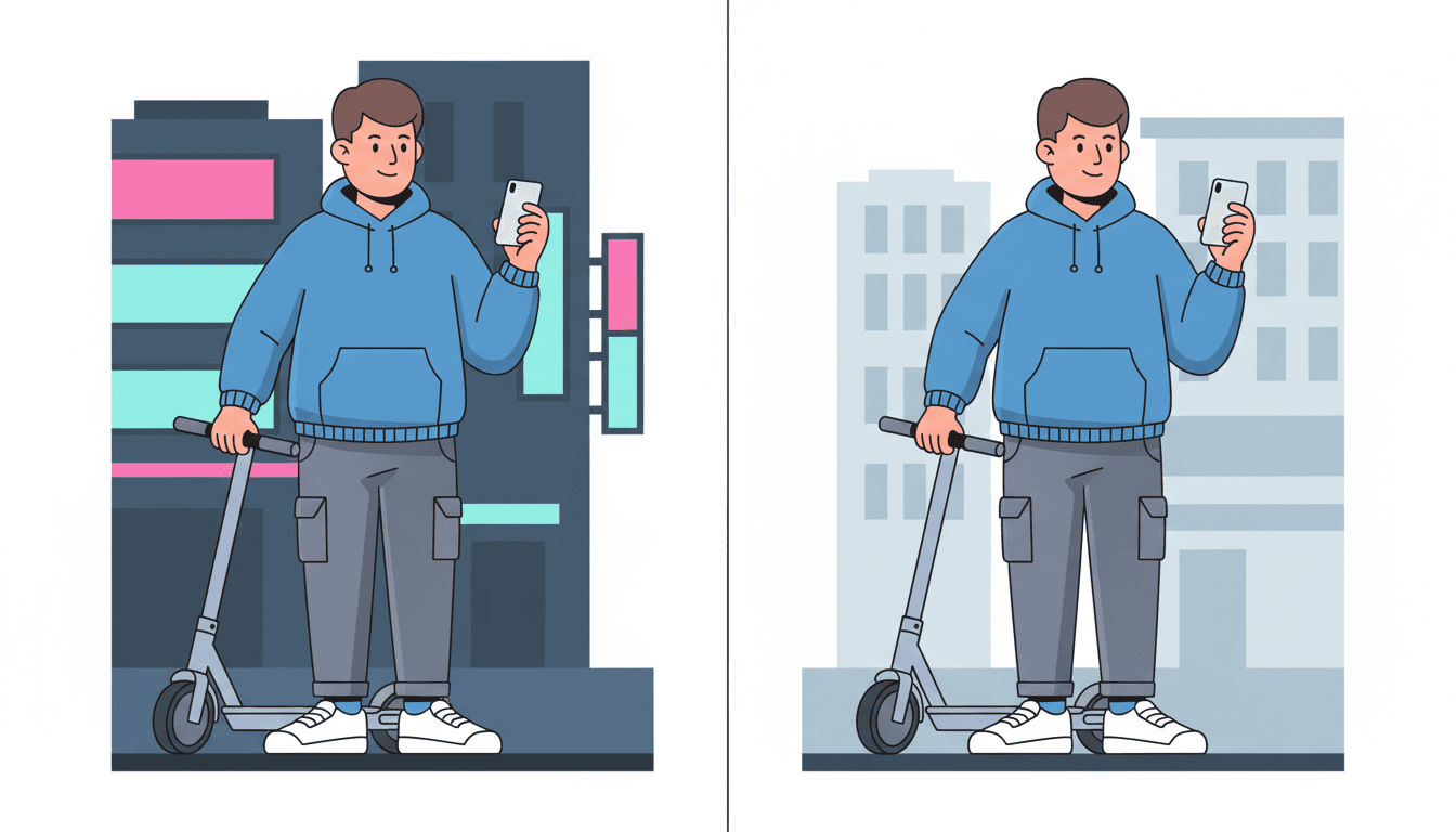
The picture beside this is the same young man twice, in the same hoodie, with the same scooter and the same phone. On the left the street behind him is dressed for night, in dark navy fronts and blocks of hot pink and cyan signage, and the eye goes to the signs. On the right the same street is pale grey and light blue in plain daylight, and the only thing to look at is him, and what he is holding.
That is what the brief’s four refusals protect. Photorealism, muddy gradients, cluttered detail and generic chibi faces would each pull the picture somewhere else. Realism and gradients bring back mood, clutter buries the silhouette, and a chibi face turns a particular person into a mascot. Take all four away and what is left is a clearly shaped person holding a clearly shaped thing.
So flat tech illustration here is not flat to look cheap or quick. It is flat so that a gadget is just a thing somebody is holding, and the person holding it is what the page is about.
Where Each Style Stands in Time
Read the seventy-eight briefs for when they are set and a pattern shows up. About a third of them name a past of some kind: a decade, a dynasty, a century, a vintage, a retro mood or a tradition. Most of the rest are timeless. Exactly one is set in the past’s idea of the future, and that is the late-1980s cyberpunk cel, with its neon, its rain and its hard shadows.
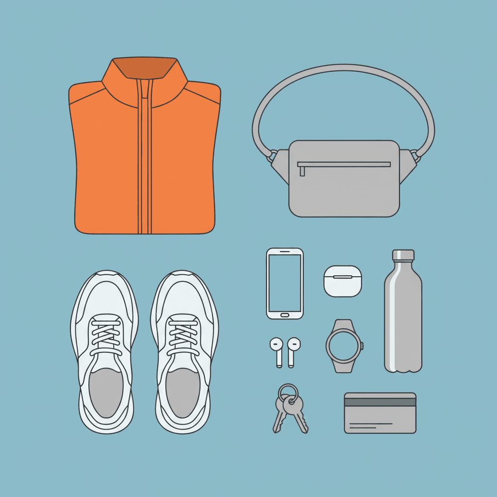
And exactly one is set now. This is the only brief whose world includes the technology its readers actually use, and it does not treat that technology as a spectacle. The picture beside this is a commuter’s whole kit laid out flat: a jacket, trainers, earbuds, a phone and a set of keys. In most styles that would be a still life. In this one it is a character description.
From One Sentence to an Urban Tech Picture Book
You pick the urban tech look once. The brief is then applied to every page, so neither the people nor their kit drifts.
Describe a person and what they carry
A sentence is enough. A girl whose parcel arrives by drone. A grandmother who is never late for her train. A teenager fixing her own e-bike. Name the object as clearly as the person, because in this style the two explain each other.
Choose Contemporary Urban-Tech Character
That fixes the whole brief at once: crisp clean lines, flat graphic shapes, cool blue, grey and one orange, clean even flat light and the four refusals. Save the main characters first, with their outfits.
Get a book, not one illustration
C2Story writes the story, splits it into pages and builds each one to the brief. Your words are set as type rather than lettered into the art. Read it on the web, share it, or buy the PDF to hand to a printer.
This Style and Its Three Nearest Neighbours
One shares its city of machines, one shares its silhouette sentence and its flat light, and one shares its streets. Here is what each actually asks for.
Contemporary Urban-Tech Character
The style on this page
A contemporary commercial character illustration with an urban and tech mood, in crisp clean flat graphic language. Silhouette is prioritised over piled detail, face shapes, head-to-body ratios and hand and foot forms make a clear visual language, and expressions are driven by real character rather than uniform chibi cuteness. The palette is a clean modern palette of cool blue, bright accent orange and neutral grey. The light is clean, even and flat, and the line is crisp and clean. The four refusals are photorealism, muddy gradients, cluttered detail and generic chibi faces.
Retro Cyberpunk Cel
The same city, as 1988 imagined it
The closest thing to a rival, and its exact opposite. It is the only other brief whose city is full of machines, and it pictures that city the way a late-1980s anime did: a neon-lit, rain-slick street at night, dense painted backgrounds, hard light and shadow and film grain. Its refusals read like this brief’s instructions, since it refuses clean digital vector art and flat lighting. Choose it for a story about what the future was supposed to feel like. Choose this one for a story about the future that actually arrived, which mostly involves a parcel turning up.
80s Clean-Line City Pop
Same silhouette sentence, forty years earlier
City pop shares this brief’s silhouette sentence almost word for word, and its light is flat and even too. The differences are the decade and the colour. City pop is a 1980s city of fashionable young women posing against a sunlit skyline, in flat high-chroma clashing blocks with generous white space. This one is today’s city and anyone in it, in a cool blue and grey palette with a single orange accent. City pop is about being seen. Urban tech is about getting something done.
Chic Urban Editorial
Same streets, but in motion and in fashion
Also set on a modern city street, and the one people are most likely to confuse with this. But that brief is a fashion editorial. It wants an elegant extended silhouette, clothing in relaxed flowing drape, matte pastels with soft pencil grain and soft warm accent lighting, and it refuses stiff static poses. Its people are caught mid-stride for the way their clothes move. This brief’s people are drawn in crisp flat shapes in practical gear, and what they carry matters more than how their coat swings.
Urban Tech Picture Book Ideas That Suit the Brief
Each idea plays to the same strength: a clearly shaped person, an ordinary piece of technology and somewhere to be.
The Parcel Came by Drone
A small girl is thrilled and her grandfather is not. A good first book in this style because the technology is the event, the light is ordinary, and the joke is in two faces reacting to the same machine very differently.
Fix It Yourself
A teenager, an upside-down e-bike and a toolbox. Flat even light shows every bolt, spanner and grip clearly, so a how-it-works story reads as easily as an instruction diagram.
Just a Minute, I’m on a Call
A parent working from the kitchen table, a child with something important to show them. Screens are drawn as plain shapes, so the page is about the people looking, or not looking, at each other.
Grandma Is Never Late
A sixty-something commuter with a folding scooter, a smartwatch and a train to catch. The brief’s confident colour and real-character faces make an older hero the obvious lead rather than a surprise.
Everything in My Bag
A counting or memory book built from one commuter’s kit: jacket, trainers, earbuds, keys, a water bottle. Clean flat shapes in a cool palette make each object a readable icon.
Three People at the Crossing
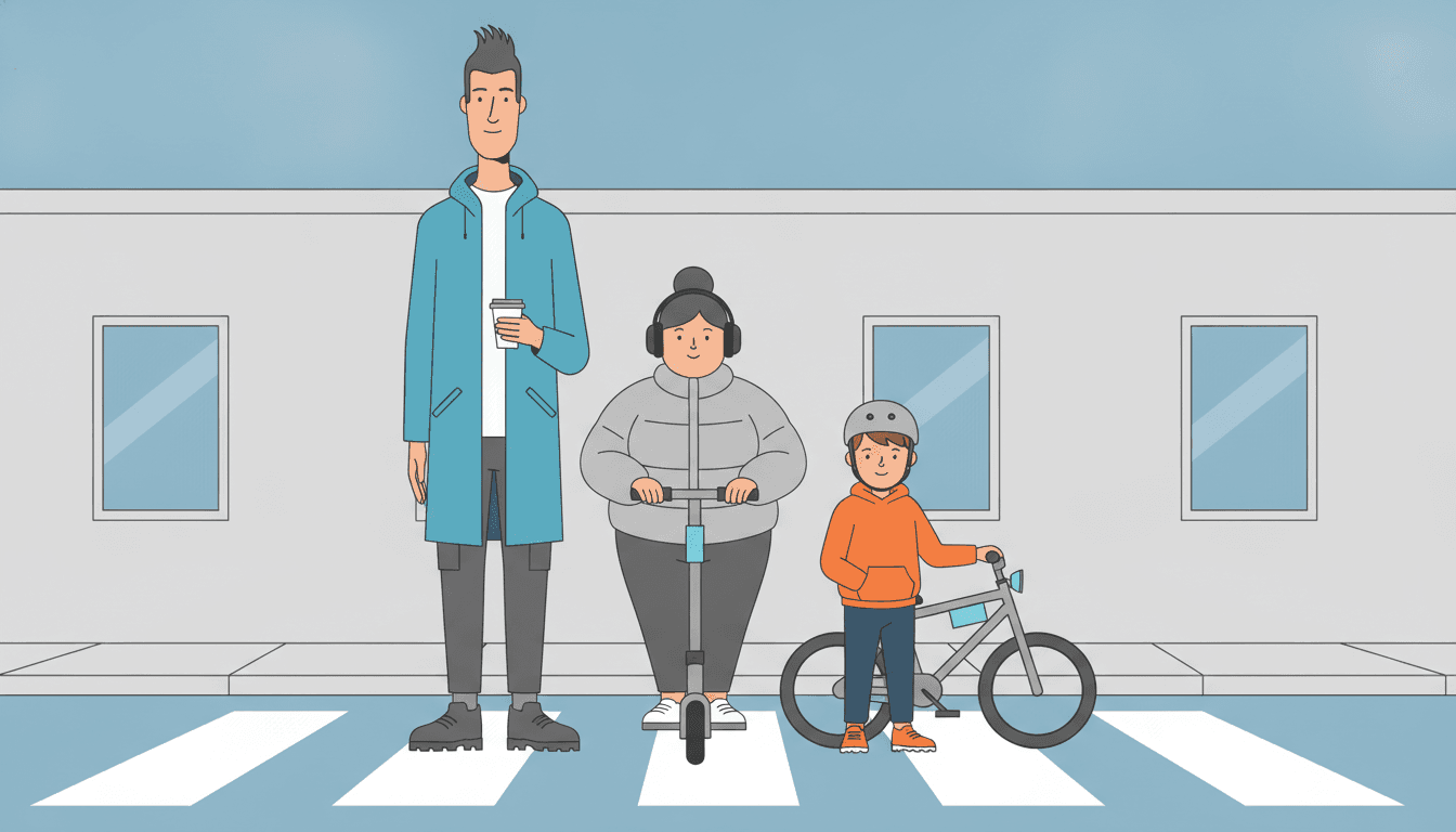
Three strangers wait at the same lights, each on the way to something different. Each one has to be recognisable from their silhouette alone, and this brief is written to do exactly that.
What Today’s City Looks Like in Clean Flat Daylight
Urban tech pages generated to this one brief, with nothing retouched afterwards.
Night Signage, Then Daylight
Known by the Outline
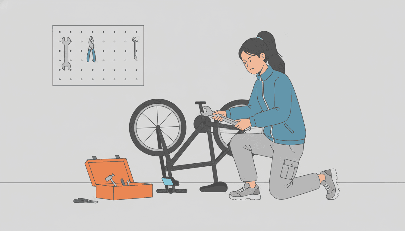
Fix It Yourself
One Character, Real Expressions and Everything They Carry
People are known by their outlines and by what they hold, so the brief spends its attention on shapes, faces, hands and feet.
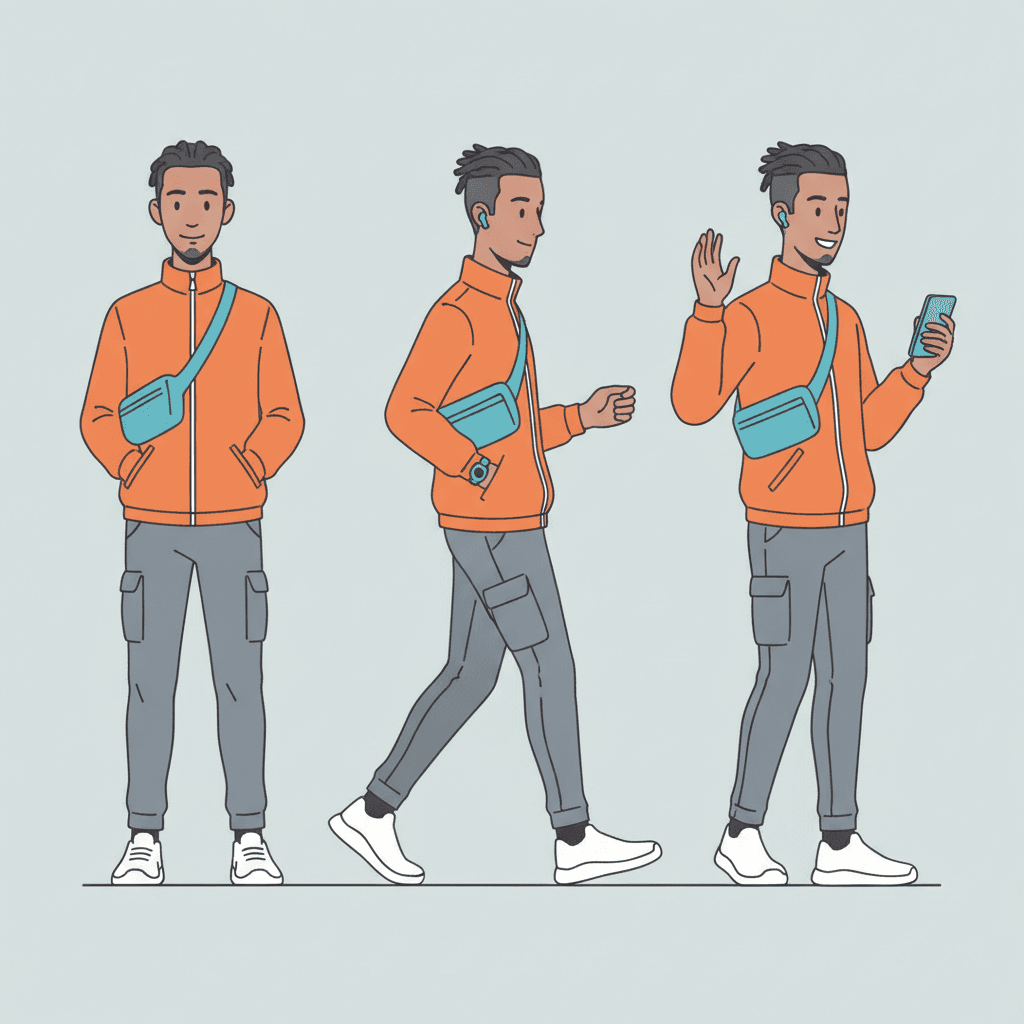
One Character, Three Poses
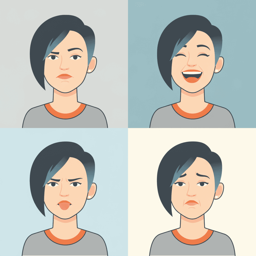
Four Faces, One Person
Everything in the Bag
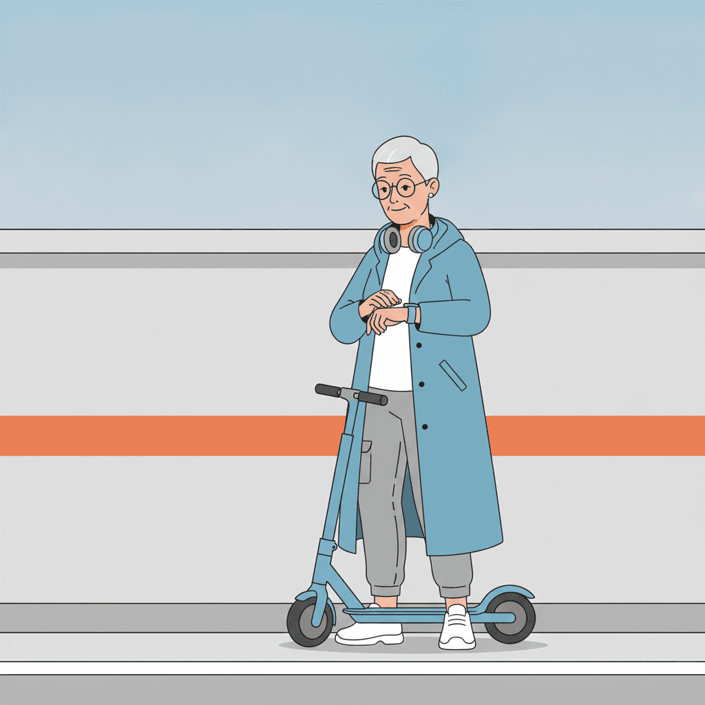
Never Late
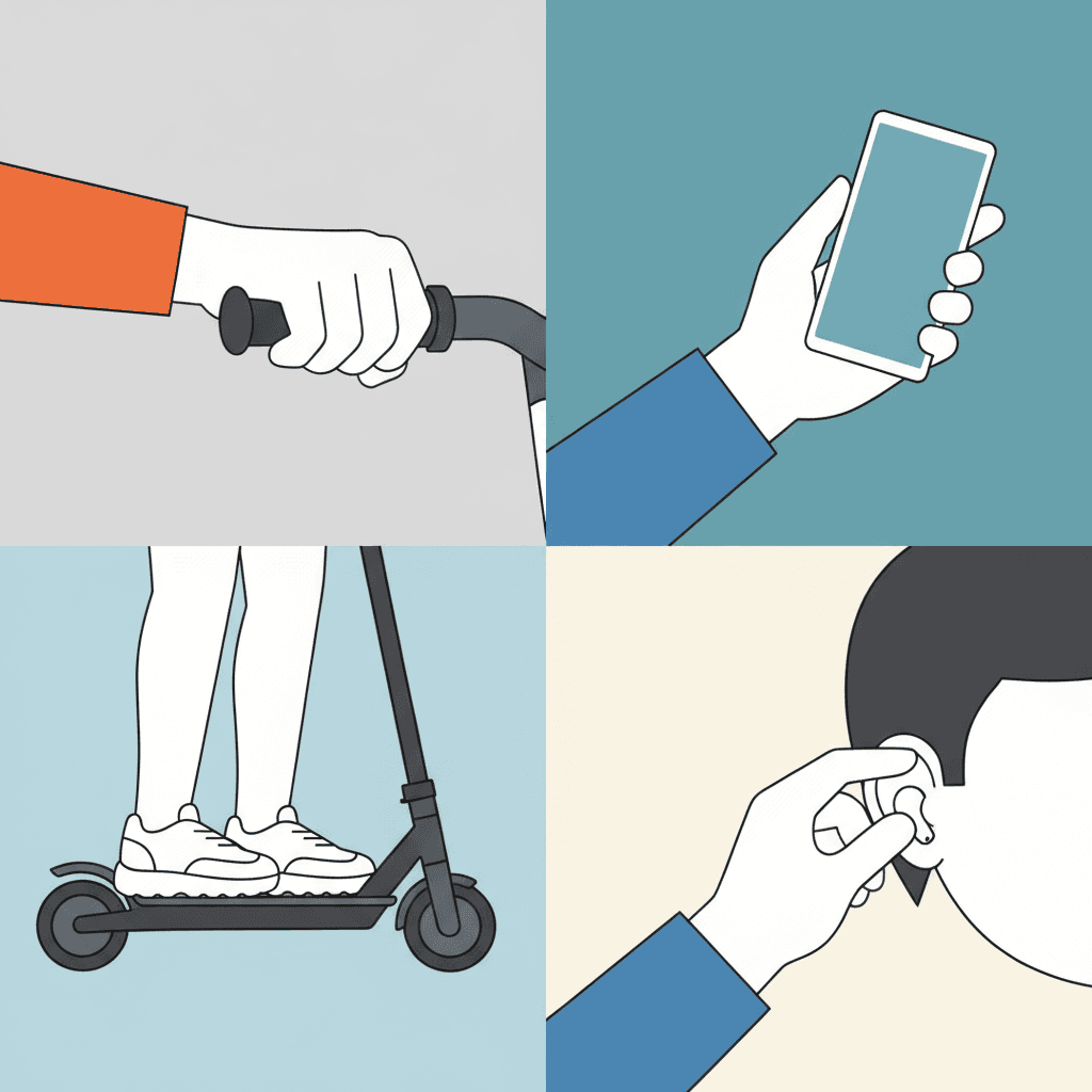
Hands and Feet, Holding On
Making a Whole Urban Tech Illustration Book
What is useful in an urban tech book and where the limits are, in the order you are likely to run into them.
The same character, and the same kit, every page
In this style a character is half person and half equipment: the orange jacket, the sling bag, the chunky trainers, the headphones round the neck. If the jacket changes colour on page six the reader stops trusting the book. C2Story carries one fixed brief into every page: crisp clean lines, flat graphic shapes, a cool blue, grey and orange palette, clean even flat light and the four refusals. Save each person in the Character Library with up to fourteen reference images, including the outfit, and they stay themselves across the book. Characters built from an uploaded photo stay private to your account.
Give everybody a different outline
Because the brief builds identity from silhouette rather than detail, two characters with the same build, haircut and coat will blur into one. Give each a shape nobody else has: one tall and thin, one short and round, one in a big helmet, one with a high bun. Then give each one thing they always carry. In most styles a prop is decoration. In this one a prop works like a name tag.
Cool blue, grey and one orange
The palette is recorded as a clean modern palette of cool blue, bright accent orange and neutral grey. It is the only brief in the library to name cool blue, and orange appears in only four. The orange works best on one thing per page, usually the thing the story is about: the hero’s jacket, the parcel, the toolbox. The honest cost is the light. It is clean, even and flat and casts nothing, so there is no night city, no neon glow, no dusk and no rain. If the story needs a glowing street after dark, this brief will not draw it.
Today, not science fiction
The brief asks for contemporary commercial illustration and a modern urban-tech scene. It does not ask for robots, spaceships or a future city, and you will get more out of it if you do not ask either. Its technology is the kind people already carry. For a story where the robot is the hero, our robot stories page and the mecha style are the better fit, and for rockets there is the space stories page. This style is for the near future in the sense of next Tuesday.
Screens stay blank, your words stay type
A story full of phones raises an obvious question about what is on them. C2Story sets your words as type on the page rather than lettering them into the art, so a screen in the picture is drawn as a plain flat shape, not a fake app full of garbled text. That suits this style, which already refuses clutter. If a message on a phone matters to the plot, put it in the story text and let the picture show the face of the person reading it.
A whole book, for children or grown-ups
Describe the story and C2Story writes it, splits it into pages and builds each page to this brief based on what that page says. The look sits comfortably in both directions. Its clean shapes and clear faces read easily for young children, and its commercial polish suits a grown-up gift book or a company story. You can write in English, Chinese, Japanese, Spanish, French and more. When you want it on paper, the paid PDF download is the handoff to your printer, and everything you make is licensed for commercial use.
If your hero is a machine rather than a person, our robot stories and space stories pages are the better starting points. For the same silhouette-first faces in a 1980s city of clashing colour, see city pop picture books, and to set up the cast before you choose a look, the AI character generator.
Questions About Urban Tech Illustration Picture Books
Explore More Story Ideas
Discover more styles, tools, and story types

Farm Stories
Friendly farm animals and barnyard fun
Explore
Graffiti Picture Books
Crude marker strokes, crowns & scrawled symbols
Explore
Bedtime Stories for Anxious Kids
Calming tales that soothe worries
Explore
ChatGPT vs C2Story
Purpose-built for picture books
ExploreUrban Tech Illustration Picture Books: Today’s City, Its Gadgets and Clean Flat Daylight
An urban tech illustration picture book rests on one unusual decision: it is set now. C2Story runs seventy-eight hand-drawn style briefs, each a short written record of a palette, a light, a line weight and a few refusals. About a third of them look back at a decade, a dynasty or a tradition, and one pictures the future as the late 1980s imagined it. Only this one, the Contemporary Urban-Tech Character style, uses the word tech, and its preview is a confident modern character with a device. It is the library’s only look written for the phones, scooters, earbuds and parcel drones that readers already live among.
The light is the second decision. The brief asks for clean even flat light, a wording no other brief uses. In the library’s other machine-age styles technology comes with neon, hard shadow or studio gleam, and the cyberpunk cel refuses flat lighting by name. Here nothing glows. A gadget is just a clearly shaped thing in somebody’s hand. The brief adds crisp clean lines, flat graphic shapes, a palette of cool blue, neutral grey and one bright orange accent, and refusals of photorealism, muddy gradients, cluttered detail and generic chibi faces.
The people are the third decision. Silhouette comes before piled-up detail, and face shapes, head-to-body ratios and hand and foot forms are asked to make a clear visual language, a sentence seven briefs share. Expressions come from real character rather than template cuteness. In practice that makes a techwear character an ideal lead: a shell jacket, a sling bag and chunky trainers are exactly the strong, simple shapes this brief reads best, and what the character carries works like a name tag.
So the choice between the city styles here is fairly clear. Take the retro cyberpunk cel for a neon future at night. Take city pop for a 1980s street of clashing colour. Take the urban editorial look for fashion in motion. Take this one for near future character art in the honest sense, the future that already arrived and is being used on the way to work. Describe the story in a sentence and C2Story writes it, splits it into pages and builds every page to the same brief, keeping your characters and their kit on model, in English, Chinese, Japanese, Spanish, French and more, with the paid PDF download as the handoff to your printer.