
Graffiti Picture BooksWhere the Marks Are Part of the Picture
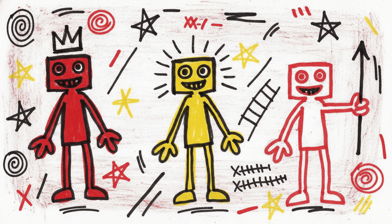
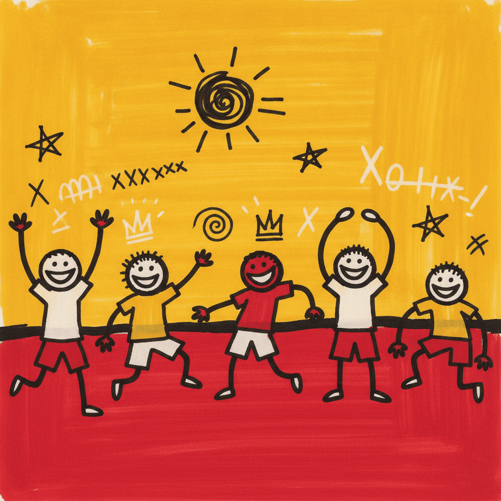
Seventy-eight styles here draw the world. Exactly one also writes on it. A graffiti picture book is built from crude marker strokes, crowns, invented symbols and scrawled fragments — so a thing can be named on the page, not just drawn.
- Crowns, symbols and scrawl drawn with the same pen as the figures
- Crossed-out and over-drawn marks kept, not tidied away
- Harsh black, bold red, electric yellow — no earth tone, no soft light
- Free credits by request — no card
50,000+
Stories Created
10,000+
Active Creators
50+
Art Styles
4.9/5
User Rating
What Makes Graffiti Illustration Different From Simply Messy
Plenty of styles here are rough on purpose. This is the only one where the roughness is carrying a message rather than confessing a lack of training — and the only one that draws writing.
Of seventy-eight styles here, exactly one puts writing inside the picture
Every style in C2Story is driven by a short written brief, and this one asks for fragments of scrawled text as part of the drawing. No other brief in the library mentions writing at all. That sounds like a small detail and it changes everything, because everywhere else the words and the pictures live on separate layers — the illustration is drawn, and then the story text is set on top of it in a typeface. Here a crown, an arrow, a crossed-out shape, a row of scribble and a figure are all made with the same blunt marker in the same pass, so they all sit at the same level of reality. A thing can be marked in this style, not just drawn.
Crowns, cryptic, fragments, explosive, restless — each appears once in the whole library
Run the words of this brief against the other seventy-seven and almost none of them are shared. Crown appears in one brief. So does cryptic, so does fragments, so does explosive, so does restless. Most styles here are assembled from vocabulary that recurs — silhouette, flat colour, thick outline, muted palette, soft light — and this one is built almost entirely from words nothing else uses. It is the most lexically isolated brief in the catalogue, which is a reasonable proxy for how different the output looks sitting next to anything else.
It is the only style that asks you to leave the mistakes in
The brief calls for raw hand-scrawled marks and layered symbols, and it is the only one in the library that keeps crossed-out and over-drawn marks as a feature rather than something to tidy away. That is why its four refusals are all refusals of neatness: clean vector art, smooth gradients, polished rendering and photorealism. Other styles refuse a technique they might fall into by accident. This one refuses the finish — the moment a line stops wobbling and an edge goes crisp, the whole thing reads as a logo of graffiti rather than graffiti.
Four alarm colours, no earth tone, and no light at all
The palette is recorded as a raw graffiti palette: harsh black, bold red, electric yellow and raw white. Those are warning-sign colours, and the absence is as deliberate as the presence — no brown, no ochre, no green, no blue, nothing to settle a page down. The lighting is flat raw lighting, which means no light source, no modelling and no cast shadow anywhere, so nothing can be made important by putting a beam on it. Emphasis in this style comes from one place only: how heavily something has been marked.
Why Graffiti Illustration Refuses a Clean Finish
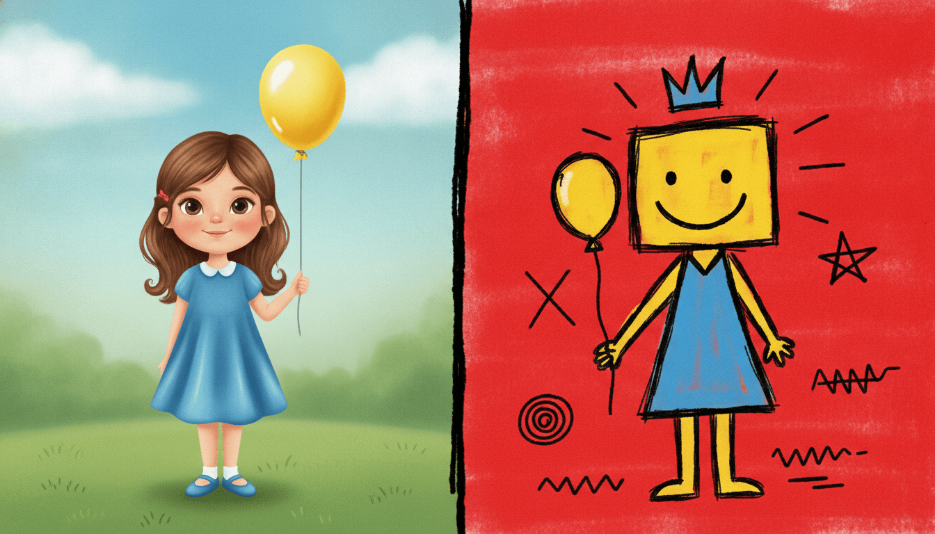
The same girl twice, holding the same balloon. On the left she is drawn the way most illustration draws a child — correct proportions, a carefully made face, hair in strands, smooth shading in the fabric, an even machine-perfect outline and a soft shadow on the grass. Nothing is wrong with it. It has been finished.
On the right the same girl is a crude marker drawing: a blunt wobbling outline that overshoots its own corners, fills scrubbed in with the stroke still showing, a crown scrawled on her head, a halo of short rays, and corrections left in rather than cleaned up. That is the whole trade. All four of this style’s refusals are refusals of neatness — clean vector art, smooth gradients, polished rendering, photorealism — because the moment the line stops wobbling, the picture stops looking like a mark somebody made and starts looking like a design somebody approved.
So think of it as marker, not aerosol. No drips, no soft fades, no chrome lettering. The brief says crude primal marker strokes and refuses smooth gradients outright, which rules out everything a spray can is good at.
And expect the correction to stay visible. Crossed-out and over-drawn marks are part of the look here. If that will bother you on page nineteen, it will bother you on page one.
Its four refusals, in the order the brief states them:
Write Stories Where Things Get Named
Here is the shift worth making before you start a book. In every other style on C2Story, your words and your pictures occupy separate layers: the illustration is drawn, and the sentence is set on top of it in type. This is the only brief that asks for written marks inside the drawing, which means the picture can do something the others cannot. It can label.
So a feeling described is wasted here, and a thing declared is not. “A girl who is proud of her dog” gives the style nothing to mark. “A girl who draws a crown over her dog so everybody knows” gives it a crown, a reason for the crown and a gesture to repeat for twenty pages. Look for the moments in your story where something is named, claimed, crossed out, counted or pointed at — those are the pages this style was built to draw, and most stories have more of them than you would expect.
Give each character a mark. A crown, a spiral, a star, a halo of rays. It appears beside them on every page and readers learn it in about three spreads — far faster than they learn a hat.
Compose the quiet yourself. The brief has no calm setting. One figure and one mark on an empty field will read as silence, but only because the page before it was full.
Worth seeing side by side before you commit: the pictogram style, which borrows from public marks too but reduces each one to a single clean sign, the crayon style, which is the gentle end of the handmade-mark family, and the bold flat style, which keeps the graphic punch but finishes every edge cleanly.
Create a Graffiti Picture Book in 3 Steps
From a one-line idea to a finished book where every page carries the same blunt stroke and the same cast, in under two minutes.
Describe the story
A sentence is enough, but look for the moment in it where something gets named or claimed or crossed out. That is the gesture this style can draw and no other style here can, so putting it in the sentence changes the result more than anything else you could write.
"A boy who crowns everything he likes"
Pick Raw Graffiti Symbolism
Choose it for blunt marker strokes, crowns and invented symbols, visible corrections and a hard black-red-yellow palette. Choose Primitive Marker instead for bold and instantly readable, Art Brut for naive charm, or Bold Street Pictogram for one clean sign per page.
Harsh black, bold red, electric yellow, raw white
Generate and export
C2Story writes the story, breaks it into pages and builds every one to the same brief. Read it on screen, share the link, or export the PDF and take that file to whichever printer or print service you already use.
Whole book built, PDF export, instant sharing
Raw Marker Art and Its Nearest Neighbours
Four real styles built from blunt strokes and deliberate roughness, sorted by the question that actually separates them: why is this drawing rough?
Raw Graffiti Symbolism
Raw symbolic graffiti illustration: crude primal marker strokes, crowns and cryptic symbols, fragments of scrawled text and explosive restless energy, rendering the whole scene with hand-scrawled marks and layered symbols. Harsh black, bold red, electric yellow and raw white under flat raw lighting, with a line weight recorded as crude scrawled marker lines. Its four refusals are clean vector art, smooth gradients, polished rendering and photorealism. One of ten styles in the graphic category, and the only one anywhere in the library that treats a written mark as something to draw.
Art Brut Raw Figure
Raw outsider-art figures drawn with a deliberately unschooled hand — thick wobbly outlines, simplified human symbols, uneven flat fills and off-kilter proportions. The nearest relative by surface, and the one to weigh against this. The difference is why the drawing is rough. That style is rough because the hand does not know how, and its palette says so: earthy brown, muddy red and chalky off-white. This one is rough because the marks were made fast by someone with something to announce, and its palette is harsh black, bold red and electric yellow. One is soil, the other is a siren.
Primitive Marker Cartoon
The only other style in the library built around a marker: thick chunky black outlines, big simple graphic shapes, lopsided proportions and flat bright fills, with strong instant readability even at tiny size as its stated aim. Choose it if you want bold and immediate. Its whole design is to be understood in one glance, and this style is designed to be read over and over — layered, crowded, marked on top of itself. Same pen, opposite intention.
Bold Street Pictogram
Thick continuous black outlines, faceless sign-like figures caught mid-motion and a bold primary palette. It is the closest thing here by subject matter, and the pair are almost a controlled experiment: both borrow from marks made in public, both work in red and yellow and black. A pictogram reduces until one sign means exactly one thing instantly. Graffiti illustration piles signs on top of each other until the surface is overloaded. One is public information, the other is a private language left where strangers can see it.
Two gentler members of the same family are worth knowing about. The crayon style shares the handmade mark and the visible stroke but aims at warmth rather than noise, and the whimsical absurd style keeps the wobbling line while spending it on odd buildings instead of loud ones. Browse everything on the illustration styles hub.
Street Art Story Ideas to Get You Started
This look is far better at naming, claiming, crowds, noise and celebration than it is at light, weather or a quiet room. These six lean into that.
The Boy Who Crowned Everything
A child with one fat marker decides what deserves a crown — the cat, the bus stop, a particularly good sandwich, his sister, eventually himself. The crown is literally in this style's brief, so the book and the look are doing the same job on every page.
Create this storyThings I Am Not Scared Of Any More
A list book where each page is a fear drawn big and then crossed straight out. Crossed-out marks are part of this style rather than a mistake in it, which makes the central gesture of the story something the illustration can actually perform.
Create this storyThe Loudest Day of the Year
Sports day, or a carnival, or the hour after the last bell of term. The brief asks for explosive restless energy and a surface with no calm area on it, so a day that is genuinely too much is the easiest possible fit.
Create this storySigns for Things That Do Not Have One
A child invents a symbol for each feeling nobody has a word for, and marks them around the house. This is the one style here that can draw a made-up symbol as seriously as it draws a person, because both are made with the same stroke.
Create this storyThe Wall at the End of Our Street
A blank wall that gets one mark, then two, then everybody's. A book about a place rather than a person, where each spread is more layered than the last — which is exactly how this style wants to accumulate.
Create this storyMy Brother Started a Band
Four kids, a garage, two drums and a biscuit tin. Noise is hard to draw in a style with soft light and fine detail, and easy in one whose marks are all shouting already.
Create this storyAI-Generated Graffiti Illustration Examples
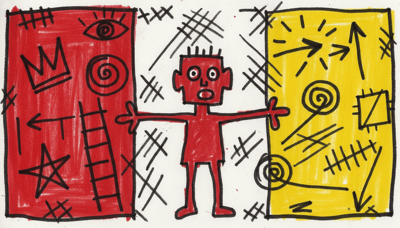
Look at the middle one with the figure covered up. The crowns, spirals, stars and slashes are still doing most of the talking — which is the whole argument for a style that draws its marks as carefully as its people.
Raw Marker Art for Every Part of Your Story
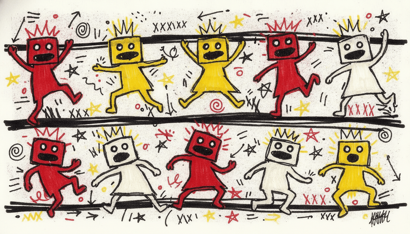
Four characters with four different marks, a cast told apart by build, one figure carrying a page alone, the four-colour palette itself, and whole scenes — the same blunt stroke spent on whatever your story is actually about.
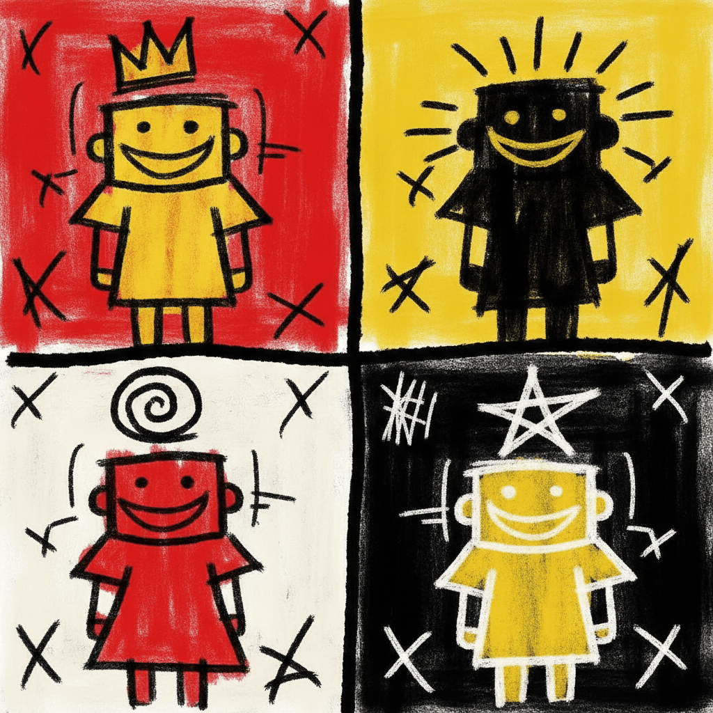
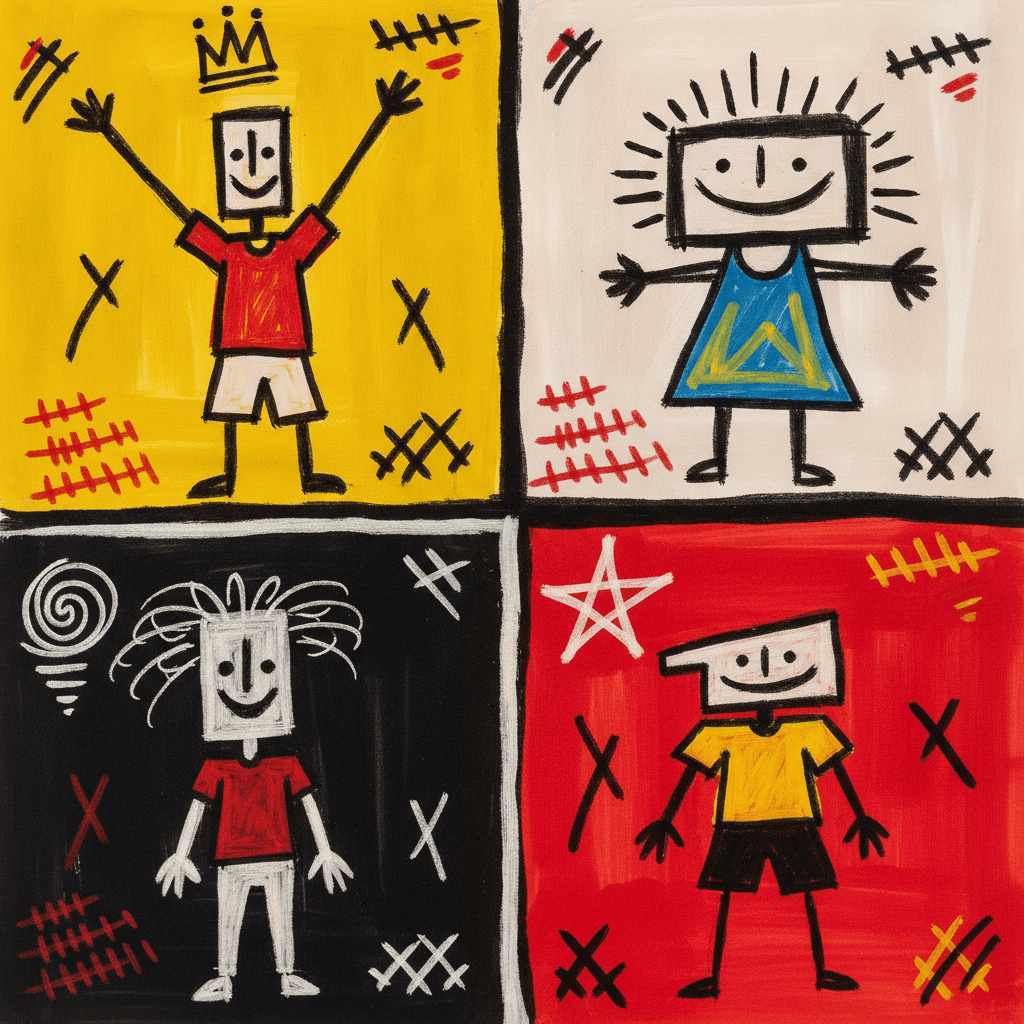
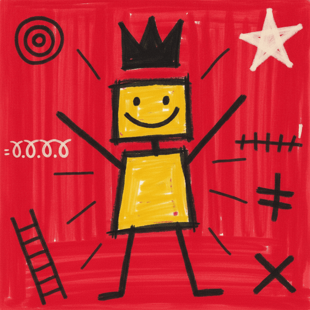
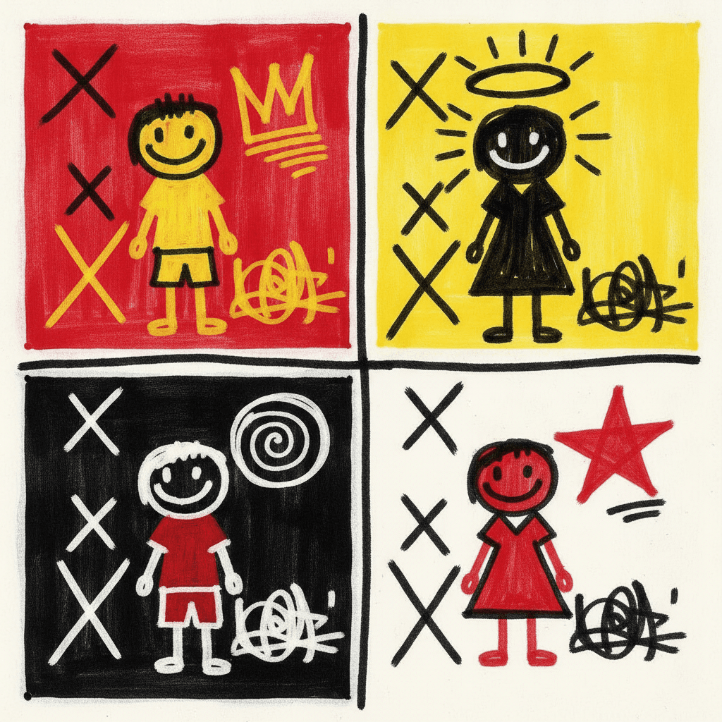
Everything You Need for Graffiti Picture Books
One loud scrawled image is easy. Twenty-four pages that stay rough in the same way, with a cast you can still recognise, is the part that needs building.
A deliberately rough hand that is still the same hand on page twenty-four
Roughness is the hardest quality to hold across a book, because there is no rule in it to fall back on — the lines drift tidy, the fills get even, and by the end it reads as a neat drawing with a few scribbles added. One fixed brief is carried into every page instead: crude primal marker strokes, crowns and cryptic symbols, scrawled fragments, explosive restless energy, harsh black and bold red and electric yellow. The last spread is built from the same instruction as the first.
Characters held together by build and mark
Be honest about the trade here: a brief that asks for a crude unschooled stroke will not reproduce a delicate face identically twice, and fine identifying detail is not what this style is for. What does carry is bigger — how tall, how wide, the shape of the head, which of the four colours a character is filled with, and what symbol belongs to them. Save each one in the Character Library with up to fourteen reference images and they are reused across every page and into later books. Characters built from an uploaded photo stay private to your account.
A symbol per character, which no other style can give you
This is the practical trick worth knowing. Because marks belong to the drawing here, you can hand a character a crown, a spiral, a star or a halo of rays and have it appear beside them on every page — a signature rather than an accessory. Readers pick these up startlingly fast, and in a style with no faces to study closely it does more work than hair colour or a hat ever would.
Loud by specification, so plan the volume
The brief asks for an explosive restless surface with nothing calm on it, and it means it. That is a gift for about eight pages and a problem for twenty-four, so build the quiet into your writing rather than expecting the pictures to supply it: a page with one figure and one mark will read as a held breath next to a page that is completely full. The contrast has to be composed, because the style will not offer it.
A whole book, not one wall
Graffiti art almost always exists as a single image — one wall, one canvas, one print. You are not prompting for one of those. Describe the story and C2Story writes it, breaks it into pages and builds each page to this brief according to what that page actually says, so the energy is spent across a narrative instead of all at once.
Read-aloud, in whichever language you read in
Big marks, four hard colours and no fine detail hold up well on a lap, on a phone screen and at the back of a classroom. Write in English, Chinese, Japanese, Spanish, French and more — the look does not change with the language of the text, and the typeset words of your story stay perfectly legible because they are set as type rather than drawn.
Graffiti Picture Books — Questions
What people ask before committing a whole book to blunt marker strokes, four hard colours and corrections left in.
Explore More Story Ideas
Discover more styles, tools, and story types
Bug Stories
Ladybugs, butterflies, busy bees and glowing fireflies
Explore
Comic Book Stories
Action-packed panel layouts
Explore
AI Story Generator
Generate complete stories with AI
Explore
Storybee Alternative
More styles & features
ExploreGraffiti Picture Books — Crude Marker Strokes, Invented Symbols and Corrections Left In
A graffiti picture book borrows a way of making marks that was never meant for books at all — the crown scrawled over a name, the symbol invented on the spot, the line gone over twice because there was no time to go over it once — and asks it to carry a story instead of a claim on a wall. On C2Story this is the Raw Graffiti Symbolism style, and its brief states the ambition plainly: raw symbolic graffiti illustration, crude primal marker strokes, crowns and cryptic symbols, fragments of scrawled text and explosive restless energy, rendering the full expressive scene the story describes with raw hand-scrawled marks and layered symbols. One brief applied across a whole book, so the twentieth spread is built from the same instruction as the first.
The thing worth knowing before you commit a book to it is which part of that is genuinely rare. Roughness is not rare here: of the seventy-eight hand-drawn styles enabled in C2Story, four describe their own line as crude, and several more ask for a wobbling or unschooled or deliberately clumsy hand. What is rare — unique, in fact — is fragments of scrawled text. No other brief in the library mentions writing in any form. Everywhere else, words and pictures are kept on separate layers: the illustration is drawn and the sentence is set on top of it in a typeface, as it is in almost every picture book ever printed. Here a crown, an arrow, a crossed-out shape, a row of scribble and a child are all made with the same blunt marker in the same pass, which means they all sit at the same level of reality. A thing in a graffiti illustration can be marked — named, claimed, counted, pointed at — and the mark is part of the art rather than a caption attached to it.
Follow that through and the rest of the brief stops looking like decoration. Run its words against the other seventy-seven and barely any of them are shared: crown, cryptic, fragments, explosive and restless each appear in exactly one brief in the whole catalogue, which makes it the most lexically isolated style in the library and a reasonable bet to look unlike anything sitting next to it. Its palette is recorded as a raw graffiti palette — harsh black, bold red, electric yellow and raw white — and the absences matter as much as the colours: no brown, no green, no blue, nothing that could settle a page. Its lighting is flat raw lighting, meaning no light source, no modelling and no cast shadow anywhere, so nothing can be made important by lighting it; emphasis comes only from how heavily a thing has been marked. And its four refusals are all refusals of neatness — clean vector art, smooth gradients, polished rendering, photorealism — which is also, usefully, the clearest line between this and the two styles nearest it. The Art Brut style is rough because the hand is unschooled, and its palette of earthy brown and muddy red says so. The Primitive Marker style uses the same instrument and aims at instant readability at tiny size. This one is rough because the marks were made fast by somebody with something to announce, and it is the only one of the three that brings symbols into the picture alongside the people. The pictogram style makes the comparison sharpest: both borrow from marks made in public, and both work in red, yellow and black, but a pictogram reduces until one sign means one thing instantly, while graffiti style layers signs until the surface is overloaded.
Three honest notes, because this style is easy to choose for the wrong reason. First, it is marker graffiti, not spray-can graffiti — the brief asks for crude primal marker strokes and refuses smooth gradients, which rules out drips, soft fades, chrome lettering and wildstyle tags; if aerosol softness is what you pictured, nothing in the library does it. Second, there will be no readable words in the pictures. The scrawled fragments come out as mark-making that reads like handwriting from across a street but spells nothing, which is the honest outcome: image models are poor at letterforms, and a page of nearly-words is worse than a page of frank scribble. The real words of your book are set as type and stay perfectly legible. Third, it is loud on every page by specification, so compose the quiet yourself — one figure and one mark will read as a held breath, but only after a spread that was completely full. For a settling-down book use the gouache style or the nordic whimsy style; for expressive faces, the cartoon style; for the same graphic force with every edge finished, the bold flat style. On consistency, save your cast in the Character Library with up to fourteen reference images each and build them from build, fill colour and their own symbol rather than from fine facial detail, because that is what survives a deliberately crude stroke; characters built from an uploaded photo stay private to your account. Write in any language you read aloud in, then export the finished book as a PDF, which is the handoff to whichever printer you already use, and the images you generate are licensed for commercial use. Start free: see our pricing plans, browse every option on the illustration styles hub, or go straight to the AI Story Generator.