Company Story BookYour Reader Has Something Better to Do
Every other book made here is for someone who loves the subject. A company story book is the only one whose reader is a stranger who did not ask for it — so the whole job is attention, not sentiment. One clear idea per page, eight pages, and a cast that looks the same from the first spread to the last.
- Turn a pitch narrative or an about page into an illustrated short book
- One drawn idea per page — the rule the page planner already uses
- The customer is the protagonist; your company is what changes for them
- Your brand palette as art direction, in one consistent style throughout
250,000+
Stories Created
80,000+
Characters Saved
45+
Art Styles
4.9/5
Creator Rating
How to Make a Company Story Book
Three steps. The hard one is the first, and it is not a design problem.
Write the Page List First
Before any tool. Number one to eight down a page and write one sentence per line — the one thing that page shows. If two lines say the same thing, delete one. If a line cannot be drawn as a single scene, it is a paragraph, not a page. Most companies stall here for an hour, and that hour is the actual work.
40 slides → 8 lines
Cast the Customer, Not the Brand
Save the protagonist as a character — the person you sell to, the new starter, the founder for an origin book — with a fixed look and a portrait. That saved record is what keeps the same face on every page, and it is also what sets the book's visual direction for everything drawn afterwards.
1 lead + 2 supporting
Pick One Style and Hold It
Choose an art style whose natural palette already sits near your brand, add your colours as art direction, and generate. The style is locked across the whole book by design, so page eight matches page one. Then export the PDF and set your real logo and type in your own layout.
8 pages, one look
Your Company Is Not the Hero of Your Company Story Book
This is the failure mode, and here it is also a technical decision with visible consequences.
The Brand as Protagonist
- “We were founded in 2019 with a bold vision” — page one, and the reader is already gone.
- Nothing changes across the book, because a company is not a thing that can learn something on page five.
- Cast a logo or a mascot as the lead and it becomes the style anchor every later page is drawn against.
- Reads as a company talking about itself, which is the exact genre readers are immunised against.
The Customer as Protagonist
- Page one is a person with a problem. Page eight is the same person without it.
- Your company is the turn in the middle, not the subject — and it lands harder for being smaller.
- A human lead gives the book a world: their desk, their commute, their bad afternoon.
- Everything drawn afterwards keys off that lead, so the book looks like the reader's life rather than your deck.
The generator settles the book's style guide from the protagonist's image — the code comments call it the style DNA — and every supporting character and scene afterwards references that guide to stay consistent. Casting is therefore an art-direction decision as much as a narrative one. Whoever leads, leads the look.
Why the hero question is not just a copywriting opinion
Which Business Story Book Are You Making?
Four different readers, four different page budgets. Trying to write one book that does all four is how you get a brochure.
What We Actually Do
A prospect who half-understands your category
The hardest one, and the one most companies get wrong by explaining the mechanism instead of the change. The protagonist is a customer with a problem on page one and without it by page eight. Your product appears in exactly two of those pages and is never described in more detail than the reader needs to believe the ending.
Why We Exist
An investor, a journalist, a candidate deciding
The origin story, which is the one people already tell out loud and the one that survives retelling. It has a natural shape — a specific annoyance, a stubborn attempt, the thing that unexpectedly worked. Resist the founder-as-hero version; the interesting page is always the one where the first attempt failed.
How It Works Here
Somebody in their first fortnight
The onboarding book, replacing the handbook nobody opened. It works because a new starter remembers a drawn scene of someone asking an awkward question far longer than a bullet point saying we value candour. Cast a new joiner as the protagonist and let them make the normal mistakes on the page.
What We Believe
Everyone, eventually
The values book, which is worthless as a list and useful as a set of incidents. One value, one page, one moment where holding it cost something. If you cannot write the moment, you do not have the value yet — which is the most valuable thing a company story book can tell you about your own company.
One Idea Per Page Is a Product Rule, Not Advice
Leave the page count on Auto and a planning pass reads your text and sizes it at roughly one clear visual moment per page. Borrow the rule even when you set the number yourself.
4 pages
A single claim, drawn. The handout at a stand, the thing in the welcome pack. Harder than it looks, and often the most read book a company owns.
8 pages
The default for explaining what you do. Problem, attempt, turn, result, with room for one page that exists only to be enjoyed.
12–16 pages
Origin stories and onboarding. Twelve if the reader is choosing whether to care, sixteen if they already work here and are paid to read it.
Thirty-two pages is available and is almost always the wrong answer
The presets run four, eight, twelve, sixteen, twenty-four and thirty-two, and the temptation on a business book is to take the big number because there is a lot to say. There is not. There are usually three things to say and thirty-seven things you are attached to. A longer company story book does not fail by boring people — it fails earlier than that, because a thick illustrated book handed to a prospect reads as homework and never gets opened. Take eight, and put the rest on your website where people go looking for it.
Your Brand Palette Is a Request, Not a Lock
Worth understanding before anyone from brand looks at a draft, because the honest version saves an afternoon of arguing with a model.
Colours: a strong preference
A stated palette is passed through with each image as art direction, with the explicit instruction to apply it only where it is compatible with the selected style and colour mode — and that it does not change the rendering medium. Choose a style whose natural palette already sits near your brand and the two stop competing.
Marks: redrawn, not reproduced
The style lock says references never override the selected style and that every referenced element is redrawn in it. A mascot or a character survives that beautifully. A precise logotype does not. Keep lettering out of the artwork and place the real logo in your own layout after export.
Style: locked on purpose
One rendering medium runs across people, backgrounds, architecture, props and shadows for the whole book, and a request for cinematic lighting on page six is not permission to change it. On a brand storybook that consistency is the product: a book that changes look halfway through reads as unfinished.
What Actually Goes in a Company Story Book
Specific incidents, not positioning statements. Pick eight of these and you have a page list.
Notice that every line names a thing that happened. “We are customer-obsessed” is not on the list because it cannot be drawn, and anything that cannot be drawn cannot be a page.
Pages a Brand Storybook Usually Needs
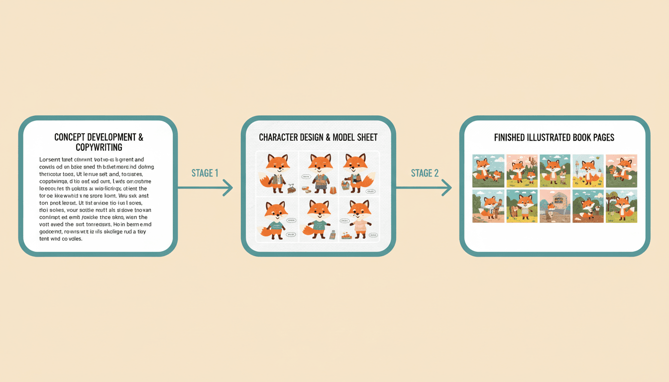
The Workflow
Copy in, pages out
The Page Budget
Eight ideas, eight pages
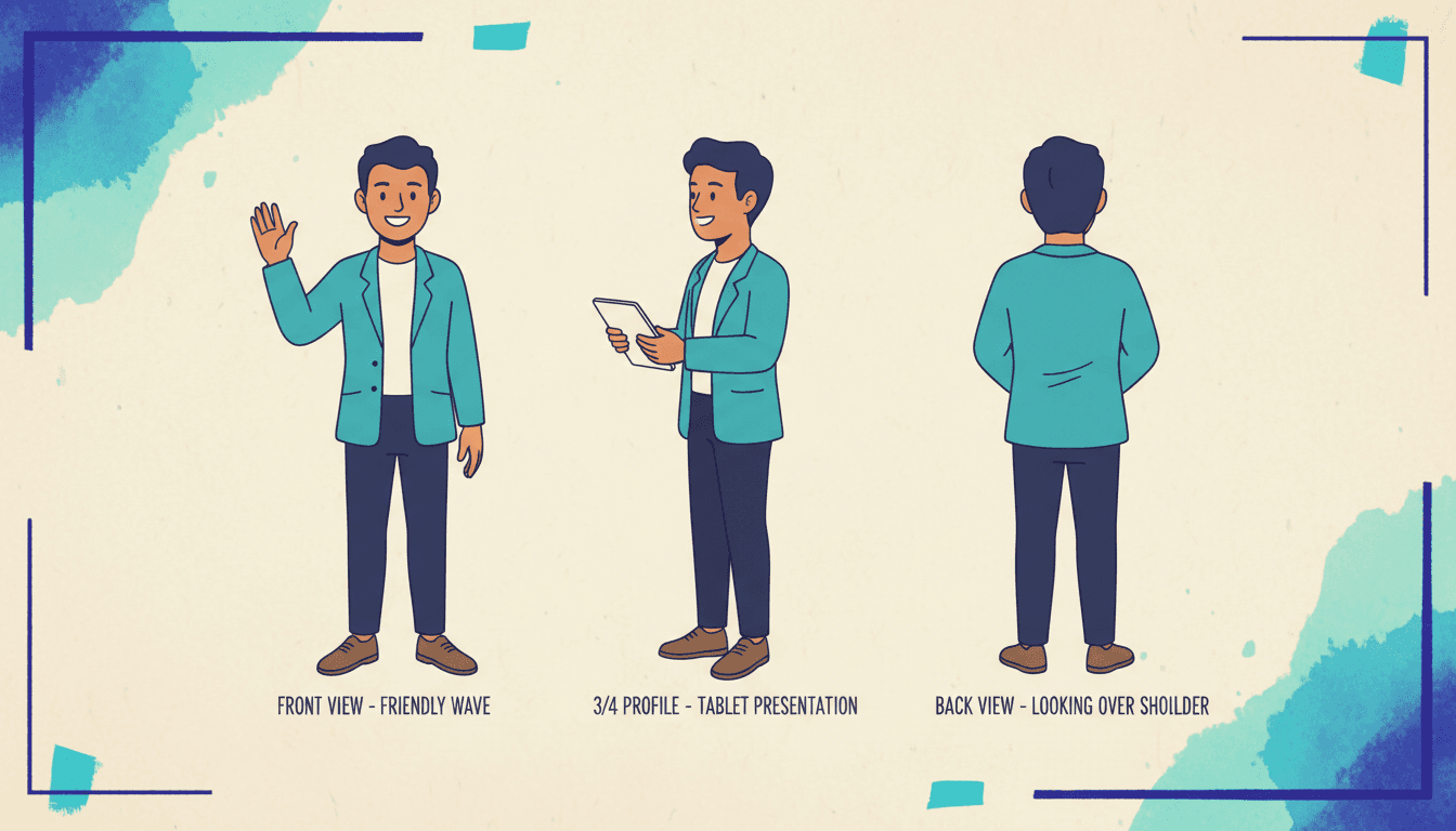
The Cast
One customer, on model
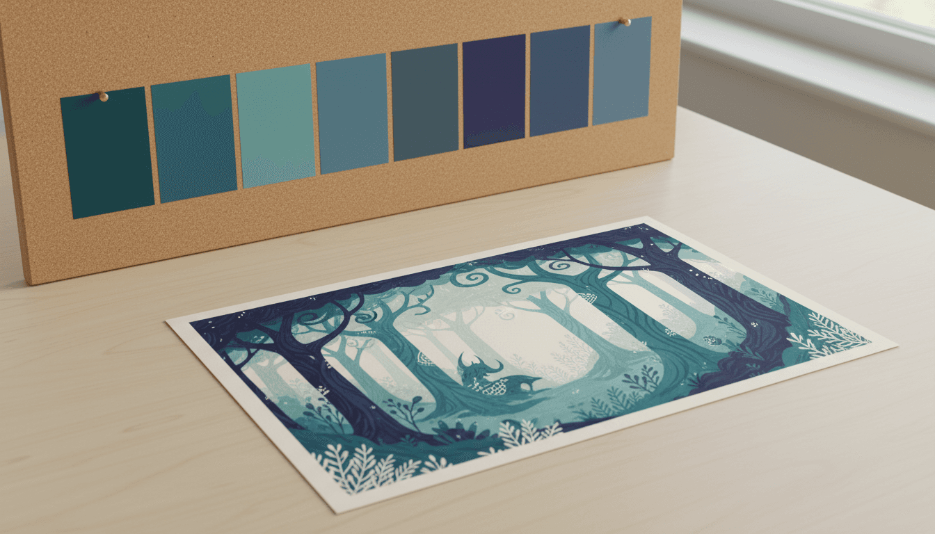
The Palette
Brand colours, requested
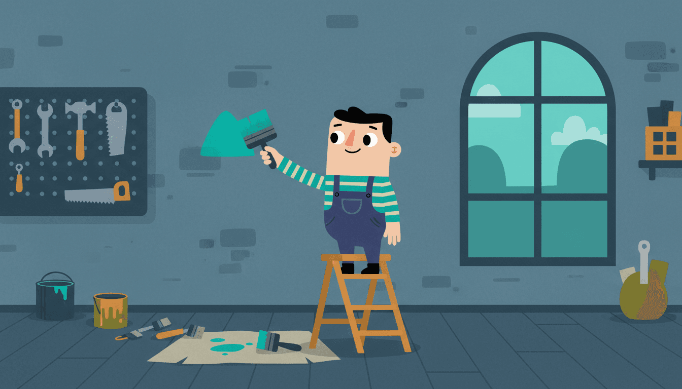
The Mark
Drawn, not pasted
What a Company Story Book Does That a Deck Cannot
Six things worth knowing before you brief the first page — including the two that will disappoint someone.
Your Reader Did Not Ask for This
Every other book made here is made for somebody who loves the subject — a child, a grandparent, a pet. A company story book is the only one whose reader is a stranger with something better to do. That single fact sets every constraint on the page: the length is a budget rather than a preference, the first spread has to earn the second, and a sentence that only makes sense if you already work there is a wasted page.
The Protagonist Sets the Look
This is not a metaphor here, it is how the generator is built: the book's style guide — the internal comments call it the style DNA — is derived from the protagonist's image once it is settled, and every supporting character and scene afterwards references that guide to stay consistent. Cast a customer as the lead and the whole book looks like their world. Cast your logo as the lead and your logo becomes the visual DNA of all sixteen pages, which is exactly as strange as it sounds.
One Clear Idea Per Page
When the page count is left on Auto, a planning pass reads the text and sizes it at roughly one clear visual moment per page, clamped to a sensible range. That is worth stealing as an editorial rule even if you set the count by hand: a spread that has to carry two ideas carries neither. Most business copy fails this test on the first read-through, and finding that out is the useful part.
Brand Colours Are a Request
You can state a palette preference as art direction, and the instruction the model receives says to apply it only where it is compatible with the selected art style and colour mode, and that it does not change the rendering medium. So a teal-and-slate brand comes through clearly in a watercolour book and is honestly negotiated in a hard-inked comic. It is a strong preference, not a hex-code lock, and knowing which one you have before you brief a page saves an afternoon.
Your Mark Gets Redrawn, Not Pasted
Reference images supply faces, clothing, shapes and layout — and the style lock is explicit that references never override the selected style and that every referenced element is redrawn in it. Which means a mascot survives beautifully and a logotype does not come back pixel-exact. Use the mascot for likeness, keep type out of the artwork, and set the real logo and wordmark in your own layout tool after export.
Unreleased Work Stays Yours
Two things worth knowing before an unannounced product goes into a draft. A character built from an uploaded photograph is stored private unconditionally, on any plan. And economy mode — which quietly reuses a close-enough picture from the shared public asset library instead of paying to generate a fresh one — is genuinely useful for an open-plan office and wrong for anything that has to be specifically yours. Leave it off for the pages that matter.
One Style, Front to Back
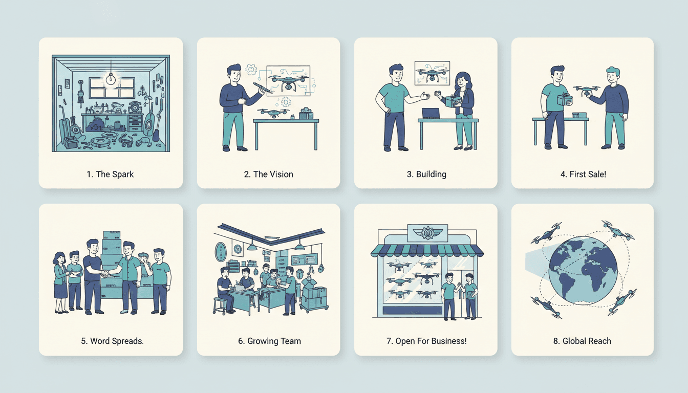
One Style, Front to Back

Four Books, Four Jobs
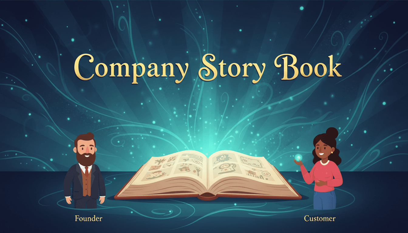
The Story You Keep Retelling
Where to Go From Here
You already have the copy
A pitch narrative, an about page, a founder essay — paste it and have it segmented into pages instead of rewritten from scratch.
Text to illustrated bookThe cast has to hold across books
If the same customer or mascot appears in book two and book three, lock the design once and reuse the record.
Character consistencyYou need a thirty-second version
The pages you already made can drive a short trailer for a launch post or a conference screen.
Book trailer makerLegal changed one sentence
One line of copy should not cost you eight fresh illustrations. Editing a finished book is its own job.
Edit a finished bookCompany Story Book Questions
Explore More Story Ideas
Discover more styles, tools, and story types
Dragon Stories
Epic fire-breathing adventures
Explore
Comic Book Stories
Action-packed panel layouts
Explore
Picture Book Maker
Create illustrated picture books
Explore
Storybee Alternative
More styles & features
ExploreA Company Story Book Is the Only Book Here Whose Reader Did Not Ask for It
Almost everything else made with this tool is made for somebody who already loves the subject. A book about a five-year-old is read by people who adore that five-year-old. A pet memory book, a christening keepsake, a grandparent's life story — the audience arrives willing. A company story book is the exception, and that one difference sets every constraint that follows. Your reader is a prospect who half-understands your category, a candidate with four other offers, an investor on the fourteenth meeting of the week, a new starter on day three. None of them asked for this. All of them can stop at any moment, alone, with nobody watching. Which means the currency of a business illustrated story is attention rather than sentiment, and attention is the one thing a forty-slide deck was never designed to earn from a stranger holding it unsupervised.
So the first job is not design, it is subtraction. Before opening any tool, number one to eight down a page and write a single sentence per line saying what that page shows. Two lines that say the same thing become one. A line you cannot picture as a single drawn scene is not a page, it is a paragraph that has not been decided yet. This is the hour that most companies stall in, and it is also the hour that does the work: the page list is where you find out that three of your four differentiators are the same differentiator, and that the thing your customers actually repeat back to you is on none of your slides. The tool will happily size a chapter for you — left on Auto, a planning pass reads the text and returns a page count at roughly one clear visual moment per page — and that rule is worth stealing by hand, because a spread carrying two ideas carries neither.
The second job is casting, and the single most common failure in a brand storybook is making the brand the hero. A company is not something that can want anything, lose anything or learn anything on page five, so a book with the company as protagonist has no story in it at all — just eight pages of an organisation describing itself, which is the precise genre every reader is immunised against. The customer is the protagonist. Page one is a person with a problem, page eight is the same person without it, and your company is the turn in the middle, landing harder for being smaller. There is a mechanical reason to get this right as well as an editorial one: the book's style guide is settled from the protagonist's image once it is locked, and every supporting character and scene afterwards references that guide to stay consistent. Casting the lead is an art-direction decision. Cast a person and the book looks like their world; cast a logo and the logo becomes the visual DNA of every page after it.
Length deserves its own paragraph because business instincts run the wrong way here. The presets are four, eight, twelve, sixteen, twenty-four and thirty-two pages, and for a prospect-facing book about what you do, eight is usually correct and four is often better. An origin story can hold twelve. An onboarding book earns sixteen, because its reader is paid to be there and a drawn scene of somebody asking an awkward question on their first week outlives any bullet point claiming you value candour. What almost never works is thirty-two. A long illustrated company story book does not fail by boring people — it fails before that, because a thick book handed to a prospect reads as homework and never gets opened. Put the eight pages in their hands and leave the other thirty-seven things on your website, where people who want them go looking.
Two honest limits, both better discovered here than in a review with your brand lead. Colour first: you can state a palette as art direction and it travels with every image, but the instruction attached to it says to apply it only where compatible with the chosen art style and colour mode, and that it explicitly does not change the rendering medium. It is a strong preference, not a hex lock, and the way to win is to pick a style whose natural palette already sits near your brand so the two stop fighting. Marks second: reference images supply faces, clothing, shapes and layout, and the style lock states plainly that references never override the selected style and that everything referenced is redrawn in it. A mascot or a recurring character comes through that process beautifully. A precise logotype does not. So keep lettering and marks out of the generated artwork, export the pages, and set your real logo, wordmark and type in your own layout tool where they will be pixel-exact. One more worth knowing before an unannounced product goes into a draft: a character built from an uploaded photograph is stored private unconditionally on any plan, and economy mode — which reuses a close-enough picture from the shared public asset library rather than generating a fresh one — is a sensible saving on a generic open-plan office and the wrong choice for anything that has to be specifically yours.
What you end up with is a book in your account that can be shared by link, plus a per-book PDF download as a paid one-off. On rights, the terms are worth reading rather than summarising: you retain ownership of the prompts and creative inputs you provide, and for the generated output you are granted a non-exclusive worldwide licence to use, download, share and commercially use it — a broad commercial licence rather than a transfer of copyright, with an explicit note that AI-generated content may not be eligible for copyright protection in every jurisdiction. There is no printing or shipping operation behind this, so the PDF is the handoff to your printer: a local print shop, a photobook service, or a stapler for the first proof. For a business book that order is right anyway. Print five, put them on a stand at one event or leave them on a desk in reception, and watch whether strangers get past the third spread — then rewrite and print two hundred. Most companies making a corporate storytelling book for the first time end up making a second within a month, because the cast and style are already saved and because the page list exercise tends to change how they describe themselves out loud. If the copy already exists, start with turning written text into an illustrated book; if the same mascot or customer has to appear across several books, lock the design once with the character consistency tool; and if a launch needs a thirty-second cut of the finished pages, the book trailer maker is the next door.