
Youth Emotion Picture BooksNothing Has Dried Yet
Of the seventy-eight style briefs here, exactly one names music. A youth emotion picture book is built from that one — the only style that borrows not how a moving picture looks, but how one is timed.
- Thin translucent washes layered over visible paper
- A flowing fluid line that is allowed to break off
- Soft bleeding edges — the only brief that refuses a hard one
- Free credits by request — no card
50,000+
Stories Created
10,000+
Active Creators
50+
Art Styles
4.9/5
User Rating
What Makes Youth Emotion Different From Any Other Soft Style
Every style here is a written brief — a palette, a light, a line weight, a short list of refusals. Four lines in this one decide everything, and each of the four appears in no other brief in the library.
The only brief in the library that names music
Every style in C2Story runs on a short written brief recording a palette, a lighting note, a line weight and a few things to avoid. Read all seventy-eight hand-drawn briefs and exactly one of them mentions music: this one asks for a music-video mood. Run the synonyms — song, lyric, album, band, melody, concert — and only two other briefs even register, one of them a Song-dynasty landscape and the other a wash described as lyrical. Nineteen of the seventy-eight do borrow from a moving picture of some kind: cinematic light, cel animation, stop-motion texture, a frame-by-frame look. Every one of those borrows how a moving picture looks. This is the only brief that borrows how one is timed. A music video cuts its images to something that is not in the frame, which is why its pictures are allowed to be about a feeling the scene itself never explains.
The only brief that refuses a hard edge by name
Six of the seventy-eight briefs refuse a heavy outline, which is a refusal about the line. This one is the only brief in the library whose list of refusals names the edge itself — a hard rigid edge — and that is a refusal about the boundary between any two colours, line or no line. The consequence is strange and worth understanding before you pick it. If no colour is allowed to stop cleanly, then no shape in the picture is closed, and nothing in the picture is finished. A wash drifts past its own contour, pools where it meets another, and feathers out into bare paper. It is the one style here that cannot make something look settled, decided or done — which turns out to be exactly the right disability for a book about being sixteen.
Transparency used for layering, not for lightness
Three of the seventy-eight briefs refuse opaque paint outright, and it is worth knowing what the other two do with that freedom, because it is not this. One is an airy watercolour look that spends transparency on lightness: minimal linework, abundant untouched paper, calm and breathable. One is a poetic ink-wash storybook that spends it on gentle bleeding warmth. Both of them let the line go faint to get there. This brief keeps a flowing fluid line at full strength and spends the transparency on layering instead: translucent overlaid washes, so where two colours cross a third one appears and you are looking through one moment at another. That is why the colour here is allowed to be gently uneven — a little denser at one side, with tide lines where a wash dried — rather than smooth.
A light that passes through the colour instead of falling on it
The lighting note is the quickest way to tell these briefs apart, so it is worth reading all seventy-eight of them in a column. Forty-five say some version of flat — flat graphic, flat even, flat shadeless — which is the house default here. The rest name a direction or a quality: strong dramatic directional light, warm nostalgic glow, high-contrast hard directional light, soft misty daylight. This one says soft translucent glow, and it is the only lighting note in the library where the light goes through the colour rather than onto it. Nothing is lit from anywhere. There is no visible sun, no lamp, no shaft, and nothing casts a shadow, because the colour itself is the light. Which means the mood of a page cannot be set by the lighting here. It has to come out of the colour you cross over another one.
A Youth Emotion Page Is Defined By What It Will Not Do
Each brief ends with a short list of things to avoid, and reading that list is usually the fastest way to understand a style. This one refuses four: opaque flat fills, hard rigid edges, heavy outlines and generic chibi faces.
The second one is the rare one. Six briefs here refuse a heavy outline, which is a refusal about the line. Only this one refuses the edge itself, and an edge exists between any two colours whether a line is drawn there or not. Give that away and no shape in the picture can close. The first refusal takes the other half of the same thing: with no opaque fill, no colour can sit on top of another and hide it, so every layer stays visible underneath.
Which is why the youth emotion brief reads like a style with a disability until you notice what the disability buys. Nothing here can be made to look settled, decided or finished — and that is the one quality a book about being sixteen most needs its pictures not to have.
Every Quiet Style Here Leaves The Page Empty For A Different Reason
Eight other styles in C2Story leave a great deal of the page bare, and they are easy to mistake for one shelf. They are not, because the emptiness is doing a different job in each.
In fine-line ink the white space is distance. In minimalist it is subtraction. In the deadpan cartoon it is the beat before the joke lands. In sumi-e it is breath. In negative space the gap is a second picture. In muted editorial it is headroom. In fashion line it is room for one contour. In city pop it is clearance for a hard colour clash.
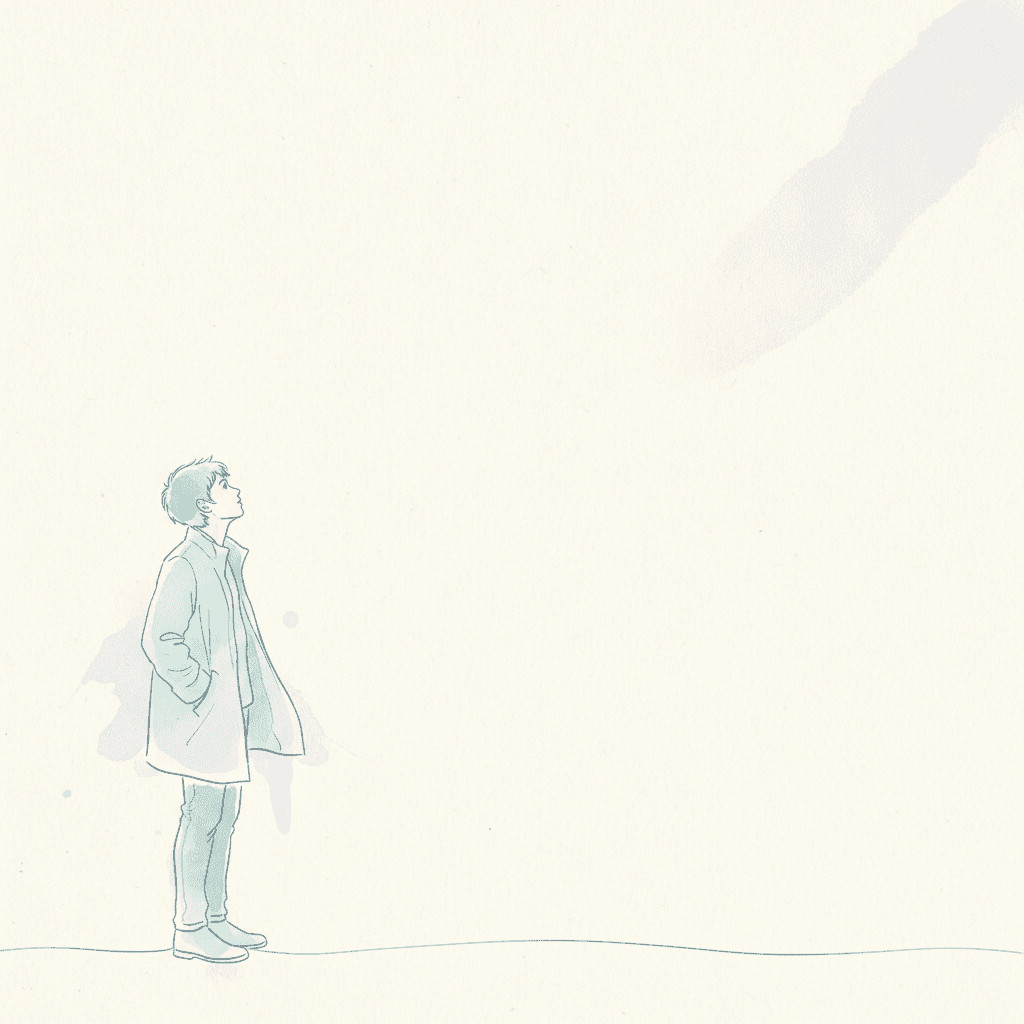
Here it is none of those. The empty paper is the unfinished edge — the place where the contour broke off and the wash kept going. In every other style the bare page is drawn deliberately. This is the only one where it is the drawing running out, which is also why it is the one brief in the library that cannot be asked to look resolved.
From One Sentence to a Book of Held Moments
You pick the look once. The brief is then applied to every page of the story, so the mood accumulates instead of arriving in one image.
Describe a stretch of time, not an event
A sentence is enough, and the less decided it is the better this style works. The last train home. The week before she managed it. The day neither of them said goodbye. You do not need a plot turn — you need somebody in a place, with the thing still open.
Choose the Transparent Youth Emotion style
Picking it fixes the whole brief at once: flowing fluid linework, translucent overlaid washes on paper texture, soft aqua, pale rose and hazy lavender under a soft translucent glow, and the four refusals. Save your characters first and they stay recognisably themselves under every layer.
Get a book, not one lovely picture
C2Story writes the story, splits it into pages and builds each page to the brief according to what that page says. Your words are set as type rather than lettered into the art. Read it on the web, share it, or buy the PDF to hand to a printer.
This Style and Its Three Nearest Neighbours
Four looks in the library sit close to this one. Here is what each actually asks for, so you can take the right one rather than the first one.
Transparent Youth Emotion
The style on this page
A youthful emotional illustration built from translucent layered colour in a music-video mood, with flowing fluid linework, translucent overlaid washes with soft edges and paper texture, gentle uneven colour and breathing negative space. Its palette is transparent washes of soft aqua, pale rose and hazy lavender; its light is a soft translucent glow; its line is a flowing fluid line; and the four things it refuses are opaque flat fills, hard rigid edges, heavy outlines and generic chibi faces. Its own preview line describes a wistful young figure with hair drifting in translucent washes of colour. It will render whatever scene your story actually describes in that same transparent flowing wash.
Anime
The easiest mix-up, and the exact mirror image
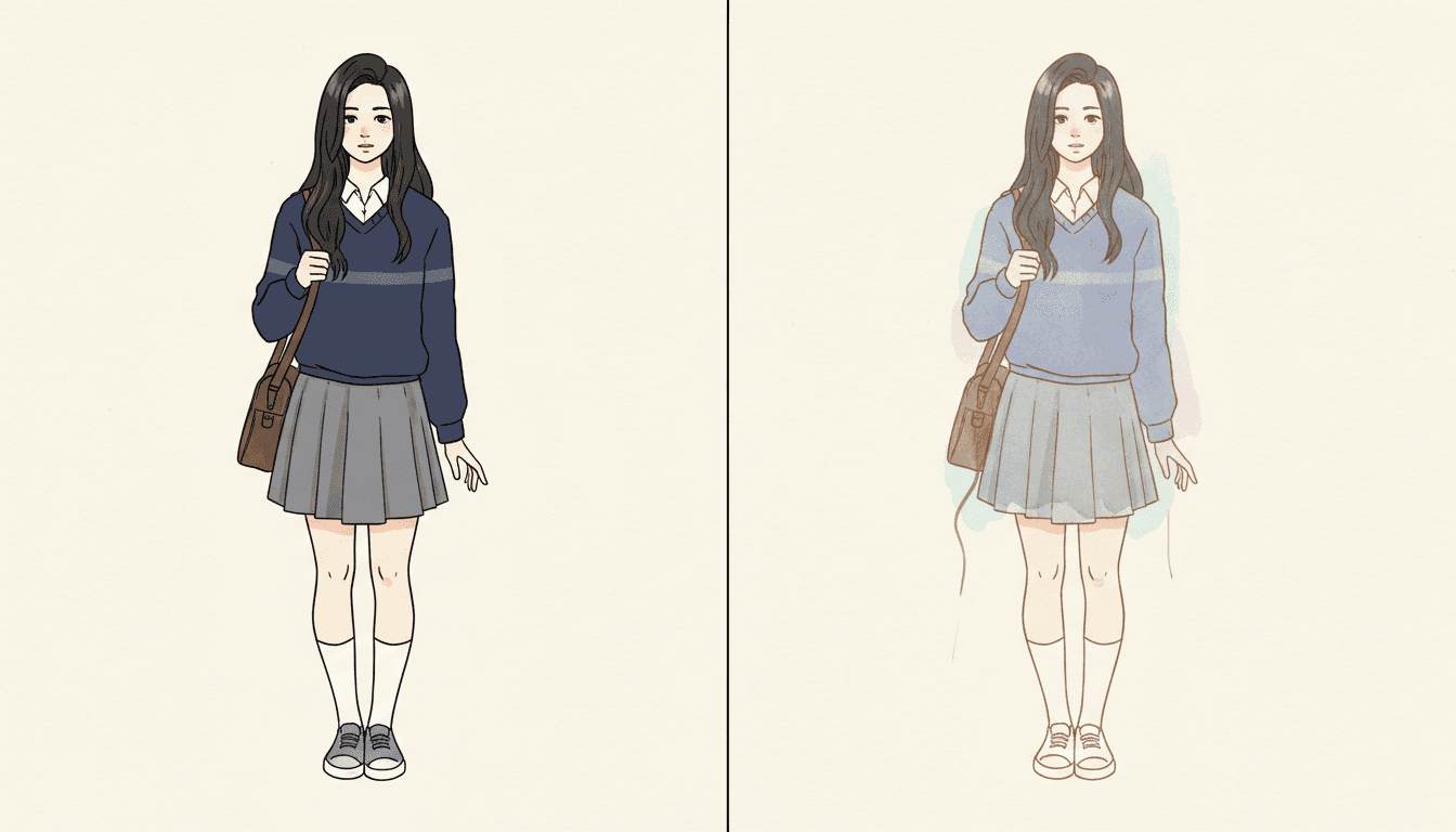
Both looks are contemporary Japanese illustration of young people, which is why people land on the wrong one. Read what each is built from and they are opposites. The anime style here is a cel look: crisp confident inking, flat colour blocks, screentone and hard-edged shading, a drawing where the line encloses the colour and the colour stops dead at the line. This brief names opaque flat fills and hard rigid edges as the first two things it will not do. One style seals the colour in; this one lets it leak out. Take anime when you want the page to look printed, graphic and certain. Take this one when you want it to look like it has not dried yet.
Sumi-e Ink Wash
Same wet transparency, one pigment instead of four
The closest relative on technique, and the distinction is genuinely useful. Both styles are thin wet transparent paint on visible paper, both leave a great deal of the page bare, and both are built on an edge that bleeds. The difference is what the transparency is varying. Sumi-e is one pigment at different strengths, so it thinks in value — light and dark, near and far, and the breath between them. This brief layers four colours over one another, so it thinks in hue, and the thing you are meant to notice is the third colour that appears where two of them cross. Take sumi-e for stillness and distance. Take this one when the feeling on the page is made of two feelings at once.
Nordic Whimsy
Also tender and quiet, about a much smaller world
The nearest relative on feeling rather than on method, and the two are often confused by people who simply want a gentle book. Nordic whimsy is cosy and a little lonely: a small world, a fine line, a tender interior, somebody content to be where they are. This brief is not cosy and is not content. The feeling it is written around is the held, unresolved kind — somebody halfway through realising something, with the picture declining to tell you what. Take nordic whimsy when the page is a warm place. Take this one when the page is a person who has not worked it out yet.
Youth Emotion Story Ideas That Suit the Brief
Each of these plays to the same strength: a person in a place, and nothing settled by the last page.
The Last Train Home
A whole book set in the forty minutes between leaving and arriving, when nothing happens and everything is being decided. A style whose brief is a music-video mood is built for a stretch of time with no events in it.
We Did Not Say Goodbye
Two friends on the last day of a school year, neither of them managing to mention it. The one style here that cannot make a shape look closed is the right one for a story that does not resolve.
The Summer I Learned To Ride
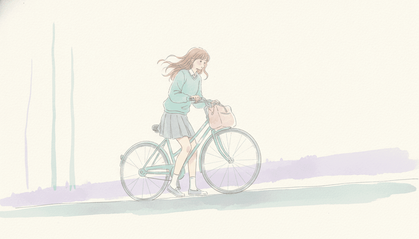
Not the day she managed it — the eleven days before. Translucent layered washes let a page carry both the wobble and the wanting at the same time.
A Letter I Never Sent
Nine pages, one envelope, and a girl who keeps putting it in her bag. Where two washes cross, a third colour appears, which is a useful thing when the character wants two opposite things.
The New School, Week One
Corridors, a wrong classroom, a seat nobody saved. Breathing negative space is the whole subject of a book about not yet belonging anywhere.
Something Changed In August
A brother and sister who used to share everything and suddenly do not, told without once naming it. A picture that is allowed to carry a feeling the scene never explains can hold a story like this one.
What a Translucent Layered Wash Actually Looks Like
Three pages generated to this one brief, with nothing retouched afterwards.
Sealed, and Not Sealed
Walking It Home
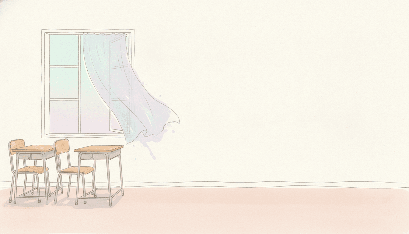
The Room Afterwards
Four Colours, a Flowing Line, and a Great Deal of Paper
The brief keeps the line at full strength while giving the colour away, which is the opposite of how most soft styles work.
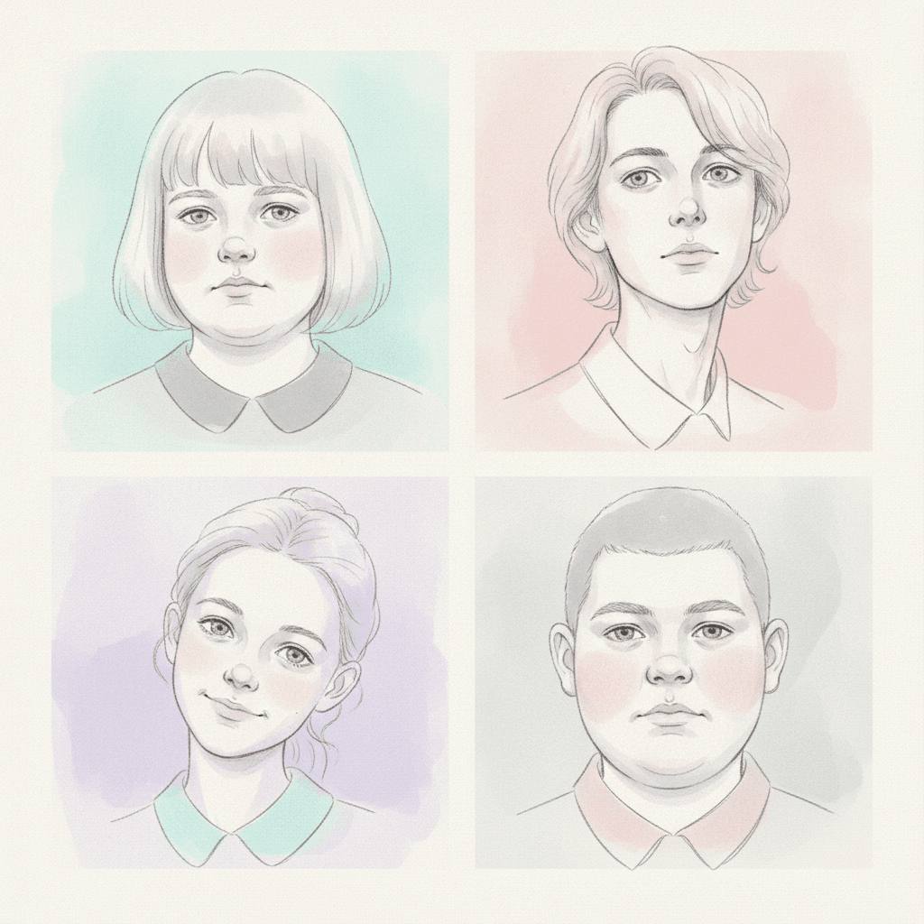
Four Quiet Faces
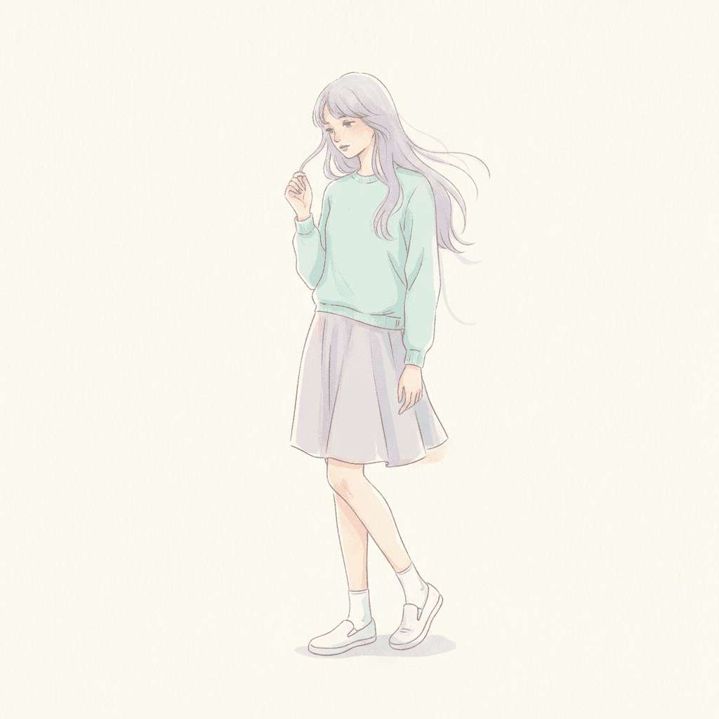
The Hair Goes Past the Line
Mostly Paper
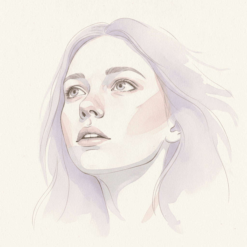
Three Washes, Up Close
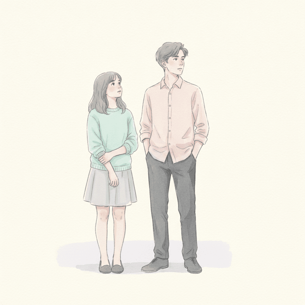
Two People, One Looking
Making a Whole Youth Emotion Picture Book, Not One Image
The useful things and the honest limits, in the order they are likely to matter to you.
The same face, through eleven thin layers of paint
This is the thing that breaks first when pages are generated one at a time, and here it breaks in a particular way. A face built from four overlapping translucent washes and one flowing line that keeps breaking off has very little hard information in it — no outline to hold the shape, no cel-shaded band to fix the cheekbone — so a system drawing each page fresh will quietly resolve the ambiguity differently every time. By page nine you have somebody else. One fixed brief is carried into every page instead: flowing fluid linework, translucent overlaid washes of soft aqua, pale rose and hazy lavender on paper texture, a soft translucent glow, and the same four refusals of opaque flat fills, hard rigid edges, heavy outlines and generic chibi faces. Save each character in the Character Library with up to fourteen reference images and the face stays theirs under every wash. Characters built from an uploaded photo stay private to your account.
Four colours, and the ones you get for free
The palette is recorded as transparent washes, soft aqua, pale rose and hazy lavender, and the structure matters more than the particular hues. Because every wash is thin, the interesting colours in the picture are not the four you were given but the ones that appear where two of them overlap — aqua over rose, lavender over aqua — and the paper showing through underneath keeps all of them cool and clear. The practical note is that this palette slides towards grey if it is pushed. The brief keeps it quiet rather than drained: thin, cool and clear, not murky, not sepia, not washed-out. The honest cost is in the same sentence as the light. With no shadow available and nothing lit from anywhere, there is no night here, no weather, no dusk and no drama — the cinematic and grainy cinematic styles exist for pages that need those. There is also no global greyscale switch in C2Story, so a monochrome book means choosing a style that is monochrome by design.
Nothing on the page can be made to pop
Worth knowing before you choose it rather than after. Most of the library gives you a way to point at something: a heavy outline, a bold accent colour, a hard shadow, a bright shape against a flat ground. This brief has given all of those away. No opaque fill means no solid shape. No hard rigid edge means no crisp boundary. No heavy outline means nothing can be ringed. No cast shadow means nothing can be lifted off the ground. So a page where one object has to be unmistakably important — the key, the letter, the one red door — has no mechanism here to make it so. What the style offers instead is position and emptiness: a figure small and low with most of the paper left bare reads as much more alone than any amount of shading could manage.
Breathing space, and the slot it occupies
Eight other styles in C2Story leave a lot of the page empty, and each one is empty for a different reason, which is the only honest way to tell them apart. Fine-line ink leaves space to mean distance. Minimalist leaves it by subtraction. The deadpan cartoon leaves it for the beat before the joke. Sumi-e leaves it for breath. Negative space makes the gap a second picture. Muted editorial leaves headroom. Fashion line leaves room for one contour. City pop leaves clearance for a hard colour clash. This brief asks for breathing negative space — a phrase it shares with one other brief in the library — and what it leaves the space for is the unfinished edge: the paper where the contour broke off and the wash kept going. Every other style here draws the empty part deliberately. This is the one where the empty part is the drawing running out.
A whole book, not one lovely single image
This look lives almost entirely as single images — one wistful figure, posted on its own, admired and scrolled past — and a single image is the easy part. You are not prompting for one. Describe the story and C2Story writes it, splits it into pages and builds each page to this brief according to what that page actually says, so the mood accumulates across a narrative instead of arriving once. You get picture-book pages with your words set as type rather than lettered into the art, which suits a style that keeps so much bare paper. Write in English, Chinese, Japanese, Spanish, French and more; the look does not change with the language. When you want it on paper, the paid PDF download is the handoff to your printer, and everything you make is licensed for commercial use.
Honest about the age this one is for
Most styles in the library will serve a three-year-old perfectly well. This one mostly will not, and it is better to say so. A brief written around the held, unresolved feeling of being seventeen gives a picture almost nothing a very small child reads first: no bold outline to follow, no strong colour to point at, no clear expression to copy, and a great deal of empty paper where a toddler expects something to look at. Where it is genuinely good is older — eleven and up, and especially the readers who are themselves the age the brief is about, plus the grown-ups buying a keepsake for a graduation, a leaving year or a sixteenth birthday. For a bedtime book or a first picture book, the watercolour, cartoon and storybook styles are built for it and this one is not.
A note on where this one sits in the wider map. For the mirror image — the same young characters drawn sealed, printed and certain — see anime picture books. For the same wet transparency working in value rather than hue, see sumi-e picture books, and for white space that means distance instead of an unfinished edge, fine line ink picture books. If you are still choosing between the gentle looks altogether, nordic whimsy picture books is the cosy relative of this one.
Questions About Youth Emotion Picture Books
Explore More Story Ideas
Discover more styles, tools, and story types
Bunny Stories
A new bunny comes home, first hops, carrot treats and lost-bunny rescues
Explore
Pixel Art Picture Books
A fixed grid, a rationed 16-bit palette
Explore
Picture Book Maker
Create illustrated picture books
Explore
Storybird Alternative
Better AI story creation
ExploreYouth Emotion Picture Books — Thin Layers, a Flowing Line and an Edge That Will Not Close
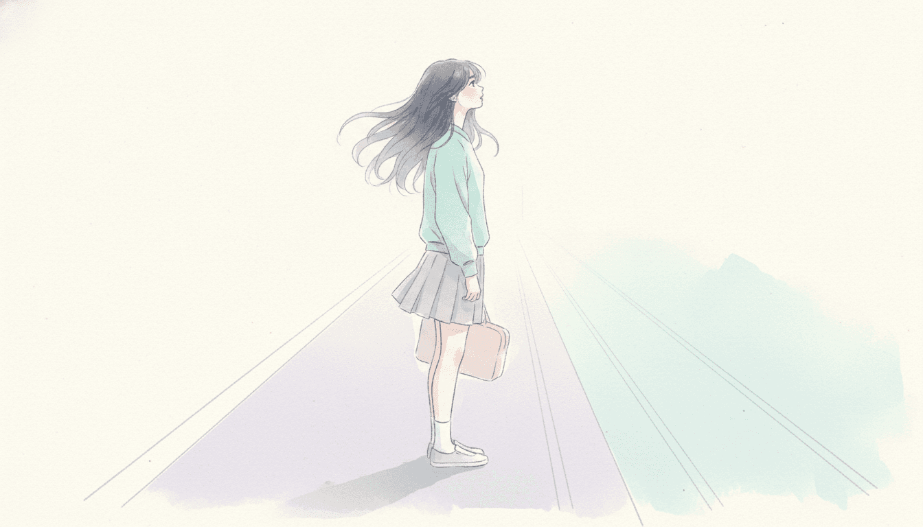
A youth emotion picture book is built on one unusual borrowing. C2Story runs seventy-eight hand-drawn style briefs, each a short written record of a palette, a light, a line weight and a few refusals, and exactly one of them mentions music: this brief asks for a music-video mood. Run the synonyms — song, lyric, album, band, melody, concert — and nothing else in the library turns up except a Song-dynasty landscape and a wash described as lyrical. Nineteen briefs do borrow from a moving picture, but every one of them borrows how a moving picture looks: cinematic light, cel animation, stop-motion texture, a frame-by-frame finish. This is the only brief that borrows how one is timed, and a music video cuts its images to something that is not in the frame. That single line is the permission slip for everything else on the page — it is why a girl standing on a platform is simply allowed to mean something, with no event to explain her.
The edge is the second decision, and the rare one. Six of the seventy-eight briefs refuse a heavy outline, which is a refusal about the line. This is the only brief in the library whose refusals name a hard rigid edge, and an edge exists between any two colours whether a line is drawn there or not. Hand that away and no shape in the picture can close: a wash drifts past its own contour, pools where it crosses another, and feathers out into bare paper. Pair it with the first refusal — opaque flat fills — and no colour can sit on top of another and hide it either, so every layer stays visible underneath. The result is a style that is physically unable to make something look settled, decided or finished. For most subjects that is a handicap. For transparent youth illustration, where the whole point is a feeling that has not resolved, it is the entire method.
Transparency itself is the third, and this brief uses it differently from its two closest relatives. Three briefs here refuse opaque paint outright. One is an airy watercolour look that spends the freedom on lightness — minimal linework, abundant untouched paper, calm and breathable. One is a poetic ink-wash storybook that spends it on gentle bleeding warmth. Both let the line go faint to get there. This one keeps a flowing fluid line at full strength and spends the transparency on layering instead, which is why the interesting colours in a page of soft youth style art are never the four you were given — soft aqua, pale rose, hazy lavender and the paper — but the quiet third colour that appears where two of them cross. The lighting note closes the argument: forty-five briefs here say some version of flat and the rest name a direction, but this one says soft translucent glow, the only light in the library that passes through the colour rather than falling on it. Nothing casts a shadow, because the colour is the light.
Which makes the choice between the gentle styles reasonably clear. Take anime when you want young characters drawn sealed, graphic and certain, with the colour stopping dead at the line. Take sumi-e when the transparency should work in value rather than hue, and the subject is stillness and distance. Take fine-line ink when the white space should mean distance, nordic whimsy when the page is a warm place somebody is content to be in, and the watercolour or storybook styles for a first picture book or a bedtime read — this brief is written around being seventeen and serves older readers, eleven and up, far better than very small ones. Take emotional anime art in this brief when the page is a person in a place with nothing settled, and accept the limits that come with it: no opaque fill, no hard edge, no heavy outline and no cast shadow means nothing on the page can be made to pop, and no night, no weather and no drama are available here. Describe the story in a sentence and C2Story writes it, splits it into pages and builds every page to the same brief, keeping your characters on model under every wash with up to fourteen reference images each — in English, Chinese, Japanese, Spanish, French and more, with the paid PDF download as the handoff to your printer and everything you make licensed for commercial use.