Novel to ManhwaThe Scroll Is the Unit, Not the Page
A manhwa is not a comic page turned sideways. C2Story stages your novel for the vertical — one beat per screen, the gap doing the timing, full colour carrying the mood.
- Panels composed tall, not cropped down from wide
- The space between panels set as a deliberate beat
- A colour script per chapter, not flat colouring
- One cast on-model from episode 1 to episode 40
250,000+
Stories Created
80,000+
Characters Saved
45+
Art Styles
4.9/5
Creator Rating
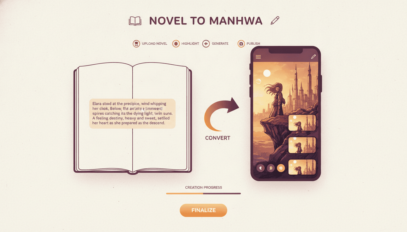
How the Novel to Manhwa Adaptation Works
Three steps, and the middle one is the whole craft — deciding what the reader travels past on the way down.
Bring the Prose
Paste a chapter, or upload the whole novel as a plain .txt file. The cast is read out of the text and each character designed once, so the lead exists before a single panel is drawn.
82,000 words · 34 chapters · 6 named characters found
Stage It Vertically
Each scene is broken into beats and laid out top to bottom, with the gap between panels set wide or tight to control timing. Episode cut points are proposed at hooks, not at chapter ends.
Chapter 4 → 1.5 episodes · 68 panels · cut at the doorway
Colour and Publish
Pick a style, get the chapter colour plan, and the panels are drawn in full colour with dialogue in bubbles and monologue floating in the gutters. Export as a scroll-ready image set.
Episode 1 · manhwa style · cool palette · 3 min scroll
Manhwa, manhua, manga, webtoon — which one are you making?
The first three are just the national words for comics: manhwa is Korean, manhua is Chinese, manga is Japanese. In practice they now imply formats, because of how each industry publishes. Manhwa and manhua are read as full-colour vertical scrolls on a phone, left to right, one episode at a time. Manga is mostly black and white, laid out as fixed pages, read right to left, with screentone doing the shading — if that is what you pictured, the AI manga generator is the right door. “Webtoon” is the format word rather than a nationality: a vertical comic of any origin. Everything on this page applies to manhwa and manhua equally.
What a Novel to Manhwa Adaptation Actually Changes
The prose stays yours. The grammar around it does not survive the move — a vertical scroll has different rules from a printed page in six specific ways.
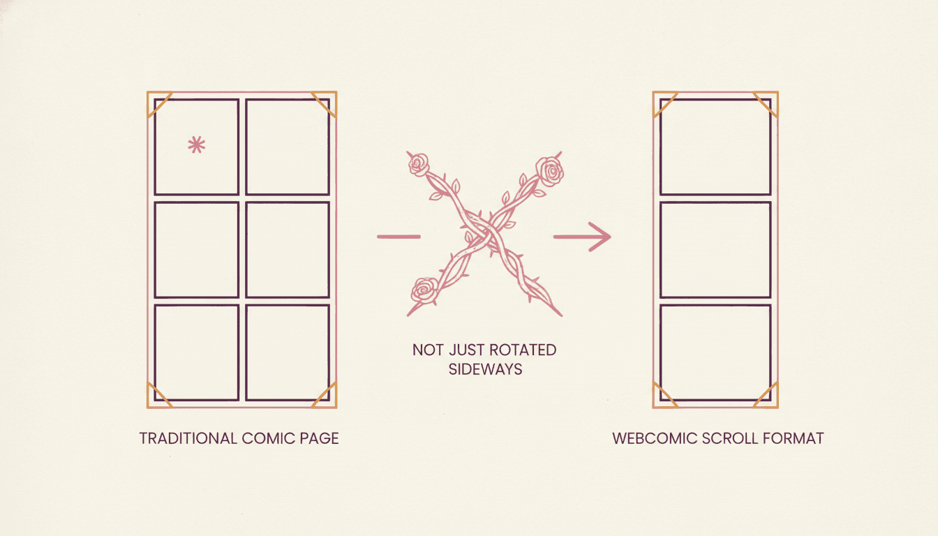
The Page Turn Disappears
A comic page hides the next beat behind a physical turn, and half of page-comic craft is deciding what waits on the other side. A scroll has no turn. Every reveal has to be earned with distance instead.
StructuralEmpty Space Becomes Time
The gap between two panels is the only thing the reader spends effort crossing, so its height is the beat length. Evenly spaced panels read as a flat monotone no matter how good the drawings are.
PacingThe Frame Gets Narrow
You are composing for roughly seven centimetres of width. A wide establishing shot with six figures in it becomes six specks. The same moment works as one face, one hand, one object at a time.
CompositionColour Takes On a Job
Manga uses screentone density to set mood in black and white. Manhwa uses full colour to do it, which means the palette is a storytelling decision per chapter rather than a finishing pass.
Art directionChapters Stop Matching Episodes
Your novel chapter resolves. An episode must not. Cut points move a paragraph or two earlier, to a door opening or a name spoken, because the last screen is the reason anyone comes back.
SerialisationInteriority Gets a Home
Unusually for comics, thought survives here. Caption text floats in the vertical gutter without consuming a panel, so a line of monologue becomes a pause on the way down rather than a cut.
AdaptationThings that only exist because the page is vertical
The Gap Between Panels Is a Beat
It is the one tool a vertical comic has that a page does not, and the one most adaptations never use. Distance is duration.
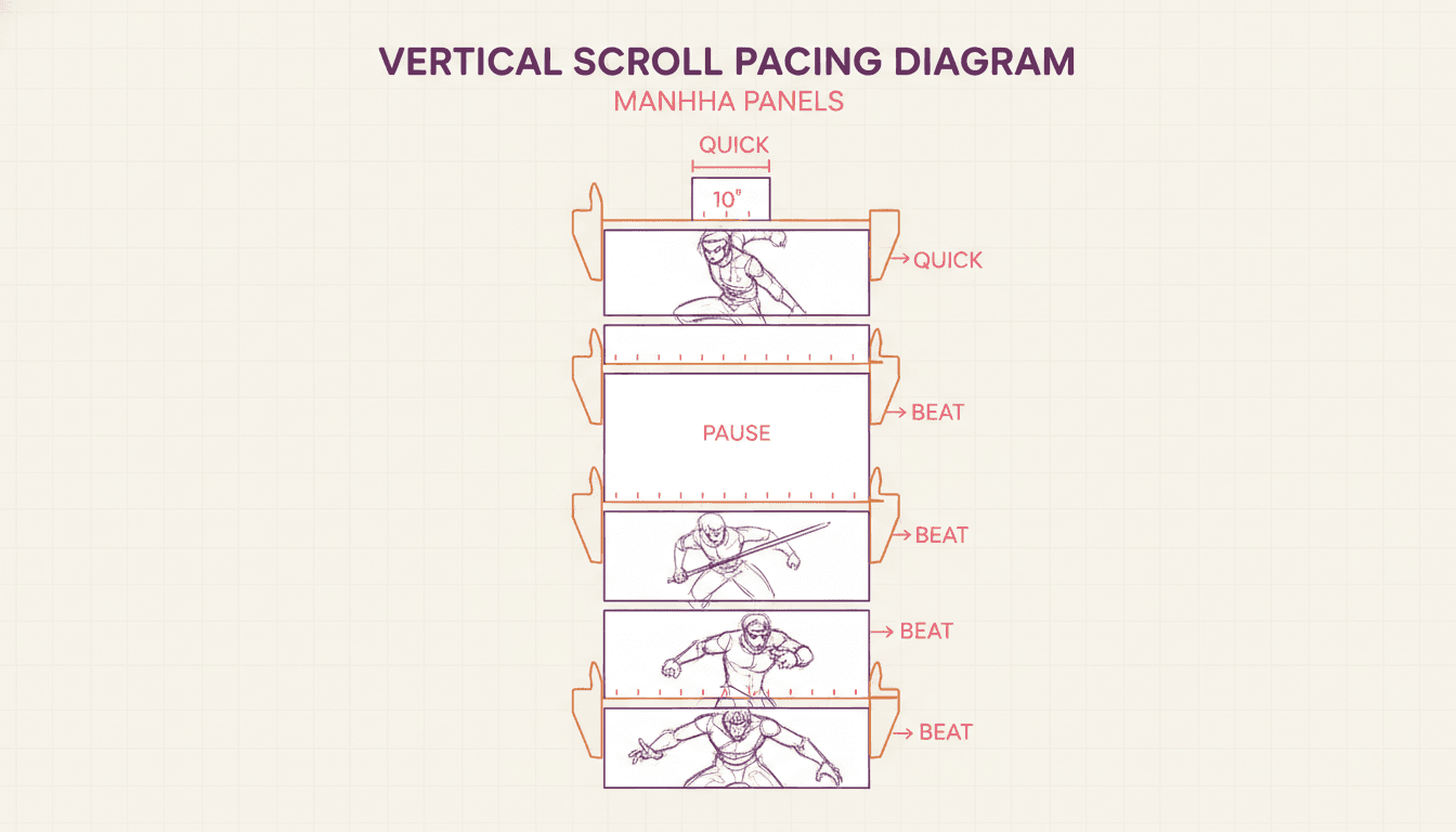
Tight
Panels Almost Touching
An argument, a fight exchange, a rapid back-and-forth. Small gaps make beats land on top of each other and the scroll accelerate. Use it when nobody in the scene is allowed to think.
Even
A Steady Rhythm
Walking, explaining, establishing. Consistent gaps are the neutral setting, and most of an episode lives here — which is precisely what makes a change in spacing register at all.
Wide
A Screen of Nothing
A death, a confession, a realisation. Push the next panel far enough down that the reader crosses empty space to reach it, and they arrive having already felt the silence.
Why evenly spaced panels read as flat
Take a finished comic page, slice it into its six panels, stack them vertically with identical gaps, and the result is legible and lifeless. Nothing was drawn badly — the timing simply went missing, because on the original page it was carried by panel size and by the turn, and neither of those survived the stack. This is the most common failure in a novel to manhwa adaptation done with a general image tool: panels are generated one at a time with no notion of how far apart they sit, so every beat gets the same weight. C2Story sets the spacing as part of the layout, which is why the same script reads differently as a manhwa than as a page comic.
The Thumb Test: Can This Panel Survive a Phone?
Hold the panel at phone width and ask what a reader scrolling with one thumb actually sees. Most establishing shots fail it.
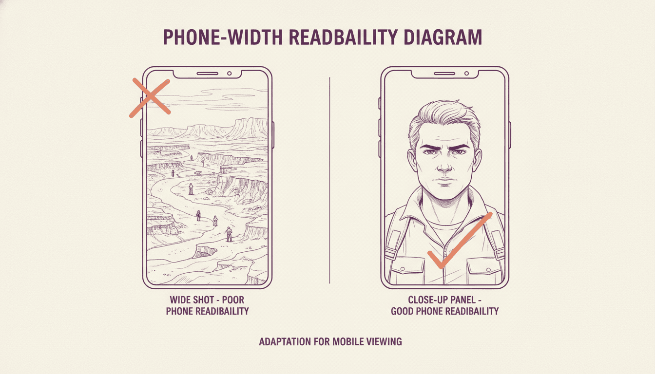
Passes: Staged for the Vertical
- One subject per panel, large in frame
- A crowd implied by three figures, not thirty
- A wide location split into two tall fragments
- Dialogue readable without pinching to zoom
Fails: A Page Panel in Disguise
- ! A cinematic wide shot with six tiny figures
- ! Two characters facing off across a wide frame
- ! Small background detail the plot depends on
- ! Four speech bubbles competing in one panel
The fix is almost never to shrink the shot. It is to split it: the room in one tall panel, the person in the next, the thing they are looking at in the third. The scroll gives you as much vertical room as you want — it is width you are rationing, and only width.
What a Novel to Manhwa Adaptation Gives You
An episode map you can edit, a cast that holds for a whole season, and scroll-ready panels that agree with each other.
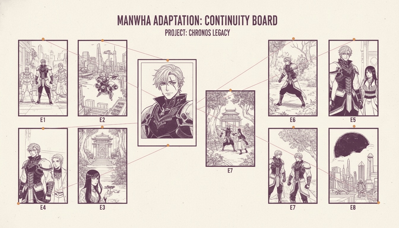
One Cast, Every Episode
Page Grid vs Scroll
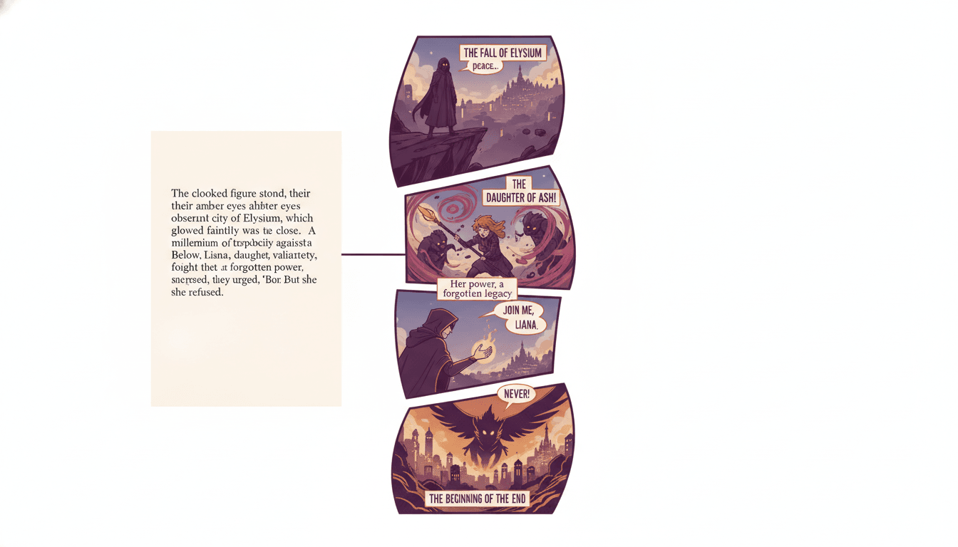
Paragraph to Scroll
“Turn my romance-fantasy novel into a full-colour vertical manhwa”
“Chapter one only — one episode, ending on a hook”
“My web serial, adapted as manhua with a wuxia colour palette”
“Keep every line of her internal monologue as floating captions”
“Regression plot — make the reset a full-screen colour break”
“Same cast across 40 episodes, no drift in the lead’s design”
Full Colour Is the Work Manga Does With Screentone
Manhwa is colour by default, which means the palette is a storytelling decision per chapter — not a finishing pass applied at the end.
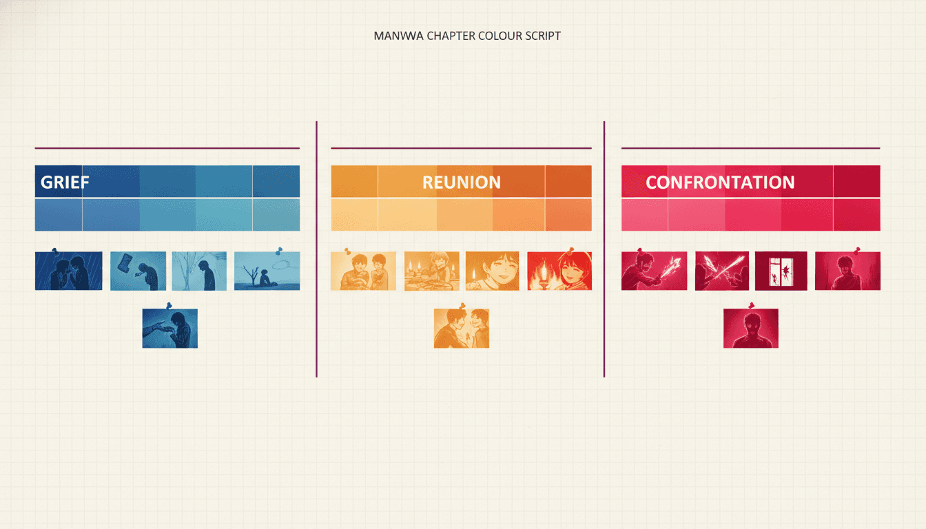
A Palette Per Emotional Register
Grief gets drained and cool, a reunion warms up, a confrontation goes hot and high-contrast. A reader scrolling fast registers the temperature before they read a word, which is exactly what screentone density does in black and white.
Flashbacks Change Temperature
Prose signals a shift in time with a tense change or a line break. A vertical scroll cannot use either, so the palette carries it — a memory rendered a few degrees cooler tells the reader where they are without a caption saying so.
Colour Marks the Turn
The moment a chapter pivots is worth a visible break: a full-bleed wash, a sudden desaturation, a single saturated object in a muted panel. It is the manhwa equivalent of a chapter break you can feel while moving.
Genre Has a Default Look
Romance fantasy runs soft and luminous, action runs saturated with hard shadows, modern drama runs muted and grey-leaning, and manhua xianxia runs painted and ornate. The plan starts from your genre and you adjust it.
How many episodes will my novel become?
1 episode
1,500–3,000 words
Roughly 50 to 80 panels, three to five minutes of scrolling. Most novel chapters land between half an episode and two.
10–12 episodes
A novella
Around 25,000 words. A short complete run, or the first arc of something longer released over three months.
30–50 episodes
A full novel
80,000 words adapted closely. That is a normal first season, and it is why the cast has to stay locked.
Do this arithmetic before you start. It shows you where your chapter breaks and your episode breaks disagree — and those disagreements are the only real decisions in the whole adaptation. A chapter that resolves neatly is a good chapter and a terrible episode ending.
One Style, Held Across the Whole Run
Pick the look once and every episode inherits it — the same way the cast does.
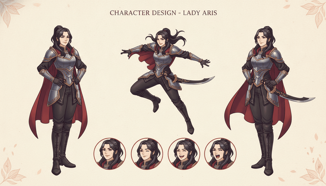
The Cast
One design, reused
The Beat
The gap does timing
The Thumb
Staged for a phone
The Episode
One scroll, top to end
The Manhwa
What you end with
45+ art styles including clean full-colour manhwa, painted manhua, anime, manga and American comic.
What the Novel to Manhwa Tool Actually Does
Six things a general image generator cannot do, because it has never had to hold a series together for a season.
Staged Vertically From the Start
Panels are composed for a tall narrow frame rather than drawn wide and cropped down. That is the difference between a manhwa and a comic page someone sliced into strips: a wide shot squeezed into phone width becomes six unreadable figures, while the same moment staged vertically becomes one face and a hand. The vertical is decided before the art, not after it.
The Gap Between Panels Carries the Timing
In a page-format comic, beats are controlled by panel size and the page turn. In a vertical scroll there is no page turn, so the empty space between panels is what the reader spends time in. Long gaps slow a moment down, tight stacks make an exchange snap. The adaptation sets those distances deliberately instead of spacing everything evenly.
A Colour Script, Not Just Colouring
Manhwa is full colour by default, and colour is doing the job screentone does in black-and-white manga: telling you the emotional register before you read a word. Each chapter gets a palette plan — cool for grief, warm for reunion, hot for confrontation — so a reader scrolling fast still feels the shape of the scene.
Interiority Survives the Move
The hardest thing to carry out of a novel is what a character is thinking, and manhwa is unusually good at it. Floating caption text sits in the vertical space between panels without stealing a panel of its own, so a line of internal monologue becomes a pause rather than a cut. Your prose is trimmed for space, not rewritten in a generic voice.
One Cast, Locked Across Forty Episodes
Each character is designed once and that saved design is what every later panel draws from, so your lead has the same face in episode 2 and episode 40. Long-running series are exactly where a general image generator falls apart: every panel looks fine alone and the cast quietly becomes different people over a season.
Built to Be Read on a Phone
Vertical comics are read one-handed, at speed, on a screen about seven centimetres wide. Text sizes, figure scale and panel height are set against that frame, so nothing needs pinching to read. The same episode still holds up on a desktop, because a scroll is forgiving in the direction a page never is.
Why consistency matters more here than anywhere else
A one-off illustration can afford a wandering face. A serialised manhwa cannot. Readers meet your lead weekly for a year, at close range, in a format built almost entirely out of faces — and they will notice a changed jawline long before they notice a plot hole. So the design is not re-derived from a text description each time; it is saved once and reused, and every later panel draws from the stored version. If you want to see that step on its own before committing a season to it, the character consistency tool covers the same locking mechanism, and the character bible generator keeps the record of who is who.
Who Adapts a Novel Into Manhwa?
Web Serial Authors
Already writing in episode-sized chunks that end on hooks, which is the exact shape a manhwa needs. Converting one serialised format into another is far less work than cutting a finished novel down.
Romance Fantasy Writers
The genre that built the format. Courts, contracts, second chances and slow-burn eye contact all read better in full colour at close range than they ever did in black-and-white page comics.
Self-Published Novelists
A finished book with a small readership and a visual hook. A manhwa version reaches an audience that was never going to open an 80,000-word file, and it points back at the original.
Action & Cultivation Writers
Fight choreography is what the vertical does best: a strike, a landing and a reaction can each own a screen. Manhua art direction suits xianxia and wuxia worlds without any extra work.
Is the Vertical the Part You Want?
This page is for people with a novel who picture a full-colour phone scroll. If you pictured something else — printed pages, an original idea, video — one of these is a better starting point. They all share the same character library.
Yes — my novel should be a manhwa
Start here. Paste a chapter, meet the cast, see the episode map and the scroll layout before you spend anything.
I have an idea, not a manuscript
Same vertical format, no source text. Generate original webtoon episodes from a premise instead of adapting prose.
Black and white, right-to-left pages
Manga rather than manhwa. Fixed page layouts, screentone instead of colour, Japanese panel order.
A Western comic book, not a scroll
Page-format panels with gutters and a page turn. The same novel, adapted for a printed grid instead of a phone.
How do I split the book into issues?
The serialisation problem on its own — chapter to issue mapping and where each instalment should end.
I do not know what to cut
The adaptation problem rather than the format problem — what survives the move from prose into panels, and what cannot.
I want it as video, not a scroll
Panels in motion with voice and music, for short-form video platforms rather than a reading app.
My vertical comic already exists
Turn a finished long-canvas scroll into video. The step after publishing, not part of the adaptation.
Illustrations with text beneath
Full-page art and prose rather than panels and bubbles. A different reading format entirely.
One long book, not a serial
Book-length and continuous, one spine, read in a sitting. No episode breaks and no weekly cadence.
My cast keeps changing faces
Lock each design once and reuse it everywhere. The single biggest failure mode of a long serialised run.
I keep losing track of who is who
Pin looks, voices and history in a reusable record, so episode 40 still agrees with episode 2.
Frequently Asked Questions
Explore More Story Ideas
Discover more styles, tools, and story types
Safari Stories
Jeep rides, giraffes, elephants and lions on the savanna
Explore
Gouache Picture Books
Flat opaque paint & matte brush edges
Explore
Picture Book Maker
Create illustrated picture books
Explore
Storybee Alternative
More styles & features
ExploreNovel to Manhwa — The Vertical Is the Hard Part, Not the Art
Most people who set out to convert a novel to manhwa assume the illustration is the obstacle. It rarely is. The obstacle is the format, and specifically the fact that a vertical scroll is not a comic page that happens to be tall. A printed comic page controls its pacing with two tools: the relative size of the panels, and the page turn. The turn in particular is doing enormous work — it is a hard cut the reader physically cannot see past, and a great deal of page-comic craft consists of deciding what sits on the other side of it. A scroll has no turn at all. Take a finished page, slice it into six panels, stack them with even gaps, and you get something perfectly legible and completely lifeless. Nothing was drawn badly. The timing simply did not come with it.
What a vertical comic has instead is distance. The empty space between two panels is the only thing a reader spends real effort crossing, so the height of that gap is the length of the beat. Small gaps stack beats on top of each other and make an argument snap. A wide gap forces the reader to travel through nothing to reach the next panel, so they arrive having already felt the silence — which is why a confession, a death or a realisation is usually worth an entire screen of emptiness before it. Most of an episode sits at a steady, unremarkable rhythm, and that is exactly what makes a deliberate change in spacing register at all. Setting those distances scene by scene is the single biggest difference between an adaptation that reads as manhwa and one that reads as a sliced-up comic.
The second thing the format changes is the frame. You are composing for about seven centimetres of width, read one-handed at speed. Vertical room is effectively free — you can make an episode as long as you like — but width is strictly rationed, and almost every wide establishing shot fails on arrival. Six figures in a cinematic wide become six specks. The fix is almost never to shrink the shot; it is to split it, so the room gets one tall panel, the person gets the next, and the thing they are looking at gets a third. That is the thumb test, and it is worth applying to every panel in the breakdown before anything gets drawn: at phone width, what does a scrolling reader actually see?
Third, colour stops being decoration. Manga is predominantly black and white and uses screentone density to set the emotional register; manhwa and manhua are full colour by default, so the palette inherits that job. That makes it a per-chapter storytelling decision rather than a finishing pass. Grief runs cool and drained, a reunion warms, a confrontation goes hot and high-contrast, and a flashback shifts temperature so the reader knows where in time they are without a caption telling them. Genre supplies a sensible starting point — romance fantasy soft and luminous, action saturated with hard shadows, xianxia painted and ornate — and you adjust from there.
Then there is where the episodes break, which is where novelists are most often caught out. Your chapters resolve; episodes must not. The last screen of an episode is the highest-value real estate in the entire run, because it is the only thing deciding whether anyone comes back next week, and it is almost never at your chapter boundary. Usually it sits a paragraph or two earlier: a door opening, a name spoken, a face turning. C2Story proposes cut points at those moments rather than at your chapter ends, and you can move any of them. Doing the length arithmetic first makes this visible early — an episode is roughly 50 to 80 panels, three to five minutes of scrolling, and about 1,500 to 3,000 words of source prose once dialogue is trimmed and description becomes art. An 80,000-word novel is therefore something like 30 to 50 episodes, which is a normal first season.
One thing carries across better than novelists expect: interiority. Comics are generally hostile to internal monologue because a thought has to steal a panel from the action, but a vertical scroll has usable empty space running down the entire episode, so a line of thought can float in the gutter between two panels. The reader passes through it on the way down and it reads as a pause rather than an interruption. Long introspective passages still have to go — three hundred words of reflection stops a scroll dead — but the working rule is simple: keep the thought that changes what the character does next, cut the thought that only explains what they already did.
Finally, and least glamorously: the cast has to hold. A serialised manhwa is built almost entirely out of faces, seen at close range, by readers who meet your lead every week for a year. They will notice a changed jawline long before they notice a plot hole. So each character is designed once, saved, and reused — every later panel draws from that stored design instead of re-inventing a face from a text description. This is precisely where a general image generator falls apart on a long run: each panel looks fine in isolation and the cast quietly becomes different people over a season. If you want to test that mechanism on its own, the character consistency tool and the character bible generator cover the same locking step.
Ready to start? Bring one chapter, not the whole book — a single episode will tell you whether your cast reads the way you pictured them and whether the style suits the story, and both are far cheaper to change now than thirty episodes later. If you want the vertical format without a manuscript, the AI webtoon generator builds original episodes from a premise. If you pictured printed black-and-white pages read right to left, that is the AI manga generator. For a Western page-format comic book from the same novel, use AI novel to comic book; to work out the issue split first, book to comic series builds the map and how to adapt a novel into a comic series covers what to cut. Want the story as motion instead of a scroll? Try web novel to comic drama. Or open your character library and start adapting.