
Essay Manga Picture BooksThe Day, Without the Event
One of the seventy-eight style briefs here names a workplace as somewhere its pictures happen. An essay manga picture book is built from that one — the style whose subject is an ordinary day, and the only one with no joke to make about it.
- Simple warm hand-drawn lines, no rendering and no gloss
- Soft warm pastels over cream white, with one gentle accent
- Flat everyday light that casts nothing and hints at nothing
- Free credits by request — no card
50,000+
Stories Created
10,000+
Active Creators
50+
Art Styles
4.9/5
User Rating
What Makes Essay Manga Different From Simply Drawing a Normal Day
Every style here is a written brief — a palette, a light, a line weight, a short list of refusals. Four lines in this one decide everything, and three of the four appear in no other brief in the library.
The only brief in the library that names a workplace
Every style in C2Story runs on a short written brief recording a palette, a lighting note, a line weight and a few things to avoid. Read all seventy-eight hand-drawn briefs and one of them — this one — asks for everyday and workplace vignettes. Run the synonyms to be sure it is not just a wording accident: no brief mentions a job, a career or a colleague at all, and only one other touches the adult working world in any form. Six briefs say everyday, two say slice-of-life, but a workplace is named exactly once. That matters because it buys a setting the rest of the library has no vocabulary for. Almost everything else here is written for somewhere a child goes — a forest, a bedroom, a classroom, a kingdom. This one is written for the hours in between.
Flat everyday light: there is no “and then” in the picture
Flat light is the house default here, not the rare part — forty-five of the seventy-eight briefs ask for flat or even light in some wording, so that alone distinguishes nothing. The distinction is in what each one names. Most name a quality the light has: flat graphic, flat neutral, flat shadeless, flat punchy, stark, clean, plain. Some name where it comes from: an antique plate, ink on paper, a mural wall, an editorial page. A few name an hour: bright even daylight. Exactly one names how often it happens — soft flat everyday lighting. This is the light that is simply always there. The consequence is strange and useful: nothing in the frame is able to announce that something is about to occur. No shaft through a window, no lengthening shadow, no darkening corner, no held breath. It is the one style here that cannot foreshadow, so the moment has to be worth looking at at its actual size.
The faces obey a personality, not a template
Thirteen of the seventy-eight briefs mention chibi, and every one of them mentions it in order to refuse it — so refusing uniform cuteness is close to a house rule and is not this brief’s idea. What is this brief’s idea is the sentence that follows the refusal. It asks that expressions and body language obey the style’s own personality logic rather than falling back on uniform standard faces, and it is the only one of the seventy-eight to put it that way. Plenty of styles here say do not make them all cute; this is the one that says what to do instead. Worth being straight about the part that is shared: three briefs carry the same line about silhouette coming before detail so that face shape, head-to-body proportions and the shapes of hands and feet form their own visual language — this one, an eighties city-pop look and a gag manga. The silhouette idea belongs to all three. The personality clause belongs to this one.
There is no joke in it — and that is the honest limit
The note most likely to catch you out, because the nearest thing to this style in the library looks identical on paper and is not. Two briefs here put an ordinary grown-up in an ordinary grown-up setting. The other is a classic single-panel magazine cartoon, and its brief is explicit that it is built around dry situational humour and one visual gag, drawn in clean black pen with a grey wash and no real colour. Every page it makes needs a punchline. This brief asks for none of that. It has no gag, no stance, no irony and no weariness; its own mood word is cosy, and its palette is warm pastel rather than ink and wash. So if what you want is the ordinary day commented on, two other styles do it better and are worth taking instead. This one only looks at it.
An Essay Manga Page Is Defined By What It Will Not Do
Each brief ends with a short list of things to avoid, and reading that list is usually the fastest way to understand a style. This one refuses four: generic chibi faces, glossy rendering, heavy shading and photorealism.
Put them together and they all take away the same thing. Heavy shading is how a drawing makes a moment grave. Gloss is how it makes a thing desirable. Photorealism is how it makes a scene impressive. A uniform cute face is how it makes a character instantly likeable without earning it. Strike all four out and the picture has no way left to add weight to what it is showing. Whatever is in the frame has to be worth the frame on its own.
That is why the essay manga brief keeps the line simple and warm rather than fine or energetic. A simple line is not a shortcut here; it is the only mark that does not editorialise.
Every Quiet Style Here Is Quiet About Something Different
A lot of styles in this library look restrained, and it is tempting to treat them as interchangeable. They are not, because each one is withholding a different thing.
In fine-line ink the emptiness is distance — the figure is small because the building is tall. In a minimalist style it is subtraction, fewer things on the page because fewer is the point. In a deadpan cartoon it is the beat, the pause where a louder style would have put the reaction. In muted editorial it is headroom, contrast saved up to be spent once.
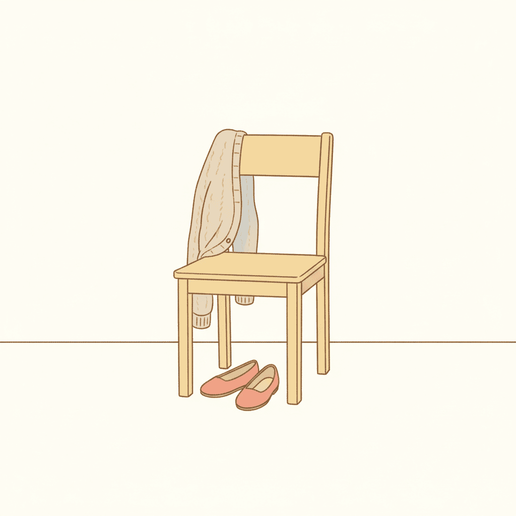
Here it is none of those. This style is not withholding space, or colour, or a reaction. It is withholding scale. The page is full, the colour is warm, the character is expressive — and the thing being shown is just genuinely small. A cardigan on a chair. A box being lifted. That is the slot this brief occupies and no other brief here occupies it.
From One Sentence to a Diary-Style Book
You pick the look once. The brief is then applied to every page of the story, so the quiet does not drift.
Describe an ordinary day
A sentence is enough, and the smaller it is the better this style works. The week the kettle broke. The shop before it opens. What Dad does all day. You do not need a plot twist, because this is the one look here that does not need somewhere to build to.
Choose the Essay-Manga Diary style
Picking it fixes the whole brief at once: simple warm linework, soft warm pastels over cream white, soft flat everyday lighting, a single gentle accent colour, and the four refusals. Save your characters first and they are carried through every page on model.
Get a book, not a vignette
C2Story writes the story, splits it into pages and builds each page to the brief according to what that page says. Your words are set as type rather than lettered into the art. Read it on the web, share it, or buy the PDF to hand to a printer.
This Style and Its Three Nearest Neighbours
Four briefs in the library sit close to this one. Here is what each actually asks for, so you can take the right one rather than the first one.
Essay-Manga Diary
The style on this page
A cute essay-manga diary illustration of everyday and workplace vignettes, with silhouette prioritised over detail so that face shape, head-to-body proportions and the shapes of hands and feet form a clear independent visual language, and with expressions and body language obeying the style’s own personality logic rather than falling back on uniform standard faces. Its palette is soft warm pastels, a gentle accent, cosy neutrals and cream white; its light is soft flat everyday lighting; its line is simple warm hand-drawn linework; and the four things it refuses are generic chibi faces, glossy rendering, heavy shading and photorealism. It will render whatever slice-of-life scene your story actually describes.
Gag-Manga Reaction
Same family, the dial turned the other way
The closest relative and the cleanest contrast. It is built on strong reactions and exaggerated emotion, with deadpan or suddenly over-the-top expressions and sharp comedic timing in the pose, drawn in rough energetic sketchy linework over simple flat colours with a bold accent pop. Both briefs share the sentence about silhouette carrying the character, and then they part completely: that one makes the reaction the event, and this one has no event for a reaction to be about. Take that one when the funny face is the page. Take this one when the page is a Tuesday.
Classic Magazine Single-Panel Cartoon
The other grown-up at a desk — with a punchline
The only other brief here set in the adult everyday world, and worth putting side by side with this one before you choose. It asks for a clean consistent black pen line, an adult everyday scene rendered fully with its setting and props, deadpan straight-faced characters and dry situational humour built around one visual gag, lit as flat even editorial light and coloured in black ink, warm paper white and a soft grey wash alone. Two differences decide it. That one is essentially monochrome and this one is genuinely pastel, and that one needs a joke on every page while this one needs nothing but a day.
Korean Lifestyle Doodle
The other slice-of-life brief, kept young and spare
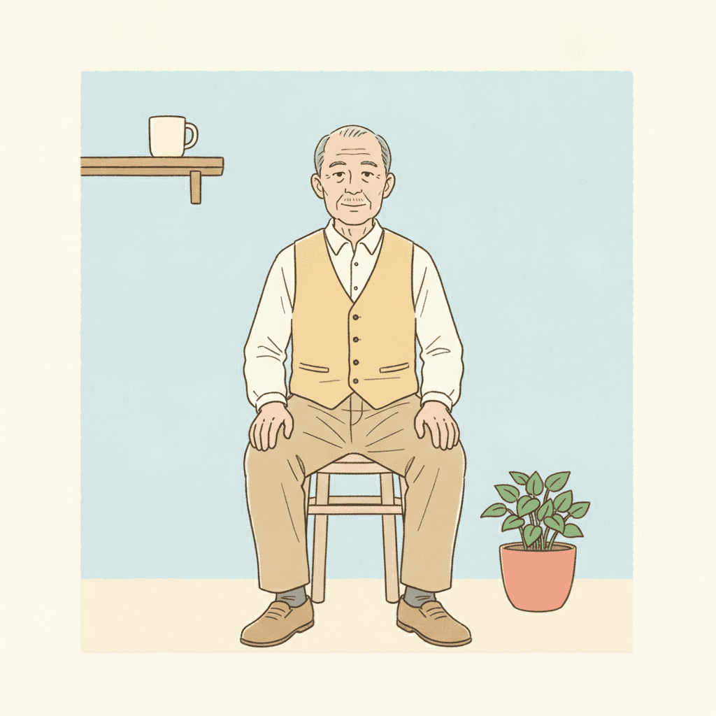
The nearest neighbour on mood rather than on subject, and the pair most people will want disentangled. It is the only other brief here using the words slice-of-life, and it shares the creamy pastel register and the cosy feeling: delicate thin gentle linework, creamy pastels, soft beige and milky pink, a clean minimal social-media feel. Two things in its brief settle the choice. It specifies cute young everyday characters, and it specifies minimal. So that one keeps its cast young and sweet and leaves the page spare; this one will put a sixty-year-old in a waistcoat at the centre of the frame and fill the room in around him.
Essay Manga Story Ideas That Suit the Brief
Each of these is written to play to the same strength: a moment that is already interesting at its real size.
The Shop Before It Opens
Six in the morning, the shutters still down, and the hour of the job nobody ever sees. A workplace drawn plainly, with nothing happening in it yet, is the scene this brief is written for ahead of anything else in the library.
What Dad Does All Day
A child’s honest survey of a parent’s job, conducted mostly by asking. This is the one style here with a setting for the answer, because it is the one brief that names a workplace as somewhere its pictures happen.
The Week the Kettle Broke
A very small inconvenience, followed all the way through to the end. A style with no dramatic light cannot inflate a problem, which makes it the right one for a problem that was never big.
Nothing Happened on Thursday
A day with no plot, given a whole book anyway. The brief asks for diary vignettes rather than scenes, so a book shaped as a sequence of unremarkable moments is its natural form rather than a compromise.
Grandma’s Last Morning at Work
Forty years, one cardboard box and a mug she is taking home. Warm, undramatic and fond is precisely the register this brief records, and it holds it without tipping into either sentiment or comedy.
The Long Way to the Post Office
One errand, nine pages, and three detours that were not strictly necessary. An ordinary route through ordinary streets is the kind of page this look fills happily, since it draws a doorway as readily as a face.
What a Simple Warm Line Actually Looks Like
Three pages generated to this one brief, with nothing retouched afterwards.
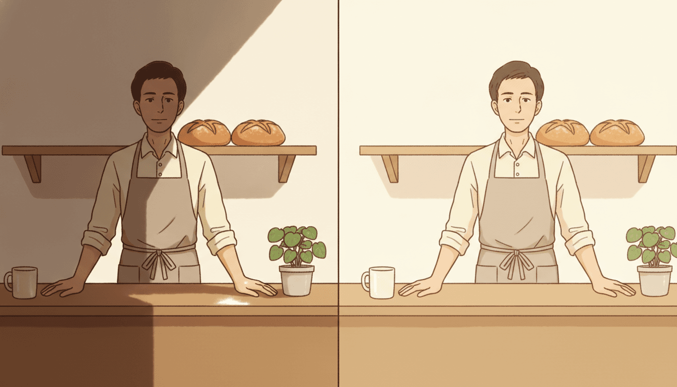
The Same Scene, Twice
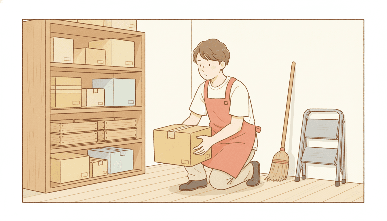
A Box, Picked Up
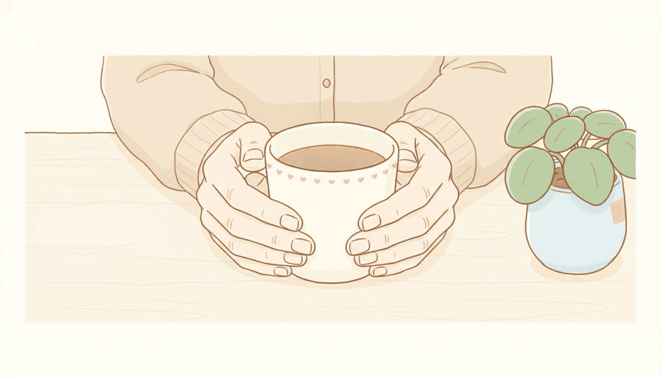
The Line, Up Close
Faces That Differ, and One Accent Doing the Work
The brief asks for individual faces rather than one cute default, and for a single gentle accent in an otherwise quiet frame.
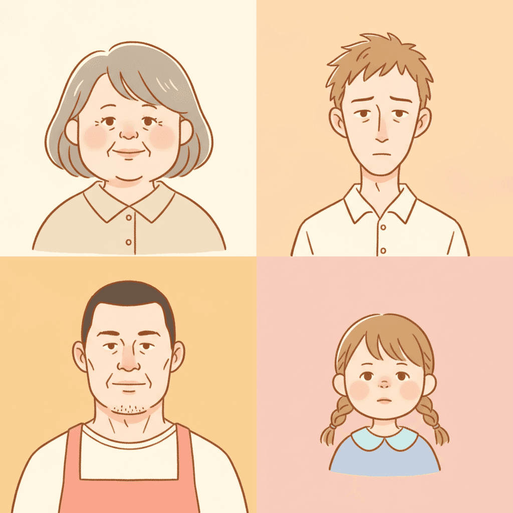
Four Faces, No Template
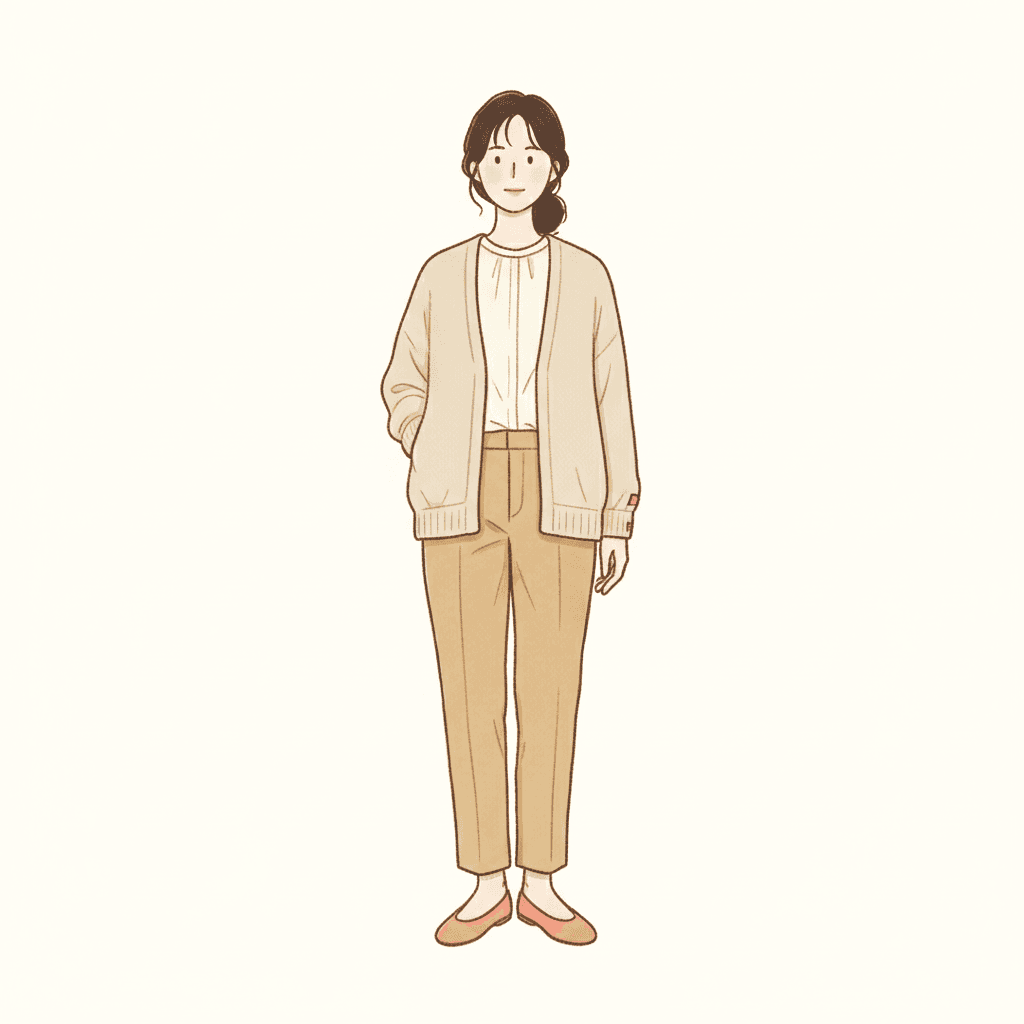
Carried By The Outline
What Somebody Left
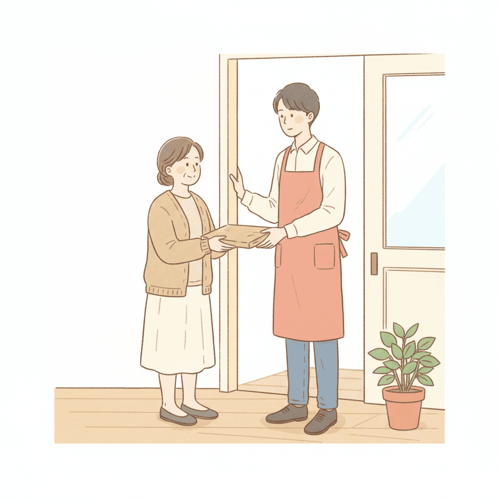
An Exchange, No Outcome
Cream, Butter, One Coral
Making a Whole Essay Manga Picture Book, Not One Panel
The useful things and the honest limits, in the order they are likely to matter to you.
The same plainness, held for twenty-four pages
This is the thing that breaks first when pages are generated one at a time, and in this style it breaks upward. Plainness is not a stable default — left alone, page four finds a dramatic sidelight, page seven finds a big shocked face, page eleven finds a sunset, and the book stops reading as somebody’s diary and starts reading as a set of unrelated highlights. One fixed brief is carried into every page instead: simple warm hand-drawn linework, soft warm pastels over cream white, soft flat everyday lighting, and the same four refusals of generic chibi faces, glossy rendering, heavy shading and photorealism. The quiet page stays quiet on page twenty because the brief on page twenty is the same one.
A cast whose faces are supposed to differ
Worth understanding before you cast your book, because this brief asks for the harder thing. A style with one cute default face is easy to keep consistent — every face is already the same face. This one requires that expressions and body language follow each character’s own personality, with face shape and head-to-body proportion doing the identifying, which is exactly the kind of specificity that drifts when every page is drawn fresh. Save each character in the Character Library with up to fourteen reference images and they are carried into every page and on into later books at the same proportions and with the same face. Characters built from an uploaded photo stay private to your account.
Cream white, cosy neutrals and exactly one gentle accent
The palette is recorded as soft warm pastels, a gentle accent, cosy neutrals and cream white — and two of those four phrases, cream white and gentle accent, appear in this brief alone out of the seventy-eight. The accent is singular on purpose: one slightly stronger colour in an otherwise quiet frame, which is why a single coral pot or one butter-yellow waistcoat ends up carrying a whole page. The honest cost is the same fact stated backwards. There is no deep dark here to drop a scene into, no cold note and no strong red, so a book in this style arrives at one steady warm temperature from beginning to end. If a page of yours needs to go cold or go dark, the cinematic and crosshatch styles are built for it. There is also no global greyscale switch in C2Story, so a monochrome book means picking a style that is monochrome by design.
The one style here that is comfortable with a grown-up
The practical reason to choose this brief over a prettier one. Most styles in this library are written with a child at the centre of the frame, and they will draw an adult, but an adult in them tends to read as somebody’s parent standing at the edge of a children’s story. This brief is written the other way round, from everyday and workplace vignettes outward, so a thirty-five-year-old in an apron is its natural subject rather than a tolerated one. That makes it the sensible pick for a leaving present, a story about a family business, a book explaining a parent’s job to a five-year-old, or a company story — and if that last one is what you are here for, our page on turning a company story into a book goes through that case properly.
A whole book, not one good vignette
This look survives mostly as single images — one panel somebody screenshotted, a strip posted on its own, a drawing of one small moment — and a single image is the easy part. You are not prompting for one. Describe the story and C2Story writes it, splits it into pages and builds each page to this brief according to what that page actually says, so the quiet observation is spread across a narrative with a beginning and an end instead of landing once. You get picture-book pages with your words set as type rather than lettered into the art, which suits this style particularly well: a real diary comic would have carried handwriting and speech balloons, and this one deliberately carries neither. When you want it on paper, the paid PDF download is the handoff to your printer.
Good for a child who likes recognising things
Honest about where this one sits with young readers. It has no spectacle at all — no dramatic light, no big reaction, no invented creature, nothing to gasp at — and that is the trade. What it has instead is recognition: a kettle, a cardboard box, a cardigan over a chair, a grown-up doing the thing your grown-up does. Children who like finding their own life in a book get a lot from that, and the flat even light means no dark corner and no shadow to interpret. The caveat is the mirror image: a toddler who wants one big clear shape per page will not be gripped, and for that the bold flat or pictogram styles are the better fit. Write in English, Chinese, Japanese, Spanish, French and more; the look does not change with the language.
A note on where this one is genuinely useful outside children’s books. Because its brief starts from the adult working day, it is the natural pick for a story whose cast is not a child — a leaving present, a family business, a book explaining a parent’s job. If that is what brought you here, see turning a company story into a book, and for where diary comics sit among the wider families, our guide to comic book art styles.
Questions About Essay Manga Picture Books
Explore More Story Ideas
Discover more styles, tools, and story types

Knight Stories
Brave knights and castle quests
Explore
Anthropomorphic Animal Books
Dressed animals with jobs & a busy little town
Explore
Children's Book Creator
Design beautiful kids books
Explore
Storybee Alternative
More styles & features
ExploreEssay Manga Picture Books — A Simple Warm Line, a Flat Everyday Light and No Event
An essay manga picture book is built on one unusual decision: the style has no way of making anything look important. C2Story runs seventy-eight hand-drawn style briefs, each a short written record of a palette, a light, a line weight and a few refusals, and this one — the Essay-Manga Diary style — is the only brief among them that names a workplace as a place its pictures happen. No brief here mentions a job, a career or a colleague at all. That single word reshapes everything downstream, because it means the style was written for the hours most children’s illustration never has to draw: the shop before it opens, the back stockroom, the staff kitchen with the kettle in it.
The light is the other decision, and it is easy to undersell. Forty-five of the seventy-eight briefs ask for flat or even light in some form, so flatness is the house default rather than a signature. What is unique here is the word the brief chose: soft flat everyday lighting. Others name a quality the light has, or a source it comes from, or an hour it belongs to. This one names how often it occurs. It is the light that is simply always on, and once you accept it there is nowhere for a shadow to be cast from, no dark corner to put anything in and no shaft through a window to announce that something is coming. A diary manga style page cannot foreshadow. Whatever is in the frame has to be worth the frame at its own size.
The brief’s four refusals point the same way. Heavy shading is how a drawing makes a moment grave; gloss is how it makes a thing desirable; photorealism is how it makes a scene impressive; a uniform cute face is how a character is made likeable without earning it. All four are struck out, and what remains is a simple warm hand-drawn line over soft warm pastels on cream white, with one gentle accent colour doing the only emphasis available. In their place the brief asks for something most styles here do not: that expressions and body language follow each character’s own personality rather than a standard template, with face shape, head-to-body proportion and the shapes of hands and feet carrying who somebody is. Three briefs share that silhouette idea — this one, an eighties city-pop look and a gag manga. The personality clause is this one’s alone.
Which makes the choice between slice of life manga art styles reasonably clear. Take the gag manga brief if the exaggerated reaction is the page. Take the single-panel editorial cartoon if every page needs a punchline and monochrome ink is welcome. Take the Korean lifestyle doodle if you want the cast young and sweet and the page spare. Take this one when the cast might be a grown-up, the setting might be a job, and the thing you want to put in a book is the half hour a louder style would have cut. Describe it in a sentence and C2Story writes the story, splits it into pages and builds every page to the same brief, keeping your characters on model throughout — in English, Chinese, Japanese, Spanish, French and more, with the paid PDF download as the handoff to your printer.