
Photocopy Cel Picture BooksThe Pencil Line, Kept
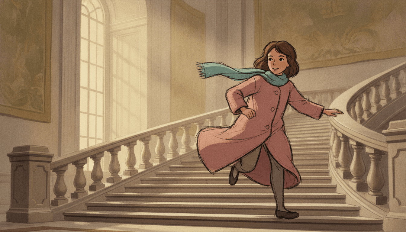
A girl running down a grand staircase, her scarf flying out behind her. Photocopy cel picture books are drawn like a frame from a hand-drawn film of the 1960s, when the animator’s pencil drawing was copied straight onto the cel instead of being traced clean: a rough, lively outline, soft flat colour, and a world behind it painted slowly in gouache.
- Rough pencil outlines, never traced clean
- Soft gouache castles, kitchens and gardens
- Dusty rose, muted teal, warm parchment
- Free credits by request, no card
50,000+
Stories Created
10,000+
Active Creators
50+
Art Styles
4.9/5
User Rating
What Makes the Photocopy Art Style Different
Every style here is a written brief: a palette, a light, a line weight and a short list of refusals. Four things in this one decide the look. The first is unique in the library; the second is unique among its animation neighbours.
The line is a copy, not a tracing
Every style in C2Story is a short written brief with a line-weight note. Five of the seventy-eight describe animation, and four of those ask for an inked line: sharp, loose, painterly or crisp. This one asks for grainy transferred pencil outlines, and it is the only brief in the library whose line is a copy of a drawing. Nobody went over it again in ink. What the animator’s hand did is what you see.
Rough people, finished world
The characters keep the rough, lively pencil line. The castles and interiors behind them are soft gouache with classical brushwork and no outline at all. Among the five animation briefs it is the only one where the figure is rougher than the place it stands in. The 1970s European cel is rough everywhere; the other three are clean everywhere.
The light belongs to the painting
Its light is soft painted classical light. It is not switched on, not hard and not cinematic. It lives in the background painting, in a tall window or a pale sky, and the drawn figures simply stand in it. So the pages are calm and warm, and nobody gets a dramatic shadow across the face.
Faded on purpose
The palette is soft gouache tones, warm parchment, dusty rose and muted teal. It refuses digital vector art, glossy CGI, flat computer colour and photorealism, so nothing is crisp, shiny or perfectly filled. The colour sits slightly behind the line, the way it does on an old print of an old film.
What a Xerox Illustration Line Looks Like
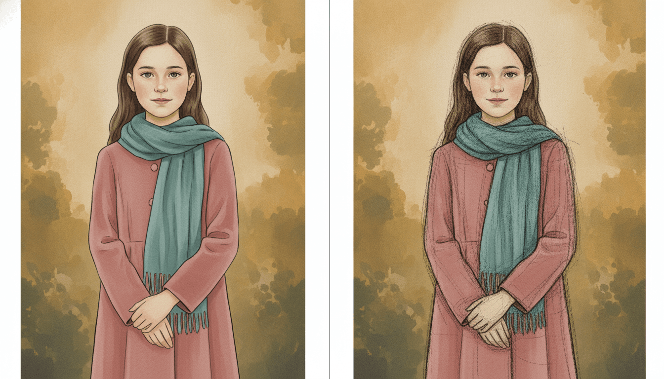
Look at one girl twice. Same long brown hair, same dusty-rose coat, same teal scarf, same painted autumn garden behind her. On the left her outline is smooth and even all the way round, the way an inker would trace it. It is tidy, and it is a little still.
On the right nothing has changed except the line. It is grainier and darker, the sleeves and the hem pick up loose doubled strokes, and faint construction lines run down the coat where the drawing was worked out. The colour and the garden are the same. The girl simply looks drawn by a person. That is the whole of this xerox illustration brief, and the left half is what it refuses: digital vector cleanliness.
Its four refusals all keep the page away from anything machine-smooth.
Spend Your Adjectives on the Room
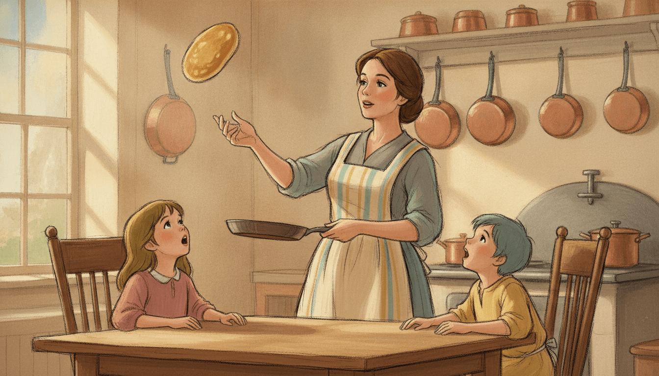
A farmhouse kitchen in morning light: a row of copper pans on the wall, a window, a stove, a scrubbed wooden table. Into it, three people drawn with a quick pencil line, and one pancake in the air. The room is calm and finished. All of the life is in the three upturned faces and the pancake.
That split is where the writing goes. This brief paints its world slowly and leaves its people at the first drawing, so detail you give the place gets painted, and detail you pile on a character mostly gets lost in a rough line. Describe the room: the tall window, the brass clocks, the tapestries on the stair. Then give each person one plain thing to do. “Mum flips the pancake.” “The boy climbs onto the crate.” “The goose chases him.”
In a book you do not write image prompts; C2Story writes them from your story. A page that says “a girl in a big old house” gets a girl and a vague hall. A page that says “down the curving stone staircase, past the tall windows and the faded tapestries” gets the hall, and the girl comes running down it.
From One Sentence to Photocopy Cel Picture Books
You pick the look once. The brief is then applied to every page, so the pencil line, the painted world and the faded palette never drift.
Describe the places and the cast
Write a sentence or two about who is in the story and what happens, and say where each scene takes place. Give each character one clear outfit and one action per page.
Choose Xerox Cel Animation
Pick the style from the Styles Library. From then on every page uses the same rough pencil outlines, the same soft gouache backgrounds and the same dusty rose, teal and parchment.
Get a whole book
C2Story writes the story, splits it into pages and illustrates each one. Regenerate any page you want to change without touching the rest, read it online, share it, or buy the PDF download to hand to a printer.
This Style and Its Three Nearest Neighbours
One shares the cel, one shares the rough line and one shares the old-fashioned taste. Here is what each actually asks for.
Xerox Cel Animation
The style on this page
Classic hand-drawn cel animation in the photocopied-outline look of the 1960s and 70s: lively, slightly rough graphite pencil lines transferred as black cel outlines, elegant expressive character designs, and painted gouache castle and interior backgrounds with soft classical brushwork. It refuses digital vector art, glossy CGI, flat computer colour and photorealism.
Retro OVA Cel
Also a cel, inked and at night
A late-1980s anime cel with sharp hand-inked outlines, dense acrylic night streets and a hard light that always comes from something switched on. Choose it for a rainy city after dark. Choose the photocopy cel for daylight, an old house and a line you can still see the pencil in.
Sketchbook Concept
The other rough line
A loose wandering pen with rustic watercolour washes on grainy paper, and the whole page is a sketch: the characters and the world are equally unfinished. In the photocopy cel only the people are rough. The world behind them has been painted slowly and properly.
Classic Storybook
Same era of taste, different medium
Golden-age book illustration with warm earthy tones and a fine ink line, made for the printed page. It has no animation in it. Choose it when the book should feel like an old illustrated edition; choose the photocopy cel when it should feel like a frame from an old hand-drawn film.
Story Ideas for Photocopy Cel Picture Books
Each idea has a place worth painting and one simple thing happening in it, which is what this brief draws best. Old houses, workshops, kitchens, libraries and castle grounds all suit it.
Late for Everything
A girl in a dusty-rose coat runs down the same grand staircase every morning, and every morning something in the old house is waiting at the bottom.
The Clockmaker’s Grandson
One clock on the high shelf has never been wound, and Grandfather will not say why. His grandson finds a crate to stand on.
Pancake Day
Mum can flip a pancake higher than the copper pans. This year it does not come down.
The Goose Who Kept the Gate
Nobody gets across the castle courtyard without the goose’s permission, and the new boy has not asked.
Too Many Books
The librarian says take as many as you can carry. A boy takes her at her word.
The Fox on the Castle Path
A girl and a fox walk the long way round the hill every afternoon, and the castle at the top is never quite as far away as it was yesterday.
What the Rough Cel Animation Look Does Across a Book
Pages generated to this one brief, with nothing retouched afterwards. Two honest notes: in the library, the shelves picked up a light outline of their own, so the painted-world split is not always total. And the girl and the fox were meant to be small in a wide landscape and came back much closer.
Traced clean, then kept as drawn
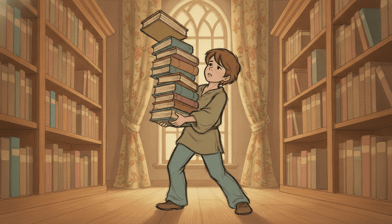
Too many books
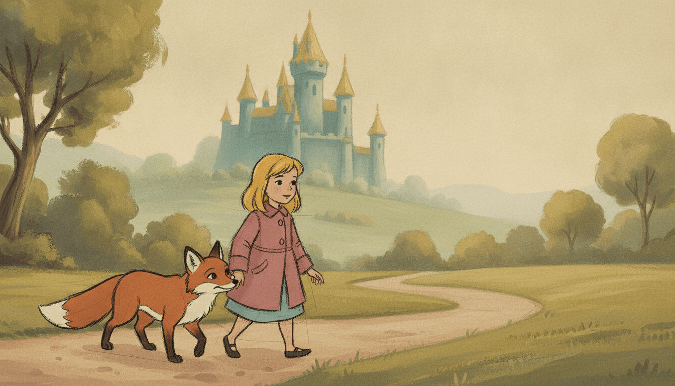
A walk below the castle
A Hand-Drawn Cast, Held Steady
Here is where the design held and where it wandered. The girl keeps her bob, dusty-rose coat, teal scarf and brown shoes through four views, though her hair is shorter here than in the two-up above, which was a separate prompt; save a character to keep that fixed. The close-up shows the pencil at its clearest, with a faint construction line still running down the middle of her face. The empty bedroom shows the other half of the brief alone: painted, with no line at all.
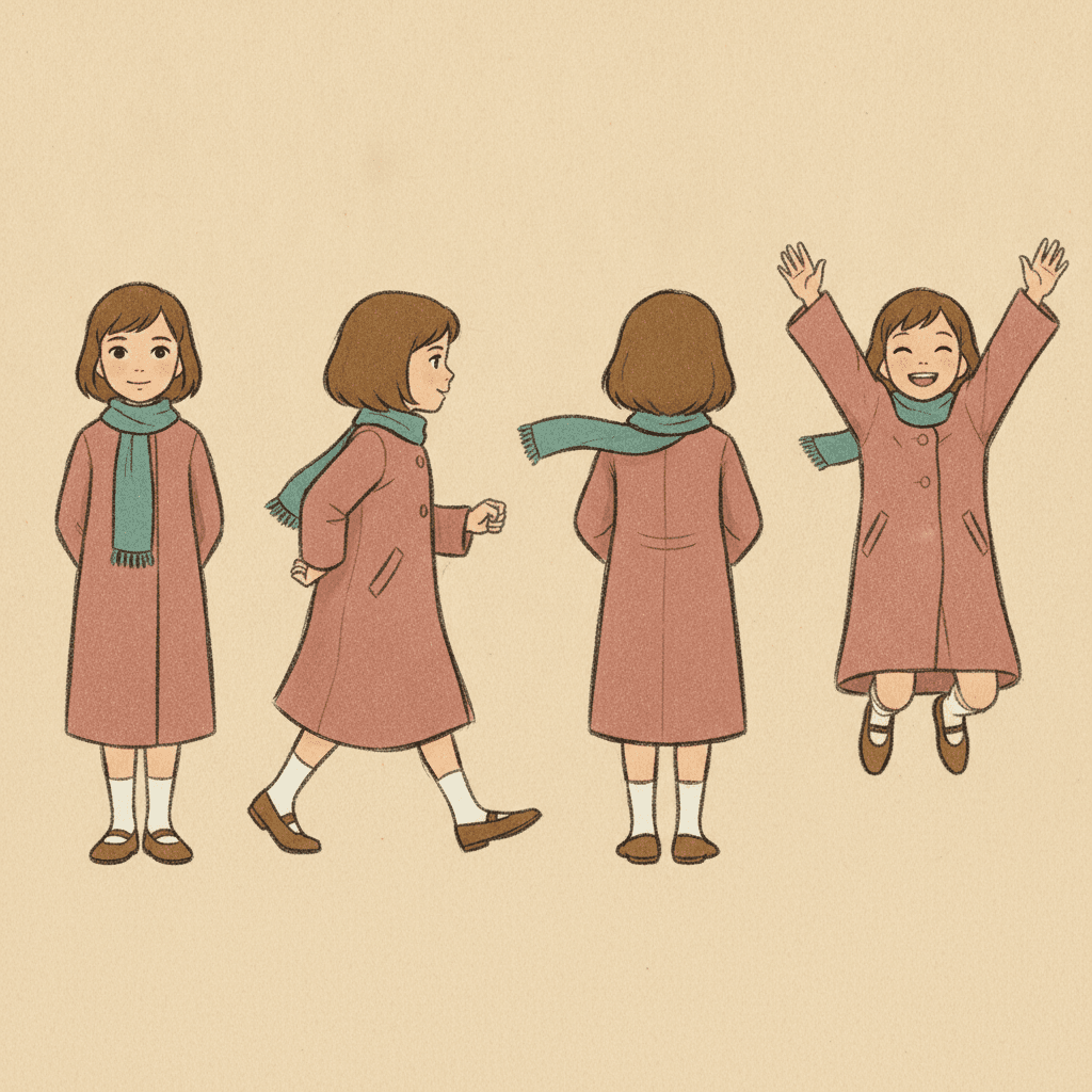
One girl, four views
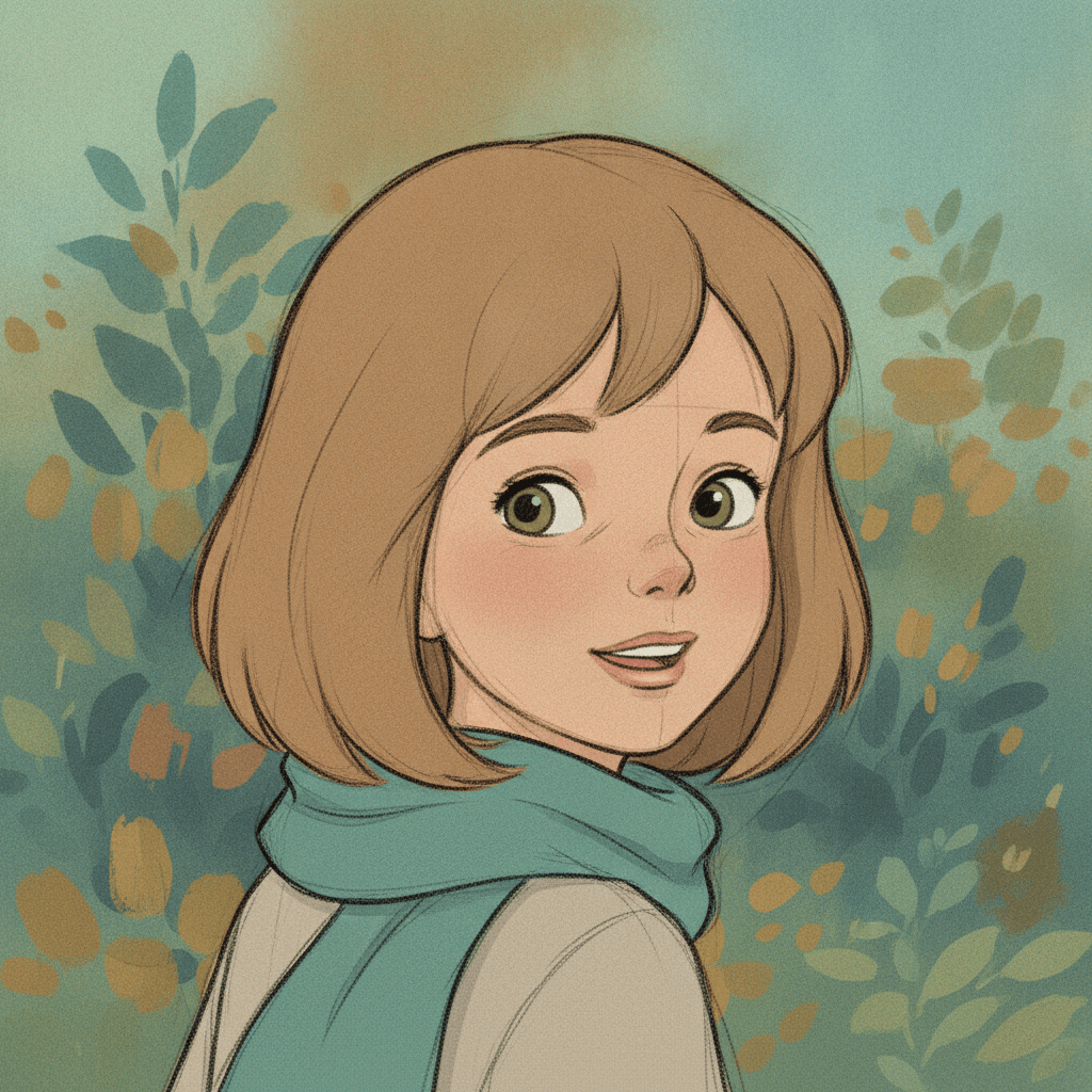
The line, up close
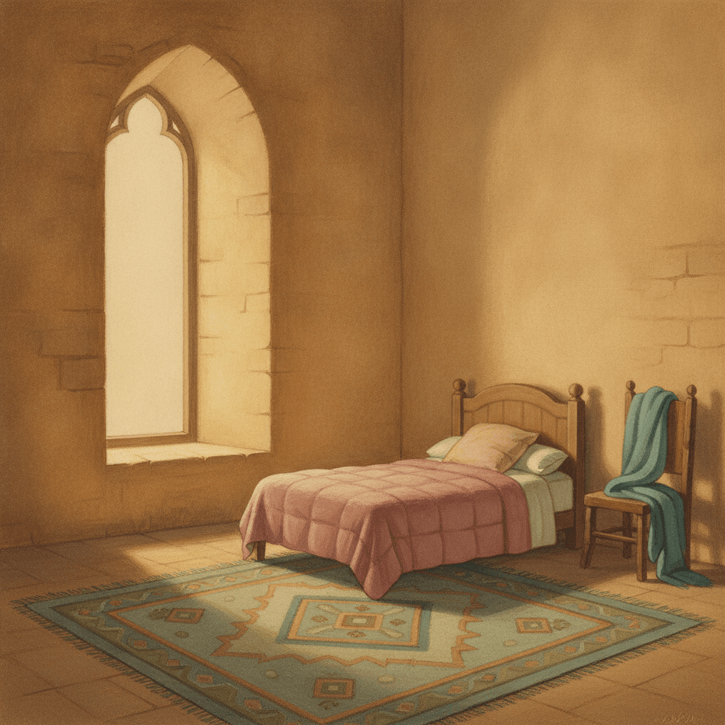
The room, with nobody in it
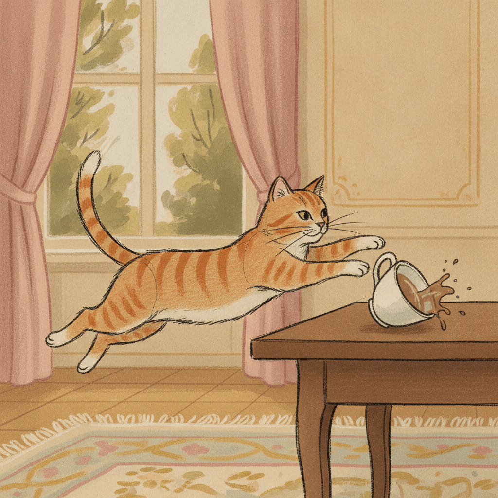
The cat and the teacup
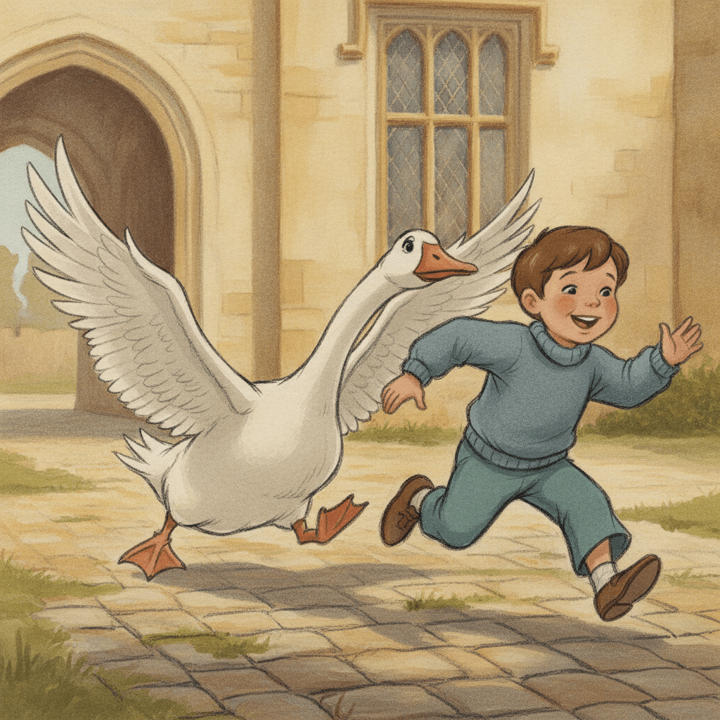
The goose wins
Making Whole Photocopy Cel Picture Books
What is useful in a book drawn this way and where the limits are, in the order you are likely to meet them.
One character, kept on model
Save each character in the Character Library with up to fourteen reference images and a short written description. The girl on this page kept her bob, dusty-rose coat, teal scarf and brown shoes through four views. Characters made from an uploaded photo stay private to your account.
Spend your adjectives on the room
The place is painted carefully and the people are drawn quickly, so put the detail where the painting goes: the copper pans, the tall window, the tapestries. Give each character one plain action instead of a list of features.
The roughness is the point
Loose doubled strokes and faint construction lines are part of the brief, not an error. If you want a perfectly clean outline, this is the wrong style: pick one of the inked cels or a clear-line style instead.
Say how big they are
The brief likes its characters close enough to show the line. A page that asked for a small girl and a fox in a wide landscape brought them in closer than asked. If somebody should be tiny in a big place, say so plainly on that page.
Calm, warm and daylit
Soft painted light and a faded palette suit gentle stories, old houses, gardens and castles, family days and bedtime. It is a weak fit for night chases, neon, horror or anything that needs a hard shadow.
A whole book from a sentence
Describe the story in a sentence and C2Story writes it, splits it into pages and draws every page to the same brief, in English, Chinese, Japanese, Spanish, French and more. Read online, share a link, or buy the PDF download as the handoff to your printer. Pages are licensed for commercial use under the terms of service.
Other hand-made and animation styles, each built on a different idea: for an inked 1980s cel at night, retro OVA cel picture books; for a page that is all sketch, sketchbook concept picture books; for golden-age book illustration, classic storybook art; for opaque paint with no rough line, gouache picture books; and for every style side by side, the children’s book illustration styles gallery.
Questions About Photocopy Cel Picture Books
Explore More Story Ideas
Discover more styles, tools, and story types
Bear Stories
A new bear friend, woodland picnics, honey treats and great bear hunts
Explore
Watercolor Picture Books
Soft washes & dreamy textures
Explore
Bedtime Story Generator
Cozy goodnight stories for kids
Explore
Storybee Alternative
More styles & features
ExplorePhotocopy Cel Picture Books: Pencil Line, Painted World, Soft Light
Photocopy cel picture books rest on a brief that keeps the first drawing. C2Story runs seventy-eight hand-drawn style briefs, each a short written record of a palette, a light, a line weight and a few refusals. Five describe animation, and four of those ask for an inked line. The Xerox Cel Animation brief asks for grainy transferred pencil outlines instead, and it is the only brief in the library whose line is a copy of a drawing rather than a tracing of one.
The look is the photocopy art style of 1960s and 70s hand-drawn animation, sometimes called the xerox animation style: lively, slightly rough graphite pencil lines carried onto the cel as black outlines, elegant expressive character designs, soft flat colour, and gouache-painted castles and interiors with soft classical brushwork. The light is soft painted classical light; the palette is soft gouache tones, warm parchment, dusty rose and muted teal. It refuses digital vector art, glossy CGI, flat computer colour and photorealism.
This rough cel animation look suits gentle stories with a place worth painting: a girl on a grand staircase, a clockmaker’s workshop, a kitchen on pancake day, a library, a castle courtyard and a goose. Spend your description on the setting and give each character one action, because the world is painted slowly and the people are drawn fast. It is a weaker fit for night scenes and anything that needs a hard shadow. Characters stay on model through the Character Library, with up to fourteen reference images each.
The choice between neighbours is clear. Take the retro OVA cel for an inked line in a rainy city at night, sketchbook concept for a page that is all sketch, and classic storybook for an illustrated edition with no animation in it. Take this style when the people should look drawn by hand and the world around them should look painted with care. Describe the story in a sentence and C2Story writes it, splits it into pages and draws every page to the same brief, with the paid PDF download as the handoff to your printer.