Animal WatercolorIllustration Picture Books
Animal watercolor illustration is not a cute animal in soft paint. It is an animal somebody actually looked at — real species, real anatomy, real habitat — held across every page of your book.
- Real identifiable species, not animal-shaped characters
- The habitat painted as carefully as the fur
- Soft translucent washes over visible paper grain
- Free credits by request — no card
50,000+
Stories Created
10,000+
Active Creators
50+
Art Styles
4.9/5
User Rating
What Makes Animal Watercolor Illustration More Than Watercolour With an Animal In It
Seven styles in this library are built on watercolour. Six of them spend their refusals on the paint. This one spends one of its refusals on the animal.
Its third refusal is about anatomy, not about paint
Every style in this library ends with four refusals. Seven of the seventy-eight hand-drawn styles enabled in C2Story are built on watercolour, and six of them spend that list policing how the paint behaves — no heavy opaque paint, no hard outlines, no muddy colour, no flat digital fill. This one refuses cartoon exaggeration, which is not a statement about paint at all. It is a statement about the drawing underneath the paint. The practical effect is the whole style in one line: the animal has to be right before the washes matter.
The habitat is painted as carefully as the animal
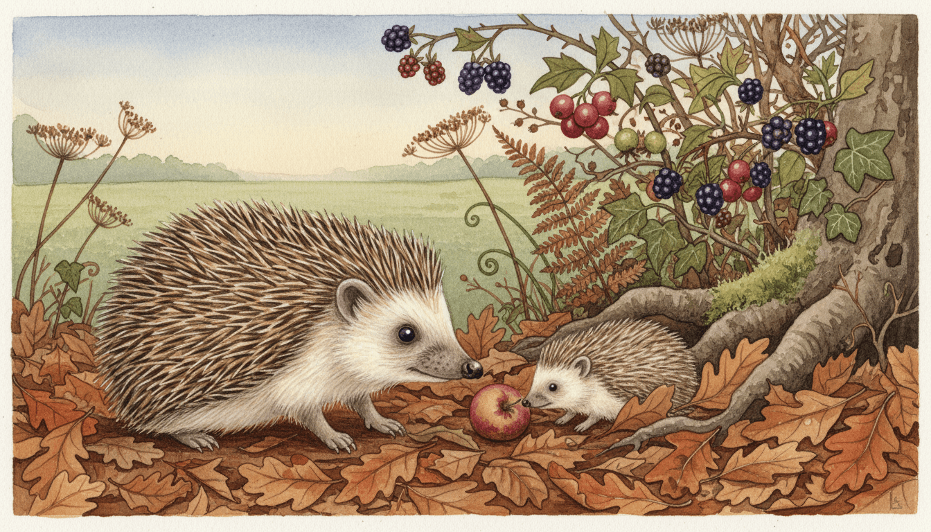
The brief asks for delicate detail in fur and foliage, and then says the natural setting is fully painted. Of all seventy-eight enabled styles, this is the only one whose specification commits in writing to finishing the background. Everywhere else, background is whatever is left over once the character is done. Here the fern fronds, the leaf veins, the wet pebbles and the seedheads get the same brush and the same patience as the fur — which is why a page can be about a place rather than about a creature.
Squeezed from both sides at once
Cartoon exaggeration and photorealistic sit in the same four-item refusal list. Most styles here only have to avoid one of those; nearly all of them ban photorealism as routine housekeeping, and only two of the seventy-eight ban exaggeration at all. The other one of those two is a deadpan cartoon that refuses exaggerated expression — a face rule. This is the only brief that refuses exaggerated anatomy. It leaves a narrow corridor to work in: accurate enough that you could name the species, soft enough that it is unmistakably a painting.
Naming the species actually changes the drawing
Because the brief asks for carefully observed realistic animals rather than animal-shaped characters, specificity is rewarded here in a way it is not elsewhere. A harvest mouse is not a mouse: it has translucent ears, a prehensile tail and a white underside, and it climbs wheat. Ask most styles for a harvest mouse and you get a generic rounded rodent in the house palette. Ask this one and the ears go thin enough to see the light through. It is the one look in the library where writing like a field guide pays you back.
The Animal Has to Be Right Before the Paint Matters
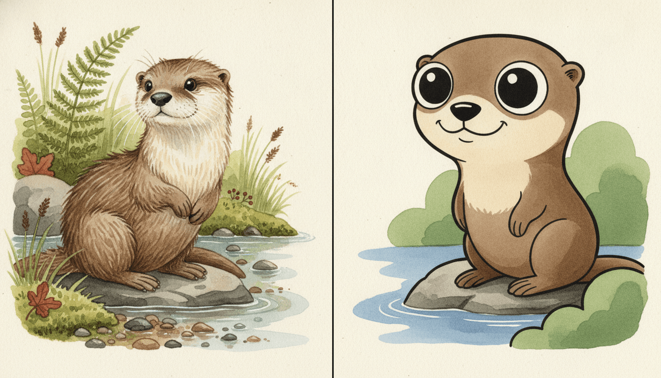
Here is the same otter, in the same pose, on the same rock. On the left it is drawn to this brief. On the right it is drawn with one refusal lifted — cartoon exaggeration allowed back in. The head swells to half the body, the eyes become glossy discs, the snout shrinks to a button and a human grin appears.
Nothing about the paint changed. Both halves are children’s book art of an otter. What changed is the anatomy underneath, and that is the decision this style exists to make. Of the seventy-eight hand-drawn styles enabled here, only two refuse exaggeration at all, and this is the only one refusing it in the body rather than the face.
So name the species. Not a bird, a wren. Not a deer, a roe deer. The brief is built on observation, so specificity is the one instruction it rewards most — and the one most people forget to give it.
And name the place. A hedgerow in October, a chalk stream, a birch wood in mist. This is the only brief in the library that promises to finish the background, so a specific habitat is free detail you would not get anywhere else.
Its four refusals, in the order the brief states them:
Two Ways to Use the Same Medium: Hold the Detail, or Dissolve It
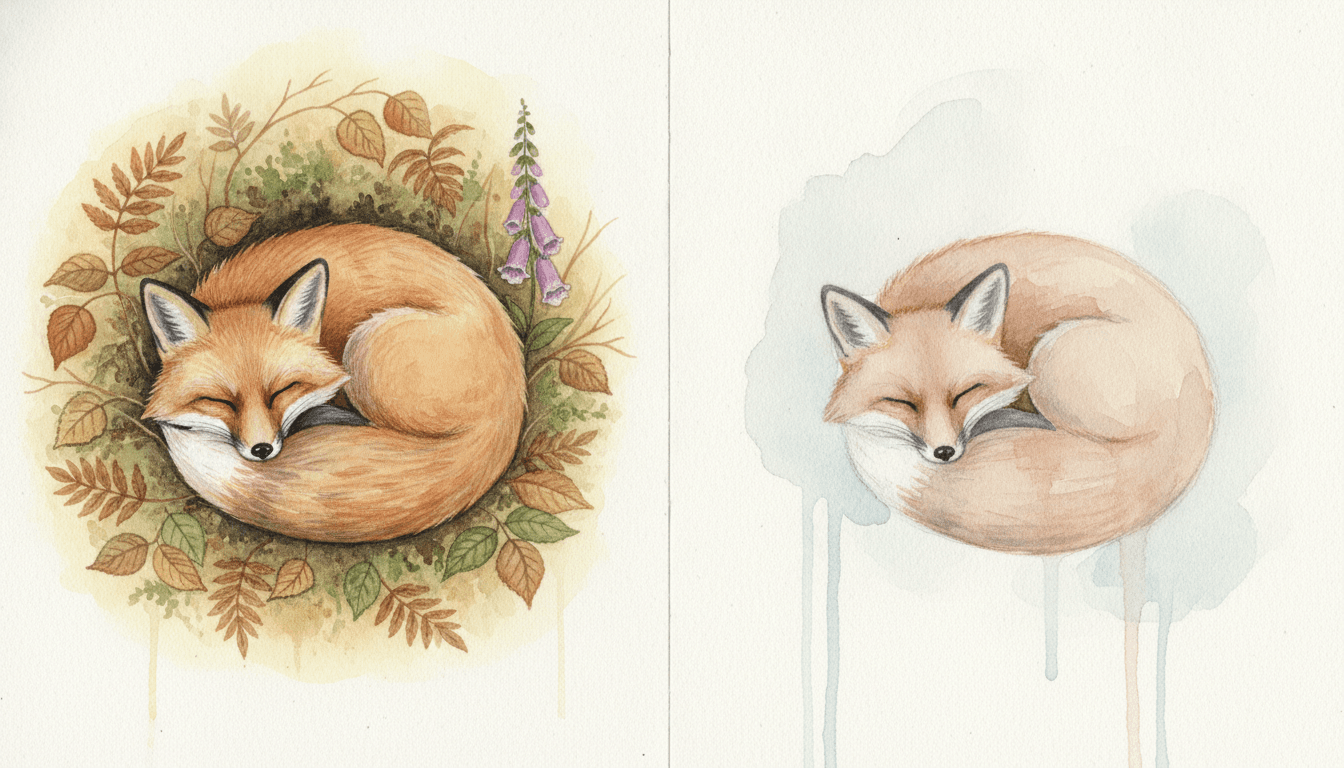
One fox, asleep, painted twice — and both halves are genuinely watercolour. The left is this page’s style: translucent washes built up in layers until you can count the coats of fur, inside a hollow of bracken and birch leaves painted just as thoroughly. The right is the library’s Airy Transparent Watercolor style, where the same medium is used to let go — dilute blooms, no fur detail, no painted eye, and bare paper doing most of the work.
Neither is better. But they are the two ends of what watercolour is for, and a whole book will feel completely different in each. If you can tell which half you were picturing when you typed animal watercolor illustration into a search box, you already know which one to pick.
One-second test. Picture your animal. Can you see individual hairs, or a soft shape? Hairs means this style. A soft shape means the airy transparent one — and asking this brief to be loose will mostly just make it look underpainted.
And one for the feeling. Faces cannot carry emotion here. If your emotional beat depends on a grin or a comic double-take, this is the wrong look — the tenderness has to come from light, weather and posture instead.
Worth seeing side by side before you commit: the anthropomorphic animal style, for animals with clothes and jobs, the general watercolor style, which has no accuracy instruction at all, and the gouache style, where the paint is opaque and the light goes on last.
Create an Animal Watercolor Picture Book in 3 Steps
From a one-line idea to a finished book where the species stays right and the habitat stays painted, in under two minutes.
Describe the story
A sentence is enough. Give this look a real species and a real place, as precisely as you can — it is the one style here that reads a field-guide noun as an instruction rather than as flavour.
"A harvest mouse builds a nest in a wheat field before harvest"
Pick Naturalist Animal Watercolor
Choose it for observed species, soft layered washes and a fully painted habitat. Choose Airy Transparent Watercolor instead for pale dissolving washes and white paper, Busy Anthropomorphic Town for dressed animals with occupations, or Mythic Bestiary Ink for creatures that were never real.
Moss green, sage, chestnut, russet, warm ochre, dusty blue
Generate and export
C2Story writes the story, breaks it into pages and paints every one to the same brief. Read it on screen, share the link, or export the PDF and take that file to whichever printer or print service you already use.
Whole book painted, PDF export, instant sharing
Animal Watercolor Illustration and Its Nearest Neighbours
Four real styles for a book with animals in it, sorted by the two questions that actually separate them: is the animal observed or invented, and does the paint hold detail or let it go?
Naturalist Animal Watercolor
Fine naturalist watercolour picturebook illustration: carefully observed realistic animals, a classic storybook feel, soft translucent washes, gentle paper texture, delicate detail in fur and foliage and a warm tender mood with the natural setting fully painted. Its light is a soft natural diffused light and its line is a soft blended edge rather than an outline. It refuses flat vector colour, harsh outlines, cartoon exaggeration and photorealism. One of eleven picture book styles enabled here.
Airy Transparent Watercolor
Extremely light transparent watercolour: soft gentle characters, delicate wet-into-wet blooming edges, abundant untouched white paper, an airy pastel palette and minimal linework, with heavy opaque paint refused by name. The clearest comparison in the library, because the medium is identical and the intent is inverted. This page’s style uses watercolour to hold detail; that one uses it to dissolve detail, and lets the bare paper carry half the composition. The sleeping fox above is the same animal painted both ways.
Busy Anthropomorphic Town
A warm anthropomorphic-animal picturebook: a busy little society of animals in occupational roles, rounded friendly contours and rich everyday detail filling a bustling town scene in soft cheerful colour. Both briefs fill the frame and refuse to leave it empty, but they fill it with different things — that one with a society, this one with a habitat. The moment your badger needs a waistcoat, a shop and an opinion, you want that style, because this one refuses the exaggeration that kind of character runs on.
Mythic Bestiary Ink
Mythic bestiary ink illustration: ancient legendary beasts reimagined as modern creature design, visible hand-drawn brush pressure, ink washes and textured strokes, with expression driven by the creature’s real character rather than a generic cute default, in deep ink black, aged paper beige, muted vermillion and smoky grey. It shares this page’s dislike of the default cute face, and takes it somewhere else entirely — the animal is imagined rather than observed, the medium is brush ink, and the mood is moody rather than tender.
Three more relatives are worth knowing about. Poetic Ink-Wash Storybook also pairs soft watercolour washes with paper grain, but builds on pen-and-ink linework and large expanses of clean white space, which is the opposite of a fully painted habitat. Gouache Animation Storybook gives you opaque matte paint instead of translucent layers, so colour sits on top rather than building up through. And Wild Ink Weirdness is the other place in the library to find non-human creatures, drawn in untamed brush ink with an eerie rather than tender edge. Browse everything on the illustration styles hub.
Naturalist Animal Art Story Ideas to Get You Started
This look is better at place, season and patience than at jokes, speed or peril. These six lean into that — notice how many of them have a habitat as the real main character.
The Hedgerow in October
One hedge, one month, and everything living in it. Because the natural setting is fully painted in this brief, a story whose real subject is a place rather than a character gets the whole brush instead of a blurred backdrop.
Create this storyOne Pond, Twelve Months
The same stretch of water painted twelve times. A structure built entirely on habitat and season suits a look where foliage is named in the specification alongside fur.
Create this storyWhat Lives Under the Log
A beetle, a newt, three woodlice and a very surprised shrew. Small creatures reward a style asking for delicate detail, because at that scale the detail is the entire drawing.
Create this storyThe Egg
One nest followed from speckled shell to the morning it is empty. Carefully observed realistic animals means a fledgling can look genuinely awkward and half-feathered rather than adorable.
Create this storyThe Long Way to the Sea
A journey downstream through every habitat a river passes. A travelling story is a chance to use the one thing this style can do that the others cannot — change the setting completely and paint each one properly.
Create this storyThe Winter the River Froze
A hard season, survived. Its feeling has to arrive through weather, light and posture rather than through faces, which is exactly what a hushed, cold, waiting story needs.
Create this storyAI-Generated Animal Watercolor Illustrations
Try this on the river bank below: cover the animals with your hand and look only at what is left. The reeds, the iris, the pebbles and the lily pads are finished paintings in their own right.
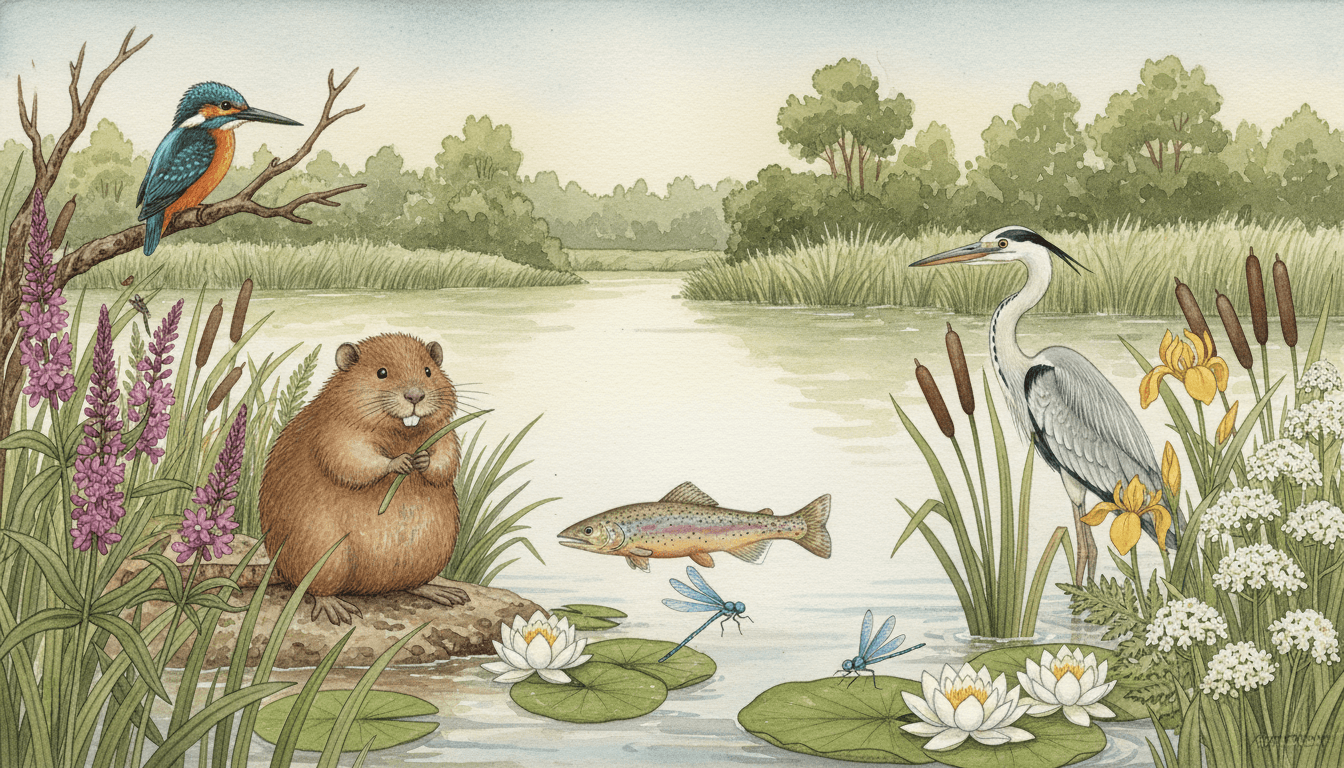
Watercolour Wildlife for Every Part of Your Story
Characters, close detail, habitats with nothing living in them, a table of found things, a page of pure colour — the same washes and the same patience, spent on whatever your story is actually about.
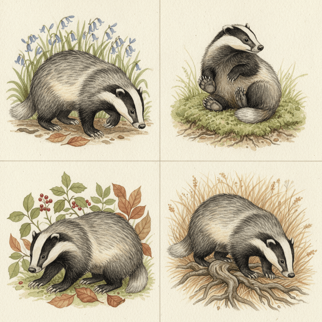
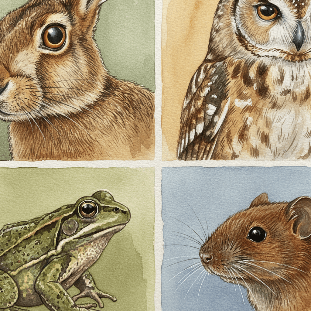
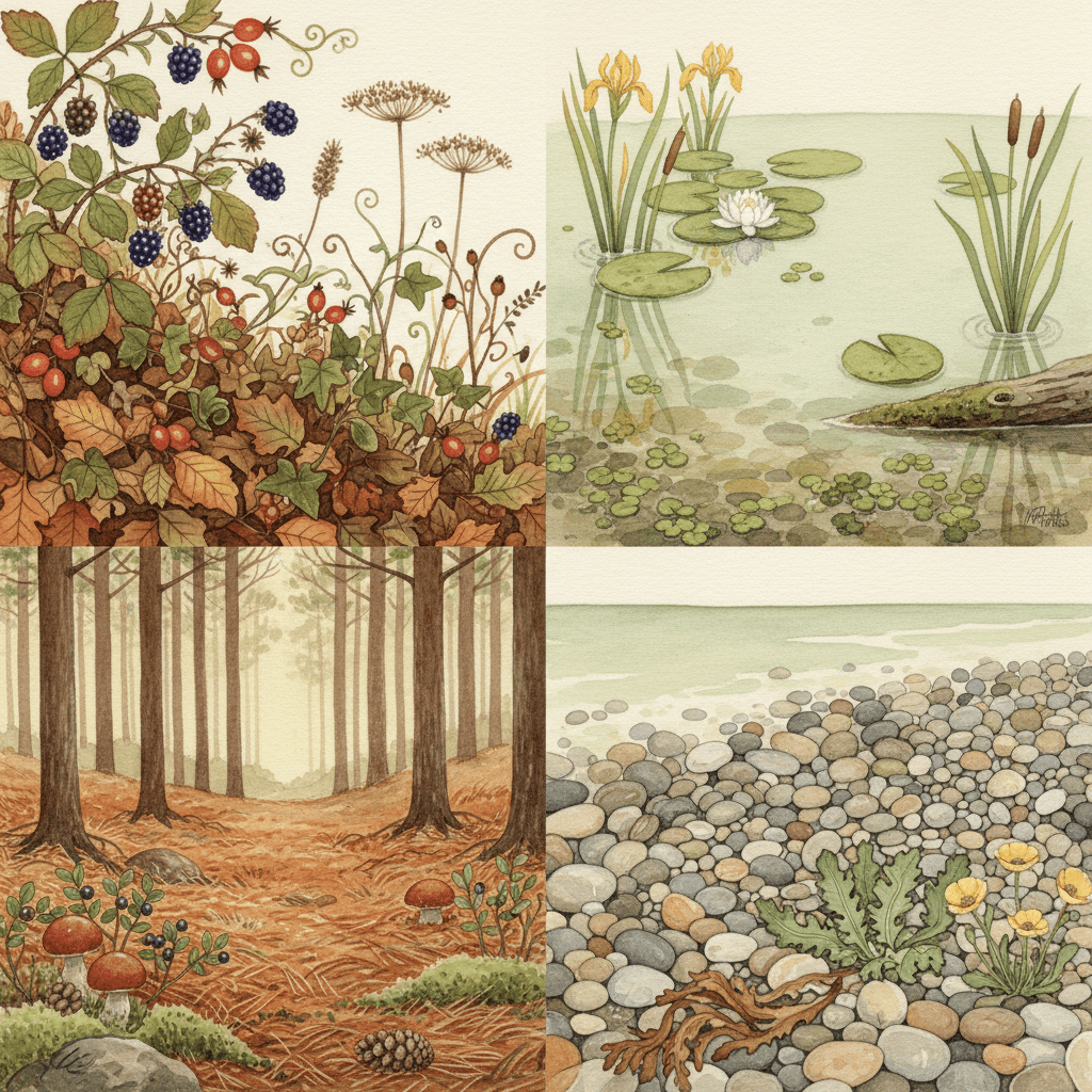
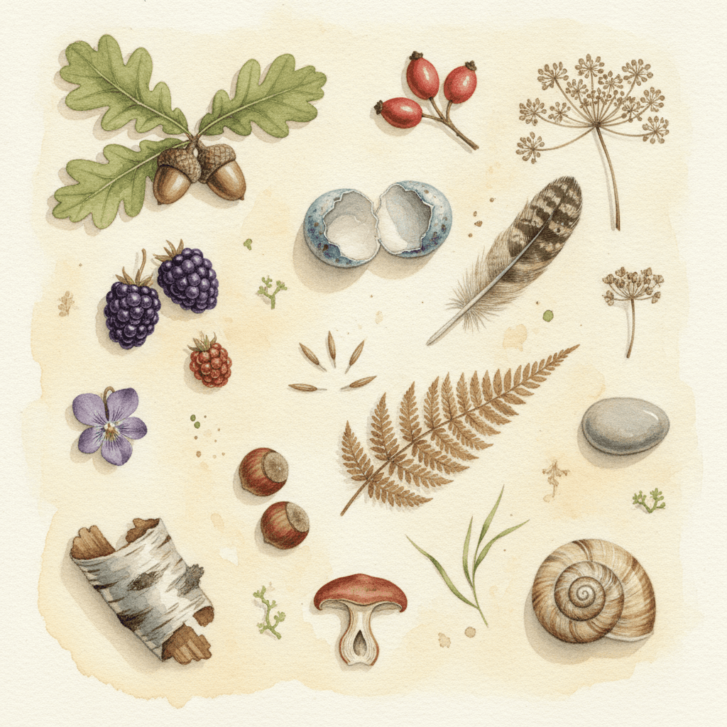
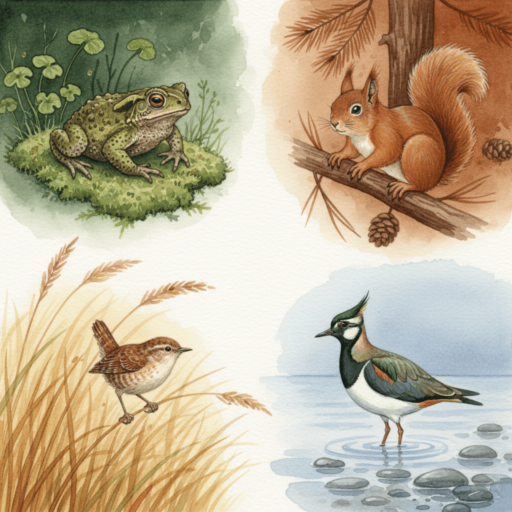
Everything You Need for Animal Watercolor Picture Books
One beautiful painting of a hare is easy. Twenty-four of them, with the same hare in all of them and a habitat finished behind every one, is the part that needs building.
The same species on page twenty
Accuracy is the first thing an image model quietly lets go of. Ask twenty times for a badger and somewhere around page eight the stripes start wandering, the snout shortens and you are looking at a generic friendly woodland creature. One fixed brief — carefully observed realistic animals, delicate detail in fur and foliage, no cartoon exaggeration — is carried into every page instead, so the last spread is as studied as the first.
Four refusals, one aimed at the drawing
Flat vector colour, harsh outlines, cartoon exaggeration, photorealism. The first two protect the medium — no hard edges, no even digital fill, so separation comes from one wash meeting another. The fourth is routine. The third is the real one, and it is unusual: it governs the shape of the animal rather than the handling of the paint.
A cast with a correct answer
Save your animals in the Character Library, with up to fourteen reference images each, and they carry into every page and into later books. It bites harder here than in an invented-creature style, because a real species has a right answer your reader already knows. A badger with the stripes in the wrong place is not a stylistic choice — it simply looks wrong, even to someone who could not say why. Characters built from an uploaded photo stay private to your account.
An earthy palette that arrives with the look
Soft natural watercolour, earthy greens and browns, warm muted tones, under soft natural diffused light with no harsh shadow. There is no eyedropper and no hex field — the range comes with the style. It is a deliberately quiet one, which is why this look holds a whole book together without ever getting loud, and also why it cannot be pushed into brightness.
Whole books, not single studies
You are not prompting for one lucky painting of a hare. Describe the story and C2Story writes it, breaks it into pages, and paints every page in this style, matched to what that page actually says — so one wood, one river or one hedgerow stays recognisably the same place across a narrative.
Any language you read aloud in
The look carries no language of its own. Write in English, Chinese, Japanese, Spanish, French and more — the translucent washes, the paper grain and the earthy palette do not change with the text. A wet black nose reads the same in every alphabet.
Animal Watercolor Picture Books — Questions
What people ask before committing a whole book to observed species, layered washes and a fully painted habitat.
Explore More Story Ideas
Discover more styles, tools, and story types
Sports Stories
The big game, sports day and the championship trophy
Explore
Mid-Century Modern Books
Flat colour blocks & hard-edged geometry
Explore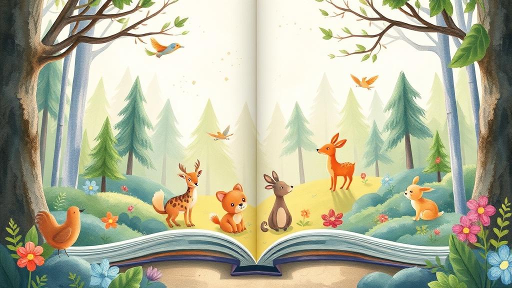
Picture Book Maker
Create illustrated picture books
Explore
ChatGPT vs C2Story
Purpose-built for picture books
ExploreAnimal Watercolor Illustration in Picture Books — Painting an Animal Somebody Looked At, with AI
Animal watercolor illustration is the oldest and most loved corner of the picture book, and it is also the easiest one to imitate badly. The imitation puts a soft brown animal in soft brown paint, gives it big friendly eyes, and calls the job done. The real thing is defined by something harder: the animal is a real species, drawn by somebody who had looked at one. On C2Story this is the Naturalist Animal Watercolor style, and its brief states it plainly — fine naturalist watercolour picturebook illustration, carefully observed realistic animals, a classic storybook feel, soft translucent washes, gentle paper texture, delicate detail in fur and foliage, and a warm tender mood with the natural setting fully painted. One brief, applied across an entire book, so the twentieth page is as carefully looked at as the first.
The thing worth understanding before you commit a book to it is where the discipline lives. Seven of the seventy-eight hand-drawn styles enabled here are built on watercolour, and every one of them ends with a list of four refusals. Six spend that list on the medium: no heavy opaque paint, no hard outlines, no muddy colour, no flat digital fill. They are all instructions about how the paint should behave. This one refuses cartoon exaggeration, which is not about paint at all — it is about the drawing underneath. Only two of the seventy-eight enabled styles refuse exaggeration in any form, and the other one is a deadpan cartoon refusing exaggerated expression, a rule about faces. This is the only brief in the library that refuses exaggerated anatomy. That single clause is what separates naturalist animal art from a cute animal in washes, and it is why the practical advice for this style is so specific: name the species. Not a bird, a wren. Not a deer, a roe deer. A brief built on observation reads a precise noun as an instruction, where most styles read it as decoration.
The second unusual thing about it is the background. Of all seventy-eight enabled styles, this is the only one whose specification promises in writing to finish the setting — delicate detail in fur and foliage, the natural setting fully painted. Everywhere else in the library, and in most illustration generally, background is whatever is left over once the character is finished: a wash, a suggestion, a soft green nothing. Here the fern fronds get veins, the pebbles get individual weight, the hedgerow gets blackberries and haws and ivy, and the wheat around a harvest mouse is painted with the same patience as the mouse. The practical consequence is that this is the one look in the library where a story can be about a place. A hedgerow in October, a pond across twelve months, a river from the hills to the sea — in most styles that is a series of backdrops, and in this one it is the subject. So name the habitat as precisely as you name the animal, because you are getting detail there that no other brief here has agreed to supply.
Two honest notes before you start. First, this style cannot do broad emotion. With cartoon exaggeration refused, faces have no grin, no comic shock and no wide-eyed delight available, and its light is a soft diffused daylight with no harsh shadow — so slapstick, menace and genuine peril all come out gentle. Every feeling has to arrive through weather, posture, season and light, which is wonderful for tenderness and quiet and simply wrong for comedy. If your animals need to talk, dress and hold down jobs, the anthropomorphic animal style is specified for exactly that; for the same medium used loosely instead of tightly, compare the watercolor style. Second, realism makes drift visible, so save each animal in the Character Library with up to fourteen reference images each before you begin — a real species has a right answer your reader already knows, and a badger whose stripes wander reads as a mistake rather than a variation. Characters built from an uploaded photo stay private to your account. Write in any language you read aloud in, then export the finished book as a PDF, which is the handoff to whichever printer you already use, and the images you generate are licensed for commercial use. Start free: see our pricing plans, browse every option on the illustration styles hub, compare it with the gouache style, the sumi-e ink wash style or the storybook style, or go straight to the AI Story Generator.