Bold Flat IllustrationPicture Books
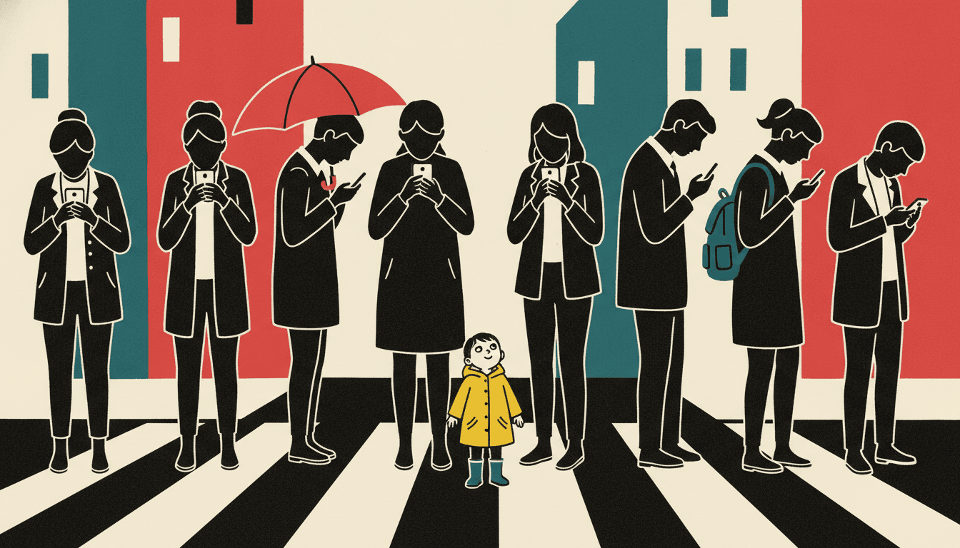
A bold flat illustration has no gradient anywhere in it — thick black contours, flat colour blocks, big simple shapes that read at any size. Held across a whole book, not one lucky poster.
- No gradients — the outline does the shading’s job
- Still readable shrunk down to a thumbnail
- Four marks on a face, so the body does the acting
- Free credits by request — no card
50,000+
Stories Created
10,000+
Active Creators
50+
Art Styles
4.9/5
User Rating
What Makes a Bold Flat Illustration More Than Simple
Two of these are about what replaces the shading. The other two are about who the characters are allowed to be.
With no gradient, the outline does the shading’s job
Every other look separates a head from the wall behind it with light — a shadow, a rim, a tonal step. This one has none available. Its lighting note reads flat graphic lighting, which means there is no light in the picture at all. What keeps the head off the wall is a thick heavy black contour drawn around it. Separation stops being an effect and becomes a line someone decided where to put.
It is drawn to survive being shrunk
Scale any page down to a stamp and most illustration turns to mush, because the information was living in the detail. Here the information lives in the silhouette and in a handful of big simple shapes, so the picture says the same thing at thumbnail size as it does across a spread. That matters more than it sounds: a store listing, a phone screen and a shelf spine are all thumbnail-sized.
Its first refusal is a face, not a technique
Styles normally forbid mark-making habits — no gradients, no fuss, no photorealism. This one lists those too, but the entry at the top of its refusals is uniform cute smiles. That is a line about acting rather than about rendering, and it is unusual enough to tell you what the style is for: everyday characters with real reactions, not a cast that beams identically on every page.
Four marks on a face means the body has to act
The brief asks for few but forceful facial features, and then specifies that poses should read through the direction of shoulders, hips, hands and feet. Those two instructions are the same instruction. Strip a face back to four marks and it can no longer carry a mood, so the mood moves into the stance — a dropped shoulder, a jutted hip, one leg leaning out of frame.
In a Bold Flat Illustration, the Outline Is Load-Bearing
Nearly every other illustration style separates things with light. A shadow under the chin, a rim along the shoulder, a step from one tone to the next — you rarely notice it, which is exactly why it works.
Flat takes that away. The lighting note is literally flat graphic lighting: no highlight, no cast shadow, no falloff. So the job has to go somewhere, and here it goes to a thick heavy black contour. Separation stops being an atmospheric fact and becomes a decision — someone chose where that line runs, and you can see the choice.
There is a test for it. Shrink the page to the size of a postage stamp. A rendered illustration turns to mush, because its information was in the detail. This one still tells you who is in the picture and what is happening, because its information was in the silhouette all along.
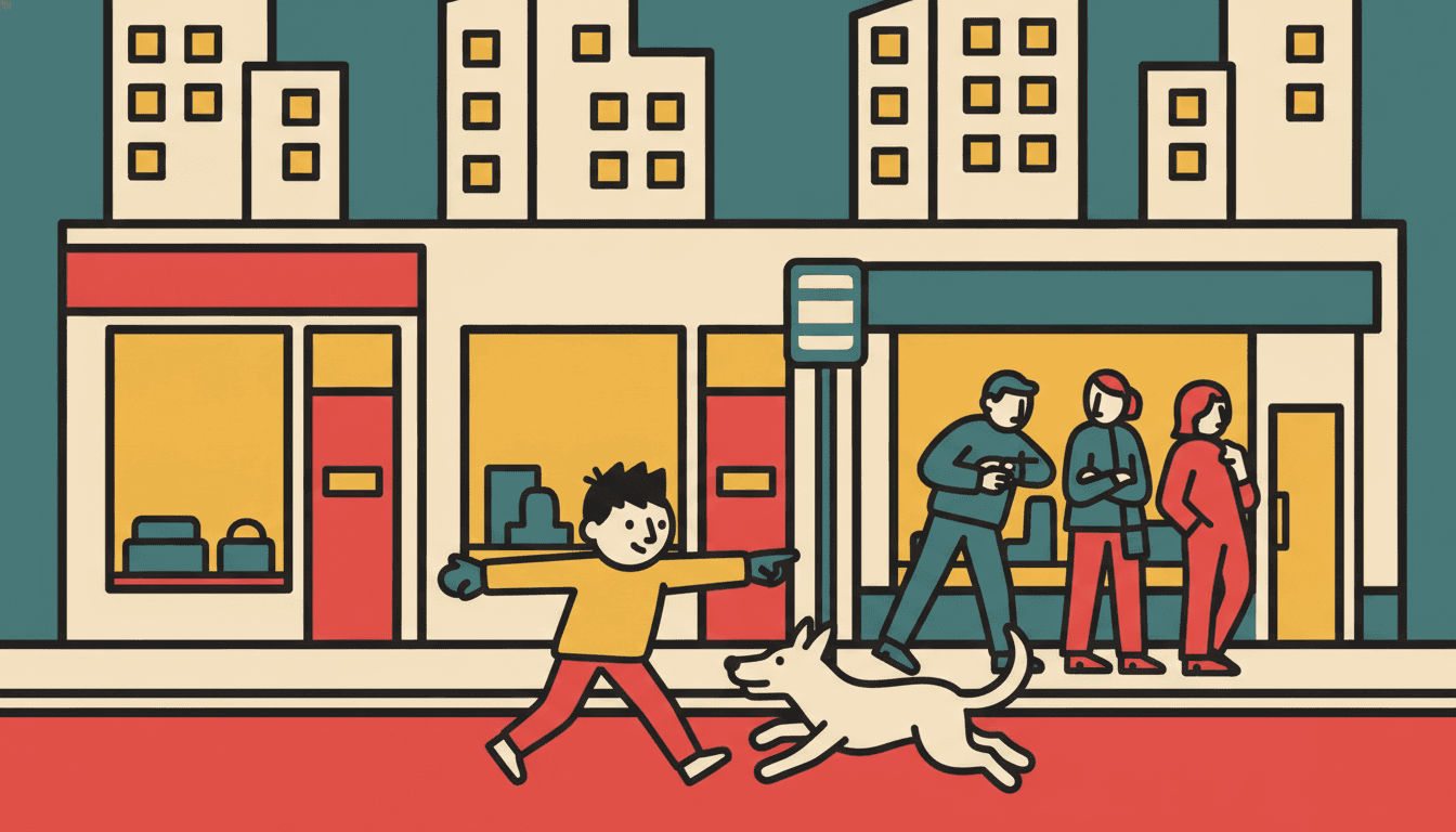
So write scenes with shapes in them. “A crowded bus stop in the rain” hands this style its whole vocabulary. “Mist settling over a quiet valley at dawn” gives it nothing to build with.
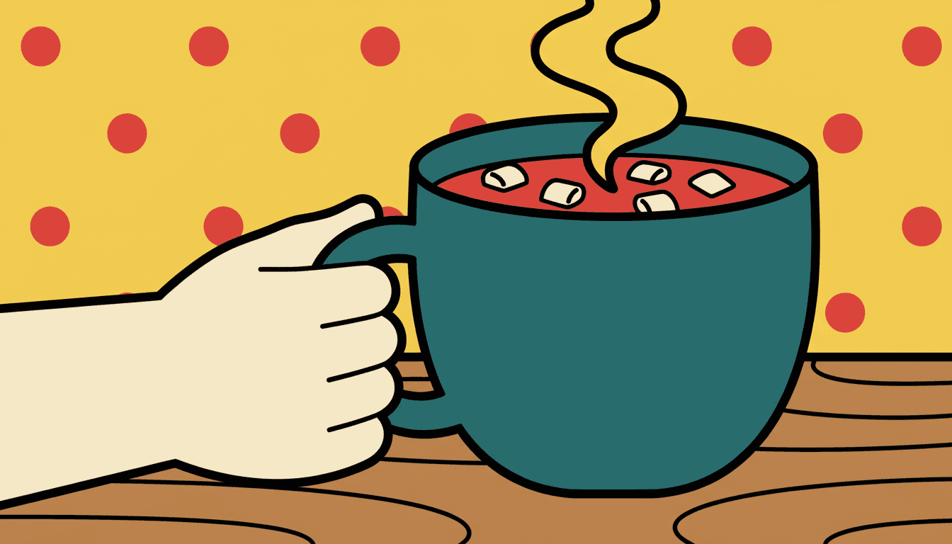
The style names what must never appear, and the first entry is the unexpected one — a refusal about acting, ahead of three about rendering:
Flat Is a Family, and They Disagree About What Holds the Shapes Apart
Choosing “flat” is not actually a decision. Several styles here are flat, and they are not variations on one look — they each had to answer the same question, and they answered it differently.
One answers with a thick heavy black contour. One puts minimal clean edges in its brief and lets clashing high-saturation hues do the separating instead. One keeps flat shapes but brings back film grain and strong directional light, so it can still be atmospheric. One uses an even thicker marker line with lopsided proportions for the youngest readers.
So pick on the separator, not the flatness. If you want the drawing to feel drawn — a visible line somebody placed — you want the heavy contour. If you want pure colour against colour, you want one of the others.
And pick on temperament, because it comes attached. This one is modern-life and dryly funny by brief. It is not a neutral rendering method you can aim anywhere.
Worth seeing side by side before you commit: the mid-century modern style, which is flat colour blocks tied to a 1950s palette, the ligne claire style, which keeps the flat colour but swaps the heavy contour for one perfectly even line, and the minimalist style, which looks adjacent and is subtracting rather than amplifying.
Create a Bold Flat Picture Book in 3 Steps
From a one-line idea to a finished book drawn at one contour weight, in under two minutes.
Describe the story
A sentence is enough. This look is strongest where there are people and modern places to put them — streets, kitchens, bus stops, parks, stairwells, sports days — so give it a situation as well as a character.
"Fourteen floors, one broken lift, everybody meeting everybody"
Pick the flat style
Choose Bold Flat Satire for a thick black contour holding everything, Bold Geometric Picturebook for clashing flat hues and almost no outline, Cinematic Grainy Flat-Shape for flat shapes with real dramatic light, or Primitive Marker Cartoon for a chunkier line aimed at younger readers.
Heavy black, flat colour blocks, punchy accent hues
Generate and export
C2Story writes the story, breaks it into pages and draws every one to the same brief. Read it on screen, share the link, or export the PDF and take that file to a printer — flat colour is the friendliest thing you can hand one.
Whole book drawn, PDF export, instant sharing
Bold Flat Illustration and Its Flat-Colour Neighbours
Four real styles that are all flat, sorted by the two things that actually separate them: what holds the shapes apart, and how old the reader is.
Bold Flat Satire
Thick heavy black contours, flat colour blocks, modern everyday characters organised by strong silhouettes and big simple shapes, few but forceful facial features, and poses with clear comic timing. Its palette is heavy black, flat bold colour blocks and punchy accent hues; its lighting is flat graphic lighting and its line is a thick bold outline. It sits in the Editorial group, and the outline is what carries the whole picture.
Bold Geometric Picturebook
Forms built from clean blocks, strong silhouettes and high-saturation colour — and crucially, minimal outlines, with a line weight described as a minimal clean edge. It solves the same problem the opposite way: where this page’s style separates shapes with a heavy contour, that one separates them by putting clashing flat hues next to each other. Same flatness, different load-bearing wall.
Cinematic Grainy Flat-Shape
Bold simplified colour shapes with visible film grain, strong dramatic directional light and layered near-and-far depth, in a muted dusk-blue and burnt-orange range. It is flat in its shapes but not in its lighting, so it can do atmosphere and gloom — which this page’s style, with its even graphic light and punchy accents, genuinely cannot. Pick it when the book needs a mood rather than a punchline.
Primitive Marker Cartoon
Thick chunky black outlines, simple big graphic shapes, flat bright primary fills and intentionally lopsided proportions, with strong readability at tiny size written into its brief. It is the closest relative here. The split is tone: that one is deliberately wonky and aimed squarely at small children, while Bold Flat Satire keeps its shapes controlled and its humour dry.
Two more relatives are worth knowing about. Belle-Époque Poster Flat uses flat decorative colour blocks and elegant simplified outlines in a graphic poster composition, and puts 3D depth on its forbidden list outright. Stylized 2D Visdev Character keeps bold flat colour blocks but adds a subtle textured light, which softens the hard graphic edge. For where flat colour sits among the wider families, see our guide to comic book art styles, or browse everything on the illustration styles hub.
Graphic Poster Style Story Ideas to Get You Started
This look is better at crowds, situations and timing than at softness, wonder or weather. These six lean into that.
The Day the Lift Broke
Fourteen floors, one stairwell, and everybody in the building meeting everybody else. A tower block cut open is a grid of flat rectangles, and a cast of silhouettes climbing through it is exactly what this look is built to draw.
Create this storyEverybody Looked Up
One thing happens in the sky and a whole street stops. A crowd scene is normally where illustration falls apart; here every onlooker is one shape with one outline, so forty heads tilting at once still reads clean.
Create this storyThird in the Queue
A child waits, and waits, and the waiting is the whole story. With four marks on a face, boredom has to be acted with the shoulders — which is precisely the kind of comic timing this style asks for in writing.
Create this storyThe Dog Who Was Not Impressed
A family tries very hard to entertain an animal who has seen it all. Flat shapes are excellent at unimpressed: a dog drawn as one unmoving silhouette while everything around it goes frantic is a joke the picture tells by itself.
Create this storyOne Glove, Half a City
A small red object travels across a big grey town. This is the thumbnail test as a plot: one punchy accent colour in a field of flat neutrals stays findable on every page, however small the page gets.
Create this storySports Day, From the Back
A whole field of running, throwing and falling over, seen by the slowest child there. Action read through limb direction is written into this style’s brief, so a sprawl of bodies mid-motion comes out legible instead of tangled.
Create this storyAI-Generated Bold Flat Illustrations
Try it on these: squint until they blur. The shapes survive, which is the entire point of the style.
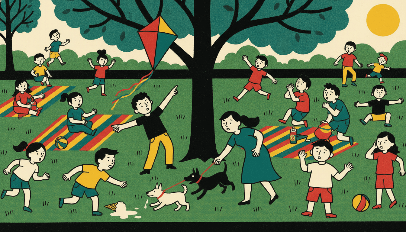
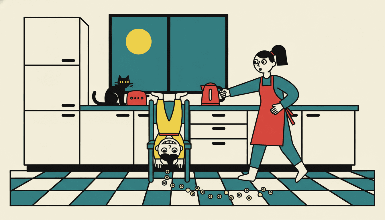
A Flat Vector Story Art Look for Every Subject
Characters, faces, buildings, objects, animals — the same thick line and the same flat fills, spent on whatever your story is actually about.
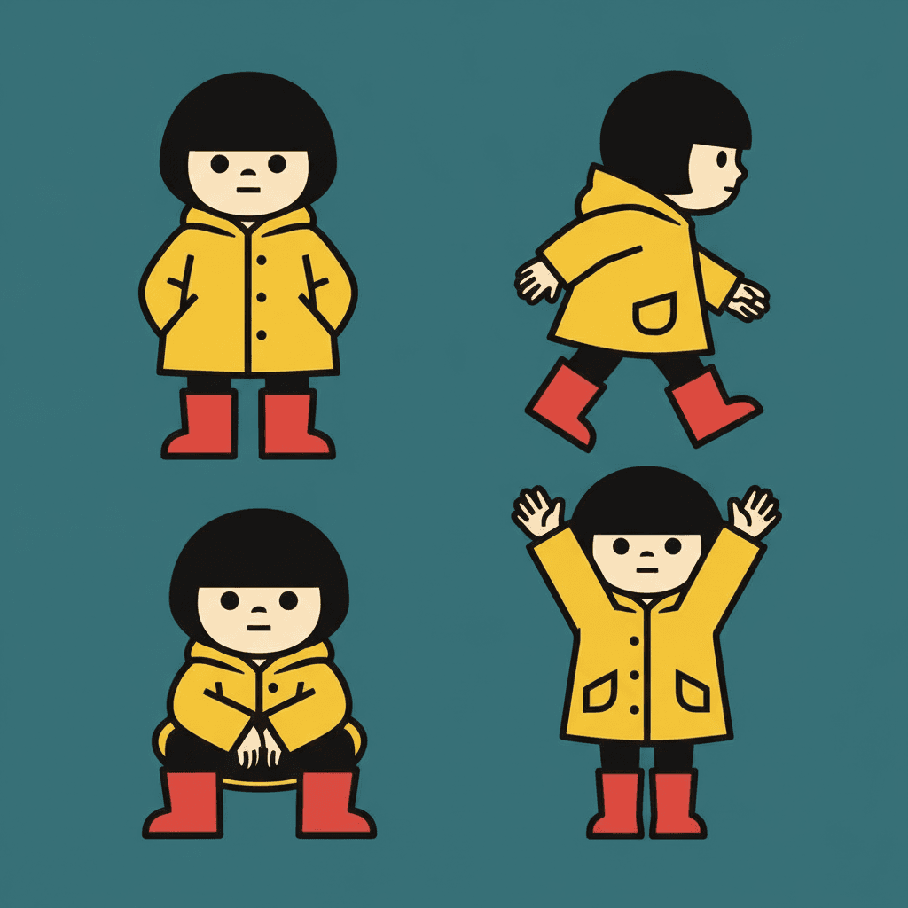
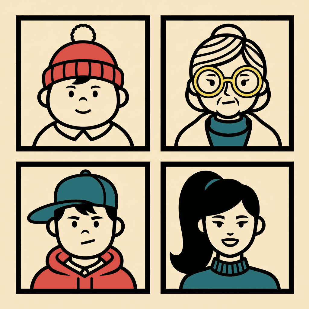

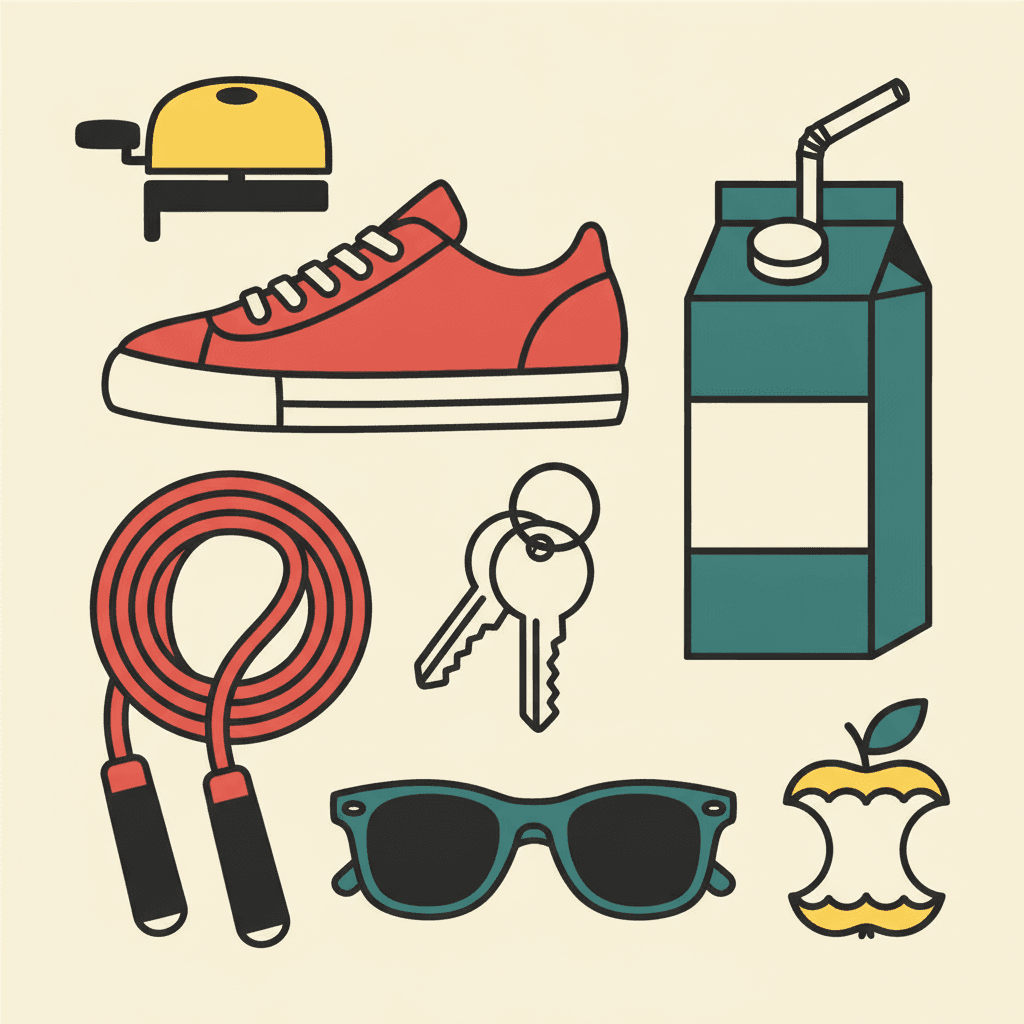
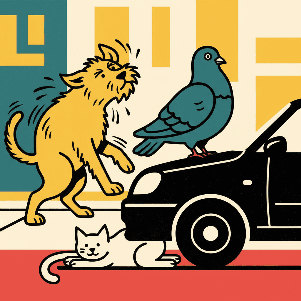
Everything You Need for Bold Flat Illustration Picture Books
One striking flat image is easy. Twenty-four of them, at the same line weight, with the same cast and no shading to hide behind, is the part that needs building.
The same weight of line on page twenty
One fixed brief — thick bold contours, flat colour blocks, flat graphic lighting, no gradients — carried into every page of the book. The thing that normally drifts in a flat style is line weight: the outlines get thinner and more careful as a book goes on, and the look quietly stops being bold. That is the part being held steady.
Four refusals, written down
Left alone, an image model reaches for a soft gradient the moment anything needs to look round, because it is the cheapest way to look finished. This style names uniform cute smiles, soft gradients, fine detail and photorealism as things that must never appear — so the colour stays genuinely flat on the last spread as much as the first.
A cast recognised by outline alone
Save your characters in the Character Library, with up to fourteen reference images each, and the description travels into every page and into later books. It earns its keep here: with four marks on a face there is almost nothing to recognise someone by except hair shape, coat silhouette and height, which is exactly what a saved character keeps steady.
A palette that arrives with the style
There is no colour picker and no hex field. The range comes with the look — heavy black, flat bold colour blocks and punchy accent hues — and what your scene descriptions steer is where those blocks go and which one thing on the page gets the accent.
Whole books, not single posters
You are not prompting for one handsome graphic image. Describe the story and C2Story writes it, breaks it into pages, and draws every page in this style, matched to what that page actually says.
Any language you read aloud in
The look carries no language of its own. Write the story in English, Chinese, Japanese, Spanish, French and more — the contour weight, the flat fills and the accent palette do not change with the text.
Bold Flat Picture Books — Questions
What people ask before committing a whole book to heavy outlines and perfectly even colour.
Explore More Story Ideas
Discover more styles, tools, and story types
Pirate Stories
Treasure hunts on the high seas
Explore
Crayon Picture Books
Waxy texture & childlike hand-drawn marks
Explore
Children's Book Creator
Design beautiful kids books
Explore
Storybird Alternative
Better AI story creation
ExploreBold Flat Illustration Picture Books — Thick Contours, Flat Colour Blocks, Whole Books with AI
A bold flat illustration is built from one removal carried a very long way: there is no gradient anywhere in the picture. Every colour area is perfectly even, every edge is hard, and the lighting note the style carries is simply flat graphic lighting — no highlight, no cast shadow, no falloff. What takes over the work is a thick heavy black contour drawn around every shape, which is why the palette reads heavy black, flat bold colour blocks and punchy accent hues, with the black doing structural duty rather than decorative duty. C2Story applies that one brief across an entire book, so page twenty is outlined with the same weight of line as page one.
The thing worth understanding before you commit a book to it is that the outline is load-bearing. Nearly every other style separates a head from the wall behind it with light, and you rarely notice because light is something you expect to be there. Flat has no light to spend, so separation becomes a line someone placed on purpose — and once separation is a line rather than a tonal step, the picture stops depending on resolution. That is the practical payoff. Shrink a rendered illustration to the size of a stamp and it turns to mush, because the information was in the detail. Shrink a graphic poster style page and it still tells you who is in it and what is going on, because the information was in the silhouette the whole time. Store listings, phone screens and shelf spines are all stamp-sized, so this is a far more useful property for a picture book than it first sounds.
The style states its refusals in writing, and the first one is the surprise. Most styles forbid a rendering habit; this one puts uniform cute smiles at the top of the list, ahead of soft gradients, fine detail and photorealism. That is a note about acting, and it explains the rest of the brief: faces carry only a few forceful marks, and poses are asked to read through the direction of shoulders, hips, hands and feet. Strip a face back to four marks and it can no longer hold a mood, so the mood has to move into the stance. On scope, be plain about one thing: several styles here are flat, and they disagree about what holds the shapes apart. Bold Flat Satire uses a heavy contour. Bold Geometric Picturebook specifies a minimal clean edge and lets clashing high-saturation hues do it instead. Cinematic Grainy Flat-Shape keeps flat shapes but brings back film grain and strong directional light. Primitive Marker Cartoon goes thicker and wonkier for younger readers. Choosing flat is not the decision; choosing the separator is.
Consistency is where a flat vector story art book quietly wins, because the thing that drifts across twenty-four spreads is line weight — outlines get thinner and more careful as a book goes on, and the look stops being bold without anyone deciding that it should. One fixed brief holds it. Keep your cast in the Character Library, with up to fourteen reference images each, and the description travels from the first page to the last and into later books, which earns its keep here because with four marks on a face a reader has almost nothing to go on but hair shape, coat silhouette and height. Write the story in any language you read aloud in, then export the finished book as a PDF; that file is the handoff to whichever printer you already use, and flat colour is the friendliest thing you can hand one, since large even areas reproduce more predictably than gradients. Be honest with yourself about the weak spot too: with no haze, no soft light and fine detail on the refusal list, this look cannot do mist, dawn, candlelight or intricacy, and it is happier on a pavement than in an enchanted forest. Start free: see our pricing plans, browse every option on the illustration styles hub, compare it with the mid-century modern style or the ligne claire style, read the guide to comic book art styles, or go straight to the AI Story Generator.