
Dry Brush Picture BooksPaint That Skips, Colour That Never Blends
A nearly empty brush dragged fast across rough paper leaves more texture than pigment. Dry brush picture books come from the only one of the seventy-eight style briefs in this library that refuses to let two colours blend — so every stroke stays broken, and the paper shows through all of it.
- Broken scratchy strokes with the paper showing through
- Warm ochre, slate blue and off-white paper
- Grown-up gestural figures, never cute
- Free credits by request, no card
50,000+
Stories Created
10,000+
Active Creators
50+
Art Styles
4.9/5
User Rating
What Makes Dry Brush Illustration Different From Any Textured Filter
Every style here is a written brief: a palette, a light, a line weight and a short list of refusals. Four things in this one decide the look, and most of the words that carry them appear in no other brief.
The only brief that refuses a blend
Every style in C2Story runs on a short written brief: a palette, a lighting note, a line weight and a few things to avoid. Twenty-four of the seventy-eight refuse something smooth or glossy. Only this one refuses the smooth blend itself — two colours melting softly into each other. Take that away and colours can only sit side by side as separate strokes, with the paper filling the gaps between them. That one refusal is most of the look.
The paper is written into the brief
Four other briefs mention paper grain, usually as a faint finish laid over the picture. This one makes the paper do the work: broken scratchy strokes that skip across rough paper grain, with the exposed white tooth of the paper showing through. Skip, rough paper, exposed and tooth each appear in no other brief in the library. The verb matters most. A brush only skips when it is moving fast over a surface that pushes back.
Broken, but never unsure
Only two briefs refuse cute rounded characters, and both ask for a broken mark, a restrained muted palette and ochre. The other is Angular Expressive Line, whose break is a nervous, searching contour — a line that hesitates. Here the figures are confident and gestural, and gestural appears in no other brief. Same break, opposite cause: there the hand is unsure; here the brush is simply going too fast to fill in.
Grown-up figures in a flat light
It is the only brief that asks for its figures to be mature — stylized and a little abstract, built from a few sure shapes rather than drawn feature by feature. The light is flat sophisticated editorial light, one of only two lighting notes in the library named after editorial work. A flat light does not model a form — at most a figure gets a dragged patch of colour under its feet. The broken texture of the stroke does the rest of the modelling.
The Same Walk, Blended and Not
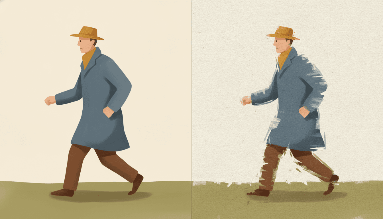
The same man twice, with the same hat, the same slate-blue coat, the same brown trousers and the same stride. On the left the paint has been allowed to behave: even fills, soft tone, a clean edge, the kind of polished finish most image tools hand you by default. It is tidy and it says nothing about how it was made.
On the right the only thing that changed is the brush. The coat breaks up at its edges into dragged streaks, the trousers turn into a few scratchy strokes, and the grain of the paper shows through behind him. Nothing else was asked for, and the figure reads as moving even though the pose is identical.
That is the whole bargain of dry brush illustration. You give up the smooth blend — the one thing this brief refuses that no other brief does — and in exchange every edge becomes a record of the hand moving across the page. The four refusals below are the four ways a picture can hide that record.
Write What Your Character Is Pushing Against
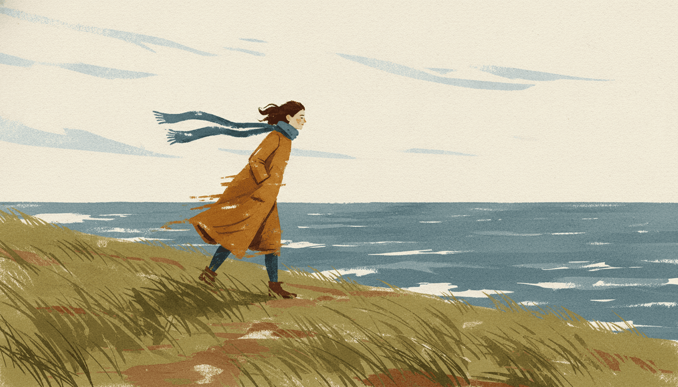
A brush only skips when it is moving fast over a surface that pushes back. The broken stroke is friction you can see. So the brief’s own sample subject is not a coincidence: a lone figure walking against wind, coat and hair streaked in dry-brush strokes. The texture and the subject are saying the same thing.
For a writer, that changes what is worth putting on the page. Do not only say where the character is going; say what is in the way. A headwind, a steep lane, rain coming sideways, a tide running the wrong way. Every one of those gives the brush a direction to drag in — the scarf, the grass, the waves all streak the same way — and the page holds together without anyone having to explain it.
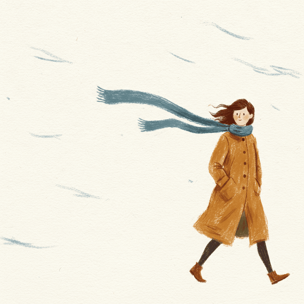
Quiet scenes still work, and the woman beside this paragraph is mostly bare paper. But even she has a wind to lean into. In a dry brush picture book the strongest pages are the ones where somebody is pushing, and the reader can feel which way.
From One Sentence to a Dry Brush Picture Book
You pick the look once. The brief is then applied to every page, so the broken stroke, the palette and each character’s silhouette never drift.
Describe the story and its weather
Write a sentence or two about who the story is about and what they are up against — a hill, a wind, a tide, a long way home. That resistance is what the dry stroke is best at showing.
Choose Dry-Brush Editorial
Pick the style from the Styles Library. From then on every page uses the same broken dry-brush edges, the same restrained palette and the same flat light, and your saved characters keep their silhouettes.
Get a whole book
C2Story writes the story, splits it into pages and paints each one. Regenerate any page you want to change without touching the rest, read it online, share it, or buy the PDF download to hand to a printer.
This Style and Its Three Nearest Neighbours
One shares its broken mark, one shares its dry-brush line and one shares the dry stroke. Here is what each actually asks for.
Dry-Brush Editorial
The style on this page
Editorial illustration painted with a dry brush: broken scratchy strokes that skip across rough paper grain, exposed white tooth of the paper, a restrained sophisticated palette of warm ochre and slate blue on off-white paper, and mature stylized abstract figures with confident gestural shapes, set in thoughtful negative space. The light is flat; the line weight is broken dry-brush edges. It refuses smooth blends, glossy digital finish, cute rounded characters and photorealism.
Angular Expressive Line
The same break, from hesitation
The nearest relative on paper: broken contour lines, a restrained muted palette with pale ochre, and the same refusal of cute rounded proportions. But its break comes from nervous, searching strokes on thin, elongated, twisting bodies, under stark uneven lighting, and its subject is raw emotion. Dry brush is calmer and surer — the gaps are speed, not doubt. Choose angular line for a story about feeling; choose dry brush for a story about weather, distance and effort.
Minimalist Ink Wash & Red
The only other dry-brush line
The one other brief whose line weight is a dry brush. It uses coarse burnt-ink strokes with flying-white texture on rice paper, high-contrast red and black, and bold blocks of flat colour clashing against each other, and it refuses muted, washed-out colour. Same tool, opposite temperature: that one is black ink shouting in red, this one is coloured paint kept deliberately quiet. Its ink cousins are on the sumi-e page.
Warm Gouache Animation
Dry strokes, wet strokes and big eyes
One of only three briefs to name a dry stroke — it asks for loose visible wet-and-dry brushstrokes in thick impasto gouache. Everything else points the other way: exaggerated clear innocent big eyes, a warm cinematic soft glow, snowy atmosphere and soft depth. It is built to be lovable. Dry brush refuses exactly the cute rounded character gouache leans on, and swaps the glow for a flat light.
Dry Brush Painting Style Story Ideas
Each idea plays to the same strength: a small cast, a lot of open paper, and something on every page for the brush to push against.
The Walk to the Lighthouse
A woman walks the cliff path every evening whatever the weather. The book is the walk, page by page — the wind getting stronger, the scarf getting longer — and the brush has something to push against on every spread.
Up Hart Hill
A grandparent and a grandchild push one old bicycle up the steepest hill in the village. The story is the effort, and the dry stroke turns every lean into the slope into something the reader can feel.
Kite Day
Two friends, one string, and a wind that would rather have the kite to itself. Long dragged strokes for the grass and the sky, and two small figures leaning back as hard as they can.
The Last Ferry
A boy rows across a choppy harbour to bring something home before dark. Short broken strokes for the waves, a lot of bare paper for the sky, and one figure pulling the whole way.
Letters From the Coast
A memoir or retirement gift book told as a year of walks. The muted ochre and slate palette and the grown-up figures suit a reader who is not a child, and the empty paper leaves room for the words.
The Heron and the Weather
A nature story with no people at all: one heron through four seasons of wind, rain and reeds bending. A good test of the style, because every page is about something moving through resistance.
What Dry Brush Pages Look Like Across a Book
Pages generated to this one brief, with nothing retouched afterwards.
Blended, and not
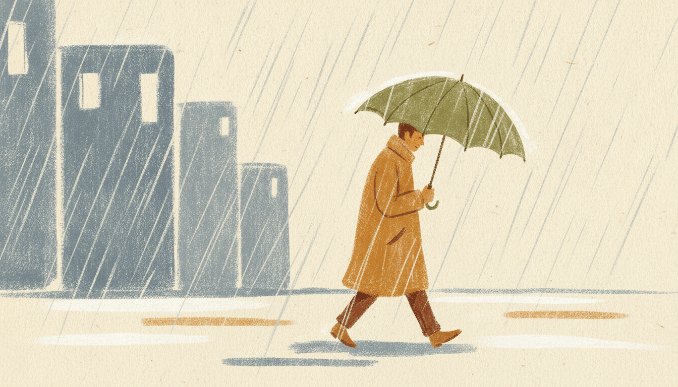
Walking in the rain
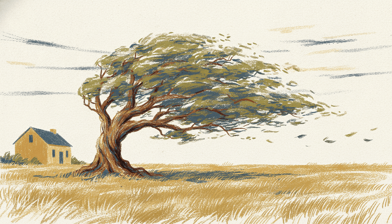
The tree on the rise
A Few Strokes per Figure, a Lot of Paper
With no blending and no shadow, a figure is known by its gesture and its one or two colours.
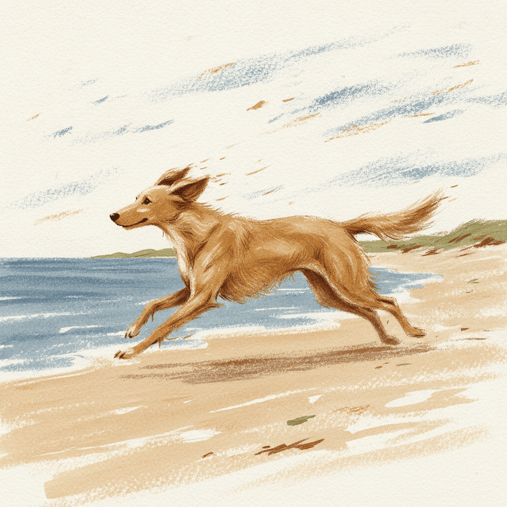
Running into the wind
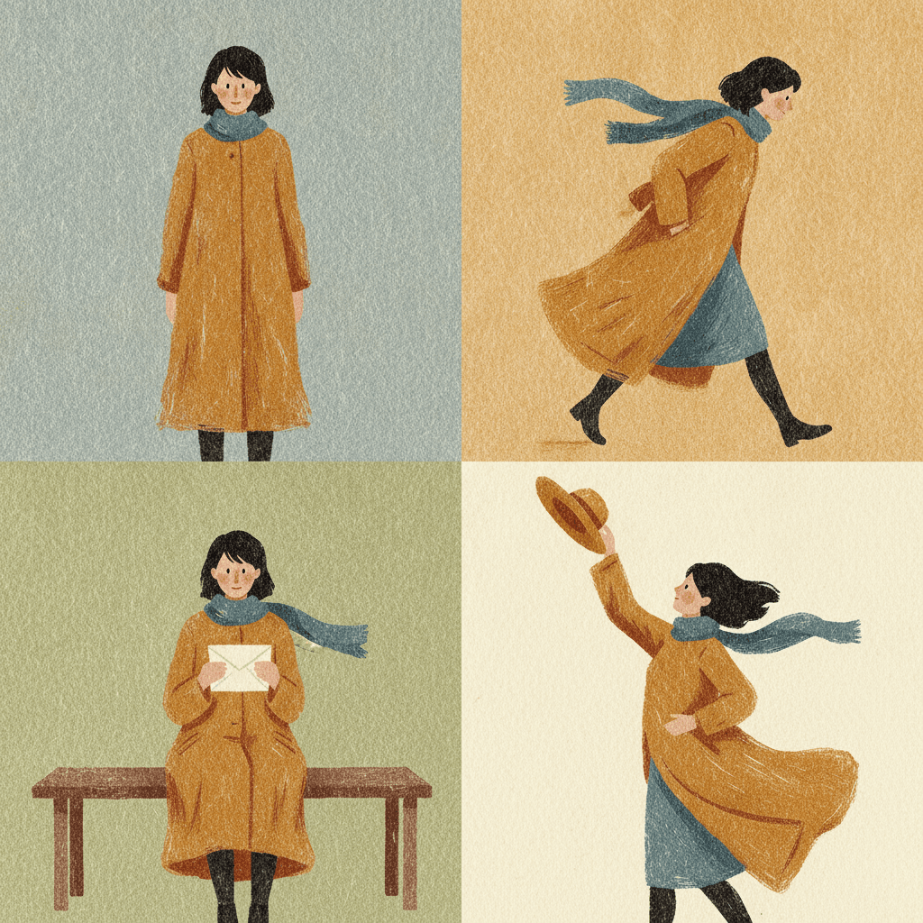
One woman, four panels
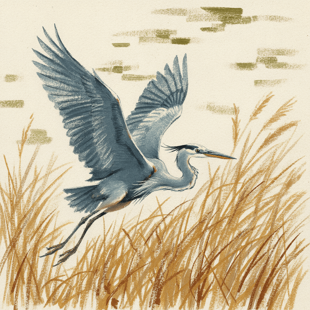
A heron lifting off
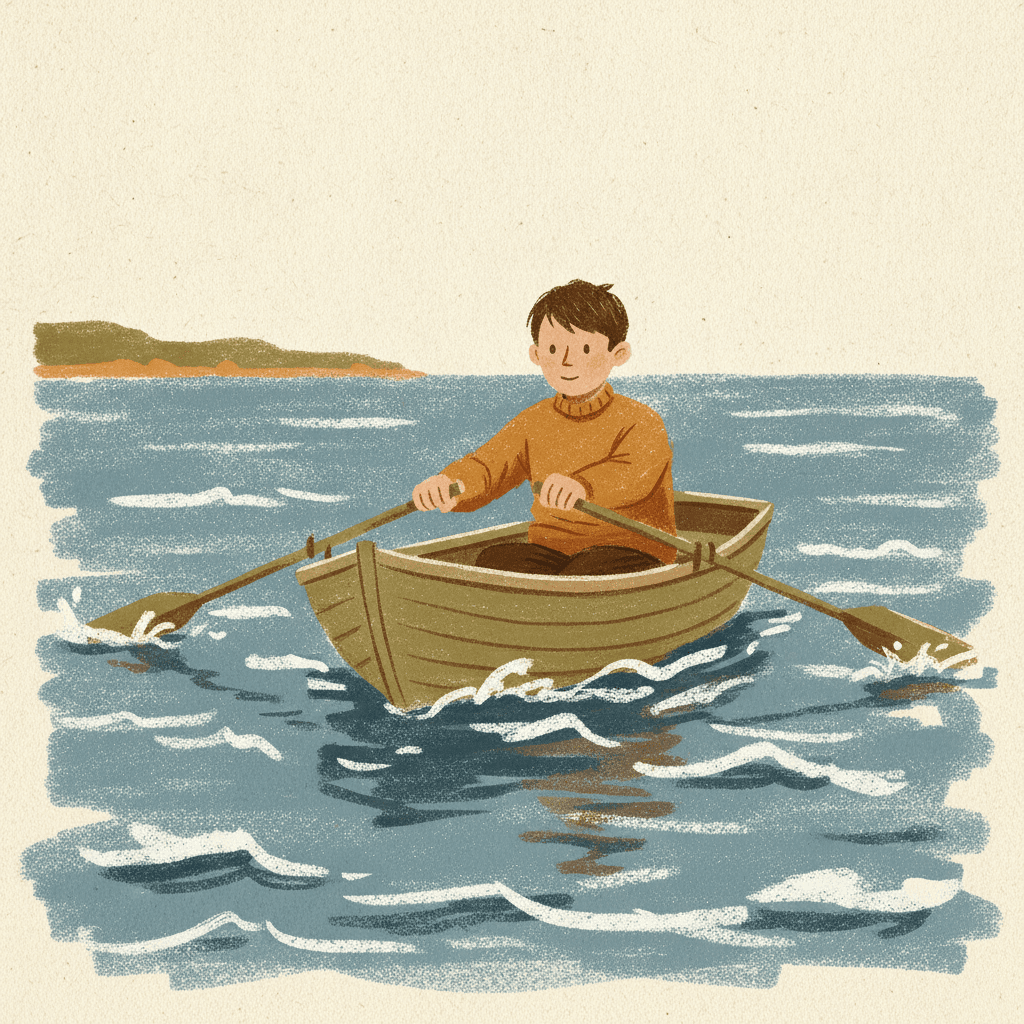
Rowing the crossing
Small, on a lot of paper
Making Whole Dry Brush Picture Books
What is useful in a book painted this way and where the limits are, in the order you are likely to meet them.
The same coat on every page
Gestural figures are built from a few strokes, so a character is known by its silhouette and one or two colours — the long ochre coat, the slate scarf. C2Story carries one fixed brief into every page, and you can save each character in the Character Library with up to fourteen reference images. Write the colour of the coat into the character notes. Characters made from an uploaded photo stay private to your account.
A few colours, named
The palette is restrained: warm ochre, slate blue and the off-white of the paper, with room for an olive or a rust. Because colours never blend, every extra colour is another separate stroke on the page. Name two or three colours in your story and let the paper carry the rest.
Not a toddler look
The brief refuses cute rounded characters and asks for mature figures, so there are no big shiny eyes and no button noses. It suits older children, grown-up picture books and gift books. For the youngest readers, a rounder and brighter style from the library will serve better.
The texture is the weather
With a flat light there is no lamp glow, no sunset and no night sky fading to black. What the style has instead is the stroke: rain, wind, waves and grass are all drawn as dragged, broken marks. Weather reads very well; candle-lit interiors and spooky moods do not.
Check the texture on big shapes
The image model is happiest painting broken strokes on small things — grass, scarves, waves. On a big figure close up it sometimes smooths the paint out more than the brief asks. Most pages land fine. If one comes back too clean, regenerate that page; the rest of the book is untouched.
A whole book from one sentence
Describe the story in a sentence and C2Story writes it, splits it into pages and paints every page to the same brief, in English, Chinese, Japanese, Spanish, French and more. Read it online, share a link, or buy the paid PDF download — the PDF is the handoff to your printer.
For a broken line that comes from feeling rather than speed, see angular line picture books. For dry strokes in black ink on rice paper, sumi-e picture books; for wet-and-dry brushwork with a warm glow and big eyes, gouache picture books; and for the same low saturation without any texture at all, muted illustration picture books.
Questions About Dry Brush Picture Books
Explore More Story Ideas
Discover more styles, tools, and story types
Cooking Stories
Little chefs, baking, pizza night and birthday cakes
Explore
Folk Decorative Books
Botanical pattern & a whole village of faces
Explore
AI Story Generator
Generate complete stories with AI
Explore
Storybee Alternative
More styles & features
ExploreDry Brush Picture Books: Broken Strokes, Rough Paper, No Blending
Dry brush picture books rest on a refusal no other brief in the library makes: colours are not allowed to blend. C2Story runs seventy-eight hand-drawn style briefs, each a short written record of a palette, a light, a line weight and a few refusals. Twenty-four refuse something smooth or glossy; only the Dry-Brush Editorial brief refuses the smooth blend itself, so every colour sits beside the next as a separate broken stroke with paper in between.
It is also the only brief that writes the paper into the instruction — broken scratchy strokes that skip across rough paper grain, with the exposed white tooth of the paper showing through. A page of dry brush illustration is a restrained palette of warm ochre, slate blue and off-white, mature stylized figures built from a few confident gestural shapes, thoughtful negative space and a flat light that models nothing, so the texture does the modelling.
Because a dry brush only breaks up when it moves fast over a surface that resists it, the dry brush painting style is at its best when the story has resistance in it: wind, rain, an uphill road, a choppy crossing. That makes it a natural fit for grown-up picture books, memoirs, gift books and nature stories for older children. It is a poor fit for toddler books, candle-lit interiors and anything that needs a cute round face.
The choice between neighbours is clear. Take angular line for a broken contour that comes from feeling, the sumi-e ink styles for dry strokes in black ink on rice paper, and gouache for wet-and-dry paint with a warm glow and big eyes. Take textured brush art in the dry-brush brief when you want quiet colour, grown-up figures and a page that shows how it was painted. Describe the story in a sentence and C2Story writes it, splits it into pages and paints every page to the same brief, keeping your characters on model, with the paid PDF download as the handoff to your printer.