
Muted Illustration Picture BooksQuiet, Not Drained
Seventeen of the seventy-eight style briefs here name saturation. Eight turn it up, eight mention it only to ban it. A muted illustration picture book is built from the one that sets it — and then gives the little colour that survives a job to do.
- A low-saturation palette asked for outright, not left over
- One quiet accent doing the separating — no outline, no shadow
- Generous empty space and light, clean, plain backgrounds
- Free credits by request — no card
50,000+
Stories Created
10,000+
Active Creators
50+
Art Styles
4.9/5
User Rating
What Makes Muted Illustration Different From Simply Desaturated
Plenty of styles here end up quiet. This is the only one where quiet was the instruction rather than the leftover.
Seventeen briefs here name saturation. Eight turn it up, eight forbid it, one sets it
Every style in C2Story runs on a short written brief that records a palette, a lighting note, a line weight and four things to avoid. Read all seventy-eight of the hand-drawn briefs and seventeen of them mention saturation at all. Eight ask for it: high-chroma clashing colours, rich saturated cinematic colour, high-saturation washes. Eight mention it only to refuse it — avoid saturated colour, avoid heavy saturation, avoid garish saturation — which means the quiet look those eight arrive at is a leftover, whatever remains once bright colour has been banned. Exactly one brief does the third thing. This one asks for a low-saturation palette as something to render, in the positive, and then separately fences the top with a refusal of saturated bright colour. It is the only style here where the dial has been set rather than taped over.
And it is the only brief that gives the remaining colour a job
This is the line that makes the style work, and the phrase appears once in seventy-eight briefs: a few spot colours separating layers. Everywhere else in the library, colour is described — a palette, a mood, a hue, a set of notes. Here it is assigned a task, and the task is structural. The near ground, the middle ground and the far background are each one flat area of a slightly different quiet tone, and what tells you which is in front is a small deliberate area of one stronger colour, placed on the thing that matters most on that page. Three other briefs mention a spot colour; none of them says what it is for. Turning the palette down is the easy half of this style. Deciding what the little colour you have left is allowed to do is the half that produces the look.
With no outline and no shadow, that accent is load-bearing
Follow the rest of the brief and you find there is nothing else left to separate anything with. Its line weight is recorded as a clean minimal line and heavy outline sits on the refusal list, so there is no dark contour holding one shape off another. Its lighting field reads soft even quiet light — the only one of the seventy-eight that uses the word quiet, and a light with no direction casts nothing, so there is no shadow under a figure and no shaded side on an object. The rendering is flat, so no gradient is modelling anything either. Take away the outline, the shadow and the blend and you are left with one instrument: a small difference in colour. That is why the accent cannot be decoration here. It is the only thing doing the work, and it is working with a very small amount of contrast.
The empty space is not a void. It is somewhere for the accent to be seen
Eleven briefs here name negative space, and each one spends it differently: in the fine-line style the emptiness is distance, in the minimalist style it is subtraction, in the deadpan style it is the beat before the joke lands, in sumi-e it is breath, in the negative-space style the gap is a second picture. This brief has two phrases that belong to it alone among the seventy-eight — generous negative space, and light clean backgrounds — and the pairing explains itself once you know what the accent is for. A quiet terracotta on a pale, plain, mostly empty ground reads instantly. The same terracotta on a patterned wall next to four other objects reads as nothing at all. The emptiness here is not restraint for its own sake, and it is not silence. It is headroom.
The Dial and the Ban, Side by Side
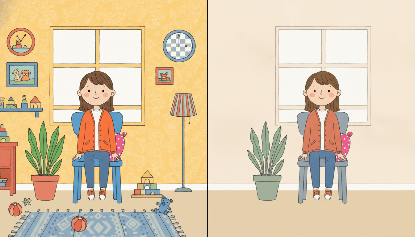
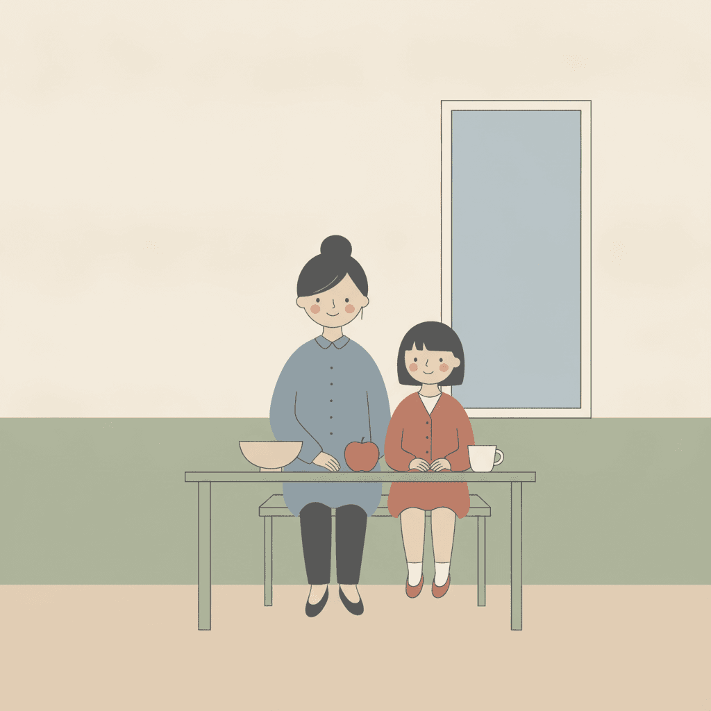
The same girl, the same pose, the same chair, the same plant by the same window — and the only things that change between the two halves are how strong the colour is and how much is in the room. On the left every colour is at full strength and they are all competing for attention: a bright yellow patterned wall, a hot orange cardigan, a strong blue chair, a vivid green plant in a red pot. The room is full to match — a patterned rug, a shelf of coloured blocks, two framed pictures, a clock, a striped lamp, toys across the floor. Nothing in it is badly drawn. It is just that nothing in it is being pointed at.
On the right the dial is down and the room is nearly empty. The cardigan is a dusty terracotta, the chair a soft grey-blue, the plant a quiet sage in a sage pot, and the wall, the floor and the window are plain. Everything else has gone. What is worth noticing is that the drawing itself did not change — the same thin line, the same simple face, the same pose — and yet you now know immediately what the picture is about, because there is one warm colour left in it and it is on the person. That is the mechanism, and it is also the trade. The left half can afford its clutter precisely because strong colour separates things even in a crowded room; the right half has no such margin. Which is why the first two of this brief's four refusals — saturated bright and busy detail — are really one decision seen from two sides.
Eight briefs turn saturation up. Eight only ban it. Those eight arrive at quiet by subtraction, so quiet is whatever is left. This brief asks for a low-saturation palette in the positive, and fences the top separately.
And it is the only one that says what the colour is for. A few spot colours separating layers appears once in seventy-eight briefs. Three others mention a spot colour; none of them gives it a task.
Its four refusals, in the order the brief states them:
Write Fewer Things on the Page
Most picture-book advice pushes you towards richness: more detail, more props, a busier spread for the reader to explore. That advice is actively wrong here, and it is worth knowing why rather than just being told. Separation in this style is paid for out of contrast, and a low-saturation palette simply does not have much contrast in it — every tone is close to every other tone. Spend it on two shapes and both read clearly. Spend it on eight and none of them do. So the most useful thing you can do in a prompt for this style is subtract: name two or three things and stop.
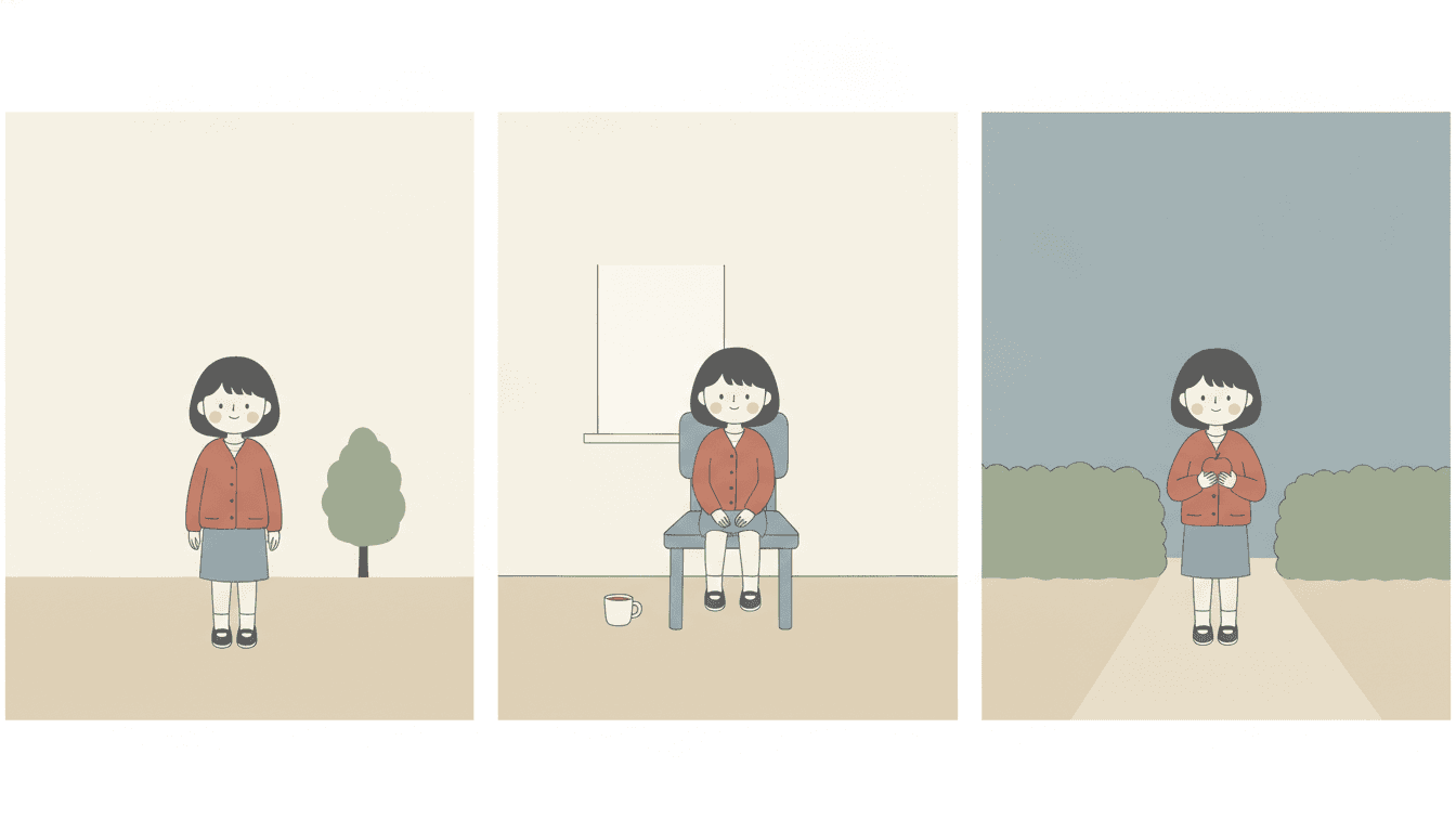
The three panels here are the same girl drawn three times: standing beside a tree, sitting on a chair with a cup on the floor beside her, walking a path between two hedges. Nothing about her has been redrawn — the same bobbed fringe, the same terracotta cardigan, the same grey-blue skirt. What is worth looking at is how little else is in any of them. A tree. A cup. Two hedges. That is not a restriction the style imposes on your story so much as the shape the style needs in order to work, because with three or four close quiet tones on a page, two objects separate cleanly and eight do not. The accent handles the rest: she is the only warm colour in all three panels, so the eye finds her first every time — which is exactly what you want from a character who has twenty-four pages to carry.
Decide what gets the accent. One character, one object, one door. If two things on a page both want to be the strong colour, the page has stopped telling the reader anything.
Leave the background alone. One wall, one window, nothing on it. The empty space is not a stylistic flourish — it is the room the accent needs in order to register.
Worth seeing side by side before you commit: the pop art style, which is this same dial turned all the way up, the geometric style, which separates with colour too but has far more of it to spend, and the fine-line ink style, which reaches the same quiet with a pen instead of a palette.
Create a Muted Illustration Picture Book in 3 Steps
From a one-line idea to a finished book where every page holds the same five quiet colours and the same single accent, in under two minutes.
Describe the story
A sentence is enough. Keep the scene small — two or three things in it — because this style has very little contrast to spend and every extra object on a page spends some of it. Say who matters most, and that is what the accent colour will land on.
"A girl waits at a bus stop with her grandfather"
Pick Quiet Low-Sat Editorial
Choose it for a low-saturation palette, generous empty space and one accent colour doing the separating. Choose pop art instead if you want the same dial turned all the way up, the geometric style if you want colour separation with far more contrast to spend, or the fine-line ink style if you want the quiet to come from a pen.
Grey-blue, pale sand, off-white, sage, one accent
Generate and export
C2Story writes the story, breaks it into pages and builds every one to the same brief. Read it on screen, share the link, or export the PDF and take that file to whichever printer or print service you already use.
Whole book built, PDF export, instant sharing
Low Saturation Art and Its Nearest Neighbours
Four real styles, sorted by the question that actually separates them: how much contrast does this one have to spend?
Quiet Low-Sat Editorial
Quiet flat illustration with a low-saturation palette, generous negative space and a calm modern magazine manner. Its palette is recorded as a low-saturation muted one — soft grey-blue, pale sand and a single spot colour — with a few spot colours separating layers, light clean backgrounds, and silhouette trusted over piled detail. Its line weight is a clean minimal line, its light soft even quiet light, and its four refusals are saturated bright colour, busy detail, heavy outline and generic chibi faces.
Pop Art
The clearest way to see what this style is choosing. Pop art asks for a few high-chroma clashing flat colours and puts muted palettes on its refusal list by name — the exact mirror of this brief, which asks for the muted palette and refuses saturated bright. Both are flat, both reduce a figure to a few shapes, and they disagree about one number. What the loud one buys with all that chroma is a page that can survive clutter, because strong colour separates even when things are crowded. Take pop art if you want a page that shouts from across the room. Take this one if you want a page somebody will sit with.
Bold Geometric Picturebook
The nearest neighbour structurally, and the comparison worth making before you choose. That style also has no outline — its line weight is a minimal clean edge — so it also separates one shape from the next with colour alone. But its palette is recorded as high-saturation clashing hues, and muted palette is one of the four things it refuses. Same mechanism, completely different budget: there, colour separation is cheap and can be spent on a busy geometric composition. Here every boundary has to be paid for out of a few close quiet tones, which is why this brief also asks for empty space and a short list of objects and that one does not.
Fine-Line Urban Wit
The other restrained style with a muted spot colour and a great deal of white space — and one of the eight briefs that names saturated colour only to refuse it. The difference is the instrument. There, a hairline pen does the separating: tiny precise figures in large airy environments, and the line is the subject of the picture. Here there is almost no line at all, only a few thin marks where one is genuinely needed, and flat areas of colour are placed rather than drawn. If you want the quiet to come from draughtsmanship, take the fine-line style. If you want it to come from the palette, take this one.
Three more worth knowing. The nordic whimsy style is the other brief here that asks to be quiet, and splits from this one on the instrument — fine ink lines and delicate hatching, where this has almost no line at all. The deadpan cartoon style shares the muted grey-blue and the empty space but spends them on withholding a reaction. And the belle époque poster style is the other muted flat one, refusing depth by name where this brief quietly stacks it. Browse everything on the illustration styles hub.
Quiet Editorial Story Ideas to Get You Started
This style is far better at a small moment than at a crowded one. These six lean into that.
One New Coat
A child gets a coat in the one strong colour in the book, and for twenty-four pages the reader can find her instantly on every spread. A story that gives the accent to a single character is the most natural possible fit for a style where one small area of colour is doing the separating.
Create this storyThe Quiet Morning
Being the first one awake, when the house still has almost nothing happening in it. Few objects, nobody else in the frame, and a great deal of empty space — which is this style at its most comfortable rather than at its most stretched.
Create this storyThe Empty Room
A family moves in, and each spread adds exactly one thing — a chair, a cup, a plant. A style that asks for a short list of objects per page turns an ordinary premise into a structure, because the reader can count what has arrived.
Create this storyWhat We Kept
Four objects, and why each one was worth keeping. With no clutter allowed anywhere near them, a single bowl on a plain table gets the kind of attention a busier style would have to fight for.
Create this storySitting Still
A child waits — for a bus, for a grandmother, for a turn. Very little happens, and that suits a look whose feeling comes from the palette rather than from action or from a big expression on a face.
Create this storySomebody at the Door
One visitor arrives into a calm house and changes the shape of the day. Give the visitor the accent colour and the story tells itself visually: the quiet rooms stay quiet, and the one new thing in them is the only strong colour on the page.
Create this storyAI-Generated Muted Illustration Examples
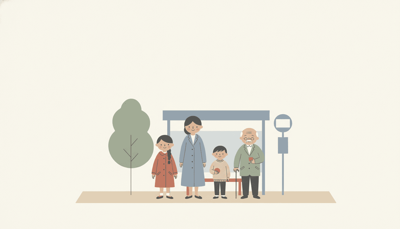
Look at the bus stop. Four people stand in a row with no outline around any of them and no shadow under anyone, and the only reason you can tell where one coat ends and the next begins is that each is a slightly different quiet tone and each overlaps the one behind it. The three small terracotta pieces — a coat, a ball, a cup — are the only strong colour in the picture, and they are what the eye goes to first.
Quiet Editorial Style for Every Part of Your Story
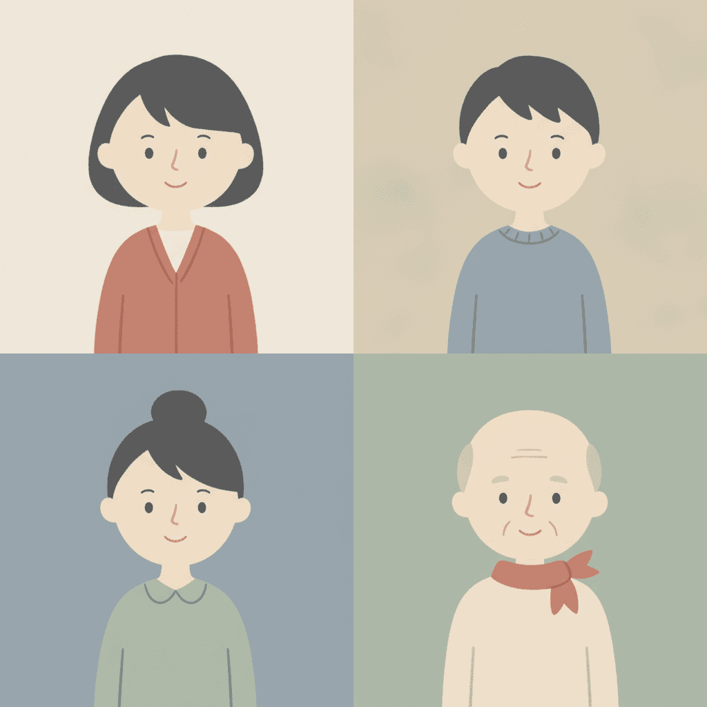
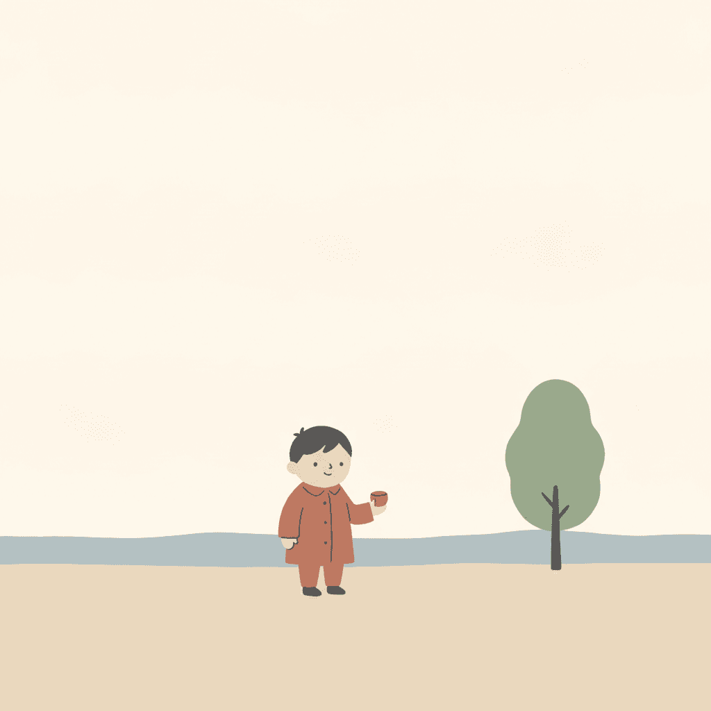
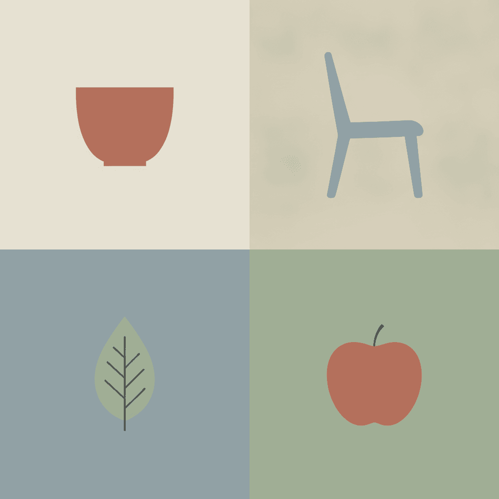
One character under four different accents, a cast told apart by shape alone, a single figure with the page almost empty around her, the five quiet colours themselves, and whole scenes — the same palette spent on whatever your story is actually about.
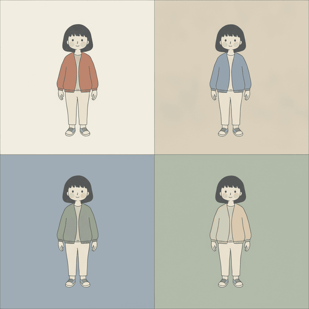
Everything You Need for Muted Illustration Picture Books
One calm image is easy. Twenty-four pages whose accent colour never drifts, with a cast you recognise by shape alone, is the part that needs building.
The accent stays the same colour for the whole book
This is the thing that breaks first when pages are generated one at a time, and in this style it breaks loudest. If the one strong colour drifts — terracotta on page three, mustard on page four, a dull red on page five — the reader loses the only cue they had for what matters on a page. One fixed brief is carried into every page instead: the low-saturation palette, a few spot colours separating layers, generous negative space, light clean backgrounds, and the same four refusals of saturated bright colour, busy detail, heavy outline and generic chibi faces. Twenty-four pages, one palette, one accent.
A cast you tell apart by shape, not by expression
The brief is explicit about this: silhouette is prioritised over piled detail, and it asks for distinctive face shapes, head-to-body ratios and hand and foot forms. Twelve of the seventy-eight briefs ask for that, so it is a family trait rather than something unique here — but it matters more in this style than in most, because there is no bold line and no shadow to add a second signal. Your cast is separated the way people are separated at a distance: who is tallest, who is roundest, whose hair is one dark shape and whose is two. Save each character in the Character Library with up to fourteen reference images and they are reused on every page and into later books. Characters built from an uploaded photo stay private to your account.
Five quiet notes, and what that honestly costs
The palette is recorded as a low-saturation muted one: soft grey-blue, pale sand, a warm off-white, a quiet sage and a single spot colour, with a soft charcoal for the few thin lines. Know the trade before you commit a whole book to it. There is no bright red, no strong yellow and nothing saturated anywhere, so a spread here cannot be carried by colour the way a board book is, and a page with eight things on it will go flat because there is not enough contrast to separate them all. What you get in exchange is a book that looks composed rather than printed, and one small area of colour that lands every single time. If you want a palette that sings, the gouache style or the pop art style will serve you better.
Quiet without being sad
The honest note this style needs. A desaturated palette, an undirected light, a still figure and a lot of empty space are also, almost exactly, the recipe for melancholy — and left unguided a brief like this drifts there, because the quickest way a model reads low saturation is as something drained. Our generation guidance holds the line on purpose: the palette stays clean and clear rather than grey, murky, faded or sepia; the cast stays children and friendly grown-ups, fully and modestly dressed, every figure whole and well fed, every face fully visible; and every figure reads as calm, settled and content rather than lonely, sombre or forlorn. The stillness is meant to be contentment. We say so in the brief rather than hoping for it.
A whole book, not one magazine illustration
This look lives almost entirely as single images — one calm illustration beside an essay, a cover, a print. You are not prompting for one of those. Describe the story and C2Story writes it, splits it into pages and builds each page to this brief according to what that page actually says, so the quiet palette is spent across a narrative with a beginning and an end rather than all at once on one picture. Worth saying plainly: the modern magazine reference describes the taste of the illustration, not a layout. You get picture-book pages, with your words set as type.
Readable very young, in whichever language you read aloud in
Easy to doubt, because the reference points are grown-up ones. But busy detail is refused outright, and what the brief leaves on a page is two or three large simple shapes and one clear accent — which is close to ideal for a small child, who finds a silhouette long before they find a face. The caveat is taste rather than complexity: these are quiet colours, so this suits roughly three and up, and grown-ups who would rather not read something shrill forty times. Write in English, Chinese, Japanese, Spanish, French and more; the look does not change with the language, and your words stay legible because they are set as type rather than drawn into the art.
Muted Illustration Picture Books — Questions
What people ask before committing a whole book to five quiet colours and one small accent.
Explore More Story Ideas
Discover more styles, tools, and story types
Garden Stories
Planting seeds, sunflowers, butterflies and the veggie patch
Explore
Belle Époque Poster Books
Flat decorative colour & one elegant outline
Explore
Bedtime Story Generator
Cozy goodnight stories for kids
Explore
Storybird Alternative
Better AI story creation
ExploreMuted Illustration Picture Books — A Low Saturation Palette, and One Accent With a Job
A muted illustration picture book is one where the colour has been turned down on purpose. Every page is built from flat areas of low-saturation colour — a soft dusty grey-blue, a pale oatmeal sand, a warm chalky off-white, a quiet sage — with generous empty space around them, no heavy outline anywhere, only a few thin lines where a line is genuinely needed, and one small deliberate area of a stronger accent colour placed on whatever matters most on that page. On C2Story this is the Quiet Low-Sat Editorial style, and its brief states the ambition plainly: quiet flat editorial illustration, a low-saturation palette, generous negative space, a calm modern magazine feel, silhouette prioritised over piled detail, a few spot colours separating layers, and light clean backgrounds. One brief applied across a whole book, so the twentieth spread is built from the same instruction as the first.
The part worth knowing before you commit a book to it is which of that is genuinely rare, because a muted palette is not rare here at all — more than thirty of the seventy-eight hand-drawn style briefs enabled in C2Story mention one somewhere. Saturation itself is what separates them. Read all seventy-eight and exactly seventeen name saturation as a thing to control. Eight ask for it: high-chroma clashing flat colours, rich saturated cinematic colour, creamy high-saturation blocks, high-saturation washes. Eight name it only in order to refuse it — avoid saturated colour, avoid heavy saturation, avoid garish saturation, avoid saturated modern colour — and that is a meaningful difference, because a style that bans bright colour arrives at quiet as a leftover. Quiet is simply what remains there once the loud option has been removed. One brief of the seventy-eight does the third thing: it asks for a low-saturation palette in the positive, as something to render, and then fences the top end separately with its own refusal of saturated bright colour. The dial has been set rather than taped over, and that is this style.
Follow that through and the rest of the look stops being taste and becomes a consequence. Setting the dial low is only half of it; the other half is the phrase that appears exactly once in all seventy-eight briefs — a few spot colours separating layers. Everywhere else in the library colour is described, as a palette or a mood or a set of notes. Here it is given a task, and the task is structural. That matters because of what the rest of the brief takes away. Heavy outline is on the refusal list and the line weight is recorded as a clean minimal line, so there is no dark contour holding one shape off another. The lighting field reads soft even quiet light — the only one of the seventy-eight to use the word quiet — and a light with no direction casts nothing, so there is no shadow under a figure and no shaded side on an object. The rendering is flat, so no gradient is modelling anything. Remove the outline, the shadow and the blend and a single instrument is left for telling a near thing from a far thing: a small difference in colour. Which is why the accent in these pictures cannot be decoration. It is load-bearing, and it is working with very little contrast, since every tone in a low-saturation palette sits close to every other. That also explains the two phrases that belong to this brief alone — generous negative space and light clean backgrounds. Eleven briefs here name negative space and each spends it differently; this one spends it as headroom. A quiet terracotta on a pale plain ground reads instantly, and the same terracotta against a patterned wall beside four other objects reads as nothing.
Four honest notes before you choose it. First, the writing advice inverts: most picture-book guidance pushes you towards a richer, busier spread, and here the discipline is subtraction, because contrast is the budget and every extra object spends some of it. Name two or three things on a page and decide which one gets the accent. Second, the palette costs you something real — there is no bright red, no strong yellow and nothing saturated anywhere, so a spread cannot be carried by colour the way a board book is; if you want a palette that sings, the gouache style or the pop art style will serve you better. Third, a desaturated palette and a still figure in a lot of empty space are also the recipe for melancholy, so our generation guidance holds that line deliberately: the palette stays clean and clear rather than grey, murky, faded or sepia, the cast stays children and friendly grown-ups with every face fully visible, and every figure reads as calm, settled and content rather than lonely or sombre. Fourth, the undirected light means this style cannot give you a dark room with one warm lamp in it — for that, take the grainy cinematic style. Among its nearest neighbours, the geometric style uses the very same mechanism of colour-as-separator but with high-saturation clashing hues, so it has far more to spend, and the fine-line ink style reaches a similar quiet with a hairline pen rather than a palette. In exchange you get a book that is unusually calm to look at and unusually easy to keep consistent — characters are carried by silhouette and proportion rather than by fine facial detail, so save each one in the Character Library with up to fourteen reference images and they are reused across every page and into later books, and characters built from an uploaded photo stay private to your account. Write in any language you read aloud in, then export the finished book as a PDF, which is the handoff to whichever printer you already use, and the images you generate are licensed for commercial use. Start free: see our pricing plans, browse every option on the illustration styles hub, or go straight to the AI Story Generator.