Fine-Line InkPicture Books
A fine line illustration draws your character small and the world around them large — hairline strokes, no shading anywhere, and most of the page left as bare paper. Held across a whole book, not one lucky drawing.
- One extremely thin ink line, and it never thickens
- No shading, no hatching, no texture — outline only
- Tiny figures, with the setting drawn small and detailed
- Free credits by request — no card
50,000+
Stories Created
10,000+
Active Creators
50+
Art Styles
4.9/5
User Rating
What Makes a Fine Line Illustration More Than a Thin Outline
Three of these are about the pen. The fourth is about the page, and it is the one that gives the style its character.
One hairline, and it never gets thicker
The line weight this style carries is specified as an extremely thin precise line, and the first thing it refuses is thick outlines. That matters more than it sounds. A contour that swells is how most illustration points at something — heavier around the hero, lighter around the furniture. Here there is no heavier. The pen has exactly one setting, so nothing can be promoted by inking it harder.
No tone at all — not even hatching
Dense shading is named as something that must never appear, which rules out the obvious workaround as well as the obvious one. Not just grey fills and gradients: no hatching, no stippling, no texture standing in for shadow. Everything is described by outline, and the paper stays bare inside every shape. That is the difference between this and every other pen-and-ink look on the site.
One muted spot colour, not a palette
The whole colour range is three entries long: hairline black ink, airy white, and a soft muted spot colour. Saturated colour is refused outright. So colour stops being decoration and becomes a pointer — one coat, one balloon, one flask picked out while everything else stays as line on paper. If you want a page that sings in colour, this is the wrong style and the crayon or gouache looks are the right ones.
It refuses a crowded frame — the composition itself
This is the unusual one. Most styles refuse techniques: no gradients, no photorealism, no muddy colour. This style also refuses a crowded frame, which is a rule about layout rather than about mark-making. Abundant white space and a setting drawn small and detailed are written into the brief. The emptiness is not a side effect of the pen. It is the instruction.
In a Fine Line Illustration, the White Space Is Distance
Several styles here leave most of the page bare, and it is easy to assume they are all doing the same thing. They are not. When a minimal style empties a page, things have genuinely been removed — the brief asks for very few details, and there is nothing behind the emptiness. When this style empties a page, nothing has been removed at all. It has only backed away.
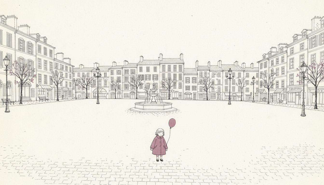
Its brief asks for two things at once that sound contradictory: abundant white space, and the setting drawn small and detailed. Both are true. The square is still a whole square, with its fountain and its shutters and its cobbles — it is just rendered at a fraction of the size, a long way off. Which means the one thing left to carry a page is where your character stands in it, and how big they are.
So write scenes with room in them. “She crossed the empty square” hands the style its whole vocabulary. “She frowned at him” asks for a close-up it has no gear for.
And expect posture, not expression. At this scale a face is two dots. Feelings arrive through how a figure stands — hunched, striding, sitting with knees pulled up — which is a real constraint and a real strength.
The style names what must never appear, and the fourth entry is the unusual one — three refusals about the pen, and then a refusal about the layout itself:
Fine Line and Minimalist Empty the Page for Opposite Reasons
This is the pair that gets confused, and the confusion is fair: both are flat, clean-edged and unshaded, both leave acres of paper alone. Choose on tidiness and you can end up with the wrong book.
One phrase from each brief settles it. Minimalist asks for simple shapes, large empty space and very few details. Fine-line asks for abundant white space and a setting drawn small and detailed. Same bare page, opposite cause.
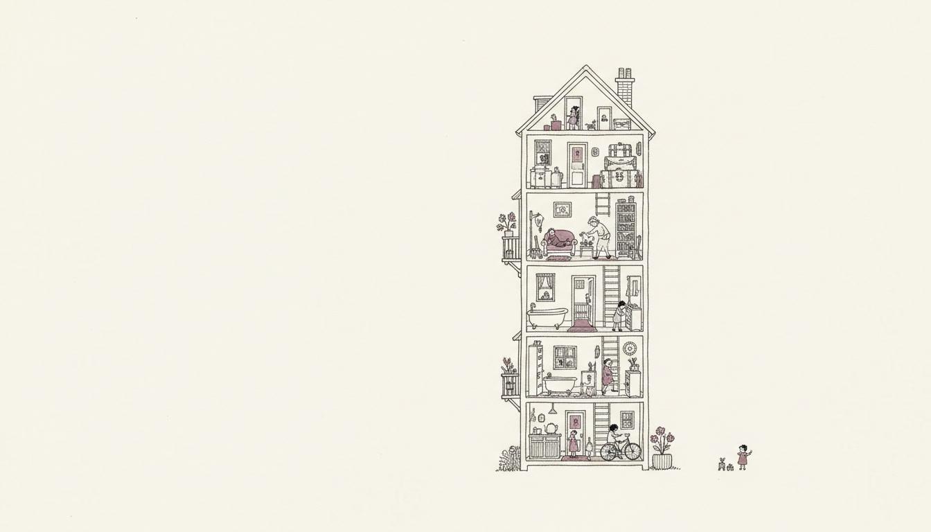
There is a test for it. Imagine zooming in on the far corner of the page. In a minimalist drawing you find nothing, because nothing was ever put there. In a fine-line drawing you find the kettle on the stove four floors up.
So pick by what the page is about. One idea, one mood, one shape — minimalist. A person who is small inside somewhere specific — fine line.
Worth seeing side by side before you commit: the minimalist style, the ligne claire style for precise ink that fills every shape with flat colour instead of leaving it bare, and the sumi-e style for emptiness made with a brush rather than a nib.
Create a Fine-Line Ink Picture Book in 3 Steps
From a one-line idea to a finished book drawn at one hairline weight, in under two minutes.
Describe the story
A sentence is enough. This look is strongest where there is real space for a character to be small inside — squares, stations, parks, shorelines, staircases, long empty streets — so give it somewhere as well as someone.
"A child who is new, in a school built for four hundred other people"
Pick the fine line
Choose Fine-Line Urban Wit for hairline ink with no tone at all, Nordic Fine-Line Whimsy for the same pen with delicate hatching and a cool palette, Crosshatch Gothic Ink for dense texture and shadow, or Minimal Fashion Line for an emptier page with far less in it.
Hairline black ink, airy white, one muted spot colour
Generate and export
C2Story writes the story, breaks it into pages and draws every one with the same nib. Read it on screen, share the link, or export the PDF and take that file to a printer — just check a sample at final size if you are printing small.
Whole book drawn, PDF export, instant sharing
Fine Line Picture Books and Their Pen-and-Ink Neighbours
Four real styles, sorted by the two things this one gives up: tone in the drawing, and size on the page.
Fine-Line Urban Wit
Delicate fine-line pen, tiny figures set inside large airy environments, abundant white space, precise hairline strokes, soft muted spot colour, and a restrained composition with the setting drawn small and detailed. Its four refusals are explicit: thick outlines, dense shading, saturated colour, crowded frame. It sits in the Editorial group, and it is dry and understated by temperament rather than sweet.
Nordic Fine-Line Whimsy
The closest relative, and the split between them is exact. This one also works in fine-line ink with vast white space, but delicate hatching is in its brief where dense shading is in the other's refusals. It adds a cool grey wash, a pale blue accent and a single soft red, and it aims at a tender, lonely, whimsical mood rather than a wry one. Choose it if you want tone in the drawing.
Minimal Fashion Line
Spare confident black contour, no shading, a large clean white background, and faces and clothing reduced — in those words — to essentials. It looks like the same idea and is not: this style empties the page by removing things, while fine-line empties it by standing further back. Identity here is built from silhouette rather than from detail.
Crosshatch Gothic Ink
Black and white only, dense crosshatching, meticulous fine ink hatching for shadow and volume, a Victorian atmosphere and quirky macabre characters. Same nib, inverted philosophy: where fine-line keeps the paper bare, this one fills it with texture, and it has the moody chiaroscuro that fine-line has no way to produce.
Two more line-first options sit nearby. One-Line Figure takes the idea to its limit — a single unbroken contour describing an entire figure, with minimal internal structure. Ornate Botanical Ink goes the other way, using a fine nib for dense cross-hatched detail and strange ornate flora, with the hand pressure and slight wobble left visible. For precise ink that fills every shape with flat colour, see the ligne claire style; for ink laid down with a brush instead, the sumi-e style; and for where pen-and-ink sits among the wider families, our guide to comic book art styles.
Pen and Ink Picture Book Ideas to Get You Started
This look is better at space, stillness and scale than at drama, darkness or close-up feeling. These six lean into that.
The First Day at the Big School
A child who is new, in corridors built for four hundred other people. This is the plot the style was waiting for — being small in a place that is large is the one thing it can say without saying it.
Create this storyNobody Else Is Awake Yet
A street at five in the morning, before anyone comes out. Empty places are usually hard to illustrate because there is nothing to draw. Here the emptiness is the drawing, and the one figure in it carries the whole page.
Create this storyThe Dog Got Off the Lead
A chase across an enormous park. A hairline pen makes a running dog and a running child read as two small marks a long way apart, and the gap between them is the suspense.
Create this storyGrandpa's Flat Has Forty-One Things In It
A counting book made of ordinary objects. The brief asks for the setting drawn small and detailed, so a flat full of specific clutter comes back as forty-one precise little drawings rather than a suggested mess.
Create this storyWaiting for the Nine Forty
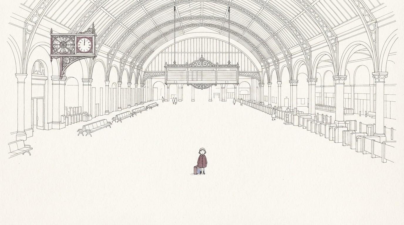
A long wait on a very big platform. Stillness is difficult for most styles, which want action to point at. A tiny figure under an enormous iron roof is a picture of waiting without needing a single line of explanation.
Create this storyThe Long Way Round the Lake
A walk that takes all day and most of the book. Landscape dwarfs the walker on every spread, and because the figure stays the same size while the shore changes, the distance covered becomes visible.
Create this storyAI-Generated Fine Line Illustrations
Look for what is missing. There is no grey anywhere in these — no hatching, no shadow under anyone, no texture doing a job the outline should be doing.
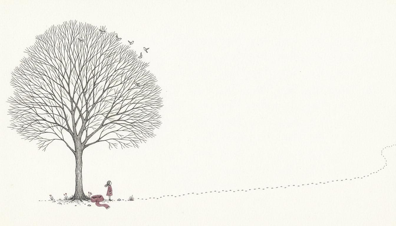
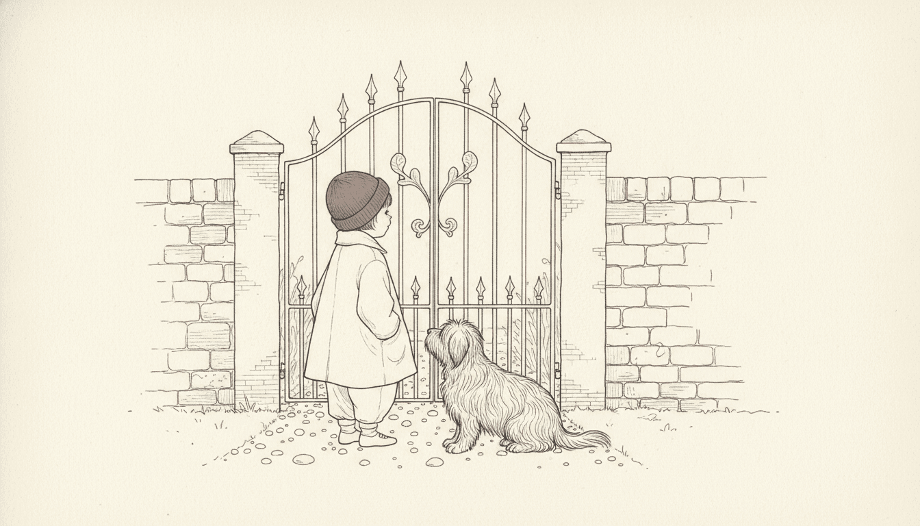
Thin Line Drawing for Every Subject
Characters, empty space, architecture, objects, crowds — the same hairline and the same bare paper, spent on whatever your story is actually about.
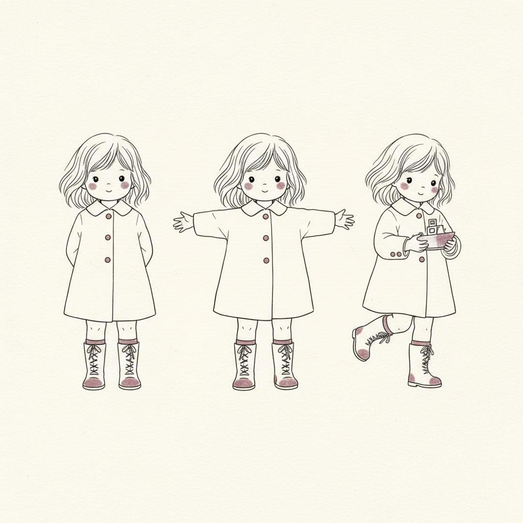
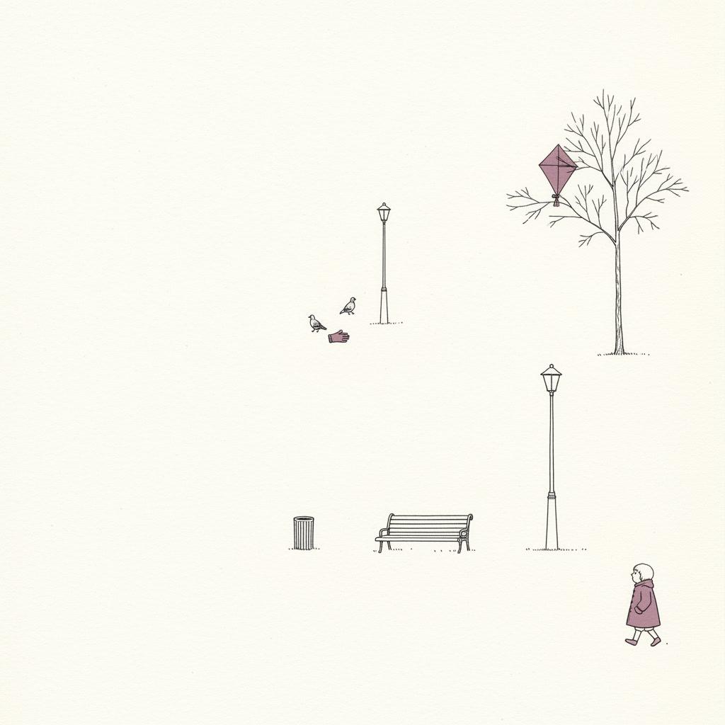
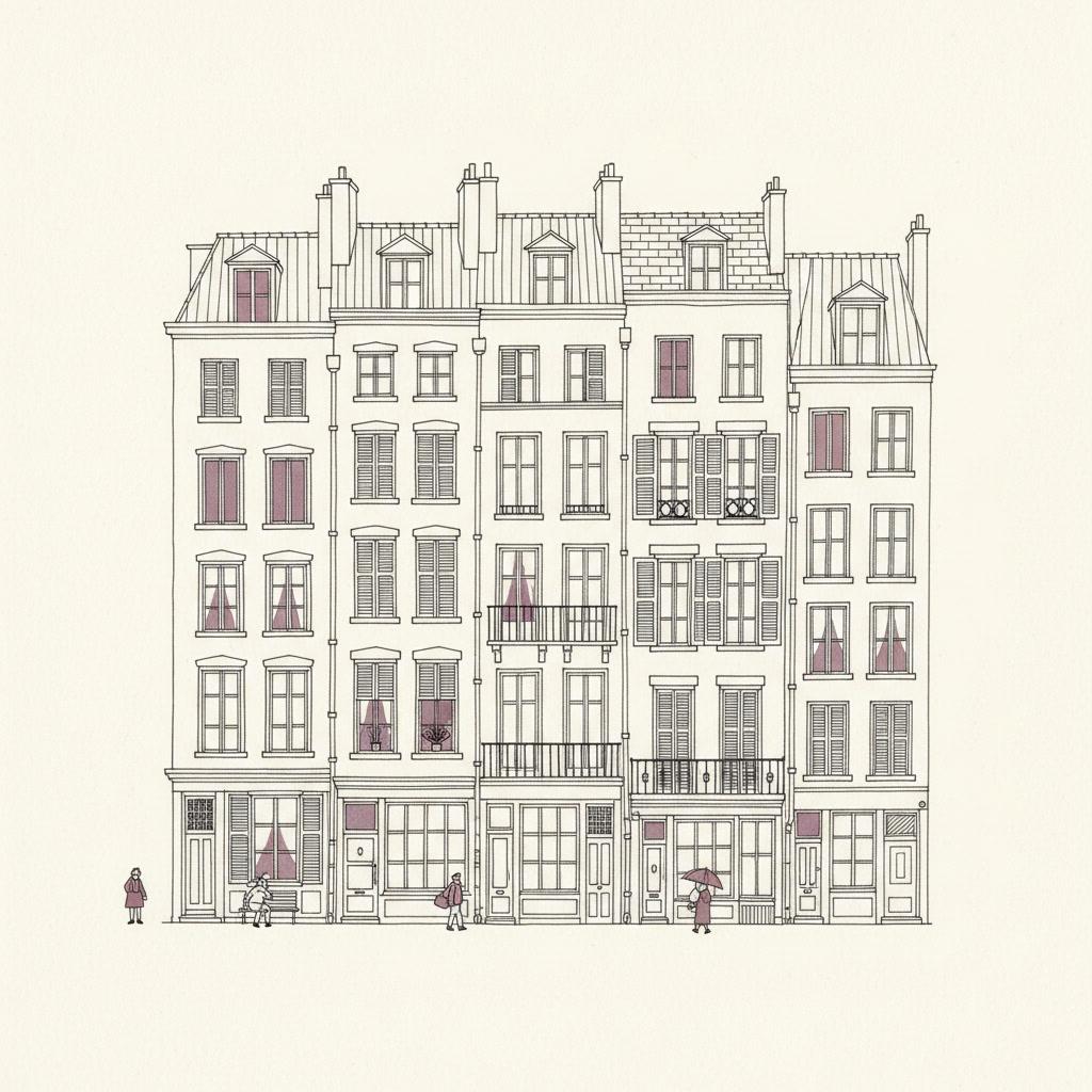
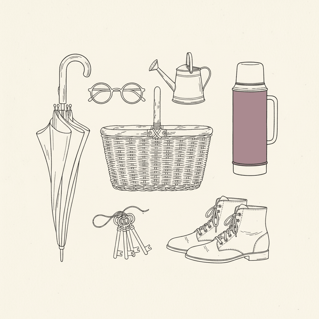
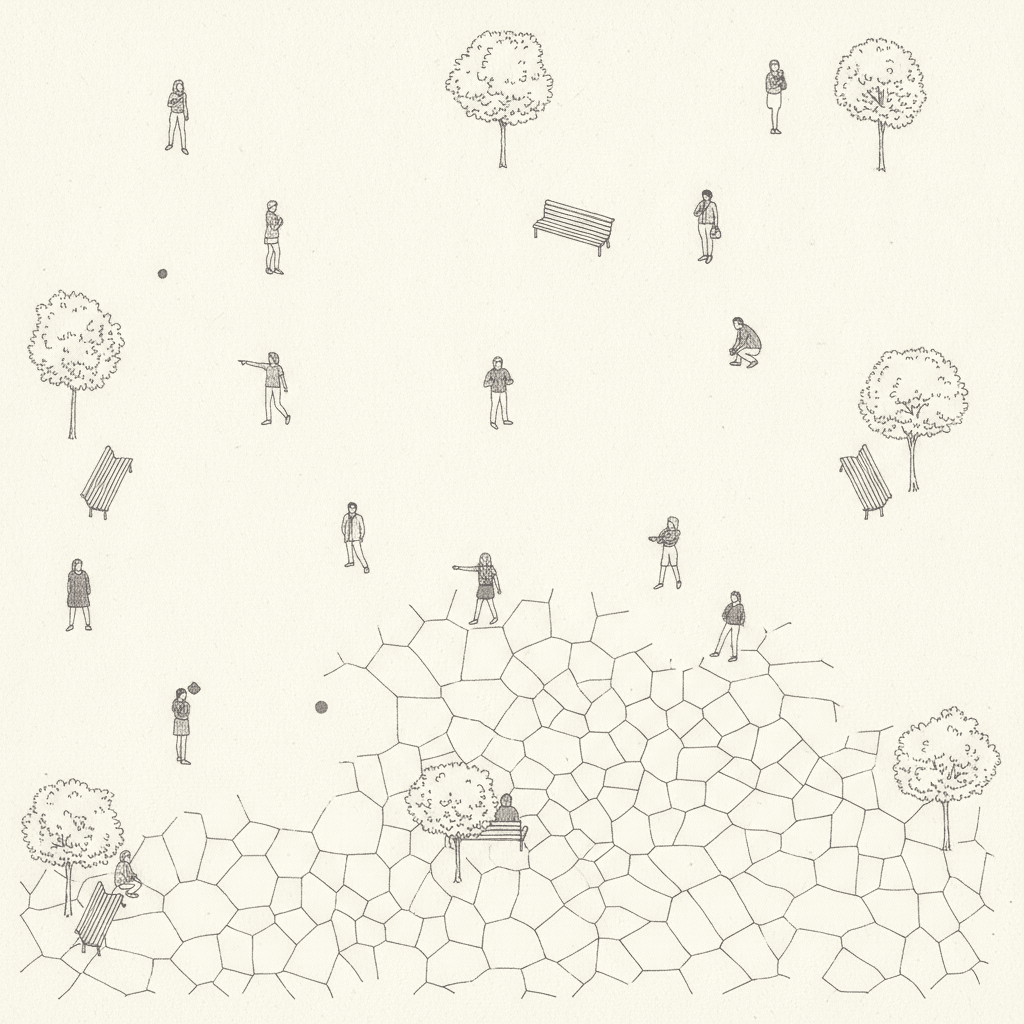
Everything You Need for Fine-Line Ink Picture Books
One good empty page is easy. Twenty-four of them, with the same nib, the same cast and the same restraint, is the part that needs building.
The same nib on page twenty
One fixed brief — hairline strokes, tiny figures, abundant white space, muted spot colour — is carried into every page of the book. Holding a hairline steady and resisting the urge to fill the empty half of the page is exactly the discipline that collapses over a long book by hand, and that is the part being automated.
Four refusals, written down
Left alone, an image model adds shading and fills space, because both read as effort. This style names what must never appear — thick outlines, dense shading, saturated colour, crowded frame — so the page stays as bare on the twentieth spread as it was on the first.
A cast recognisable at thumbnail size
Save your characters in the Character Library, with up to fourteen reference images each, and the description travels into every page and into later books. It matters more here than elsewhere: when a figure is a centimetre tall, the coat shape and the hair shape are the only things a reader has to recognise them by.
A palette that arrives with the style
There is no colour picker and no hex field. The style brings its own three-entry range — hairline black ink, airy white, one muted spot colour — and your scene descriptions steer what that single accent lands on, whether it is a coat, a door or a kite.
Whole books, not single drawings
You are not prompting for one handsome empty plaza. Describe the story and C2Story writes it, breaks it into pages, and draws every page in this style, matched to what that page actually says.
Any language you read aloud in
The look carries no language of its own. Write the story in English, Chinese, Japanese, Spanish, French and more — the hairline, the bare paper and the single spot colour do not change with the text.
Fine-Line Ink Picture Books — Questions
What people ask before committing a whole book to one hairline and a mostly empty page.
Explore More Story Ideas
Discover more styles, tools, and story types
Fairy Stories
Enchanted worlds and magic spells
Explore
Graffiti Picture Books
Crude marker strokes, crowns & scrawled symbols
Explore
Bedtime Story Generator
Cozy goodnight stories for kids
Explore
Storybee Alternative
More styles & features
ExploreFine Line Illustration Picture Books — Hairline Ink, Vast White Space, Whole Books with AI
A fine line illustration is made with one tool and almost nothing else: an extremely thin, precise ink line that never swells and never tapers. There is no shading, no hatching, no stippling and no texture; the paper simply stays bare inside every shape. A single muted spot colour is allowed, used sparingly — one coat, one balloon, one thermos — against hairline black ink and airy white. What turns that into a recognisable look rather than a technical constraint is scale: the figures are drawn very small inside large airy environments, with the setting itself rendered small but in meticulous detail. C2Story applies that one brief across an entire book, so page twenty is drawn with the same nib and the same restraint as page one.
The thing worth understanding before you commit a book to it is what the empty page means. Several styles here leave most of the paper alone, and they do it for different reasons. A minimal style empties a page by removing things — its brief asks, in those words, for very few details, and there is nothing behind the emptiness. This style empties a page by standing further back. Everything is still in frame, drawn at a fraction of the size, which is why zooming into a corner finds the kettle on the stove four floors up rather than finding nothing. The practical consequence is that a pen and ink picture book in this style says things through position and scale: how small your character is, and how much room is around them. Loneliness, awe, patience, newness and distance come almost free. Close-up emotion does not, because at this size a face is two dots and feelings have to arrive through posture instead.
The style states its refusals in writing, and the list is revealing — thick outlines, dense shading, saturated colour, and a crowded frame. The first three are about mark-making, and they are what keep the drawing honest: no heavier contour to flatter the hero, no grey to cover an unresolved area, no colour flood to carry a page that the line should be carrying. The fourth is about layout, which is unusual, and it is why the emptiness is deliberate rather than accidental. On scope, it is worth being plain: two styles here carry fine-line in their name and they split on exactly one decision. Fine-Line Urban Wit, the style on this page, sits in the Editorial group and refuses tone outright. Nordic Fine-Line Whimsy sits in the Picturebook group and asks for delicate hatching, a cool grey wash and a single soft red. Around them sit Crosshatch Gothic Ink, which is built from the tone fine line gives up, Minimal Fashion Line, One-Line Figure and Ornate Botanical Ink.
Consistency is where a thin line drawing book quietly wins, because this style fixes nearly every variable that normally drifts: one line weight, no tonal rendering to vary, one accent colour, soft airy daylight throughout. Keep your cast in the Character Library, with up to fourteen reference images each, and the description travels from the first page to the last and into later books — which matters more here than anywhere else, since a figure a centimetre tall is recognised by coat shape and hair shape alone. Write the story in any language you read aloud in, then export the finished book as a PDF; that file is the handoff to whichever printer you already use, and the one caution specific to this look is to check a sample page at final size if you are printing small, because hairlines are the first marks to thin out. Start free: see our pricing plans, browse every option on the illustration styles hub, compare it with the minimalist style or the ligne claire style, read the guide to comic book art styles, or go straight to the AI Story Generator.