
Gag Manga Picture BooksThe Half Second After
Two of the seventy-eight style briefs here mention anybody reacting to anything, and in the other one nobody notices. A gag manga picture book is built from the one style where somebody in the picture does.
- Rough, fast, sketchy linework — the only messy thing on the page
- Deadpan, awkward or suddenly over-the-top, with the timing in the pose
- Flat colour and plain neutrals on stark white, with one bold accent
- Free credits by request — no card
50,000+
Stories Created
10,000+
Active Creators
50+
Art Styles
4.9/5
User Rating
What Makes Gag Manga Different From Simply Drawing a Funny Face
Every style here is a written brief — a palette, a light, a line weight, a short list of refusals. Four lines in this one decide everything, and three of the four appear in no other brief in the library.
The only brief in the library built on a reaction
Every style in C2Story runs on a short written brief recording a palette, a lighting note, a line weight and a few things to avoid. Read all seventy-eight hand-drawn briefs and exactly two of them mention anybody reacting to anything — run the synonyms and it holds: nothing about startling, flinching, recoiling or responding appears anywhere else. One of those two is a single-panel magazine cartoon, and in that one the characters are explicitly straight-faced; the gag sits in the situation and nobody in the picture has noticed it. Which leaves this brief as the only one in the library where somebody in the picture notices. That sounds like a small distinction and it is not. It decides what a page has to contain: an event, and a witness to it.
Comedic timing, written into a still picture
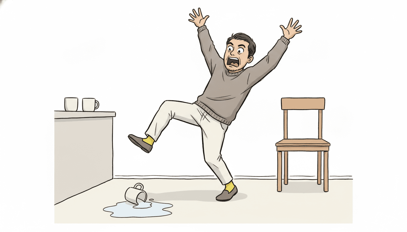
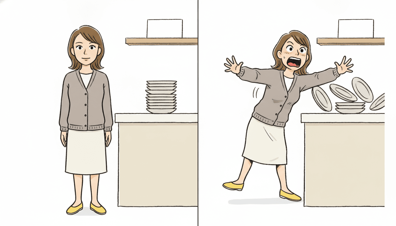
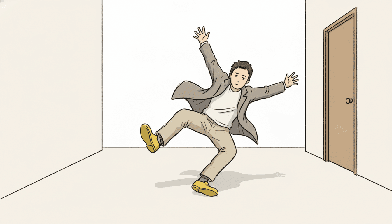
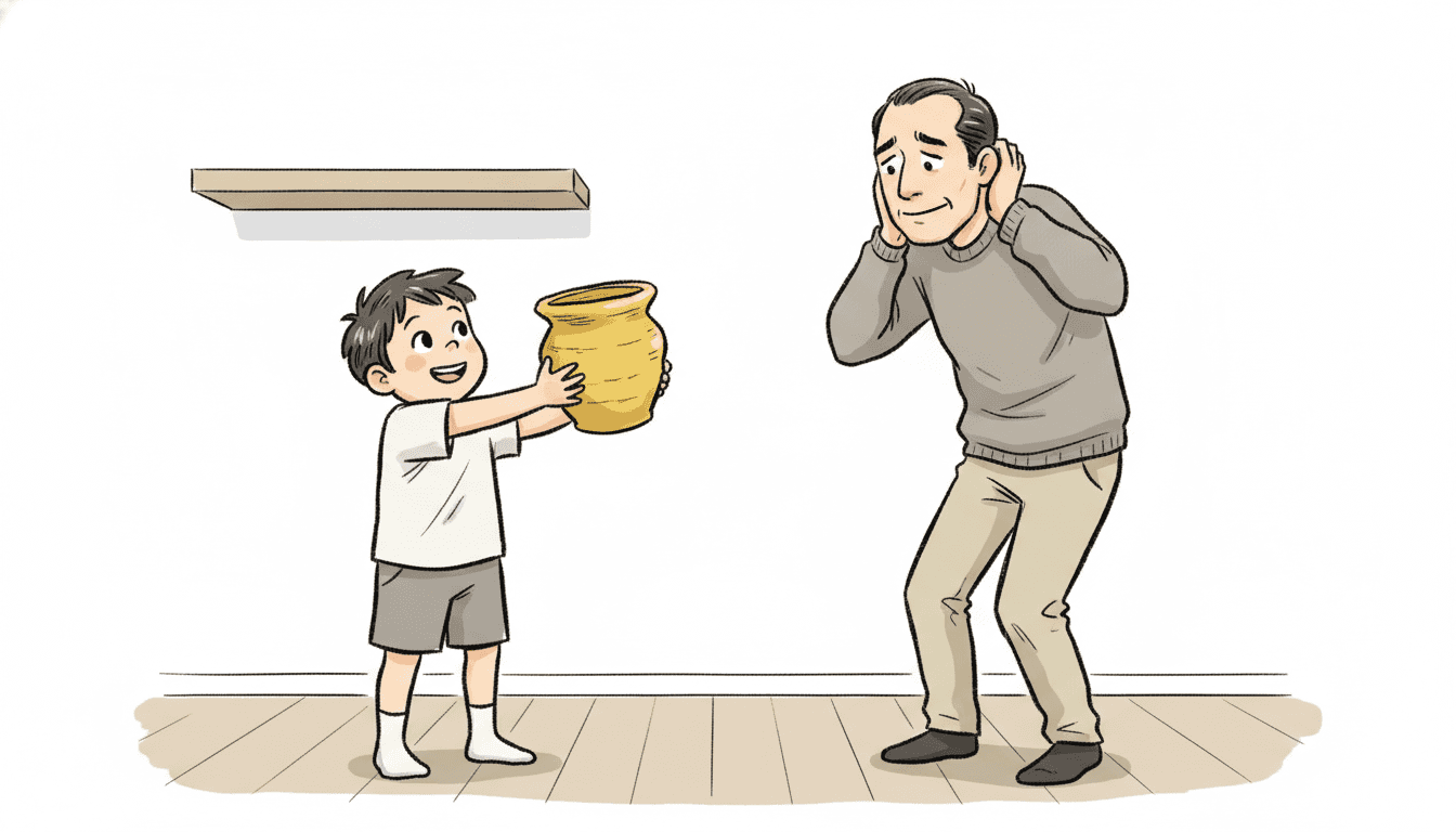
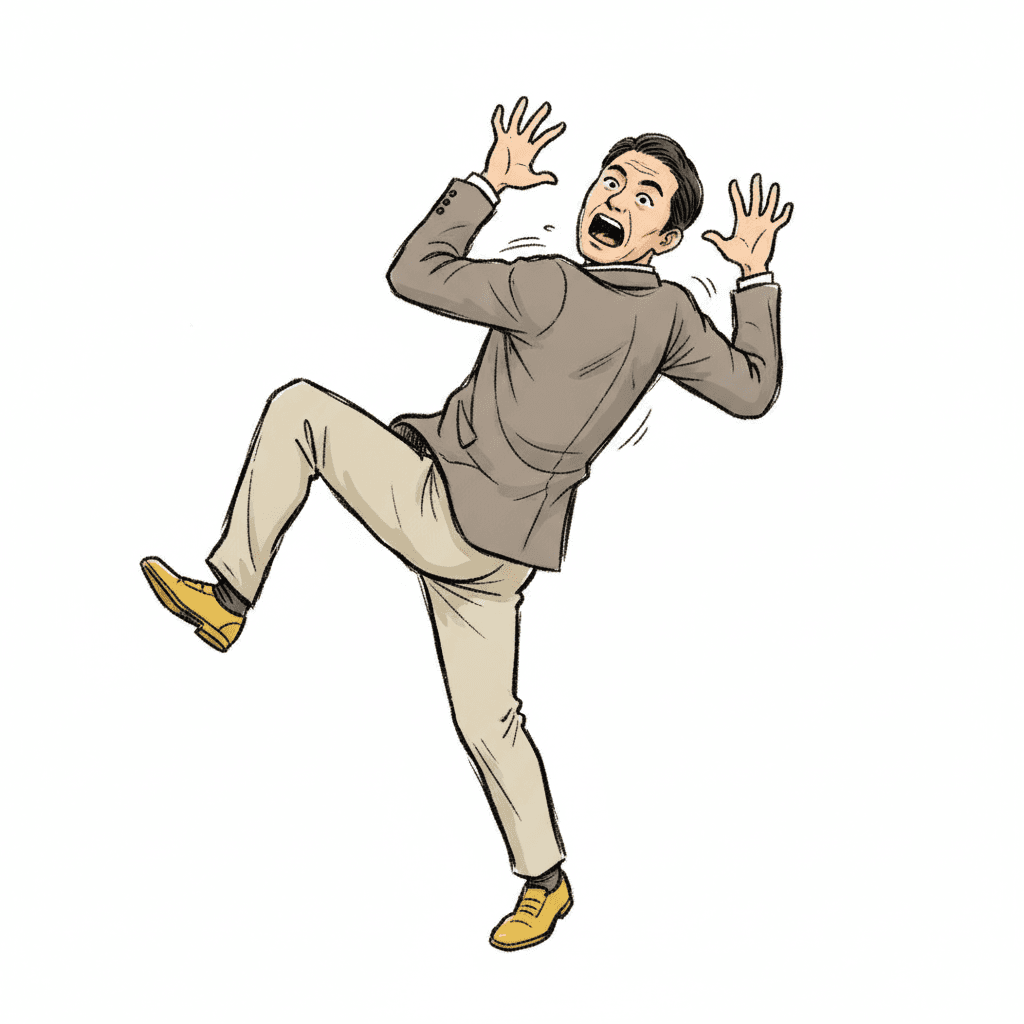
The brief asks for sharp comedic timing in the pose, and timing is a strange thing to ask a single drawing for. Three of the seventy-eight briefs use the word, and the other two are satire looks that spend it on a wry, settled expression. This one puts it in the body, and its own preview line describes a character frozen mid-reaction — frozen being the giveaway. A picture book page is one held instant, so the instant is the whole joke. The event itself is almost never the funny part. The plate falling is not funny; the half second after the plate has fallen, with somebody still halfway through turning round, is. Choosing that instant is what this style does, and it is the one craft decision it hands back to you.
A rough line, and roughness for an unusual reason
Six of the seventy-eight briefs ask for a line that misbehaves, so an unruly mark is not rare here. What is rare is why. One wants thick wobbly uneven lines because the drawing is meant to look untaught. One wants shaky uneven hand lines because being bad on purpose is its entire charm. One wants a loose rough ink line because it is imitating a wax crayon in a child’s fist. One wants a wandering ink line because it is a concept sketchbook thinking out loud. One wants loose hand-inked outlines because it is copying old cel animation. This brief is the only one whose line is rough for speed: rough energetic sketchy linework, a mark made fast because the moment it is describing happened fast. Everything else on the page is clean and flat. Only the line is out of breath.
The scene has to be funny too, not just the face
The most quietly demanding line in the brief, and the one that separates it from its two closest relatives. All three of the comedy-timing briefs share the same sentence about deadpan, awkward or suddenly over-the-top expressions. Then they say what to do with the rest of the frame. One asks for a full modern-life setting. One asks for a simple suggested setting. This one asks to render the full comedic scene the story describes — the only brief of the seventy-eight whose instruction for the whole picture, not just the character, is that it be comic. The practical reading is that you cannot put a straight scene behind a funny face here and expect it to land. The room, the objects and the other people are all in on it.
A Gag Manga Page Is Defined By What It Will Not Do
Each brief ends with a short list of things to avoid, and reading that list is usually the fastest way to understand a style. This one refuses four: uniform cute smiles, polished rendering, soft shading and photorealism.
The first one is the interesting one, and it is first in the brief for a reason. A uniform cute smile is not merely bland here — it is the exact failure state, because a face wearing the same pleasant expression on every page cannot react to anything. The other three take away the ways a drawing slows down. Polish, soft shading and realism all make a picture look considered, and a considered picture reads as something that took time. This style has to look like it was caught.
That is why the gag manga brief keeps a rough energetic line rather than a clean one. The scrappiness is not a shortcut; it is the only mark that looks the same speed as the moment it is drawing.
Every Funny Style Here Is Funny About Something Different
Seven of the seventy-eight briefs touch comedy in some form, and it is tempting to treat them as one shelf. They are not, because each one puts the joke in a different place.
In the deadpan cartoon the joke is in nobody noticing — a whale in the sky and not one head turning. In whimsical absurd it is in the world itself, bent and bendy, while the characters carry on normally. In bold flat satire it is a verdict, a point being made about modern life. In heta-uma it is in the drawing being wrong on purpose. In the single-panel cartoon it is in the situation, with the people in it kept straight-faced.
Here it is none of those. The joke is the response. The world is ordinary, the drawing is competent, nothing is being satirised, and the funny thing on the page is simply a person having an experience slightly too loudly. That is the slot this brief occupies, and it is the only one of the seven that needs a witness in the frame to work at all.
From One Sentence to a Book Full of Reactions
You pick the look once. The brief is then applied to every page of the story, so the timing does not drift.
Describe something going wrong
A sentence is enough, and the smaller the mishap the better this style works. The cake that did not rise. The dog got on the table. We missed the bus by four seconds. You do not need a grand plot, but you do need something to happen — and somebody left standing there when it does.
Choose the Gag-Manga Reaction style
Picking it fixes the whole brief at once: rough energetic sketchy linework, simple flat colours over stark white, one bold accent pop, flat simple lighting, and the four refusals. Save your characters first and they stay recognisably themselves however far a face is pushed.
Get a book, not a reaction panel
C2Story writes the story, splits it into pages and builds each page to the brief according to what that page says. Your words are set as type rather than lettered into the art. Read it on the web, share it, or buy the PDF to hand to a printer.
This Style and Its Three Nearest Neighbours
Four briefs in the library sit close to this one. Here is what each actually asks for, so you can take the right one rather than the first one.
Gag-Manga Reaction
The style on this page
A rough gag-manga illustration built on strong reactions and exaggerated emotion, with silhouette prioritised over detail so that face shape, head-to-body proportions and the shapes of hands and feet form a clear independent visual language, and with deadpan, awkward or suddenly over-the-top expressions carrying sharp comedic timing in the pose. Its palette is simple flat colours, plain neutrals, stark white and one bold accent pop; its light is flat simple lighting; its line is rough energetic sketchy linework; and the four things it refuses are uniform cute smiles, polished rendering, soft shading and photorealism. It will render whatever comic scene your story actually describes.
Deadpan Dialogue Cartoon
The exact opposite, and the easiest mix-up
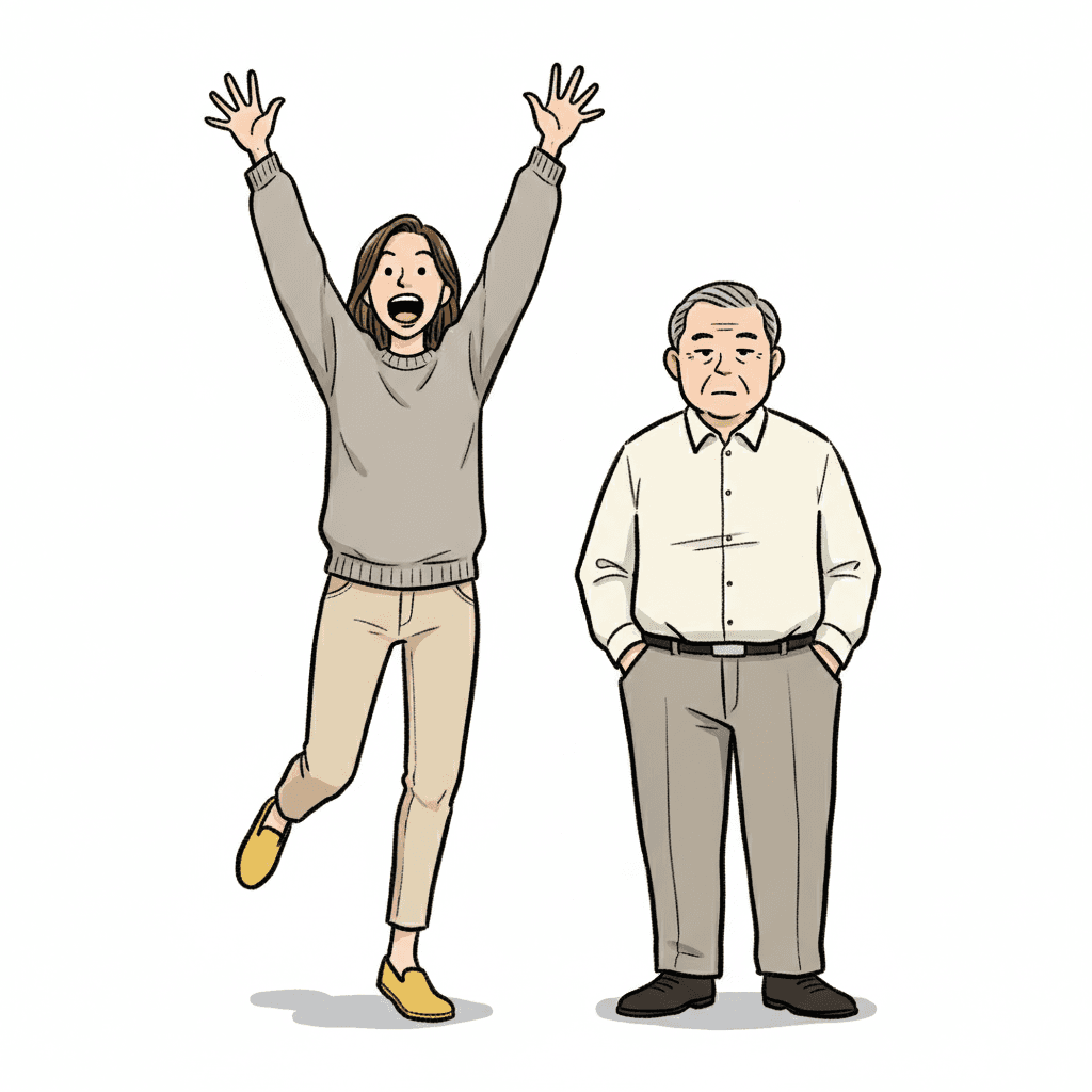
Both styles are funny and both are built around a face, which is why people land on the wrong one. Read the two briefs side by side and they are mirror images. That one asks for simple round-headed characters with blank expressionless faces, cool detached poses and generous white space, and its list of refusals names exaggerated expressions outright — the picture declines to react and the reader has to do it instead. This one puts the reaction in the picture and turns it all the way up. Take the deadpan cartoon when the humour is in nobody noticing. Take this one when the humour is in somebody very much noticing.
Bold Flat Satire
Same comic timing, a controlled line and a verdict
The nearest relative on timing. It shares the whole deadpan-or-awkward-or-suddenly-exaggerated sentence with this brief, so the faces come from the same place. Two things separate them. Its line weight is a thick bold outline and its palette is heavy black with flat colour blocks, so the drawing itself stays completely composed while the face misbehaves — where this brief lets the line get scrappy too. And it is satire: it asks for modern everyday characters in a full modern-life setting, which means the page is making a point about something. This one is not making a point. It is only trying to be funny, which is a different and often harder job.
Essay-Manga Diary
Same family, no event to react to
The other manga-family brief most often confused with this one, and the two share a sentence: silhouette before detail, so face shape, proportion and the shapes of hands and feet carry who somebody is. After that they want opposite pages. That one asks for quiet slice-of-life vignettes in soft warm pastels under a flat everyday light, with mild ordinary expressions and a mood its own brief calls cosy — there is no event in it for anyone to react to. Choose it when the page is a Tuesday. Choose this one when something lands on the Tuesday.
Gag Manga Story Ideas That Suit the Brief
Each of these is written to play to the same strength: a small thing goes wrong, and somebody has to be standing there when it does.
The Cake That Did Not Rise
One oven door opened, one flat disc inside, and four people who each take the news differently. The brief wants the whole scene comic rather than one funny face, so a kitchen full of separate reactions is exactly its shape.
The Dog Got On The Table
Nothing bad happens. The dog simply will not get down. A small event with a long aftermath suits a style whose subject is the aftermath rather than the event.
Grandad Is Not Impressed
Everybody is amazed except one person, and the book is about that one person. A deadpan face only reads as funny when something is plainly happening to it, which is what this brief supplies.
The Umbrella Turned Inside Out
One gust of wind, nine pages of consequences. Comic timing lives in the pose here, so a story made of physical mishaps gives every page a body to put the joke in.
We Missed The Bus By Four Seconds
The whole book is the four seconds and the hour afterwards. A style written around the instant just after something happens is the right one for a story about being slightly too late.
The Surprise Party Nobody Could Keep Quiet About
Six people failing to hide one secret, badly, in sequence. Awkwardness is one of the three expressions the brief names, and it is the least used and the funniest of them.
What a Rough, Fast Line Actually Looks Like
Three pages generated to this one brief, with nothing retouched afterwards.
One Second Apart
All the Timing Is in the Pose
The Awkward Middle
Deadpan, Awkward, Over the Top — and One Loud Colour
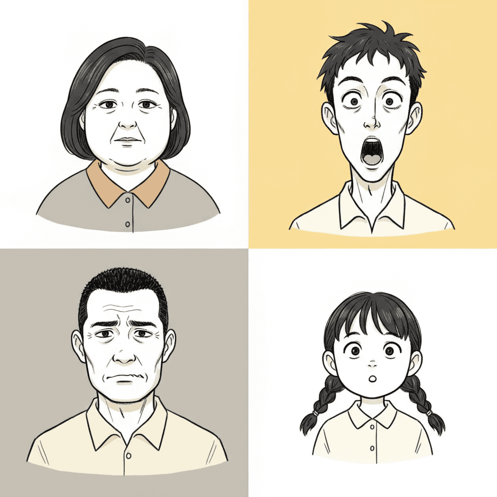
The brief names three expressions rather than one, and allows exactly one strong colour into an otherwise plain frame.
The Range, Four Ways
Readable as a Silhouette
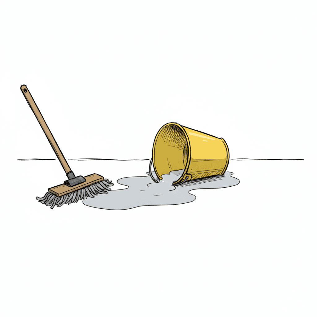
An Event With Nobody to See It
Same Surprise, Opposite Faces
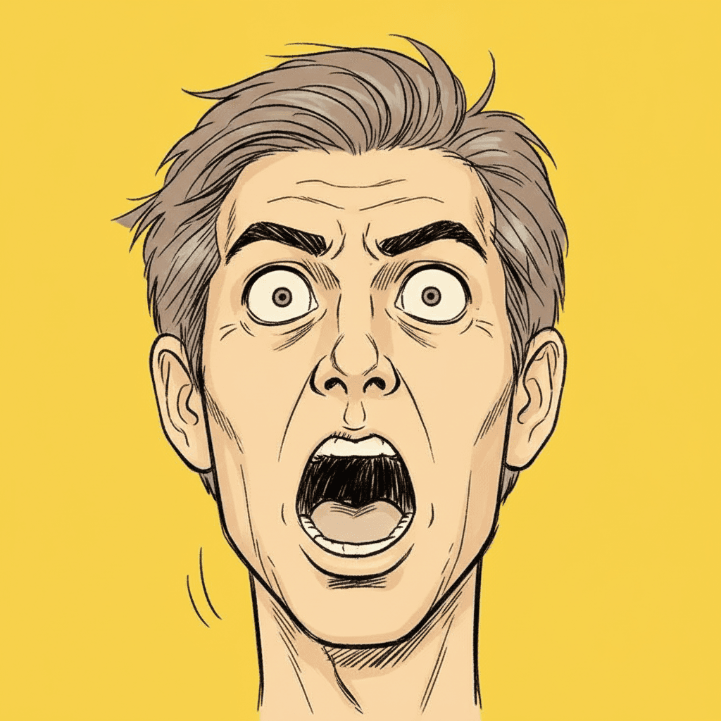
The Line, Up Close
Making a Whole Gag Manga Picture Book, Not One Panel
The useful things and the honest limits, in the order they are likely to matter to you.
The same face, pulling twenty different expressions
This is the thing that breaks first when pages are generated one at a time, and in this style it breaks in a particular way. An exaggerated face is a face under deformation — eyes stretched, jaw dropped, eyebrows gone — and a system drawing each page fresh will happily deform it into a different person. By page nine the big reaction is being pulled by somebody who is not your character any more. One fixed brief is carried into every page instead: rough energetic sketchy linework, simple flat colours over stark white with one bold accent, flat simple lighting, and the same four refusals of uniform cute smiles, polished rendering, soft shading and photorealism. Save each character in the Character Library with up to fourteen reference images and the face stays theirs no matter how far it stretches. Characters built from an uploaded photo stay private to your account.
Three expressions, and the middle one is the useful one
The brief names its register precisely: deadpan, awkward, or suddenly over-the-top. Most people reach for the third and stay there, and a book of nothing but shouting faces flattens by page six. The deadpan end is the one that makes the loud pages work, because a reaction only reads as large next to something small. The awkward middle is the least used and quietly the best â shoulders up, a strained polite smile, a person trying very hard to behave normally. Worth saying what this brief shares and does not: the silhouette sentence about face shape, head-to-body proportion and the shapes of hands and feet belongs to three briefs here, this one among them. The reaction is this one’s alone.
Flat colour, plain neutrals, and exactly one loud one
The palette is recorded as simple flat colours, a bold accent pop, plain neutrals and stark white, and the structure matters more than the particular hues. The drawing is already shouting, so the colour deliberately is not: everything sits in plain flat patches on a stark white ground and one single strong accent is allowed to pop. Put a second loud colour in and the reaction stops being the loudest thing on the page. The honest cost is stated in the same sentence. There is no atmosphere available here — no deep shadow, no dusk, no weather, no mood lighting of any kind, because the light is flat and simple and casts nothing. A page that needs to feel ominous or tender has to get there on the words alone, and the cinematic and grainy cinematic styles exist for pages that cannot. There is also no global greyscale switch in C2Story, so a monochrome book means picking a style that is monochrome by design.
Every page needs something to happen on it
The real constraint, and better known before you start than after. Most styles here will happily draw a page on which nothing occurs — a character thinking, a landscape, a quiet goodbye. This one has nothing to do with that page. Strip out the event and you have removed the subject, because the subject is the response to the event, and the result arrives as a person standing in a room pulling a face at nothing. So the story shape this style wants is a chain of small incidents rather than a single arc: the cake, the dog, the bus, the umbrella, one per page, each with a consequence somebody has to wear on their face. If your story is mostly interior, the essay manga or fine-line ink briefs are built for it and this one is not.
A whole book, not one good panel
This look survives mostly as single images — one reaction panel screenshotted out of a chapter, a four-frame strip, a face used as a sticker — and a single image is the easy part. You are not prompting for one. Describe the story and C2Story writes it, splits it into pages and builds each page to this brief according to what that page actually says, so the comedy is spread across a narrative with a setup and a payoff instead of landing once. You get picture-book pages with your words set as type rather than lettered into the art, which matters here: a real gag manga would have carried speech balloons and sound effects, and this one deliberately carries neither. When you want it on paper, the paid PDF download is the handoff to your printer, and everything you make is licensed for commercial use.
Good for a child who wants the page to be loud
Honest about where this one sits with young readers, because it sits very well. Big clear expressions are the first thing a small child reads in a picture, well before they read the words, and this brief is built out of almost nothing else: a few forceful features, a whole-body pose, one bright accent and a stark white ground with no clutter to search through. It is also genuinely funny rather than sweet, which matters to five-to-eight-year-olds who have started finding cute faces babyish. The caveat is the mirror image. There is no softness in it anywhere — no gentle light, no texture, no tenderness — so a bedtime book or anything consoling wants the watercolour or nordic whimsy styles instead. Write in English, Chinese, Japanese, Spanish, French and more; the look does not change with the language.
A note on where this one sits in the wider map. Gag manga is one corner of a much larger comics tradition, and if you are still deciding which corner you want, our guide to comic book art styles lays the families out side by side. For the quiet relative that shares its silhouette rule and refuses its reactions, see essay manga picture books, and for the mirror image where nobody reacts at all, deadpan cartoon picture books.
Questions About Gag Manga Picture Books
Explore More Story Ideas
Discover more styles, tools, and story types
Cooking Stories
Little chefs, baking, pizza night and birthday cakes
Explore
Pixel Art Picture Books
A fixed grid, a rationed 16-bit palette
Explore
Bedtime Story Generator
Cozy goodnight stories for kids
Explore
Storybee Alternative
More styles & features
ExploreGag Manga Picture Books — A Fast Line, a Flat Light and Somebody Who Noticed
A gag manga picture book is built on one unusual decision: the picture is a response rather than a depiction. C2Story runs seventy-eight hand-drawn style briefs, each a short written record of a palette, a light, a line weight and a few refusals, and exactly two of them mention anybody reacting to anything. Run the synonyms — startle, flinch, recoil, respond — and nothing else in the library turns up. One of those two is a single-panel magazine cartoon whose characters are explicitly straight-faced, where the gag sits in the situation and nobody in the frame has noticed it. That leaves this brief, the Gag-Manga Reaction style, as the only one here where somebody in the picture notices. Everything else about the style follows from that.
The timing is the second decision, and it is the one that catches people out. The brief asks for sharp comedic timing in the pose, which is an odd request to make of a still drawing, and its own preview line describes a character frozen mid-reaction. A picture-book page is one held instant, so the choice of instant is the whole joke. The plate falling is not funny. The half second afterwards, with somebody still only partway through turning round, is. Three briefs here use the word timing and the other two are satire looks that spend it on a settled, wry expression; this is the one that puts it in the body. A page of reaction face manga is therefore built backwards from the aftermath rather than forwards from the event.
The line is the third. Six of the seventy-eight briefs want a mark that misbehaves, and each wants it for a different reason — one is imitating an untaught hand, one is being bad on purpose, one is a wax crayon, one is a sketchbook thinking out loud, one is old cel animation. This one specifies rough energetic sketchy linework, and it is the only one whose roughness is speed. Everything else in the frame stays disciplined: simple flat colours, plain neutrals, a stark white ground, flat simple lighting and one bold accent pop allowed to be loud. The four refusals point the same way. Polish, soft shading and photorealism all make a picture look considered, and a considered picture looks like it took time; a uniform cute smile is worse still, because a face wearing the same pleasant expression every page cannot react to anything at all.
Which makes the choice between the funny styles here reasonably clear. Take the deadpan cartoon if the humour is in nobody noticing. Take bold flat satire if the page is making a point about modern life and you want the drawing to stay composed. Take whimsical absurd if the world itself should be bent. Take essay manga if there is no event at all. Take comedy manga art in this brief when something small goes wrong and somebody has to wear it on their face — and accept the honest limit that comes with it: with a flat even light and no atmosphere available, a page where nothing happens has nothing here to draw. Describe the story in a sentence and C2Story writes it, splits it into pages and builds every page to the same brief, keeping your characters on model however far an expression is pushed — in English, Chinese, Japanese, Spanish, French and more, with the paid PDF download as the handoff to your printer.