
Isometric Map Picture BooksThe Whole World, From Above
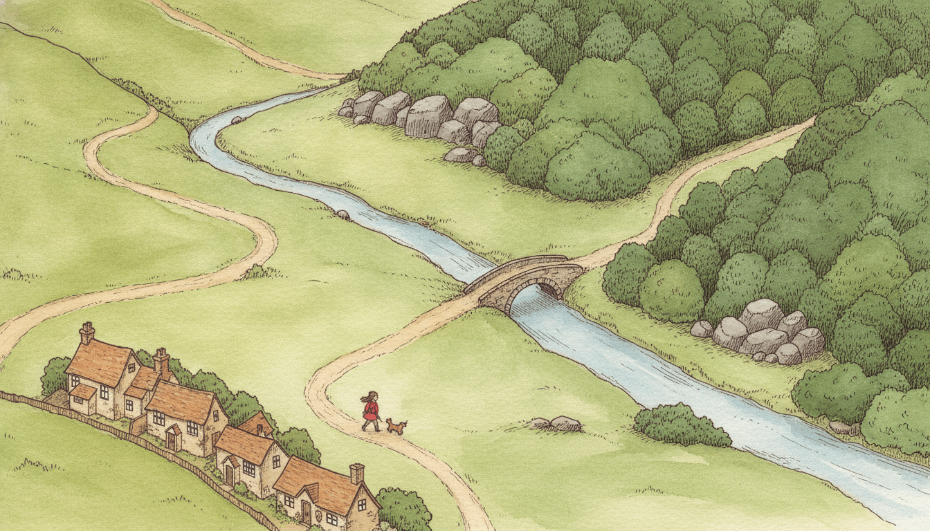
A path from the village, a bridge over the river, a wood on the hill. Isometric map picture books show the whole story world from above at one fixed, tilted angle, like a hand-drawn adventure map you could walk across with a finger: fine ink pen lines, careful hatching on the rocks and roofs, and warm watercolour woods, fields and streams. Your characters are the small figures travelling through it.
- One fixed view from above, no vanishing point
- Fine hatched ink under warm watercolour
- Valleys, rivers, coasts, woods and villages
- Free credits by request, no card
50,000+
Stories Created
10,000+
Active Creators
50+
Art Styles
4.9/5
User Rating
What Makes Isometric Map Illustration Different
Every style here is a written brief: a palette, a light, a line weight and a short list of refusals. Four things in this one decide the look, and three of them are found in no other brief in the library.
The camera is part of the style
Every style in C2Story is a short written brief: a palette, a light, a line weight and a few refusals. Almost all of them leave the viewpoint to the story. This one fixes it: isometric and top-down, looking down at the land at one tilted angle. Only one other brief in the library asks to be seen from above at all, and that one is a bird’s-eye city panorama with ordinary perspective.
The subject is the land
Most briefs end by asking for “the full scene the story describes”. This one asks for “the full illustrated map landscape”, and it is the only brief out of seventy-eight that says the word map. Valleys, rivers, woods, rocks and villages are the main subject, and the characters are small people travelling across it.
Hatching underneath, watercolour on top
Five briefs ask for ink hatching. Four of them stop at the ink: gothic black and white, airy Nordic line, a botanical plate, an Edwardian fashion plate with a little spot colour. This is the only one that paints warm watercolour woodland over the hatching, so the pen gives rocks and roofs their shape and the paint gives the land its colour.
No time of day
The light is “even soft daylight wash”: a wash, not a sun. Nothing casts a long shadow and there is no glow to steer the eye, because a map is not taken at a particular hour. Every corner of the page is lit the same, so every corner can be read.
What Isometric Map Illustration Changes
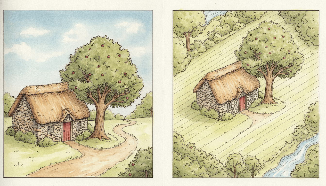
Look at one cottage twice. Same thatched roof, same stone walls, same red door, same apple tree. On the left you are standing in the lane: the path curves away from you, the sky sits above the roof, and you can see one side of one house.
On the right you are above it. Now the roof, the garden, the path, the field behind and a stream in the corner are all on the page at once, and the lines of the house run parallel instead of meeting at a point. That is the whole trade this brief makes: you lose the sky and the faces, and you gain the place. Look at the grass too: it is hatched in long, even pen strokes before the watercolour goes on.
Its four refusals keep the page hand-made and warm rather than digital.
Write the Way There
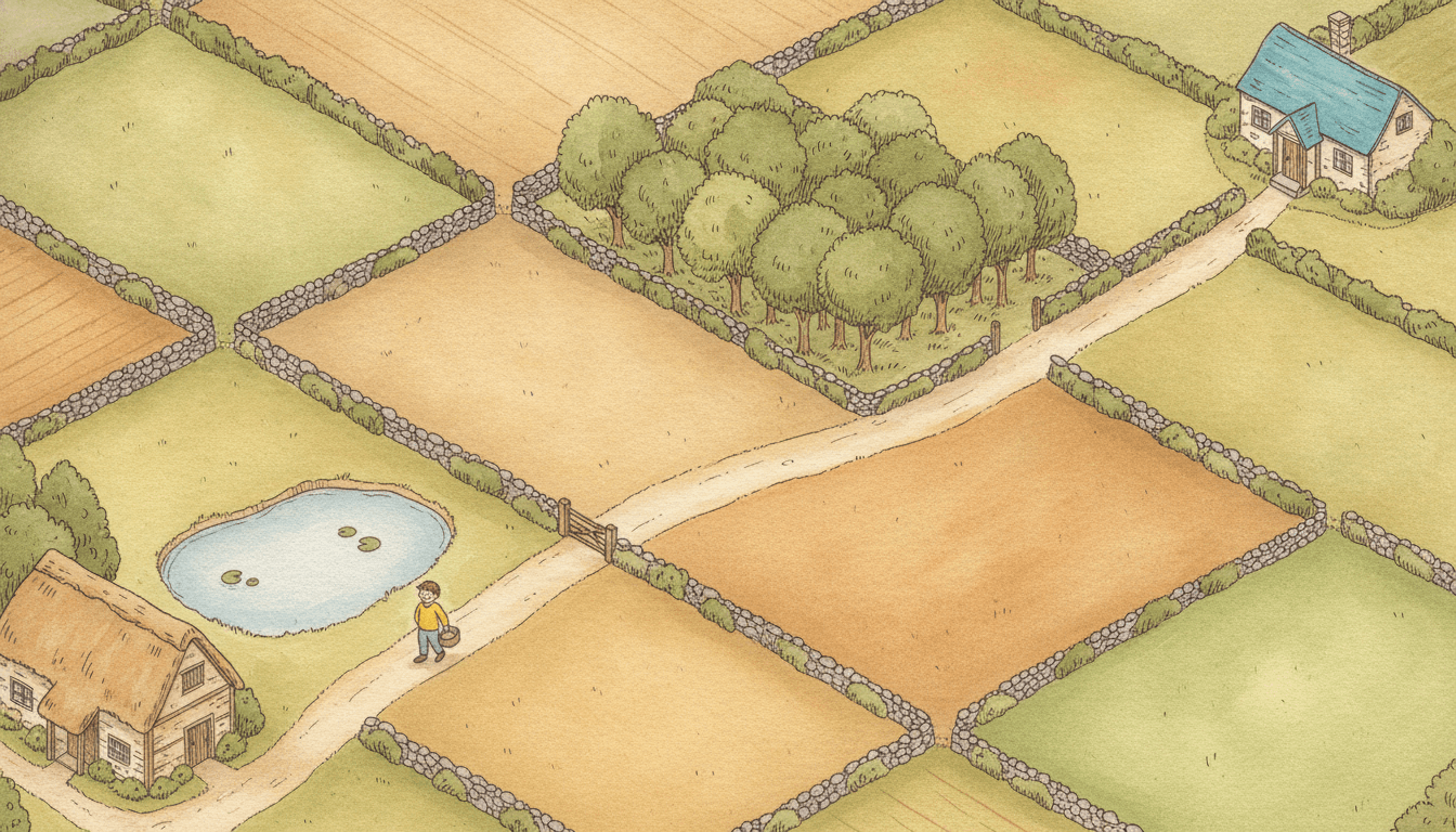
A cottage by a lily pond in one corner, a cottage with a blue roof in the other. Between them a footpath, a wooden gate, a patchwork of fields behind dry-stone walls and a small wood. Halfway along, one boy in a yellow jumper with a basket. He is tiny. The page is about the distance he still has to go.
That is where the writing goes. A brief that draws the land from above has room for everything between two places, so the most useful thing you can give it is a route: where the page starts, where it ends, and what lies in between. “He goes to Grandma’s” gets a boy and a house. “Past the pond, through the gate, across the fields and round the wood to the blue roof” gets the whole journey, and a reader can trace it with a finger.
In a book you do not write image prompts; C2Story writes them from your story. Name the landmarks in your text and they turn up on the page. Leave them out and the brief fills the land with pleasant, generic fields.
From One Sentence to Isometric Map Picture Books
You pick the look once. The brief is then applied to every page, so the angle, the hatched ink and the watercolour land never drift.
Describe the land and the cast
Write a sentence or two about who is in the story and where they are going. Name the places along the way, and give each character one strong colour that reads from above.
Choose Isometric Fantasy Map
Pick the style from the Styles Library. From then on every page uses the same view from above, the same fine hatched ink and the same warm earth, forest green and stream blue.
Get a whole book
C2Story writes the story, splits it into pages and illustrates each one. Regenerate any page you want to change without touching the rest, read it online, share it, or buy the PDF download to hand to a printer.
This Style and Its Three Nearest Neighbours
One shares the view from above, one shares the land as subject and one shares the pen. Here is what each actually asks for.
Isometric Fantasy Map
The style on this page
A hand-drawn isometric top-down fantasy map: fine ink pen outlines with careful hatching, warm hand-painted watercolour woodlands, streams and rocky textures, and the detail of a charming old adventure map. Its palette is warm watercolour earth tones, forest green, sepia ink and soft stream blue. It refuses flat digital vector, glossy 3D, neon colours and photorealism.
Ligne Claire
The other view from above
A clear-line European comic with an elevated bird’s-eye view of old-town streets, uniform black ink and bright flat colour. Its view has perspective: the street runs off toward a vanishing point and the rooftops shrink. Choose it for a busy town. Choose the isometric map when the story crosses a whole stretch of country and every place in it should stay the same size.
Song Landscape
The other land-first style
Chinese ink-wash mountains in mist, seen from the ground and looking up, where the white of the paper hides the distance between ranges. It is about what you cannot see. The isometric map is the opposite: nothing is hidden, and you can see the whole valley at once.
Crosshatch
Same pen, no paint
Dense black-and-white pen hatching that builds all of its shading out of crossed lines and stops there. The isometric map uses the same careful hatching as a foundation and then paints over it. Choose crosshatch for a dark, fully inked book; choose the map for a warm, coloured one.
Story Ideas for Isometric Map Picture Books
Each idea has somewhere to go and something to find, which is what this brief draws best. Journeys, searches, seasons and village days all suit it.
The Long Way to Grandma’s
Past the pond, through the gate, across three fields and a small wood. A boy with a basket takes the long path for the first time on his own.
The Lighthouse Keeper’s Lunch
Every day somebody rows his lunch out to the lighthouse on the rock. Today the sea is calm and it is a girl’s turn.
Where Did the Goat Go?
The goat is somewhere in the forest. The reader can see it from up here. The girl at the stream cannot.
First Snow on the Hill
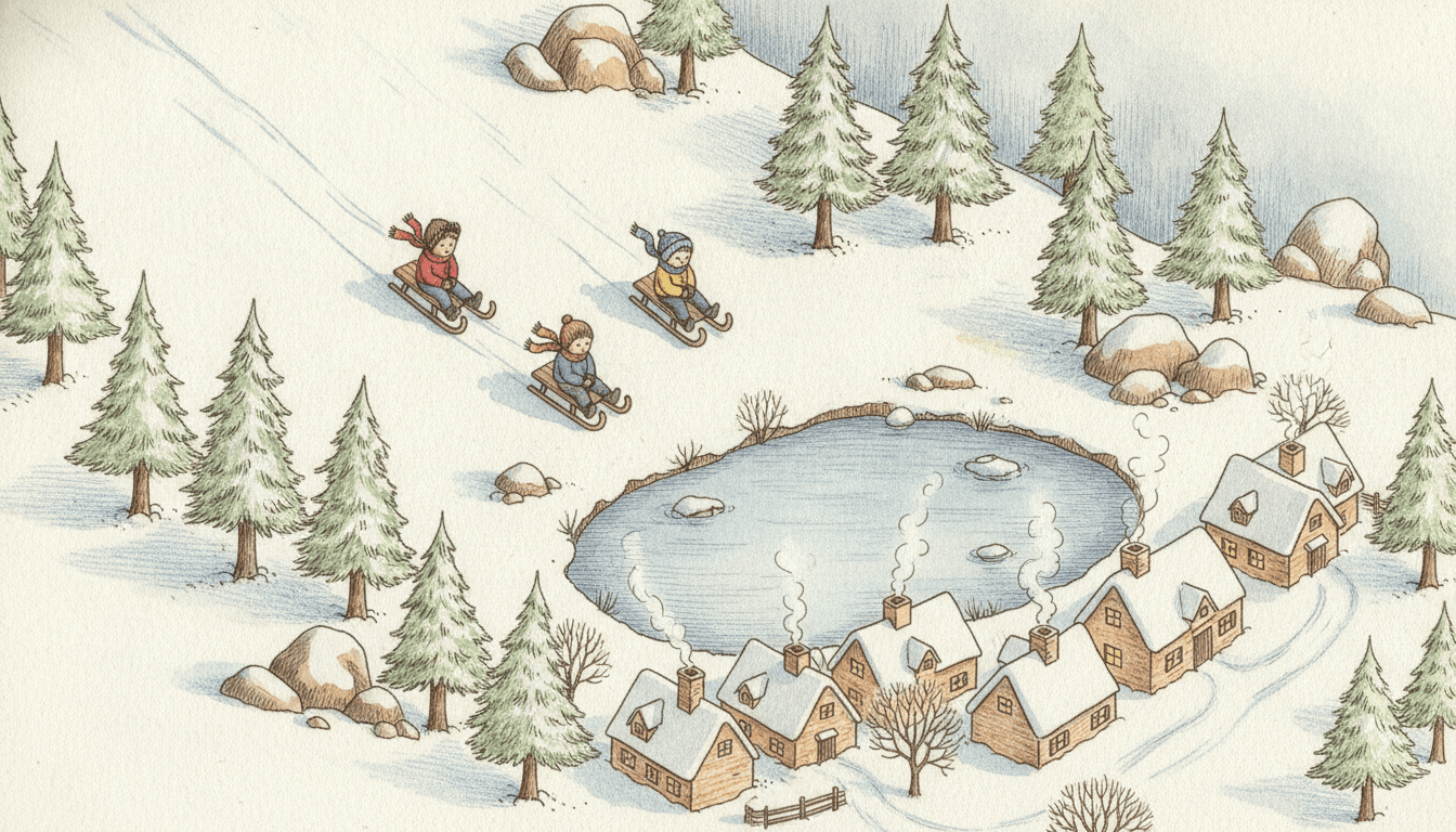
Three children, one sled, a slope that ends at a frozen pond, and a village of chimneys watching from below.
Market Day
One chicken has got loose among the stalls. Follow it round the square from the well to the baker’s and back.
The Bridge Over the Stream
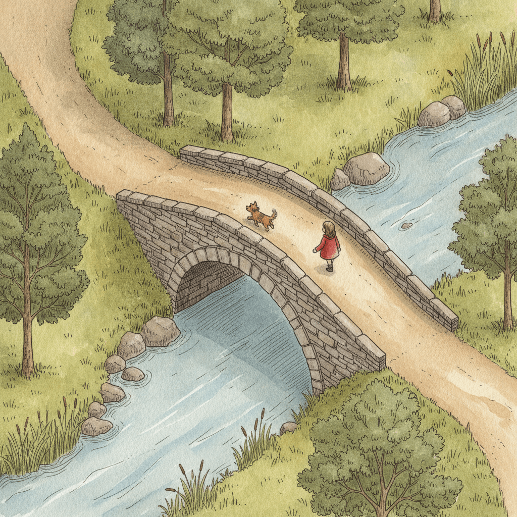
A girl and her dog set off from the village to see what is on the other side of the river. The book ends where the path does.
What Fantasy Map Art Does Across a Book
Pages generated to this one brief, with nothing retouched afterwards. Two honest notes: the snowy hill first came back with four sledders instead of three and was generated again with the count made the first thing in the prompt. And in the forest the brief drifted from a strict isometric angle toward an ordinary view from above, with the trees standing up tall. It still reads as a map; it is just less strict than the cottage.
From the ground, then from above
Three sleds, one pond
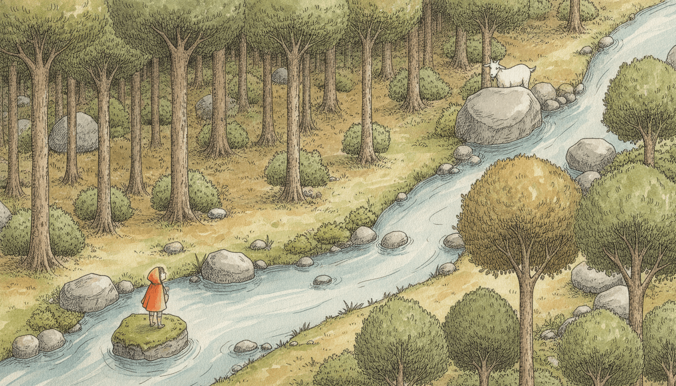
The goat she cannot see
A Small Cast in a Big World, Held Steady
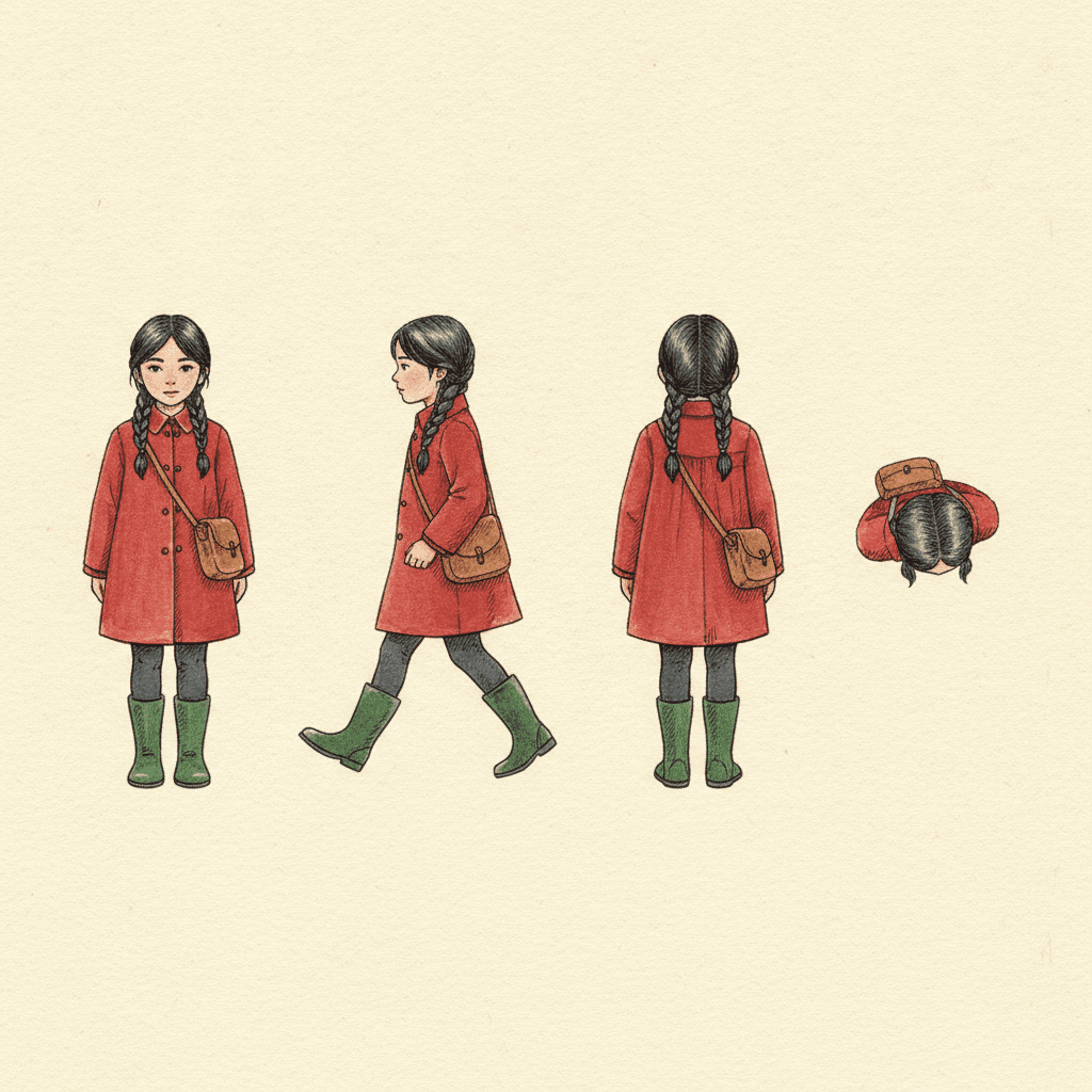
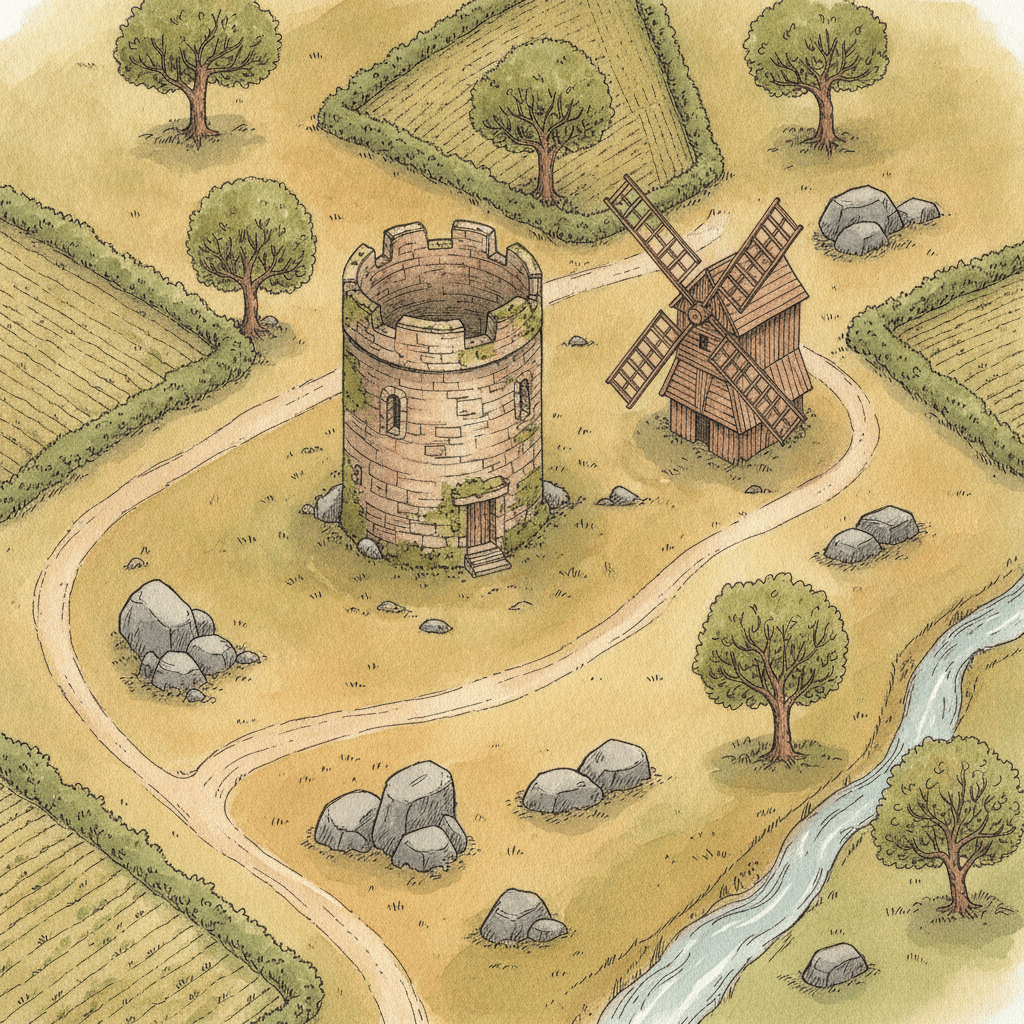
Here is where the design held and where it wandered. The girl keeps her plaits, red coat, satchel and green boots through four views; the last is from straight above, where she is only dark hair, a satchel and two red shoulders, which is why a strong colour matters more here than in any close-up style. Closer in, the bridge page keeps her red coat readable. The empty hilltop shows the brief with nobody in it. The market came back with more shoppers than asked for, and in the treehouse the boy climbs a wooden stair rather than the rope ladder in the prompt.
One girl, four views
Crossing the bridge
The land, with nobody on it
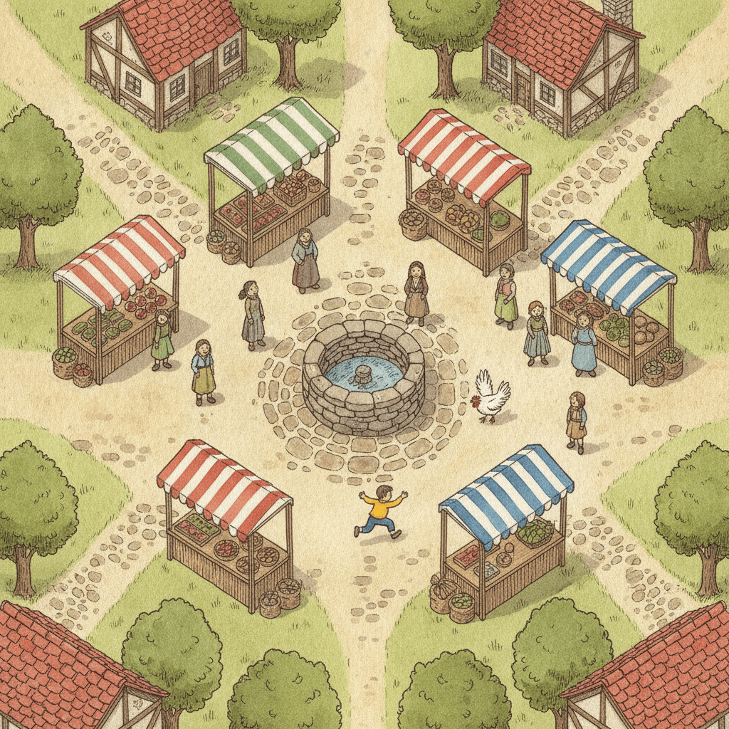
Market day and a loose chicken
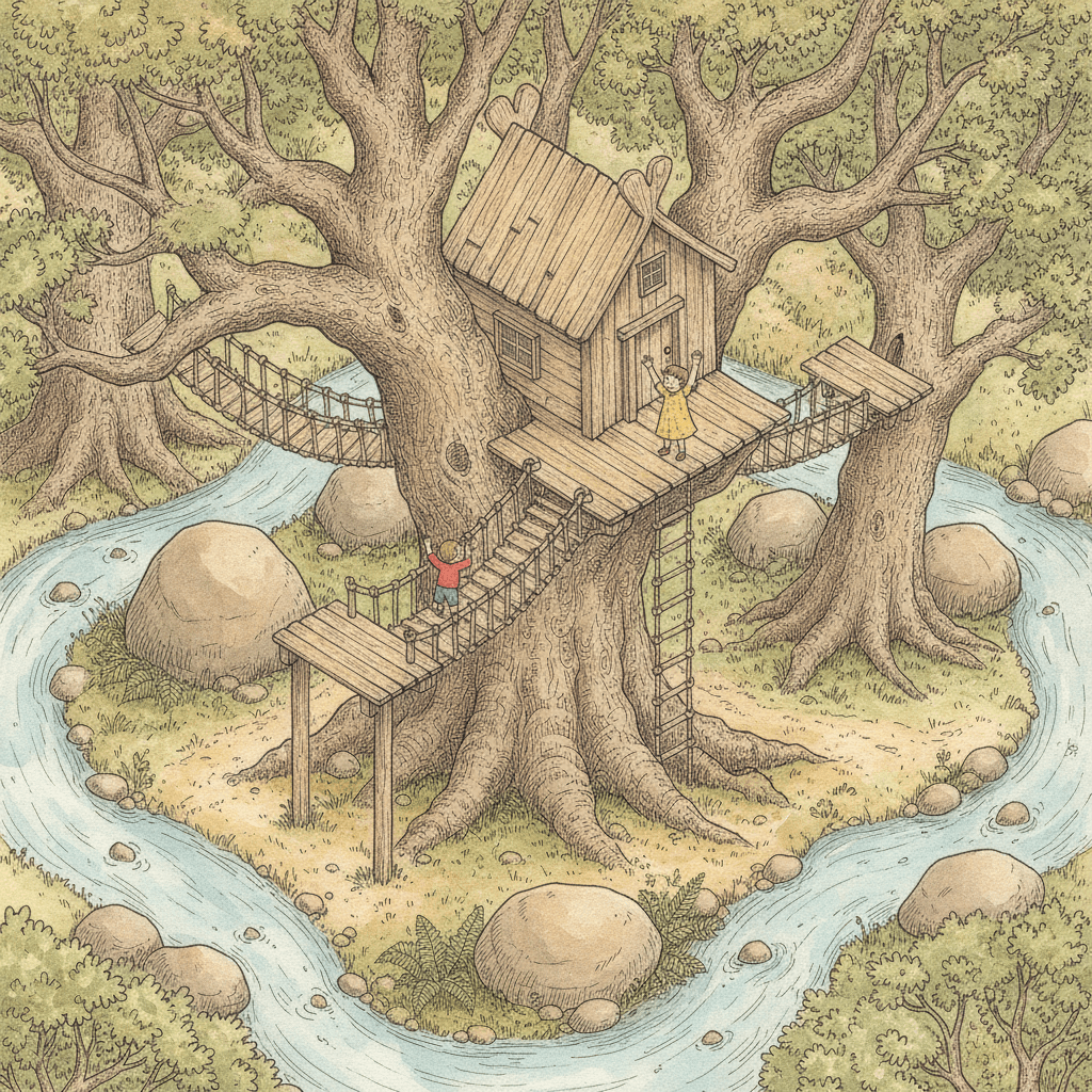
The treehouse by the stream
Making Whole Isometric Map Picture Books
What is useful in a book drawn this way and where the limits are, in the order you are likely to meet them.
One character, kept on model
Save each character in the Character Library with up to fourteen reference images and a short written description. On a map page a person is small, so give them one strong colour, like a red coat, that reads from above. Characters made from an uploaded photo stay private to your account.
Write the way there
Name where the page starts and where it ends, and the things in between: the pond, the gate, the bridge, the wood. The brief draws routes well because it shows the whole stretch of land at once.
It does not do close-ups
Every page is asked for as a map landscape, so faces stay small. A page whose whole point is one tear on one cheek will not land here. If your story turns on expressions, choose a style that comes in close.
Room for a lot of world
Villages, rivers, coastlines, forests and hills all fit on one page. Search-and-find stories, journeys, quests and “a day in the village” books suit it. Keep the number of named characters small so each one can be found.
Pictures, not labels
The pages are illustrations of the land, not map documents. Ask for place names, a compass or a legend and you are asking against the brief. Put the names in your story text, where they can be read.
A whole book from a sentence
Describe the story in a sentence and C2Story writes it, splits it into pages and draws every page to the same brief, in English, Chinese, Japanese, Spanish, French and more. Read online, share a link, or buy the PDF download as the handoff to your printer. Pages are licensed for commercial use under the terms of service.
Other styles that care about a place, each built on a different idea: for a bird’s-eye town in clear line and flat colour, ligne claire picture books; for mountains half hidden in mist, Song landscape picture books; for hatching with no paint over it, crosshatch picture books; for soft wash with no fixed viewpoint, watercolor picture books; for building a whole setting before the story, the story universe builder; and for every style side by side, the children’s book illustration styles gallery.
Questions About Isometric Map Picture Books
Explore More Story Ideas
Discover more styles, tools, and story types
Rainbow Stories
Rainbows after the rain, rainbow bridges and pots of gold
Explore
Mythic Bestiary Picture Books
Legendary beasts with a temper of their own
Explore
Picture Book Maker
Create illustrated picture books
Explore
Storybee Alternative
More styles & features
ExploreIsometric Map Picture Books: One Angle, Hatched Ink, Warm Watercolour
Isometric map picture books rest on a brief that decides where the reader stands. C2Story runs seventy-eight hand-drawn style briefs, each a short written record of a palette, a light, a line weight and a few refusals. Nearly all of them let the story choose the viewpoint. The Isometric Fantasy Map brief fixes it: top-down and isometric, at one tilted angle, with no vanishing point. It is also the only brief in the library that names a map, and the only one of the five hatching briefs that paints watercolour over its hatching.
The look is classic isometric map illustration crossed with hand-drawn fantasy map art: fine ink pen outlines with careful hatching, warm hand-painted watercolour woodlands, streams and rocky textures, and the detail of an old adventure map. The palette is warm watercolour earth tones, forest green, sepia ink and soft stream blue, and the light is an even, soft daylight wash with no time of day. It refuses flat digital vector, glossy 3D, neon colours and photorealism.
This kind of isometric world art suits stories that travel: a boy taking the long path to his grandmother’s, a rowing boat crossing to a lighthouse, a goat hiding in a forest, three children on a snowy hill. Write the way there, naming where each page starts, where it ends and what lies between. It is a weak fit for stories that depend on close-up faces, because every page shows the land from above. Characters stay on model through the Character Library, with up to fourteen reference images each.
The choice between neighbours is clear. Take ligne claire for a bird’s-eye town with perspective, Song landscape for mountains in mist, and crosshatch for a fully inked page with no paint. Take this style when the whole stretch of land should be visible at once and every place in it should stay the same size. Describe the story in a sentence and C2Story writes it, splits it into pages and draws every page to the same brief, with the paid PDF download as the handoff to your printer.