Crosshatch IllustrationPicture Books
A crosshatch illustration makes its shadows out of countable pen strokes — dense hatched darkness, engraved ink texture, black and white by design. Held across a whole book, not one lucky drawing.
- Every grey is strokes and gaps — no wash, no gradient
- Black and white by specification, not by a toggle
- Hatch direction tells stone from fur from water
- Free credits by request — no card
50,000+
Stories Created
10,000+
Active Creators
50+
Art Styles
4.9/5
User Rating
What Makes a Crosshatch Illustration More Than Shading
Two of these are about how the darkness is built. The other two are about what the style will and will not agree to be.
Nothing in the drawing is actually grey
Put a magnifier on a shaded area and there is no grey pigment in it. There are black strokes and there is white paper, and the grey happens in your eye. That is the whole mechanism: the palette this style carries is black ink, paper white, and dense grey hatching — and the third one is an optical result of the first two, not an ink. Every value in the picture has to be built, stroke by stroke, rather than mixed.
The angle of the lines is a second channel
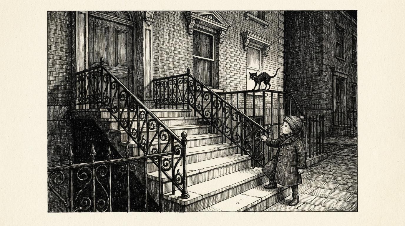
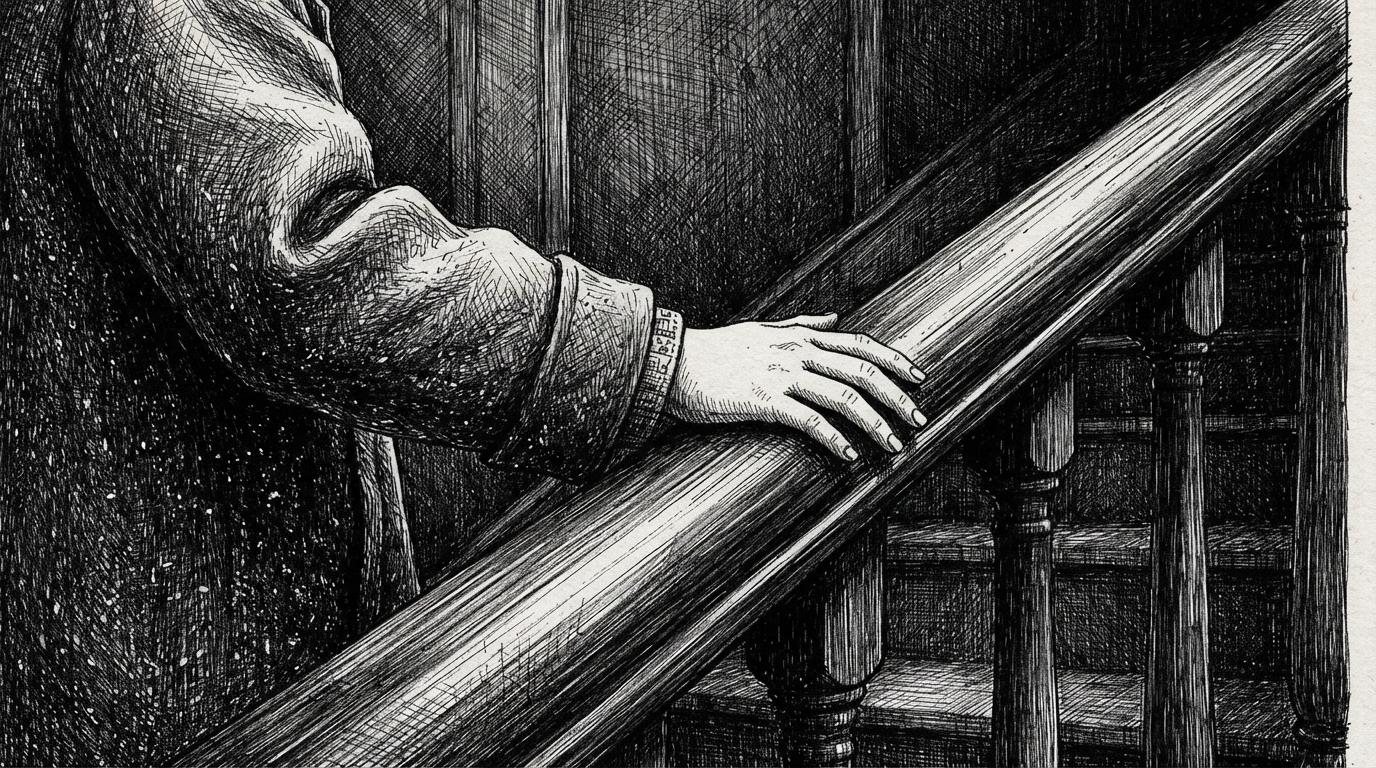
A wash can only say how dark. Hatching says two things at once: spacing says how dark, and direction says what it is lying on. Curved strokes wrap a dog, tight verticals run down railings, long diagonals rake across a lawn. That is how a drawing with no colour in it still tells stone apart from fur apart from water.
Black and white by specification, not by a switch
Worth knowing before you go looking for a toggle: there is no global greyscale switch on the site. A style is monochrome because its own brief says so, and this one does — colour is the very first entry in its refusals, ahead of flat digital shading, soft gradients and photorealism. Most styles refuse a technique. This one refuses an entire dimension, which is why it is the dependable choice for a true black-and-white book.
Its lighting note is moody hatched chiaroscuro
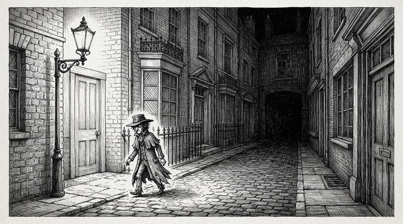
This is the style with a shadow vocabulary, and the catalogue says so in one phrase. Where a clear-line look has bright even daylight and no way to make a room feel dark, this one banks blackness into corners and lets one lit surface carry the page. It comes with a temperament attached — Victorian, quirky and faintly macabre, with a cold understated humour — so it is a mood as much as a technique.
In a Crosshatch Illustration, the Shadow Is Itself a Drawing
Most ways of making a page dark are an application. You put something over the area — a wash, a grey fill, a gradient — and the darkness arrives as a quantity. You cannot see how it was made, which is exactly why it is convenient, and also why it hides things.
Hatching has no such move available. Full-strength black ink goes down as separate strokes, so a shadow is a count: twenty strokes is dusk, eighty crossed four ways is the back of a cupboard. Which means the dark half of the picture has to be drawn with the same decisions as the lit half — where the strokes start, which way they run, how close they sit.
There is a test for it. Imagine putting a magnifier on a shaded patch. Over a wash you find more grey. Over hatching you find black lines and the white paper between them — no grey at any magnification, because the grey was never in the picture. It was in your eye.
So write scenes with light in them. “One candle in a crowded room” hands this style its whole vocabulary. “A bright flat afternoon” gives it nothing to build with.
The style names what must never appear, and the first entry is the unusual one — three refusals about mark-making, preceded by a refusal of colour itself:
Four Hatching Styles That Disagree About How Much
Choosing “hatching” is not actually a decision. Four enabled styles here hatch, and they are not variations on one look — they disagree about what the hatching is for, and you can read the disagreement in their briefs.
One of them asks for dense crosshatching and moody chiaroscuro. One asks for crisp pen hatching and then puts dense shading on its forbidden list. One asks for delicate airy hatching and refuses heavy fills. One uses dense cross-hatching for ornament under even antique-plate lighting, where nothing is meant to be dark at all.
So pick on quantity, not technique. If the hatching is the substance of the picture and the book needs real darkness, you want this one. If you want stroke texture on a bright page, you want one of the other three.
And pick on mood, because it comes attached. This style is Victorian, quirky and faintly macabre by brief. It is not a neutral rendering method you can aim anywhere.
Worth seeing side by side before you commit: the fine-line ink style, which is the same nib with the tone taken out, the ligne claire style, which has no shadow vocabulary at all, and the sumi-e style for darkness made of dilute ink rather than of strokes.
Create a Crosshatch Ink Picture Book in 3 Steps
From a one-line idea to a finished book hatched at one density, in under two minutes.
Describe the story
A sentence is enough. This look is strongest where there is darkness or intricacy to build — night streets, cluttered rooms, weather, machinery, woodland, a cabinet of small specific things — so give it something to model as well as someone.
"A child works out why the east rooms are always cold"
Pick the hatching
Choose Crosshatch Gothic Ink for dense black-and-white chiaroscuro, Ornate Botanical Ink for cross-hatched ornament in sepia, Vintage Ink Fashion Plate for crisp hatching that refuses to go dense, or Nordic Fine-Line Whimsy for delicate hatching on a bright page.
Black ink, paper white, and optical grey from the strokes
Generate and export
C2Story writes the story, breaks it into pages and hatches every one to the same brief. Read it on screen, share the link, or export the PDF and take that file to a printer — print is where this look is at its best.
Whole book drawn, PDF export, instant sharing
Crosshatch Illustration and Its Engraved-Ink Neighbours
Four real styles that all hatch, sorted by the two things that actually separate them: how dense it gets, and whether any colour survives.
Crosshatch Gothic Ink
Black and white only, dense crosshatching, meticulous fine ink hatching for shadow and volume, richly textured linework filling the full scene and its ornate setting, a Victorian atmosphere and quirky macabre characters with cold understated gothic humour. Lighting is moody hatched chiaroscuro on a fine nib ink line. It sits in the Editorial group and it is the one style here that refuses colour outright.
Ornate Botanical Ink
The same dense cross-hatched detail from a fine nib, pointed at strange ornate flora and fauna and classical curio-cabinet whimsy, with visible hand pressure, pauses and a slight wobble left in the line. The giveaway is its lighting note — even antique-plate lighting. The hatching is there to make things intricate rather than to make them dark, and it keeps a warm ivory, sepia and faded-rose range rather than going monochrome.
Vintage Ink Fashion Plate
Refined crisp pen hatching and feathered shading, elegant retro silhouettes, large breathing white space and a minimal vintage-blue and mustard spot colour. Read its refusals and the split is exact: dense shading is on its forbidden list, which is the thing this page is about. Same tool, opposite quantity — hatching used as a light touch of modelling rather than as the substance of the picture.
Nordic Fine-Line Whimsy
Fine-line ink with dense yet airy delicate hatching, whimsical quirky characters, a tender lonely mood and vast white space framing the subject, on cool grey wash, pale blue and a single soft red. It refuses heavy fills and saturated floods, so the hatching stays light and the page stays bright. Pick it if you want the stroke texture without the gloom.
Two near relatives are worth knowing about. Isometric Fantasy Map uses fine ink pen outlines with careful hatching and then puts hand-painted watercolour woodlands on top — hatching as understructure rather than as the finish. Pointillist Pixel Fantasy builds its values out of stippled dots instead of crossed lines, which is the same idea with one mark instead of two. For where pen-and-ink sits among the wider families, see our guide to comic book art styles, or browse everything on the illustration styles hub.
Engraved Ink Art Story Ideas to Get You Started
This look is better at darkness, texture and intricacy than at brightness, sweetness or wide-open light. These six lean into that.
The House That Was Dark on One Side
A child works out why the east rooms are always cold. This look can make one wall genuinely black and the next wall genuinely lit, so the plot is visible in the hatching before a word of it is read.
Create this storyThe Night the Clocks Went Back
An hour that happens twice, in a house full of ticking. Clutter, brass, patterned wallpaper and deep corners are exactly what dense hatching is good at — and the extra hour has somewhere to hide.
Create this storyWhat the Lighthouse Keeper Lost
Weather, rigging and a very large sea. Storm skies are thousands of crossed strokes and water is long raking ones, which means bad weather arrives as texture rather than as a grey smear.
Create this storyThe Moth Collection
A gentle story about a child who inherits a cabinet of pinned specimens. Hatching is at its best on small intricate things, and an engraved catalogue plate is a look this style produces almost by default.
Create this storyNobody Has Opened This Door Since
A key, a corridor, and a room nobody mentions. Scary-fun rather than scary-bad: the style has real darkness in it, so the suspense can be built from shadow instead of from anything upsetting.
Create this storyThe Fox Who Counted the Trees
A woodland at night, told by an animal. Fur, feather, bark and grass each take a different hatch direction, so a cast of animals stays legible even with no colour available to tell them apart.
Create this storyAI-Generated Crosshatch Illustrations
Look at the dark areas rather than the lit ones. Every one of them is drawn, and you can see which way the strokes were going.
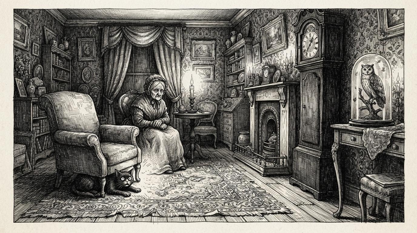
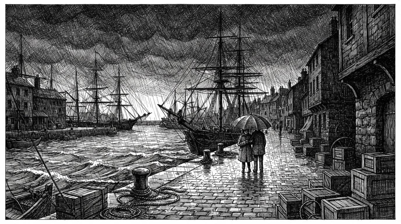
A Hatching Drawing Style for Every Subject
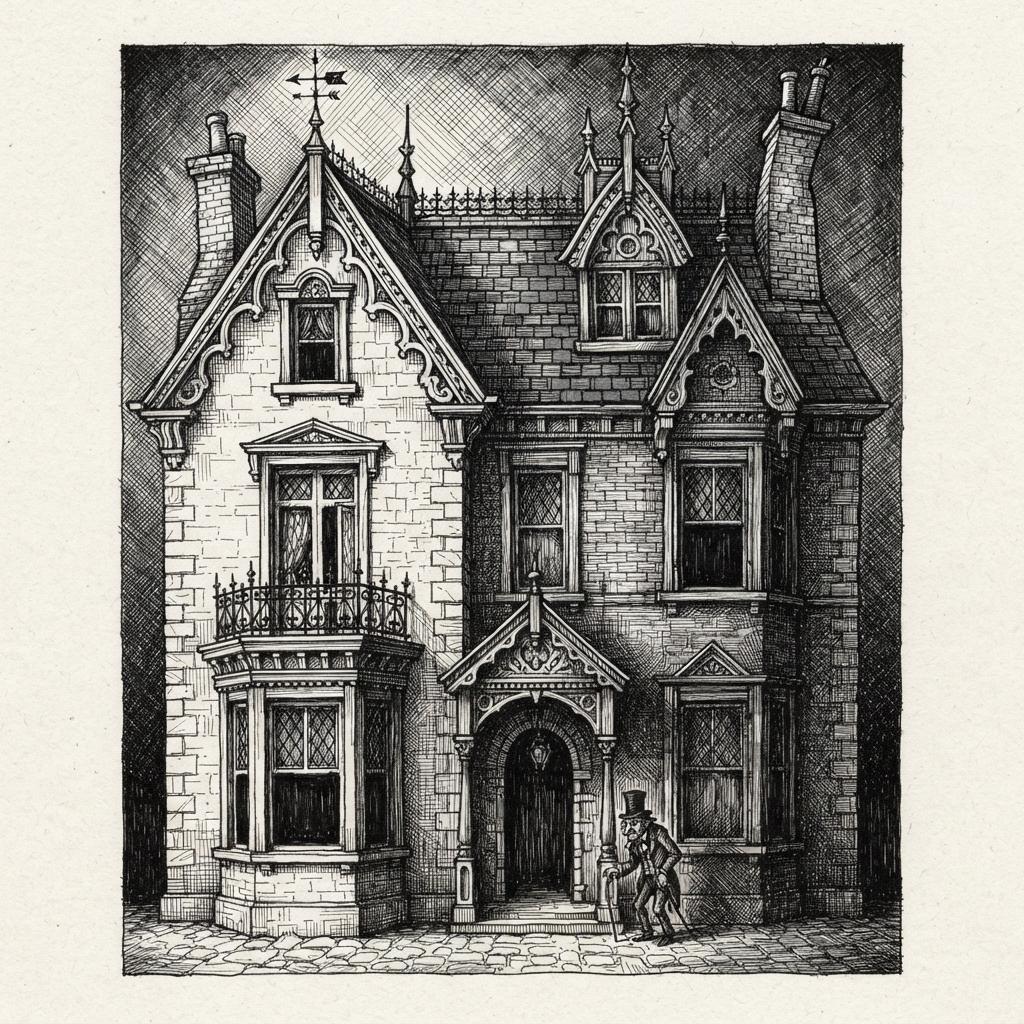
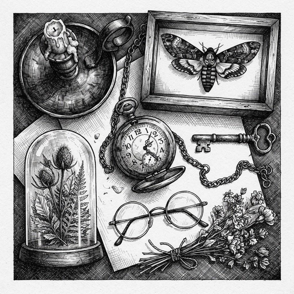
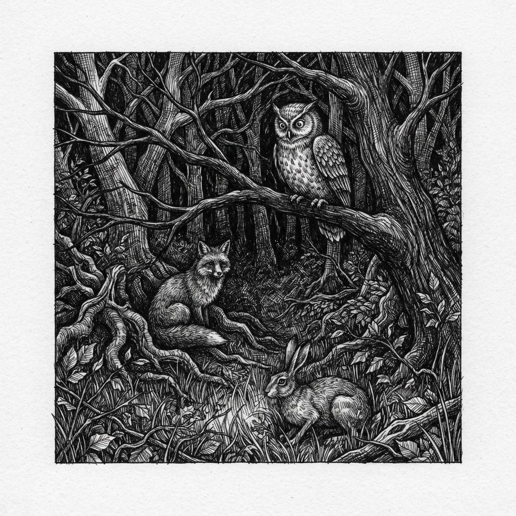
Characters, faces, architecture, objects, animals — the same nib and the same crossed strokes, spent on whatever your story is actually about.
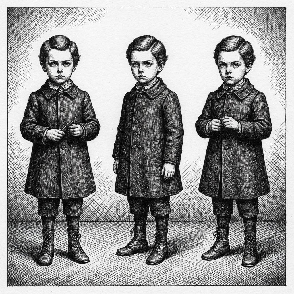
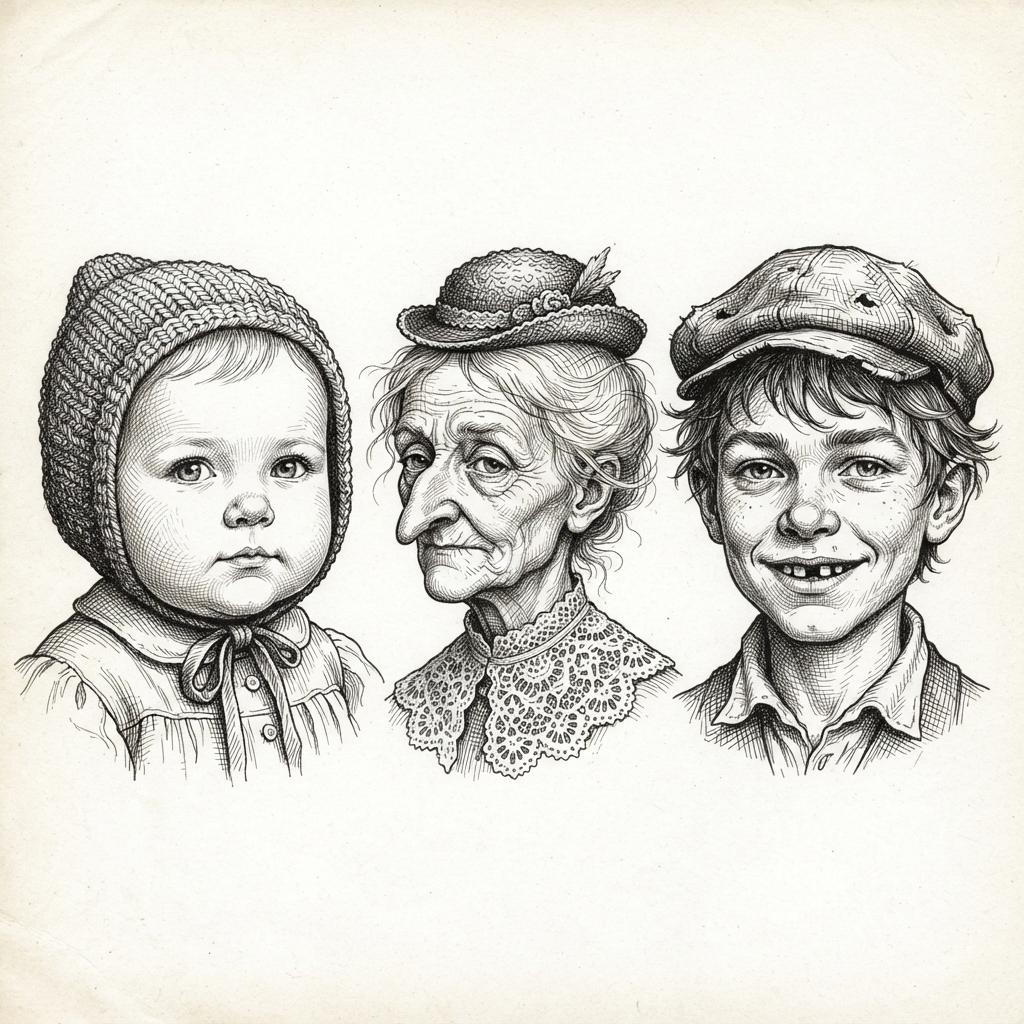
Everything You Need for Crosshatch Illustration Picture Books
One good hatched plate is easy. Twenty-four of them, at the same density, with the same cast and no colour to lean on, is the part that needs building.
The same hatch on page twenty
One fixed brief — dense crosshatching, fine nib, hatched chiaroscuro, no colour — carried into every page of the book. Hand-hatching is the most patience-expensive way to shade a drawing, and the thing that normally slips over a long book is consistency of density. That is the part being automated.
Four refusals, written down
Left alone, an image model reaches for a soft grey gradient the moment a scene needs to be dark, because it is the cheapest way to look finished. This style names colour, flat digital shading, soft gradients and photorealism as things that must never appear, so the shadow stays made of strokes on the last spread as much as the first.
A cast that survives having no colour
Save your characters in the Character Library, with up to fourteen reference images each, and the description travels into every page and into later books. It earns its keep here: with no colour to identify anyone by, a reader recognises your cast by silhouette, coat shape and face structure, which is precisely what a saved character keeps steady.
A palette that arrives with the style
There is no colour picker and no hex field, and in this style there is nothing for one to do. The range is black ink, paper white, and the optical grey that crossed strokes produce. What your scene descriptions steer is where the light falls — which surface is left bare and which corner gets four layers.
Whole books, not single drawings
You are not prompting for one handsome engraved plate. Describe the story and C2Story writes it, breaks it into pages, and draws every page in this style, matched to what that page actually says.
Any language you read aloud in
The look carries no language of its own. Write the story in English, Chinese, Japanese, Spanish, French and more — the nib, the hatch density and the black-and-white range do not change with the text.
Crosshatch Ink Picture Books — Questions
What people ask before committing a whole book to black ink, white paper and nothing in between.
Explore More Story Ideas
Discover more styles, tools, and story types
Rainbow Stories
Rainbows after the rain, rainbow bridges and pots of gold
Explore
Mid-Century Modern Books
Flat colour blocks & hard-edged geometry
Explore
Picture Book Maker
Create illustrated picture books
Explore
Storybee Alternative
More styles & features
ExploreCrosshatch Illustration Picture Books — Dense Hatched Shadow, Engraved Ink Texture, Whole Books with AI
A crosshatch illustration is built from one idea carried a very long way: every value in the picture is a count of pen strokes. There is no dilute ink and no grey pigment anywhere in it — the drawing is full-strength black lines on white paper, and the greys appear because of how tightly the lines are packed and how many directions are laid across each other. That is what gives the look its engraved-plate character, and it is why the palette this style carries reads black ink, paper white and dense grey hatching, with the third entry being an optical result rather than a material. C2Story applies that one brief across an entire book, so page twenty is hatched with the same nib and the same patience as page one.
The thing worth understanding before you commit a book to it is that the shadow is a drawing rather than an effect. Every other way of darkening a page is something you put over an area, which is convenient precisely because it hides what is underneath. Hatching cannot hide anything: the dark half of the picture takes the same decisions as the lit half, and the direction of the strokes becomes a second channel of information alongside their spacing. Spacing says how dark; direction says what it is lying on. Curved strokes wrap an animal, tight verticals run down railings, long diagonals rake across a field. That is how an engraved ink art page with no colour in it still tells stone from fur from water — and it is why this look rewards stories with darkness and intricacy in them: night streets, cluttered interiors, weather, machinery, woodland, cabinets of small specific things.
The style states its refusals in writing, and the first one is unusual. Most styles forbid a technique — no gradients, no photorealism, no muddy colour. This one forbids colour itself, ahead of flat digital shading, soft gradients and photorealism. That matters practically, because there is no global greyscale switch on the site: a book comes out monochrome when the style you picked is monochrome by definition, not because a toggle was flipped. Crosshatch Gothic Ink is black and white by specification, which makes it the dependable choice for a true pen-and-ink book. On scope, be plain about one thing: four enabled styles here use hatching and they disagree about how much. This one makes it the substance of the picture. Ornate Botanical Ink uses dense cross-hatching for ornament under even antique-plate lighting. Vintage Ink Fashion Plate has crisp pen hatching and puts dense shading on its forbidden list. Nordic Fine-Line Whimsy asks for delicate airy hatching and refuses heavy fills. Choosing to hatch is not the decision; choosing how far is.
Consistency is where a hatching drawing style book quietly wins, because hand-hatching is the most patience-expensive way to shade a drawing and density is the first thing to drift over twenty-four spreads. One brief holds it: dense crosshatching, a fine nib ink line, moody hatched chiaroscuro, no colour. Keep your cast in the Character Library, with up to fourteen reference images each, and the description travels from the first page to the last and into later books — which earns its keep here, since with no colour available a reader identifies your characters by silhouette, coat shape and face structure alone. Write the story in any language you read aloud in, then export the finished book as a PDF; that file is the handoff to whichever printer you already use, and print is where this look is at its strongest, while a phone is its honest weak spot because merged strokes read as a smudge. Start free: see our pricing plans, browse every option on the illustration styles hub, compare it with the fine-line ink style or the sumi-e style, read the guide to comic book art styles, or go straight to the AI Story Generator.