Nordic WhimsyPicture Books
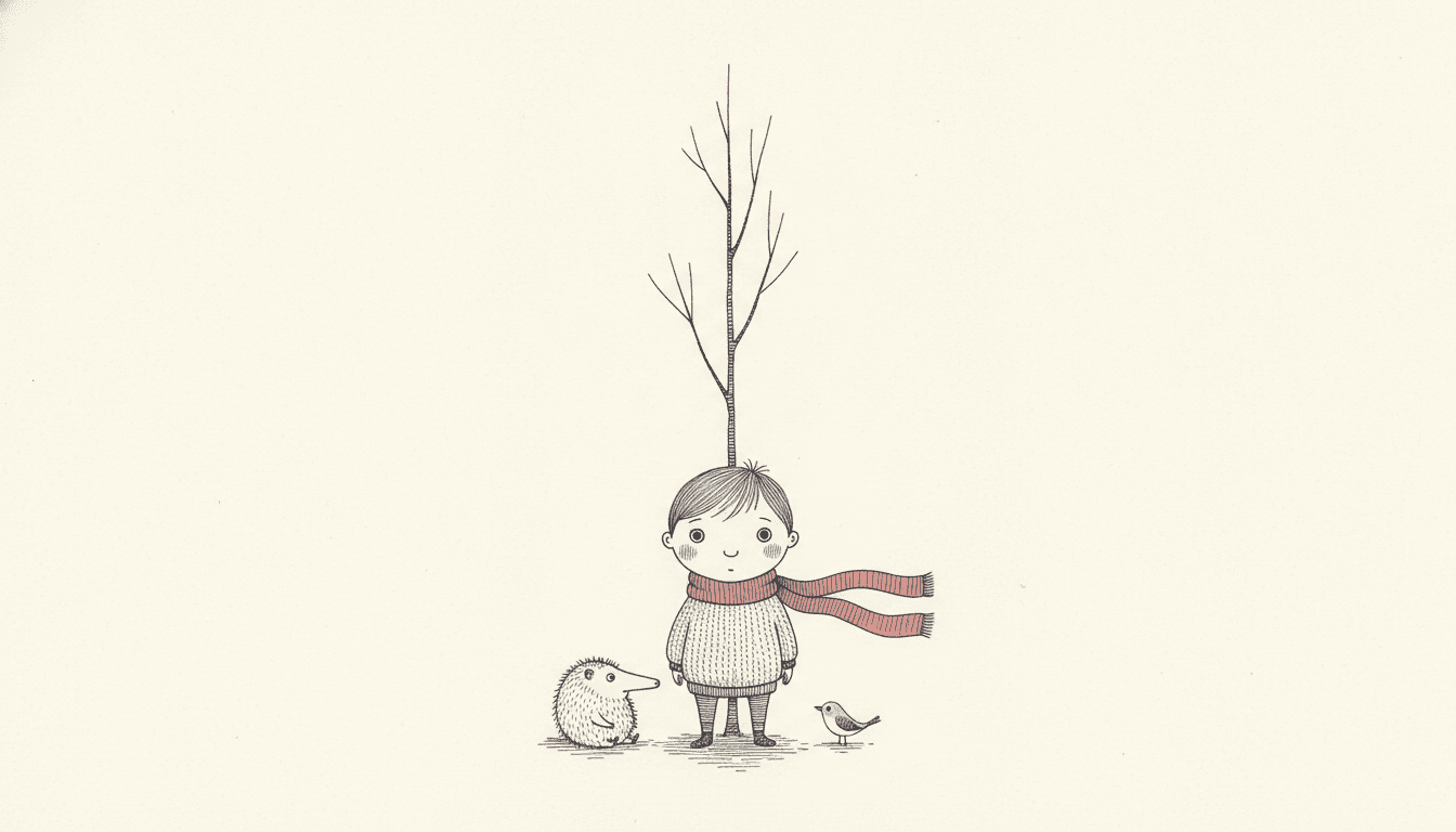
Nordic whimsy is cosy that refuses to be sweet. Thin ink lines, delicate hatching, a cool grey page — and one soft red, spent once and made to count, held across a whole book.
- Hairline ink and light open hatching, never fills
- Four cold colours and exactly one warm one
- A small figure with a lot of quiet paper around it
- Free credits by request — no card
50,000+
Stories Created
10,000+
Active Creators
50+
Art Styles
4.9/5
User Rating
What Makes Nordic Whimsy Different From Every Other Quiet Style
A lot of looks in this library are restrained and empty and pale. Only this one is asking for a particular feeling, and the other three decisions all exist to deliver it.
Plenty of styles here ask for cosy. One asks for lonely.
Of the seventy-nine hand-drawn styles switched on in C2Story, six name a cosy mood in their brief — pastel cafés, waxy healing colour, knitted puppets, warm domestic Japanese scenes. Exactly one asks for loneliness by name, and it is this one: the instruction reads tender lonely mood, with both words carrying equal weight. That pairing is the entire style. Not sad, not bleak, and not sweet either. Tender about being alone.
The whole warmth budget is one colour
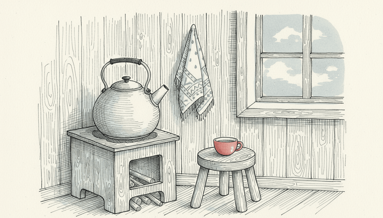
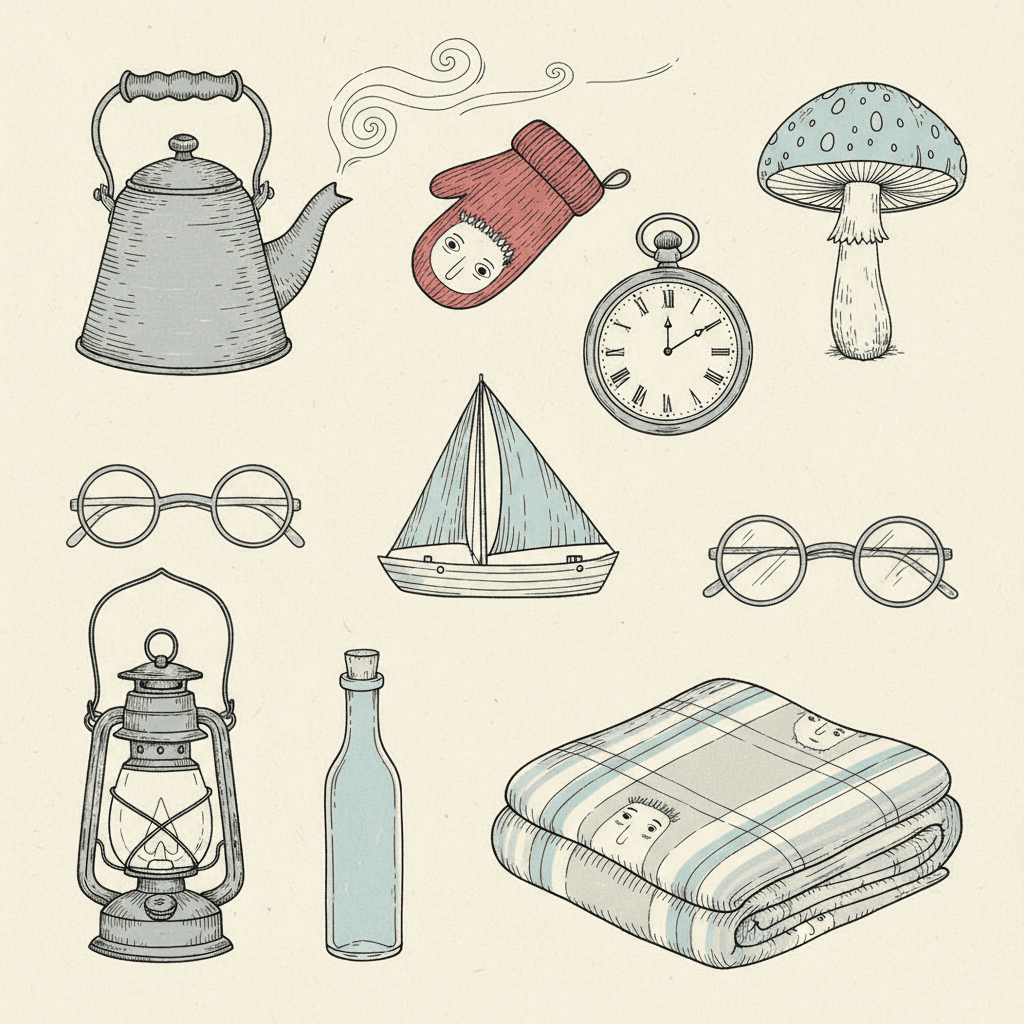
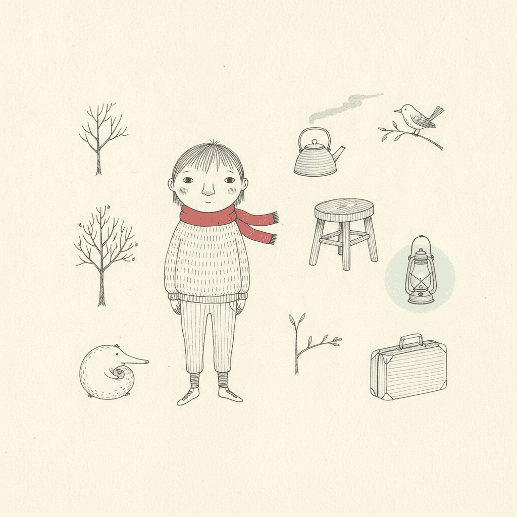
The palette has five entries: fine black ink, cool grey wash, pale blue accent, muted cream — and a single soft red. Four cold notes and one warm one, and the warm one is rationed by the word single. That is what cosy without being sugary means in practice. A sugary book spends warmth on every page until none of it registers. Here you get one red scarf, one red teapot, one red mitten, and because it is the only warm thing in the picture it lands every time.
Dense yet airy — it hatches, but it never fills
The brief asks for dense yet airy delicate hatching, which sounds like a contradiction until you look at a page. Shadow is built from fine parallel strokes with paper still showing between them, so the picture carries real tone and still reads as mostly empty. The four refusals protect exactly that: heavy fills, saturated flood, thick outlines, photorealistic. You may darken an area as much as you like, as long as you do it one thin line at a time.
Your character is drawn small on purpose
The composition instruction is vast white space framing the subject, and the style’s own reference scene is a lone figure standing small under a spindly tree on a wide white page. Scale is doing emotional work here. Draw someone large and the page is about them; draw them small with quiet paper all around and the page is about how much room there is around them. That is a decision to make deliberately, because it is not reversible halfway through a book.
Cosy Is Common Here. Lonely Is Not.
Six of the seventy-nine hand-drawn styles switched on in C2Story ask for a cosy mood. Pastel cafés, waxy healing colour, knitted puppets, warm kitchens. They are genuinely lovely and they are all doing the same thing: filling the page with comfort.
Exactly one style asks for loneliness by name, and it is this one. The brief reads tender lonely mood, and the two words are inseparable. That is the mechanism behind cosy without being sugary — the comfort is not spread across the page, it is one small warm thing in a cool quiet one. Which also tells you what to write.
It is a stillness style. Waiting, walking, watching out of a window, being awake first, being new somewhere. Scenes where very little happens are the ones this look was built to draw, and most styles cannot survive them.
And it fights the loud ones. A parade, a chase, a full classroom — a style whose composition rule is spacious will keep quietly emptying your crowd scene. For those, pick something built for noise.
Its four refusals are a single instruction wearing four coats. Nothing is allowed to become solid:
Nordic Whimsy or Nordic Folk? The Nib or the Brush.
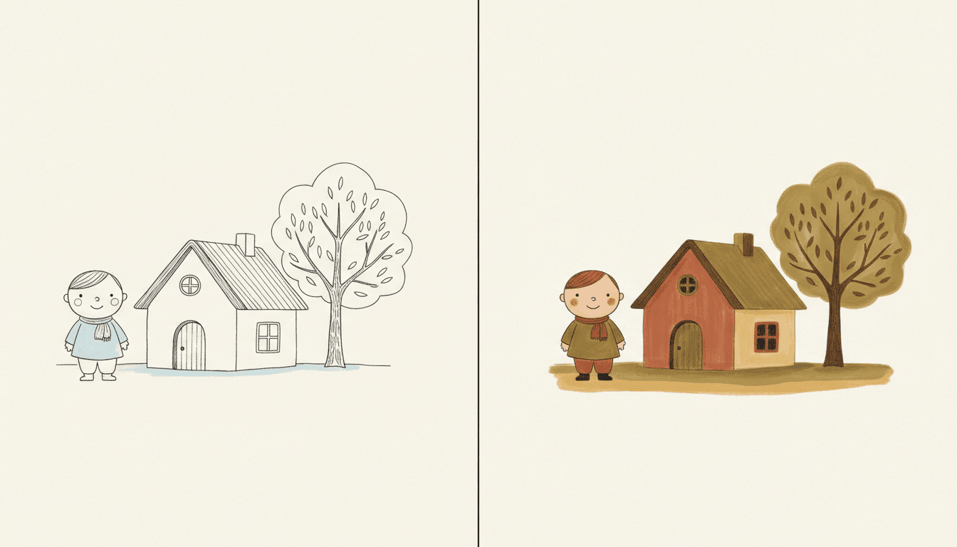
Both halves of that picture are northern, restrained and gentle. Anyone searching for nordic illustration ends up having to choose between them, and the choice is not about the subject at all — it is about the instrument.
The right-hand look is Scandinavian Folk Naive: humble naive childlike shapes, a soft matte earth-tone palette, relaxed hand-brushed texture and no pen line anywhere in it. Warm, flat, painted. The left is this page’s style — an outline first, with tone built inside it one thin hatched stroke at a time, on cool grey and cream. Cold, drawn, and mostly empty paper.
There is a test for it. Imagine zooming in on a shadow. In the folk style you find a matte patch of colour and a brush edge. In nordic whimsy you find individual lines with paper between them. Tone here is a drawing, never a surface.
And a quick way to choose. If you pictured pattern, folk motifs and handmade warmth, take the folk style. If you pictured a thin ink drawing of someone small on a big quiet page, you are already here.
Worth seeing side by side before you commit: the scandinavian folk art style, the fine line ink style, which uses the same thin pen but refuses hatching entirely, and the minimalist style, which empties the page by subtracting detail rather than by stepping back from it.
Create a Nordic Whimsy Picture Book in 3 Steps
From a one-line idea to a finished book that stays quiet all the way through, in under two minutes.
Describe the story
A sentence is enough. Give this look a small cast and somewhere to be still — a cabin, a jetty, a long winter, a window. Scenes where not much happens are the ones it draws best.
"A woolly creature knocks at the door in the snow"
Pick Nordic Fine-Line Whimsy
Choose it for hatching, tenderness and one warm colour. Choose Fine-Line Urban Wit instead for pure outline with no tone, Scandinavian Folk Naive for matte brushed earth tones, or Ornate Botanical Ink for the same nib with no empty paper left.
Fine black ink, cool grey, pale blue, cream, one soft red
Generate and export
C2Story writes the story, breaks it into pages and draws every one to the same brief. Read it on screen, share the link, or export the PDF and take that file to whichever printer or print service you already use.
Whole book drawn, PDF export, instant sharing
Nordic Whimsy and Its Quiet Neighbours
Four real styles that all run pale and restrained, sorted by the two things that actually separate them: whether there is tone in the picture, and how much paper is left bare.
Nordic Fine-Line Whimsy
Nordic fine-line ink illustration: dense yet airy delicate hatching, whimsical quirky characters, a tender lonely mood and vast white space framing the subject, with the instruction to render the full quiet scene while keeping detail light and the composition spacious. Its palette is fine black ink, cool grey wash, pale blue accent, muted cream and a single soft red; its light is soft and flat and ambient; its line is thin and delicate. It is filed as a picture book style, not an editorial one, which matters — the quirky characters are the point rather than a joke at their expense.
Fine-Line Urban Wit
The closest relative and the easiest one to confuse it with. Extremely thin precise hairline strokes, tiny figures set inside large airy environments, abundant white space, a soft muted spot colour and gentle understated urban wit. The split is tone: this style refuses dense shading by name, so it never hatches — it is pure outline, and the fine detail goes into the setting rather than the character. It is also wry where the nordic style is tender. Pick it for a city, a crowd seen from far off, or a joke told quietly.
Scandinavian Folk Naive
Minimalist Scandinavian folk-art illustration: humble naive childlike shapes, a soft matte earth-tone palette of terracotta, muted olive, cream and faded mustard, relaxed textured hand-drawn brushwork and restrained empty space. There is no pen anywhere in it. Where the nordic whimsy look draws an outline and hatches inside it, this one puts down a flat matte shape and leaves it. Warm where the other is cool, brushed where the other is drawn. Both are northern and they could not be built more differently.
Ornate Botanical Ink
Intricate fine-nib pen-and-ink work covering strange ornate flora and fauna in dense cross-hatched detail, with deliberately crooked linework that keeps visible hand pressure, pauses and slight wobble, on warm ivory paper in sepia, muted botanical greens and faded rose. Its characters are quirky in the same spirit — it bans the uniform cute default by name. The difference is appetite for empty paper: this style leaves almost none, and the nordic one is mostly empty paper. Same instrument, opposite answer to how much is enough.
Two more relatives are worth knowing about. Crosshatch Gothic Ink hatches far harder and turns the quirkiness macabre — same technique, a cold understated gothic mood instead of a tender one. Korean Cream Doodle keeps the thin gentle linework but swaps the cool palette for creamy pastels and the loneliness for easy everyday warmth. For where this sits among the wider families, browse everything on the illustration styles hub.
Nordic Illustration Story Ideas to Get You Started
This look is better at small, still and slightly odd than at big, fast and bright. These six lean into that.
The House at the End of the Jetty
One small house, one wide grey sea, and a long wait for someone to arrive. A tender lonely mood is the brief, so a story about waiting is a story where the style and the plot are saying the same thing.
Create this storyThe Guest Who Came in Winter
A strange woolly creature knocks at the door in the snow and does not explain itself. Whimsical quirky characters and gentle strangeness are built into this look — it draws an odd visitor without making the visitor sinister.
Create this storyThe Smallest Chair
A child who feels too small for a very large family house. Drawing the figure small inside vast empty paper is the style’s default composition, which means this story gets its central feeling for free on every single page.
Create this storyEveryone Has Gone to the Island
The summer ends, the boats leave, and one family stays. Fine ink line and a cool grey palette are built for off-season light, and the one soft red in the palette can be the last sail still on the water.
Create this storyThe Night the Lamp Would Not Light
A small adventure through a dark house that turns out to hold nothing frightening at all. Soft flat ambient light means this style cannot do horror shadows even if you ask — which is exactly what you want for a brave-in-the-dark story.
Create this storyThe Long Thin Tree
A tree that grows taller than everyone expects, told across a whole year. Spindly line work and a page that is mostly empty above the horizon give a story about height somewhere to actually go.
Create this storyAI-Generated Nordic Whimsy Illustrations
Try it on these: find the warm colour. There is only ever one of it, and everything else in the picture is cold on purpose.
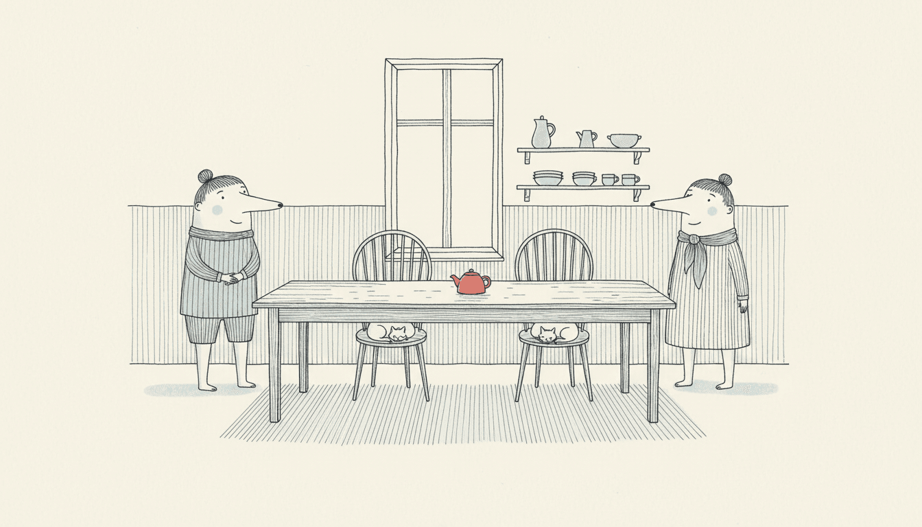
A Nordic Illustration Style for Every Subject
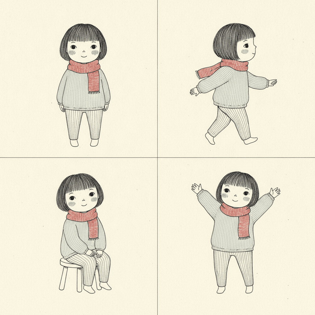
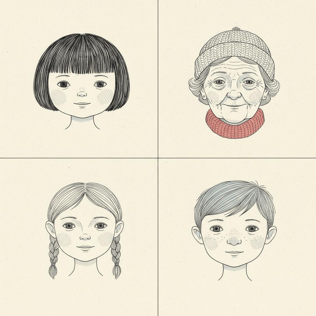
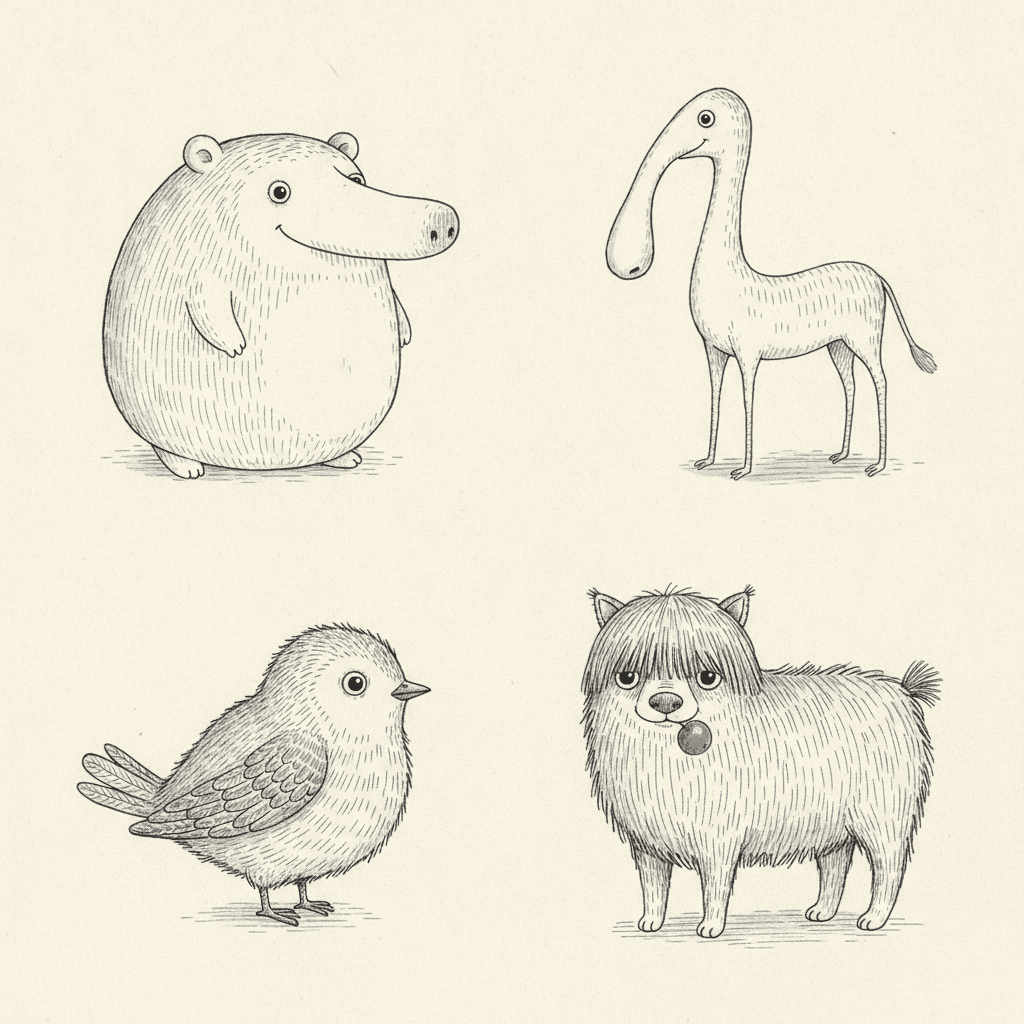
Characters, faces, invented creatures, everyday objects, whole pages — the same hairline ink and the same single red, spent on whatever your story is actually about.
Everything You Need for Nordic Whimsy Picture Books
One quiet drawing is easy. Twenty-four of them, with the same cast, the same cold palette and the same amount of bare paper, is the part that needs building.
The same restraint on page twenty
Restraint is the first thing an image model abandons. Ask for quiet twenty times and somewhere around page nine it starts adding colour, filling the sky and crowding the frame to be helpful. One fixed brief — thin delicate ink, light open hatching, cool palette, a single soft red, spacious composition — is carried into every page of the book instead, so the last spread is as empty as the first.
Four refusals that all protect the paper
Heavy fills, saturated flood, thick outlines, photorealistic. Read them together and they are one instruction wearing four coats: nothing may become solid. No black mass, no colour flood, no fat contour, no rendered surface. Strip all four out and what is left is line, hatching and bare paper — which is the whole look.
A small cast that stays itself
Save your characters in the Character Library, with up to fourteen reference images each, and they carry into every page and into later books. It matters here because this style tends toward a very small cast — one child, one odd companion, one house — and when a character appears on nearly every spread, any drift in the nose, the jumper or the scarf is immediately obvious.
A palette that arrives with the look
There is no colour picker and no hex field. The range comes with the style — fine black ink, cool grey wash, pale blue accent, muted cream, a single soft red — and the restriction is the feature. Hand out an eyedropper and the first thing anyone does is add a second warm colour, which is precisely the edit that turns this style into an ordinary cheerful one.
Whole books, not single drawings
You are not prompting for one pretty image. Describe the story and C2Story writes it, breaks it into pages, and draws every page in this style, matched to what that page actually says — so the quiet holds across a narrative instead of lasting one lucky render.
Any language you read aloud in
The look carries no language of its own. Write in English, Chinese, Japanese, Spanish, French and more — the ink line, the hatching and the cool palette do not change with the text. A small figure on a wide quiet page reads the same in every alphabet.
Nordic Whimsy Picture Books — Questions
What people ask before committing a whole book to thin lines, cold colour and a lot of empty paper.
Explore More Story Ideas
Discover more styles, tools, and story types
Mermaid Stories
Magical underwater kingdoms
Explore
Ligne Claire Picture Books
One even ink line & flat unshaded colour
Explore
Bedtime Story Generator
Cozy goodnight stories for kids
Explore
ChatGPT vs C2Story
Purpose-built for picture books
ExploreNordic Whimsy Picture Books — Fine Ink, Cold Colour and One Warm Note, with AI
Nordic whimsy is the style people are reaching for when they describe a book as cosy but not sweet and cannot explain the difference. On C2Story it is the Nordic Fine-Line Whimsy style, and the brief is unusually specific about what it wants: nordic fine-line ink illustration, dense yet airy delicate hatching, whimsical quirky characters, a tender lonely mood, and vast white space framing the subject, with the instruction to render the full quiet scene the story describes while keeping detail light and the composition spacious. Its light is soft, flat and ambient. Its line is thin and delicate. Its palette is fine black ink, cool grey wash, pale blue accent, muted cream — and one single soft red. One brief, applied across an entire book, so the twentieth page is as restrained as the first.
The thing worth understanding before you commit a book to it is that the melancholy is not a side effect, it is the specification. Six of the seventy-nine hand-drawn styles enabled here name a cosy mood — pastel cafés, waxy healing colour, knitted puppets, warm domestic scenes — and all of them get there by filling the page with comfort. Exactly one style in the whole library asks for loneliness by name, and this is it, in the same phrase as tenderness. That is why the single soft red matters so much: a nordic illustration in this style spends its entire warmth budget on one object per page, and because everything around it is cool grey and cream, that one red scarf or red teapot or red mitten registers every single time. Sugary books spend warmth everywhere until none of it is felt. This one rations it, which is the whole trick behind scandinavian whimsy art and the reason it reads as grown-up without ever being bleak.
The second thing to know is where the tone comes from, because it is what separates this style from its nearest relative. The brief asks for hatching that is dense yet airy, which sounds impossible until you look closely: shadow is built from fine parallel strokes with bare paper still showing between them, so a page carries real weight and still reads as mostly empty. Zoom into a shadow here and you find individual lines, not a surface. That is the split from the fine line ink style, which uses the same hairline pen but refuses dense shading by name and so never hatches at all — pure outline, no grey anywhere, with its fine detail poured into the setting rather than the character, and a wry urban wit rather than a fond one. It is also the split from Scandinavian Folk Naive, which is northern and restrained in the same way but is painted rather than drawn: naive flattened shapes in matte terracotta, olive and faded mustard, with hand-brushed edges and no pen line in it anywhere. Same part of the world, opposite instrument. If you pictured pattern and handmade warmth you want the folk style; if you pictured a thin ink drawing of someone small on a big quiet page, you want this one.
Two honest notes before you start. First, scale is a commitment. The style’s own reference scene is a lone figure standing small under a spindly tree on a wide white page, and drawing your character small with quiet paper all around them is not a neutral choice — it makes the book about the room around that character, which is wonderful for a cosy nordic story about waiting, winter, a new house or a strange visitor, and wrong for a parade. Second, the limits are predictable from the four refusals — heavy fills, saturated flood, thick outlines, photorealistic — which are really one rule stated four ways: nothing may become solid. So there is no dramatic shadow, no full-colour summer, no solid black mass and no rendered texture, and crowds, chases and spectacle will keep quietly emptying out. Keep your cast small and save them in the Character Library, with up to fourteen reference images each, so the nose, the jumper and the scarf stay fixed across a book where the same character appears on nearly every spread. Write in any language you read aloud in, then export the finished book as a PDF — that file is the handoff to whichever printer you already use, and the images you generate are licensed for commercial use. Start free: see our pricing plans, browse every option on the illustration styles hub, compare it with the scandinavian folk art style, the fine line ink style or the crosshatch style, or go straight to the AI Story Generator.