
Organic Pastel Picture BooksA Few Soft Shapes, Not a Room
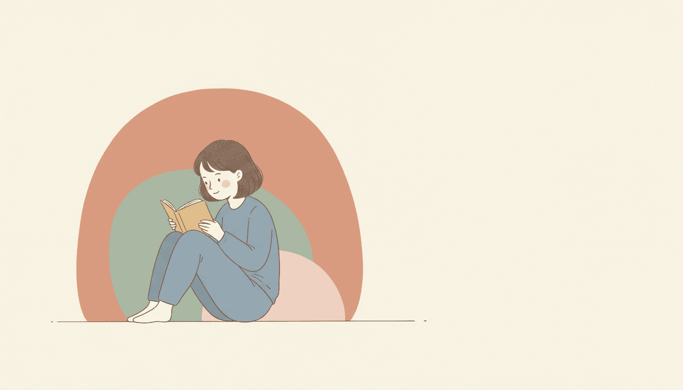
Most picture books draw the room. Organic pastel picture books draw how the room feels: a figure in a light pencil-and-ink line, and around them two or three soft abstract shapes in dusty sage, terracotta and greige. The shapes are not furniture or hills. They are the mood, and everything else is calm space.
- Light, nimble pencil-and-ink figures
- Soft abstract shapes instead of a setting
- Muted Morandi pastels with a fine paper grain
- Free credits by request, no card
50,000+
Stories Created
10,000+
Active Creators
50+
Art Styles
4.9/5
User Rating
What Makes Organic Pastel Illustration Different
Every style here is a written brief: a palette, a light, a line weight and a short list of refusals. Four things in this one decide the look, and most of them appear in no other brief of the seventy-eight.
Shapes that are not anything
Every style in C2Story runs on a short written brief: a palette, a light, a line weight and a few things to avoid. Twenty-seven of the seventy-eight mention shapes. This is the only brief that asks for organic ones, and one of only two with the word abstract. The other one abstracts its figures. This one keeps the people and puts the abstract shapes beside them.
Shapes instead of the room
The brief tells the model to render the scene with these organic shapes and pastel calm, rather than dense detail. No other brief names a substitute for detail. Most briefs that dislike clutter simply refuse it. This one hands the model something else to put there: a terracotta arch where a doorway might be, a sage mound where a sofa might be.
Morandi pastels and greige
The palette is muted Morandi pastels, dusty sage, soft terracotta and warm greige. Morandi and greige appear in no other brief. Pastel appears in eight, which is why the word alone is not the point: here it names a colour family, not a chalk or wax medium. Saturated colour is refused outright.
Pencil and ink, kept light
The line is light, nimble pencil and ink, the only brief to pair the two, laid over flat colour with a subtle paper grain and a gentle noise. Heavy outlines are refused, as they are in seven briefs. The light is soft, even and diffuse, which here means it casts nothing: the shapes have no shadows and no highlights.
What “Rather Than Dense Detail” Looks Like
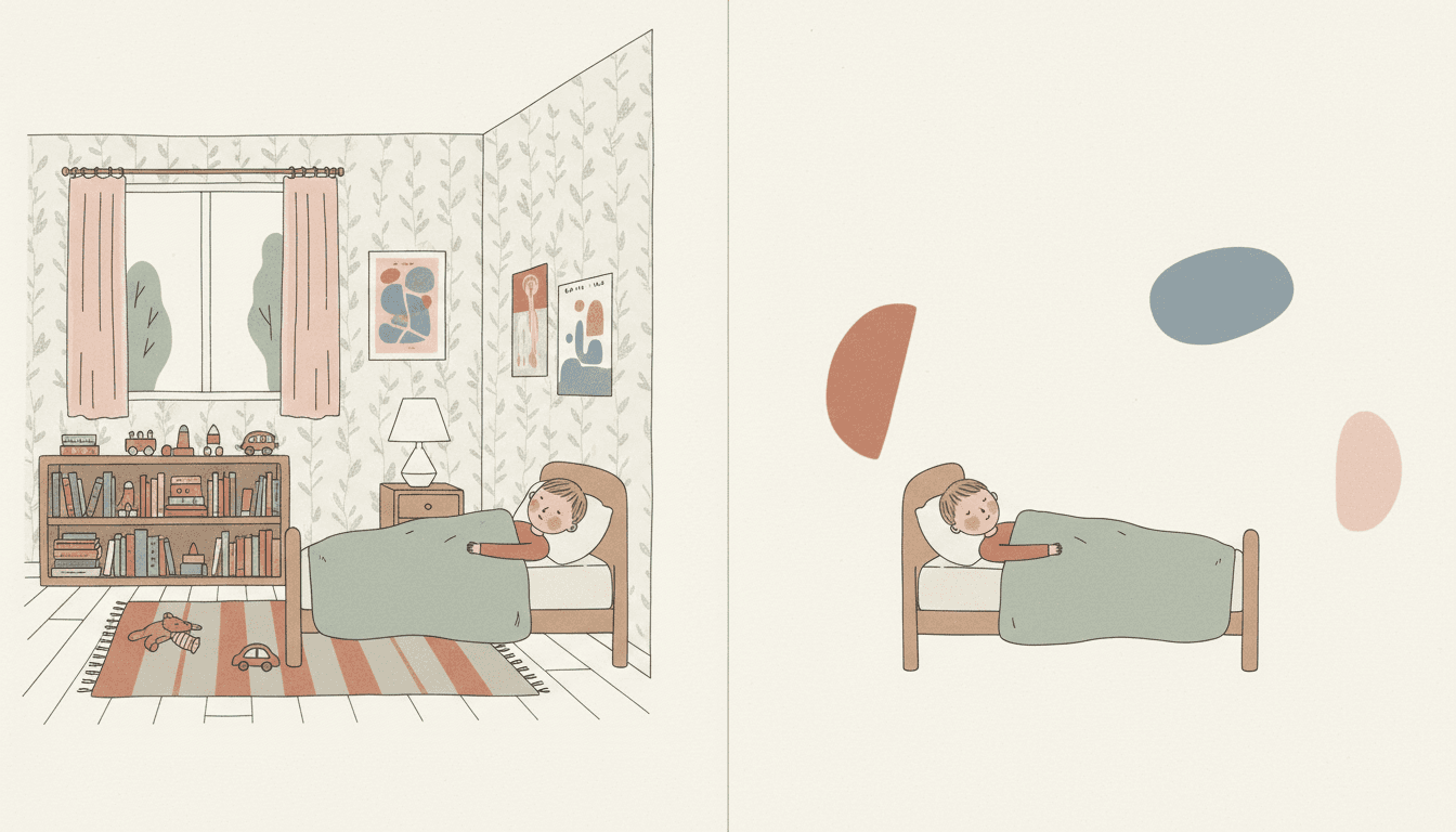
Look at one boy asleep twice. The same wooden bed, the same sage blanket, the same pencil line. On the left the room is drawn in full: leaf wallpaper, pink curtains, a window, a lamp, a shelf crowded with books and toys, pictures on the wall, a striped rug, a toy car on the floor. Nothing is wrong with it. Your eye simply goes everywhere.
On the right the room has gone. Three soft shapes float around the bed, a terracotta half-circle, a dusty-blue oval, a blush pebble, and the rest is warm off-white. Your eye goes to the boy and stays there. That is the trade this organic pastel illustration brief makes on every page: it does not just remove the detail, it puts a few calm shapes where the detail was.
Its four refusals all protect that calm.
Write How It Feels, Not What’s in the Room
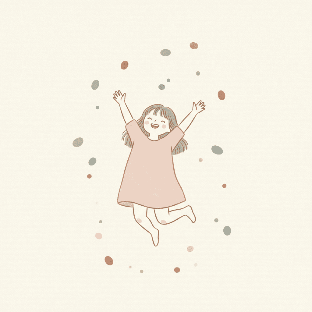
The girl beside this paragraph is jumping, and the air around her is full of small scattered pebbles of colour. Further down the page a boy sits hugging his knees, and one huge blue shape leans in over him. Neither picture has a room. Both tell you exactly how the moment feels.
That is where the writing goes in this style. A list of furniture is wasted: the brief will replace the furniture with shapes. What it cannot invent is the feeling. So for each page, say it plainly. “He is lonely.” “They are not speaking yet.” “She has never been this happy.” For the samples on this page we wrote the shapes into our own prompts, one heavy shape for the sad boy and a scatter of small ones for the jumping girl. In a book you do not write image prompts; C2Story writes them from your story, and the feeling you put in the sentence is the strongest thing it has to go on.
Then keep one thing real. The orange two friends share, the book a girl reads, the teacup on an empty table: a single drawn object among the shapes is what the reader holds on to.
From One Sentence to Organic Pastel Picture Books
You pick the look once. The brief is then applied to every page, so the line, the palette and the soft shapes never drift.
Describe the story by feeling
Write a sentence or two about who is in the story and what happens, and say how each moment feels. Give the cast exact hair and clothes, since there is little else on the page to tell them apart.
Choose Organic Pastel Editorial
Pick the style from the Styles Library. From then on every page uses the same pencil-and-ink line, the same Morandi pastels and the same soft shapes in place of a setting.
Get a whole book
C2Story writes the story, splits it into pages and illustrates each one. Regenerate any page you want to change without touching the rest, read it online, share it, or buy the PDF download to hand to a printer.
This Style and Its Three Nearest Neighbours
One shares its calm editorial quiet, one shares the word abstract, and one shares the word pastel. Here is what each actually asks for.
Organic Pastel Editorial
The style on this page
Modern minimalist editorial illustration in light, nimble pencil and ink lines, with abstract organic geometric shapes, a soft muted Morandi pastel palette, subtle paper grain and gentle noise, generous breathing negative space and a calm, airy contemporary mood. It renders the scene with organic shapes and pastel calm rather than dense detail, and refuses heavy outlines, saturated colour, clutter and a glossy finish.
Quiet Low-Sat Editorial
Also calm and editorial, but the space stays empty
A flat, low-saturation magazine look with generous negative space and a single spot of colour, built around a lone figure in wide quiet space. It takes things away and leaves the space empty. This brief puts something into the space instead, a few soft shapes, and draws its people in a pencil line rather than flat silhouette.
Dry Brush
The other brief that says abstract
Editorial illustration in broken, scratchy dry-brush strokes that skip across rough paper and leave its white tooth showing, with mature, stylized abstract figures. Its abstraction is in the people: the figures themselves are pared down into gestural shapes. Here the people stay plainly drawn and the abstraction moves into the space around them.
Oil Pastel
Same word, a different meaning
Thick waxy oil pastel, smudged edges and colour turned warm and full in a cosy room. There, pastel is the stick you draw with. Here it is a palette: dusty, quiet colour laid flat under a fine pencil line. If you want texture you can almost touch, take oil pastel. If you want calm, take this one.
Story Ideas for Organic Pastel Picture Books
Each idea turns on one feeling and keeps one real object, which is what this brief draws best.
The Reading Nook
A girl who cannot find a quiet place in a busy house builds one out of three soft shapes, and each page the shapes move a little closer to keep the noise out.
Half an Orange
Two friends after a quarrel share one orange in silence. Their two coloured shapes start far apart and overlap a little more on every page.
The Heavy Blue Day
A boy has a sad day, and the sadness is a big blue shape that follows him around. By the end it is small enough to fit in his pocket.
Walking With Nana
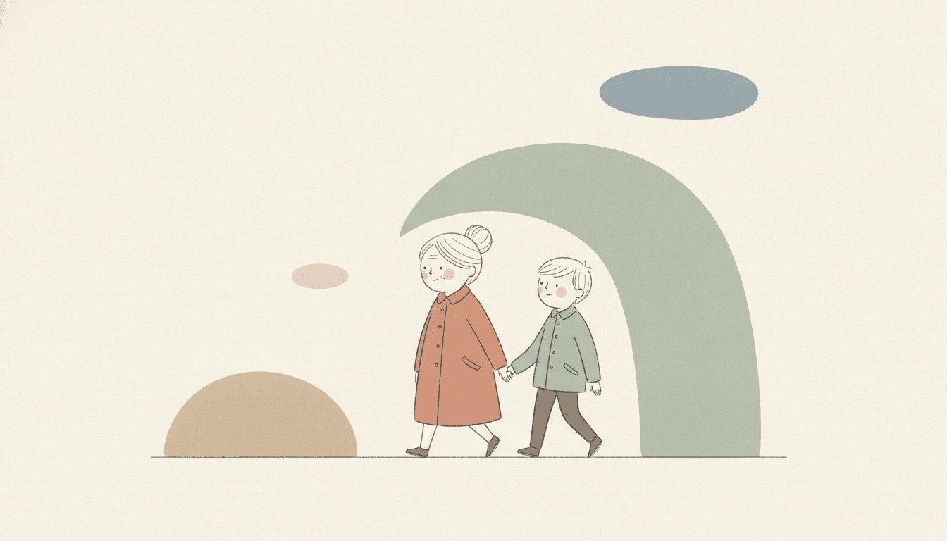
A grandmother and grandson take the same walk every Sunday. The street is never drawn; what changes from page to page is the shape above them.
Hello, Small One
A first-year book for a new baby, one quiet moment per page, each held inside a soft sage curve: feeding, rocking, the first smile.
What the Dog Sees
A boy and his dog sit and look at the same view every evening. The reader never sees the view, only the shape and colour it has that day.
What Organic Shape Art Looks Like Across a Book
Pages generated to this one brief, with nothing retouched afterwards. Two honest notes: the grandmother and boy were meant to walk under one arch and got three shapes, the tallest bent like a stem; and the blue shape over the sad boy came out shaded, so it reads a little like a boulder. In the furnished half of the bedroom, the pictures on the wall carry a few faint scribbles.
The room, then the shapes
A shelter that is not a building
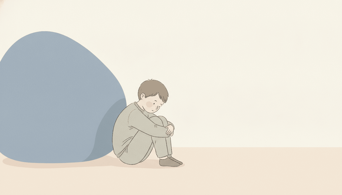
One heavy shape
A Quiet Cast, Held Steady
Here is where the design held and where it slipped. The same girl keeps her bob, skirt and shoes across four views, but her dusty-blue jumper became a blue pinafore over a greige top, and instead of a three-quarter view she got two side profiles facing each other. The boy and his dog, asked for no shadows, still sit on two soft shadow ovals. Check a character in a few poses before you build a book on it.
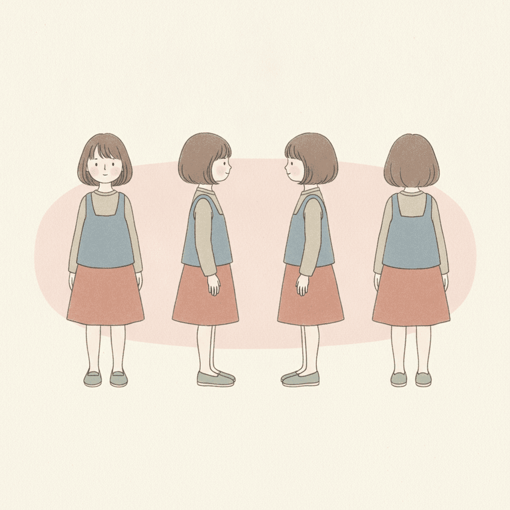
One girl, four views
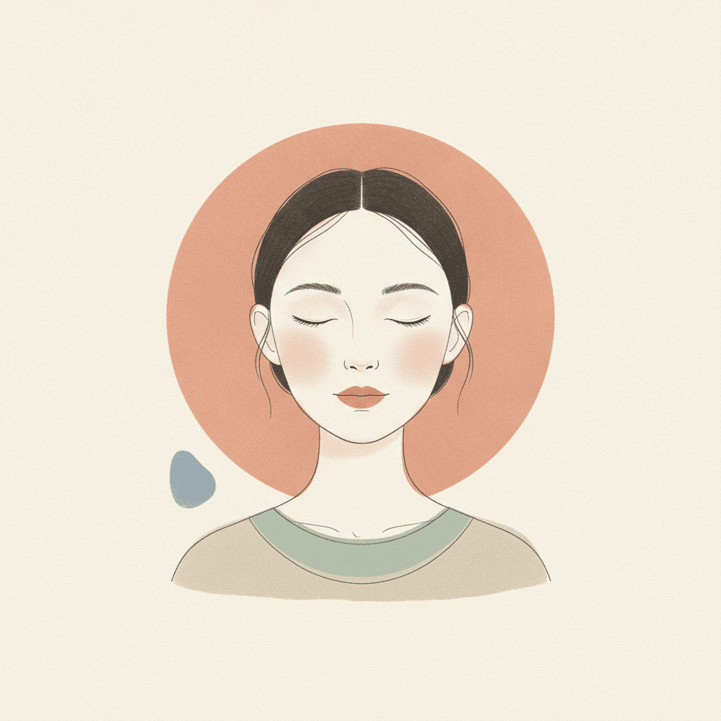
A circle behind the head
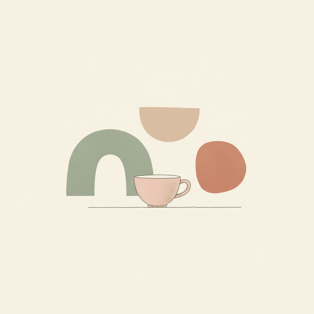
Nobody here, just tea
Many small shapes
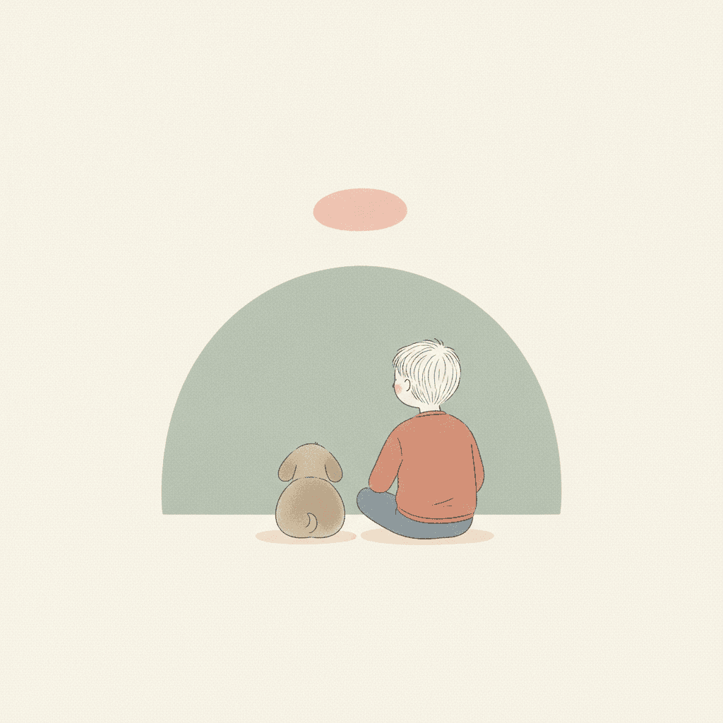
Looking at a shape
Making Whole Organic Pastel Picture Books
What is useful in a book drawn this way and where the limits are, in the order you are likely to meet them.
One character, kept on model
Save each character in the Character Library with up to fourteen reference images and a plain written description. In this style, with almost nothing else in the picture, the clothes and the hair carry the identity, so name them exactly: “short brown bob, dusty-blue jumper”. Characters made from an uploaded photo stay private to your account.
Say how the moment feels
The page pictures are drawn from what you write, and with no furniture to describe, the feeling is the most useful thing you can give them. Write it plainly for each page, “she is lonely”, “they are making up”, rather than listing what is in the room.
Shapes do not always behave
Asked for no shadows, the boy and dog on this page still sat on two soft shadow ovals, and the heavy blue shape came out shaded like a boulder. Asked for one arch over a grandmother and boy, the model added two more shapes and bent the arch like a stem. Regenerate one page if a shape starts to look like a thing.
Not for busy settings
The brief refuses clutter and busy backgrounds, so a story whose fun is in the setting, a crowded market or a toy shop to search, is a poor fit. If the reader needs to find things in the picture, take a denser style. If the reader needs to feel something, this one gives them room to.
Quiet, not grey
Low-saturation styles can slide toward grey. The brief names its colours, sage, terracotta, greige, so the pages stay coloured, just softly. There is no night, no lamp glow and no dramatic light: a story that turns on a storm or a dark forest is better served by a cinematic style.
A whole book from a sentence
Describe the story in a sentence and C2Story writes it, splits it into pages and draws every page to the same brief, in English, Chinese, Japanese, Spanish, French and more. Story text sits beside the picture, not inside it. Read online, share a link, or buy the PDF download as the handoff to your printer. Pages are licensed for commercial use under the terms of service.
Other quiet, spacious styles, each built on a different idea: for an empty page and one spot of colour, muted illustration picture books; for a picture hidden in the gap between two shapes, negative space picture books; for cosy cream tones and cute everyday doodles, Korean doodle picture books; for thick, smudged, warm colour, oil pastel picture books; and for a clean modern line with very little else, minimalist picture books.
Questions About Organic Pastel Picture Books
Explore More Story Ideas
Discover more styles, tools, and story types
Farm Stories
Friendly farm animals and barnyard fun
Explore
Graffiti Picture Books
Crude marker strokes, crowns & scrawled symbols
Explore
Picture Book Maker
Create illustrated picture books
Explore
ChatGPT vs C2Story
Purpose-built for picture books
ExploreOrganic Pastel Picture Books: Soft Shapes, Pencil Line, Morandi Calm
Organic pastel picture books rest on a brief that replaces the setting. C2Story runs seventy-eight hand-drawn style briefs, each a short written record of a palette, a light, a line weight and a few refusals. The Organic Pastel Editorial brief is the only one that asks for organic shapes, the only one that names Morandi or greige, the only one to pair pencil with ink, and the only one that tells the model what to draw instead of detail.
The look is a calm pastel editorial illustration: light, nimble pencil-and-ink figures, a few abstract organic shapes in dusty sage, soft terracotta, warm greige and blush, a subtle paper grain and gentle noise, generous empty space and soft, even light that casts no shadows. It refuses heavy outlines, saturated colours, cluttered backgrounds and a glossy digital finish.
This organic shape art suits quiet stories that turn on a feeling: a sad day, a quarrel and a making-up, a new baby, a walk with a grandparent, bedtime. Write how each moment feels and keep one real object per page. It is a poor fit for detailed settings, seek-and-find pages, night scenes or dramatic weather. Characters stay on model through the Character Library, with up to fourteen reference images each.
The choice between neighbours is clear. Take muted editorial for an empty page and a single spot of colour, dry brush for figures that are themselves abstracted, and oil pastel for thick, warm, smudged texture. Take this style when the room should become a few soft shapes and the feeling should do the rest. Describe the story in a sentence and C2Story writes it, splits it into pages and draws every page to the same brief, with the paid PDF download as the handoff to your printer.