
Negative Space Picture BooksWhere the Gap Is the Second Picture
Twenty-one styles here leave the page empty. Exactly one asks the empty part to mean something. A negative space picture book says two things at once — in two colours, with hard edges, on every page of your story.
- A double image: the gap between things is a second drawing
- A two-colour scheme, because a flip needs a clean boundary
- Bold flat shapes that still read at thumbnail size
- Free credits by request — no card
50,000+
Stories Created
10,000+
Active Creators
50+
Art Styles
4.9/5
User Rating
What Makes a Negative Space Picture Book Different From an Empty One
Plenty of styles leave room on the page. This is the only one where leaving room is not the point — the shape of what you left is.
Twenty-one styles here leave space empty. One asks that space to be a picture
Of the seventy-eight hand-drawn styles enabled in C2Story, twenty-one name negative space, white space or empty space somewhere in their brief. Emptiness is ordinary here. What is not ordinary is what this one does with it: exactly one style in the entire library asks for a double image and a visual pun, and this is it. Everywhere else the empty area is atmosphere — room to breathe, distance, restraint. Here it is the second half of the drawing, and the brief says so outright: the empty space forms a second meaning.
Two colours is not a taste. It is the mechanism
This is the only style in the library whose palette begins with a two-colour scheme — a deep navy and a warm off-white, plus at most one bold accent. That restriction is doing structural work. A double reading only happens if your eye can flip which area is the object and which is the background, and that flip needs an unambiguous boundary. Add a third colour, a gradient or a shadow and the gap stops being one clean shape. The picture still looks handsome. It just stops saying two things.
Its first two refusals both protect the gap
Every style here ends with four refusals. This one refuses busy detail first and gradients second, then chibi faces and photorealism. Read the first two together and they are not stylistic preferences at all — they are the two ways a hidden second image gets destroyed. Clutter fills the empty area so no shape can be read in it; gradients soften the border so the eye cannot tell where the object ends. Most styles spend their refusals defending a technique. This one spends half of them defending a legibility.
There is no drawing instrument anywhere in the brief
Most styles here name a tool — a nib, a brush, a crayon, a marker. This one never does. Its line weight is recorded as crisp clean shape edges, which is not a line at all but the place where two flat colours meet. Nothing is outlined, because an outline would belong to the object and the whole point is that the gap has equal standing. That is why figures here arrive as solid silhouettes with only a notch or two for the eyes: heavy interior detail would make the navy shape the real drawing and demote the off-white one.
Why Negative Space Illustration Refuses Shading
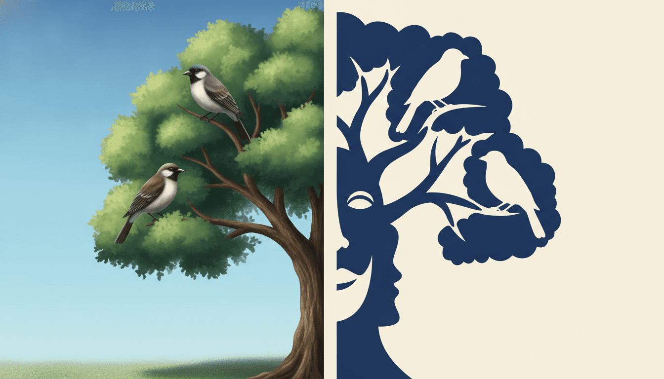
The same subject twice. On the left it is rendered the way most illustration is rendered — modelled in many greens and browns, softly lit, every leaf described, a shadow on the ground beneath it. Nothing is wrong with it. It is simply a picture of a tree with birds in it, and it says one thing.
On the right the same subject is one flat navy shape against one flat field — and look at what happened to its two birds. One is a solid navy silhouette. The other is a bird-shaped hole cut straight through the canopy. The same bird, made twice: once as the thing, once as the space where the thing is not. That only works because there is nothing in between. The moment a gradient softens the boundary or a third colour enters the gap, your eye stops being able to swap which area is the object, and the second picture quietly disappears. This is why busy detail and gradients are the first two things the brief refuses: they are not matters of taste, they are the two ways a double image dies.
So think in cut paper. If you could not make the shape with scissors and two sheets of paper, this style cannot make it either. That is a surprisingly good test to apply while you are writing.
And keep the scene small. Every extra object you put in a sentence is more clutter in the gap. Crowded pages are where the second reading goes first.
Its four refusals, in the order the brief states them:
Name Both Things, Not Just the Object
Here is the part no style can do for you. A visual pun needs two meanings worth confusing with each other, and choosing that pair is a writing decision. Ask for “hills at dusk” and you will get a handsome two-colour landscape with nothing hidden in it. Ask for “hills at dusk, and the sky between them is a sleeping cat” and the style has something to build around.
That is the whole craft of writing for this look: say the object, then say what the leftover space is. An armchair and the cat-shaped hole in its back. Two profiles and the tree between them. A skyline and the animal sitting in the sky. Be warned that it is a fussy thing to land even so — some pages will come back as a good flat illustration where the gap means nothing in particular, and the fix is to regenerate that page rather than to rebuild the book.
Pick pairs that already belong together. Cage and bird. Cup and heart. Hills and a cat. A pun lands when the two meanings share a reason, not just a shape.
Give the gap room to be big. A hidden shape smaller than a character’s head will not be found. Make the empty area the largest simple shape on the page.
Worth seeing side by side before you commit: the minimalist style, which uses emptiness as rest rather than as meaning, the geometric style, which also builds everything from flat shape boundaries, and the bold flat style, which keeps the graphic punch but puts a thick outline back around every object.
Create a Negative Space Picture Book in 3 Steps
From a one-line idea to a finished book where every page holds the same two colours and the same cast, in under two minutes.
Describe the story
A sentence is enough, but make it a sentence with two things in it. Name the object and name what the space it leaves should look like. This is the one style here where the second half of that sentence is doing most of the work.
"An empty cage, and the bird-shaped hole inside it"
Pick Negative-Space Visual Pun
Choose it for double images, two-colour restraint and hard clean edges. Choose Minimalist instead for quiet empty space with no hidden meaning, Bold Geometric for flat shapes at full saturation, or Bold Street Pictogram for reduction that means exactly one thing.
Deep navy, warm off-white, one bold accent
Generate and export
C2Story writes the story, breaks it into pages and builds every one to the same brief. Read it on screen, share the link, or export the PDF and take that file to whichever printer or print service you already use.
Whole book built, PDF export, instant sharing
Negative Space Illustration and Its Nearest Neighbours
Four real styles built from flat shapes and restraint, sorted by the question that actually separates them: is the empty part of the page rest, or is it a second subject?
Negative-Space Visual Pun
Negative-space visual-pun graphic illustration: a clever double image where the empty space forms a second meaning, very limited colour, bold flat shapes, and figures built from clear distinct silhouettes rather than piled-on detail, with the whole composition organised around one shared positive-and-negative shape. Its palette is a two-colour scheme of deep navy and warm off-white with a single bold accent; its lighting is flat and graphic; its edges are crisp and clean. One of ten styles in the graphic category, and the only one in the library built on a double reading.
Minimalist Clean Shapes
Simple shapes, a limited palette, large empty space, very few details. The style most people mean when they say negative space, and the honest comparison to make first. It subtracts: the page is quiet because things have been removed from it, and the space left over is rest. This style adds by subtracting — the space left over is a second subject with a shape of its own. If you want elegant calm, that one. If you want the empty area to carry an idea, this one.
Bold Geometric Picturebook
Forms built from clean geometric blocks, minimal outlines, high-saturation colour and strong silhouettes, with its edge recorded as a minimal clean edge rather than a drawn line. The closest relative in method, because both build everything from flat shape boundaries with nothing outlined. Two things separate them: that one is high-saturation and clashing where this one is two colours, and its shapes mean only themselves. A circle is a head. Here the space beside the head is also something.
Bold Street Pictogram
Sign-language simplicity, with figures reduced until only the action remains. It shares this style's faith that a flat silhouette can carry everything, and it is the other place in the graphic category where you are reading shapes rather than drawings. The difference is ambition: a pictogram works by being unmistakable and meaning exactly one thing. This style works by meaning two things at once, which is also why it is the harder of the two to write for.
Two more relatives are worth knowing about, both of which treat emptiness as mood rather than as meaning. The fine-line ink style uses white space as distance — a tiny figure in a vast page — and the sumi-e ink wash style uses emptiness as breath, left deliberately unpainted. Neither asks you to find anything in it. Browse everything on the illustration styles hub.
Visual Pun Art Ideas to Get You Started
This look is better at absence, secrets, pairs and things that turn out to be two things than it is at weather, warmth or a crowded room. These six lean into that.
The Cage and the Bird That Left
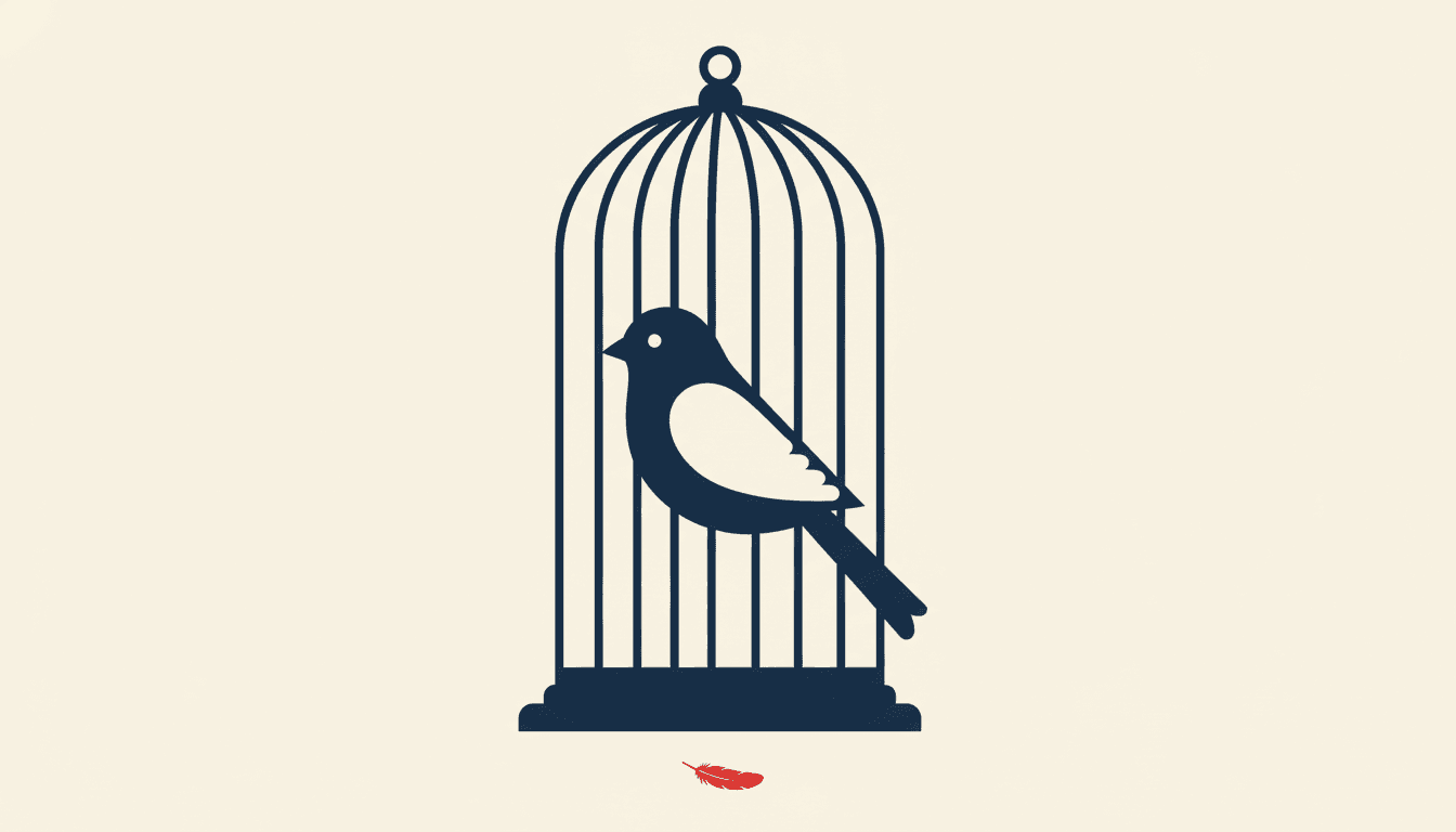
An empty cage that is never empty, because the hole inside it keeps being bird-shaped. The clearest possible brief for this style: one object, one absence, and a reader who sees both at once without being told.
Create this storyTwo Who Would Not Look
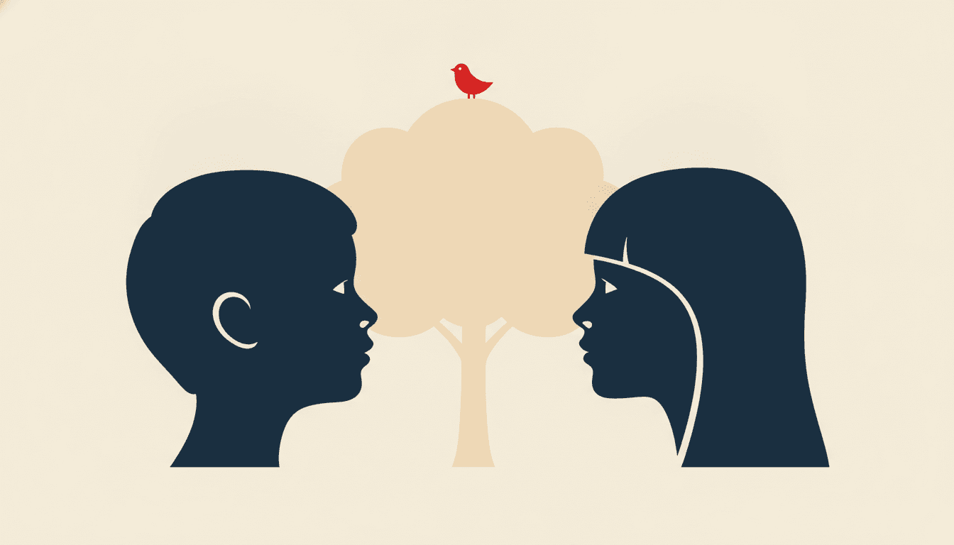
Two children refuse to face each other, and between their turned profiles a tree grows page by page. A falling-out story where the thing being repaired is literally the space between the characters.
Create this storyWhat the Hills Are Hiding
A walk at dusk where the sky between every pair of hills turns out to be an animal. Built for a style that puts the second picture where nobody looks, and for a reader who learns to look there.
Create this storyThe Boy Made of Window
A child who only appears as the gap in things — the door left open, the slice of light under the stairs. A ghost story with no ghost in it, which is the one idea this style can tell and no other style here can.
Create this storyOne Red Thing
Everything is navy and off-white except for a single red object that moves from page to page. The accent colour in this palette is allowed exactly once per picture, so a story can be built on where it goes.
Create this storyCut From the Same Paper
A grandmother cuts a shape out of paper and both halves come alive, each insisting it is the real one. A story about figure and ground that is also, conveniently, a story about what this style is.
Create this storyAI-Generated Negative Space Picture Book Illustrations
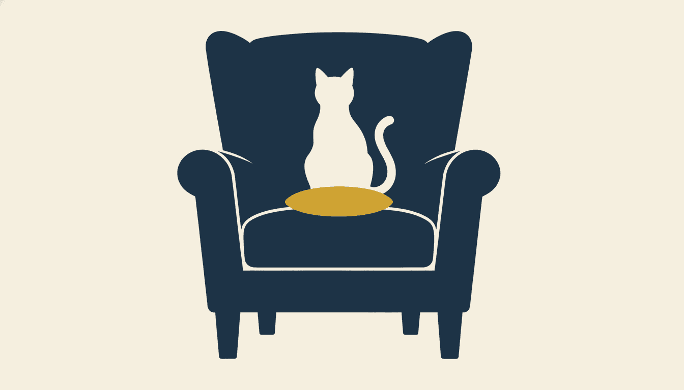
Try it on the armchair below. Look at the chair. Then stop looking at the chair and look at the hole in it — and notice that the cat you just found was never drawn.
Double Image Illustration for Every Part of Your Story
Four different double readings, a cast reduced to outlines, one idea carried alone, the two-colour palette itself, and whole scenes — the same hard edges and the same restraint, spent on whatever your story is actually about.
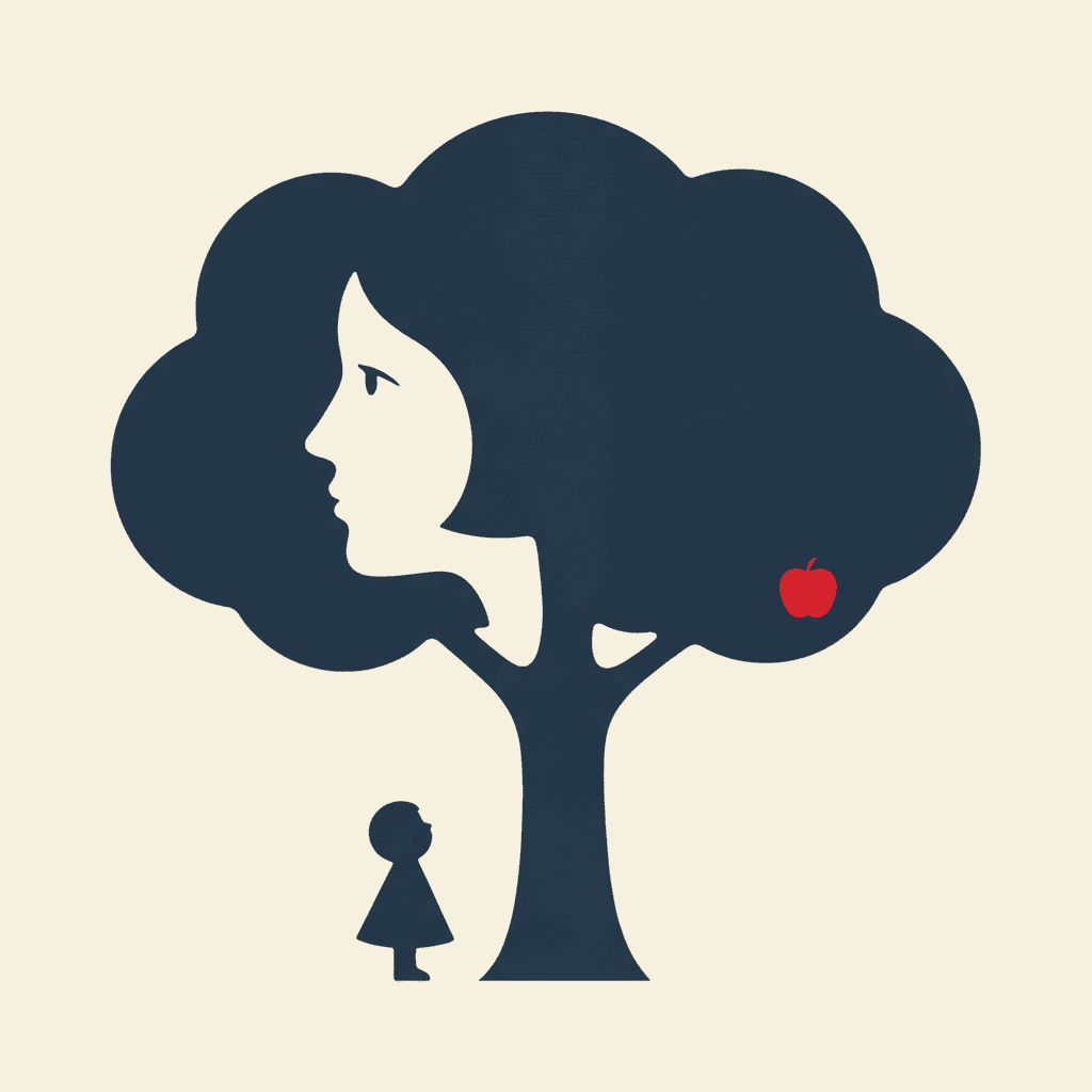
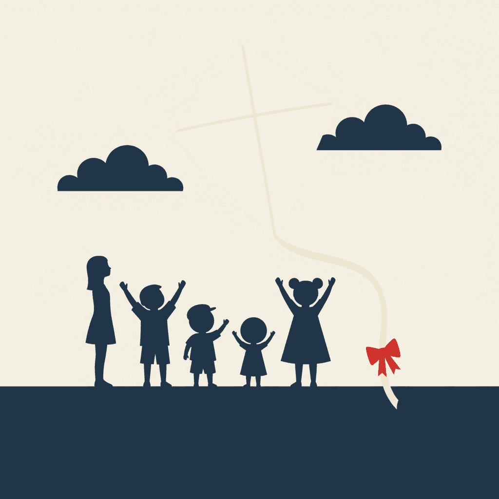
Everything You Need for Negative Space Picture Books
One clever image is easy — this style has been a poster trick for a century. Twenty-four pages that hold the same two colours and the same cast is the part that needs building.
The same two colours on page twenty-four
The hardest thing about a two-colour book is not the first spread, it is the twelfth, where one extra tint creeps in and the whole scheme quietly loosens. One fixed brief is carried into every page instead — deep navy, warm off-white, one accent, bold flat shapes, crisp edges — so the restraint that makes your double images readable is still intact at the end of the book.
Characters who survive being reduced to a shape
In this style a character is an outline and almost nothing else, so identity has to live in the silhouette. The brief asks for exactly that: a distinct face shape, head-to-body ratio and hand-and-foot forms for each one. Save each character once in the Character Library, with up to fourteen reference images, and they carry into every page and into later books. Characters built from an uploaded photo stay private to your account.
One accent colour, and it is a real budget
The palette is a two-colour scheme plus a single bold accent. That third colour is the only emphasis the style has — no spotlight, no warm glow, no shallow focus, because the lighting is flat and graphic. Spend it on the thing the page is about, once, and it works like a pointing finger. Spend it on four things and the page has no subject at all.
A look that survives being shrunk
Flat shapes with hard edges and two values hold together at any size — as a thumbnail, a cover, a phone screen or a printed page. There is no fine texture to disappear and no subtle gradient to band. It is the practical argument for this style over a painted one, and the reason a double image still reads when your book is a postage stamp in a library catalogue.
Whole books, not single clever images
A negative space illustration is usually a one-off — a poster, a logo, a single clever frame. You are not prompting for one of those. Describe the story and C2Story writes it, breaks it into pages, and builds every page in this style to match what that page actually says, so the look holds across a narrative rather than peaking once.
Any language you read aloud in
The look carries no language of its own. Write in English, Chinese, Japanese, Spanish, French and more — the flat shapes, the two-colour scheme and the hidden second readings do not change with the text. A shape means the same thing in every alphabet, which is rather the point of this one.
Negative Space Picture Books — Questions
What people ask before committing a whole book to two colours, hard edges and a joke hidden in the background.
Explore More Story Ideas
Discover more styles, tools, and story types
Dance Stories
Ballerinas, tutus, twirling and the big recital
Explore
Comic Book Stories
Action-packed panel layouts
Explore
Children's Book Creator
Design beautiful kids books
Explore
Midjourney vs C2Story
Stories, not just images
ExploreNegative Space Picture Books — Two Colours, Hard Edges and a Story That Says Two Things at Once
A negative space picture book is built on a trick that is older than picture books and still works on everyone: arrange a shape so that the area around it is also a shape, and let the reader discover the second one for themselves. On C2Story this is the Negative-Space Visual Pun style, and its brief states the ambition plainly — a clever double image where the empty space forms a second meaning, in very limited colour and bold flat shapes, with figures built from clear distinct silhouettes rather than piled-on detail, and the whole idea composed around one shared positive-and-negative shape. One brief applied across a whole book, so the twentieth spread is built the way the first one was.
The thing worth knowing before you commit a book to it is how unusual that ambition is here. Of the seventy-eight hand-drawn styles enabled in C2Story, twenty-one mention negative space, white space or empty space somewhere in their instructions. Emptiness is not rare; it is one of the most common ideas in the library. But in every one of those other twenty, the empty area is a mood. The fine-line ink style uses it as distance, so a tiny figure can be dwarfed by a page. The minimalist style uses it as subtraction, leaving calm around a few simple shapes. The deadpan cartoon style uses it as timing, a silence before the punchline. The sumi-e style uses it as breath, unpainted on purpose. Exactly one style in the whole library asks for a double image and a visual pun, and this is it. Everywhere else the gap is atmosphere. Here it is content, and it has a name — a bird, a tree, a cat, a face.
Follow that through and the rest of the brief stops looking like decoration and starts looking like engineering. This is the only style here whose palette begins with a two-colour scheme — deep navy and warm off-white, plus a single bold accent — and the restriction is not an aesthetic preference. A double reading depends on your eye being able to flip which region is the object and which is the ground, and that flip needs one unambiguous boundary with nothing in between. Add a third colour in the gap, or a gradient across the edge, and the shape you hid stops being findable. That is why busy detail and gradients are the first two of its four refusals, ahead of chibi faces and photorealism: half its refusals exist to protect a legibility rather than a technique. It is also why the brief never names a drawing instrument. Its line weight is recorded as crisp clean shape edges, which is not a line but the place two flat colours meet — an outline would belong to the object, and the whole premise is that the empty half has equal standing. A useful test while you write: if you could not cut the image out of two sheets of paper with scissors, this style cannot make it either.
Two honest notes, because this is the most demanding style in the library to write for. First, the pun is your job. The style reliably delivers the grammar — flat shapes, hard edges, two values, a composition arranged around a shared boundary — but it cannot decide which two meanings belong together, because that is a story decision. So name both halves in your sentence: not “an empty cage” but “an empty cage, and the bird-shaped hole inside it”. Expect to steer it as well, since a double reading is a fussy thing to land and some pages will return as a handsome flat illustration with nothing hidden in it; regenerate those individually rather than rebuilding the book, and do not try to put a pun on all twenty-four pages — let the two-colour look carry the ordinary spreads and spend the hidden images on the three or four beats that matter. Second, this style cannot do faces, weather or clutter. Characters are solid silhouettes, so emotion lives in posture rather than expression; the lighting is flat and graphic, so there is no dusk, no lamplight and no shadow; and busy detail is refused outright, so a crowded scene will be simplified far past what you pictured. For expressive faces try the cartoon style, for warmth and light the gouache style, and for flat graphic punch without the double-reading demand the bold flat style or the geometric style. Save your cast in the Character Library with up to fourteen reference images each, and build them as measurements rather than accessories, because accessories vanish when a figure becomes one solid shape; characters built from an uploaded photo stay private to your account. Write in any language you read aloud in, then export the finished book as a PDF, which is the handoff to whichever printer you already use, and the images you generate are licensed for commercial use. Start free: see our pricing plans, browse every option on the illustration styles hub, or go straight to the AI Story Generator.