
Saturated Cinematic Picture BooksWhere You Stand Is the Decision
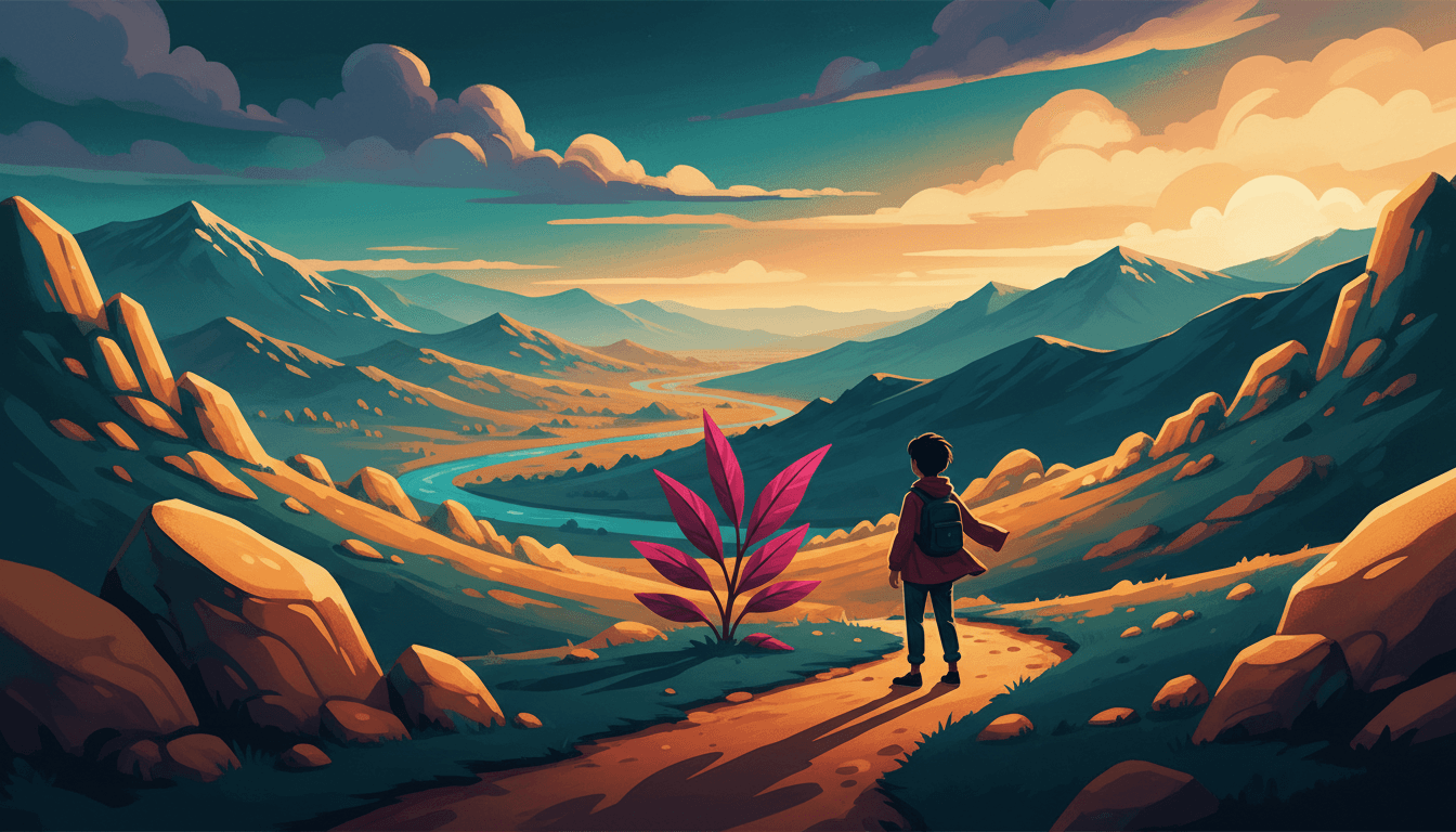
Of the seventy-eight style briefs here, exactly one says how the scene is staged — where things sit, and how far back you are. A saturated cinematic picture book is built from that one — deep teal and warm amber under a single hard light, and every page arranged in depth.
- Filmic staging — a near, a middle and a far on every page
- Colour at full strength: deep teal, warm amber, one magenta
- One hard directional light doing the work
- Free credits by request — no card
50,000+
Stories Created
10,000+
Active Creators
50+
Art Styles
4.9/5
User Rating
What Makes Saturated Cinematic Different From Every Other Bold Style
Every style here is a written brief — a palette, a light, a line weight, a short list of refusals. Four lines in this one decide everything, and the first three appear in no other brief in the library.
The only brief in the library that says where the camera goes
Every style in C2Story runs on a short written brief recording a palette, a lighting note, a line weight and a few things to avoid. Read all seventy-eight hand-drawn briefs and they are almost entirely instructions about the drawing: what the line does, how the paint sits, which colours are allowed, how a face is simplified. Exactly one of them asks for filmic scene staging, and filmic appears in no other brief in the library. One other brief does use the word staged, but it means a different thing by it — a character staged as a witty urban vignette, which is a note about the joke being set up, not about the space being arranged. This is the only brief where staging is a property of the picture. That single phrase changes the kind of instruction the brief is — it stops describing the surface of the picture and starts describing the position of the person looking at it. Everything else on this page follows from that one line.
The only refusal in the library about where you are standing
Each brief ends with four things to avoid, which across seventy-eight styles is three hundred and twelve separate refusals, and reading them in a column is the fastest way to understand what the library thinks a mistake is. Almost all of them are about the mark: photorealism, smooth gradient, thick outline, muddy colour, glossy CGI, slick polish, fussy detail. A few are about a figure — a stiff pose, a neutral pose, a generic chibi face. Exactly one of the three hundred and twelve is about the arrangement of the whole scene in depth: this brief refuses flat staging. It is the only style here you can fail by drawing every single thing in the picture correctly and putting the viewer in a boring place.
The only lighting note that names a result instead of a light
Each brief records its light in one short phrase, and read as a column those seventy-eight phrases are remarkably concrete. Soft airy daylight. Flat graphic lighting. Strong dramatic directional light. High-contrast hard directional light. Soft diffused dreamy light. Warm nostalgic glow. Even antique-plate lighting. Every one of them tells you something physical and checkable — how hard it is, which way it comes from, how warm it is, whether it is there at all. This brief says cinematic dramatic lighting and stops. No direction, no softness, no temperature, no contrast figure. It is the only lighting note in the library that describes what the light has to achieve rather than what the light is, and that is a different kind of instruction: it hands the decision back to the scene.
A palette that is a grade rather than a set of paints
The colours are recorded as rich saturated colour, deep teal, warm amber and vivid magenta, and that list is worth reading twice because it is not shaped like the other palettes in the library. Most briefs name pigments or printing inks or materials — crayon brights, aged paper cream, screentone grey, brick red, imperial gold, dusty jade. Teal and amber are not two paints that happen to sit near each other on a shelf. They are what a lit surface and a shaded surface turn into when one strong warm light falls across a scene: amber where it reaches, blue-green where it does not. The palette is a description of light rather than of pigment, which is why in this style the colour decision and the staging decision are not two decisions at all.
A Saturated Cinematic Page Is Defined By What It Will Not Do
Each brief ends with a short list of things to avoid, and reading that list is usually the fastest way to understand a style. This one refuses four: washed-out colour, generic chibi faces, flat staging and over-detailed clutter.
The first and the third are the unusual ones. Hardly anything else in the library bothers to forbid weak colour — most briefs are busy restraining colour rather than insisting on it — and nothing else at all forbids a dull viewpoint. Together they say something quite specific: you cannot make this style work by being careful. Pale is a failure here, and so is standing in the obvious place.
The second and fourth then protect the first two. Refusing a generic cute face keeps the silhouettes distinct enough to read at a distance, and refusing clutter keeps the layers of the saturated cinematic page separate enough to see through.
Every Other Style Here Separates On Something You Can See In One Square Inch
Hold a magnifying glass to any other brief in the library and you can identify it. Fine-line ink by the hairline stroke. Crosshatch by the shadow being drawn rather than filled. Gouache by the opacity. Pixel art by the grid. Art brut by the refusal to be correct. The distinguishing fact is always inside a small patch of the picture.
This one cannot be identified that way, because its distinguishing fact is how far back you are standing. In every other brief that is a free variable — something each individual page settles for itself, with the style holding no opinion about it at all. Here the brief has an opinion, and it is the only one that does.
Which changes the useful question when you are writing. For most styles it is what does this page show. For this one it is how close is the reader to it — and two pages of the identical moment, one from a mile away and one from six inches, are not two versions of a picture. They are two different pictures.
From One Sentence to a Book of Shots
You pick the look once. The brief is then applied to every page of the story, so a long shot on page three can be answered by a close one on page nine.
Say where the reader is standing
A sentence is enough, and a distance in it goes a long way. Not she walked home — the house was still a long way off across the field. Not he was surprised — he was close enough to see her face change. Add a time of day and the light has somewhere to come from.
Choose the Saturated Cinematic Story style
Picking it fixes the whole brief at once: rich saturated colour on deep teal, warm amber and one vivid magenta accent, a clean shape-defining line, cinematic dramatic light, and the four refusals. Save your characters first and their silhouettes stay theirs at every distance.
Get a book, not one lovely picture
C2Story writes the story, splits it into pages and builds each page to the brief according to what that page says. Your words are set as type rather than lettered into the art. Read it on the web, share it, or buy the PDF to hand to a printer.
This Style and Its Three Nearest Neighbours
Four looks in the library sit close to this one. Here is what each actually asks for, so you can take the right one rather than the first one.
Saturated Cinematic Story
The style on this page
A cinematic storybook illustration with strong saturated colour and filmic scene staging, built around storytelling characters whose silhouettes come before piled-up detail, with distinctive face shapes, head-to-body ratios and hand and foot forms forming a clear visual language, and expressions driven by real character rather than uniform cuteness. Its palette is rich saturated colour — deep teal, warm amber and vivid magenta; its light is cinematic and dramatic; its line is a clean shape-defining edge; and the four things it refuses are washed-out colour, generic chibi faces, flat staging and over-detailed clutter. It will render whatever scene your story actually describes, staged in depth and lit hard.
Cinematic Grainy Flat-Shape
The sharpest rival — the same word, the other half of its meaning
Six briefs in the library use the word cinematic, but four of them spend it on a glow or a finish — a warm cinematic glow, a luminous cinematic light, a polished feature-film look. Only two build the whole style on it, and the difference between those two is not a matter of degree. The grainy brief borrows cinema as a surface: bold simplified flat colour shapes, visible film grain, preserved paper grain and printing imperfections, and a cinematic muted palette of dusk blue, burnt orange and grainy cream. It looks like a frame of film — the material. This brief borrows cinema as a method: saturated colour at full strength, a scene arranged in near, middle and far, and a camera put somewhere deliberate. It is shot like a film rather than printed like one. Take the grainy one when you want the texture and the hush. Take this one when you want the depth and the colour.
80s City-Pop Girl
The other high-chroma brief, spending its colour differently
Eight of the seventy-eight briefs ask for colour at or near full strength, so saturation on its own is not what tells them apart — what they do with it is. City pop runs high-chroma pop colours, hot pink and electric blue, under a flat even pop light, and its brief asks for generous white space, because two hot colours side by side need room or they fight. The saturation there is the event: the page is a colour clash with clearance around it. Here the saturation is the light: the same strength of colour is spent on the difference between a lit surface and a shaded one, and the page is filled rather than cleared. Take city pop when colour is the subject. Take this one when colour is what the light is doing.
Quiet Low-Sat Editorial
The same dial, turned all the way the other way
The most instructive comparison in the library, because the two briefs disagree about exactly one thing and agree about a surprising amount else. The quiet editorial brief asks for a low-saturation muted palette — soft grey-blue, pale sand and a single spot colour — under a soft even quiet light, and the first thing on its list of refusals is saturated bright. This brief refuses the exact opposite: the first word on its own list of refusals is washed-out, which almost nothing else in the library bothers to forbid. Both are styles where the colour is doing a structural job rather than decorating. One of them has decided the way to make colour mean something is to ration it. The other has decided the way is to commit to it.
Saturated Cinematic Story Ideas That Suit the Brief
Each of these plays to the same strength: a clear light, a real distance, and a small event given weight by where you watch it from.
The Long Way Home in the Last of the Light
A whole book of one road at golden hour, the house getting closer page by page. A brief whose palette is built out of lit and unlit surfaces has nothing better to draw than late afternoon.
What You Can See From Up Here
A climb, and a view that keeps widening. The one style in the library whose brief names distance can build a book out of nothing but how far back the reader is standing.
The Door Was Open
Somebody is inside and somebody is outside, every page. A lit doorway is this brief at its most natural: a dark near shape, a hard warm opening and a long shadow on the floor.
Nobody Was in the Kitchen
A house told through empty rooms. A style that arranges a scene in near, middle and far can make an unoccupied room carry a page, which most picture-book styles cannot.
My Brother Got Taller Than Me
Two children and three years. The brief asks for distinctive head-to-body ratios and builds, so a book about changing shape is one it is genuinely built to draw.
The Sea Came Right Up to the Wall
Weather, scale and a small person near something enormous. Deep teal water against a hard amber sky is the palette doing precisely the job it was written for.
What Filmic Staging Actually Looks Like
Three images generated to this one brief, with nothing retouched afterwards.
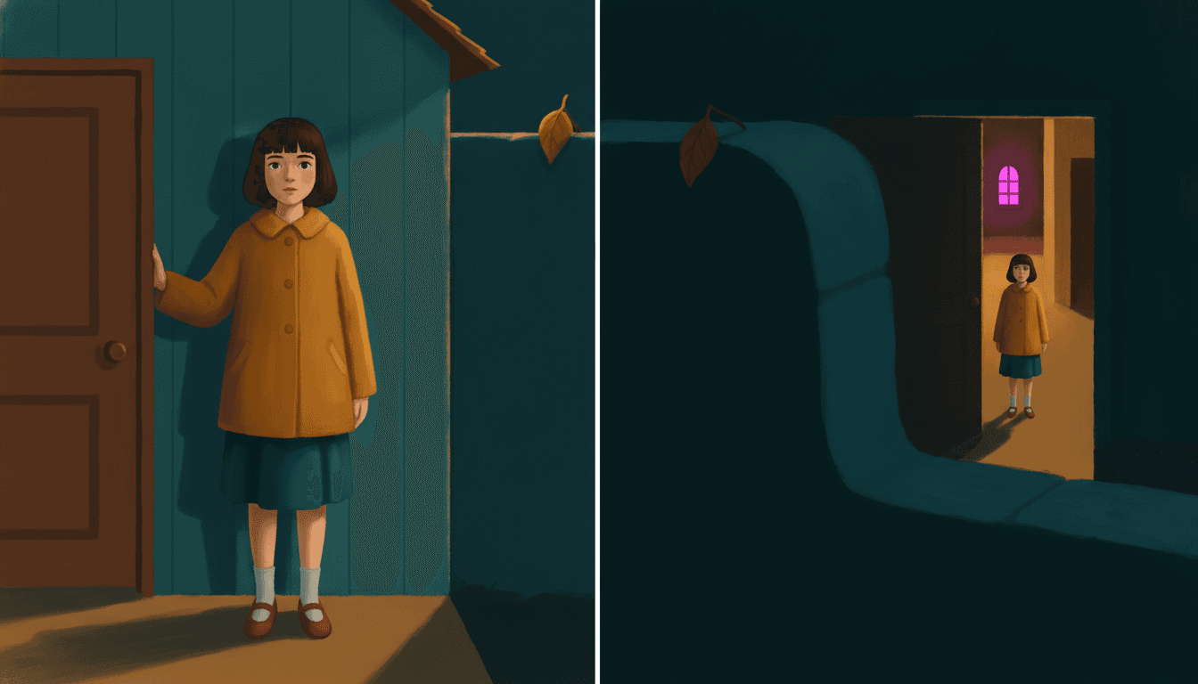
The Same Girl, the Same Doorway
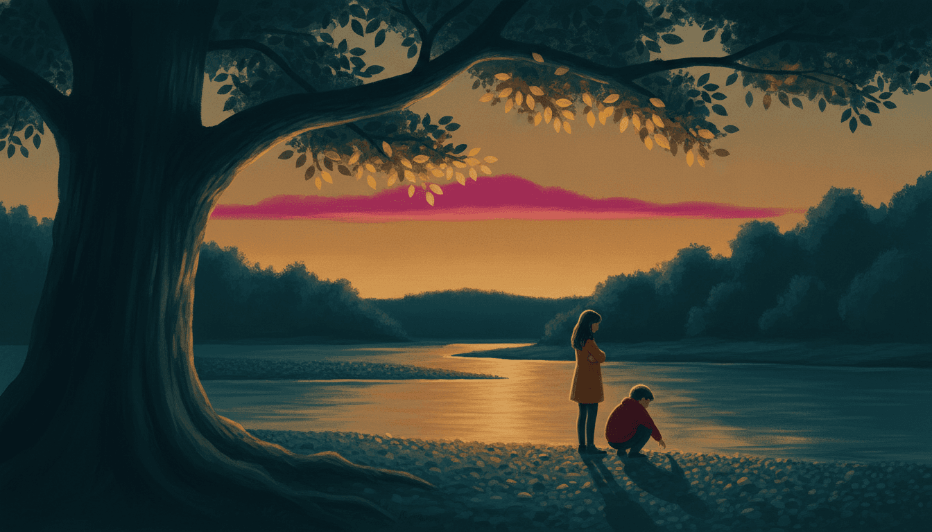
Something in the Way
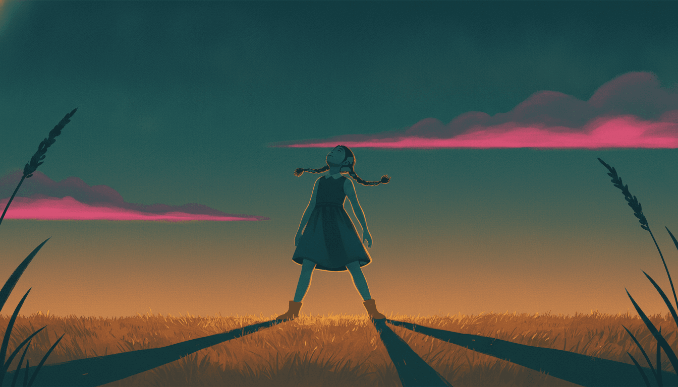
Lit From Behind, and That Is All It Needs
Five Pages Where the Staging Is the Subject
Same brief, same four colours, same hard light — and a viewer put somewhere different each time.
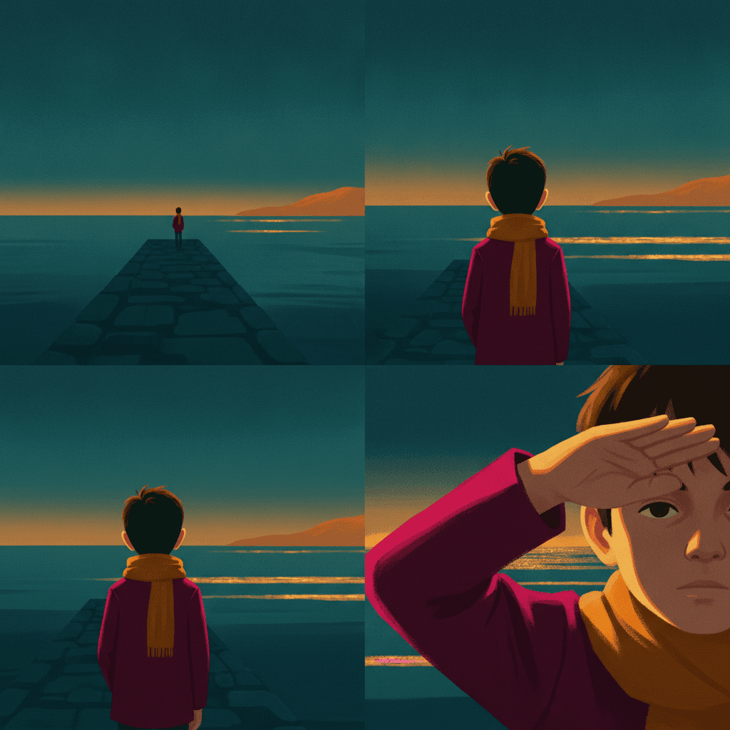
The Same Moment, Four Distances
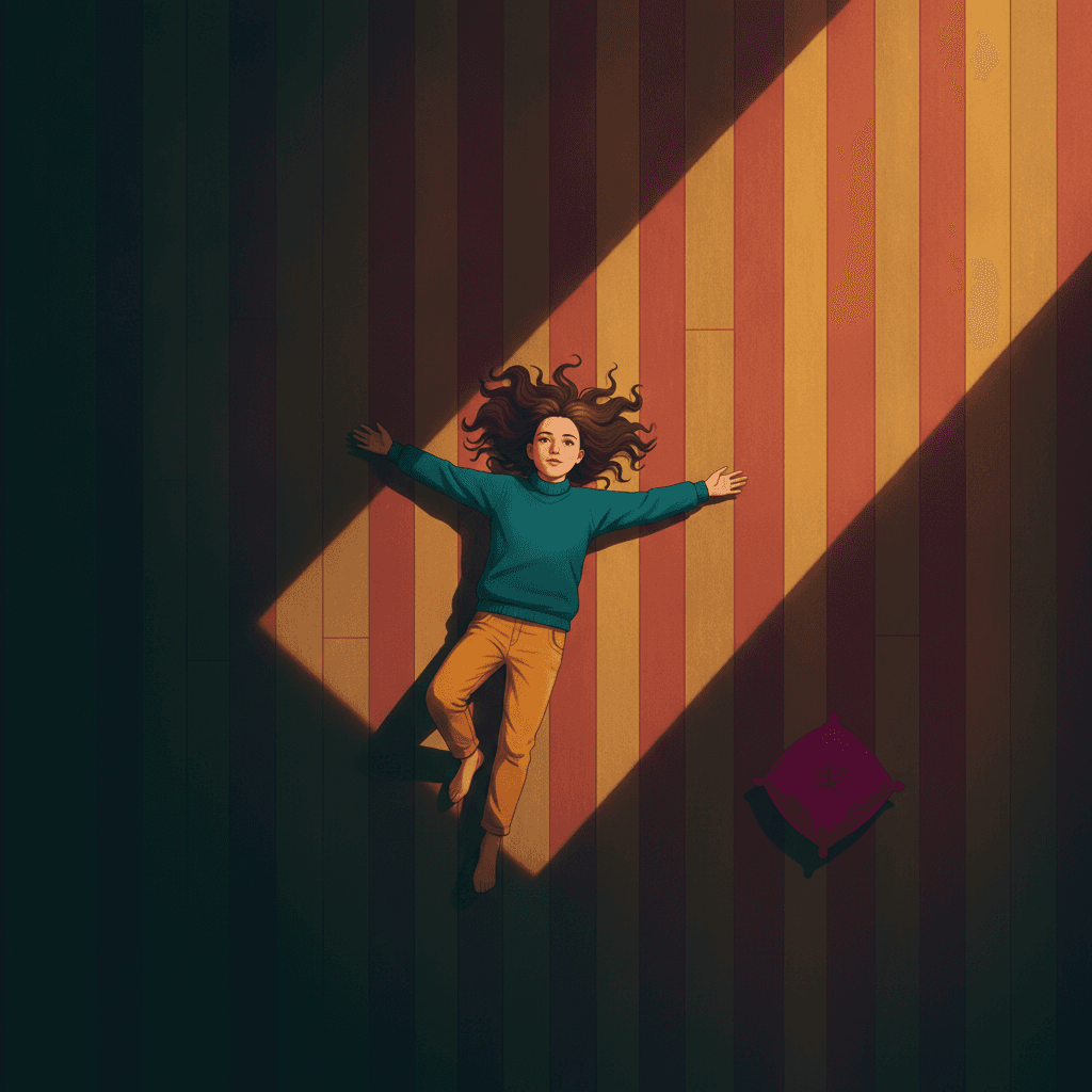
From Directly Above
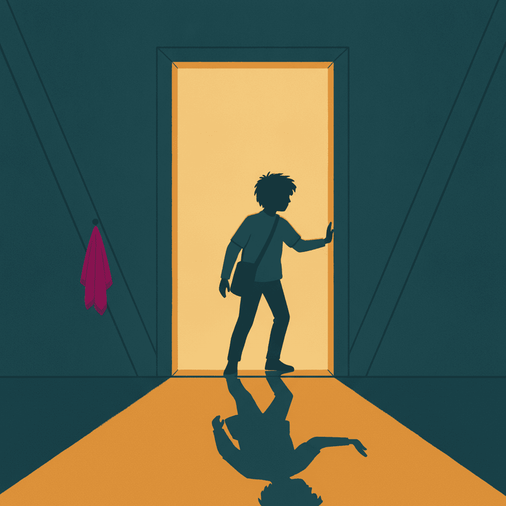
Shape Before Anything Else
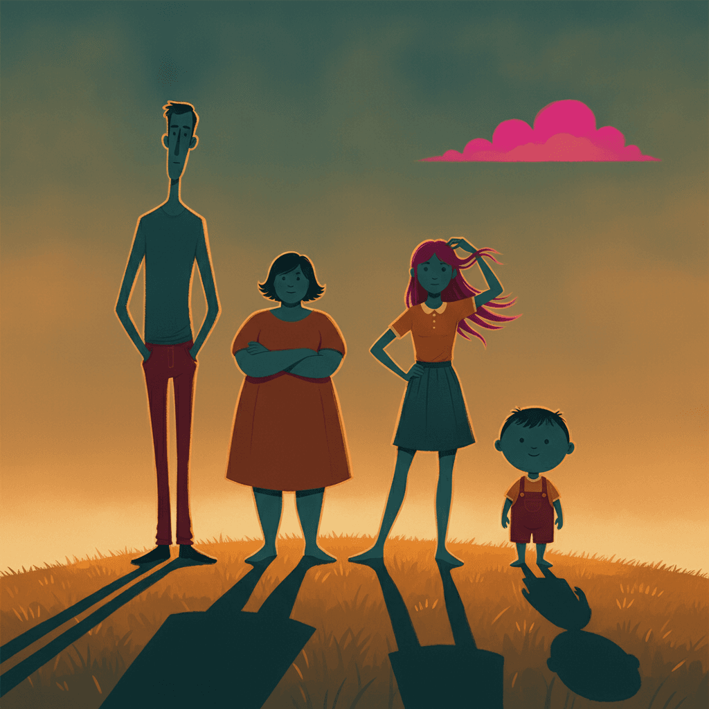
Four Builds, No Template
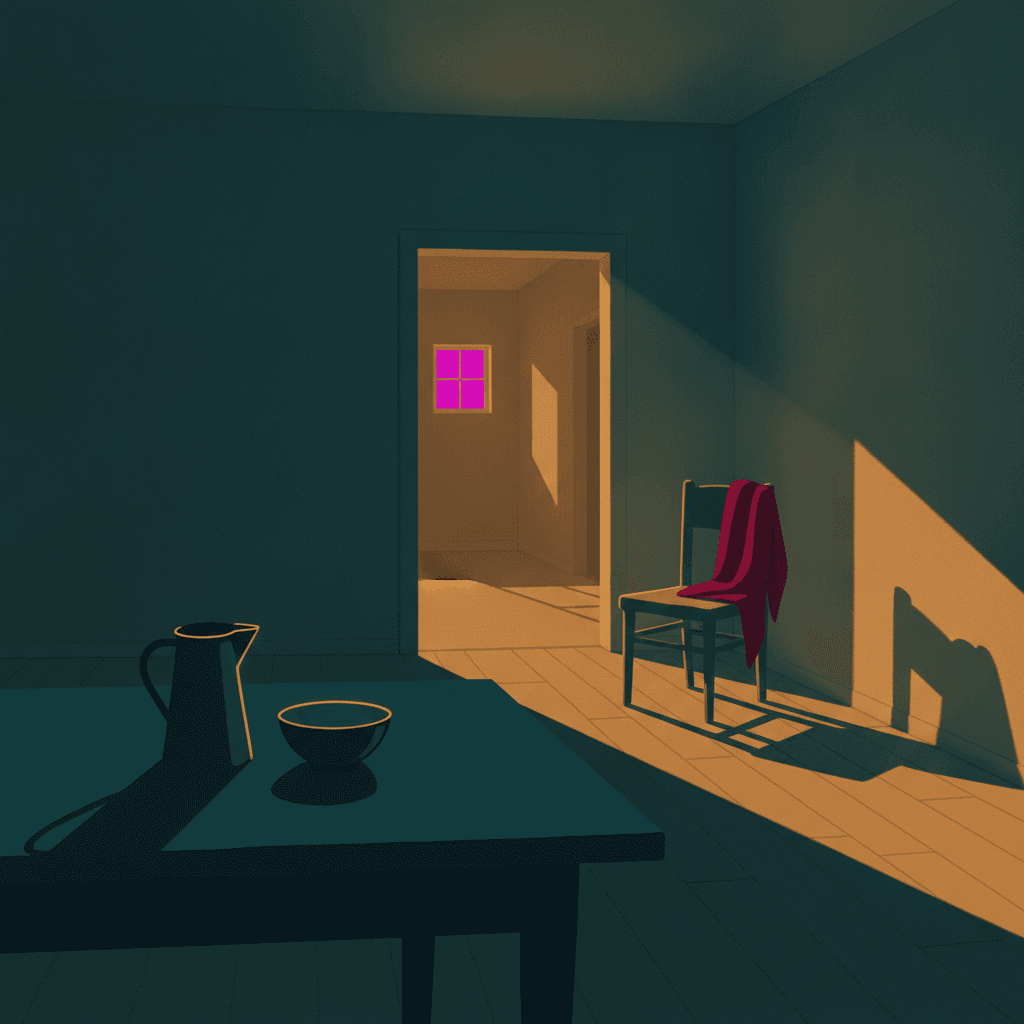
Three Layers, Nobody Home
Making a Whole Saturated Cinematic Picture Book, Not One Image
The useful things and the honest limits, in the order they are likely to matter to you.
Keeping a character the same while the camera keeps moving
This is the thing that breaks first when pages are generated one at a time, and this style stresses it in an unusual way. A book in this brief will show the same child as a thumbnail on a hillside on one page and as a face filling the frame on the next, and a system drawing each page fresh has to keep the head-to-body ratio, the build, the hair shape and the clothes consistent across a twentyfold change in size — which is exactly where drift shows. One fixed brief is carried into every page instead: saturated colour on deep teal, warm amber and one magenta accent, a clean shape-defining line, cinematic dramatic light and the same four refusals. Save each character in the Character Library with up to fourteen reference images and they stay recognisably themselves from the long shot to the close one. Characters built from an uploaded photo stay private to your account.
Saturated meaning rich, not meaning loud
Worth being precise about, because saturated is a word people have been burned by. The brief asks for rich saturated colour across deep teal, warm amber and vivid magenta, and the magenta is written as the accent rather than as a third equal — one vivid note against two deep ones. What that produces is weight rather than noise: colours with real body in them, closer to poster paint than to a screen. It will not give you fluorescent, neon or acid, and it will not give you the opposite either, because washed-out is the first thing on its list of refusals. There is also no global greyscale switch in C2Story, so if you want a monochrome book you want a style that is monochrome by design rather than this one with the colour turned down.
What you are giving up, said plainly
You are giving up the ordinary page, and in a picture book that matters more than it sounds. A style whose light is always doing a job cannot do an afternoon where nothing is happening: every page arrives arranged, lit and weighted, so a quiet beat between two events comes out looking like an event. There is no low gear here. If your book needs the page where somebody is just sitting there and it means nothing yet, the essay manga and deadpan cartoon briefs are built for exactly that and this one will fight you. The other thing to know is that deep shadow is not darkness — the brief wants a shadow you can still see into, so write late afternoon, a lit doorway or a tall window rather than night, because night is not what this palette is made of.
A different kind of difference from the rest of the library
Most of the styles here separate on an axis you can see in a single square inch: how the line is made, how dense the page is, how much paper is left bare, where the joke sits. This one separates on something you can only see by stepping back. Distance — where the reader has been put relative to what is happening — is a free variable in every other brief in the library, something each page chooses for itself without the style having an opinion. Here it is the style’s own subject. That is why two pictures in this brief of the identical moment can be completely different pictures, and why the useful question when you are writing is not what does this page show but how close is the reader to it.
A whole book, not one admired single image
A staged, hard-lit, saturated image is the kind of thing that does very well on its own and tells you nothing about whether a style can carry forty pages. You are not prompting for one picture. Describe the story and C2Story writes it, splits it into pages and builds each page to this brief according to what that page actually says, so a long shot on page three can be answered by a close one on page nine. You get picture-book pages with your words set as type rather than lettered into the art, which keeps the staging clear. Write in English, Chinese, Japanese, Spanish, French and more. When you want it on paper, the paid PDF download is the handoff to your printer, and everything you make is licensed for commercial use.
Honest about the age this one suits
Unusually broad, and for a reason worth knowing. The brief puts silhouette ahead of detail and runs strong colour under one clear light, and those are precisely the two things a very young child reads best — a shape they can name and a colour they can point at — so it works from about three. At the same time the staging rewards a reader who can notice that the picture has been arranged, which keeps it interesting to nine-year-olds, teenagers and adults. The only caution is tone rather than age: hard light reads as significant, so a gentle bedtime book can come out feeling more momentous than you meant. For a soft bedtime read the watercolour and storybook styles are easier company.
A note on where this one sits in the wider map. For the other brief built on cinema — the one that borrows the grain and the muted grade rather than the staging — see grainy cinematic picture books. For high-chroma colour spent on a clash instead of on light, see city pop picture books and pop art picture books. For the same dial turned all the way down, muted editorial picture books. And if what you actually want is epic movie-poster spectacle rather than a staged, saturated storybook page, that is the broader cinematic style.
Questions About Saturated Cinematic Picture Books
Explore More Story Ideas
Discover more styles, tools, and story types

Horse Stories
First pony rides, grooming, horse shows and the stable
Explore
Negative Space Books
Two colours, and the gap is a second picture
Explore
AI Story Generator
Generate complete stories with AI
Explore
ChatGPT vs C2Story
Purpose-built for picture books
ExploreSaturated Cinematic Picture Books — One Hard Light, Three Distances and Colour at Full Strength
A saturated cinematic picture book is built on one unusual line in one brief. C2Story runs seventy-eight hand-drawn style briefs, each a short written record of a palette, a light, a line weight and a few refusals, and almost every line in almost every one of them is an instruction about the drawing — what the mark does, how the paint sits, which colours are allowed, how a face is simplified. Exactly one brief asks for filmic staging, and the word filmic appears in no other brief in the library. One other brief calls a character staged, but means the joke is set up rather than the space arranged, which makes this the only brief where staging is a property of the picture. That single phrase changes what kind of instruction the brief is. It stops describing the surface of the picture and starts describing the position of the person looking at it, which is why this is the only style here where the first decision is not what to draw but where to stand.
The refusals say the same thing from the other side. Seventy-eight briefs listing four things to avoid is three hundred and twelve refusals in total, and read in a column they are almost entirely about the mark: photorealism, smooth gradients, thick outlines, muddy colour, glossy finish, fussy detail, slick polish. A handful concern a figure — a stiff pose, a neutral pose, a generic chibi face. Exactly one of the three hundred and twelve is about the arrangement of a whole scene in depth, and it is this brief refusing flat staging. It is the only style in the library that you can fail while drawing every individual thing correctly, simply by putting the viewer in the obvious place. The first refusal on its list is just as unusual in the other direction: washed-out. Hardly anything else here bothers to forbid weak colour, because most briefs are busy restraining colour rather than insisting on it.
Those two decisions explain the third, which is the light, and the light is where saturated color story art gets its particular look. Every brief in the library records its lighting in one short phrase, and those phrases are concrete almost without exception — soft airy daylight, flat graphic lighting, strong dramatic directional light, high-contrast hard directional light, even antique-plate lighting. Each tells you something physical and checkable. This brief says cinematic dramatic lighting and stops: no direction, no softness, no temperature. It is the only lighting note in the library that names what the light must achieve rather than what the light is. The palette then completes the thought, because deep teal and warm amber are not two pigments that sit near each other on a shelf — they are what a lit surface and a shaded surface become under one strong warm light. Vivid magenta is written in as the single accent against them. The colour and the staging are not two separate choices in this style; the palette is a description of light.
Which makes the choice between the bolder styles reasonably clear. Take grainy cinematic when you want cinema as a material — flat shapes, visible film grain, print imperfection and a deliberately muted grade, a page that looks like a frame of film rather than a shot composed like one. Take city pop or pop art when high-chroma colour is the event itself and wants clearance or a clash around it, and muted editorial when you would rather ration colour than commit to it. Choose filmic staging illustration in this brief when your page is a person in a place with a real distance between them and the reader, and accept the one honest limit: a style whose light is always doing a job has no low gear, so the deliberately uneventful page comes out looking like an event, and night is not in this palette — write late afternoon, a lit doorway or a tall window instead. Describe the story in a sentence and C2Story writes it, splits it into pages and builds every page to the same brief, holding your characters steady from the long shot to the close one with up to fourteen reference images each — in English, Chinese, Japanese, Spanish, French and more, with the paid PDF download as the handoff to your printer and everything you make licensed for commercial use.