
Grainy Illustration Picture BooksFlat, and Still Lit
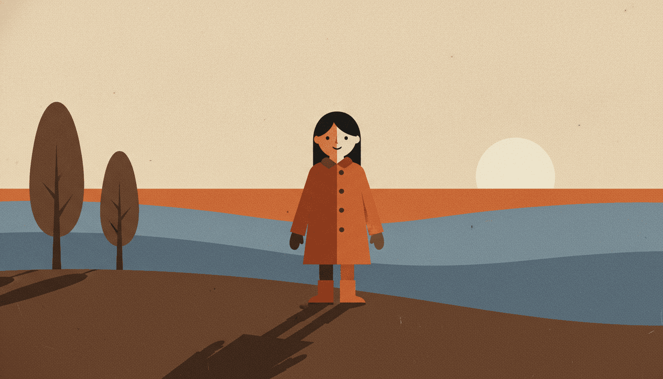
Eighteen of the seventy-eight style briefs here refuse the smooth gradient, and seventeen of them give up the sun along with it. A grainy illustration picture book is built from the one that kept it — so the shadow stops being an effect and becomes a shape.
- Flat colour shapes with no outline, cut in two by one hard light
- Real film grain over every surface — a decision, not a residue
- Five muted notes: dusk blue, burnt orange, deep shadow, grainy cream, near black
- Free credits by request — no card
50,000+
Stories Created
10,000+
Active Creators
50+
Art Styles
4.9/5
User Rating
What Makes the Film Grain Art Style Different From Simply Flat
Plenty of styles here are flat. This is the only one that is flat and still has a sun in it.
Eighteen briefs here refuse the smooth gradient. Seventeen of them pay for it with the light
Every style in C2Story runs on a short written brief that lists four things to avoid and records, in one phrase, what the light is doing. Eighteen of the seventy-eight briefs put the smooth gradient on the refusal list — and then read what each of those eighteen settles for. Four say flat graphic lighting. Others say flat even pop lighting, flat plain lighting, clean even flat light, even antique-plate lighting, soft flat mural lighting, soft muted ambient light, soft warm diffused light. Seventeen of the eighteen, almost without exception, give up the light along with the blend, because once you cannot fade one tone into another the easy answer is to stop having a sun at all. This one keeps it. Its lighting field reads strong dramatic directional light, and it is the only brief of the eighteen that says anything of the kind.
With no blend and no line to hatch with, the light has to become an edge
There is one other style that refuses the gradient and still keeps some drama, and comparing it shows why this one is unusual. That style buys its drama with hatching — moody hatched chiaroscuro, tone built from thousands of ink strokes — so it has an instrument to model with. This brief has none. Its line weight is recorded as shape-based with minimal outlines, which means there is no contour to thicken and no hatching to lay in. That leaves exactly one way to show a strong light: draw the boundary. The place where the lit side stops and the shadowed side starts becomes a hard edge, and the shadow on the ground becomes a shape with a border, a definite end and a colour of its own. A shadow here is not an effect applied to the picture. It is another object in it.
Depth is stacked rather than receded, because there is nothing to blur with
Most illustration pushes things backwards by softening them — haze on the far hills, detail dropping away, a lens going gently out of focus. None of that is available when every shape has a hard edge. So this brief carries layered near-and-far depth among the things it actively asks for, and the layers are literal: a near field as one large dark shape, a ridge behind it, a lighter ridge behind that, a band of sky, then the sky itself, each a single flat colour meeting the one in front along a clean edge and each a little lighter and a little plainer than the layer before. Distance is a position in a stack rather than a loss of focus. It is worth knowing because it changes how you describe a setting: you are building a set of flats, not a view.
Fifteen briefs mention grain. In the other fourteen it is the trace of a tool
Grain turns up more often than you would guess — fifteen of the seventy-eight briefs name it — but in almost all of them it is evidence of something physical: the tooth of a crayon, a dry brush skipping, oil pastel dragging, ink sinking into paper, the flaw of a photocopied cel. Grain there is what the instrument left behind. This style has no instrument. It is flat colour shapes with minimal outlines, so nothing in it could produce a texture by accident, and the brief therefore asks for grain outright — visible film grain, preserved paper grain, print imperfection, for what it calls indie-publication tactility. It is the one place in the library where grain is a decision rather than a residue. One of the other cinematic styles even puts retro grain on its refusal list, which is a fair measure of how deliberate it is here.
The Blend and the Cut, Side by Side
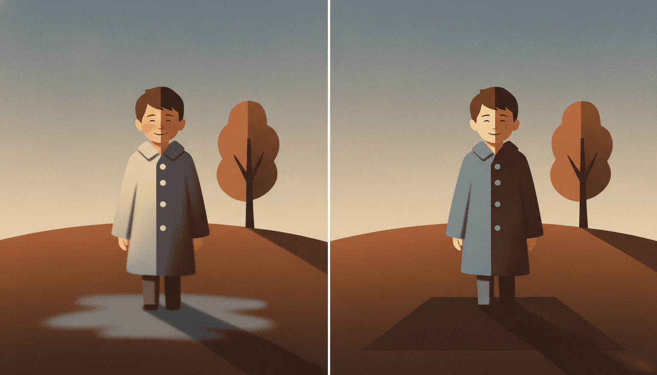
The same boy, the same tree, the same hillside, and in both halves the light is coming from the same direction. Only one thing changes between them: how the shadow is made. On the left it is blended. The lit side of his coat slides gradually into the shadowed side with no edge anywhere between them, his face is softly rounded, the sky is a graded wash, and the shadow on the ground is a pale, blurred pool with feathered edges that thin out and fade away into nothing. You could not point to where it stops.
On the right, every one of those decisions has been cut instead. His coat is pale blue on one side and near-black on the other, meeting along a single hard edge straight down his front with nothing in between. The tree is one light shape against one dark shape. And the shadow on the ground is now a slab — straight sides, a flat colour of its own, and a definite end you could put a finger on. That is the whole style in one comparison. Its four refusals are listed in this order: slick polish, cluttered detail, smooth gradient, photorealism — and the third one is what forces the shadow to grow a border.
Flatness normally costs you the light. Eighteen briefs here refuse the gradient, and seventeen of them settle for flat, even or ambient lighting afterwards. This one still asks for strong dramatic directional light.
And there is no line to fall back on. Its line weight is recorded as shape-based with minimal outlines — no contour, no hatching. The light is not decorating the picture. It is holding it together.
Its four refusals, in the order the brief states them:
Write the Hour, Not the Mood
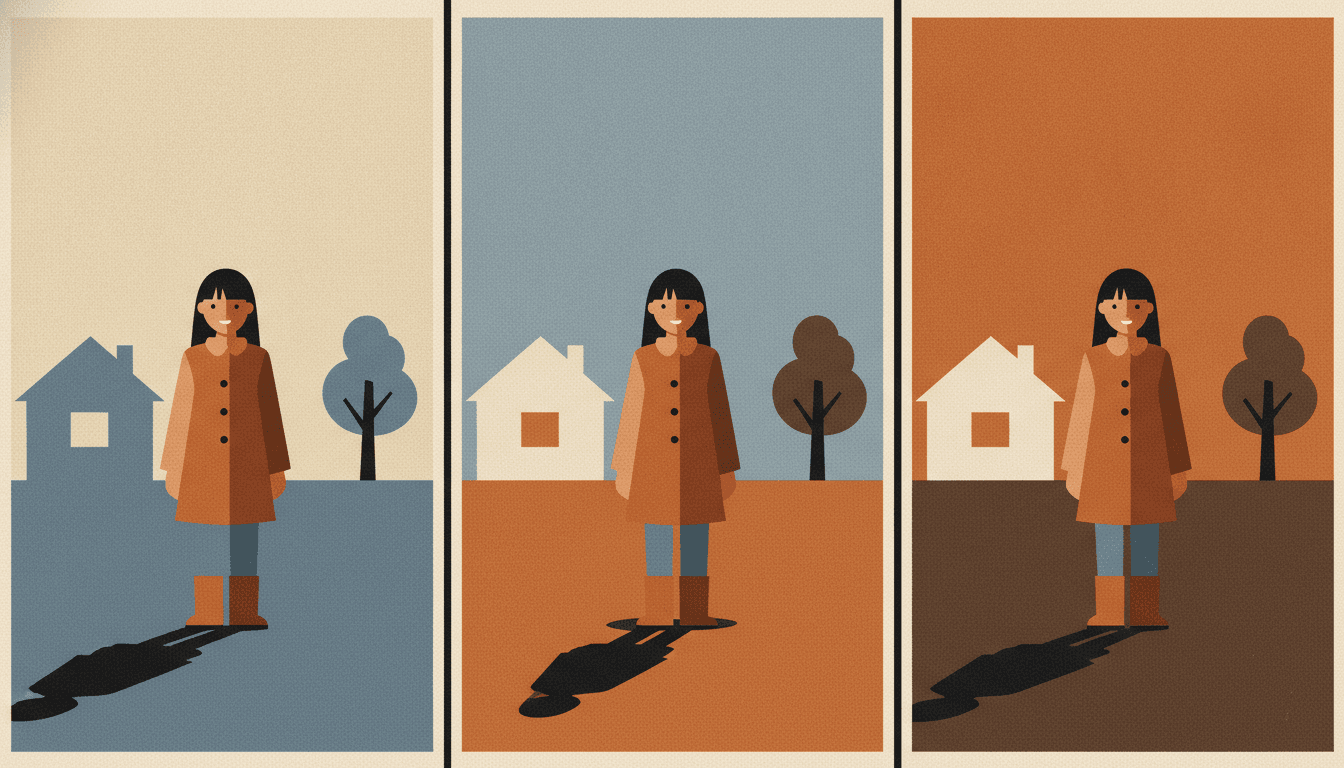
Most picture-book advice tells you to put the feeling into the weather, the detail or a look crossing a face. This style has very little of any of those: cluttered detail is refused outright, and a face is a few marks on a flat shape. What it has instead is a light with a direction, and that turns out to be enough — so the most useful thing you can put in a prompt here is a time of day. Not a sad walk home but walking home as it gets dark. The style will do the rest, because in a picture made of flat shapes the hour is not an atmosphere, it is a set of shapes that visibly change.
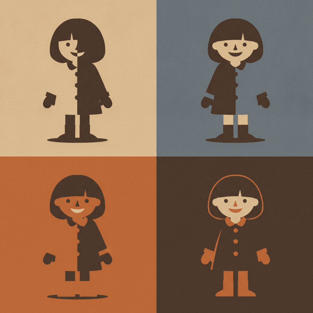
The three panels here are the same girl in the same coat standing between the same house and the same tree, drawn three times. Nothing about her has been redrawn. What moved is the sky, the ground and her shadow — pale cream over cool blue, then light blue over warm orange, then deep orange over brown — and that alone is the difference between morning and dusk. It is also why returning to one identical composition is a strength in this style rather than a repetition: the reader reads the change immediately, because there is nothing else in the frame competing to be read.
Name a light source on every page. A sun low on one side, an open door, one lit window. A page with no source has nothing to cut.
Keep the setting to a few big shapes. Depth is stacked, not blurred — a near field, a ridge, a band of sky. A cluttered room has nowhere to go.
Worth seeing side by side before you commit: the bold flat style, which solves the same refusal with an outline instead of a sun, the cinematic style, which gets its drama by rendering, and the mid-century style, which has the hard edges but keeps the light flat.
Create a Grainy Illustration Picture Book in 3 Steps
From a one-line idea to a finished book where every page carries the same grain, the same five muted colours and a light that keeps its direction, in under two minutes.
Describe the story
A sentence is enough, but include a time of day and a light source. This style has no fine detail and almost no facial expression to work with, so the hour you name changes the result far more than any adjective about how the scene should feel.
"A boy walking home across the hills as the sun goes down"
Pick Cinematic Grainy Flat-Shape
Choose it for flat colour shapes, real film grain and one hard directional light. Choose Bold Flat Satire instead if you want flat colour held together by a thick outline, the cinematic style if you want the drama rendered rather than cut, or Mid-Century Geometric Fable for hard edges under even light.
Dusk blue, burnt orange, deep shadow, grainy cream
Generate and export
C2Story writes the story, breaks it into pages and builds every one to the same brief. Read it on screen, share the link, or export the PDF and take that file to whichever printer or print service you already use.
Whole book built, PDF export, instant sharing
Cinematic Flat Shapes and Their Nearest Neighbours
Four real styles, sorted by the question that actually separates them: what is holding the shapes apart?
Cinematic Grainy Flat-Shape
Bold simplified colour shapes under visible film grain, with strong dramatic light and shadow and layered near-and-far depth. Faces and clothing are reduced to clear silhouettes carrying eyes, a mouth and a few key shapes. Its palette is a cinematic muted one — dusk blue, burnt orange, deep shadow and grainy cream — its line weight is recorded as shape-based with minimal outlines, its light as strong dramatic directional light, and its four refusals are slick polish, cluttered detail, smooth gradient and photorealism.
Bold Flat Satire
Flat colour, no gradient, and the closest comparison in the library — which makes the one difference between them the most useful thing on this page. That style is built on a thick bold outline and its light is recorded as flat graphic lighting. Separation there comes from the line: a dark contour holds every shape apart, so the picture does not need a sun to stay readable. This brief has minimal outlines and nothing to hold the shapes apart except the light itself, which is exactly why it cannot give the sun up. Choose bold flat when you want a stamp. Choose this when you want an hour of the day.
Saturated Cinematic Story
The other way to get a film-lit page, and worth seeing before you choose. It also asks for cinematic dramatic lighting, but it does not refuse the gradient, and one of the four things it does refuse is flat staging. So it arrives at drama the ordinary way — modelled form, graded light, saturated colour, depth you look into. This style arrives at the same drama with none of those, which is the whole trick. If you want a page that feels rendered, take that one; if you want the light to read as a cut shape, take this one.
Mid-Century Geometric Fable
Hard-edged geometric shapes, flat colour and an explicit refusal of the airbrush gradient — so on paper it sounds very close. Its lighting field settles the matter: flat graphic lighting. The shapes there are hard because they are built from geometry, and the picture is lit evenly so the composition can carry it. Here the shapes are hard because a light is falling across them from one side. Same crispness, opposite cause, and completely different books: one is a designed page, the other is a moment at a particular time of day.
Three more worth knowing. The geometric style also builds everything from colour boundaries rather than lines, but keeps its light flat and lets composition do the work. The negative space style shares the crisp shape edges and spends them on a visual pun instead of a sun. And the belle époque poster style is the flattest thing in the library — it refuses depth by name, where this one goes to real trouble to stack it. Browse everything on the illustration styles hub.
Grainy Picture Book Story Ideas to Get You Started
This style is far better at an hour of the day than at a busy room. These six lean into that.
The Long Way Home
A child takes the slow route back and the shadows get longer on every spread. The one thing this style can do that almost nothing else here can is make the passing of an afternoon visible, because a shadow is a shape and a shape can simply be drawn longer each time.
Create this storyWhat the Morning Looked Like
A book about being the first one up. Early light comes in low and sideways, which is the exact condition this brief is happiest in — one direction, long shadows, a cold sky and one warm band near the ground.
Create this storyThe Light Under the Door
Someone is still awake somewhere in the house. A lit doorway here lands on the floor as a hard slab you could cut out with scissors, so a story built around one source of light in a dark room gets a picture that treats that light as an object rather than a glow.
Create this storyThe Hill in Four Seasons
The same place, four times, nothing moving but the light and the colour of the ground. With depth built from stacked flat layers, returning to one identical composition is a strength rather than a limitation — the reader reads the change instantly.
Create this storyWaiting
A small person waits for a bus, a ferry, a grandmother. Very little happens, which suits a style whose drama lives in the lighting rather than the action: the same figure, the same bench, and an hour visibly going by behind them.
Create this storyThe Last One Awake
A night book that is calm instead of spooky. A muted palette of dusk blue and deep shadow with one small warm rectangle of window light does the work, and the single lit window becomes the thing every page is arranged around.
Create this storyAI-Generated Grainy Illustration Examples
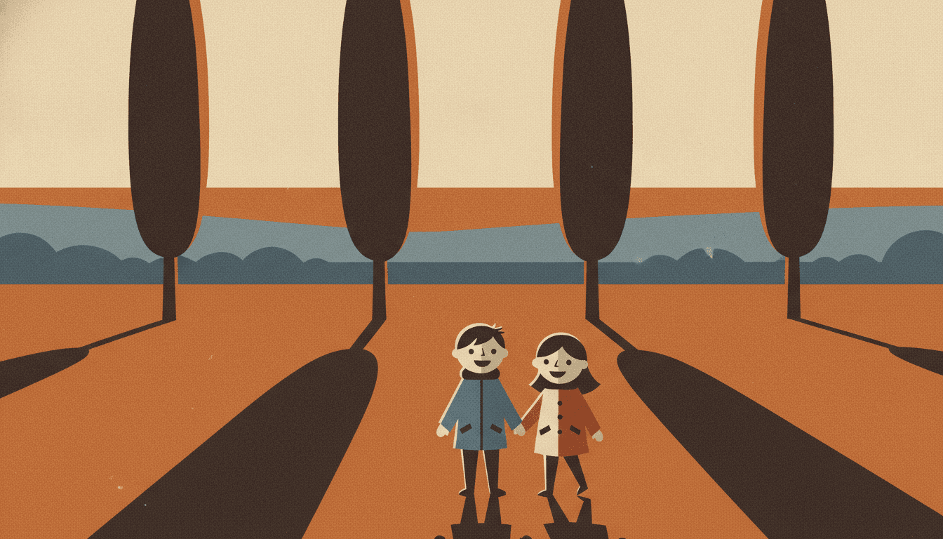
Look at the four trees in the last one. The trees themselves are almost nothing — four plain dark shapes — and the picture is really about the four long slabs they throw across the orange field. Each shadow has straight sides, one flat colour and a definite end, which is what a shadow becomes once you are not allowed to fade it out.
Film Grain Illustration for Every Part of Your Story
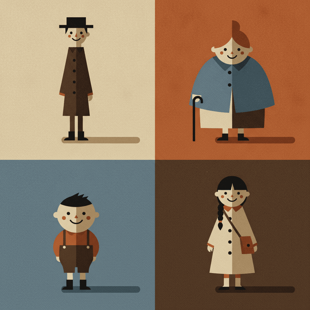
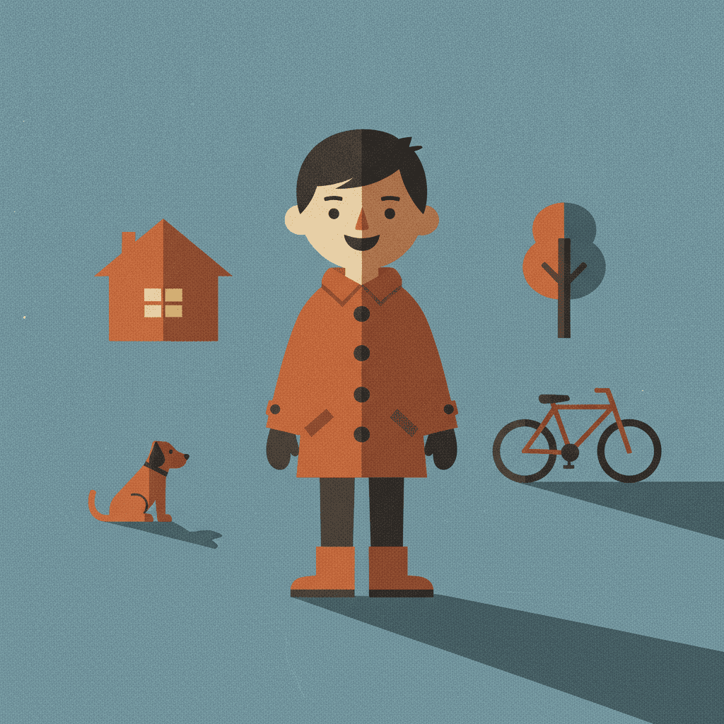
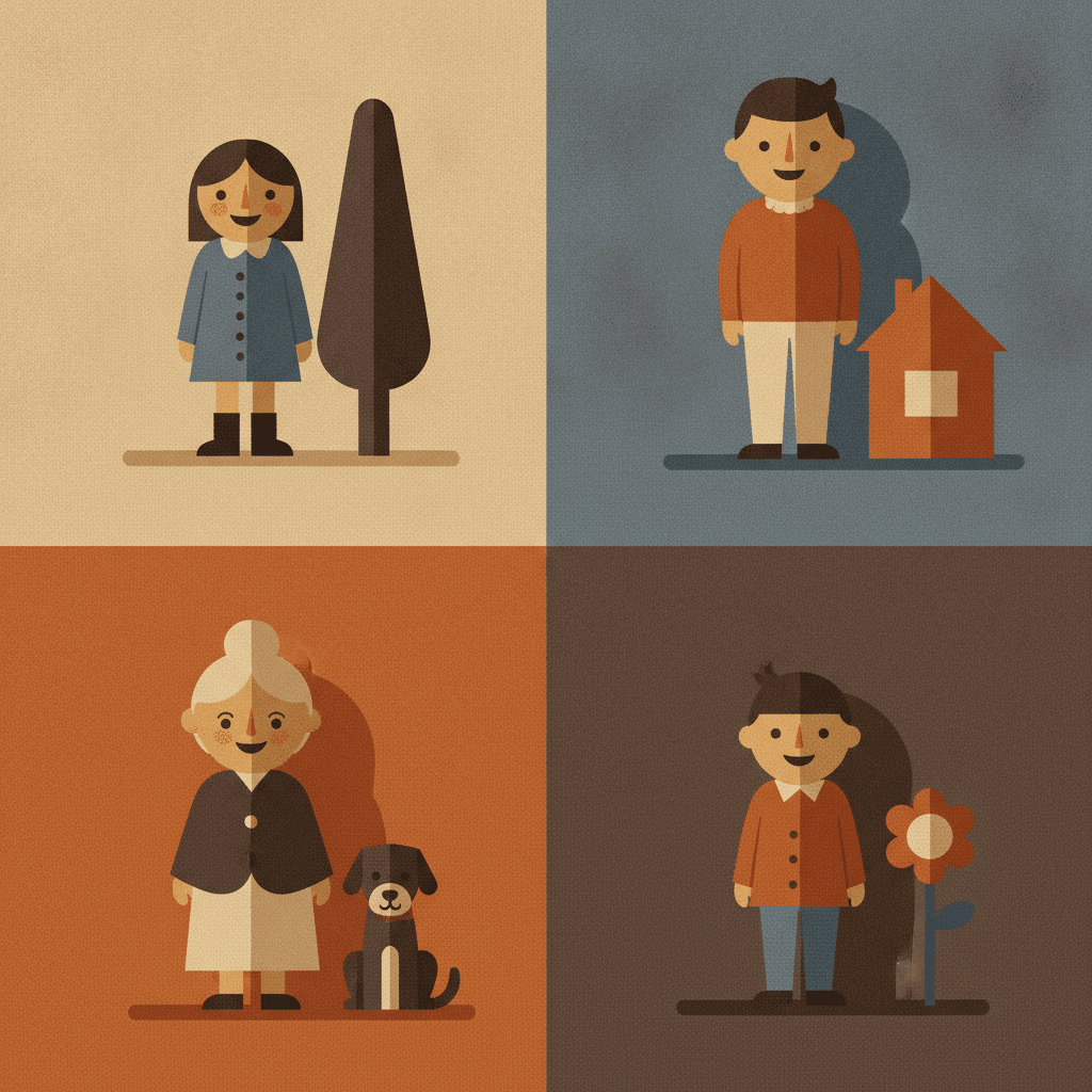
One character under four different lights, a cast told apart by silhouette alone, a single figure carrying a page, the five muted colours themselves, and whole scenes — the same grain and the same hard-edged sun spent on whatever your story is actually about.
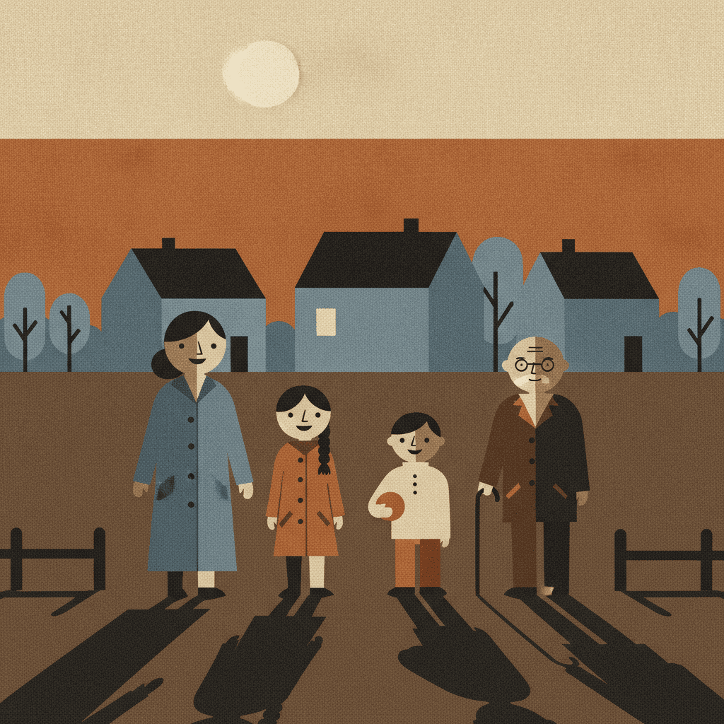
Everything You Need for Grainy Illustration Picture Books
One well-lit image is easy. Twenty-four pages whose sun stays on the same side, with a cast you recognise by silhouette alone, is the part that needs building.
The light keeps its direction for the whole book
A page lit from the left and the next one lit from the right is the fastest way to make a picture book feel assembled rather than made, and it is a very easy thing to lose when images are generated one at a time. One fixed brief is carried into every page instead — flat colour shapes, visible film grain, strong dramatic directional light, layered near-and-far depth, and the same four refusals of slick polish, cluttered detail, smooth gradient and photorealism. When the hour changes in your story it changes because the story said so.
Characters recognised by silhouette, which is what this style is built for
The brief says it plainly: faces and clothing reduced to clear silhouettes carrying eyes, a mouth and a few key shapes. That rules out telling your cast apart by their features, and it rules it out by design rather than by accident. They are separated the way figures in a title sequence are — who is tallest, who is widest, who is the long cream coat and who is the blue cape. That holds up far better across twenty-four pages than an expression does, and it survives being cut in half by a shadow. Save each character in the Character Library with up to fourteen reference images and they are reused on every page and into later books. Characters built from an uploaded photo stay private to your account.
Five muted notes, and no bright colour at all
The palette is recorded as a cinematic muted one: dusk blue, burnt orange, deep shadow and grainy cream, with near-black doing the darkest shapes. Be clear about what that costs before you commit a whole book to it. There is no primary red, no bright yellow, no green and nothing saturated, so a page cannot be carried by colour the way a board book is. What you get in exchange is that every one of the five reads clearly against every other, which is what makes a figure stay legible when half of them has gone into shadow. If you need a palette that sings, look at the gouache style or the pop art style instead.
Dramatic light, and still a warm book
This is the honest note the style needs. Strong directional light, deep shadow and a muted palette are the ingredients of something sombre, and left unguided a style like this drifts towards the bleak — long shadows and a lone figure do most of the work of melancholy on their own. Our generation guidance holds the line deliberately: the cast stays children and friendly grown-ups, fully and modestly dressed, every figure whole and well fed, every face fully visible and plainly cheerful, and scenes kept warm, calm and easily readable rather than dark. The light stays dramatic. The mood does not have to be.
A whole book, not one poster
This look lives almost entirely as single images — a print, a film poster, one quiet frame. You are not prompting for one of those. Describe the story and C2Story writes it, splits it into pages and builds each page to this brief according to what that page actually says, so the grain and the hard-edged light are spent across a narrative with a beginning and an end rather than all at once on one picture.
Readable very young, in whichever language you read aloud in
Easy to underestimate, because the reference points are grown-up ones. But the brief refuses cluttered detail, and what it leaves is one or two large simple shapes per page in five clearly separated colours — which is close to ideal for a small child, who reads a silhouette long before they read a face. The caveat is tone rather than complexity: muted dusk blue and burnt orange are quiet colours, so this suits roughly three and up, and grown-ups buying a picture book they will not mind reading forty times. Write in English, Chinese, Japanese, Spanish, French and more; the look does not change with the language, and your words stay legible because they are set as type rather than drawn into the art.
Grainy Illustration Picture Books — Questions
What people ask before committing a whole book to flat shapes, five muted colours and one hard light.
Explore More Story Ideas
Discover more styles, tools, and story types
Bear Stories
A new bear friend, woodland picnics, honey treats and great bear hunts
Explore
Animal Watercolor Books
Real species & fully painted habitats
Explore
Children's Book Creator
Design beautiful kids books
Explore
Midjourney vs C2Story
Stories, not just images
ExploreGrainy Illustration Picture Books — Flat Colour Shapes, Real Film Grain and One Hard Light
A grainy illustration picture book is one where nothing is blended. Every page is built from bold, simplified shapes of flat colour with no outline holding them apart, a dusty film grain lying over the whole surface, and a strong light arriving from one side so that each shape is cut into a lighter piece and a darker piece along a single hard edge. On C2Story this is the Cinematic Grainy Flat-Shape style, and its brief states the ambition plainly: cinematic minimalist flat-shape illustration, bold simplified colour shapes, visible film grain, strong dramatic light and shadow, layered near-and-far depth, with faces and clothing reduced to clear silhouettes carrying eyes, a mouth and a few key shapes, and paper grain and print imperfection preserved for an indie-publication tactility. One brief applied across a whole book, so the twentieth spread is built from the same instruction as the first.
The part worth knowing before you commit a book to it is which of that is genuinely rare, because flatness is not rare here at all. Read the four refusals attached to each of the seventy-eight hand-drawn style briefs enabled in C2Story and eighteen of them refuse the smooth gradient. Then read what each of those eighteen records for its lighting. Four say flat graphic lighting. The rest say flat even pop lighting, flat plain lighting, clean even flat light, even antique-plate lighting, soft flat mural lighting, soft warm diffused light, soft muted ambient light, clean flat graphic lighting. Seventeen of the eighteen give up the sun at the same moment they give up the blend, and that is a reasonable trade — once you cannot fade one tone into another, the simplest way forward is to stop having a light source at all and let composition carry the page. This brief does not take it. Its lighting field reads strong dramatic directional light, and among the eighteen it stands alone.
Follow that through and the rest of the look stops being decoration and becomes a consequence. There is exactly one other gradient-refusing brief that keeps any drama in its light, and it buys that drama with hatching — tone built out of thousands of ink strokes, which is an instrument to model with. This style has none: its line weight is recorded as shape-based with minimal outlines, so there is no contour to thicken, nothing to cross-hatch, and no dark line separating one colour from the next. That leaves a single way to show a strong light, which is to draw its boundary. The place where the lit side of a coat stops and the shadowed side begins becomes a hard edge running straight down the figure, and the shadow thrown on the ground becomes a slab with straight sides, a flat colour of its own and an end you could point to. A shadow in these pictures is not an effect laid over the scene; it is another object in it, the same kind of thing as the hill and the tree. Depth works the same way — the brief asks for layered near-and-far depth, so distance is a stack of flat layers each plainer and lighter than the one in front, rather than anything softening into haze. And the grain itself is a decision rather than a residue: fifteen briefs mention grain, but in the other fourteen it is the trace of something physical — a crayon's tooth, a dry brush, ink in paper, a photocopied cel — whereas this style has no instrument that could leave a texture, so it asks for the grain outright. One of the other cinematic briefs even lists retro grain among the things it refuses.
Four honest notes before you choose it. First, the writing advice changes: with no fine detail and almost no facial expression available, the most useful thing you can put in a prompt is a time of day and a light source — walking home as it gets dark, the only lit window on the street — because here an hour is not an atmosphere, it is a set of shapes that visibly change. Second, the palette is five muted notes and nothing else: dusk blue, burnt orange, deep shadow, grainy cream and near-black, with no bright or saturated colour anywhere, so if you want a page that sings in colour the gouache style or the pop art style will serve you better. Third, dramatic light plus deep shadow drifts towards the bleak if nobody stops it, so our generation guidance keeps the cast children and friendly grown-ups, fully and modestly dressed, every figure whole and well fed, every face fully visible and plainly cheerful, and scenes warm and calm rather than dark. Fourth, cluttered detail is refused, so a setting here is a few large shapes rather than a painted world. Among its neighbours, the bold flat style solves the same refusal with a thick outline instead of a sun, the cinematic style earns the same drama by rendering it, and the mid-century style has the hard edges under flat, even light. In exchange you get a look that is unusually easy to keep consistent, because characters are carried by silhouette rather than by facial detail — save each one in the Character Library with up to fourteen reference images and they are reused across every page and into later books, and characters built from an uploaded photo stay private to your account. Write in any language you read aloud in, then export the finished book as a PDF, which is the handoff to whichever printer you already use, and the images you generate are licensed for commercial use. Start free: see our pricing plans, browse every option on the illustration styles hub, or go straight to the AI Story Generator.