
Art Brut Picture BooksA Sign for a Person
Fourteen of the seventy-eight style briefs here ask for exaggerated proportions. An art brut picture book is built from the only one that refuses correct anatomy outright — so the figure stops being a person drawn badly and becomes a symbol for one.
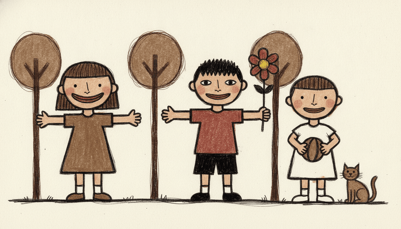
- Thick wobbly outlines and uneven flat fills that miss the line
- Big heads, stumpy limbs, off-kilter proportions, facing you squarely
- Four raw unmixed colours — earthy brown, muddy red, chalky off-white, ink black
- Free credits by request — no card
50,000+
Stories Created
10,000+
Active Creators
50+
Art Styles
4.9/5
User Rating
What Makes the Art Brut Style Different From Simply Messy
Several styles here are rough on purpose. This is the only one that stops believing there is a correct body underneath.
Three of the seventy-eight briefs refuse anatomy. They refuse three different words
Every style in C2Story runs on a short written brief, and each brief lists four things to avoid. Read all seventy-eight lists and only three of them refuse anatomy at all. One refuses realistic anatomy — a register, so you can be stylised and still be correct. One refuses perfect anatomy — a ceiling, so you can fall short of it and still be right. This one refuses correct anatomy, and that is a different kind of word. There is no partly correct. Refusing realistic means drawing the body another way; refusing correct means dropping the standard the body was being measured against. It is the only brief in the library that does that.
Fourteen briefs ask for exaggerated proportions. This one asks for off-kilter
Seventeen of the seventy-eight briefs mention proportion, and sorting them by the word they choose is the quickest way to find where this one sits. Fourteen ask for exaggeration — extreme exaggerated proportions, playfully exaggerated, exaggerated head-to-body, exaggerated slender. Four want proportion kept clear and readable. Two ask for lopsided or wobbly proportions. Exaggeration is a dial: it needs a correct body to push away from, and the further it goes the more obviously it knows where correct was. This brief says off-kilter, which is not a dial setting. Something off-kilter is simply out of true. That is the whole difference between drawing it wrong on purpose and not drawing it right at all.
It is the only style here whose light is non-illusionistic — and that is what lets the anatomy go
Each brief records its lighting in one phrase, and plenty of them are flat: four say flat graphic lighting, two say flat plain lighting, others say flat neutral or flat raw. Flat is a decision about where the light comes from. This is the only one of the seventy-eight that says flat non-illusionistic light, which is a decision about whether the picture is a view at all. No light source, no modelling, no cast shadow, no depth, no perspective — the page never pretends to be a window into a room. And that is the hinge, because a body can only be wrong if the picture claims to be showing you a real one. Remove the claim and correct anatomy stops being a thing the drawing failed at.
What it draws instead is a human symbol — a phrase used once in the whole library
The brief does not ask for simplified people. It asks for childlike simplified human symbols, and that exact idea appears in one brief of seventy-eight. A symbol for a person: a big round head straight on a short solid body, stumpy limbs stuck out at plain angles, mitten hands, large flat feet, facing you squarely. Seven more of its words are used exactly once across the entire library — unschooled, anti-refined, off-kilter, compulsive, outsider, professional and unmixed. That last one is in the palette, which reads raw unmixed colors, earthy brown, muddy red, chalky off-white. Mixing a colour is itself a trained act, and this is the only palette in the library that refuses to have done it.
Why the Art Brut Figure Is Not Just a Bad Drawing
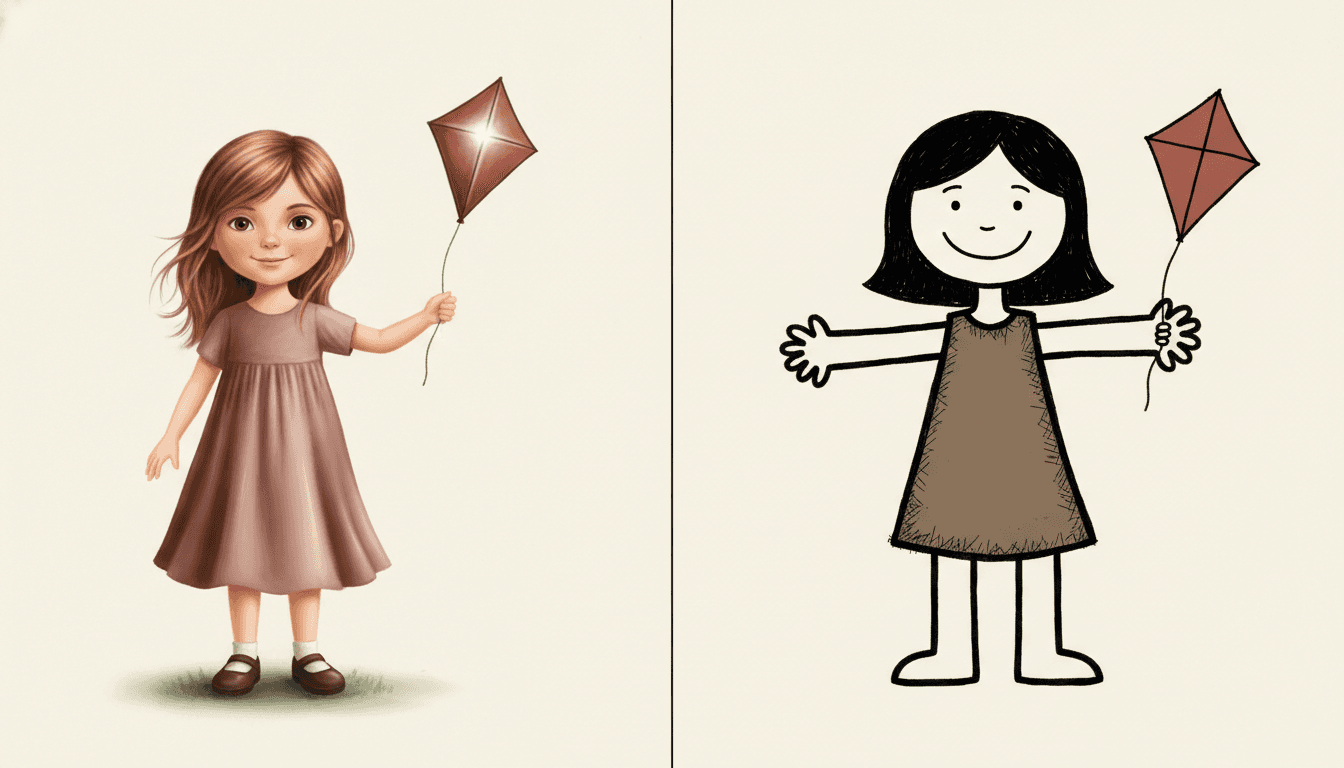
The same girl twice, with the same kite. On the left she is drawn the way most illustration draws a child: a smooth even outline, her hair rendered strand by strand, soft folds shaded into her dress, a bright star of white highlight on the kite, and a shadow pooling into a patch of grass under her shoes. Her hands have fingers. Her proportions are correct. Nothing is wrong with it — and it is also, item for item, a list of everything this style refuses.
On the right, the same girl again. Her head is now a wobbly circle sitting on her shoulders with barely a neck, her arms are two plain tubes stuck straight out sideways ending in mitten hands, her legs are two more tubes, and her hair is one solid black shape rather than strands. Her dress is a flat brown patch scratched over with short pen marks instead of shaded. Her kite is the same kite, matte, with no shine on it at all. And she casts no shadow, because there is nothing for her to cast one onto. Its four refusals are listed in this order: polished, correct anatomy, smooth shading, professional gloss — and the second one is the one no other brief in the library uses.
Exaggerated is a dial. Off-kilter is not. Fourteen briefs here ask for exaggerated proportions, which needs a correct body to push away from. This one asks for off-kilter, which just means out of true.
And the light is why it gets away with it. It is the only brief whose lighting is non-illusionistic. A body can only be wrong if the picture claims to be showing you a real one.
Its four refusals, in the order the brief states them:
Say the Feeling Out Loud
Almost every piece of picture-book advice tells you to imply. Put the sadness in the weather, the fear in the lighting, the joy in a look that crosses a face. That advice assumes a picture that can imply, and this one cannot: there is no light source, no shading, no depth, no perspective, and a face is four marks. So this is the one style in the library where the plain declarative sentence is the right craft choice. “He was cross” is a usable line here. Everywhere else it would be lazy; here the picture is going to announce the same thing in the same flat voice, and the two will agree.
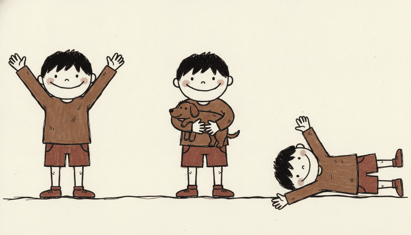
The second half of the test is about what changes between spreads. With no perspective, you cannot give the reader a new angle on the same room — nothing in these pictures is nearer or further than anything else. What you can change is who is in the frame. So build the book from plain statements rather than camera moves: arms straight up, holding the dog, flat on the floor like a star, everybody at the gate together. The picture here is doing exactly that — the same boy three times, each time one act you could name in three words.
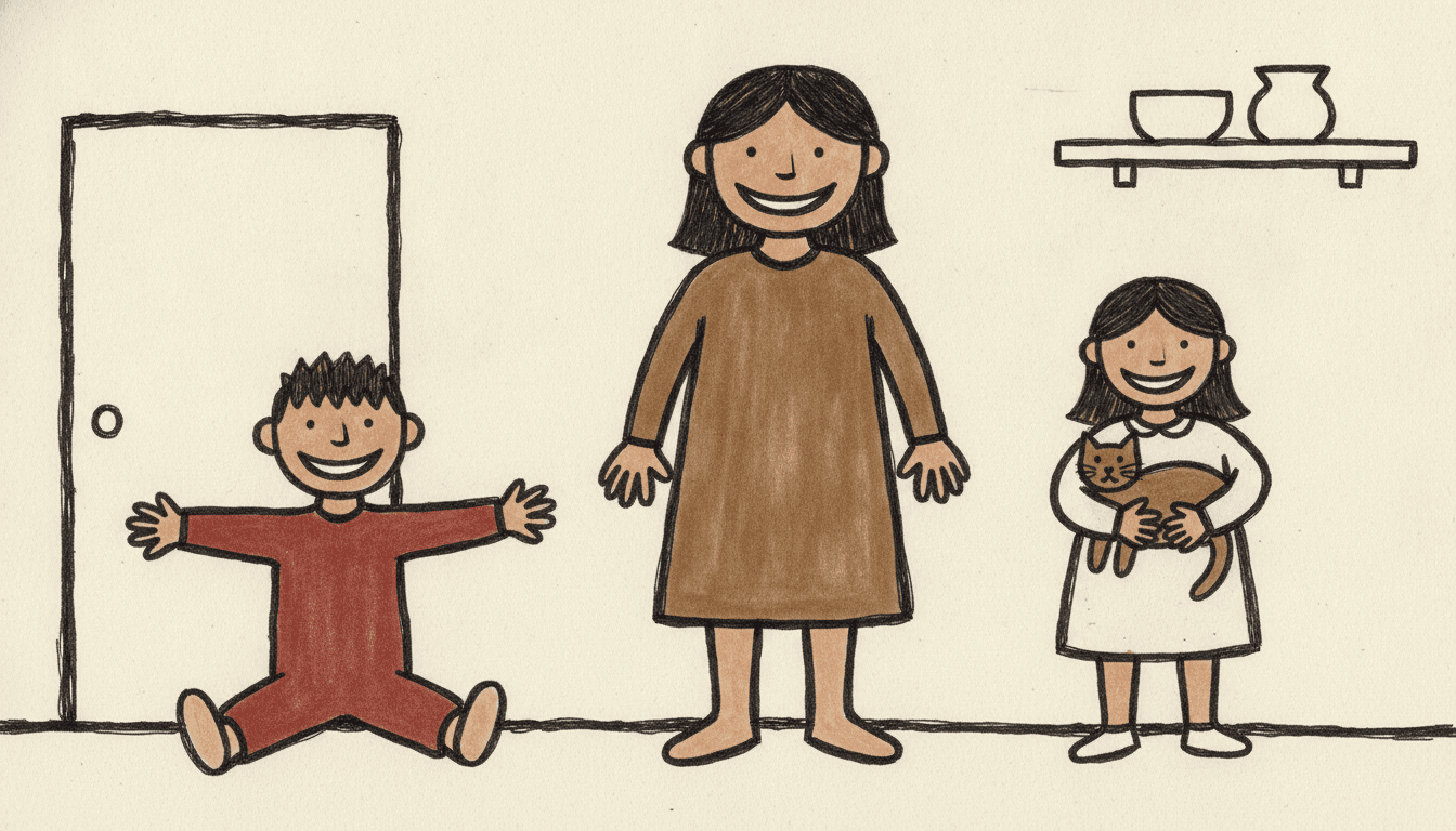
Give your cast a silhouette, not a face. Readers will tell them apart by who is tallest, widest, or always in the brown coat. Decide that once and everybody stays recognisable.
One act per page, not two. A symbol has one reading. Two things happening at once in the same frame will read as neither.
Worth seeing side by side before you commit: the graffiti style, which is rough for the opposite reason, the crayon style, which gets its childlike quality from the instrument rather than the hand, and the scandinavian folk style, which is naive but painted and decorative.
Create an Art Brut Picture Book in 3 Steps
From a one-line idea to a finished book where every page carries the same fat wobbly outline, the same four raw colours and the same cast, in under two minutes.
Describe the story
A sentence is enough, but say the feeling plainly rather than implying it, and say what a body is doing rather than what the room looks like. This style has four colours, no light and no depth, so a stated feeling and a nameable act change the result far more than any description of a setting.
"A small child who is cross all morning and is not sorry about it"
Pick Art Brut Raw Figure
Choose it for thick wobbly outlines, off-kilter human symbols and raw earthy colour. Choose Heta-Uma Bad-Good instead for the same roughness played as a joke, Primitive Marker Cartoon for crude but bright and instantly readable, or Raw Graffiti Symbolism for marks made fast and loud.
Earthy brown, muddy red, chalky off-white
Generate and export
C2Story writes the story, breaks it into pages and builds every one to the same brief. Read it on screen, share the link, or export the PDF and take that file to whichever printer or print service you already use.
Whole book built, PDF export, instant sharing
Outsider Art Style and Its Nearest Neighbours
Four real styles that are all crude on purpose, sorted by the question that actually separates them: why is the drawing rough?
Art Brut Raw Figure
A raw outsider-art figure drawn with a deliberately crude and unschooled hand: thick wobbly ink outlines, childlike simplified human symbols, anti-refined rendering, uneven flat fills, scratchy marks and off-kilter proportions, carried through the whole scene your story describes. Its palette is raw unmixed colour — earthy brown, muddy red and chalky off-white — its instrument is recorded as thick wobbly uneven lines, its light as flat and non-illusionistic, and its four refusals are polished, correct anatomy, smooth shading and professional gloss.
Heta-Uma Bad-Good
Intentionally crude wobbly proportions, shaky uneven hand lines and a flat quirky palette of muddy mustard, faded red and dull blue. This is the comparison that decides it, because on the surface the two are almost the same picture. The split is in one word of each refusal list. That style refuses perfect anatomy — a ceiling it falls short of knowingly, and the knowingness is the joke; the reader is invited to be in on it. This one refuses correct anatomy, and it is not joking. Choose bad-good for wry and offbeat, and this one when the drawing should feel urgent rather than clever.
Raw Graffiti Symbolism
Crude scrawled marker lines, invented symbols and scrawled fragments, on a hard palette of harsh black, bold red and electric yellow. Both styles are rough and both refuse polish, so the useful question is why the marks are rough. That style is rough because they were made fast by somebody with something to announce, and it is the one that brings signs and scrawl into the picture alongside the people. This one is rough because the hand does not know how, and its palette says so: earthy brown, muddy red, chalky off-white. One is a siren, the other is soil.
Primitive Marker Cartoon
Very thick bold marker lines, intentionally lopsided proportions and flat bright fills in primary red, bright blue and sunny yellow. It shares this style’s instinct — fat line, no shading, no fine detail — but points it somewhere else entirely: at being instantly readable at tiny size, which is why its colour is primary and cheerful rather than earthy. Choose that one for bold and immediate, and this one for raw and unschooled. The palettes alone will tell you which book you are making.
Three more worth knowing. The crayon style is also childlike, but it gets there through the instrument — waxy marks on paper — rather than through an unschooled hand, and its colour is bright. The scandinavian folk style is naive but painted and decorative, with real folk motifs holding it together. And the angular line style distorts the figure too, but for a different reason: it refuses a neutral pose while still believing in the body underneath. Browse everything on the illustration styles hub.
Raw Figure Drawing Story Ideas to Get You Started
This style is far better at a plain statement than at a mood, a vista or a clever reveal. These six lean into that.
I Am Cross and I Am Not Sorry
A small child works through a plain bad mood with no apology at the end. A style that cannot do subtext is the right home for a book that does not want any: the feeling is stated in the words and the body states it again, arms down, feet planted, facing the reader.
Create this storyThis Is My Dog
A whole book of plain introductions — my dog, my gate, my grandmother, my shoes. The figures here are symbols rather than portraits, and a symbol is exactly the right drawing for a page whose only job is to hold something up and name it.
Create this storyEverybody at Number Eleven
One flat, frontal family portrait per spread, adding a person each time. With no perspective and no light, the thing that changes between pages is who is in the frame — so a story built on a growing cast gives this style the one variable it actually has.
Create this storyThe Thing I Planted
A seed, a pot, a long wait, a flower. Four raw earthy colours and a plain wobbly line suit a slow, patient, slightly muddy book far better than they suit a bright one, and the flower at the end arrives as one big simple shape rather than a bouquet.
Create this storyMy First Day, Told Flat Out
A first morning at school where the child simply says what is true — I did not want to go, then I went, then it was fine. This style announces rather than implies, so a text that says the hard thing plainly and a picture that stands square to the reader pull in the same direction.
Create this storyThe House I Drew
A child’s own drawing of a house comes to life and the family moves in. The joke writes itself in this style, because a plain square with a triangle on top and one blank window is exactly what the brief would have drawn anyway — the book and the child agree about what a house looks like.
Create this storyAI-Generated Art Brut Illustration Examples
Look at the boy lying down in the middle one. He has not been redrawn from a new angle — he is the same flat frontal figure as the two standing beside him, simply turned on his side. There is no perspective here to foreshorten him in, nothing is lit, and nothing casts a shadow, so there is no illusion of a room for a body to be wrong in.
Art Brut Illustration for Every Part of Your Story
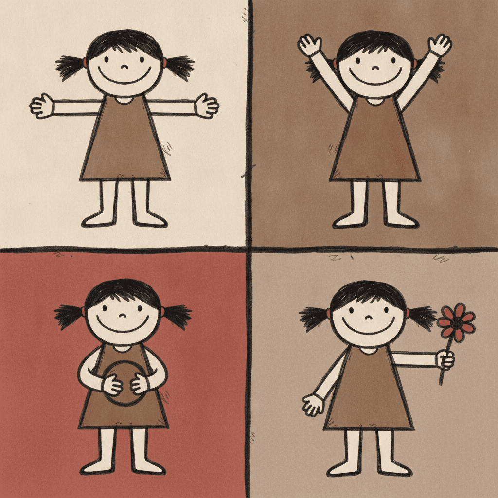
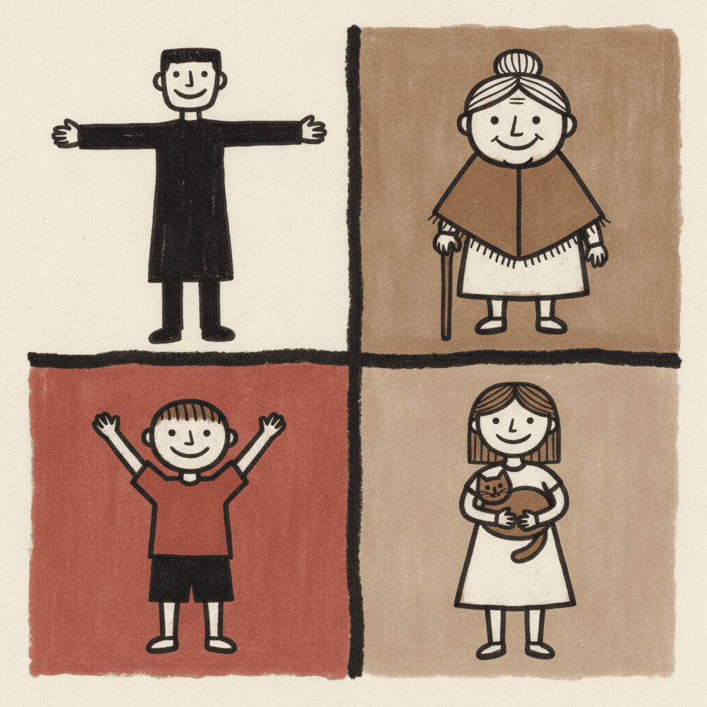
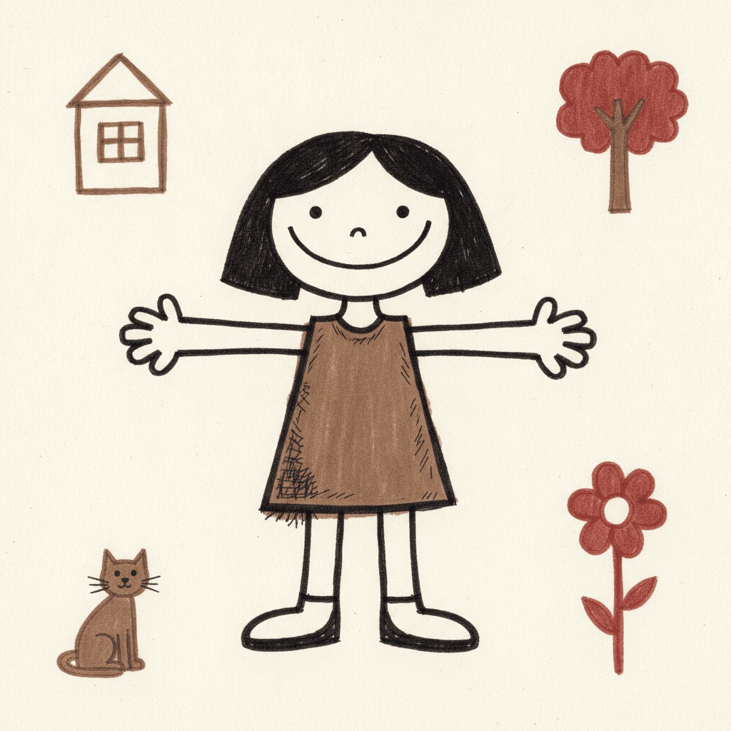
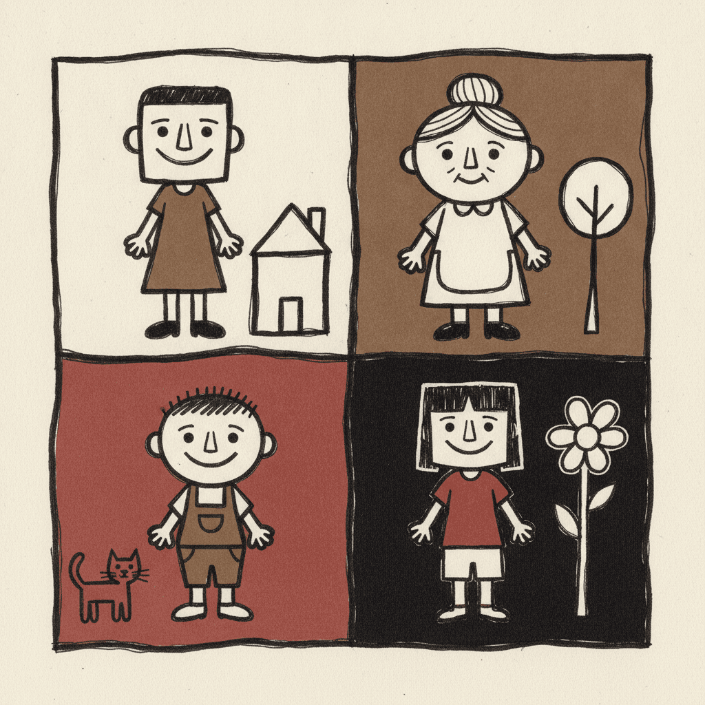
One character held across four plain acts, a cast told apart by silhouette alone, a single figure carrying a page, the four raw colours themselves, and whole scenes — the same fat wobbly line spent on whatever your story is actually about.
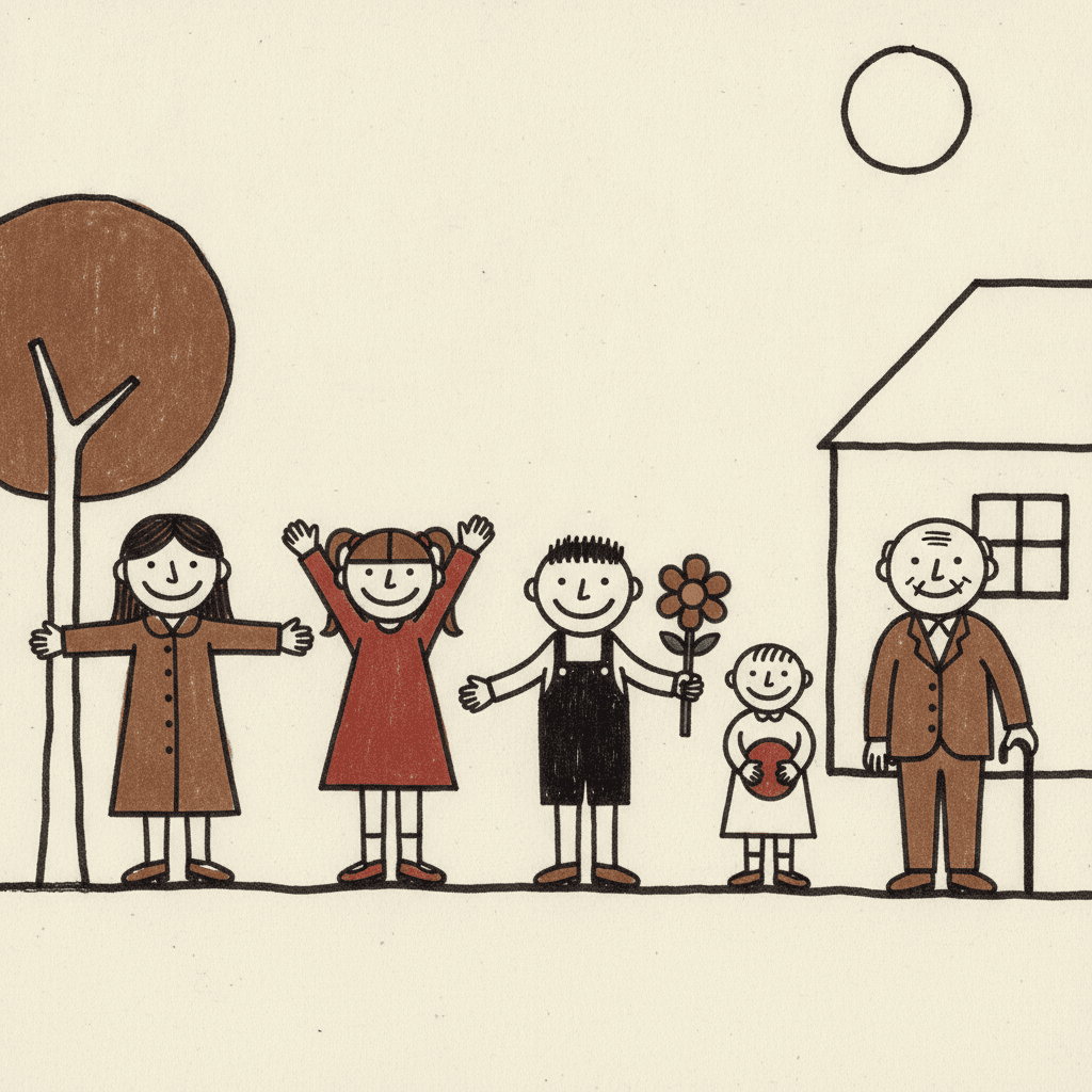
Everything You Need for Art Brut Picture Books
One raw drawing is easy. Twenty-four pages whose line wobbles in the same way, with a cast you recognise by silhouette alone, is the part that needs building.
The same crude hand on page one and on page twenty-four
Crude is the hardest look to keep consistent, because there are endless ways to be rough and a human hand drifts between them — one spread comes out charmingly wonky and the next just looks like a mistake. One fixed brief is carried into every page instead: thick wobbly uneven outlines, uneven flat fills, scratchy marks, off-kilter proportions and human symbols rather than drawn people, with the same four refusals of polished, correct anatomy, smooth shading and professional gloss. The wobble stays the same wobble for the whole book.
Characters recognised by silhouette, because there is nothing else to recognise
A face here is a few marks — two dot eyes, a nose, one curved mouth — so your cast cannot be told apart by features, and trying will only produce four slightly different wobbles. They are told apart the way a child tells people apart in their own drawings: who is tallest, who is widest, who has the big black hair shape, who always wears the brown coat. That is genuinely good for consistency, because a silhouette survives from page to page far better than an expression does. Save each character in the Character Library with up to fourteen reference images and they are reused on every page and into later books. Characters built from an uploaded photo stay private to your account.
Crude, and still a book you would hand to a child
This is the honest note the style needs, and it is the one real risk in generating it. A tradition of raw, anti-refined figure drawing can tip towards the unsettling — a simplified face is only a few marks away from a mask, and a crude body only a few marks away from something a child would not want to look at. Our generation guidance holds the line: the cast stays children and friendly grown-ups, fully and modestly dressed, solid and well fed rather than gaunt, every figure whole with its limbs attached, and every face plainly cheerful with round eyes and an upturned mouth. Raw is the look. Grim is not.
Four raw colours, none of them mixed
The palette is recorded as raw unmixed colours — earthy brown, muddy red and chalky off-white, with ink black doing the outlines — and the word unmixed appears in no other brief in the library. Be clear about what that costs before you commit a book to it. There is no bright, hot or saturated colour available, no blue, no green, and no gradient, so you cannot stage a page with a sunset or a lamp. Colour here does one job: it separates a coat from a wall. If you need a palette that carries mood, the gouache style or the pop art style are the ones to look at.
A whole book, not one raw canvas
Work in this tradition almost always exists as a single piece — one figure, one board, one burst. You are not prompting for one of those. Describe the story and C2Story writes it, splits it into pages and builds each page to this brief according to what that page actually says, so the fat wobbly line is spent across a narrative with a beginning and an end rather than all at once on one image.
Younger readers than you would guess, in whichever language you read in
Worth saying, because the name suggests a gallery and the pictures do not. Nothing in this brief refuses cuteness and nothing in it asks for intensity, so unlike most of the expressive graphic styles here it works for very young readers: big simple shapes, thick outlines, one clear figure per page and no visual detail to decode. The honest caveat is the palette — earthy brown and muddy red do not shout the way a board-book palette shouts, so this suits roughly three and up and grown-ups who want a plain, unsentimental look. Write in English, Chinese, Japanese, Spanish, French and more; the look does not change with the language, and your words stay legible because they are set as type rather than drawn.
Art Brut Picture Books — Questions
What people ask before committing a whole book to a wobbly outline, four raw colours and no light at all.
Explore More Story Ideas
Discover more styles, tools, and story types
Cowboy Stories
Pony rides, lasso practice and Wild West treasure trails
Explore
Sumi-e Ink Wash Books
One-pass brushwork & deliberate emptiness
Explore
Children's Book Creator
Design beautiful kids books
Explore
Storybird Alternative
Better AI story creation
ExploreArt Brut Picture Books — A Fat Wobbly Line, Off-Kilter Figures and Four Raw Colours
An art brut picture book is drawn by a hand that is not pretending to be trained. There is no modelled light, no gradient, no depth and no fine detail — only thick wobbly ink outlines that fatten and thin as they travel, figures built as simple human symbols with big heads and stumpy limbs, uneven flat patches of raw colour that miss the outline in one place and run over it in another, and short scratchy marks scribbled across them. On C2Story this is the Art Brut Raw Figure style, and its brief states the ambition plainly: a raw outsider-art figure, a deliberately crude and unschooled hand, thick wobbly ink outlines, childlike simplified human symbols, anti-refined naive rendering, uneven flat fills, scratchy marks and off-kilter proportions, carried through the whole scene your story describes. One brief applied across a whole book, so the twentieth spread is drawn from the same instruction as the first.
The part worth knowing before you commit a book to it is which of that is genuinely rare, because “rough on purpose” is not rare here at all. Read the four refusals attached to each of the seventy-eight hand-drawn style briefs enabled in C2Story and only three of them refuse anatomy. One refuses realistic anatomy, which is a register — you can be stylised and still be correct. One refuses perfect anatomy, which is a ceiling — you can fall short of it and still be right. This brief refuses correct anatomy, and there is no such thing as partly correct. Sort the briefs by proportion instead and the same gap appears: seventeen mention proportion at all, fourteen of them ask for it to be exaggerated, and exaggeration is a dial that needs a correct body to push away from. This one asks for off-kilter, which is not a setting on a dial but a thing simply out of true. That is the whole difference between drawing a body wrong on purpose and not drawing it right at all.
Follow that through and the rest of the look stops being decoration and becomes a consequence. Its lighting field reads flat non-illusionistic light — the only one of the seventy-eight to use that word, where four others settle for flat graphic lighting and two for flat plain lighting. Flat is a decision about where the light comes from; non-illusionistic is a decision about whether the page is a view into anywhere at all. There is no light source, no modelling, no cast shadow, no depth and no perspective, so nothing in one of these pictures is nearer or further away than anything else. And that is the hinge the whole style turns on, because a body can only be wrong if the picture claims to be showing you a real one. Remove the claim and the figure stops being an inaccurate person and becomes a sign for a person — which is exactly what the brief asks for in a phrase used in no other brief in the library: childlike simplified human symbols. Seven more of its words appear exactly once across all seventy-eight briefs: unschooled, anti-refined, off-kilter, compulsive, outsider, professional and unmixed. That last one sits in the palette, recorded as raw unmixed colors, earthy brown, muddy red, chalky off-white — mixing a colour being itself a trained act, and this the only palette in the library that declines to have done it.
Four honest notes before you choose it. First, the writing advice inverts. Nearly every picture-book instinct tells you to imply a feeling through light, weather or a look crossing a face, and this style has none of those to work with, so it is the one place in the library where the plain declarative sentence is the right craft choice — say what somebody feels, and give them one act per page you could name in three words. Second, what changes between spreads is who is in the frame rather than where the camera is, because there is no perspective to move through; for a style that uses size as a hierarchy in a related way, compare the scandinavian folk style. Third, crude must never mean grim: a simplified face sits a few marks from a mask, so our generation guidance keeps the cast children and friendly grown-ups, fully and modestly dressed, solid and well fed, every figure whole, and every face plainly cheerful. Fourth, it cannot give you a world — no bright colour, no painted background, no weather, no night lit by a lamp — so if your story needs a place rather than a person, the gouache style or the cinematic style will serve you far better. Among its own relatives, the graffiti style is rough because the marks were made fast rather than unschooled, and the crayon style is childlike through its instrument rather than its hand. In exchange you get a look that is unusually forgiving to keep consistent, because characters here are carried by silhouette rather than by facial detail — save each one in the Character Library with up to fourteen reference images and they are reused across every page and into later books, and characters built from an uploaded photo stay private to your account. Write in any language you read aloud in, then export the finished book as a PDF, which is the handoff to whichever printer you already use, and the images you generate are licensed for commercial use. Start free: see our pricing plans, browse every option on the illustration styles hub, or go straight to the AI Story Generator.