
Guochao Picture BooksThe Ornament Goes on the Place, Not the Person
Of the seventy-eight style briefs here, only three refuse an empty background — and only one fills it with something that was built. A guochao picture book comes from that one: carved and painted architecture, dense pattern, and saturated crimson and gold that is never allowed to go muddy.
- Ornate architecture and dense decorative pattern
- Saturated crimson, imperial gold, teal and indigo
- Silhouette-first characters, never a generic cute face
- Free credits by request — no card
50,000+
Stories Created
10,000+
Active Creators
50+
Art Styles
4.9/5
User Rating
What Makes Guochao Illustration Different From Every Other Decorative Style
Every style here is a written brief — a palette, a light, a line weight, a short list of refusals. Four lines in this one decide everything, and the most revealing of them is a thing it will not leave out.
One of only three briefs in the library that refuse an empty background
Every style in C2Story runs on a short written brief recording a palette, a lighting note, a line weight and a few things to avoid. Those avoid-lists are where a style is most honest, and almost all of them refuse techniques — photorealism, heavy shading, muddy colour, stiff vector lines. Read all seventy-eight and exactly three refuse a kind of emptiness: one is the busy animal-town brief, one is the ornate dark-fantasy brief, and the third is this one, whose list ends with empty backgrounds. That is a rare instruction to find in a style note, because it is not a rule about how to draw — it is a rule about how much has to be there. A page in this style cannot be one figure on a clean ground. Something has to be behind them.
And the only one of the three that fills it with something built
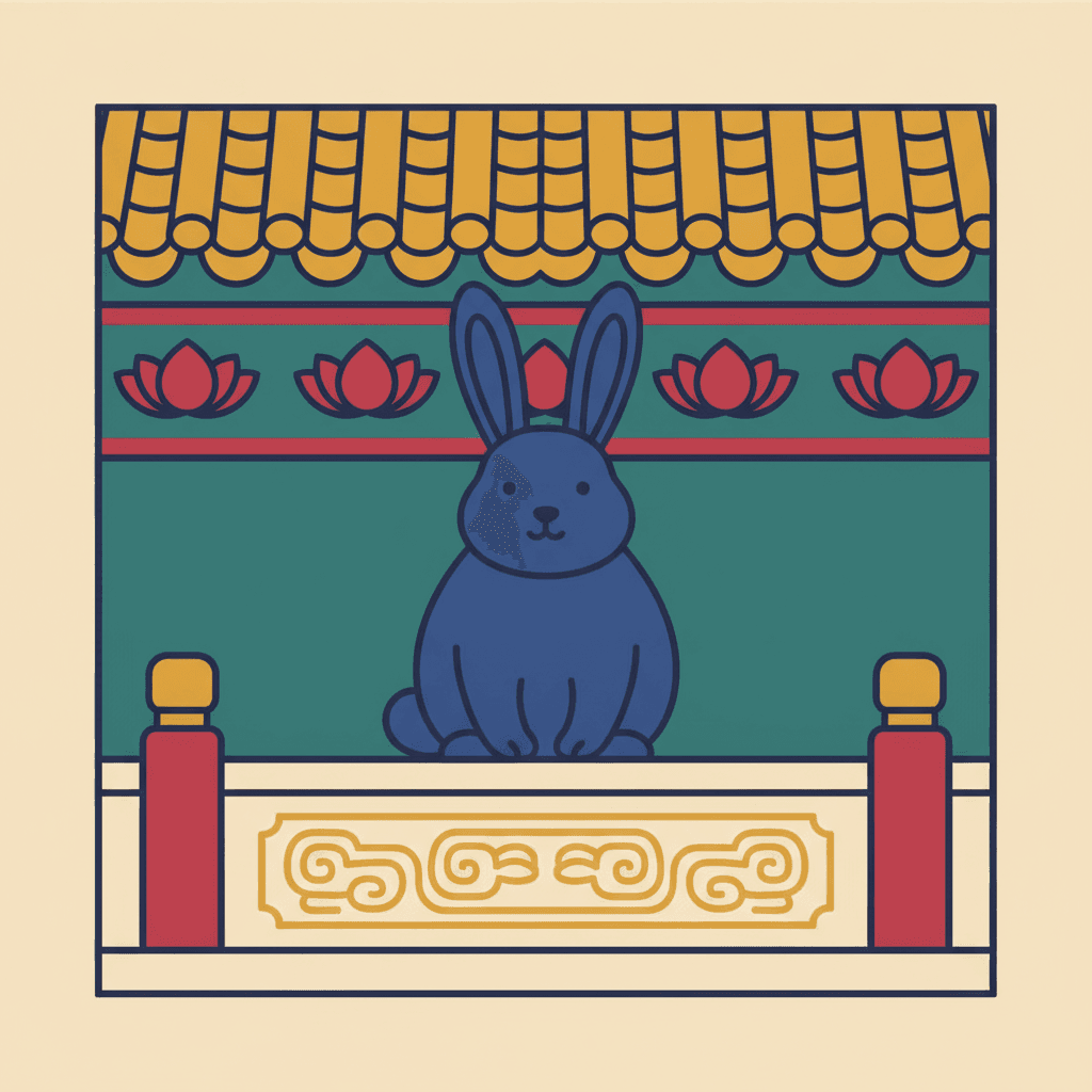
What separates the three is what they put in the space they refuse to leave bare. The animal-town brief fills it with a society — more creatures, more small errands, a crowd of occupations. The dark-fantasy brief fills it with ornament on the figure itself: gorgeously dressed characters, elaborate costume, jewel tones. This brief fills it with architecture. Its own words are a stylized character with ornate architecture and traditional decorative patterns, and the Chinese note kept with it is blunter still — character plus building plus decorative pattern. So the thing that has to be there is not more people and not a better outfit. It is a made place: a gate, a shopfront, a railing, a lattice window, a tiled roof, and the carved and painted pattern that somebody put on all of it.
Crowded and clean at the same time — a combination only one other brief attempts
Here is the demanding part, and it is visible in the arithmetic. Eighteen of the seventy-eight briefs ask for density in some form — dense, ornate, intricate, elaborate, meticulous, filling the frame. Nine of the seventy-eight refuse muddy colour. Only two briefs do both, and the other one is a clear-line city sketch built from flat cheerful colour blocks with no pattern in it at all. So this is the only brief in the library asked to crowd a frame with ornament and forbidden from letting the colours go muddy while doing it. Most dense styles pay for their density in colour: crosshatch goes monochrome, the curio-cabinet ink brief goes sepia, folk decorative goes muted and vintage. This one refuses the trade — saturated crimson, imperial gold, deep teal and royal indigo, all at full strength, all kept apart by a crisp outline.
The figure is the plain thing in a decorated picture
A brief that fills the frame needs a way to keep the person findable, and this one is specific about it. It opens with silhouette-first design, where face shape, head-to-body ratio and hand-foot forms make a distinct visual language, and it refuses generic chibi faces — expression and body language driven by real personality rather than a generic cute default. Its line weight is recorded as crisp defined outlines and its light as flat decorative lighting, which casts nothing anywhere. Put those together and you get the actual mechanism: the ornament goes on the architecture, the character stays comparatively plain, and the eye finds the person because they are the simplest shape in a complicated picture. Reverse it — pattern the costume, bare the wall — and you have a different style entirely.
A Guochao Page Is Defined By One Thing It Will Not Leave Out
Each brief ends with a short list of things to avoid, and that list is usually the fastest way into a style. This one refuses four: photorealism, generic chibi faces, muddy colours and empty backgrounds.
The last one is the unusual refusal. Seventy-eight briefs each naming four things to avoid makes three hundred and twelve refusals in total, and almost all of them are about craft — a technique, a finish, a kind of line. Only three refuse a kind of emptiness at all, which makes this a rule about content: not how to draw a page, but how much has to be on it.
And the two it shares that refusal with fill the space differently. One fills it with a crowd of animals going about their business; one fills it with ornament on the costume of the figure. This is the only brief in the library that fills it with architecture — which is the whole thesis of guochao illustration in a sentence: the decoration is not a texture laid over a picture, it is the surface of a place somebody made.
Write Somewhere That Was Built on Purpose
Here is the practical consequence of a brief that will not leave a background bare, and it is the reason to pick this style rather than a prettier one. Most stories treat setting as a stage direction — outside, at home, in a room — because most styles are happy to supply a vague somewhere and get on with the characters. This one cannot. It is going to draw a specific made place on every single page, whether you chose it or not.
So choose it. And notice what kind of place the brief is asking for: an ornate one. Pattern in this style is not atmosphere or texture — it is evidence. A carved railing, a painted door, a repeating band of tile along a roof is somebody work, and work implies a person who did it, a reason they bothered, and a length of time it has been standing there. Density here is nobody idea of a mood. It is labour, left visible on a surface.
Which changes what you should put in your writing. For most styles the useful note is what the scene feels like. For this one it is what was made here, and by whom — and the test of a page is whether somebody could have built the thing in the background.
From One Sentence to a Place With Pattern On It
You pick the look once. The brief is then applied to every page of the story, so the street you establish on page one is still the same street on page thirty.
Name the place, not just the feeling
A sentence is enough, and a built thing in it goes a long way. Not they argued outside — they argued on the steps of the painted gate. Not she went home — she went back past the shop with the carved railing. The background is getting filled either way, so spend the words there.
Choose Guochao Decorative Character
Picking it fixes the whole brief at once: ornate architecture and dense decorative pattern, silhouette-first characters with real personality rather than a cute default, saturated crimson, imperial gold, deep teal and royal indigo, crisp defined outlines, a flat decorative light, and the four refusals.
Get a book, not one lovely picture
C2Story writes the story, splits it into pages and builds each page to the brief according to what that page says. Your words are set as type rather than lettered into the art — which matters in a style this full. Read it on the web, share it, or buy the PDF to hand to a printer.
This Style and Its Three Nearest Neighbours
Four looks in the library sit close to this one. Here is what each actually asks for, so you can take the right one rather than the first one.
Guochao Decorative Character
The style on this page
A decorative guochao commercial illustration combining a stylized character with ornate architecture and traditional decorative patterns. Its palette is saturated crimson, imperial gold, deep teal and royal indigo. Its design is silhouette-first, so that face shape, head-to-body ratio and hand-and-foot forms form a distinct visual language, with expression and body language driven by real personality rather than a generic cute default. Its ornament is dense, its finish is flat and graphic, its outlines are crisp and defined, and its light is flat decorative lighting that casts nothing. The four things it refuses are photorealism, generic chibi faces, muddy colours and empty backgrounds. It renders whatever ornate scene your story describes.
Folk Decorative Storybook
The only other brief that says the word pattern
The comparison to make first, because these two are the only briefs in the whole library whose text contains the word pattern, and they spend it in opposite directions. That one asks for ornamental botanical motifs — decoration that grows: leaves, stems, flowers, seed heads winding around a quirky crowd of figures — in a vintage muted palette of dusty teal, warm brick red, ochre and faded cream. This one asks for the decoration of made things, in colour at full strength. The deeper difference is what each one pays for its density with. Folk decorative mutes the colour so a filled page stays restful, and it fills the page with people. This one keeps the colour loud and fills the page with building. Take folk decorative for a warm crowded village; take this for a bright crowded place.
New-Guofeng Flat Line
The same tradition, the opposite answer about empty space
Same tradition, and almost a mirror image. The guofeng flat-line brief asks for airy negative space and a great deal of open cream ground, with the tradition arriving as a few large plain forms — one cloud scroll, one roof line, one round gateway — under the phrase traditional motifs modernised. This brief refuses an empty background outright and lays the motifs on densely, as the carved and painted surface of everything in the scene. One of them is the brightest sparse style in the library and the other is the brightest crowded one. They even split the palette: guofeng is a daylight set of yellow-orange, clear blue and leaf green with no gold and no crimson in it, while this one is built on exactly the imperial crimson and gold that guofeng leaves out.
Ornate Dark Fantasy
The sharpest rival — ornament on the person instead of the place
The closest brief in the library, and worth knowing about before you choose. It shares all three of this one unusual traits: it is dense, it is silhouette-first, and it is one of the only three that refuses a bare background. Then it puts the decoration somewhere else. Its subject is gorgeously dressed characters in a beautiful gothic mood with intricate decorative detail and elaborate ornamentation — the ornament is worn, on the costume and the figure — and its palette is dark and jewel-toned, deep burgundy, midnight blue, antique gold and dusky violet, lit with a soft interior light rather than a flat one. This brief ornaments the place and leaves the person comparatively plain. One dresses a character; the other builds them a room.
Guochao Story Ideas That Suit the Brief
Each of these plays to the same strength: a made place that matters to the story, and a character with a reason to be standing in it.
The Shop With the Painted Door
A child who passes the same shopfront every day and finally goes in. A brief that refuses an empty background is at its best when the place is the point, and a door somebody painted is a place with a history already in it.
Grandfather Carved the Railing
The pattern on the bridge is not decoration in this story — it is somebody work, and somebody who is still alive to be asked about it. The decoration in this brief is built rather than grown, which makes a maker a natural character.
We Were Never Allowed Past the Gate
One gateway, drawn many times, and a rule that finally breaks. Ornate architecture gives a story a threshold you can actually see, so going through it reads as an event rather than a sentence.
Every House on Our Street Was a Different Red
A book about a neighbourhood told entirely through its surfaces. Saturated crimson, imperial gold, deep teal and royal indigo with no muddying allowed means a row of buildings can be a cast of characters.
The Courtyard Filled Up With Lanterns
A festival that arrives in a place you already know well. Because the light here is flat and decorative and casts nothing, a crowded bright evening stays completely legible instead of dissolving into glow.
I Was Learning to Paint the Tile Pattern
A quiet apprenticeship story, one repeat at a time. This is the rare style where the ornament itself can be the plot, because the brief treats pattern as something a person puts on a surface on purpose.
What Ornate Architecture and Dense Pattern Actually Look Like
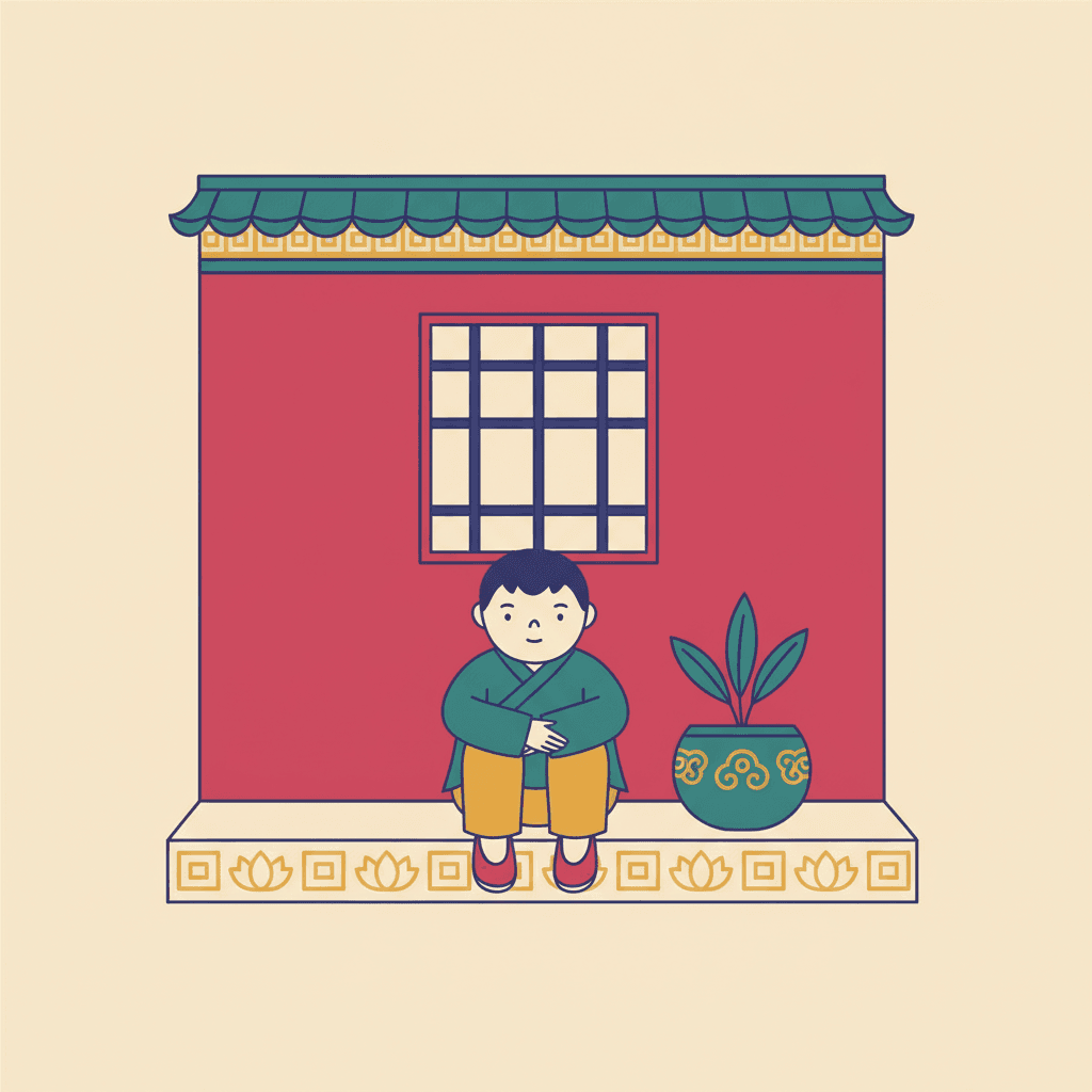
Three images generated to this one brief, with nothing retouched afterwards.
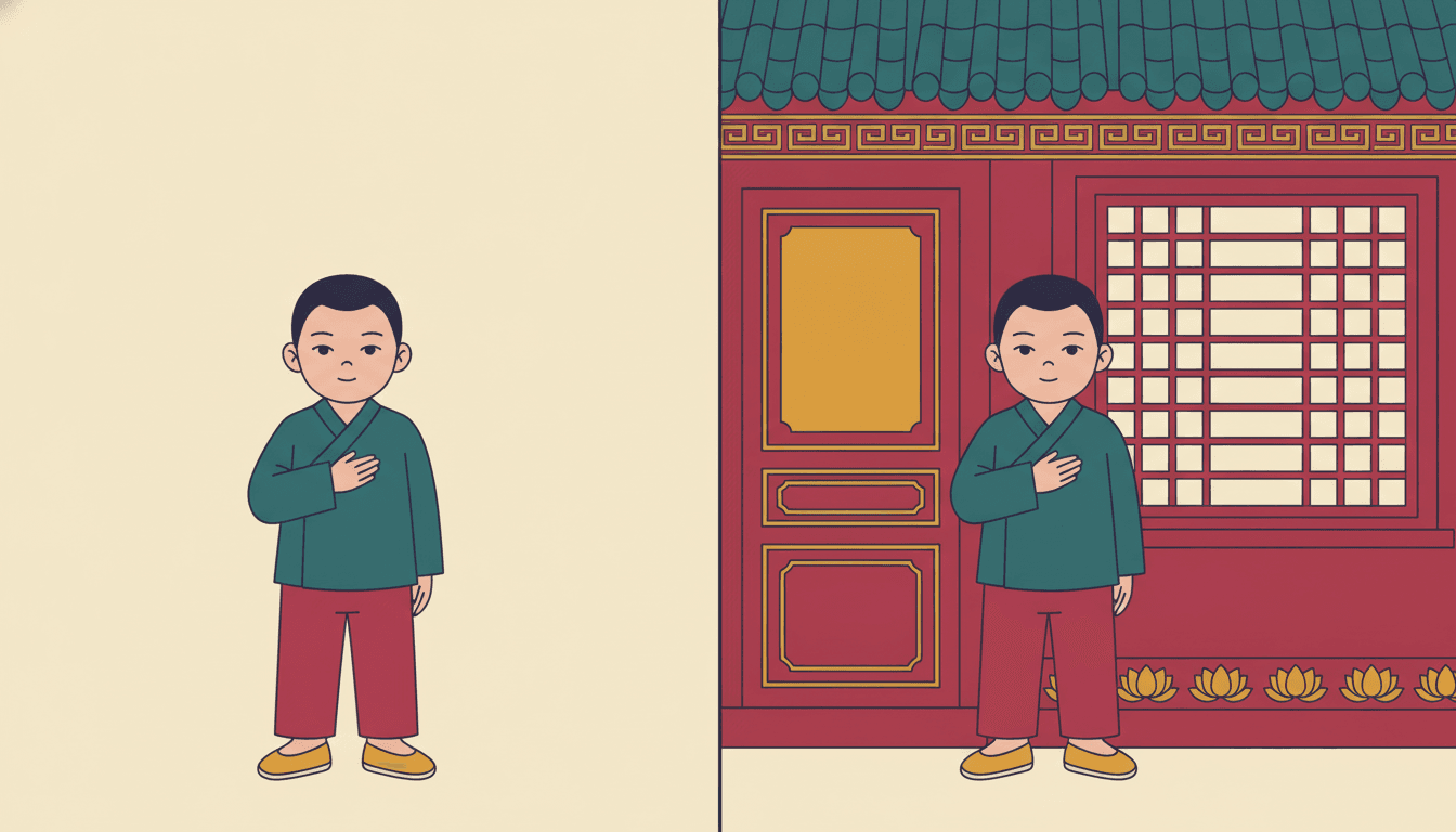
The Same Boy, With and Without a Place
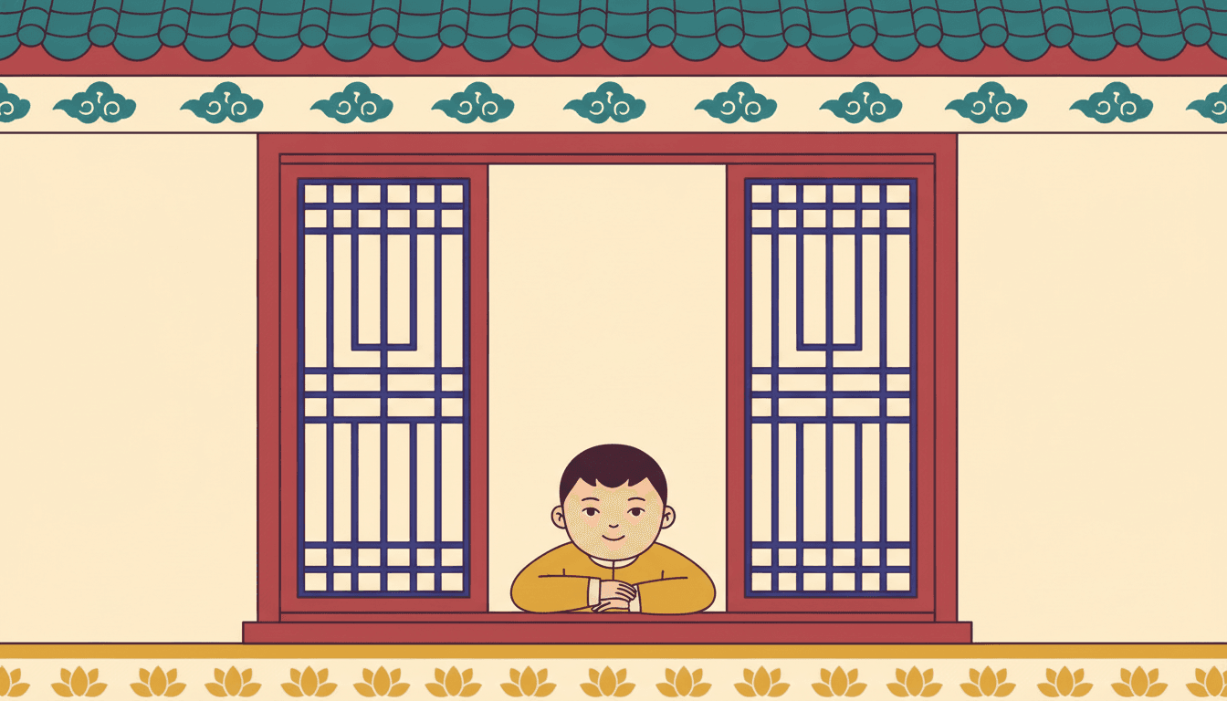
The Window Somebody Set Out By Hand
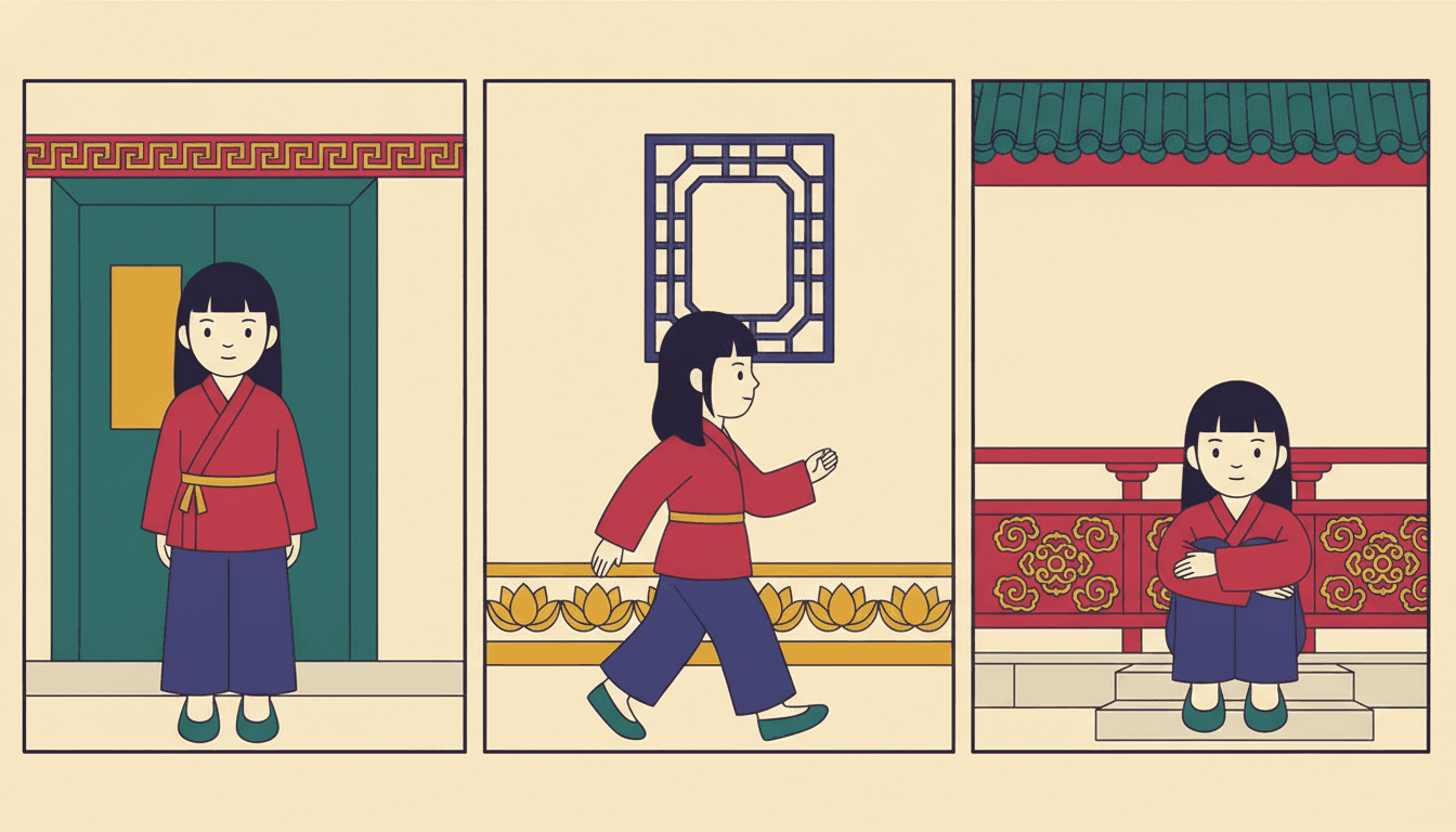
Same Girl, Three Different Places
Five Pages Where the Built Setting Is the Subject
Same brief, same four colours, same crisp outline — and a different made surface doing the work each time.
The Plain Thing in a Decorated Picture
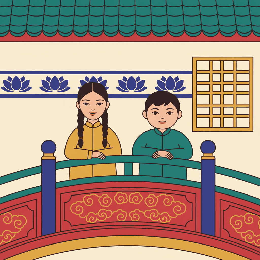
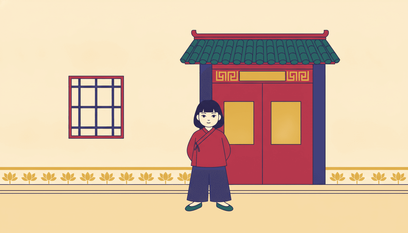
One Girl, One Painted Gate1
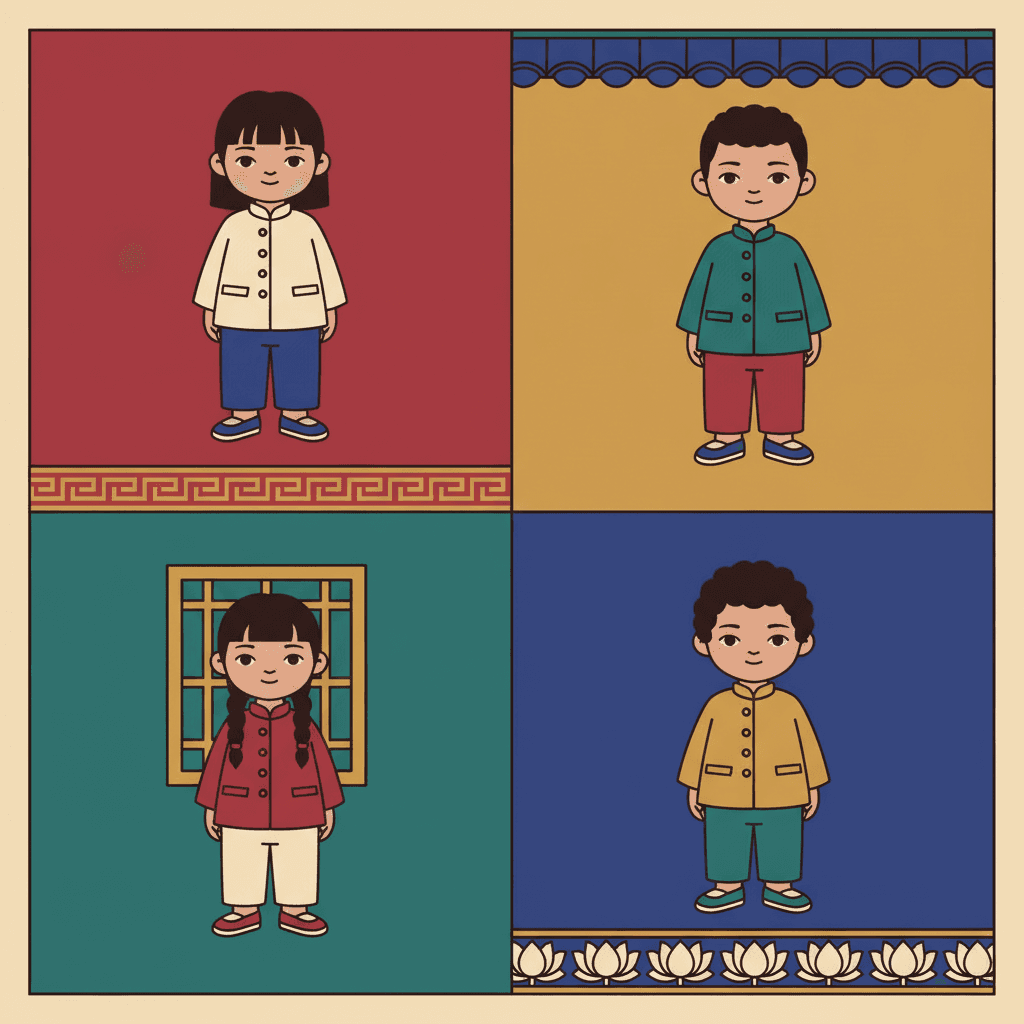
Four Grounds, Four Borders
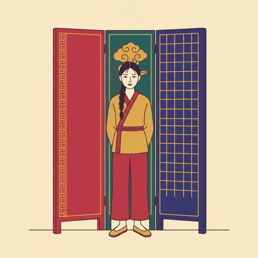
A Screen in Three Panels
One Girl, One Painted Gate0
Making a Whole Guochao Picture Book, Not One Image
The useful things and the honest limits, in the order they are likely to matter to you.
A plain character in a decorated world stays recognisable
Consistency across pages is the first thing that breaks when images are generated one at a time, and this brief has an unusual safeguard built into it. Because the decoration lives on the architecture and the figure is kept comparatively plain, there is far less about a character to drift — no patterned robe to redraw differently on every page, no ornament that has to land in the same place twice. What holds a character here is what the brief calls silhouette-first design: face shape, head-to-body ratio, and hand-and-foot forms. One fixed brief is carried into every page, and you can save each character in the Character Library with up to fourteen reference images so they stay themselves across the whole book. Characters built from an uploaded photo stay private to your account.
Loud colour, and specific about which loud
The palette is written down rather than left to taste: saturated crimson, imperial gold, deep teal and royal indigo, laid as a flat graphic finish with no blending. The refusal of muddy colours is doing real work alongside it, because that is the failure mode of every dense style — put enough pattern in a frame and the colours start averaging each other into brown. Here each colour area is held apart by a crisp defined outline instead, so the picture can be completely full and still read. Two honest notes. The golds and crimsons are flat paint rather than metal, so you will not get gilding, sheen or gold leaf. And there is no global greyscale switch in C2Story, so if you want a monochrome book, pick a style that is monochrome by design rather than this one with the colour removed.
What you are giving up, said plainly
You are giving up the empty page, and everything an empty page can do. There is no quiet spread in this style, no held breath, no single small figure alone in a lot of space — the brief refuses exactly that, and asking for it will fight the look rather than bend it. You are also giving up atmosphere of the weather-and-time-of-day kind: the light is recorded as flat decorative lighting, which means no sun direction, no cast shadow, no dusk, no gloom and no mood arriving through the air. And because the finish is flat and graphic, there is no texture and no modelled depth anywhere. If your story turns on loneliness or on one quiet moment in a bare room, the minimalist and fine-line briefs are built for it and this one is not.
Why a full page is not a busy mess
The reasonable worry about a style like this is that every spread turns into wallpaper with a person lost somewhere in it. Three lines in the brief are there to stop that. The ornament is attached to things — it is the pattern of an architecture and of made objects, following their edges, rather than a decorative fill laid over the image. The outlines are crisp and defined, so every shape has a hard boundary and nothing bleeds into its neighbour. And the design is silhouette-first, which puts the clearest, simplest form in the picture around the character. The result is closer to a decorated room than to a patterned surface: crowded, but crowded with separate identifiable things, which is a thing a child can actually search through.
A whole book, not one admired single image
An ornate character against a patterned gate is exactly the kind of image that looks finished on its own, which tells you nothing about whether it can carry forty pages. You are not prompting for one picture. Describe the story and C2Story writes it, splits it into pages and builds each page to this brief according to what that page actually says, so the place you establish on page one is still the same place on page thirty. You get picture-book pages with your words set as type rather than lettered into the art, which matters more than usual here — a style this full is not one you want to also crowd with hand-lettering. Write in English, Chinese, Japanese, Spanish, French and more. When you want it on paper, the paid PDF download is the handoff to your printer, and everything you make is licensed for commercial use.
Honest about the age this one suits
This brief suits slightly older readers than most bright flat styles, and the reason is the density. A page with a great deal in it rewards being searched, which is a pleasure that arrives around four and keeps growing — children who like finding things in a picture will stay on one of these spreads far longer than on a sparse one. It works comfortably from about four to around ten. Below four the full frame is genuinely a drawback, because a very young child reads one big nameable shape on a clear ground and this style will not give them that. For toddlers, the flat-line guofeng brief or a plain cartoon style is the better pick, and for older readers the limit is not the density but the light — nothing here can be dark, tense or atmospheric.
A note on where this one sits in the wider map. For the other brief out of the same revival — bright, sparse, built from circles and arcs on open cream — see guofeng picture books, and for the quiet brush-drawn modern take on the same tradition, new Chinese minimal picture books. For decoration that grows rather than being built — botanical motifs in a muted vintage palette, around a crowd — see folk decorative picture books, and for dense ornament bought with ink instead of colour, botanical ink picture books and crosshatch picture books. For the clear even outline and flat colour without the pattern, ligne claire picture books. And if what you actually want is the empty page — one small figure with a great deal of room around them — that is minimalist picture books or fine line picture books, and it is the one thing this brief refuses outright.
Questions About Guochao Picture Books
Explore More Story Ideas
Discover more styles, tools, and story types

Space Stories
Blast off to distant galaxies
Explore
New Chinese Minimal Picture Books
A calligraphic stroke & a face left as paper
Explore
Children's Book Creator
Design beautiful kids books
Explore
Storybee Alternative
More styles & features
ExploreGuochao Picture Books — Ornate Architecture, Dense Pattern and Colour That Never Muddies
A guochao picture book is built on one unusual instruction. C2Story runs seventy-eight hand-drawn style briefs, each a short written record of a palette, a light, a line weight and four things to avoid — three hundred and twelve refusals in total across the library. Almost every one of them refuses a craft decision: photorealism, heavy shading, stiff vector lines, a glossy render, a muddy colour. Only three refuse a kind of emptiness, and this is one of the three. Its list ends with empty backgrounds, which makes it a rule about content rather than about technique — not how a page should be drawn, but how much has to be in it. A page of guochao illustration cannot be one figure standing on a clean ground. Something always has to be behind them.
What separates it from the other two is what it puts there. The busy animal-town brief fills the space with a society: more creatures, more small errands, a crowd of occupations. The ornate dark-fantasy brief fills it with decoration on the figure itself — gorgeously dressed characters, elaborate ornamentation, a dark jewel-toned palette. This brief fills it with building. Its own words are a stylized character with ornate architecture and traditional decorative patterns, and the Chinese note kept alongside it is blunter: character plus building plus decorative pattern. So the ornament in chinese trend art of this kind is not worn and not grown. It is carved and painted onto made things — the repeating tile along a roof, the key-fret border on a beam, the cloud-scroll on a railing, the lattice of a window, the band of lotus around the foot of a wall. The word pattern itself appears in only one other brief in the entire library, the folk decorative one, where the motifs are botanical and the palette is deliberately muted.
That contrast points at the hardest thing this brief asks for. Eighteen of the seventy-eight briefs want density in some form — dense, ornate, intricate, elaborate, meticulous, filling the frame. Nine refuse muddy colour. Only two do both, and the other is a clear-line city sketch made of flat cheerful colour blocks with no ornament in it at all. Which leaves this as the only brief in the library asked to crowd a frame with pattern while being forbidden to let the colours go muddy. Most dense styles pay for their density in colour and go monochrome, sepia or muted; a decorative chinese character page refuses the trade and keeps saturated crimson, imperial gold, deep teal and royal indigo at full strength. Three things make that survivable: the ornament is attached to objects and follows their edges rather than being a fill laid over the image, the outlines are crisp and defined so no colour area bleeds into its neighbour, and the design is silhouette-first, which keeps the character the simplest shape in a complicated picture. The brief also refuses generic chibi faces outright, asking for expression and body language driven by real personality rather than a cute default.
The practical payoff is a change in what you write. Most stories treat setting as a stage direction — outside, at home, in a room — because most styles will happily supply a vague somewhere. This one will not: it is going to draw a specific made place on every page whether you chose it or not, so you may as well choose. And pattern here is evidence rather than atmosphere. A carved railing or a painted door is somebody work, which implies a person who did it and a length of time it has been standing, so a book in this style can be about a made thing or about the person who made it. The honest limits are the mirror of that strength. There is no quiet bare spread, no held breath, no single figure alone in a lot of space — the brief refuses exactly that. The light is flat decorative lighting, so there is no sun direction, no cast shadow and no mood arriving through the air. And the finish is flat and graphic, so there is no texture and no modelled depth. It suits roughly four to ten, since a full page rewards searching. Describe your story in a sentence and C2Story writes it, splits it into pages and builds every page to the same brief, holding each character steady with up to fourteen reference images — in English, Chinese, Japanese, Spanish, French and more, with the paid PDF download as the handoff to your printer and everything you make licensed for commercial use.