
Marker Cartoon Picture BooksLopsided on Purpose, Readable at Once
Three of the seventy-eight style briefs in this library ask for characters drawn out of proportion on purpose. Marker cartoon picture books come from the only one that draws them with a fat, sure line in clean primary colour — so the one big ear is not a mistake, it is how you know who it is.
- Very thick black marker outlines, flat bright fills
- Lopsided characters you can spot from across a room
- Primary red, bright blue and sunny yellow
- Free credits by request, no card
50,000+
Stories Created
10,000+
Active Creators
50+
Art Styles
4.9/5
User Rating
What Makes the Marker Cartoon Style Different From Any Kid’s Doodle
Every style here is a written brief: a palette, a light, a line weight and a short list of refusals. Four things in this one decide the look, and two of them appear in no other brief.
Wrong on purpose, with a sure hand
Every style in C2Story runs on a short written brief: a palette, a lighting note, a line weight and a few things to avoid. Three of the seventy-eight ask for proportions that are wrong on purpose. Two of them get there with an unsteady hand — wobbly ink, shaky uneven lines. This is the only one of the three whose line weight is very thick, bold and sure. The proportions are lopsided; the line that draws them is not. The oddness lives in the shape, not in the hand.
The only brief that names a size
A few briefs ask for clear, readable poses. This is the only one that says how small the picture may get and still work: strong instant readability even at tiny size. No other brief in the library mentions the size a picture is seen at. Everything else in it follows from that one sentence — the fat outline, the few big shapes, the flat fills — because those are the things that survive being shrunk.
Four refusals, all things that vanish when small
The brief refuses fine detail, thin lines, gradients and photorealism. Read them together and they are one refusal: each is something that disappears or turns to mush when a picture shrinks. A thin line breaks up, a gradient becomes a smudge, fine detail becomes noise. Notice what is not on the list. It does not refuse correct anatomy, which both of the other wrong-proportion briefs do, and it does not refuse cute, which heta-uma does.
The three primaries, by name
The palette is flat bright fills in primary red, bright blue and sunny yellow — and no other brief in the library names primary red or sunny yellow. The other two wrong-proportion briefs go the opposite direction: one asks for earthy brown and muddy red, the other for muddy mustard, faded red and dull blue. Same idea about shape, opposite idea about colour. The light is flat and plain, so nothing casts a shadow.
The Same Dog, Straightened and Not
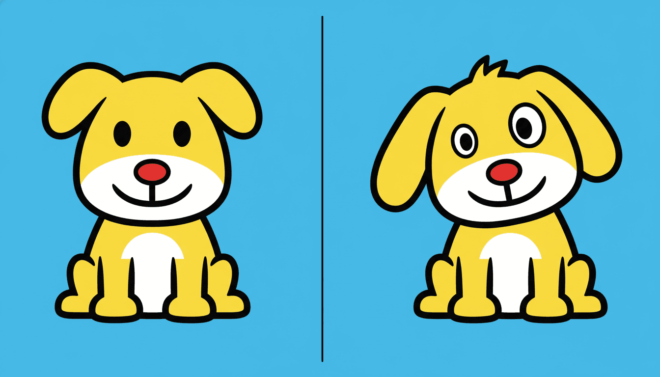
Look at the same dog twice, drawn with the same fat outline, the same yellow, the same red nose and the same smile. On the left it has been straightened: two matching ears, two matching eyes, head dead centre. It is neat, and it looks like a mascot you have already seen on a hundred packets.
On the right nothing has changed except the proportions. A tuft sticks up on top, one eye is bigger than the other, and the ears hang at different angles. The difference is small — the image model tends to bend a character gently rather than wildly — and it is still enough to turn a dog into one particular dog.
That is what the lopsidedness is for. It is not a joke about bad drawing; the line is as sure on the right as on the left. In marker illustration the odd proportion is the name tag, and the four things the brief refuses are the four things that would blur it.
Write the Thing a Child Would Draw First
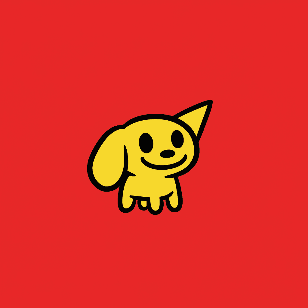
The brief’s most unusual sentence is about size: strong instant readability even at tiny size. Shrink this page to a postage stamp, a board-book corner or a phone held at arm’s length and the dog beside this paragraph is still a dog — and still that dog, because of the one floppy ear and the one stiff pointed ear. There is no fine detail to lose, so nothing is lost.
For a writer that changes what is worth putting on the page. Do not describe a character with a list — brown eyes, freckles, a stripy jumper, a little scar. At this size, in this line, most of that list will vanish. Describe the one thing you would see from across a room: the huge ear, the tall bunch of red hair, the hat that is too big.
A good test is to ask what a five-year-old would draw first if they drew your character from memory. That is the feature a marker cartoon keeps, and it is the one worth writing into your character notes so it comes back the same on every page.
From One Sentence to a Marker Cartoon Picture Book
You pick the look once. The brief is then applied to every page, so the outline, the primaries and each character’s odd feature never drift.
Describe the cast and their one odd thing
Write a sentence or two about who the story is about, and give each character one feature that is too big, too small or tilted. That feature is how readers will find them on every page.
Choose Primitive Marker Cartoon
Pick the style from the Styles Library. From then on every page uses the same very thick marker line, the same flat bright fills and the same flat plain light, and your saved characters keep their shapes.
Get a whole book
C2Story writes the story, splits it into pages and illustrates each one. Regenerate any page you want to change without touching the rest, read it online, share it, or buy the PDF download to hand to a printer.
This Style and Its Three Nearest Neighbours
One shares its wrong-on-purpose proportions, one shares the marker and one shares the thick outline. Here is what each actually asks for.
Primitive Marker Cartoon
The style on this page
A bold primitive marker cartoon: thick chunky black outlines, simple big graphic shapes, intentionally lopsided proportions, flat bright fill and strong instant readability even at tiny size. It renders the full scene as simple bold marker shapes. The palette is flat bright fills in primary red, bright blue and sunny yellow; the light is flat and plain; the line is very thick and bold. The refusals are fine detail, thin lines, gradients and photorealism.
Heta-Uma Bad-Good
Also wrong on purpose — the hand is in on it
The nearest relative in intent. It also asks for wobbly proportions, but it draws them with shaky, uneven, awkward lines, a muddy mustard and faded palette and a quirky adult sensibility, and it refuses cute polish outright. Its charm is that the drawing looks as if it could not do any better. The marker cartoon plainly could: the line is sure, the colour is clean, and the lopsided ear is a decision. Choose heta-uma for a wry grown-up joke; choose this for a five-year-old.
Raw Graffiti Symbolism
The only other marker brief
The only other brief built on a marker, pointed at the opposite result. Graffiti wants crude primal marker strokes, crowns, cryptic symbols, scrawled fragments of text and explosive restless energy. Its marks are made fast to announce something. The marker cartoon wants one shape you can read from across a room. Same instrument; one is a shout on a wall, the other is a picture a toddler can name.
Bold Flat Satire
Same thick outline, a different audience
Bold flat also uses thick heavy black contours, flat colour blocks and big simple shapes, so the two can look alike at a glance. The difference is who they are for and what they bend. Bold flat keeps its proportions and bends the expression — deadpan, awkward, suddenly exaggerated — for modern adult life, and it refuses uniform cute smiles. The marker cartoon bends the body, keeps the smile, and is aimed at the youngest readers.
Marker Illustration Story Ideas That Suit the Brief
Each idea plays to the same strength: a small cast, big shapes, and one feature per character that a small child can point at.
The Dog With One Big Ear
A dog whose one huge ear is always flopping into things — the soup, the bath, a neighbour’s hat — until the day it hears something nobody else can. The lopsided feature is the plot, and the reader spots it on every page.
Red Bus, Blue Bus
A first book of colours and vehicles: one big bus per page, one primary colour per bus. The palette of the brief is the lesson, and every shape is big enough for a finger to land on.
Who Is Hiding?
A lift-the-flap style guessing game told in pages: a lopsided ear behind a sofa, a tilted hat behind a tree. Characters drawn this way can be recognised from one piece of them, so the game actually works.
Bear’s Big Birthday
A birthday countdown with a cake that gets one more candle per page. Thick candles and flat yellow flames stay readable even in a small board-book size.
Two in a Boat
Two friends, one boat, one oar, and a very flat blue sea. A story about taking turns that needs almost nothing in the picture except the two of them and where they are pointing.
The Sleepy Cat
Everyone in the house is busy except the cat on the red chair. One room, the same chair on every page, and a cat who is recognisable at once by its two unequal ears.
What Thick Marker Cartoon Pages Look Like Across a Book
Pages generated to this one brief, with nothing retouched afterwards.
Straightened, and not
Up and down
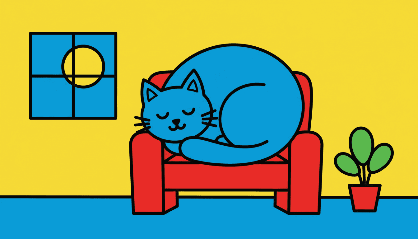
The cat on the red chair
A Small Cast, Each With One Odd Thing
With nothing fine inside the shapes, characters are known by their outline and their one feature out of proportion.
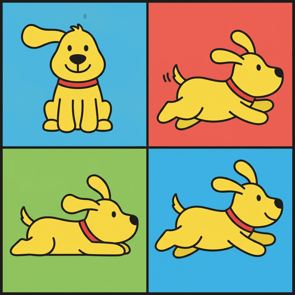
One dog, four panels
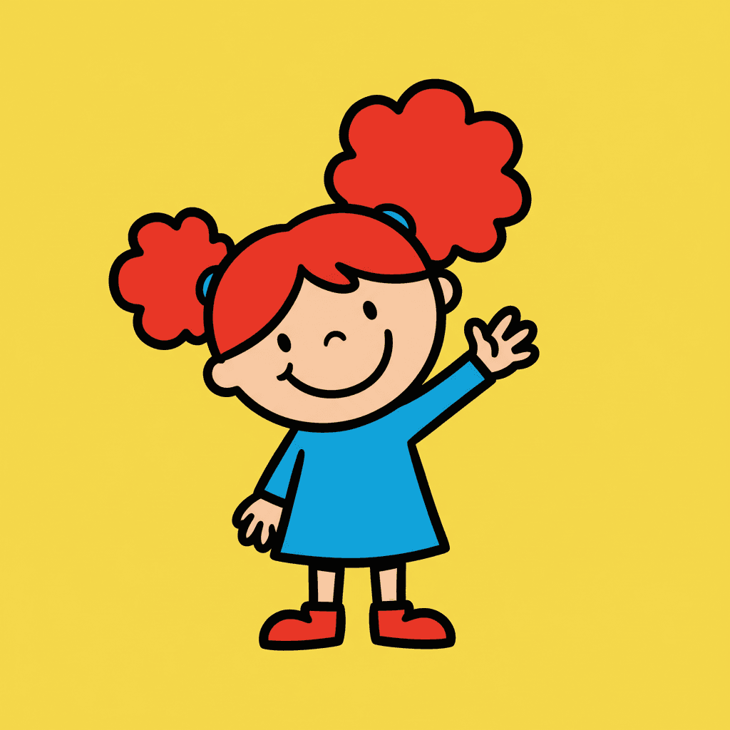
One bunch bigger than the other
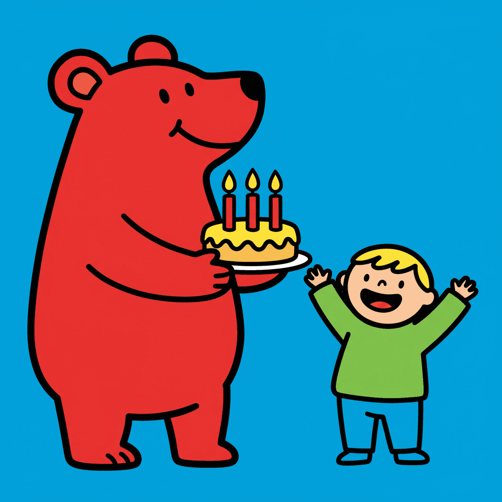
A bear with a cake
Still readable small

Two in a boat
Making Whole Marker Cartoon Picture Books
What is useful in a book drawn this way and where the limits are, in the order you are likely to meet them.
The same lopsidedness on every page
In this style the wonky part is the character’s identity, so it has to be the same wonky part every time — the left ear huge, not whichever ear the page felt like. C2Story carries one fixed brief into every page and you can save each character in the Character Library with up to fourteen reference images. Write the lopsided feature into the character notes in plain words. Characters built from an uploaded photo stay private to your account.
One odd feature per character
Give each recurring character exactly one thing that is out of proportion and nobody else shares: one big ear, one tall bunch of hair, one short leg, a tilted head. Two characters with the same oddness read as one character twice, and a character with five oddities reads as a scribble.
Small casts, big shapes
The brief wants simple big graphic shapes, which means each thing on the page gets a lot of the page. One to three characters and a few props suit it. A classroom of thirty children shrinks every one of them back down to the size the style was built to survive, and the picture stops being instant.
No dark, no dusk, no mood lighting
The light is flat and plain and gradients are refused, so there is no lamp glow, no long shadow and no night sky fading to black. Bedtime still works — closed eyes, a moon drawn as a shape — but a spooky or tense story will lose most of its atmosphere here.
Lopsided, not broken — check the page
The brief asks for proportions that are off on purpose, and the image model sometimes reads that more gently than you wanted, or less. Most pages land in between. If one character comes back too tidy, or a paw goes missing, regenerate that page; the rest of the book is untouched.
Readable at any size you print
Describe the story in a sentence and C2Story writes it, splits it into pages and draws every page to the same brief, in English, Chinese, Japanese, Spanish, French and more. Because nothing in the picture depends on fine detail, the same pages hold up on a phone, on a small board book and on a big page. The paid PDF download is the handoff to your printer.
For the same thick outline aimed at grown-up comedy, see bold flat picture books. For the other marker brief, rough and loud, graffiti picture books; for proportions bent by a raw, untrained hand, art brut picture books; and for a waxy hand-made line that children recognise as their own, crayon picture books.
Questions About Marker Cartoon Picture Books
Explore More Story Ideas
Discover more styles, tools, and story types
Mermaid Stories
Magical underwater kingdoms
Explore
Showa Retro Picture Books
Plump characters & flat bright printed colour
Explore
AI Story Generator
Generate complete stories with AI
Explore
Storybird Alternative
Better AI story creation
ExploreMarker Cartoon Picture Books: Thick Lines, Primary Colour, One Odd Feature
Marker cartoon picture books rest on a pairing no other brief in the library makes: proportions that are wrong on purpose, drawn with a line that is completely sure of itself. C2Story runs seventy-eight hand-drawn style briefs, each a short written record of a palette, a light, a line weight and a few refusals. Three ask for bent proportions. The Primitive Marker Cartoon brief is the only one of the three whose line is very thick and bold rather than wobbly or shaky, and the only one in primary colour.
It is also the only brief that names the size a picture is seen at — strong instant readability even at tiny size — and its four refusals, fine detail, thin lines, gradients and photorealism, are the four things that vanish first when a picture shrinks. A page of marker illustration is a few big shapes, a fat black outline and flat fills of primary red, bright blue and sunny yellow under flat plain light.
Because the oddness is in the shape, a lopsided cartoon character here is easier to recognise than a tidy one: one huge ear, one tall bunch of hair, a tilted head. That makes the style a natural fit for toddler books, first books of colours and vehicles, guessing games and birthday countdowns. It is a poor fit for night scenes, crowds and stories that need atmosphere or fine texture.
The choice between neighbours is clear. Take heta-uma for a wry adult joke told in a shaky line, graffiti for loud rough marks, and bold flat for grown-up comedy in thick outline. Take the thick marker cartoon style when the reader is very young and every character needs to be found at a glance. Describe the story in a sentence and C2Story writes it, splits it into pages and draws every page to the same brief, keeping your characters on model, with the paid PDF download as the handoff to your printer.