
Belle Époque Poster Picture BooksA Picture With No Inside
Six of the seventy-eight style briefs here mention depth. Five ask for it. A belle époque poster picture book is built from the one that refuses it — so every page is flat colour, an elegant simplified outline, and nothing to hide behind.
- Flat decorative colour blocks — no shading, no gradient, no cast shadow
- One elegant simplified outline carrying every figure
- Muted olive, warm cream, dusty rose and deep teal — a faded poster palette
- Free credits by request — no card
50,000+
Stories Created
10,000+
Active Creators
50+
Art Styles
4.9/5
User Rating
What Makes the Belle Époque Poster Style Different From Simply Flat
Plenty of styles here flatten the picture. This is the only one that says so in its own refusals — and the only one that expects elegance to come out of flatness rather than survive it.
Six of the seventy-eight briefs mention depth. Five ask for it. This one refuses it
Every style in C2Story is driven by a short written brief, and the word depth appears in six of them. Five want it — layered near-and-far depth, subtle depth, soft painterly depth, atmospheric depth. One lists it among the things to avoid, and that one is this style: avoid photorealistic shading, 3D depth, gritty texture, fussy realism. It is the only brief in the whole library that refuses the third dimension by name, and once you notice it the rest of the look explains itself. No vanishing point, no receding street, no haze in the distance, no cast shadow, no highlight. The picture has no inside to walk into. It is shapes laid beside shapes, like coloured paper cut out and put down.
Thirteen briefs ask for elegance. Only this one asks for it without fine detail
Elegant is not a rare word here — thirteen of the seventy-eight use it. What is rare is how this style expects to get it. Everywhere else elegance arrives through refinement of the mark: hairline pen strokes, crisp hatching, fluid iron-wire outlines, soft airbrushed blending, mineral pigment washes. This brief has none of that. Its instrument is recorded as elegant simplified outlines, its fill as flat decorative colour blocks, and its fourth refusal is fussy realism. So the elegance has nowhere to live except in the shape of the contour and the choice of colour. That is a genuinely different discipline, and it is why a picture in this style looks expensive while containing almost nothing.
Four styles here descend from posters. This is the only flat one, and the only quiet one
The library holds four briefs that trace themselves back to printed posters, and they disagree completely about surface. The Shanghai Calendar Poster style is soft airbrushed rendering with smoothly blended skin. Gongbi Vintage Fantasy works in mineral pigment washes. Showa Commercial Cartoon is bright retro advertising with halftone warmth — and it lists muted colors among the things to avoid. This one is the only poster style that is genuinely flat, and the only one built from a palette recorded as a vintage poster palette: muted olive, warm cream, dusty rose and deep teal, every one of them low in saturation. Poster composition, without poster volume.
It is one of the few briefs with an opinion about where your story happens
Most style briefs describe only how to draw. This one also says what to draw: turn-of-the-century urban life mood, and render the full stylish city scene the story describes. That exact phrase about the turn of the century appears nowhere else in the library, and stylish appears in only four briefs. It means the style arrives already pointed at a particular kind of page — people out in public, on a street, in a square, on a terrace, dressed for being seen. A story set entirely in one bedroom is fighting it. A story that goes outside is being handed half its pictures.
Why the Belle Époque Poster Style Refuses Depth
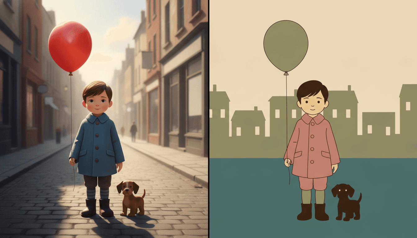
The same boy twice, with the same dog and the same balloon. On the left he is drawn the way most illustration draws a child: the street runs away behind him to a vanishing point, the buildings shrink and fade into haze, the sun comes from one side, his coat has gradient shading and creased folds, his hair is in strands, his balloon has a glossy highlight and his shadow stretches across the paving. Nothing is wrong with it. There is a world behind him.
On the right the same boy stands on two bands of flat colour in front of a row of houses all drawn at the same size. No vanishing point, no haze, no sun, no shadow, no shine on the balloon. His coat is one block of dusty rose described by a single even contour. That is the whole trade, and it is stated in the brief as a refusal: photorealistic shading, 3D depth, gritty texture, fussy realism. Nothing in this style can be made beautiful by rendering it, because there is no rendering. It has to be beautiful as a shape.
So nothing can be far away. No distant horizon, no long street, no character glimpsed at the end of a road. If the drama of a page depends on distance, this style cannot stage it.
And nothing can be lit. The lighting is recorded as flat decorative poster light: no sun, no lamp, no dusk, no shadow. Mood has to come from colour and from how much empty field you leave.
Its four refusals, in the order the brief states them:
Write Arrangements, Not Views
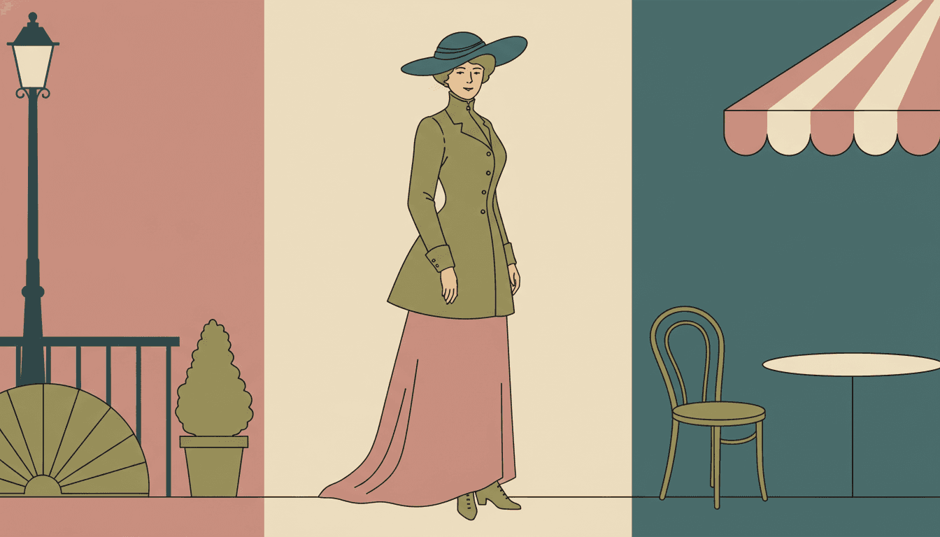
Here is a test to run on a scene before you write it. Could you cut this picture out of coloured paper and lay the pieces down flat? A woman, a railing, a potted shrub, an awning, a chair, a table — those are all shapes, and the style will make them elegant. A long boulevard stretching into evening, a face half in shadow, the glint on a window: those are not shapes, they are effects of depth and light, and this is the one brief in the library that refuses both.
So the sentences that serve this style well are inventories rather than vistas. “She stood at the end of the avenue and looked into the distance” gives it nothing it can draw. “She stood between the flower barrow and the lamp post while the tram went past” gives it four flat shapes to arrange and one long elegant contour to carry the figure. The picture above is doing exactly that: a woman, three objects on the left, three objects on the right, and a single unbroken line running from her hat brim to her hem.
Dress your cast deliberately. With no shading and no fine detail, a character is their silhouette — a wide hat, a long coat, an enormous bow. Decide those once and readers will know everyone on sight.
Send the story outside. The brief asks for turn-of-the-century urban life. Streets, squares, terraces, parks and shopfronts are what it is already pointed at.
Worth seeing side by side before you commit: the mid-century modern style, which shares the flat fills but adds printed halftone texture, the bold flat style, which keeps the flatness and raises the volume, and the ligne claire style, which draws the same kind of town but wants all the depth and detail this one leaves out.
Create a Belle Époque Poster Picture Book in 3 Steps
From a one-line idea to a finished book where every page carries the same flat colour, the same elegant contour and the same cast, in under two minutes.
Describe the story
A sentence is enough, but put a place and a few objects in it rather than a distance or a time of day. This style has no depth and no light, and it has a whole city it already knows how to draw, so naming what is in the scene changes the result more than anything else you could write.
"A girl who walks the whole avenue to find her grandmother a hat"
Pick Belle-Époque Poster Flat
Choose it for flat decorative colour, an elegant simplified outline and a faded vintage palette. Choose Mid-Century Modern instead if you want printed halftone texture, Bold Flat Satire for a heavier contour and a louder voice, or Shanghai Calendar Poster for soft airbrushed period portraits.
Muted olive, warm cream, dusty rose, deep teal
Generate and export
C2Story writes the story, breaks it into pages and builds every one to the same brief. Read it on screen, share the link, or export the PDF and take that file to whichever printer or print service you already use.
Whole book built, PDF export, instant sharing
Flat Poster Illustration and Its Nearest Neighbours
Four real styles built from flat colour and a carrying outline, sorted by the question that actually separates them: what is the flatness for?
Belle-Époque Poster Flat
Flat belle-époque poster illustration: elegant simplified figure outlines, flat decorative colour blocks, a turn-of-the-century urban life mood and a graphic poster composition, rendering the whole stylish city scene in clean flattened shapes. Its palette is a vintage poster palette of muted olive, warm cream, dusty rose and deep teal under flat decorative poster light, and its four refusals are photorealistic shading, 3D depth, gritty texture and fussy realism. One of ten styles in the graphic category, and the only brief anywhere in the library that names depth as a thing to avoid.
Mid-Century Modern
Flat colour blocks, mustard and teal, geometric construction and 1950s halftone print texture. The closest built neighbour and the one most worth weighing, because the two share both flat fills and a refusal of fussy realism. The split is texture and subject. Mid-century wants the grain of the printing press on the page and thinks in geometry; this style wants a perfectly clean flat field and thinks in figures and clothes. One is a printed object, the other is a drawn contour.
Bold Flat Satire
Thick heavy black contours, flat colour blocks, strong silhouettes and punchy accent hues, built for comic timing. Both styles flatten everything and both carry the picture on an outline, so the question between them is loudness. Bold flat is a raised voice: heavy contour, forceful shapes, few but emphatic features. Belle-époque poster is an even, elegant line and a faded palette. Choose bold flat for a joke that has to land hard, and this one for a scene that should look composed.
Ligne Claire City Sketch
A clear-line European city sketch with precise uniform ink lines, bright cheerful flat colour and meticulous old-world street architecture from an elevated panoramic viewpoint. The other city style in the library, and almost a controlled experiment against this one: both draw towns, both fill with flat colour. Ligne claire wants an inventory seen from above, with depth, cobbles and every building drawn through. This one flattens the same town into a row of silhouettes and leaves the detail out on purpose.
Two further relatives are worth knowing about if the period is what drew you here. The folk decorative style is the ornamental one, with pattern filling the page the way art nouveau borders do, and the minimalist style takes the same flatness much further towards empty space. Browse everything on the illustration styles hub.
Vintage Poster Story Ideas to Get You Started
This look is far better at streets, crowds, clothes and arrangement than it is at distance, weather or a quiet dark room. These six lean into that.
The Longest Street in the World
A child walks from one end of an avenue to the other, one shopfront per spread. The style builds a street as a row of flat silhouettes side by side, so a book that simply moves along a row is working exactly the way the pictures want to be built.
Create this storyGrandmother Needs a Hat
Four shops, four wrong hats, one right one. In a style with no shading and no detail, a hat is pure silhouette — so a story whose whole plot is the outline of a thing gets to be funny in the drawing rather than in the caption.
Create this storyThe Day the Tram Stopped
A tram halts in the middle of the square and the whole neighbourhood comes out. Vehicles in this style are drawn completely side-on as simple flat shapes, and a crowd is an arrangement rather than a perspective — both of which play to its strengths.
Create this storyThe Flower Stall on the Corner
A book about a place rather than a person: the same corner across a year, with the barrow restocked each spread. The muted palette and the flat fields make small changes legible, because nothing else in the picture is competing for attention.
Create this storyEveryone Came to the Park on Sunday
One big public afternoon, with every spread a little fuller than the last. A flat style stacks figures sideways rather than into the distance, so a growing crowd becomes a widening row — a simple visual promise a young reader can follow.
Create this storyMy Great-Grandmother Was Eight Once
A family story that reaches back a hundred years. This is the one style in the library whose brief names a historical moment, so the period does not have to be described in every sentence — the illustration is already there.
Create this storyAI-Generated Belle Époque Poster Illustration Examples
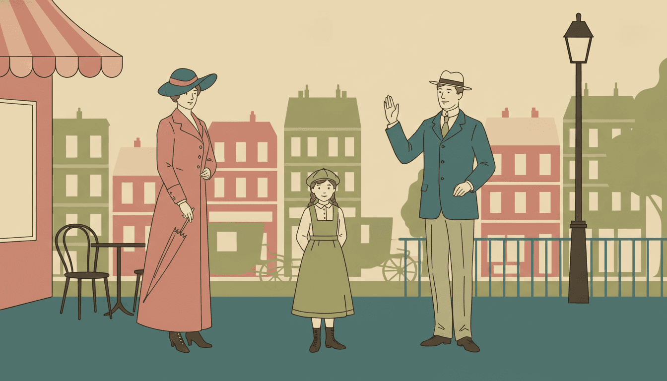
Look at the middle one and try to find a shadow. There is no light source anywhere in it, and it still reads as a bright afternoon — which is the whole argument for a style that builds its mood out of colour instead.
Flat Poster Illustration for Every Part of Your Story
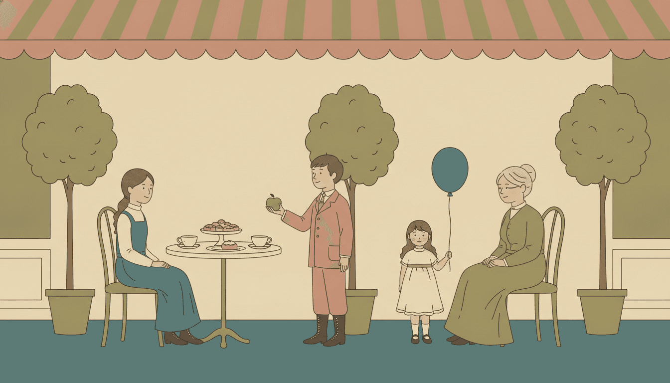
One character held across four poses, a cast told apart by silhouette alone, a single figure carrying a page, the four-colour palette itself, and whole scenes — the same flat elegance spent on whatever your story is actually about.
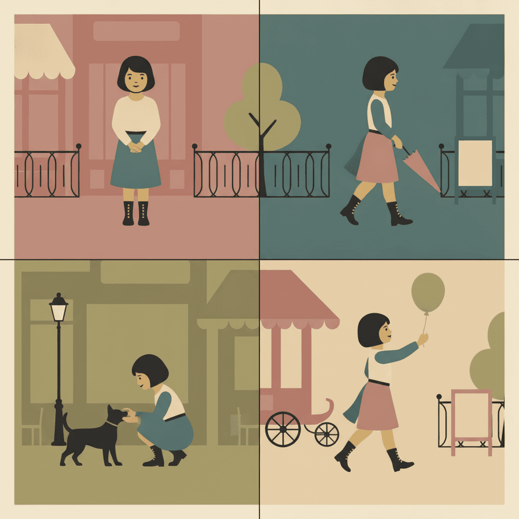
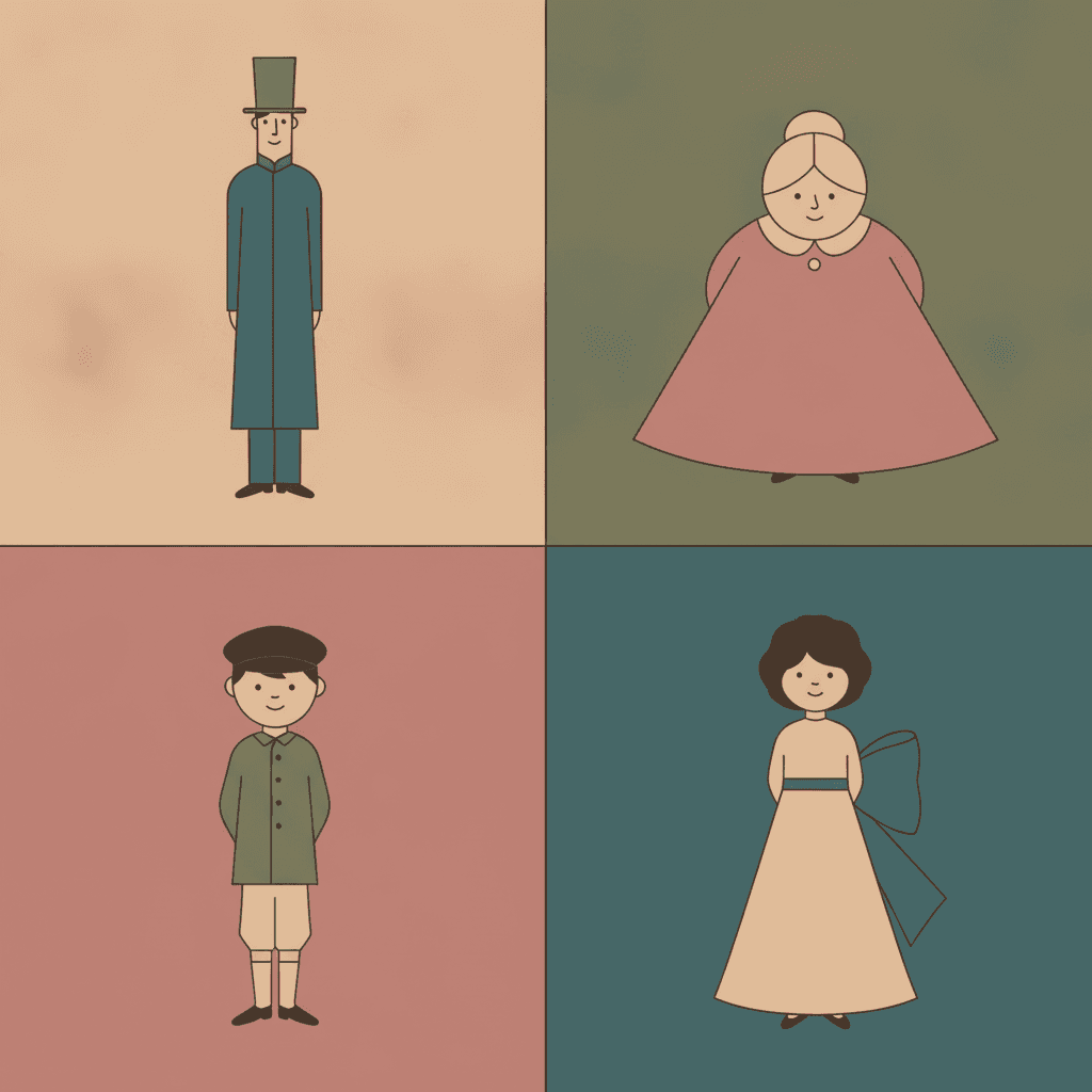
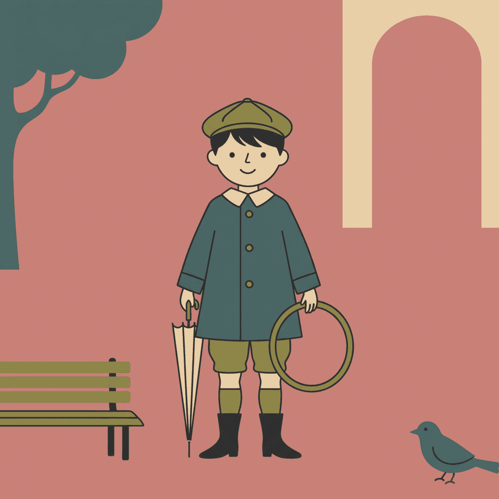
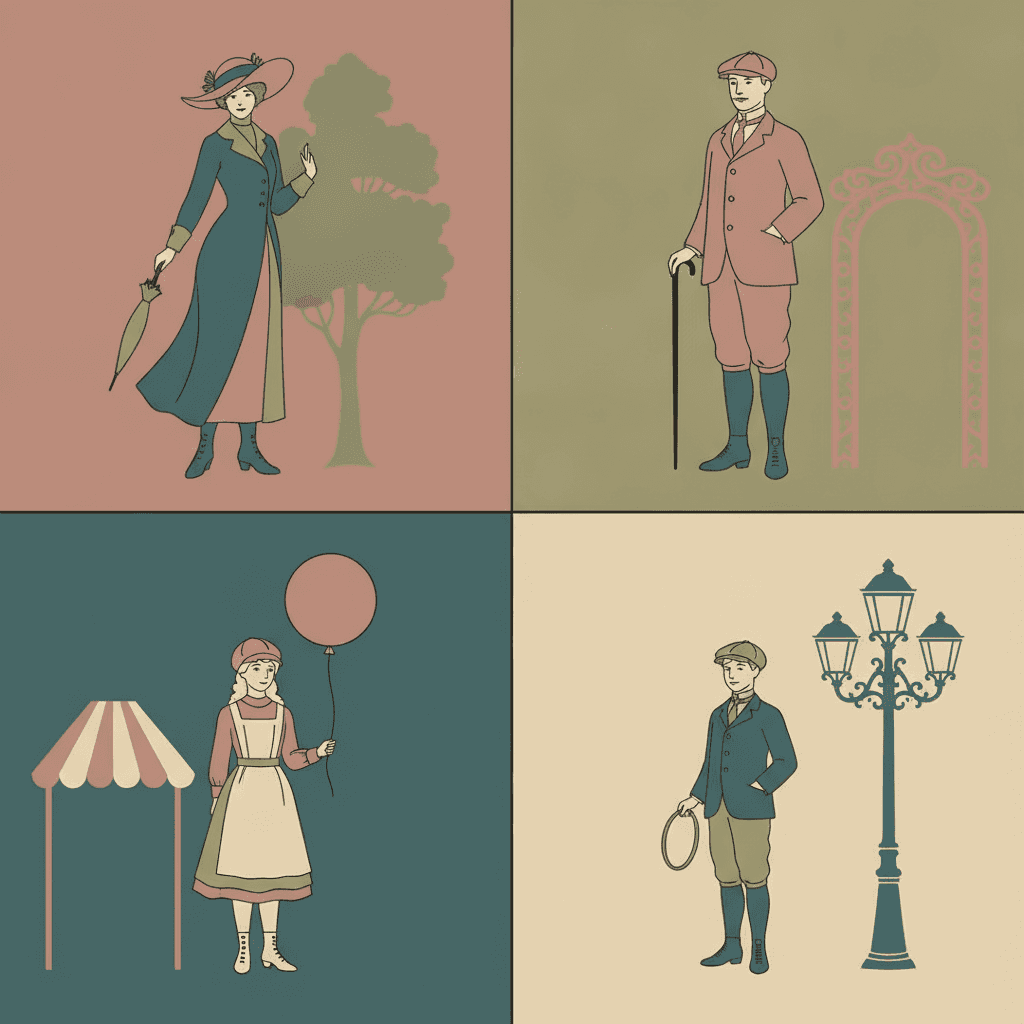
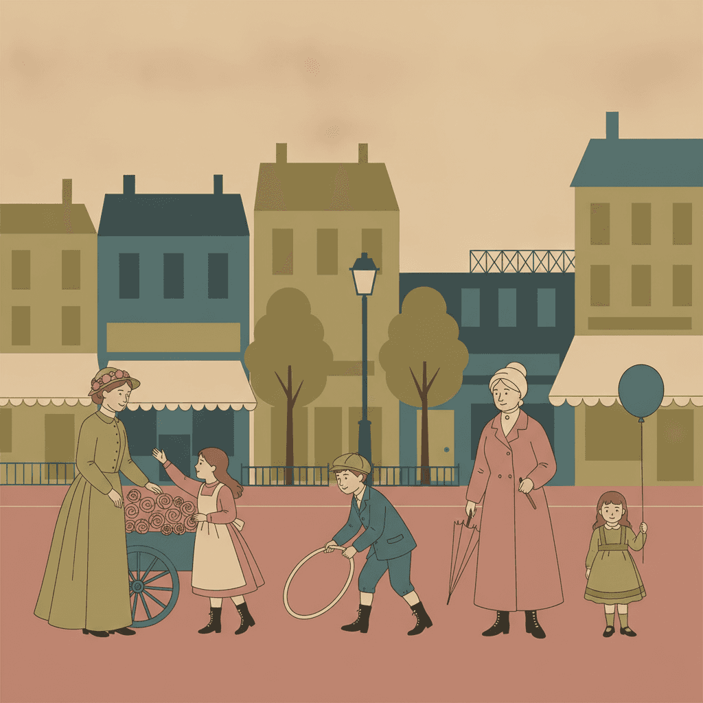
Everything You Need for Belle Époque Poster Picture Books
One elegant flat image is easy. Twenty-four pages that stay flat in the same way, with a cast you recognise by outline alone, is the part that needs building.
The same flat discipline on page one and on page twenty-four
Flatness is easy to hold for one image and hard to hold for a book, because every page tempts the drawing back towards a shadow here or a little depth there — and a single modelled face in a flat book looks like a mistake. One fixed brief is carried into every page instead: elegant simplified figure outlines, flat decorative colour blocks, a turn-of-the-century urban mood, and the same four refusals of shading, depth, texture and fuss. The last spread is built from the same instruction as the first.
Characters held together by silhouette and colour
This style identifies people the way a poster does — by outline, build, hat and the one or two flat colours they are filled with, rather than by the fine detail of a face. That is a real advantage for consistency, because a silhouette survives from page to page more reliably than a delicate expression does. Save each character in the Character Library with up to fourteen reference images and they are reused across every page and into later books. Characters built from an uploaded photo stay private to your account.
Legible at any size, because there is nothing small in it
A practical reason to choose a flat poster style for a children’s book: it was designed to be read from across a street. Large flat shapes and one clean contour do not collapse when the picture is shrunk to a thumbnail, a phone screen or the corner of a page. Styles built from hairline strokes and fine texture lose most of their information at small sizes. This one loses nothing, because it never had any fine detail to lose.
No light, so plan your mood another way
Be clear-eyed about the cost. The lighting is recorded as flat decorative poster light, which means there is no light source anywhere, no dusk, no lamplight, no weather and no shadow. Mood in a normal picture book usually arrives through light, and here it cannot. It has to come from colour instead — which of the four flat hues dominates a spread, and how much empty field you leave around a figure. That is a composition decision, so make it deliberately rather than hoping the pictures will supply it.
A whole book, not a single poster
Poster art almost always exists as one image: one sheet, one announcement, one moment. You are not prompting for one of those. Describe the story and C2Story writes it, breaks it into pages and builds each page to this brief according to what that page actually says, so the same flat elegance is spent across a narrative with a beginning and an end instead of all at once.
Read-aloud, in whichever language you read in
Large flat shapes and a soft faded palette are easy on the eye on a lap, on a screen and at the back of a classroom, and the quiet colours make this one of the gentler styles here to read at bedtime. Write in English, Chinese, Japanese, Spanish, French and more — the look does not change with the language of the text, and the words of your story stay perfectly legible because they are set as type rather than drawn.
Belle Époque Poster Picture Books — Questions
What people ask before committing a whole book to flat colour, a faded palette and no depth at all.
Explore More Story Ideas
Discover more styles, tools, and story types
Kitten Stories
A new kitten comes home, first explores, lost kittens and playful yarn fun
Explore
Felt & Knit Picture Books
Fuzzy yarn, real stitching & button eyes
Explore
Children's Book Creator
Design beautiful kids books
Explore
Midjourney vs C2Story
Stories, not just images
ExploreBelle Époque Poster Picture Books — Flat Decorative Colour, an Elegant Outline and No Depth at All
A belle époque poster picture book borrows a way of making pictures that was invented to be understood from across a street — a few enormous flat shapes, one confident contour, a colour you remember afterwards — and asks it to carry a story instead of an announcement. On C2Story this is the Belle-Époque Poster Flat style, and its brief states the ambition plainly: flat belle-époque poster illustration, elegant simplified figure outlines, flat decorative colour blocks, turn-of-the-century urban life mood and a graphic poster composition, rendering the full stylish city scene the story describes with clean flattened shapes. One brief applied across a whole book, so the twentieth spread is built from the same instruction as the first.
The thing worth knowing before you commit a book to it is which part of that is genuinely rare. Flatness is not rare here: plenty of the seventy-eight hand-drawn styles enabled in C2Story work in flat colour blocks, and several refuse gradients and shading. What is rare — unique, in fact — is the second item in its list of refusals. The word depth appears in six briefs in the whole library, and five of them are asking for it: layered near-and-far depth, subtle depth, soft painterly depth, atmospheric depth. This is the only brief that names the third dimension as something to avoid. Follow that one line through and the rest of the look stops being a matter of taste and becomes a consequence. There is no vanishing point, so a street is a row of silhouettes standing side by side rather than a view receding to a corner. There is no distance, so nothing can be far away or half-glimpsed. The lighting is recorded as flat decorative poster light, meaning no sun, no lamp, no dusk and no cast shadow anywhere. A picture in this style has no inside to walk into. It is shapes laid beside shapes, like coloured paper cut out and put down — and every decision you make about a page is therefore a decision about arrangement rather than about space.
What makes that worth choosing rather than merely tolerating is the other half of the brief. Thirteen of the seventy-eight styles ask for elegance, and in almost every one of them the elegance arrives through refinement of the mark: hairline pen strokes, crisp hatching, fluid iron-wire outlines, soft airbrushed blending, mineral pigment washes. This brief has none of those. Its recorded instrument is elegant simplified outlines and its fill is flat decorative colour blocks, with fussy realism among the things it refuses — so the elegance has nowhere to live except in the shape of the contour and the choice of colour. That is a real discipline, and it is why these pages look composed while containing almost nothing. The palette does the rest of the work: a vintage poster palette of muted olive, warm cream, dusty rose and deep teal, all low in saturation. Four styles in the library descend from printed posters, and this is the only flat one and the only quiet one — the Showa Commercial Cartoon style is bright retro advertising that lists muted colours among its refusals, the Shanghai Calendar Poster style is soft airbrushed rendering with blended skin, and Gongbi Vintage Fantasy works in mineral washes. Poster composition, in other words, without poster volume. Among the styles you can read about here, the mid-century modern style is the closest cousin and splits from it on printed halftone texture, the bold flat style keeps the flatness and raises the volume with a heavy black contour, and the ligne claire style draws the same kind of old-world town but wants every bit of the depth and architectural detail this one leaves out.
Three honest notes, because this style is easy to choose for the wrong reason. First, it is the flat poster side of the era, not the ornamental one — if what you pictured was swirling art nouveau borders and dense decoration, the folk decorative style is much closer to that. Second, there will be no lettering in the illustrations. Real posters of the period are famous for their type, but this brief does not ask for any and we keep it out deliberately, because image models are unreliable at letterforms; every sign, awning and board in your pages is blank, and the words of your story are set as type so they stay legible and translatable. Third, it cannot do night, weather or distance, so if your story turns on a storm or a horizon, the cinematic style or the gouache style will serve you far better. In exchange you get a look that is unusually easy to keep consistent, because characters here are carried by silhouette, build, hat and fill colour rather than by delicate facial detail — save each one in the Character Library with up to fourteen reference images and they are reused across every page and into later books, and characters built from an uploaded photo stay private to your account. Write in any language you read aloud in, then export the finished book as a PDF, which is the handoff to whichever printer you already use, and the images you generate are licensed for commercial use. Start free: see our pricing plans, browse every option on the illustration styles hub, or go straight to the AI Story Generator.