
Pictogram Picture BooksWhere the Pose Is the Whole Character
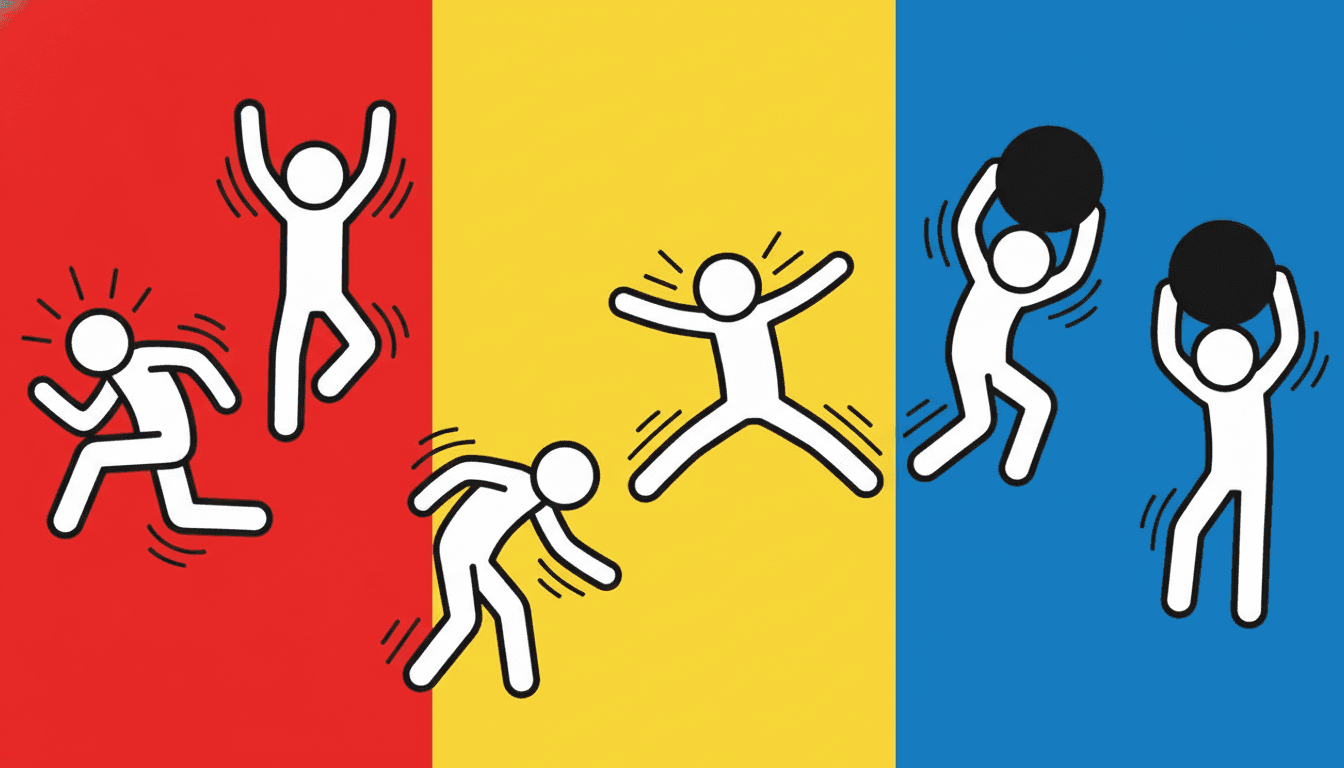
Twenty-three styles here reduce a figure to a silhouette. Exactly one asks that silhouette to be moving. A pictogram picture book has no faces at all — thick black outlines, bold primaries, and a cast you read entirely from what they are doing.
- Figures caught mid-motion, never standing still
- No face, so the action carries the character
- Thick unbroken outlines that hold at thumbnail size
- Free credits by request — no card
50,000+
Stories Created
10,000+
Active Creators
50+
Art Styles
4.9/5
User Rating
What Makes Pictogram Illustration Different From Simply Flat
Plenty of styles here flatten a figure into a shape. This is the only one that insists the shape be caught halfway through a movement — and then takes the face away so it has to be.
Twenty-three styles here reduce a figure to a shape. One asks that shape to be moving
Of the seventy-nine hand-drawn styles enabled in C2Story, twenty-three name a silhouette somewhere in their brief and twenty talk about posing a figure. Reduction is ordinary here. What is not ordinary is the tense. The words kinetic, mid-motion and running each appear in exactly one brief in the whole library, and it is this one, which asks outright for figures mid-motion. Everywhere else a pose is arranged, held and composed — a figure standing in a way that tells you something. Here the figure is caught halfway through doing something, and the difference between a pose and a movement is the whole style.
It is the only style that refuses a realistic body
Every style here ends with four refusals. Most of them refuse a technique — gradients, soft shading, photorealism, fine detail. This one refuses thin lines, soft shading and photorealism too, but its third refusal is realistic proportions, and that phrase appears in exactly one negativeKeywords list in the entire library. It is a different kind of rule. The others protect a surface; this one protects the premise. A pictogram is not a stylised person, it is a sign that means person, and a sign only works at the moment you stop reading it as an individual. Give it correct anatomy back and it quietly becomes a cartoon.
There is no face in the brief, so the pose carries all of it
This is clearest against its nearest neighbours, which all keep a channel open for who a character is. The bold flat style asks for few but forceful facial features. The bold geometric style gives each character identity from clear outlines and a few key shapes. The negative-space style goes furthest, specifying a distinct face shape, head-to-body ratio and hand-and-foot forms per figure. All three spend something on identity. This brief spends none of it — it names no face, no expression and no hair, and puts the entire budget into high-energy action. Characterisation does not disappear. It moves into the limbs.
Thick, continuous, and the only bold-primary palette in the library
The palette is recorded as bold primary colours — bright red, flat yellow, solid black and clean white — and no other style here starts from primaries. The lighting is flat bold graphic light, which means there is no light source, no modelling and no cast shadow anywhere, so nothing is separated by tone. That is why the line weight matters so much: it is specified as thick continuous black lines. Twelve of the seventy-nine briefs ask for a thick line, but only this one insists it be unbroken. With no shading to do the work, that single heavy contour is the only thing holding a figure apart from the colour behind it.
Why Pictogram Illustration Refuses a Real Body
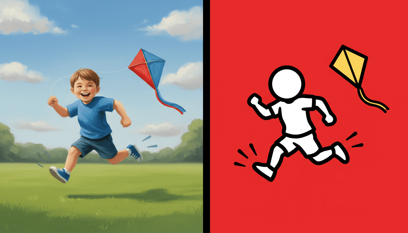
The same boy twice, running with the same kite. On the left he is rendered the way most illustration renders a child — correct anatomy, a face with eyes and a smile, strands of hair, folds in his shirt, soft light and a shadow under his shoes. Nothing is wrong with it. It is a picture of a particular boy, and you read his face first.
On the right he is one thick unbroken black outline filled with a single flat colour, his head a plain oval with nothing on it, his proportions deliberately wrong. And notice what you read first now: the stride. There is nothing else to look at. That is the whole trade this style makes, and it is why realistic proportions sits in its list of refusals — the only brief in the library that refuses a body rather than a technique. Correct anatomy invites you to read the figure as an individual. A sign-like figure asks you to read it as an action, and those two readings cannot both be first.
So think in crossing signs. If the pose would not be clear as a black shape on a lit panel seen from across a road, this style cannot make it either. That is a genuinely useful test to run while you are writing.
And exaggerate the action. A figure walking and a figure standing look nearly identical once the face is gone. Push it to a run, a leap, a reach — the pose has to be unmistakable, because it is all you have.
Its four refusals, in the order the brief states them:

Write Verbs, Not Adjectives
Here is the part worth adjusting before you start a book. Every other style gives you several channels to put a feeling through — a face, the light, the weather, the texture of a room. This one has none of them. No expression, no light source, no shadow, no fine detail. What it has instead is a body, and a brief that insists the body be moving.
So an adjective lands nowhere. “An excited girl in the garden” gives the style nothing it can draw and comes back as a flat figure standing in a flat garden. A verb lands everywhere. “A girl running the length of the garden with a sheet held up behind her” gives it a stride, an angle, a trailing shape and a reason for the motion marks. Name what the character does and let it imply what the character feels, which is how the style is designed to work and also, usefully, how small children read pictures anyway.
One action per page. Two figures doing two interesting things will fight, because both arrive at the same volume. Give the page one verb and let the rest of the cast react to it.
Spend the primaries like a pointer. With no light to spotlight anything, a single figure filled red in a crowd of white ones is the only emphasis available. Use it on whoever the page is about.
Worth seeing side by side before you commit: the bold flat style, which keeps the thick outline but gives a character a face to react with, the geometric style, which drops the outline entirely and separates everything by colour, and the negative space style, which reduces a figure just as hard but asks the gap around it to mean something too.
Create a Pictogram Picture Book in 3 Steps
From a one-line idea to a finished book where every page holds the same heavy line and the same cast, in under two minutes.
Describe the story
A sentence is enough, but make it a sentence with a verb doing the work. Name what the characters are physically doing rather than how they feel. This is the one style here where that swap changes the result more than anything else you could write.
"Everyone runs out when the school bell goes"
Pick Bold Street Pictogram
Choose it for sign-like figures, thick unbroken outlines, bold primaries and non-stop motion. Choose Bold Flat instead if your characters need visible expressions, Bold Geometric for flat shapes with no outline, or Negative Space for reduction with a hidden second reading.
Red, yellow, blue, black and white
Generate and export
C2Story writes the story, breaks it into pages and builds every one to the same brief. Read it on screen, share the link, or export the PDF and take that file to whichever printer or print service you already use.
Whole book built, PDF export, instant sharing
Icon Style Art and Its Nearest Neighbours
Four real styles built from flat shapes and hard reduction, sorted by the question that actually separates them: once you have thrown away the detail, what is left to tell you who this is?
Bold Street Pictogram
Bold kinetic street-pictogram illustration: thick continuous black outlines, dynamic little running figures, high-energy action and an urban graphic feel, rendering the full lively scene with every figure mid-motion. Its palette is bold primary colours — red, yellow, black and white — its lighting is flat and graphic, and its four refusals are thin lines, soft shading, realistic proportions and photorealism. One of ten styles in the graphic category, and the only one in the library whose brief is written in the present participle.
Bold Flat Satire
Thick heavy black contours, flat colour blocks, modern everyday characters organised by strong silhouettes, and poses that read through shoulder-hip-limb direction. The closest relative by line, and the one to choose if you are torn. It keeps few but forceful facial features and a deadpan or awkward expression, so a character can react. This style has no face to react with. Pick that one for comedy that lands on a face, this one for comedy that lands in a body.
Bold Geometric Picturebook
Forms built from clean geometric blocks, high-saturation clashing colour, strong silhouettes and characters reduced to essentials — but its line weight is recorded as a minimal clean edge, meaning nothing is outlined at all and every separation is a colour boundary. That is the exact inverse of this style, where a thick unbroken black contour does all the separating. Both reduce a figure hard. One reduces it to a shape, the other to a sign.
Negative-Space Visual Pun
Bold flat shapes in a two-colour scheme, composed so the empty space around the subject forms a recognisable second picture. It shares this style's faith that a flat silhouette can carry a whole book, and it is the other place in the graphic category where you read shapes rather than drawings. The difference is ambition. That style wants a figure to mean two things at once. A pictogram wants to mean exactly one thing, instantly, which makes it far the easier of the two to write twenty-four pages for.
Two more relatives are worth knowing about, both of which flatten a figure but keep it still. The minimalist style reduces by subtraction and leaves calm space around a few simple shapes, and the pop art style shares the loud saturated palette but presents a character rather than catching them in the middle of something. Browse everything on the illustration styles hub.
Symbol Character Design Ideas to Get You Started
This look is far better at races, crowds, parades, playgrounds and bodies than it is at faces, weather or a quiet room. These six lean into that.
The Girl Who Took the Long Way Round
A child who will not walk anywhere directly — she hops the kerbstones, circles the postbox twice and arrives late and delighted. A whole book of one character and one verb, which is exactly what this style is built to draw.
Create this storyEverybody Out at Once
The school bell goes and a flat empty street fills with forty small figures in nine seconds. The crowd is the subject rather than any one child in it, and no face is needed for a reader to find the one carrying too much.
Create this storyThe Parade That Grew
One figure dances down a street and every page adds another until the line reaches the far edge. The style draws a chain of bodies better than almost anything else here, because every link can be doing something different.
Create this storyHow to Get Across a Puddle
Eleven methods, one puddle, told almost entirely in limbs: the long jump, the stepping stones, the run-up, the piggyback, the admitting defeat. A wordless or nearly wordless book, and a very good first project in this look.
Create this storyThe Signs Came Down Off the Wall
The little figures on the crossing signs and fire-exit doors climb out and spend a night using the city properly. A story that makes the style's own logic the plot, which is a rare thing to be able to do.
Create this storyLearning to Do a Cartwheel
Fourteen failed attempts and one that works, which is a book about a body and nothing else. Save it for a child who is working on something physical — the pictures will read before the words do.
Create this storyAI-Generated Pictogram Illustration Examples
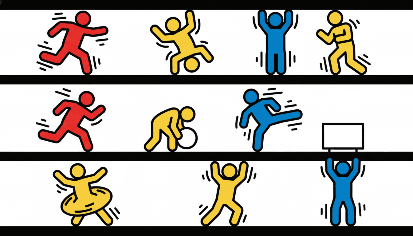
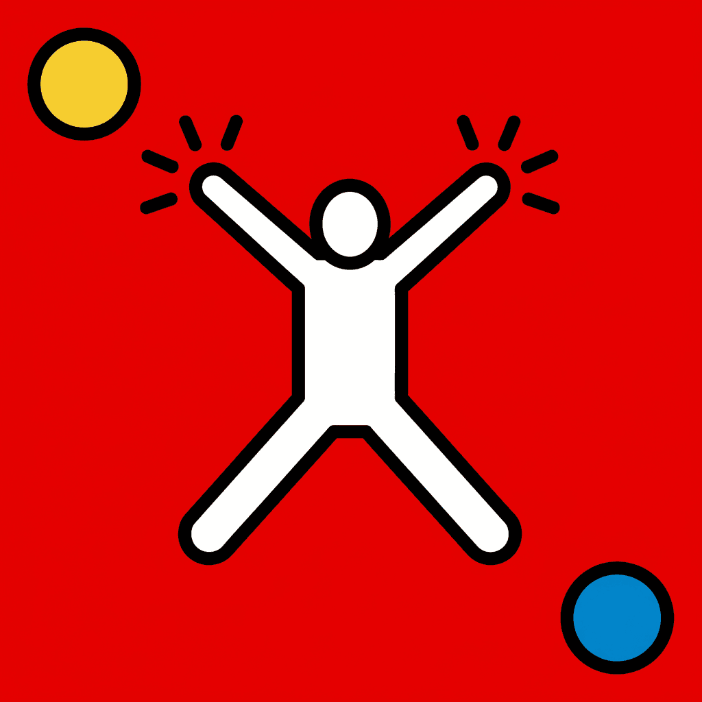
Try it on the middle one. Cover the figure and the radiating marks still tell you a jump happened — which is the whole argument for drawing a body this way.
Icon Style Art for Every Part of Your Story
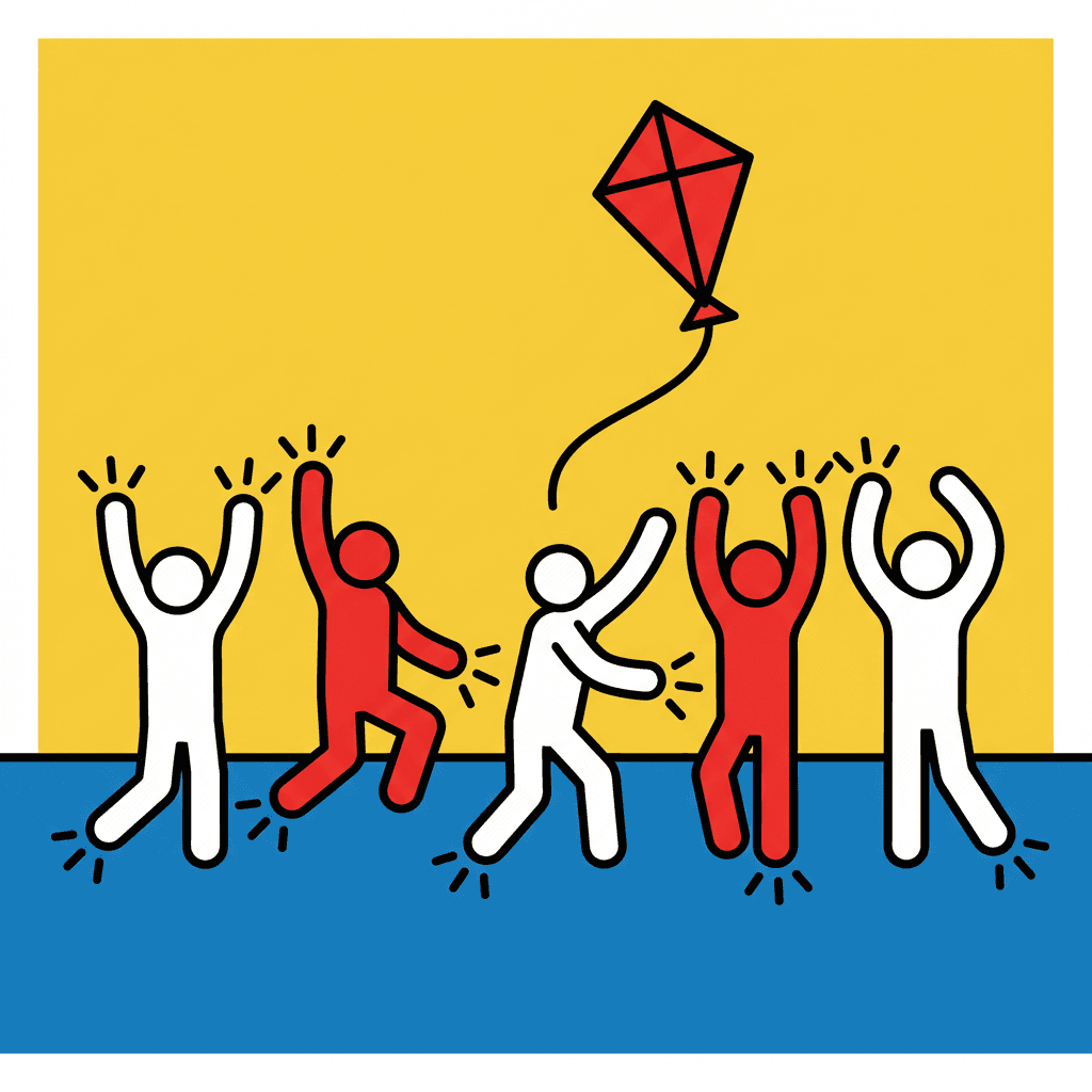
Four actions side by side, a cast told apart without a single face, one figure carrying a page alone, the primary palette itself, and whole scenes — the same heavy line and the same momentum, spent on whatever your story is actually about.


Everything You Need for Pictogram Picture Books
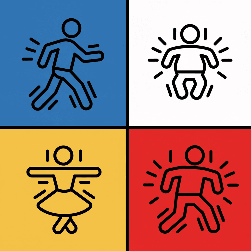
One bold figure on a flat ground is easy — this has been the language of public signage for half a century. Twenty-four pages that hold the same line weight and the same faceless cast is the part that needs building.
The same heavy line on page twenty-four
A single thick unbroken contour is easy to draw once and surprisingly hard to hold. Halfway through a book the lines thin out, a bit of shading creeps in and the signage feel is gone. One fixed brief is carried into every page instead — thick continuous black lines, bold primaries, flat graphic light, figures mid-motion — so the last spread is built the way the first one was.
Characters you tell apart without a face
This is the real consistency problem in this style, and it is worth planning for. There are no faces and no hair, so none of the usual identifying detail exists. What survives is build and fill: how tall, how broad, how big the head is against the body, and what one flat colour the figure is. Save each character once in the Character Library with up to fourteen reference images and they carry across every page and into later books. Characters built from an uploaded photo stay private to your account.
Motion marks that belong to the drawing
The short radiating strokes around a moving body are not a comic-book effect bolted on afterwards — they are part of the brief, which asks for high-energy action in the same breath as the outline. They act as the style's only tool for emphasis, since there is no spotlight, no blur and no shallow focus available. Put them on the thing the page is about.
A look designed to survive being small
This family of imagery was invented for signs read at a distance by someone walking past, so holding up at small sizes is not a happy accident. Thick contours and flat primaries stay legible as a thumbnail, a cover, a phone screen or a printed page — there is no fine texture to vanish and no gradient to band. It is the most practical argument for this style over a painted one.
Whole books, not one poster
Pictogram art almost always exists as a single image — a sign, a logo, a one-off print. You are not prompting for one of those. Describe the story and C2Story writes it, breaks it into pages and builds each page in this style to match what that page actually says, so the energy holds across a narrative instead of peaking once.
Readable before the words are
A faceless figure caught mid-action is about the most legible picture there is: a child who cannot yet read a sentence can read a run, a fall or a reach. That makes this a strong look for pre-readers and for read-aloud, and for any book where you want the pictures to carry the plot. Write in English, Chinese, Japanese, Spanish, French and more — the look itself does not change with the text.
Pictogram Picture Books — Questions
What people ask before committing a whole book to thick black lines, four colours and a cast with no faces.
Explore More Story Ideas
Discover more styles, tools, and story types
Beach Stories
Sandcastles, seashells, tide pools and splashing waves
Explore
Gouache Picture Books
Flat opaque paint & matte brush edges
Explore
Children's Book Creator
Design beautiful kids books
Explore
Midjourney vs C2Story
Stories, not just images
ExplorePictogram Picture Books — Thick Lines, Bold Primaries and a Cast You Read by How They Move
A pictogram picture book borrows the visual language you already read without noticing — the running figure on a fire-exit door, the walking figure on a crossing light — and asks it to carry a story instead of an instruction. On C2Story this is the Bold Street Pictogram style, and its brief states the ambition plainly: bold kinetic street-pictogram illustration, thick continuous black outlines, dynamic little running figures, high-energy action and an urban graphic feel, rendering the full lively scene the story describes with every figure mid-motion. One brief applied across a whole book, so the twentieth spread is built the way the first one was.
The thing worth knowing before you commit a book to it is which part of that is actually rare. Of the seventy-nine hand-drawn styles enabled in C2Story, twenty-three name a silhouette somewhere in their instructions and twenty discuss how to pose a figure. Reducing a person to a bold shape is one of the most common ideas in the library, not an unusual one. What is unusual is the tense. The words kinetic, mid-motion and running each appear in exactly one brief in the whole catalogue, and this is that brief. Everywhere else a figure is arranged — standing in a way that tells you something, composed for the frame, held still for you to read. Here it is caught halfway through a movement, and a pose and a movement are not the same picture. The bold flat style asks for poses reading through shoulder-hip-limb direction. The negative space style asks for poses that come from real individual personality. Both are describing an arrangement. This one describes a moment.
Follow that through and the rest of the brief stops looking like decoration and starts looking like engineering. Every style here ends with four refusals, and three of this one’s are ordinary — thin lines, soft shading, photorealism. The third is not: realistic proportions, a phrase that appears in exactly one negativeKeywords list in the entire library. Most refusals protect a surface. That one protects the premise, because a sign-like figure stops being a sign the moment you can read it as a particular individual. It is also why the brief never mentions a face, an expression or hair, while its nearest relatives all do — the bold flat style keeps few but forceful facial features, the geometric style gives each character identity from clear outlines and a few key shapes, and the negative space style specifies a distinct face shape and head-to-body ratio per figure. All three keep a channel open for who somebody is. This one closes it and spends everything on what somebody is doing. The palette follows the same logic: bold primary colours — bright red, flat yellow, solid black, clean white, the only primaries-first palette in the library — under flat bold graphic light, meaning no light source, no modelling and no cast shadow anywhere. With no tone to separate anything, the line has to, which is why its weight is recorded as thick continuous black lines. Twelve briefs here ask for a thick line. Only this one insists it be unbroken.
Two honest notes, because this style is unusually easy to use badly. First, write verbs rather than adjectives. With no face, no light and no weather available, a mood word gives the style nothing — ask for “an excited girl in the garden” and you will get a stiff flat figure standing in a flat garden, which is the worst version of this look. Ask for “a girl running the length of the garden with a sheet held up behind her” and it has a stride, an angle and a reason for the motion marks. Push the action further than feels natural, too, because a walking figure and a standing figure are nearly identical once the face is gone. Second, know what it cannot do. Stillness is refused by design, so a bedtime or quiet-interior book is the wrong fit — try the gouache style or the nordic whimsy style for that. There are no expressions, so for a character who needs to react visibly try the cartoon style. And thin lines are the first thing refused, so fine detail and texture get flattened far past what you pictured. On consistency: save your cast in the Character Library with up to fourteen reference images each, and build them as build and fill rather than as features — this height, this width, this head-to-body ratio, this one flat primary — because that is all that survives when a character becomes a sign; characters built from an uploaded photo stay private to your account. Write in any language you read aloud in, then export the finished book as a PDF, which is the handoff to whichever printer you already use, and the images you generate are licensed for commercial use. Start free: see our pricing plans, browse every option on the illustration styles hub, or go straight to the AI Story Generator.