
Naive Cartoon Picture BooksDrawn Badly on Purpose
Of the seventy-eight style briefs in this library, one has a shaky hand and refuses to be drawn well. Naive cartoon picture books come from that brief — awkward proportions, a trembling line, muddy mustard and dull blue — and they are clumsy, yet charming, which is the point.
- A shaky, uneven hand line on every page
- Awkward proportions that stay the same awkward
- Muddy mustard, faded red and dull blue
- Free credits by request, no card
50,000+
Stories Created
10,000+
Active Creators
50+
Art Styles
4.9/5
User Rating
What Makes the Naive Art Style Different From Just Drawing Badly
Every style here is a written brief: a palette, a light, a line weight and a short list of refusals. Four things in this one decide the look, and each of them is somewhere no other brief goes.
A brief built on the word “yet”
Every style in C2Story runs on a short written brief: a palette, a lighting note, a line weight and a few things to avoid. Most briefs list qualities. This one lists a fault and a pull in the same breath — clumsy yet charming, awkward linework that is oddly appealing. Oddly, offbeat and unpolished appear in no other brief of the seventy-eight. The style is not the clumsiness and not the charm; it is the two arriving together.
The only shaky hand in the library
The line weight is shaky uneven hand lines, and no other brief uses the word shaky. Three briefs draw people out of proportion on purpose. Art brut’s line is thick and wobbly — the outline bends. The marker cartoon’s line is thick and sure. Here the hand itself trembles: lines thicken and thin by accident, overshoot a corner, stop short of the next one. The awkwardness is in the drawing, not only in the thing drawn.
It refuses skill, not mistakes
Three of seventy-eight briefs refuse anatomy. Art brut refuses correct anatomy; one Chinese graphic brief refuses realistic anatomy. This one refuses technically perfect anatomy — the only refusal aimed at technique itself. It also refuses slick clean rendering and, alone in the library, cute polished style: the finish of a professional children’s book. What it turns away is the evidence of training.
Dull blue, asked for by name
The palette is a flat quirky palette of muddy mustard, faded red and dull blue. Two briefs in the library refuse dull colour outright and nine refuse muddy colour. This is the only brief that asks for dull by name, and one of just two that ask for muddy. The light is flat and plain and comes from nowhere, so nothing is dramatised. The colours are clearly colours, just not trying hard.
The Same Man, Drawn Well and Drawn Badly
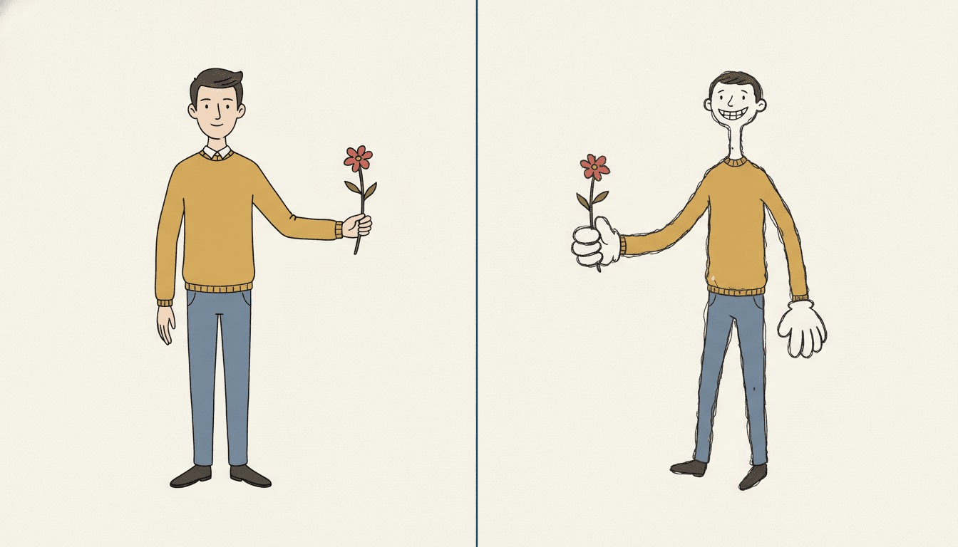
Look at the same man twice, in the same mustard jumper, the same blue jeans, holding out the same red flower against the same cream ground. On the left he has been drawn properly: a clean outline of even weight, sensible proportions, neat hands with the right number of fingers, a pleasant face. It is perfectly fine, and you have seen it a thousand times.
On the right nothing has changed except the skill. The outline goes over itself twice, the neck is long and thin, the head is too small, the grin is too wide, and the hands have turned into two enormous white cartoon gloves. He is plainly worse drawn — and he is the one you look at, and the one who seems to be meaning it.
That is what a bad good drawing is for. The brief does not ask for random mistakes; it refuses the four things that would make the left-hand man: technically perfect anatomy, slick clean rendering, cute polish and photorealism. Take those away and what is left is a drawing that looks like a person made it.
Write the Effort, Not the Success
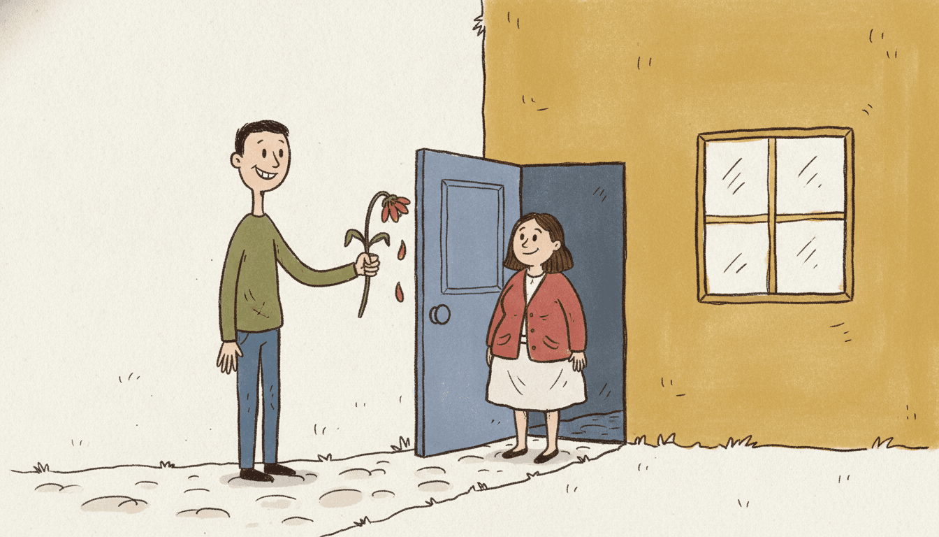
The brief’s own sample subject is a lanky, odd-looking character grinning awkwardly while holding a wilted flower. It is the whole style in one picture. The man beside this paragraph has clearly tried — he came to the door, he brought a flower — and the flower has given up on the way, dropping petals as he holds it out. He is offering it anyway.
That is also what the drawing is doing. A naive art style is a picture that tried and fell a little short, and is liked because of it. So the stories that suit it best are stories about effort rather than triumph: a cake that leans, a crown that slips over one eye, a boy being walked by his dog. Put a flawless hero in a shaky line and the line looks like a mistake. Put somebody trying in it, and the line agrees with them.
When you write the story, write the attempt, and let the result be slightly wrong. Say what each character is trying to do and what goes not quite to plan. The drawing will take care of the rest.
From One Sentence to a Naive Cartoon Picture Book
You pick the look once. The brief is then applied to every page, so the shaky line, the dull palette and each character’s particular awkwardness never drift.
Describe somebody trying
Write a sentence or two about who the story is about and what they are attempting — a cake, a gift, a walk with a dog that will not be walked. Note what is wrong about how each character looks: arms too long, a tiny head.
Choose Heta-Uma Bad-Good
Pick the style from the Styles Library. From then on every page uses the same shaky hand line, the same muddy mustard, faded red and dull blue and the same flat plain light, and your saved characters keep their shapes.
Get a whole book
C2Story writes the story, splits it into pages and illustrates each one. Regenerate any page you want to change without touching the rest, read it online, share it, or buy the PDF download to hand to a printer.
This Style and Its Three Nearest Neighbours
Two share its wrong-on-purpose proportions and one shares its dry grown-up humour. Here is what each actually asks for.
Heta-Uma Bad-Good
The style on this page
A deliberately clumsy yet charming bad-good illustration: intentionally crude wobbly proportions, awkward naive linework that is oddly appealing, a quirky offbeat adult sensibility, raw hand-drawn energy and playful imperfection. The palette is muddy mustard, faded red and dull blue; the light is flat and plain; the line is shaky and uneven. It refuses technically perfect anatomy, slick clean rendering, cute polished style and photorealism.
Art Brut Raw Figure
Also untrained — but not joking
The nearest relative. Art brut also wants crude outlines, childlike figures and naive flat fills, and refuses correct anatomy. But its figures are human symbols drawn with compulsive scratchy marks and primal energy, in earthy brown and muddy red. Art brut is rough because the maker never learned the rules; the naive cartoon is rough with a wink, and wants to be liked for it.
Primitive Marker Cartoon
Same odd proportions, steady hand
The marker cartoon bends its characters too — one big ear, a tilted head — but draws them with a very thick, sure line in primary red, bright blue and sunny yellow, aimed at the youngest readers. Nothing about it is shaky. Its oddness is a name tag; this style’s oddness is a confession. Choose the marker cartoon when the reader is two, and this one when the reader will get the joke.
Deadpan Dialogue Cartoon
Also dry — but drawn cleanly
The deadpan cartoon is funny in a quiet grown-up way too, with round-headed figures, blank faces, grey-blue and beige, and lots of white space. Its line is clean, even and thin, and it refuses exaggerated expressions. The joke there is in nobody noticing; here the joke is in the drawing being wrong. Same dry humour, opposite hand.
Naive Art Style Story Ideas That Suit the Brief
Each idea is about somebody trying, and something that does not quite come off — the same thing the drawing is doing.
The Flower Was Fine This Morning
Someone sets out to bring a flower to someone else and it droops a little more on every page. It is handed over anyway, and received anyway. The story and the drawing are making the same point.
The Cake That Leaned
A birthday cake made at home, by someone who has never made one, presented with total pride. A birthday book for a grown-up who will recognise every lean and every crooked candle.
A Crown That Does Not Fit
A child makes a crown, wears it all day, and it slips over one eye at every important moment. Small, sincere, and a little bit wrong — which is the whole style in one prop.
Room for One and a Half
Two friends, one umbrella that is too small, and a walk home in the rain where both of them get one shoulder wet. A friendship book told through a prop that does not quite work.
Who Is Walking Whom
A boy takes the dog for a walk; the dog has other plans. A comedy of effort, where the joke is how hard somebody is trying and how little difference it makes.
Grandma Takes the Long Way
A grandmother on a bicycle that has seen better days, delivering three lemons across the village. Every page is a slightly wobbly errand, completed with dignity.
What Deliberately Clumsy Illustration Looks Like Across a Book
Pages generated to this one brief, with nothing retouched afterwards.
Drawn well, drawn badly
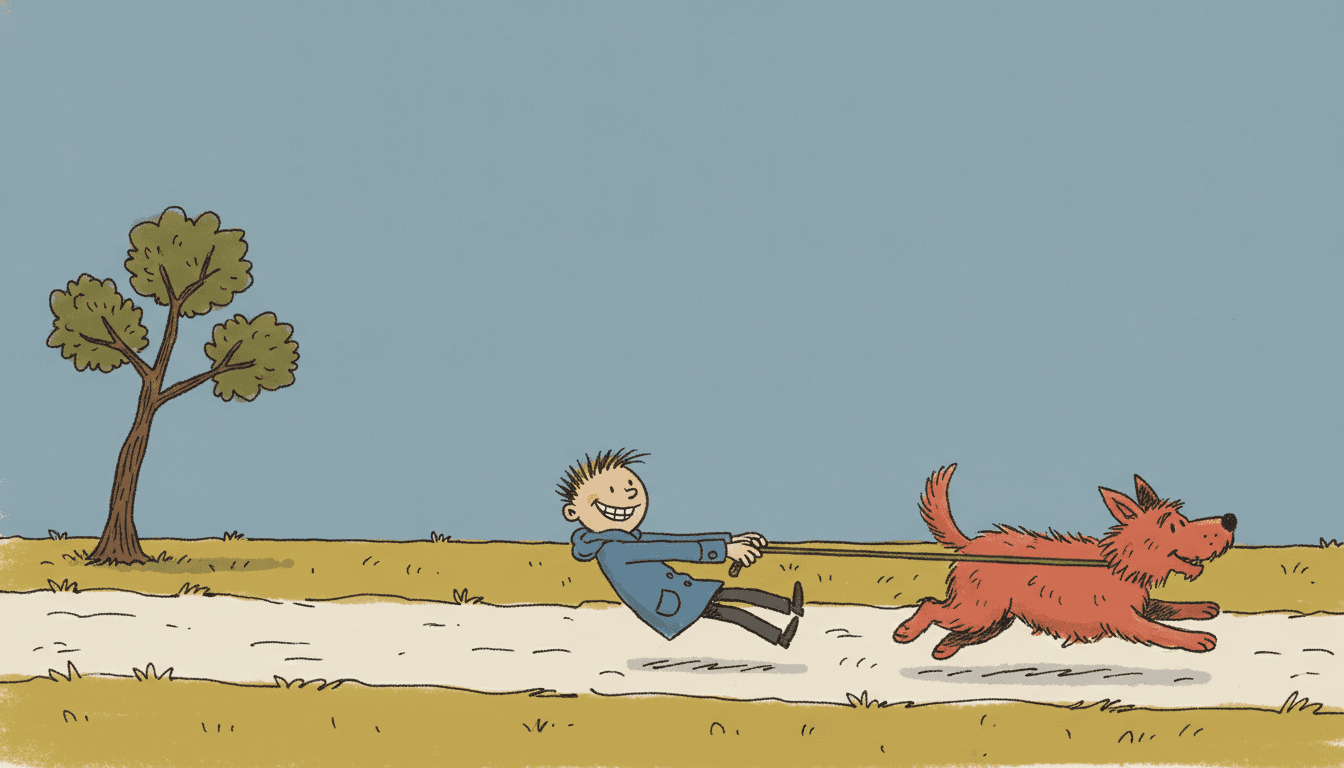
Who is walking whom
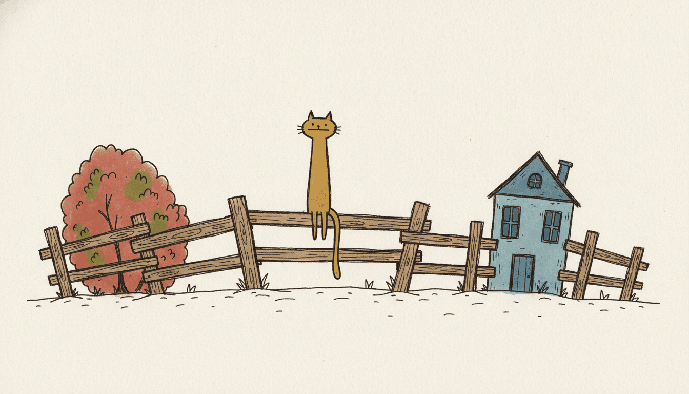
A cat far too long
A Cast Recognised by How They Are Drawn Wrong
Characters here are known by what is slightly wrong about them — a crown over one eye, a stack that leans, a stick much longer than the dog. Expect the image model to draw that awkwardness more gently than the brief describes: most pages come out closer to a scruffy, offbeat cartoon than a truly bad drawing.
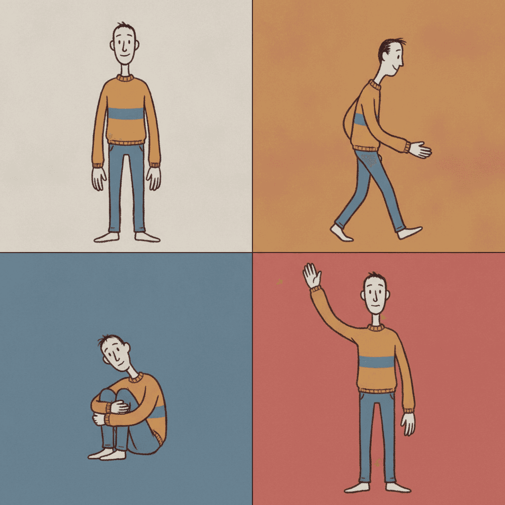
One man, four quarters
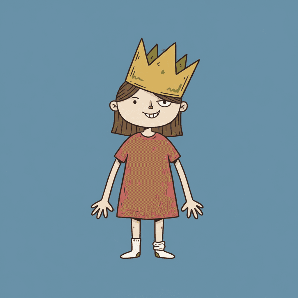
The crown that does not fit
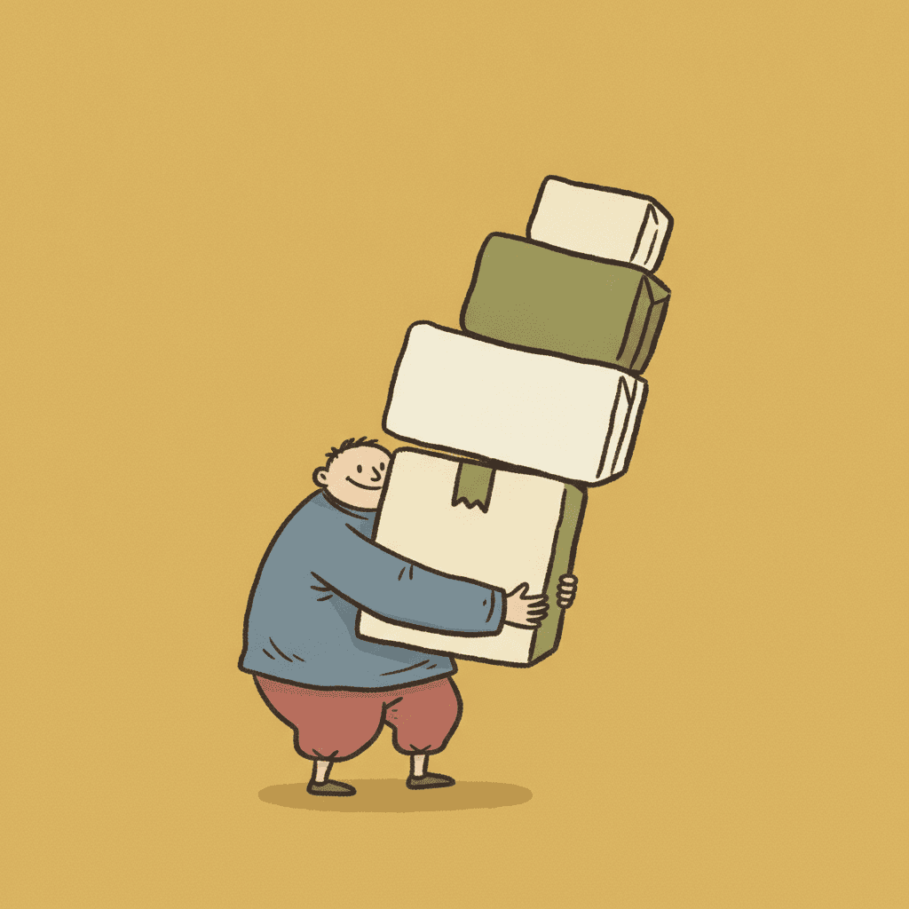
Too many parcels
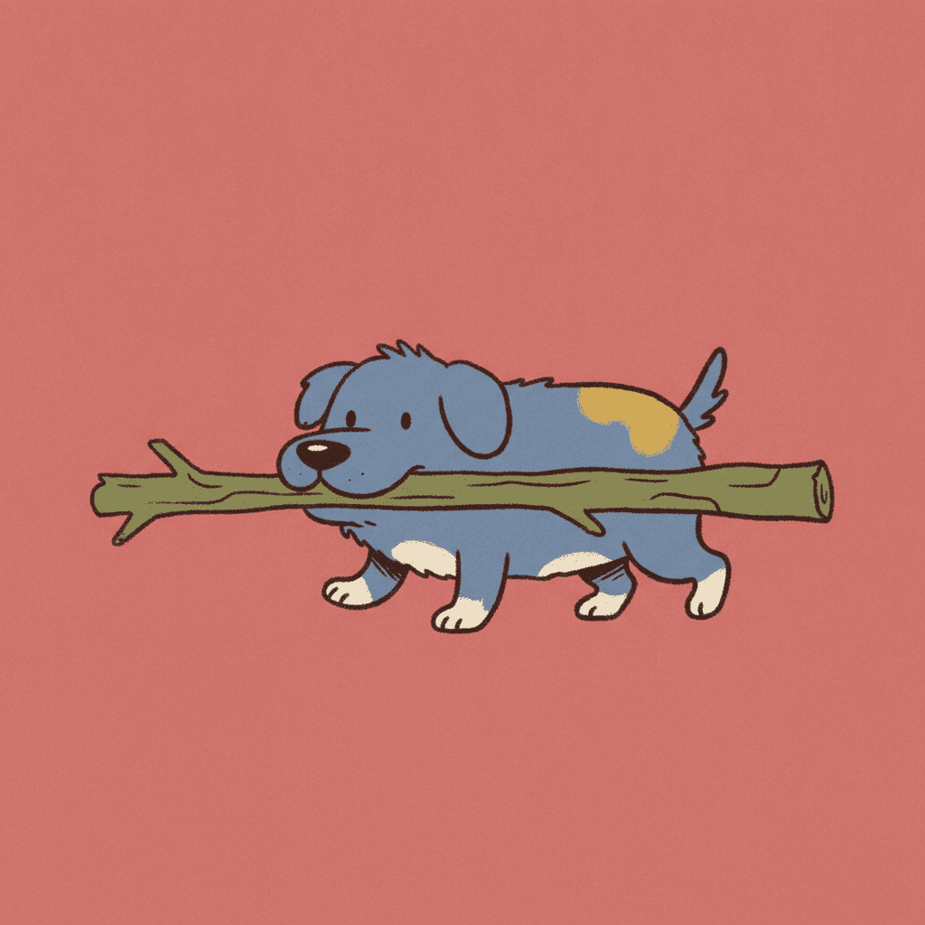
A stick far too long
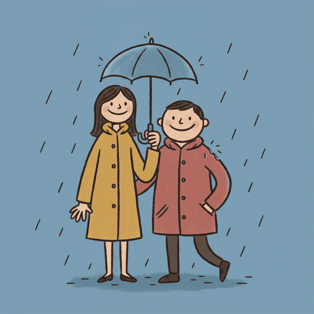
One umbrella between two
Making Whole Naive Cartoon Picture Books
What is useful in a book drawn this way and where the limits are, in the order you are likely to meet them.
The same wrongness on every page
In this style a character is recognised by how they are drawn wrong — the arms too long, the head too small, the one sock down. That has to be the same wrong every time. C2Story carries one fixed brief into every page and you can save each character in the Character Library with up to fourteen reference images. Write the awkward parts into the character notes in plain words. Characters built from an uploaded photo stay private to your account.
Grown-ups in the cast
The brief asks for an offbeat adult sensibility, and the style is at its best when grown-ups are in the cast: a father with a cake, a grandmother on a bicycle, two friends under one umbrella. It is still a picture-book look — nothing in the brief is dark or crude in content — but the humour is the kind adults laugh at first.
Good for gift books
A birthday book for a friend, an anniversary story, a thank-you book for a teacher. A polished style can make a personal book look bought; a style that looks hand-made and a little bit wrong looks like somebody tried, which is what a gift is meant to say.
No drama in the light
The light is flat and plain and comes from nowhere, so there is no lamp glow, no long shadow and no stormy sky. Night can be a dull blue page with a moon on it. A story that depends on suspense or atmosphere will lose most of it here; a story that depends on somebody’s face will not.
Clumsy, not broken — check the page
The brief asks for proportions that are wrong on purpose, and the image model sometimes reads that more gently than you wanted, or more wildly. Most pages land in between. If one character comes back too tidy, or a hand goes missing, regenerate that page; the rest of the book is untouched.
A whole book from a sentence
Describe the story in a sentence and C2Story writes it, splits it into pages and draws every page to the same brief, in English, Chinese, Japanese, Spanish, French and more. Read it online, share a link, or buy the PDF download as the handoff to your printer. Pages are licensed for commercial use under the terms of service.
For proportions bent by a raw, untrained hand with no joke in it, see art brut picture books. For the same lopsided idea with a fat, sure line for toddlers, marker cartoon picture books; for dry humour drawn cleanly, deadpan cartoon picture books; and for a waxy hand-made line children recognise as their own, crayon picture books.
Questions About Naive Cartoon Picture Books
Explore More Story Ideas
Discover more styles, tools, and story types
Circus Stories
Big-top clowns, acrobats and parades
Explore
Ghibli Style Books
Dreamy Miyazaki-inspired art
Explore
Picture Book Maker
Create illustrated picture books
Explore
Midjourney vs C2Story
Stories, not just images
ExploreNaive Cartoon Picture Books: A Shaky Hand, Dull Blue and an Honest Joke
Naive cartoon picture books rest on a brief that names a fault and a pull in the same breath: clumsy yet charming, awkward linework that is oddly appealing. C2Story runs seventy-eight hand-drawn style briefs, each a short written record of a palette, a light, a line weight and a few refusals. Three of them bend proportions on purpose. The Heta-Uma Bad-Good brief is the only one whose hand is shaky, and the only one with an offbeat grown-up sense of humour about it.
It is also the only brief that refuses a technically perfect drawing, and the only one that refuses a cute polished finish. Its palette — muddy mustard, faded red and dull blue — asks for the dull colour two other briefs refuse outright, under flat plain light. That is what the naive art style means here: not a child’s drawing, but a grown-up’s, made with the training left out on purpose.
A bad good drawing works best when the story is doing the same thing as the line. A wilted flower handed over anyway, a cake that leans, a crown that will not stay up, an umbrella too small for two — stories about somebody trying and falling a little short match a drawing that does exactly that. The style suits gift books, birthday books and family stories with grown-ups in the cast. It is a poor fit for suspense, night drama and stories that need a heroic, perfect protagonist.
The choice between neighbours is clear. Take art brut for raw, compulsive roughness with no joke in it, the marker cartoon for odd shapes drawn with a sure line for toddlers, and the deadpan cartoon for dry humour in a clean hand. Take this deliberately clumsy illustration style when the drawing itself should be in on the joke. Describe the story in a sentence and C2Story writes it, splits it into pages and draws every page to the same brief, keeping your characters on model, with the paid PDF download as the handoff to your printer.