
Geometric Picture BooksBuilt From Shapes, Not Lines
In a geometric picture book nothing is outlined. Circles, triangles and blocks are butted straight up against each other, so the boundary between two colours is the drawing — on every page of your story.
- Characters assembled from a fixed kit of flat blocks
- No contour line — clashing saturated colour separates the shapes
- Every object a shape a pre-reader can name
- Free credits by request — no card
50,000+
Stories Created
10,000+
Active Creators
50+
Art Styles
4.9/5
User Rating
What Makes a Geometric Picture Book More Than Flat Shapes
Every style here ends with four refusals, and reading them in order tells you how the style actually works. These four start with the most consequential thing about this one: it has almost no line.
Ten of the eleven picture book styles draw with a line. This one barely does
Every style in this library carries a specified line weight, and among the eleven picture book styles enabled in C2Story, ten of them name an actual drawing instrument: thin delicate ink lines, clean confident ink outlines, a loose rough ink line, delicate relaxed pen lines, a fluid springy line, soft rounded outlines, grainy crayon strokes, painterly brush edges. This one names no instrument at all. Its line weight is a minimal clean edge, and the brief asks instead for forms built from clean geometric blocks with minimal outlines. The shapes are not drawn around. They are butted up against each other.
Which is why a muted palette is refused, not merely discouraged
If there is no line holding a shape in, the only thing left to separate one form from the next is the collision of two colours — so the brief asks for high-saturation colour and clashing flat hues keeping silhouettes in strong graphic contrast, and then lists muted palette among the four things it refuses outright. Four of the seventy-eight enabled styles refuse a muted palette, and this is the only picture book among them; the other three are an editorial satire, a Showa-era commercial cartoon and a seventies European animation look. Two of its own category siblings refuse neon colour by name, and a third refuses a saturated flood. It sits in direct opposition to them.
Its first refusal is fine detail, so write silhouettes instead
The four refusals are stated in order: fine detail, soft gradient, muted palette, photorealism. Fine detail coming first is a practical instruction to you rather than to the renderer. A sentence about lace cuffs, freckles, individual feathers or the pattern on a teacup has nowhere to land here — it will be flattened into a block or simply dropped. What this style reads well is shape, scale, posture and colour. So describe the thing a reader would see from across a room: a tall figure, a wide hat, a low heavy animal, a steep hill.
Identity comes from a kit of parts, not from a face
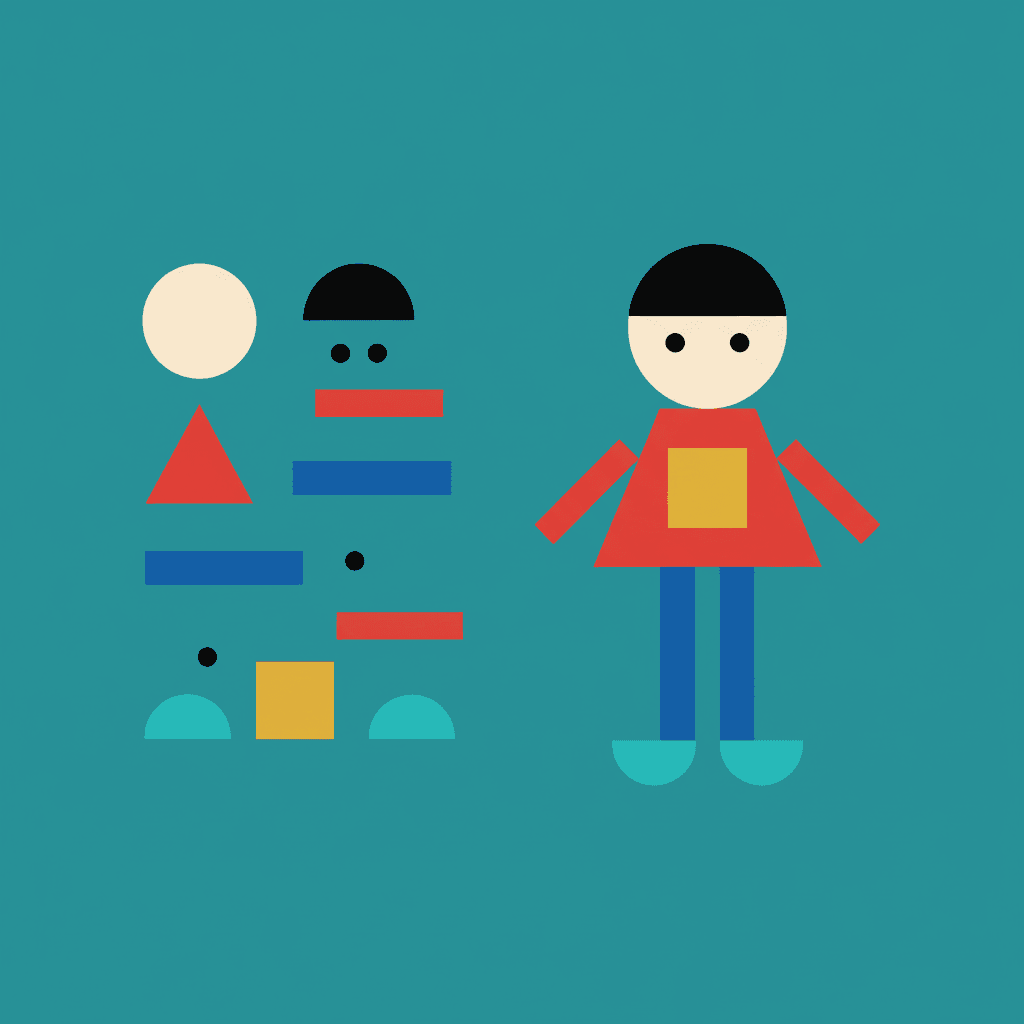
The brief says characters are reduced to essentials, with identity carried by clear outlines and a few key shapes. That is a genuinely different way to keep a cast recognisable. A character here is not a face with features you could describe; it is a fixed set of blocks in fixed colours — this head shape, this body shape, this one accent colour in this one place. Change the pose and the kit survives. It also means two characters must differ as shapes, not as expressions, because at this level of reduction a face has about three marks to work with.
Take the Colour Away and the Picture Falls Apart
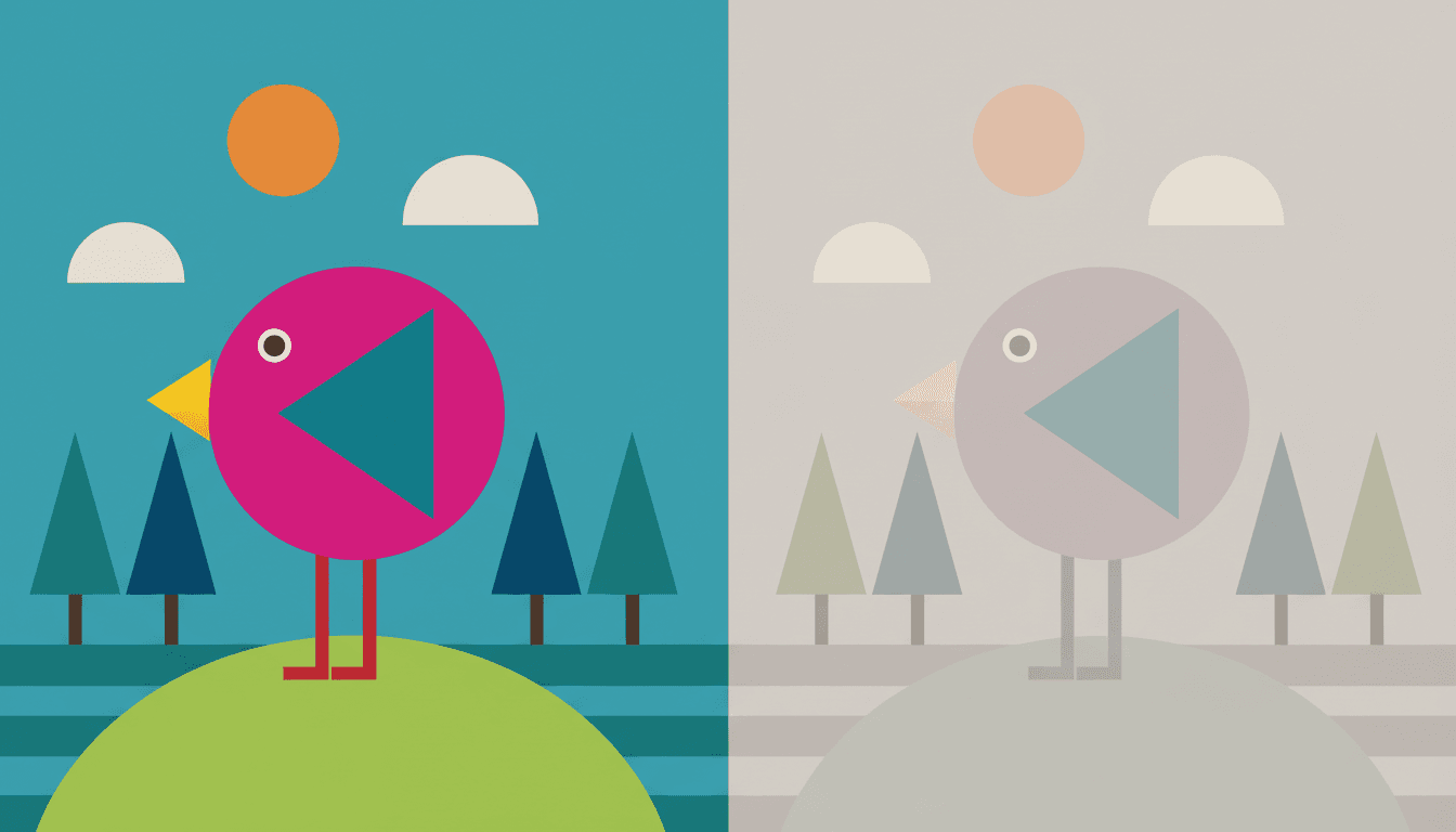
Here is the same bird, the same hill, the same trees, twice. Every shape is in the identical position in both halves, and neither half has an outline. The only thing that changed on the right is that each colour was swapped for a muted, greyed version sitting at roughly the same tone as its neighbours.
The bird barely separates from the sky behind it. The trees all but vanish. Nothing is left to catch the picture, because in this style there was never a line underneath — and that is why muted palette is not a preference in the brief but one of the four things it refuses.
So let it clash. The instinct to tastefully harmonise a palette is the one instinct to suppress here. This brief asks for high-chroma hues placed against each other, and a tidy tonal scheme is the fastest way to make a geometric page look broken.
And skip the detail. Fine detail is its first refusal, so describe shape, scale and posture instead. Detail in your sentence is simply thrown away by this style.
Its four refusals, in the order the brief states them:
Two Ways to Hold a Flat Shape: a Line, or a Colour
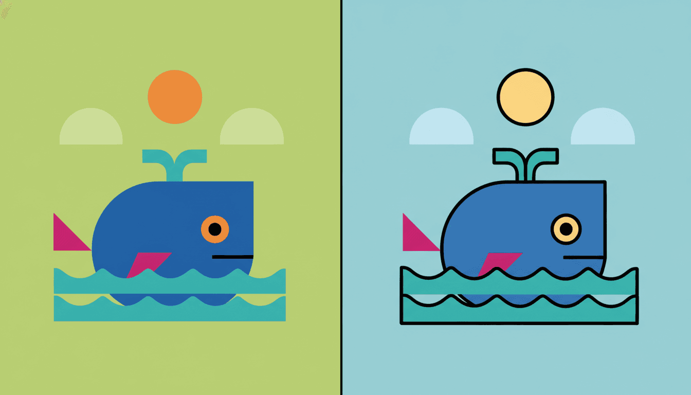
One whale, built from the same five blocks, twice. On the left is this page’s style: no contour anywhere, the cobalt body separating from the turquoise sea only because those two saturated colours collide. On the right is the library’s Bold Flat Satire approach — a thick black line around every shape, and because the line is now doing the separating, the colours can relax.
Neither is better, and both are flat. But this is the actual decision in front of you, and it is not the one most people think they are making. Choosing flat is easy. Choosing what holds the shapes apart is the choice that changes how a whole book looks.
One-second test. Picture your page and look for the black line. If you can see one, you want the bold flat style. If the shapes in your head sit straight against each other with nothing between them, you want this one.
And one for the audience. Bold Flat Satire is specified for adult social satire. This is a picture book brief. If the reader is four, that difference matters more than the line does.
Worth seeing side by side before you commit: the bold flat style, where the outline is load-bearing, the mid-century modern style, which uses geometry to evoke a decade, and the minimalist style, which uses simple shapes to subtract rather than to shout.
Create a Geometric Picture Book in 3 Steps
From a one-line idea to a finished book where every page is assembled from the same blocks in the same loud palette, in under two minutes.
Describe the story
A sentence is enough. Give this style shape, scale and posture rather than detail — it is the one look here that will quietly discard an adjective about texture and build beautifully from a word about size.
"Two neighbours keep building their towers higher"
Pick Bold Geometric Picturebook
Choose it for blocks, clashing saturated colour and almost no outline. Choose Bold Flat Satire instead for a thick black contour, Mid-Century Geometric Fable for a 1950s palette, Minimalist for quiet negative space, or Cinematic Grainy Flat-Shape for flat shapes with real dramatic light.
Vermillion, cobalt, lime, magenta, mustard, turquoise
Generate and export
C2Story writes the story, breaks it into pages and builds every one to the same brief. Read it on screen, share the link, or export the PDF and take that file to whichever printer or print service you already use.
Whole book built, PDF export, instant sharing
The Geometric Illustration Style and Its Nearest Neighbours
Four real styles for a book built out of shapes, sorted by the two questions that actually separate them: what holds the shapes apart, and is the geometry a method or a period?
Bold Geometric Picturebook
Bold geometric picturebook illustration: forms built from clean geometric blocks, minimal outlines, high-saturation colour, strong silhouettes, characters reduced to essentials with identity carried by clear outlines and a few key shapes, and a few high-chroma clashing flat colours keeping silhouettes and clothing in strong graphic contrast. Its light is flat graphic lighting, its line weight is a minimal clean edge, and it refuses fine detail, soft gradients, a muted palette and photorealism. One of eleven picture book styles enabled here.
Bold Flat Satire
Bold flat satirical illustration: thick heavy black contours, flat colour blocks, characters organised by strong silhouettes and big simple shapes, with poses that read through the direction of shoulders, hips and limbs. The clearest comparison in the library, because both styles are flat and neither has any shading to fall back on — and they answer the question differently. That one separates shapes with a heavy black line. This one deletes the line and makes the colours clash instead. Worth noting it is aimed at satire and modern adult life rather than at small children.
Mid-Century Geometric Fable
Mid-century geometric fairytale illustration: modernist flat colour blocks, playfully exaggerated proportions, a bright cheerful palette of warm orange, teal, mustard and cream, hard-edged geometric shapes and a retro graphic sensibility, with muddy colours refused. It is built from geometry too, and the difference is what the geometry is for. That style is a period idiom — it is asking to look like 1955, and it carries a fixed era palette to get there. This one is not about a decade at all; it is about reduction, and its palette is simply whatever clashes hardest.
Bendy Absurd Storybook
A wobbling absurd storybook look with a fluid springy line, bending architecture and impossible balance — and rigid geometry sitting at the top of the four things it refuses by name. It is the exact photographic negative of this page. The library contains a style assembled entirely out of hard-edged geometric blocks and a style that rejects hard-edged geometry as its first principle, which is a useful pair to know about: if your story needs the world to sag and lean, the blocks here will fight you the whole way.
Three more relatives are worth knowing about. Cinematic Grainy Flat-Shape keeps the flat blocks but brings back film grain and strong directional light, so it can do atmosphere that this one cannot. Pop Satire Cartoon is one of only three styles here that shares the high-chroma clashing colour clause, and spends it on adult satire with thick outlines and bulging eyes. And the minimalist style also builds from simple geometric shapes, but towards quiet and negative space rather than towards volume and collision. Browse everything on the illustration styles hub.
Geometric Storybook Art Ideas to Get You Started
This look is better at shape, scale, counting and construction than at texture, tenderness or small hidden details. These six lean into that.
The Night the Triangles Left
Every triangle walks out of town, so nothing has a roof and no tree has a top. A story whose plot is literally made of shapes suits a style where every object on the page is one nameable block.
Create this storyTen Red Circles
Ten circles go missing one at a time and turn up somewhere useful. Counting books live or die on instant legibility, and flat saturated blocks with no fine detail are about as legible as illustration gets.
Create this storyThe Tallest Tower
Two neighbours keep stacking. Building and stacking stories are the natural home of a look where scenery genuinely is assembled from blocks, so each new storey reads as one more shape.
Create this storyThe Machine That Made Weather
Pipes, cogs, levers and one enormous switch. Machinery is one of the few subjects that gets better when it is reduced — a cog is a circle, a lever is a rectangle, and the whole contraption stays readable.
Create this storyNorth
A long walk from a hot orange country into a cold blue one. Because this style has nothing but colour to separate its shapes, a journey written as a change of palette is doing the work the brief is best at.
Create this storyThe City Wakes Up
One street, from dark to busy. Flat rectangles with lit squares punched into them make a city almost effortlessly, and the whole mood can turn on swapping the sky from indigo to turquoise.
Create this storyAI-Generated Geometric Picture Book Illustrations
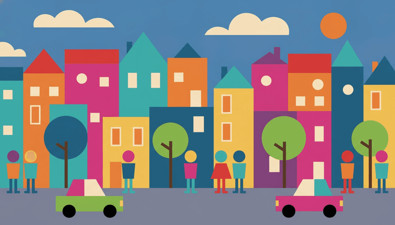
Try this on the town below: look for a single black line anywhere in it. There isn’t one. Every window, roof, wheel and face is held in place by nothing but the colour next to it.
Flat Shape Illustration for Every Part of Your Story
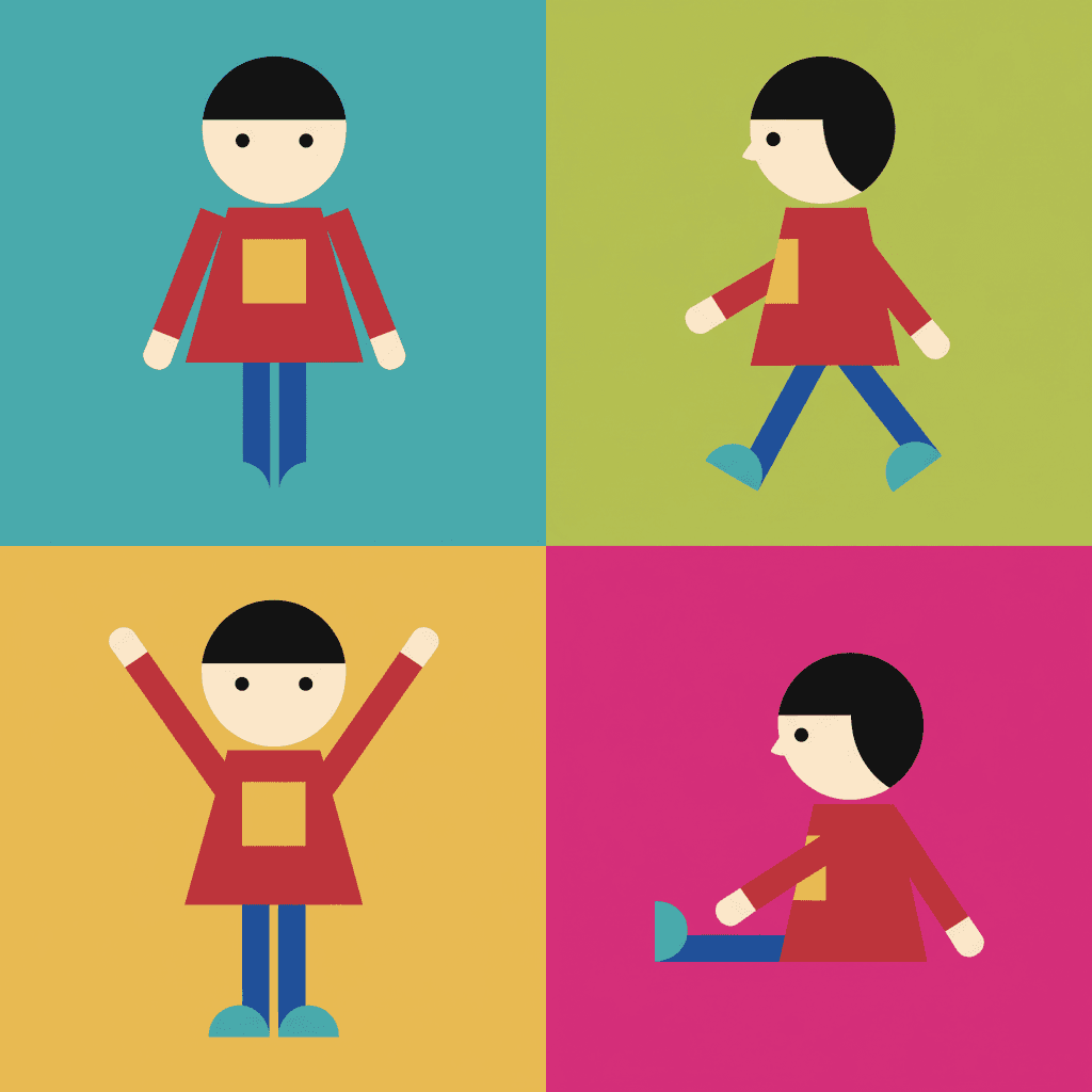
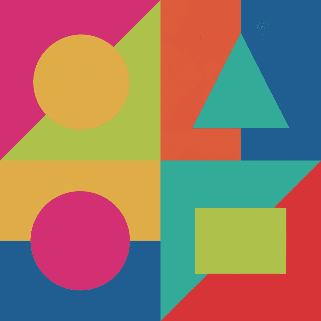
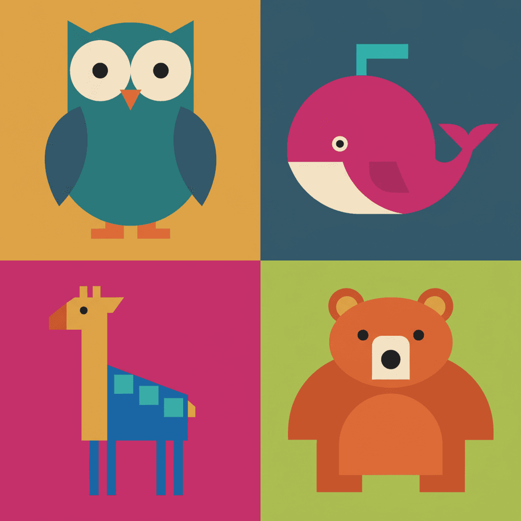
Characters, the kit they are built from, pure colour collisions, animals reduced to blocks and whole places — the same hard edges and the same loud palette, spent on whatever your story is actually about.
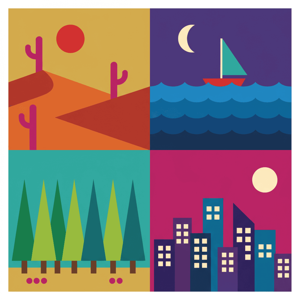
Everything You Need for Geometric Picture Books
One striking graphic image is easy. Twenty-four of them, with the same character assembled from the same blocks in all of them, is the part that needs building.
The same shape kit on page twenty
Reduction is exactly where image models drift, because there is so little to hold on to. Ask twenty times for a geometric child and the head quietly rounds off, an outline creeps back in, the saturation drops and by the last spread you have a soft cartoon instead. One fixed brief — geometric blocks, minimal outlines, high-saturation colour, no fine detail — is carried into every page of the book instead, so the final page is built the same way as the first.
A palette chosen to clash, on purpose
High-saturation colour, clashing flat hues, bold blocks, under flat graphic lighting. There is no eyedropper and no hex field — the range arrives with the style, and it arrives loud. That is the point rather than a limitation, but it is worth knowing before you commit: this look will not go quiet, dusty or pastel for you, because quiet is the one thing it is specified against.
A cast saved as shapes
Save each character once in the Character Library, with up to fourteen reference images each, and they carry into every page and into later books. It works unusually cleanly in this style, because what has to stay consistent is a short list of blocks and colours rather than a face — the trapezoid coat, the one mustard patch, the turquoise shoes. Characters built from an uploaded photo stay private to your account.
A page a pre-reader can point at
A side effect of reduction is that everything on the page is a shape a small child already has a word for. A triangle is the roof, a circle is the sun, a rectangle is the door. That makes this look genuinely good for reading aloud to someone who cannot read yet, because there is something to name and point at on every spread rather than a detailed scene to decode.
Whole books, not single posters
You are not prompting for one lucky graphic image. Describe the story and C2Story writes it, breaks it into pages, and builds every page in this style to match what that page actually says — so one town, one forest or one machine stays recognisably the same construction across a narrative.
Any language you read aloud in
The look carries no language of its own. Write in English, Chinese, Japanese, Spanish, French and more — the blocks, the hard edges and the clashing colour do not change with the text. A triangle is a triangle in every alphabet.
Geometric Picture Books — Questions
What people ask before committing a whole book to flat blocks, hard edges and a palette chosen to clash.
Explore More Story Ideas
Discover more styles, tools, and story types
Garden Stories
Planting seeds, sunflowers, butterflies and the veggie patch
Explore
Ligne Claire Picture Books
One even ink line & flat unshaded colour
Explore
AI Story Generator
Generate complete stories with AI
Explore
Storybird Alternative
Better AI story creation
ExploreGeometric Picture Books — Building a Story Out of Circles, Triangles and Blocks with AI
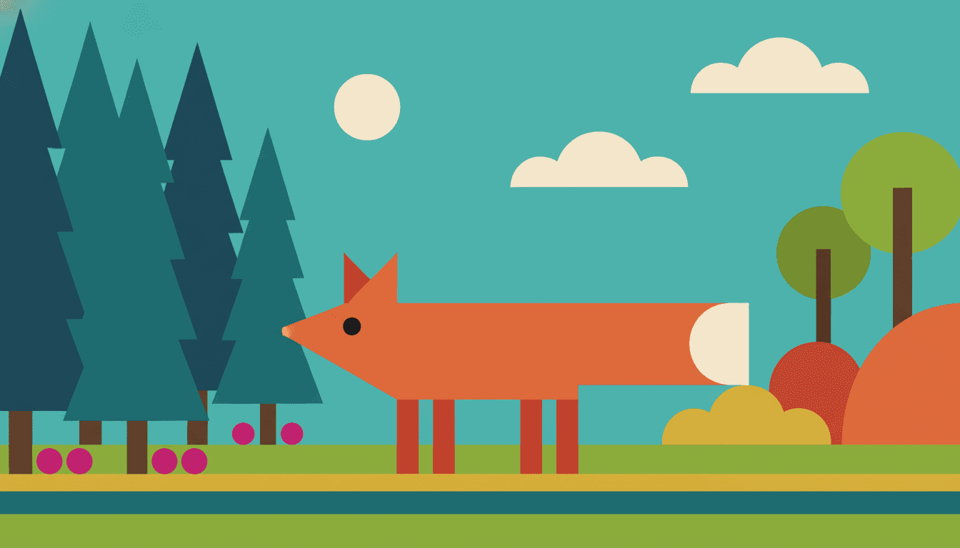
A geometric picture book is one where nothing is drawn in the ordinary sense. A fox is not outlined and filled in; a fox is a triangle lying on its side with two smaller triangles for ears and four rectangles underneath, and it reads as a fox because that silhouette is unmistakable. On C2Story this is the Bold Geometric Picturebook style, and its brief says it plainly — bold geometric picturebook illustration, forms built from clean geometric blocks, minimal outlines, high-saturation colour, strong silhouettes, characters reduced to essentials with identity carried by clear outlines and a few key shapes, and a few high-chroma clashing flat colours keeping silhouettes and clothing in strong graphic contrast. One brief, applied across a whole book, so the twentieth spread is assembled exactly the way the first one was.
The thing worth understanding before you commit a book to it is that this is the only picture book style in the library that does not draw with a line. Each of the seventy-eight hand-drawn styles enabled here carries a specified line weight, and among the eleven picture book styles, ten name a real instrument: thin delicate ink lines, clean confident ink outlines, a loose rough ink line, delicate relaxed pen lines, a fluid springy line, soft rounded outlines, grainy crayon and brush strokes, painterly brush edges, soft irregular hand-drawn edges. This one names a minimal clean edge and asks for forms built from blocks with minimal outlines. The shapes are not drawn around — they are butted up against each other, and the boundary where two colours meet is the entire drawing. Everything else about the style follows from that one structural fact.
Follow it to its conclusion and you arrive at the most useful piece of practical advice for this look. If no line is holding a shape in, then the only mechanism separating one form from the next is colour contrast — which is why the brief asks for high-saturation colour and clashing hues, and why muted palette appears in its list of four refusals alongside fine detail, soft gradients and photorealism. Four of the seventy-eight enabled styles refuse a muted palette and this is the only picture book among them, while two of its own category siblings refuse neon colour by name and a third refuses a saturated flood. The refusal is structural, not a matter of taste. Desaturate a geometric page towards a single tasteful tonal range and adjacent shapes genuinely start to merge, because there is nothing underneath to catch them. So resist the urge to harmonise, and let the colours clash. That is the one instinct to suppress in this style, and it is the instinct most people bring to it first.
Two honest notes before you start. First, this style cannot do intimacy, texture or atmosphere. With fine detail and soft gradients both refused and the lighting specified as flat and graphic, there is no fur, no fabric, no mist, no dusk and no soft light anywhere in it, and a face reduced to three marks cannot carry a complicated emotion — so mood has to arrive through colour relationships, scale and posture instead. For tenderness and surface, compare the animal watercolour style or the gouache style; for flat blocks that still have dramatic light, the cinematic grainy flat-shape look keeps the shapes and brings the lighting back. Worth knowing too that the library contains a style which refuses rigid geometry as its first principle — the whimsical absurd style, where everything sags and leans — so if that is the world you are picturing, these blocks will fight you. Second, because reduction is where image models drift most, save each character in the Character Library with up to fourteen reference images before you begin, and make sure any two characters differ as silhouettes rather than as faces. Characters built from an uploaded photo stay private to your account. Write in any language you read aloud in, then export the finished book as a PDF, which is the handoff to whichever printer you already use, and the images you generate are licensed for commercial use. Start free: see our pricing plans, browse every option on the illustration styles hub, compare it with the bold flat style, the mid-century modern style or the pop art style, or go straight to the AI Story Generator.