
Showa Retro Picture BooksThe One Brief in a Good Mood
Sixteen of the seventy-eight style briefs here refuse dull colour. A showa retro picture book is built from the one that goes on to say what the brightness is for — and upbeat appears exactly once in all seventy-eight.
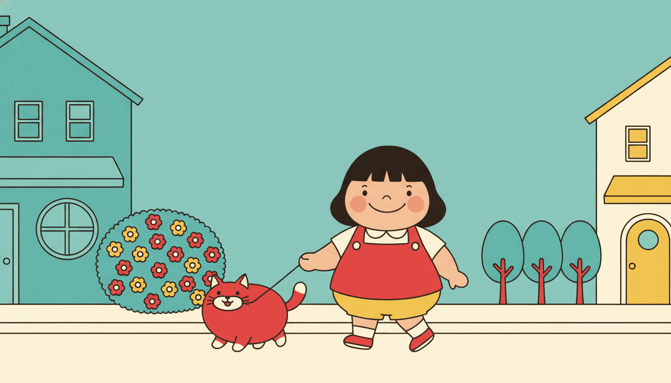
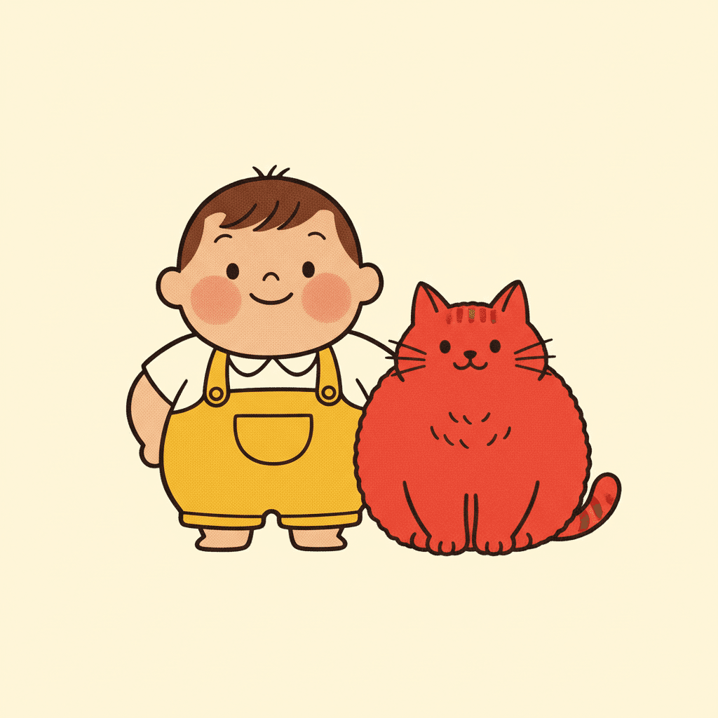
- Plump rounded characters — the warmth is in the body, not the face
- Flat printed colour with a subtle halftone dot texture
- Flat bright poster light, so nothing casts a shadow anywhere
- Free credits by request — no card
50,000+
Stories Created
10,000+
Active Creators
50+
Art Styles
4.9/5
User Rating
What Makes Showa Retro Illustration Different From Simply Using Bright Colours
Bright flat colour is everywhere in this library. Four fields in this one brief turn it from a palette setting into a mood the style is obliged to produce.
Sixteen briefs refuse dull colour. One says what it wants the brightness for
Every style in C2Story runs on a short written brief recording a palette, a lighting note, a line weight and four things to avoid. Sixteen of the seventy-eight hand-drawn briefs list a muted, muddy, washed-out or dull colour among those four — it is one of the commonest refusals in the library, usually a quality-control note telling the render not to go murky. This brief refuses muted colours too, and then does something none of the others do: it says what the brightness is in aid of. Its mood is an upbeat nostalgic advertising mood, and the word upbeat appears exactly once across all seventy-eight briefs. Everywhere else brightness is a technical setting. Here it is a feeling the style is under instruction to produce.
Then the bodies are built to agree with it
The word plump also appears exactly once in the seventy-eight, in this brief: plump rounded cheerful characters. Six briefs ask for something rounded, but rounded is a line instruction — it describes a curve. Plump is an instruction about mass, and it changes where the warmth in a drawing comes from. A round cheek, a short rounded limb and a soft heavy middle read as friendly before the character has done anything at all: no smile is required, no gesture, no scene. That is unusual and it is worth knowing, because it means the goodwill on these pages is not being carried by expressions. It is built into the shape of everyone in them.
And the surface is a printing press, not a brush
Printed is the third word here that occurs once in seventy-eight briefs, and it occurs twice inside this one: a flat printed poster feel with subtle halftone warmth, and flat printed color in the render notes. Only one other brief in the library mentions halftone at all. This matters more than it sounds. A painted surface carries light — a wash gets deeper, a gouache layer sits heavier. A printed surface carries none: it is one flat even area of ink with a fine dot texture in it, and the dots warm the colour without shading it. So the page you get is not a painting of a cheerful scene. It is a cheerfully printed object, which is a different look and a far more consistent one across twenty-four pages.
Which leaves no shadow anywhere to put a bad mood in
The lighting field is the quiet one that settles it: flat bright poster lighting. Plenty of briefs here are flat and plenty are bright; this is the only one whose light is both at once and named after a printed poster. Flat removes modelling, so nothing has a dark side; bright removes the low key, so nothing is underlit. Put that beside the refused muted palette, the refused gritty texture and the plump rounded bodies, and the style has handed back every instrument a drawing normally uses for gloom. It is not that showa retro illustration refuses to be sad. It is that there is nothing left in it to be sad with — and that gives the look a floor under its mood that no other style here has.
The Same Drawing, With the Colour Taken Out
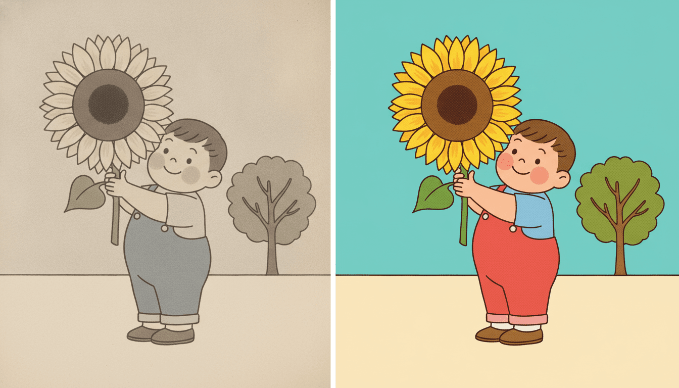
Look at the two halves. It is the same boy, the same dungarees, the same sunflower held in the same hand, the same round-topped tree behind him and the same halftone dot texture over all of it â the drawing has not changed between them at all. What changed is the ink it was printed in. On the left the sky has gone dishwater beige, the sunflower is grey-white with a brown middle, the dungarees are flat grey and the tree is a grey smudge, and the page reads instantly as something faded, something found at the back of a drawer. Notice that nothing about the boy is sad. He has the same round cheeks and the same small smile he has on the right. The picture is not unhappy. It is just tired.
On the right the identical drawing is printed in a flat teal sky, cherry-red dungarees, a marigold sunflower and a warm cream ground, and the mood arrives with the colour. That is the whole argument of this style in one frame, and it is why the brief lists muted colours among its four refusals instead of leaving the palette to taste. Sixteen of the seventy-eight briefs refuse a dull, muddy or washed-out colour, and in most of them the line is housekeeping â a note telling the render not to go murky. Here it is load-bearing, because the brief has already committed to a mood it is obliged to deliver, and the left-hand half is exactly what becomes of that mood when the palette slips. Nothing else in the picture is holding it up. There is no shadow, no texture and no modelling to fall back on. There is only the ink.
Sixteen of seventy-eight briefs refuse a dull colour. This is the only one that names the feeling the brightness is meant to deliver — an upbeat nostalgic mood.
Upbeat, plump and printed each appear once in seventy-eight. A mood, a body and a surface, all three found nowhere else, all three pulling the same way.
Its four refusals, in the order the brief states them:
Write the Day It Worked Out
Most picture-book advice tells you to write the feeling â she was frightened, he felt left out â and for nearly every other style here that is good advice, because a face can be drawn doing it and a light can be dimmed around it. This brief has the face but not the light. Its mood is set to upbeat before you write a word, its palette refuses to go muted, its bodies are plump and therefore read warm before anybody has done anything, and with flat bright poster lighting there is not one shadow anywhere on the page to put dread into. Hand it “she was terrified of the dark” and you have asked a style with no darkness in it to go and find some.
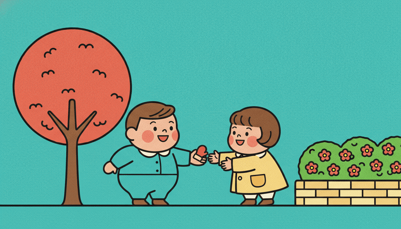
Hand it the other half of your story and nothing here beats it. This is the moment a lost mitten gets handed back: one boy holding it out flat on his palm, one girl already reaching, a red tree, a flowering hedge, a teal sky, and not a shadow in sight. Nothing in the picture is straining â there is no dramatic light, no tension, no held breath â and none is needed, because every element is already pulling the same way the story is. That is the lever this style hands you, and it is a writing lever rather than an art one: find the page in your book where something small goes right, and give that page to this brief. The bicycle that finally holds. The bread baked anyway. The stray that stays.
Give it the scene where things go right. The bicycle that finally holds, the bread baked anyway, the mitten handed back — this style draws a resolution better than any other here.
Keep the trouble solvable. With no shadow and no muted colour available, a page of real dread is the one thing the brief cannot build.
Worth seeing side by side before you commit: the mid-century modern style, which is bright from geometry rather than from print, the muted editorial style, which turns the same dial the whole way down on purpose, and the pop art style, which shares the advertising ancestry and spends it on force instead of warmth.
Create a Showa Retro Picture Book in 3 Steps
From a one-line idea to a finished book printed end to end in the same flat bright ink, in under two minutes.
Describe the story
A sentence is enough. Hand it the part of the story that goes right rather than the part that goes dark — this brief is under instruction to be upbeat and has no shadow to put dread in, but it will draw an ordinary good day beautifully.
"A boy is sent for the last melon bread and arrives too late"
Pick Showa Commercial Cartoon
Choose it for plump rounded characters, flat printed colour and a halftone warmth. Choose Retro Vintage instead if you want the same era faded and muted, Mid-Century Geometric if you want the brightness built from shapes, or Shanghai Calendar Poster for commercial art that is airbrushed rather than printed.
Cherry red, teal and warm cream, flat and bright
Generate and export
C2Story writes the story, breaks it into pages and builds every one to the same brief. Read it on screen, share the link, or export the PDF and take that file to whichever printer or print service you already use.
Whole book built, PDF export, instant sharing
Showa Retro Illustration and Its Nearest Neighbours
Four real styles, sorted by the question that actually separates them: what is all this brightness in aid of?
Showa Commercial Cartoon
Mid-century Japanese commercial cartoon illustration with plump rounded cheerful characters, a bright cheerful retro palette of cherry red, teal and warm cream, clean confident outlines and a flat printed poster feel with subtle halftone warmth, all in aid of an upbeat nostalgic mood. Its light is flat bright poster lighting and its four refusals in order are modern anime shading, gritty texture, muted colours and photorealism. It is one of the styles featured in the picker rather than buried in the long list.
Retro Vintage
The comparison to make before any other, because this is the same period and the same printing and it disagrees on the one thing that matters. Its brief asks for a 1950s aesthetic with halftone textures and a muted warm palette — muted being the exact quality the showa retro brief lists among its four refusals. So the library holds two styles built from mid-century print, one of which wants the colour faded and one of which forbids it. If what you picture is an old book found in a loft, soft and dimmed by age, you want that one. If you picture the book when it was new on the shelf, you want this one.
Mid-Century Geometric Fable
The other genuinely bright style from this era, and the closest thing to a rival. It also refuses muddy colours and it also works in modernist flat colour blocks on a bright palette of warm orange, teal, mustard and cream. The difference is what the brightness is wrapped around. That brief builds its characters out of bold simplified geometry with playfully exaggerated proportions, and its light is flat graphic lighting with no print texture at all. Take it if you want a page that is designed. Take this one if you want a page that is warm — plump bodies and halftone dots are the whole difference.
Shanghai Calendar Poster
Only two of the seventy-eight briefs mention advertising, and this is the other one. It shares the commercial ancestry and the nostalgic warmth, then parts company on the surface: soft airbrushed rendering, smooth blended skin and a soft flattering studio glow, in rouge pinks and jade greens. Where showa retro illustration is flat ink with a dot texture and a crisp outline, that one is blended and glowing with no outline to speak of. Same trade, two centuries of print apart. It also sits in a different decade and a different country, and it draws adults where this brief draws children.
Three more worth knowing. The pop art style is the other look descended from advertising, but it clashes its colours to grab you where this one warms them to welcome you. The bold flat style shares the flat unshaded fill and makes the outline load-bearing instead of the print texture. And the muted editorial style is the exact inverse, built by turning the saturation down on purpose rather than forbidding it. Browse everything on the illustration styles hub.
Showa Retro Story Ideas to Get You Started
This style is far better at an ordinary good day than at a dark night. These six give it trouble it is allowed to solve.
The Bread That Sold Out
A child is sent for the last melon bread and arrives one customer too late — so the baker makes one more. A small want, a small setback and a visible fix, which is exactly the shape of story this style can draw end to end.
Create this storyLearning the Bicycle
Wobble, wobble, and then the morning it holds. The whole arc is physical and happens in daylight, and a style with no shadow and no dim light is at its best on a story whose trouble is solvable by teatime.
Create this storyThe Cat Who Chose Us
A round stray turns up at the shop door and keeps turning up. Plump rounded characters is a cast instruction as much as a drawing one, and a story about a soft animal moving in plays directly to it.
Create this storyGrandmother Makes Lunch
Rice balls, a low table, everyone reaching at once. Interiors in this style are lit flat and bright with nothing casting a shadow, so a crowded warm kitchen stays completely readable instead of going murky in the corners.
Create this storyThe Festival Stall
One evening, one street, far too many things to spend your coins on. Bright flat colour and clean outlines keep a busy crowded page legible, where a painted style would turn the same scene into mud.
Create this storyThe Mitten Handed Back
Something is lost on page two and returned by a stranger on page ten. A story whose engine is ordinary kindness suits a look that is under instruction to be upbeat, and needs no dark page to earn its ending.
Create this storyAI-Generated Showa Retro Illustration Examples
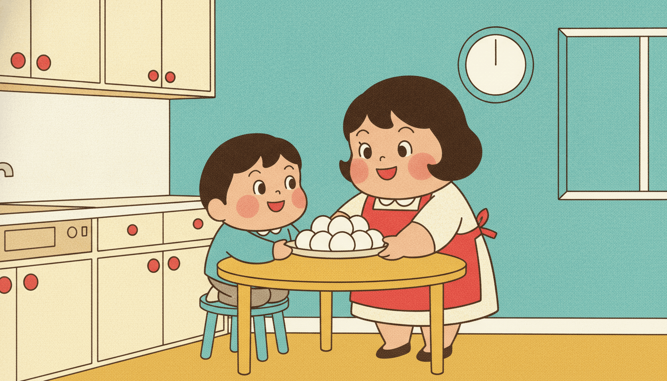
Three pages, one press run. The split frame is the same boy drawn twice with only the ink changed, faded on the left and printed bright on the right, the drawing underneath identical. The mitten being handed back is the kind of page this style exists for — a small thing put right, in flat daylight, with nobody casting a shadow. And the kitchen is the proof it holds up indoors: a woman, a child, a stool, a round table and a dish of rice balls, lit flatly and evenly like a printed page, with no light falling across the floor and nothing shadowing anything else.
Showa Retro Illustration for Every Part of Your Story
Four flat fields of ink with a face in each, one figure against a single colour, an animal held together by its outline, a bright day out and a pair sitting on nothing at all — the same press run spent on whatever your story is actually about.
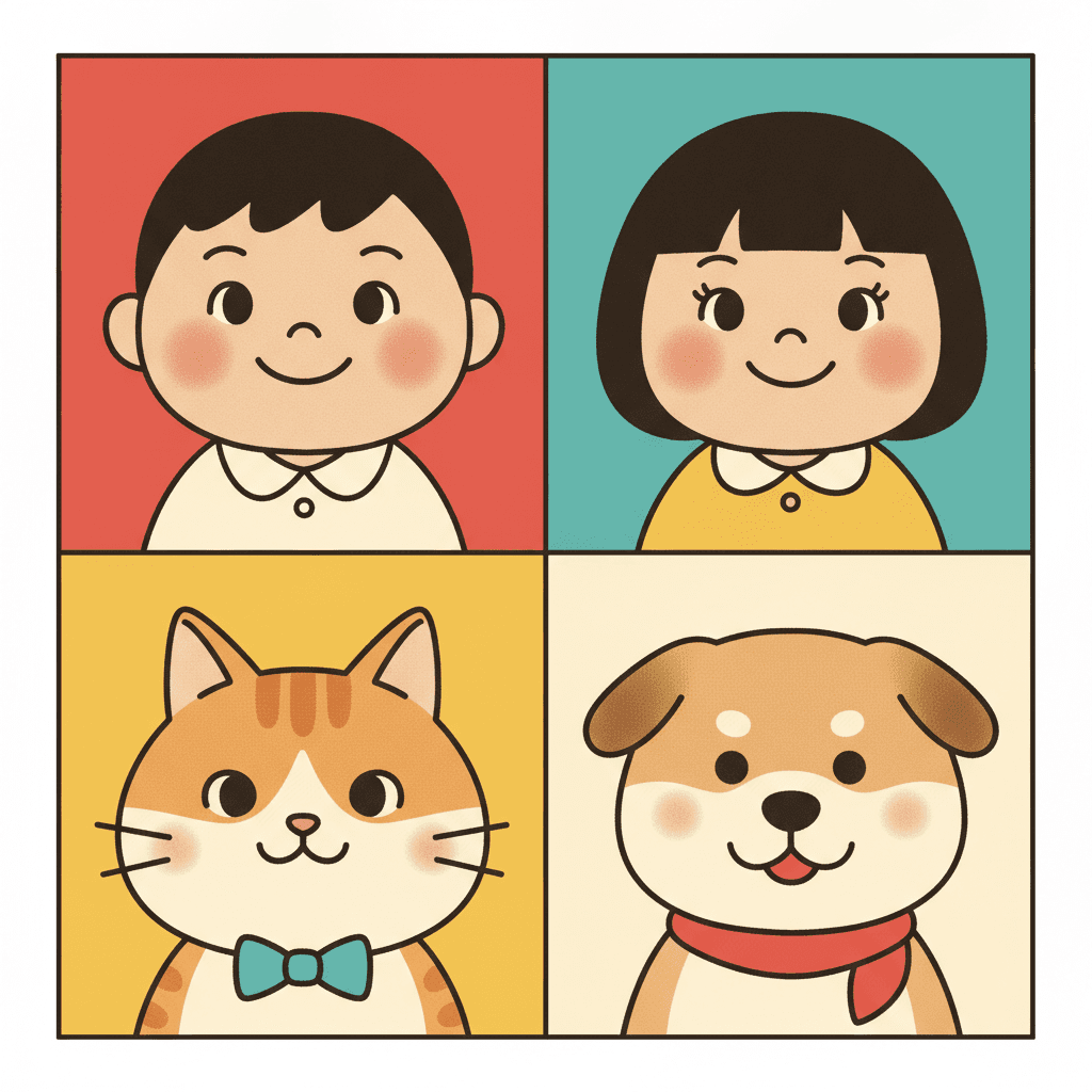
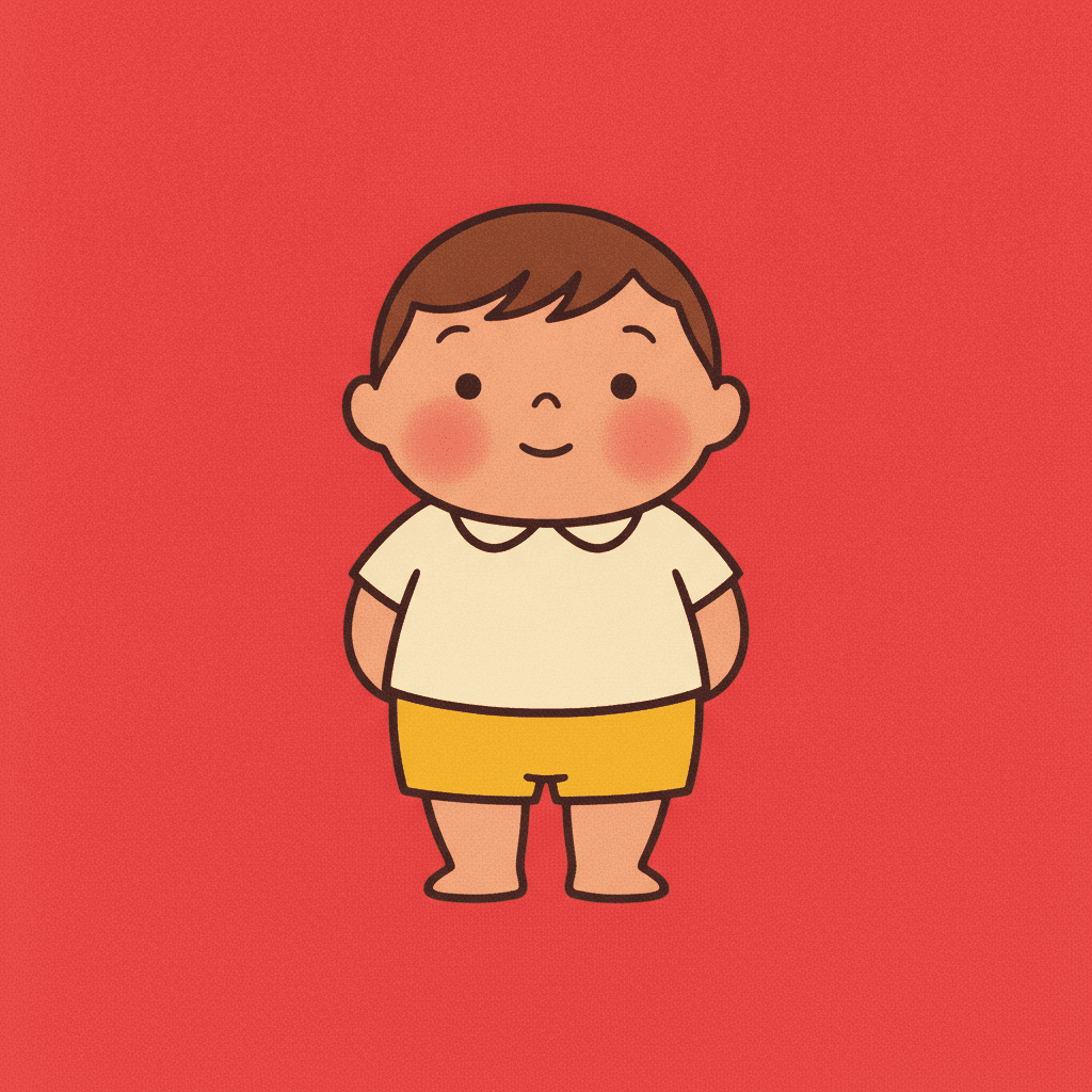
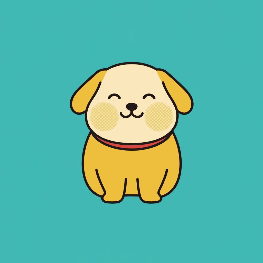
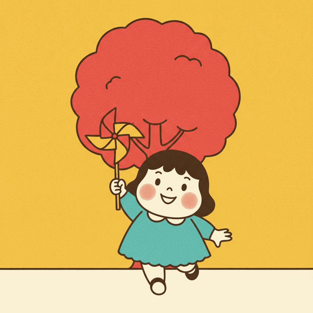
Everything You Need for Showa Retro Picture Books
One charming nostalgic image is easy. Twenty-four pages whose ink stays flat, whose palette stays loud and whose cast stays plump is the part that needs building.
One printed surface, held for the whole book
This is the thing that breaks first when pages are generated one at a time, and in a printed style it breaks loudest, because a flat even area of ink and a painted wash do not sit together at all. If page three is flat printed colour, page four has a soft airbrushed sky and page five has visible brushwork, the book stops looking printed and starts looking assembled. One fixed brief is carried into every page instead: plump rounded cheerful characters, bright retro palette, clean confident outlines, flat printed colour, subtle halftone, and the same four refusals of modern anime shading, gritty texture, muted colours and photorealism. Twenty-four pages, one press run.
A cast that stays plump and stays itself
Worth understanding before you cast your book. Because the warmth here lives in body shape rather than in facial expression, your characters are recognised by silhouette — the round one in the red pinafore, the rounder cat, the grandmother who is widest of all — and silhouette is exactly what drifts when each page is drawn fresh. Save each character in the Character Library with up to fourteen reference images and they are carried into every page and on into later books, at the same proportions each time. Characters built from an uploaded photo stay private to your account.
Cherry red, teal and warm cream — and what that costs
The palette is recorded as a bright retro palette of cherry red, teal and warm cream, and it is a narrow, loud, deliberate set. Know the trade before you commit a book to it. There is no grey here to push anything into the background, no sepia to age a flashback and no low-key colour to drop the temperature for one page, so every spread arrives at roughly the same pitch. That consistency is the point of a printed look, but it does mean this style cannot modulate the way a painted one can. If you want a book that can go quiet, the muted editorial or grainy cinematic styles are built for it. There is also no global greyscale switch in C2Story, so a monochrome book means picking a style that is monochrome by design.
Mid-century advertising, with its actual contents left out
The honest note this style needs, because the tradition it borrows from is a commercial one from a specific decade, and that decade sold things a children's book should not inherit. Left alone, a brief citing mid-century Japanese commercial art drifts towards the real artefacts: beer and cigarette advertising, product packaging, shopfront hoardings, adult nightlife, pin-ups. Our generation guidance holds the line on purpose. The cast is children and friendly animals, everyone wholesome and modestly dressed; there is no alcohol, no tobacco and no nightlife anywhere; and nothing in the picture is a poster, a billboard, a package or a product being presented to you. The words commercial and advertising describe the bright flat printed manner of the drawing, never a thing appearing in it.
A whole book, not one nostalgic image
This look survives today mostly as single images — a reissued tin, a mascot, a print somebody framed. You are not prompting for one of those. Describe the story and C2Story writes it, splits it into pages and builds each page to this brief according to what that page actually says, so the printed surface is spent across a narrative with a beginning and an end rather than all at once on one charming picture. You get picture-book pages, with your words set as type rather than drawn into the art — which is just as well, since this style produces no lettering of its own.
Readable very young, in whichever language you read aloud in
This is one of the easier styles here for a small child, and the reasons are structural rather than a matter of taste. Flat bright colour separates one object from the next with no ambiguity; a clean confident outline tells a child where a thing stops; there is no shadow to be mistaken for an object and no texture to read through; and plump rounded bodies are the shape small children find friendliest. The caveat is subject rather than complexity — a look with an upbeat floor suits a story that resolves rather than one that unsettles, so save the frightening page for a different style. Write in English, Chinese, Japanese, Spanish, French and more; the look does not change with the language.
Showa Retro Picture Books — Questions
What people ask before committing a whole book to flat bright ink and no shadows.
Explore More Story Ideas
Discover more styles, tools, and story types

Puppy Stories
A new puppy comes home, first walks, lost puppies and puppy school
Explore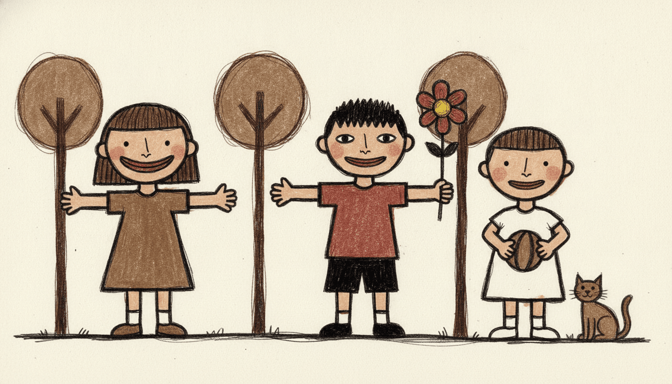
Art Brut Picture Books
Thick wobbly outlines & off-kilter figures
Explore
Picture Book Maker
Create illustrated picture books
Explore
ChatGPT vs C2Story
Purpose-built for picture books
ExploreShowa Retro Picture Books — Flat Printed Ink, Plump Characters and a Mood With a Floor Under It
A showa retro picture book is one where every page is a mid-century Japanese commercial cartoon: plump rounded cheerful characters drawn in clean confident outlines, filled with flat bright printed colour in cherry red, teal and warm cream, and warmed by a subtle halftone dot texture instead of by shading. On C2Story this is the Showa Commercial Cartoon style, and its brief states the ambition plainly — mid-century Japanese commercial cartoon illustration, plump rounded cheerful characters, a bright cheerful retro colour palette, clean confident outlines, a flat printed poster feel with subtle halftone warmth, and an upbeat nostalgic advertising mood. One brief applied across a whole book, so the twentieth spread is built from the same instruction as the first.
The part worth knowing before you commit a book to it is which of that is genuinely rare, because bright flat colour is not rare here at all. Sixteen of the seventy-eight hand-drawn briefs enabled in C2Story list a muted, muddy, washed-out or dull colour among their four things to avoid; refusing dullness is one of the commonest instructions in the library, and in most briefs it is a piece of quality control telling the render not to go murky. What no other brief does is say what the brightness is for. This one names a mood — upbeat — and that word appears exactly once across all seventy-eight. Two more of its words are equally singular. Plump occurs once in the library, in this brief: six briefs ask for something rounded, but rounded describes a curve, while plump describes mass, and mass is why these characters read as friendly before they have done anything at all. And printed occurs once too, twice over inside this one brief — a flat printed poster feel, and flat printed colour — where only one other brief in the library so much as mentions halftone.
Read those three together with the lighting field and the look stops being a taste and starts being a machine for one feeling. The light is flat bright poster lighting: plenty of briefs here are flat and plenty are bright, but this is the only one that is both at once and named after a printed poster, which means nothing is modelled, nothing has a dark side and nothing anywhere casts a shadow. Set that beside a refused muted palette, a refused gritty texture and a cast of plump rounded bodies, and every instrument a drawing normally uses for gloom has been handed back. The consequence is a floor under the mood that no other style here has. It is not that showa retro illustration refuses to draw an unhappy page; it is that there is nothing left in it to make one with. This is also why the surface matters: a painted page carries light, so a wash can deepen and a layer can sit heavier, while a printed page is one flat even area of ink with a fine dot texture in it, and the dots warm a large field of cherry red without making any part of it darker than another.
Four honest notes before you choose it. First, the writing advice inverts. Most picture-book guidance pushes you to name the feeling, and this brief already has one, so the useful move is to hand it the scene that goes right rather than the scene that goes dark — the bicycle that finally holds, the bread baked anyway, the mitten handed back by a stranger. Write the day it worked out and this style will draw it better than anything else in the library; write a storm, a dark bedroom or a goodbye at dusk and you have asked a flat shadowless surface for tone, which is the one thing it has given up. For those pages take the grainy cinematic style, the crosshatch style or the muted editorial style, which is this one's exact inverse. Second, the palette costs you something real: cherry red, teal and warm cream is a narrow loud set with no grey to push anything back and no low key to drop the temperature for a single spread, so every page arrives at roughly the same pitch — that consistency is the point of a printed look, but it is not a style that modulates. Third, the tradition this borrows from is a commercial one from a particular decade, and that decade sold beer and cigarettes to adults, with product packaging, shopfront hoardings and pin-ups among its stock imagery, so our generation guidance states the opposite outright: the cast is children and friendly animals, everyone wholesome and modestly dressed, no alcohol or tobacco or nightlife anywhere, and nothing on the page is a poster, a billboard, a package or a product being presented to you — the words commercial and advertising describe the manner of the drawing, never its contents. Fourth, the comparison that settles it is within the era itself. The Retro Vintage style asks for the same 1950s print and the same halftone with a muted warm palette, which is the exact quality this brief refuses, so the library holds the same period twice over: once faded by age and once new on the shelf. The mid-century modern style is bright too but builds its brightness from modernist geometry with no print texture and no plump bodies, and the pop art style shares the advertising ancestry and spends it on force rather than warmth. In exchange you get a book that is unusually easy for a very young reader — flat bright colour separates one object from the next with no ambiguity, a clean outline says where a thing stops, there is no shadow to be mistaken for an object and no texture to read through — and unusually easy to keep consistent, since characters are carried by silhouette, so save each one in the Character Library with up to fourteen reference images and they are reused across every page and into later books, with photo-built characters staying private to your account. Write in any language you read aloud in, then export the finished book as a PDF, which is the handoff to whichever printer you already use, and the images you generate are licensed for commercial use. Start free: see our pricing plans, browse every option on the illustration styles hub, or go straight to the AI Story Generator.