
Wild Ink Picture BooksThe Strange Thing Is Standing in Plain Daylight
Of the seventy-eight style briefs here, only one asks for the eerie — and it refuses to use the dark to get it. A wild ink picture book comes from that brief: untamed brush-ink spirits, strange and uncanny, standing on bare cream paper under a flat even light, with nothing hidden in shadow.
- Untamed flowing brush-ink with real hand pressure
- Eerie spirit-creatures and uncanny characters
- Black ink, muted vermillion and washed indigo
- Free credits by request — no card
50,000+
Stories Created
10,000+
Active Creators
50+
Art Styles
4.9/5
User Rating
What Makes Wild Ink Illustration Different From Every Other Ink Style
Every style here is a written brief — a palette, a light, a line weight, a short list of refusals. Four lines in this one decide everything, and the most revealing of them is the light.
The only brief in the library that asks for the eerie
Every style in C2Story runs on a short written brief — a palette, a light, a line weight and four things to avoid. Read all seventy-eight for the vocabulary of unease and almost nothing turns up. Three briefs use the word strange, and two of them mean it kindly: the bendy-absurd brief has strange invented creatures in bright playful colour, and the botanical ink brief has strange ornate flora in a spirit of curio-cabinet whimsy. Only this one pairs strangeness with words that are meant to make you a little uncomfortable. Eerie appears in exactly one brief. So does uncanny. So does untamed. Its subject is eerie Eastern spirit-creatures and strange uncanny characters, and nothing in it softens that into cute.
And it refuses to use the dark to get there
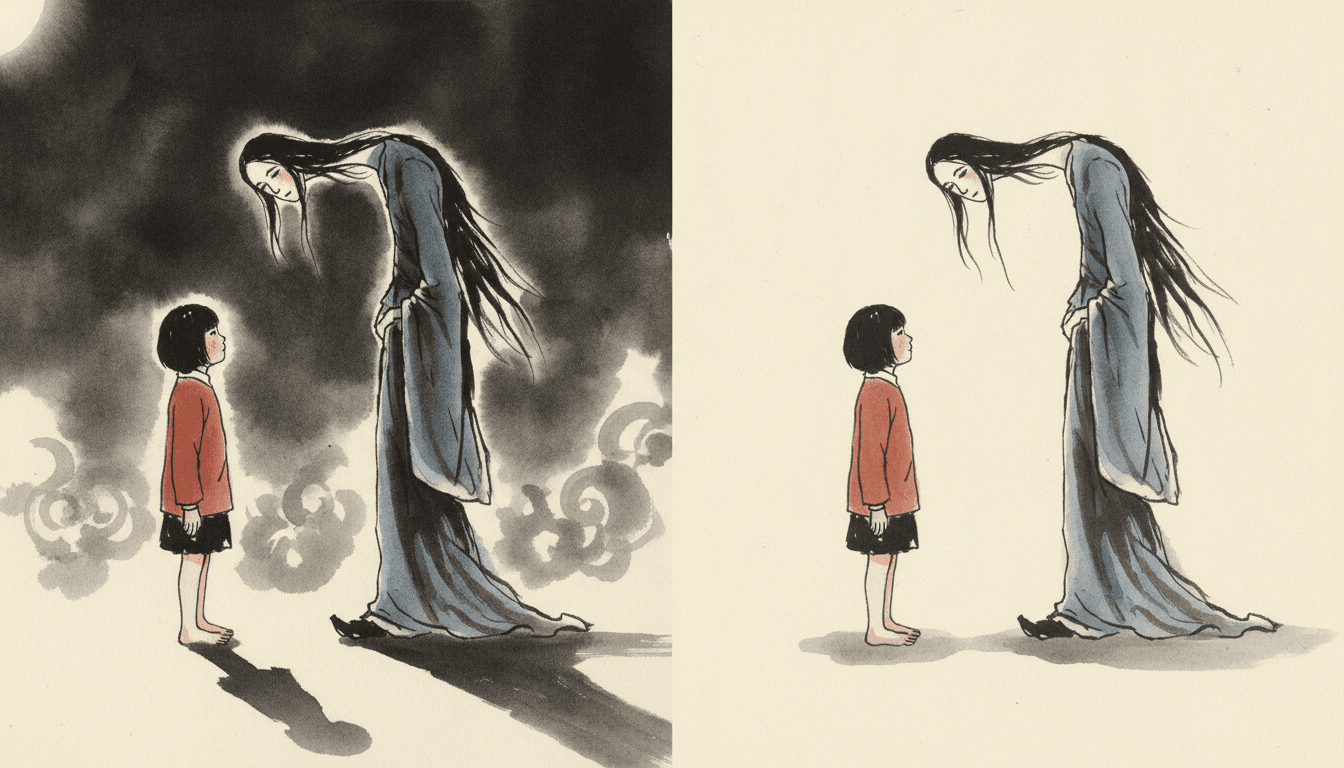
This is the part that makes the style. Six other briefs reach for darkness, shadow or mystery — crosshatch gothic, ornate dark fantasy, a dark cyberpunk cel, a heroic-fantasy castle in shadow, a grainy cinematic look, a mysterious pixel fable — and every one of the six gets its mood from the light: moody hatched chiaroscuro, dramatic moody chiaroscuro, hard directional light, dramatic warm and cool light, strong dramatic directional light, soft muted ambient light. This brief records its light as flat ink-on-paper light. No moon, no lantern, no shadow pooling behind anyone. The uncanny thing in these pictures is standing on bare cream paper in plain view, with every stroke of it visible, and it is still uncanny.
Wild means untamed, not messy
The word in the name is easy to misread as splatter. The brief does not ask for blots or a ruined page. It asks for untamed flowing ink lines — a brush allowed to run — with visible brush pressure, pauses and slight unevenness for a real on-paper rhythm, and a line weight recorded as bold variable brush-pressure lines. Two other briefs carry that exact hand-pressure sentence: the botanical ink brief, which draws with a fine dip pen, and the mythic bestiary brief, which works in brush and soft ink washes like this one. What makes this line wild is speed and weight — it swells where the brush was pressed, thins where it lifted, and lets robes, hair and poses flow with the movement rather than being drawn around.
Every strange face is its own face
A style about spirits could easily collapse into one spooky template repeated across a book. The brief closes that door by refusing uniform cute faces outright — one of about a dozen briefs that refuse a cute default face in some wording, and the only one of them whose subject is spirits — and by placing the Eastern feel in form and rhythm rather than in costume props. In practice that means each creature gets its own long or wide or lopsided face, its own odd proportion, its own way of standing, and none of them borrows the big glossy eyes of a mascot. The strangeness is specific to each one. That is also what lets a child tell the spirits in a story apart, which matters more than usual when the cast is not human.
A Wild Ink Page Is Uncanny Without Being Dark
Almost every picture-book tradition makes a strange thing strange the same way: it hides part of it. A shape in a doorway at dusk, a face lit from below, a figure half lost in mist. It works because the reader fills in the dark with whatever they are most afraid of.
The library shows how standard that is. Six briefs reach for darkness, shadow or mystery, and all six get there through the light — chiaroscuro twice, hard directional light, dramatic warm-and-cool light, strong dramatic light, a soft muted ambient light. Then there is this one, whose light is recorded as flat ink-on-paper light: the ordinary even light of ink on a sheet of cream paper, which hides nothing and casts nothing.
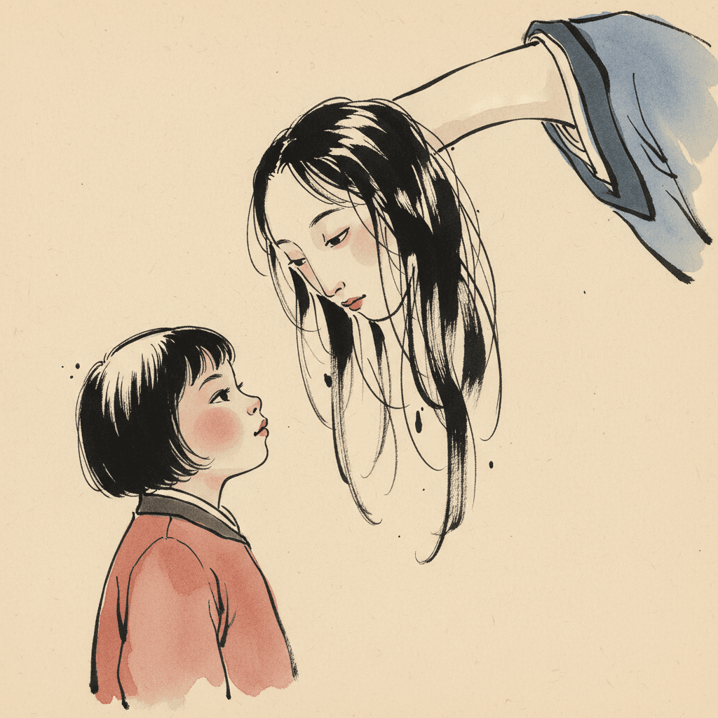
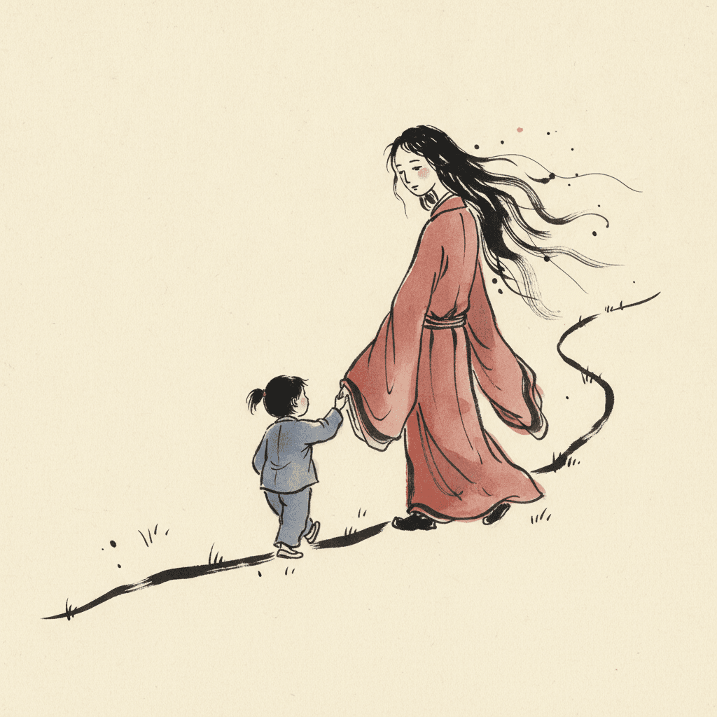
That leaves the brief only one place to put its unease — in the thing itself. A neck a little too long. Sleeves that hang past the knees. A face that is calm in a way that is not quite right. That is the whole thesis of wild ink illustration: the strangeness is drawn, not lit.
Write the Strange Thing in Plain Sight
Here is the practical consequence of a brief that will not supply darkness, and it is the reason to pick this style over a moodier one. Most eerie stories save their strange character for the end — a glimpse, a noise, a reveal at midnight — because the pictures can hide it until then. This style cannot hide anything. Whatever is strange in your book is going to be standing on the page, fully drawn, in ordinary light, from the first time it appears.
So stop saving it. Let the tall lady be at the wall on page two and still be there on page twenty. Let the long-legged thing walk beside the children in the open field. The question a story in this style asks is not what is in the dark? but what is this, that we can see perfectly well? — and that question can carry a whole book in a way a jump-scare cannot.
Which changes what you should write. For most eerie styles the useful note is the mood: the night, the cold, the silence. For this one it is the shape — how tall, how still, which part of it is wrong — and the test of a page is whether it would still be uncanny at noon.
From One Sentence to a Book Full of Quiet Strangers
You pick the look once. The brief is then applied to every page of the story, so the spirit you meet on page one is the same spirit on page thirty.
Describe the strangeness, not the mood
A sentence is enough, and a specific oddity in it goes a long way. Not a spooky figure appeared at night — a woman twice as tall as the door was waiting by the wall. The style will not add darkness, so put the uncanny into the shape.
Choose Wild Ink Weirdness
Picking it fixes the whole brief at once: untamed flowing brush-ink with visible pressure and pauses, eerie spirit-creatures and uncanny characters, black ink with muted vermillion and washed indigo on cream, deliberate negative space, flat ink-on-paper light, and the four refusals.
Get a book, not one striking picture
C2Story writes the story, splits it into pages and builds each page to the brief according to what that page says. Your words are set as type rather than brushed into the art. Read it on the web, share it, or buy the PDF to hand to a printer.
This Style and Its Three Nearest Neighbours
Four looks in the library sit close to this one. Here is what each actually asks for, so you can take the right one rather than the first one.
Wild Ink Weirdness
The style on this page
A wild expressive brush-ink illustration with untamed flowing ink lines, eerie Eastern spirit-creatures and strange uncanny characters, carried by a strong personal hand-touch: visible brush pressure, pauses and slight unevenness for a real on-paper rhythm. Calligraphic linework with deliberate negative space, robes, hair and poses that flow naturally, and an Eastern feel that comes from form and rhythm. Its palette is black ink, rice-paper cream, muted vermillion and washed indigo, its line is bold variable brush pressure, and its light is flat ink-on-paper light. It refuses stiff vector lines, uniform cute faces, smooth digital fill and photorealism.
Mythic Bestiary Ink
The same brush and the same hand — a different creature and a different light
The comparison to make first. It shares the visible-pressure sentence, the brush, the ink washes, the muted vermillion and the refusal of a generic cute face. Then it diverges twice. Its subject is ancient legendary beasts reimagined as modern creature design — horned, prowling, animal in body — where this one draws spirits that are closer to people: robed, long-haired, standing upright. And its light is moody atmospheric ink lighting, with drifting ink mist in its own preview, where this one is lit flat. Take the bestiary for a fierce creature with weather around it; take this for something uncanny standing quietly in the daylight.
Crosshatch Gothic Ink
Black ink and dark subject matter, with the darkness drawn in
The other ink brief with a sombre streak, and the clearest illustration of the road this one did not take. Crosshatch gothic builds its mood out of meticulous fine hatching for shadow and volume under a moody hatched chiaroscuro, and it refuses colour outright. Every one of its marks is a way of making dark. This brief keeps colour — vermillion and indigo washes on cream — leaves most of the paper bare, and spends its ink on the creature rather than the shadow around it. One is unsettling because of what you cannot see; the other because of what you can.
Bendy Absurd Storybook
Strange creatures too — played for delight instead of unease
The other brief with strange invented creatures in it, and the gentlest way to see what the eerie adds. The absurd brief has fluid flowing lines and extreme bendy proportions too, but its colour is bright and inventive, its light is playful even storybook light, and its creatures exist to make a reader laugh. This brief has the same appetite for odd shapes and points it the other way: muted vermillion and washed indigo instead of brights, Eastern spirits instead of invented toys, a quiet unease instead of a joke. If the strangeness in your story is meant to be funny, take the absurd brief. If it is meant to be slightly too still, take this one.
Wild Ink Story Ideas That Suit the Brief
Each of these plays to the same strength: something strange that is present from the start, in plain view, and a child with a reason to keep looking at it.
The Tall Lady Who Waits by the Wall
She is there every afternoon and nobody else seems to see her. A flat light means the spirit is never revealed in a dramatic moment — she is simply present, page after page, which is far stranger than a reveal.
Grandmother Says Do Not Answer Him
A spirit who is polite, patient and wrong in some way nobody will name. The brief refuses a cute default face, so the wrongness can live in his proportions rather than in a scary expression.
The Thing That Walked Home With Me
Something on long thin legs follows a child down the lane and turns out to be lonely. Untamed flowing line suits a creature in motion, and bare paper keeps the lane wide enough for it.
The Cat Sleeps Next to the Ghost
The household animals were never afraid of it, and that is the clue. A story about who is allowed to be frightened, in a style that never makes the picture itself frightening.
Where the Wind Spirit Goes in Summer
A season story told from the side of something that is not a person. Hair and robes that flow with the pose make wind easy to draw without ever drawing the wind.
The Field Where the Old Ones Live
A child is allowed to visit a meadow full of quiet strange neighbours as long as they keep the rules. The brief deliberate negative space gives each spirit room, so a crowd of them still reads one at a time.
What Untamed Brush-Ink and Flat Light Actually Look Like
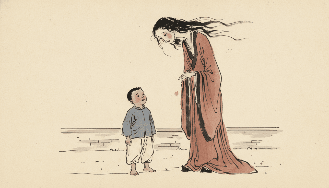
Three images generated to this one brief, with nothing retouched afterwards.
The Same Spirit, Lit Two Ways
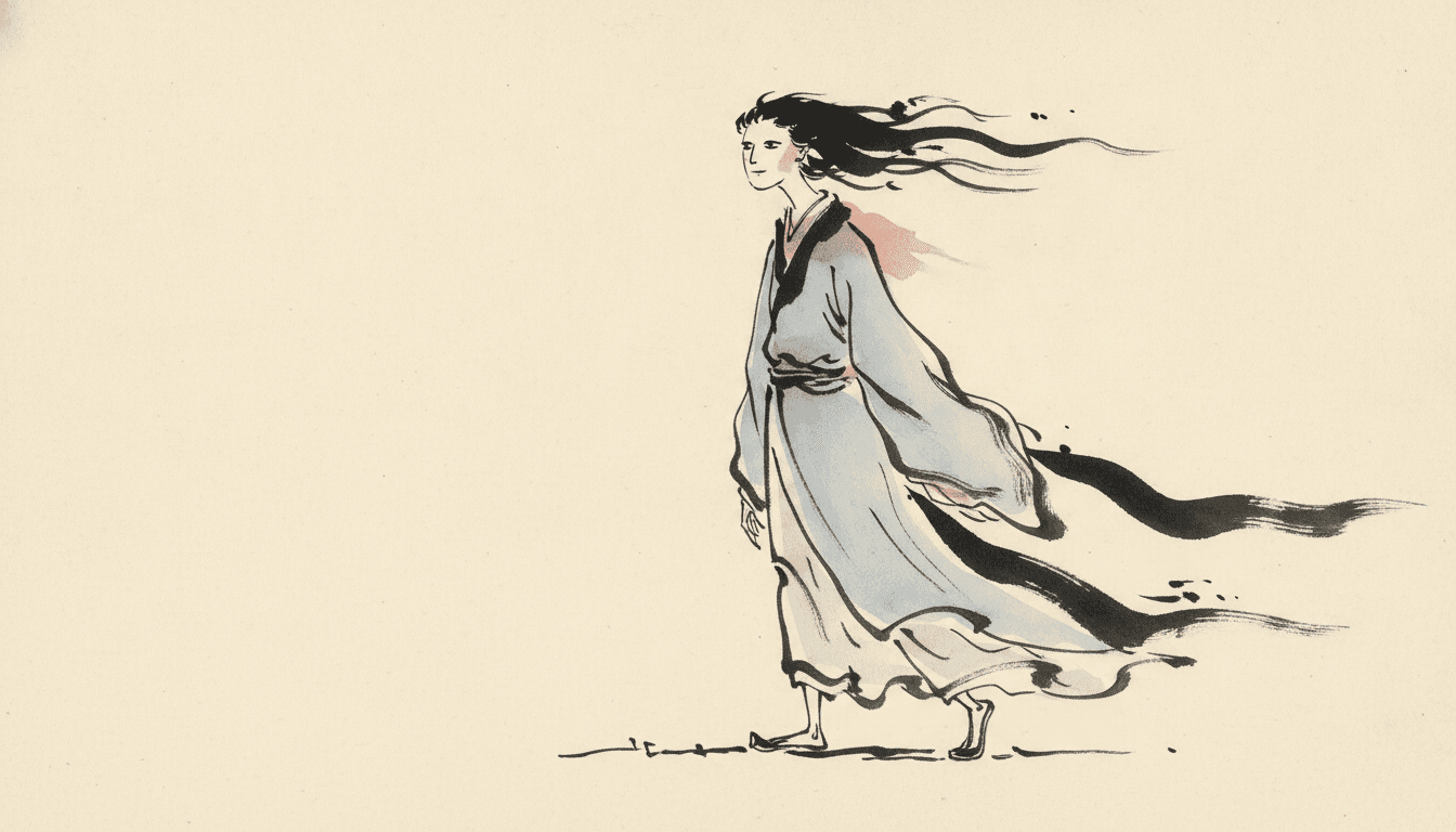
One Spirit, Very Few Strokes
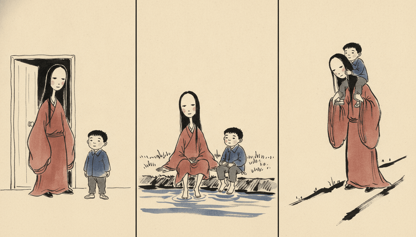
Same Spirit, Three Ordinary Afternoons
Five Pages Where Nothing Is Hidden
Same brief, same four colours, same flat light — and a different kind of strangeness standing on the paper each time.
Her Neck Is Far Too Long
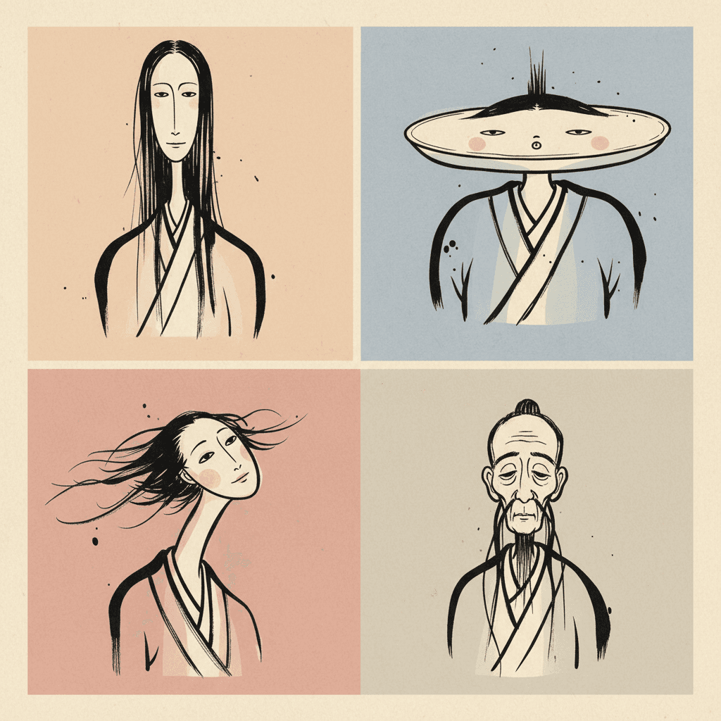
Four Spirits, Four Faces
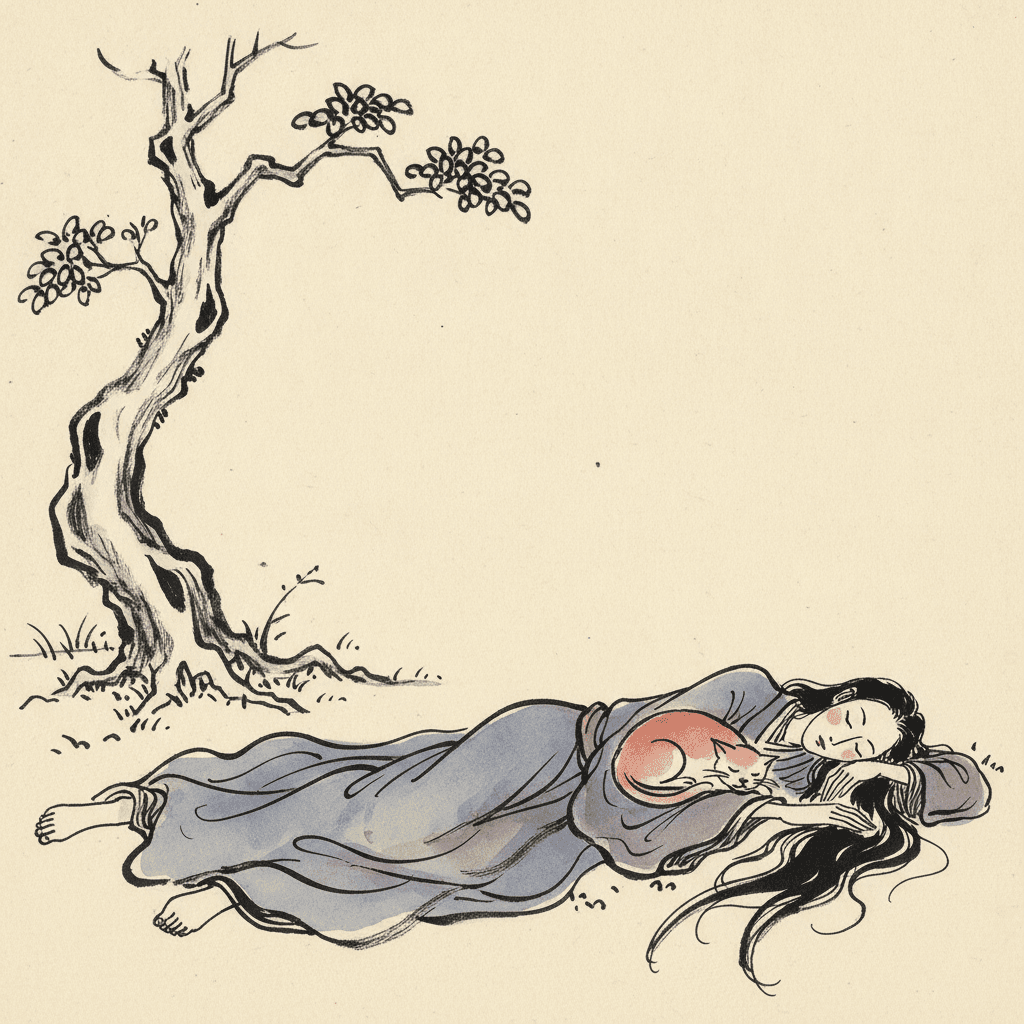
The Cat Was Never Afraid of Her
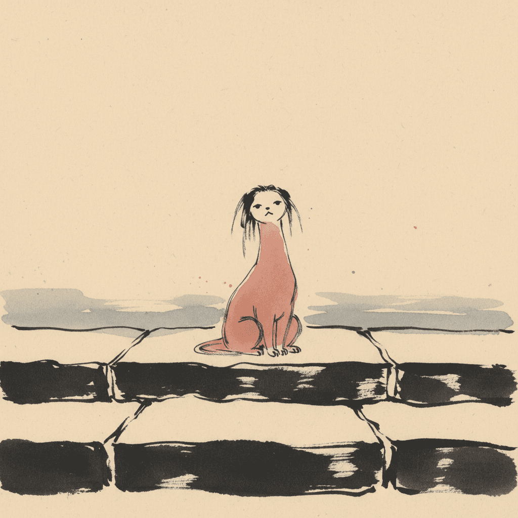
Something Is Sitting on the Steps
Holding On to Her Sleeve
Making a Whole Wild Ink Picture Book, Not One Image
The useful things and the honest limits, in the order they are likely to matter to you.
A strange cast that stays the same strange cast
Consistency is the first thing to break when images are generated one at a time, and a cast of spirits breaks faster than a cast of people, because there is no ordinary face to anchor to. C2Story carries one fixed brief into every page, so the line, the palette and the flat light never drift between spreads. Each character — human or otherwise — can be saved in the Character Library with up to fourteen reference images, which is how a very tall spirit with a long neck and wind-blown hair stays exactly that tall and that long-necked on page thirty. Characters built from an uploaded photo stay private to your account.
Four colours, and most of the paper left alone
The palette is written down rather than left to taste: black ink, rice-paper cream, muted vermillion and washed indigo, laid as thin transparent washes rather than solid fills, which the brief refuses as smooth digital fill. Deliberate negative space is part of the recipe, so a typical page is a figure or two and a great deal of bare warm cream. One honest note: there is no global greyscale switch in C2Story, so if you want pure black ink with no colour at all, pick a brief that is monochrome by design rather than this one with the washes removed.
What you are giving up, said plainly
You are giving up atmosphere — all of it. The light is flat ink-on-paper light, so there is no night that looks like night, no lantern glow, no moonlit mist, no long shadow behind a figure in a doorway. If your story needs its tension to arrive through the weather or the hour, this is the wrong brief, and the mythic bestiary or crosshatch gothic briefs are built for exactly that. You are also giving up the clean edge: the line is bold and uneven by instruction, so a crisp graphic look, a neat cartoon outline or a precise technical drawing will fight the style rather than bend it.
Why flat light makes it gentler, not weaker
The reasonable worry about an eerie style in a children's book is that it will be frightening. This brief is unusually well suited to the problem, precisely because it refuses the dark. Most of what makes a picture scary to a small child is what it hides — the corner you cannot see into, the shape behind the shadow. Here nothing is hidden. The spirit is on bare paper in plain daylight, every line of it visible, so a child can look at it for as long as they like and decide for themselves what it is. The unease is real, but it is the curious kind, not the startled kind.
A whole book, not one admired single image
A tall robed figure in sweeping brush strokes is exactly the kind of image that looks finished on its own and tells you nothing about forty pages. You are not prompting for one picture. Describe the story and C2Story writes it, splits it into pages and builds each page to this brief according to what that page says. Your words are set as type rather than painted into the art, so there are no fake brush-written characters in the picture. Write in English, Chinese, Japanese, Spanish, French and more. When you want it on paper, the paid PDF download is the handoff to your printer, and everything you make is licensed for commercial use.
Honest about the age this one suits
This is not a toddler style. Very young children read one big friendly shape on a clear ground, and a brief that refuses cute faces will not give them that. It comes into its own from around five, when children start to enjoy the pleasant shiver of a story with something odd in it, and it keeps working well into the early teens and for adult readers of folklore. The flat light is what keeps the lower end safe — nothing is hiding — and the uncanny subject is what keeps the upper end interested. For younger readers who want a creature story, the bendy absurd brief is the friendlier choice.
A note on where this one sits in the wider map. For the calmer members of the same ink family — black and red, pink wash, blue-green landscape — see sumi-e picture books, and for ink that shares this one's visible hand pressure but holds a fine dip pen instead of a brush, botanical ink picture books. For darkness drawn in with hatching, crosshatch picture books; for strange creatures played for laughs instead, whimsical absurd picture books. For a line that is uneven because it is still searching rather than because it is running, angular line picture books, and for the quiet brush-drawn modern Chinese figure with its face left blank, new Chinese minimal picture books.
Questions About Wild Ink Picture Books
Explore More Story Ideas
Discover more styles, tools, and story types

Camping Stories
Tents, campfires, hiking and starry nights
Explore
Fashion Illustration Picture Books
One unvarying black line & no shading at all
Explore
Children's Book Creator
Design beautiful kids books
Explore
Storybird Alternative
Better AI story creation
ExploreWild Ink Picture Books — Untamed Brush-Ink, Eerie Spirits and a Light That Hides Nothing
A wild ink picture book is built on a rare instruction. C2Story runs seventy-eight hand-drawn style briefs, each a short written record of a palette, a light, a line weight and four things to avoid. Read them all for the vocabulary of unease and very little turns up. Three use the word strange, and two of those mean it warmly — strange invented creatures in bright playful colour, strange ornate flora in a curio-cabinet spirit. Only one brief asks for strangeness that is meant to unsettle. The words eerie, uncanny and untamed each appear in exactly one brief, and it is this one: a wild ink illustration style of untamed flowing brush-ink lines, eerie Eastern spirit-creatures and strange uncanny characters.
What makes it distinctive is how it gets there. Six other briefs reach for darkness, shadow or mystery — crosshatch gothic, ornate dark fantasy, a dark cyberpunk cel, a heroic fantasy castle, a grainy cinematic look and a mysterious pixel fable — and every one of them takes its mood from the light, through chiaroscuro, hard directional light, dramatic light or a soft muted ambience. This brief records its light as flat ink-on-paper light. There is no night, no lantern, no mist and no shadow pooling behind a figure. The palette is black ink, rice-paper cream, muted vermillion and washed indigo, with deliberate negative space, so the uncanny figure stands on bare paper in plain view. The strangeness has to live in the drawing itself — a neck too long, sleeves past the knees, a calm face that is not quite right — which is what turns this weird ink art into something closer to folklore than to horror.
The line matters as much as the subject. It is recorded as bold variable brush-pressure lines, and the brief asks for visible brush pressure, pauses and slight unevenness for a real on-paper rhythm — a sentence it shares with only two other briefs, the fine-nib botanical ink brief and the mythic bestiary brief. Wild here means untamed rather than messy: the brush is allowed to run, robes, hair and poses flow with the stroke, and nothing is traced. That makes it a genuinely expressive ink drawing style, and its refusals keep it honest. It rejects stiff vector lines, smooth digital fill and photorealism, and it rejects uniform cute faces, so every spirit in a story carries its own odd face and its own proportions rather than sharing one spooky template.
The practical payoff is a change in what you write. Most eerie stories save their strange character for a reveal, because the pictures can hide it until then. This style cannot hide anything, so the strange thing is present and fully drawn from the first time it appears — and the story becomes a question about what it is rather than what is lurking. Describe the oddity, not the mood. The honest limits are the mirror of that strength: there is no atmosphere of night or weather, and the line is never crisp or graphic. It suits roughly five and up, with the flat light keeping it curious rather than frightening. Describe your story in a sentence and C2Story writes it, splits it into pages and builds every page to the same brief, holding each character steady with up to fourteen reference images — in English, Chinese, Japanese, Spanish, French and more, with the paid PDF download as the handoff to your printer and everything you make licensed for commercial use.