
Guofeng Picture BooksA Character You Can Say in Four Shapes
Of the seventy-eight style briefs here, exactly one names the shapes its people are built from. A guofeng picture book comes from that one — circles, squares and arcs, a face reduced to a few small marks, and flat bright colour on open cream.
- Characters built from circles, squares and arcs
- Iconified faces — two small eyes and a mouth
- Flat clean colour: yellow-orange, blue, leaf green
- Free credits by request — no card
50,000+
Stories Created
10,000+
Active Creators
50+
Art Styles
4.9/5
User Rating
What Makes Guofeng Illustration Different From Every Other Flat Style
Every style here is a written brief — a palette, a light, a line weight, a short list of refusals. Four lines in this one decide everything, and three of them appear in no other brief in the library.
The only brief in the library that names the shapes it is made of
Every style in C2Story runs on a short written brief recording a palette, a lighting note, a line weight and a few things to avoid. Read all seventy-eight hand-drawn briefs and a great many of them ask for simple shapes, big shapes, bold shapes, graphic shapes. Exactly one of them says which shapes. This brief asks for characters built from bold simple shapes — circles, squares and arcs — and the words circle, square and arc each appear in no other brief in the entire library. That is a stranger thing to find in a style note than it sounds. Every other brief describes an effect and leaves you to reach it however you like; this one hands you a vocabulary of three forms and tells you the people are assembled out of them. A head is a circle. A body is a square. A sleeve is an arc. You can say a whole character out loud before anything is drawn.
Simplified towards being recognised, not towards being funny
Five of the seventy-eight briefs build their characters out of big simple shapes, so the construction on its own is not what separates them — what each one does next is. Four of the five follow the simplification with a deliberate distortion: one asks for intentionally lopsided proportions, one for round bulging eyes, one for suddenly exaggerated expressions, one for exaggerated slender proportions. Reduce a figure to a few shapes and the obvious next move is to bend those shapes out of true, because that is where the comedy is. This is the only one of the five that does not. Its own next line reads: proportions tuned for graphic recognition over realistic anatomy. The reduction here is in service of being read, not of being laughed at — which is why a guofeng page can be simple without being a gag.
The face is a few small marks — not a missing face
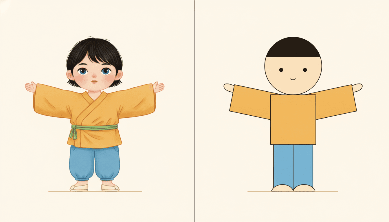
The brief asks for iconified minimal facial features, and iconified appears nowhere else in the library. Worth being precise about what it means here, because the neighbouring idea is a different style entirely. This is not a blank face: there are two small eyes and a small mouth and they are plainly, visibly there on every head, however large that head is in the frame. What has gone is everything around them — no eyebrow, no eyelash, no pupil ring, no eye shine, no nostril, no lip line, no cheek shading. A face reduced to the few marks that identify it, in the way a road sign is reduced. If you want the other thing — the face left out altogether so the reader supplies it — that is the new-Chinese minimal brief, and this page is not it.
A line that flows but never changes width
The brief calls its linework calligraphic yet crisp, and the yet is carrying the whole sentence. Its line weight is recorded as clean uniform confident lines. So the line travels like handwriting — the hem of a robe, a sash, a sleeve, a lock of hair is one long unbroken curve drawn in a single movement, and the brief asks for robes, hair and poses flowing with rhythm — but it never swells, never tapers, never presses and never releases. That combination is unusual. A flowing line almost always gets its grace from pressure; here the grace has to come from the path of the stroke alone, at one constant width the whole way. Flat clean colour fills sit inside those lines, under a flat even graphic light that casts nothing at all, with a lot of open cream ground left around everything.
A Guofeng Page Is Defined By What It Will Not Do
Each brief ends with a short list of things to avoid, and that list is usually the fastest way into a style. This one refuses four: photorealism, heavy shading, gritty texture and realistic anatomy.
The last one is the interesting refusal, and it is nearly unique. Seventy-eight briefs each name four things to avoid, which is three hundred and twelve refusals in total, and only three of them mention anatomy at all. One is the art brut brief refusing correct anatomy; one is the bad-good brief refusing technically perfect anatomy. Both of those are refusing it in order to draw badly on purpose — deliberately crude and unschooled, intentionally crude and wobbly.
This is the only brief in the library that refuses realistic anatomy in order to draw clearly. The same word appears in its positive clause too — proportions tuned for graphic recognition over realistic anatomy — which is the whole thesis of guofeng illustration in one line: correctness was never the goal, legibility was.
Give Every Character One Shape and the Book Casts Itself
Here is the practical consequence of a brief that names its forms, and it is the reason to pick this style rather than a prettier one. Most illustration styles get harder to read as you add people: four children in a watercolour spread become four similar faces with different hair, and by page thirty a reader has quietly stopped tracking who is who.
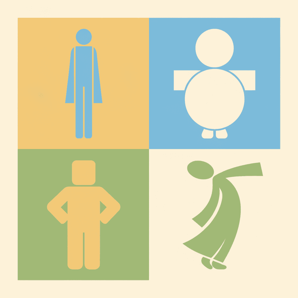
This brief inverts that. Because a character is assembled from a few large nameable forms, you can hand each one a different form and the cast becomes separable from across the room — the tall narrow one, the short round one, the square one, the one made of curves. The reader is not matching faces. They are matching shapes, which they can do at a glance and from any distance.
Which changes what you should put in your writing. For most styles the useful note is what somebody looks like. For this one it is what somebody is shaped like — and the test of a cast is whether you could still tell them apart with every face painted out.
From One Sentence to a Cast of Shapes
You pick the look once. The brief is then applied to every page of the story, so the four children you set up on page one are still the same four on page thirty.
Cast by shape, not by face
A sentence is enough, and a shape in it goes a long way. Not her grandmother was kind — her grandmother was the short round one. Not his brother was skinny — his brother was all elbows. Then say what bodies are doing, because the body carries the feeling here.
Choose New-Guofeng Flat Line
Picking it fixes the whole brief at once: circles, squares and arcs, iconified minimal faces, flat clean fills in warm yellow-orange, clear blue and leaf green, a clean uniform confident line, a flat even graphic light, and the four refusals.
Get a book, not one lovely picture
C2Story writes the story, splits it into pages and builds each page to the brief according to what that page says. Your words are set as type rather than lettered into the art. Read it on the web, share it, or buy the PDF to hand to a printer.
This Style and Its Three Nearest Neighbours
Four looks in the library sit close to this one. Here is what each actually asks for, so you can take the right one rather than the first one.
New-Guofeng Flat Line
The style on this page
A modern new-guofeng flat-line illustration, with characters built from bold simple shapes — circles, squares and arcs — with iconified minimal facial features and proportions tuned for graphic recognition over realistic anatomy. Its palette is a bright yellow-orange and blue-green one: warm yellow-orange, clear blue, leaf green and soft cream. Its colour is laid in flat clean fills. Its line is clean, uniform and confident, calligraphic yet crisp, with an awareness of negative space, so that robes, hair and poses flow with rhythm. Its light is flat even graphic lighting. Traditional motifs are modernised rather than reproduced, and the four things it refuses are photorealism, heavy shading, gritty texture and realistic anatomy. It renders whatever scene your story describes.
New-Chinese Minimal Figure
The same tradition, the opposite hand
The comparison you should make first, because both briefs draw on the same tradition and then disagree about almost every mechanism. That one asks for slightly tall slender figures in a quiet refined palette of muted ivory, soft ink grey and dusty jade, drawn in thin fluid calligraphic lines that press and taper like real brushwork, with the face left as good as blank so the reader supplies it. This one is bright rather than quiet, built from nameable geometric forms rather than flowing contours, drawn at one even unvarying line width rather than with pressure, and it keeps a small working face of two eyes and a mouth. One of them removes the face and keeps the brush. The other keeps the face and removes the brush. Take the minimal one for stillness and restraint; take this one for clarity and cheerfulness.
Bold Flat Satire
The sharpest rival — the same construction, a different purpose
The closest brief in the library on method, and it is instructive precisely because it starts in the same place. It also organises modern characters by strong silhouettes and big simple shapes, also gives them few but forceful facial features, also fills them with flat colour blocks. Then it adds a thick heavy black contour and asks for deadpan or awkward or suddenly exaggerated expressions with clear comic timing, because the shapes there exist to deliver a verdict on somebody. Here the line is thin and even rather than heavy, the expressions are calm, and the shapes exist so that a reader can tell one character from another on page thirty. Same construction, opposite intent: one simplifies in order to judge, the other simplifies in order to identify.
Flat Geometric Shapes
Shares the word, not the method
Seven briefs in the library use the word geometric and this is the pair most often confused, so it is worth separating cleanly. In the geometric style the shape is the drawing: forms are built from hard-edged geometric blocks with no outline at all, and what defines an edge is the boundary where one flat colour stops and the next begins. There is nothing to call a line. Here the shape is what the body is made of, but the drawing is still a line drawing — a clean even contour runs round every form and the flat colour sits inside it. One is a composition of coloured planes that happens to read as a figure; the other is a figure drawn with a pen and assembled out of three named forms. Take geometric for abstraction, this one for characters.
Guofeng Story Ideas That Suit the Brief
Each of these plays to the same strength: a cast you could tell apart in silhouette, and bodies that are doing something.
The Four of Us Walked to the Market
A whole book of the same four children, every page. A style whose characters are built from nameable shapes is at its strongest when there is a group to tell apart, and it will do it from across the page.
Grandmother Is the Round One
A family seen the way a small child sees them: by shape and by size, before anything else. Give each relative one form and the book casts itself.
Nobody Could Catch the Red Cat
A chase across courtyards and over walls. The brief asks for poses flowing with rhythm, and a body built from one long arc is a body that reads as running.
The Festival Started Without Us
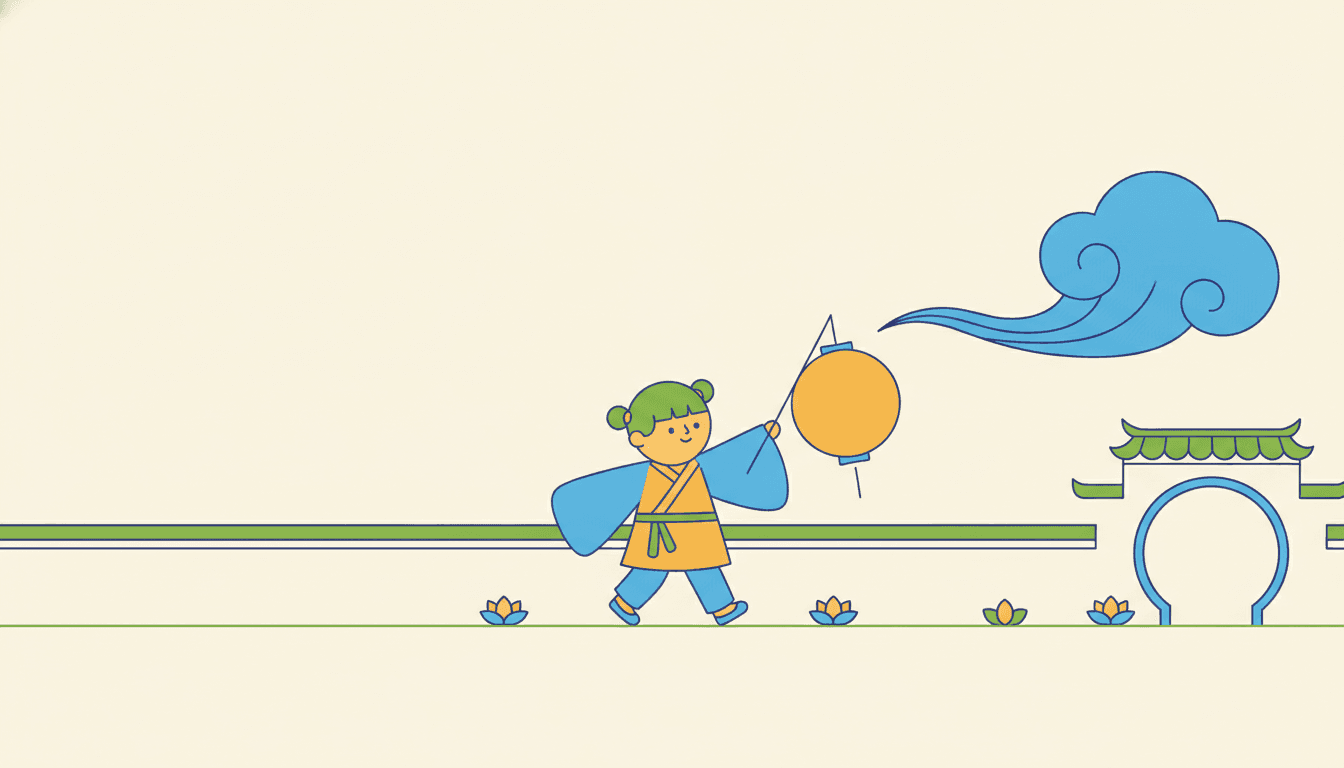
Crowds, lanterns and a long walk home. Traditional motifs modernised means a few big plain shapes rather than dense ornament, so a busy day stays easy to look at.
I Grew Out of My Jacket
One child and one year. When proportions are tuned for recognition rather than realism, a book about a changing body is one this brief can draw plainly and kindly.
The Long Walk Up the Hill
A journey with very little in it. Flat even light and a lot of open cream ground mean an almost empty page still holds, so the smallest event can carry a spread.
What Circles, Squares and Arcs Actually Look Like
Three images generated to this one brief, with nothing retouched afterwards.
The Same Child, Drawn and Assembled
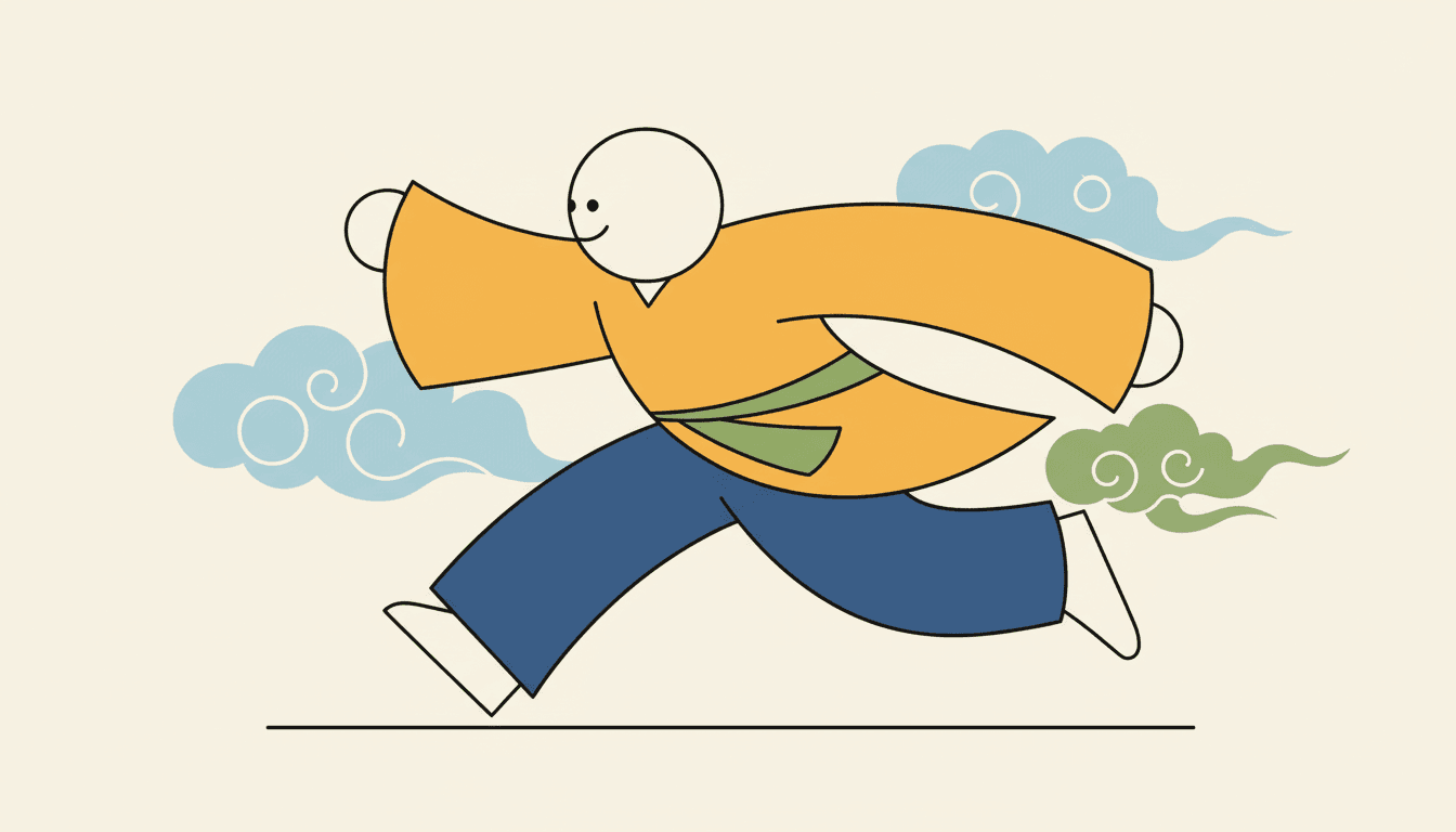
The Whole Body Is One Arc
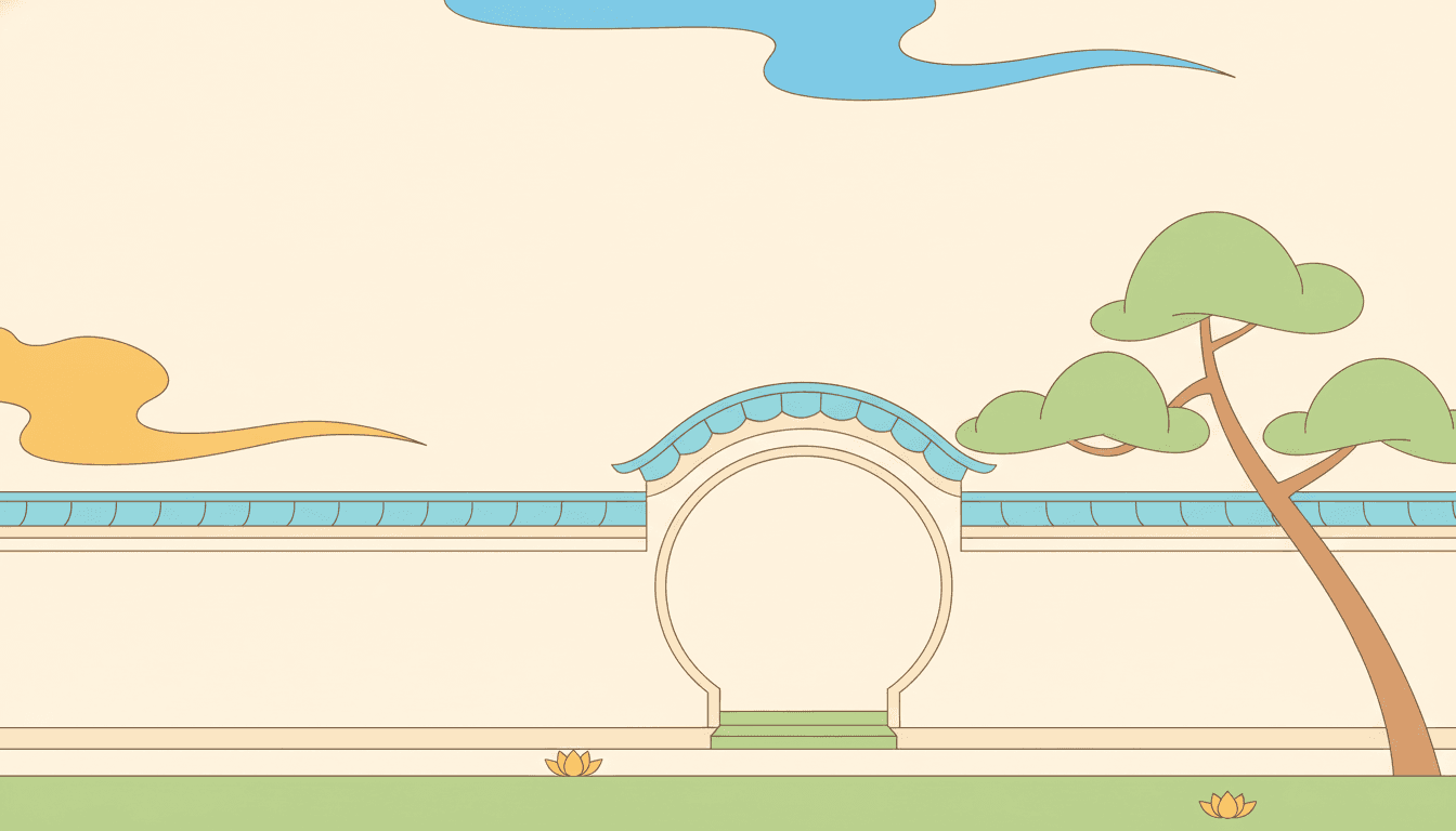
The Place Is Built the Same Way
Five Pages Where the Construction Is the Subject
Same brief, same four colours, same even line — and a different set of forms doing the work each time.
Four Silhouettes, Nothing Inside Them

A Head This Big, a Face This Small
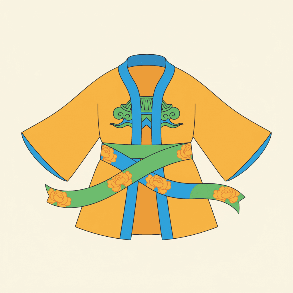
Traditional Motifs, Modernised
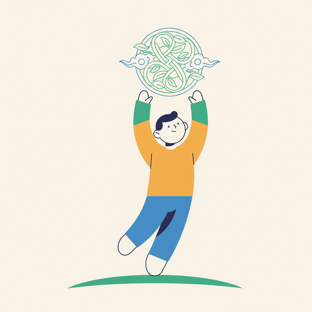
Reaching, and the Whole Body Curves
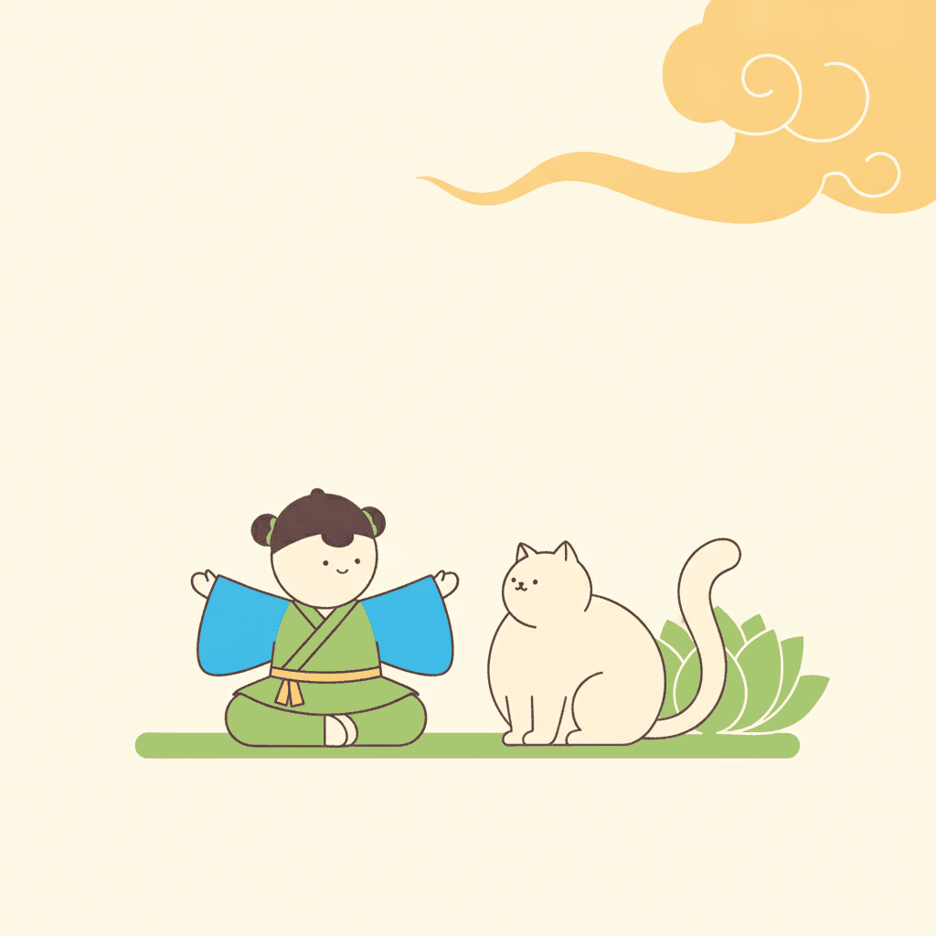
The Child and the Cat, Same Shapes
Making a Whole Guofeng Picture Book, Not One Image
The useful things and the honest limits, in the order they are likely to matter to you.
A style that helps a character stay the same
Consistency across pages is the thing that breaks first when images are generated one at a time, and this is one of the few briefs in the library that actively makes it easier. A character described as a circle head, a square body and two arc sleeves in three flat colours has far less to drift than one described by a face, a hairstyle and the fall of a sleeve — there is simply less information to lose. That is what proportions tuned for graphic recognition buys you. One fixed brief is carried into every page: circles, squares and arcs, iconified faces, flat clean fills in warm yellow-orange, clear blue and leaf green, a clean uniform line and a flat even light. Save each character in the Character Library with up to fourteen reference images and they stay themselves across the whole book. Characters built from an uploaded photo stay private to your account.
Bright, and specific about which bright
The palette is written down rather than left to taste: warm yellow-orange, clear blue, leaf green and soft cream, laid as flat clean colour fills. It is worth knowing what that is not. It is not the deep imperial red-and-gold that the word guofeng tends to summon, and it is not a muted or antique scheme either — this is a clear, fresh, daylight set of colours closer to printed paper than to lacquer. Because the colour is flat and the light casts nothing, the palette is doing structural work rather than decorating: with no shading available, a change of colour is one of the only ways the picture can separate one thing from another. There is also no global greyscale switch in C2Story, so for a monochrome book you want a style that is monochrome by design rather than this one with the colour taken out.
What you are giving up, said plainly
You are giving up the close-up that carries a feeling on its own. A face made of a couple of dots and a short line can be cheerful, calm or sad in outline, but it cannot do the particular small expression that a reader leans in to read, and no amount of describing one in your text will produce it. Everything emotional in this style has to be carried by the body: posture, where the weight sits, how a sleeve is thrown, which direction somebody is facing. You are also giving up texture and depth entirely — the brief refuses gritty texture and heavy shading, so there is no weather on a surface and no modelled volume anywhere. If your book needs a face doing the work, the classic rounded manga and storybook styles are built for it and this one will fight you.
Why the shapes are not a diagram
A reasonable worry about any style described this way is that it sounds cold, like an instruction manual with people in it. Two lines in the brief prevent that. The first is the one about rhythm: robes, hair and poses flowing with rhythm, which asks the shapes to be arranged as movement rather than stacked as construction. The second is the negative-space note that sits with the line — these forms are given room, not packed in. A circle and two arcs can be a child mid-run or a child standing to attention depending entirely on how the arcs are set, and the brief is explicit that it wants the first. The flat even light helps: with nothing modelled and nothing shaded, a pose has to be legible from its outline, which pushes every figure towards a clear and slightly generous bit of acting.
A whole book, not one admired single image
A clean flat-line figure in three bright colours is the kind of thing that looks finished on its own, which tells you nothing about whether it can carry forty pages. You are not prompting for one picture. Describe the story and C2Story writes it, splits it into pages and builds each page to this brief according to what that page actually says, so the cast you set up on page one is the cast you still have on page thirty. You get picture-book pages with your words set as type rather than lettered into the art, which suits a style with this much open cream ground. Write in English, Chinese, Japanese, Spanish, French and more. When you want it on paper, the paid PDF download is the handoff to your printer, and everything you make is licensed for commercial use.
Honest about the age this one suits
This is one of the best briefs in the library for the youngest readers, and the reason is in the construction. A two-year-old reads a nameable shape and a flat bright colour before they read anything else — that is why board books look the way they do — and a style whose characters are literally assembled from circles, squares and arcs under a flat even light is giving a very young child exactly what they can use. It works from about two and is comfortable to about eight. Above that the limit is the face: older readers want expression, and a handful of marks will start to feel thin for a book that turns on how somebody feels. For nine and up, pick a brief that keeps a working face.
A note on where this one sits in the wider map. For the other brief out of the same tradition — quiet, muted, brush-drawn and faceless — see new Chinese minimal picture books. For big simple shapes spent on a verdict instead of on recognition, see bold flat picture books and pop art picture books. For shape used as a colour boundary with no line at all, geometric picture books. If what you want is a figure stripped right down to a public sign — interchangeable rather than individual — that is pictogram picture books, and the difference matters: a pictogram is made simple so that anyone could be it, while these shapes are made simple so that one particular child is recognisable on every page. And for the clear even contour without the geometry, ligne claire picture books.
Questions About Guofeng Picture Books
Explore More Story Ideas
Discover more styles, tools, and story types
Garden Stories
Planting seeds, sunflowers, butterflies and the veggie patch
Explore
Pictogram Picture Books
Faceless sign-like figures caught mid-motion
Explore
Children's Book Creator
Design beautiful kids books
Explore
Storybird Alternative
Better AI story creation
ExploreGuofeng Picture Books — Circles, Squares, Arcs and a Face of a Few Marks
A guofeng picture book is built on one unusual sentence in one brief. C2Story runs seventy-eight hand-drawn style briefs, each a short written record of a palette, a light, a line weight and a few refusals, and a great many of them ask for simple shapes, big shapes, bold shapes or graphic shapes. Exactly one says which shapes. This brief asks for characters built from bold simple shapes — circles, squares and arcs — and the words circle, square and arc appear in no other brief in the entire library, in English or in the Chinese notes the briefs are kept in. That matters more than a piece of trivia should, because naming a vocabulary instead of an effect changes what you can do with a style. A character in modern chinese aesthetic of this kind can be described completely out loud before anything is drawn — a circle for the head, a square for the body, two arcs for the sleeves — and a thing you can say in four words is a thing that survives being drawn forty times.
The next clause tells you what the reduction is for, and it is not what you would guess. Five of the seventy-eight briefs assemble their characters out of big simple shapes, so the construction is not the distinguishing fact — what each does next is. Four of the five immediately bend the shapes out of true: one asks for intentionally lopsided proportions, one for round bulging eyes, one for suddenly exaggerated expressions, one for exaggerated slender proportions. Simplify a body and the obvious move is to distort it, because that is where comedy lives. This is the only one of the five that keeps its shapes straight, and its own line explains why: proportions tuned for graphic recognition over realistic anatomy. The refusals confirm it from the other side. Seventy-eight briefs naming four things to avoid makes three hundred and twelve refusals, and only three of them mention anatomy — the art brut brief refusing correct anatomy and the bad-good brief refusing technically perfect anatomy, both in order to draw badly on purpose. This brief is the only one in the library refusing realistic anatomy in order to draw clearly.
The other three decisions follow from that one. The face is iconified — a word that appears in no other brief here — which means two small eyes and a small mouth and nothing else at all: no eyebrow, no eyelash, no pupil ring, no nostril, no lip line, no shading. It is a reduced face rather than an absent one, which is what separates guofeng illustration from the new-Chinese minimal brief next door, where the face is left as bare paper for the reader to fill. The line is recorded as clean uniform confident lines and described as calligraphic yet crisp, so it travels like handwriting in one long unbroken curve but never swells or tapers — a flowing line that gets its grace from its path rather than from pressure, which is rare. Flat clean colour fills sit inside it, in warm yellow-orange, clear blue, leaf green and soft cream, under a flat even graphic light that casts nothing anywhere. And the tradition arrives as traditional motifs modernised — another phrase no other brief in the library uses — which in practice means a few large plain forms, a cloud scroll or a roof line or a round gateway, with a great deal of open ground around them. It is emphatically not the imperial red-and-gold brocade that the word tends to summon.
Which makes the practical payoff clear enough to act on. Most illustration styles get harder to read as the cast grows, because four children become four similar faces with different hair; chinese style art of this kind gets easier, because you can give each character a different set of forms and let a reader separate them from across the room. So write the shape rather than the face: her grandmother was the short round one, his brother was all elbows. The honest limits are the mirror of the strength — a face of a few small marks cannot carry the quiet close-up that turns on a small expression, there is no texture and no modelled depth anywhere, and above about eight a reader will start to want more face than this brief has. Below that it is one of the best things in the library, because a nameable shape and a flat bright colour are the first two things a very young child can read. Describe your story in a sentence and C2Story writes it, splits it into pages and builds every page to the same brief, holding each character steady with up to fourteen reference images — in English, Chinese, Japanese, Spanish, French and more, with the paid PDF download as the handoff to your printer and everything you make licensed for commercial use.